10,000 search results
(0.214 seconds)
- Compasse by Dharma Type,
$24.99 Compasse is a semi-condensed sans-serif family designed by Ryoichi Tsunekawa and the whole family consists of 12 style: six weights from Thin to ExtraBold and their matching Italics. The range of styles provides flexibility for title, headline and body text. And the large x-heights increases legibility and readability. The basic skeleton of their letterform was not designed over-modularly but moderately semi-modularly (adjusted by designer's experience). Therefore the typical artificiality and unnaturalness which come from module-design does not exist in this family. The sophisticated letterform and its universal, neutral, and standard design make it possible to be used across a wide range of applications in all medias, all purposes. Compasse supports almost all european languages: Western, Central, South Eastern Europeans and afrikaans. And superior figures, inferior figures, denominators, numerators and fraction can be accessed by using OpenType features.
 - Wallgain by Keristyper Studio,
$14.00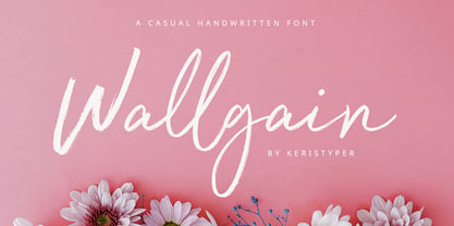 Introducing Wallgain A rustic, dapper handwritten font with a personal touch. With quick dry strokes and a signature style. Wallgain Handwriting Font multilingual support: Afrikaans, Albanian, Catalan, Danish, Dutch, English, Estonian, French, Finnish, German, Icelandic, Indonesian, Italian, Malay, Norwegian, Portuguese, Spanish, Swedish, Zulu, and many more. What’s Included : Standard & Multilingual glyphs Ligature Works on PC & Mac Simple installations Accessible in Adobe Illustrator, Adobe Photoshop, Adobe InDesign, and even work on Microsoft Word. Hope you enjoy our font!
 - Churchward Typestyle by BluHead Studio,
$25.00 Churchward Typestyle is a clean sans serif font, originally designed as a photo font by Joseph Churchward back in 2002. Under exclusive license, BluHead Studio has digitized this typeface by using his original drawings. We added any missing glyphs, being careful to maintain the aesthetic that makes this a classic Churchward design. Joseph intended this to be a six weight family, so we digitized the Light and Ultra Bold weights and interpolated the middle four. We enhanced the functionality of the family by creating a complimentary set of small caps, as well as creating a 10 degree oblique of each weight, being careful to correct the slanted curve forms of the letters. Churchward Typestyle is now an extensive 12 weight family, ranging in weights from Light to Ultra Bold, making it extremely useful in a broad range of design applications, from text and print, to display, posters and billboards. It’s sanserif design is clean and open, with a few of those characteristic Churchward goodies. Joseph loved his ink traps, so look for many of those! They especially become more apparent in the heavier weights. All of the Churchward Typestyle fonts support the major Western European languages, and have OpenType features for ligatures, smallcaps, tabular figures, superiors, inferiors, fractions, and ordinals.
 - Strak by Kustomtype,
$25.00 Strak is a font that was born out of admiration for the work of E. Vermeulen, a Belgian artist known for his tight, precise line and an unseen masterpiece that is spread around the world. He has published and exhibited his work in London, Liverpool, Angoulême, New York, Geneva, Amsterdam, Lyon and Turku (in Finland) and he even signed for the New York Times. Based on a few characters, a complete font was composed by Kustomtype. After a few sketches, Strak came to life. The name Strak, in this case, refers to the slender, beautiful woman with the correct waistlines and proportions. The font is designed this way; it is completely hand-drawn, digitized and can be used in all modern and graphic media. Strak is available in 8 different styles, has class and will make many people's mouth water when they see it on your designs. Do you want quality and style? Then Strak is the font-perfect solution!
 - Sinkwitz Gotisch by preussTYPE,
$29.00 Sinkwitz Gotisch is a new release of the font of the same name originally designed by Paul Sinkwitz in 1942. The Sinkwitz Gotisch was 1942 by Schriftguss AG Dresden font cast first cast and later supplied by the East German firm VEB Typoart. Paul Sinkwitz (1899-1981) has created them. This font displays not the characteristics of a chunky Gothic, which have influenced the image of national socialism. Paul Sinkwitz was a painter, graphic artist, wood engraver, was interested in religious topics, which he had presented in numerous graphics. But also his interpretation of his Gothic font is modern, without having the font this is ugly. In addition to the GOTISCH he created Roman Uppercase letters, which perfectly harmonize with the lowercase letters. This extra font is called BASTARD. The digital version of Sinkwitz is a beneficial addition to a Gothic with calligraphic character and should be in any historically interested graphic design.
 - Rebekah by Ascender,
$29.99 Rebekah Pro is a revival of ATF’s Piranesi family, the regular being designed by Willard Sniffin, and the remaining weights designed by Morris Fuller Benton. Tom Rickner first revived Benton’s Italic for use in his wedding invitations for his marriage to Rebekah Zapf in 2006. He completed the character set in 2009. Rebekah Pro captures the elegance and distinction of the original. Tom carefully studied samples from 1930s American Type Founders catalogues and created a digital version with meticulous care. While considered an informal script because its letterforms do not connect, Rebekah Pro has graceful strokes and a truly elegant appearance. Tom created a variety of typographic enhancements not found in the original Piranesi italic font. These OpenType typographic features offer a distinguishing touch to everything from invitations and announcements to greeting cards and advertisements. Rebekah Pro contains the Latin 1 character set and the following OpenType typographic features: Swashes, Small Capitals, Ligatures, Alternates, Oldstyle Figures, Proportional Lining Figures, Tabular Lining Figures and Ornaments.
 - F2F Czykago by Linotype,
$29.99The Face2Face (F2F) series was inspired by the techno sound of the mid-1990s, personal computers and new font creation software. For years, Alexander Branczyk and his friends formed a unique type design collective, which churned out a substantial amount of fresh, new fonts, none of which complied with the traditional rules of typography. Many of these typefaces were used to create layouts for the leading German techno magazine of the 1990s, Frontpage. Branczyk and his fellows would even set in type at 6 points, in order to make it nearly unreadable. It was a pleasure for the kids to read and decrypt these messages! The three fonts in the F2F Czykago family, F2F Czykago Light, F2F Czykago Semi Serif, and F2F Czykago Trans, were all inspired by the Apple system font Chicago. The F2F Czykago family, along with 38 other Face2Face fonts, is included in the TakeType 5 collection from Linotype. Branczyk designed 16 of these himself." - F2F Mekanik Amente by Linotype,
$29.99The Face2Face (F2F) series was inspired by the techno sound of the mid-1990s, personal computers and new font creation software. For years, Alessio Leonardi and his friends formed a unique type design collective, which churned out a substantial amount of fresh, new fonts, none of which complied with the traditional rules of typography. Many of these typefaces were used to create layouts for the leading German techno magazine of the 1990s, Frontpage. Leonardi and his fellows would even set in type at 6 points, in order to make it nearly unreadable. It was a pleasure for the kids to read and decrypt these messages! F2F Mekanik Amente appears as if it had once been a normal font whose letters were horribly attacked by a pair of scissors. This font could be a very creative choice for headlines. F2F Mekanik Amente is one of 41 Face2Face fonts included in the Take Type 5 collection from Linotype GmbH. Leonardi designed 11 of these himself." - Sneakers Max by Positype,
$22.00 Sneakers was a typeface that I originally drew all the way back in 2005, with a release in 2006. Its most recent iteration, Sneakers Pro was released in 2009. Since then, the idea of reworking the design has lingered in the back of my head, but I wanted to add additional flexibility and value to anything offered beyond the originals. Sneakers Max does just that and I am happy to see it released and available to everyone. Sneakers Max raises the bar in terms of functionality… incorporating all of the options found in Sneakers Pro (e.g. Small Caps and a biform/unicase located now in Titling Alternates), but it expands the character offering, improves on letter designs (everything was redrawn) and explores more flexible settings by providing 5 distinct counter widths to keep more uniform multi-line settings with mixed letter heights. Special thanks to Potch Auacherdkul for his additions to the original character set and for his engineering skills.
 - Melina BT by Bitstream,
$50.99Melina Plain and Melina Fancy are characterized by graceful lines, strong contrast and nostalgic overtones. These typefaces are patterned after two members of a type family named Greco, released by Fundición Tipográfica Richard Gans of Madrid, Spain, in the 1920s. Melina Plain is a refined version of Greco Bold, and Melina Fancy is based on Greco Adornado, with the notable addition of a lowercase, which was not a part of the original design. Melina is based on two typefaces (ca. 1920) from the Fundición Tipográfica Richard Gans in Madrid, Spain. Nick Curtis first found Greco Adornado in a type specimen at the Library of Congress. It was a cap only design. He made a cut of the original (Melina Fancy) and created his own lowercase, and many other characters to support contemporary character sets. Later he came across Greco Bold, which had a lowercase, but he chose not to use it and instead, adapted his Melina Fancy to create Melina Plain. - Thirsty for Souls - Personal use only

- Qiltray by Tour De Force,
$25.00 Qiltray is a good example of how handwritten fonts can be made for use in long texts. With clear and readable letters, Qiltray may be used in any kind of publications. Includes Cyrilic and CE character set support.
 - Minsky by Solotype,
$19.95The Bruce Foundry in New York gave this Italian Clarendon the catchy name of Ornamented No. 1529. The original had a top right white shadow which we eliminated. Additionally we improved the color of several of the characters. - Ben Kidoz by Sipanji21,
$5.00 Ben Kidoz is a sweet and friendly display font, created with an incredible playful touch, with Regular, Bold, Italic and hollow feel. Add this font to your favorite creative ideas and notice how it makes them come alive!
 - Venarotta by Aftertime Studio,
$20.00 Venarotta is a minimal and neat sans serif font. It can easily be matched to an incredibly large set of projects, so add it to your creative ideas and notice how it makes them stand out! Thank you.
 - Belinday by Stringlabs Creative Studio,
$25.00 Belinday is a Monoline Script Font with Retro Vintage Style. This font is perfect for fashion brand, apparel, shoes company, wedding invitation, business card, logo brand, clothing, and also business brand name like barber shop or taylor. Thanks.
 - Bal Harbour JNL by Jeff Levine,
$29.00Inspired by hand lettering on a 1940s toy game spotted on ebay called "Let's Go Shopping", Jeff Levine created "Bal Harbour JNL" and named it after a South Florida community famous for its luxury homes and trendy stores. - Happy Dinosaur by Sipanji21,
$10.00 Happy Dinosaur is a sweet and chunky lettered display font. Its friendly feel makes this font incredibly versatile, fitting a wide range of contexts. Add it to your creative ideas and notice how it makes them stand out!
 - Breakfast by PizzaDude.dk,
$15.00 This is close to insane! My Breakfast font has got 8 (yes EIGHT!) different versions using contextual alternates! They cycle nice and easy AS you type! How cool is that?! Ofcourse, the font is also loaded with diacritics!
 - Sugo by Zetafonts,
$29.00 Created for a skateboard shop logo Sugo is a headline font with a blocky shape, a freestyle finish and a street attitude. Its high readibility and contemporary feel make it the right typeface to mix personality and dynamism.
 - Spooky Green by Illushvara,
$13.00 Spooky Green is an incredibly unique and quirky display font. Its friendly feel makes this font incredibly versatile, fitting a wide range of contexts. Add it to your creative ideas and notice how it makes them stand out!
 - Bilhete by Vernacular,
$9.99 Bilhete ('note') is a font for a quick writing. You can write a poem, a shop list or your name in a coffee cup. Any note on your project will have a personal taste with Bilhete by Vernacular. :)
 - Rollicking Polly by Happy Heart Fonts,
$19.99 This is my frilly, girly font I created in 2011. It's my version of my teenage handwriting. I hope you enjoy it and use it often. It's perfect for fun scrap-booking projects or making cute tags etc.
 - Juicebash by Bogstav,
$17.00 It's tall, legible and handmade - and on top of that, charming as heck! Each letter has rounded corners, which leaves a pleasant and smooth look. Juicebash is legible, even at very small sizes and it has multilingual support
 - Cry Wolf by Hanoded,
$20.00 When I was a kid, I loved the story of The Boy Who Cried Wolf. I thought it was pretty stupid of the boy to trick the villagers into believing wolves are attacking his flock of sheep. But I also thought it was a bit sad that the sheep are eaten by a wolf in the end. I didn’t really feel sorry for the boy (he really was stupid), nor the wolf (he just does what he is supposed to do in life), but I did feel sorry for those poor sheep. I guess this is what disinformation leads to in the end. Cry Wolf is a bit of a scary font: it was made with a really old and battered brush, using Chinese ink and some quality French paper. It has a slight tilt to the right and I added some inky splatter for dramatic effect. Use Cry Wolf for your book covers, product packaging and headlines; use if to spice up you invitations and your halloween posters. Comes in a slightly tilted Regular style and an outright Italic style.
 - June by Schriftlabor,
$26.99 June is a contemporary neo-grotesque sans-serif typeface designed to be highly legible, readable, and usable. The clarity and mathematics were inspired by the research into type form by Adrian Frutiger. June was designed by developing a modern and unique approach to his findings. June's legible features include a near uniform stroke width, open apertures and counters, angular cut stems, and a large x-height. Italics are angled at eight degrees and have been redesigned to provide a stylistic difference without reducing legibility. June comes in seven weights, from Thin to Bold, each equipped with OpenType features. June can be used for all print sizes, and has characteristics that are more visible at larger sizes. June was inspired by a close family member of the designer. A part of all sales will be donated to Alzheimer's Society. Free Variable Font: If you buy the full family, you will also receive the Variable Font version of June, without extra charge.
 - Soul Adventures Cyr by Ira Dvilyuk,
$18.00 Soul Adventures Cyrillic Script adds hand look style to all your design projects: logos, signatures, labels, packaging design, and blog headlines. Also, it will look great in mugs, cards, gorgeous typographic designs, wedding stationery, and much more. An additional font Soul Adventures Symbols Font can help you to make a lot of pretty designs and logos. Soul Adventures script includes a full set of uppercase 2 sets of lowercase letters, numerals, a large range of punctuation, and 70 ligatures, giving a realistic hand-lettered style. The Cyrillic part of the font contains the uppercase letters and lowercase letters and 20 ligatures, giving realistic hand-lettered style. Soul Adventures Symbols is a font with over 36 unique, hand-drawn elements and swashes that can help to make your design more original. A different symbol is assigned to every uppercase or lowercase standard character plus numbers 0-9 so you do not need graphics software just simply type the letter you need. Multilingual Support for 32 languages: Latin glyphs for Afrikaans, Albanian, Basque, Bosnian, Catalan, Danish, Dutch, English, Estonian, Faroese, Filipino, Finnish, French, Galician, Indonesian, Irish, Italian, Malay, Norwegian Bokmål, Portuguese, Slovenian, Spanish, Swahili, Swedish, Turkish, Welsh, Zulu. And Cyrillic glyphs support for Russian, Belorussian, Bulgarian, Ukrainian, and Kazakh languages.
 - Drummer by Harvester Type,
$20.00 Drummer is a large futuristic font family inspired by the Expansion TV series, old science fiction book covers and Honda Prelude and Porsche logos. The family contains a large number of styles and a lot of language support. 54 styles, 6 in width (Ultra Condensed, Condensed, Normal, Expanded, Extra Expanded, Ultra Expanded) and 9 in weight (Thin, Extra Light, Light, Regular, Medium, Semi Bold, Bold, ExtraBold, Black). The font also has a variable version. 573 glyphs, including 40 alternate characters. A lot of work has been done on the font. The fillets on the symbols have been well worked out and tested for a better visual and practical experience. The font combines the monospacing of many characters combined with kerning, which makes it very convenient for many purposes, such as vertical typography. The font is good in all sizes, both small and large, which makes it possible to use it anywhere. Branding, logos, titles, posters, texts, covers, merch, prints, web, titles, banners, games and design in games and much more. In the near future, it is planned to add another axis of variability - the slant. Consequently, the family itself will increase. It is also planned to add a small case (capital). If you want to say something about the font or get a font in other formats, then write to the mail: bunineugene@gmail.com .
 - Northills by LetterStock,
$25.00 Northills Font This pair was inspired by the great lettering poster design that i saw on some coffee shop, It was crafted by hand specially to add natural handmade feeling in its brand identity than i make it clean with pentool. Opentype features Northills font has 215 character set Northills is very good looking in labels, retro logo design, product packaging, invitations, advertising and others. Rough lettering is always have a good retro vibes and give your design authentic and good looking, it’s perfect for branding or even poster design. If you looking for rough retro font for your logo or even lettering design, this font is a great choice to make your design authentic and good looking This fonts works with folowing languages: Afrikaans, Albanian, Asu, Basque, Bemba, Bena, Chiga, Cornish, Danish, English, Estonian, Filipino, Finnish, French, Friulian, Galician, Gusii, Indonesian, Irish, Italian, Kabuverdianu, Kalenjin, Kinyarwanda, Low German, Luo, Luxembourgish, Luyia, Machame, Makhuwa-Meetto, Makonde, Malagasy, Malay, Manx, Morisyen, North Ndebele, Norwegian Bokmål, Norwegian Nynorsk, Nyankole, Oromo, Portuguese, Romansh, Rombo, Rundi, Rwa, Samburu, Sango, Sangu, Scottish Gaelic, Sena, Shambala, Shona, Soga, Somali, Spanish, Swahili, Swedish, Swiss German, Taita, Teso, Vunjo, Zulu Thank you for using this font. LS
 - Basic Commercial Soft Rounded by Linotype,
$29.99 Basic Commercial is a font based on historical designs from the hot metal typeface era. It first appeared around 1900, and was created by type designers whose names have not been recorded but whose skills cannot be overlooked. This typeface's design has been popular among groups and movements as diverse as the Bauhaus, Dadaism, and the masters of Swiss/International-Style typography. It influenced for a variety of later grotesque fonts, such as Helvetica and Univers. Basic Commercial was distributed for many years in the United States under the name Standard Series. The typeface worked its way into many aspects of daily life and culture; for instance, it became the face chosen for use in the New York City subway system's signage. The Basic Commercial's font family members have a clear and objective design. Their forms exhibit almost nothing unusual, but remain both lively and legible nonetheless. Perhaps for this reason, Basic Commercial's design has been popular with graphic designers for decades. To read more about the history of typefaces like Basic Commercial, visit our font feature, The Sans Serif Typefaces. In addition several weights of this typefamily are available as soft rounded versions."
 - Victoria Smitters by Din Studio,
$29.00 It is critical to ensure that your design appearance represents the messages you deliver. However, it can be such a difficult task and time wasting to create a personal, lovely design. Therefore, Victoria Smitter is the answer to what you need. Victoria Smitter is a visually beautiful handwriting font which is perfect to show modern, elegant impressions in a personalized design to impress your customers and to make your messages more prominent than the others. It is designed in a cursive way in which the letters are connected to each other. Details on each letter and cursive wipes on the edges show high contrasts. Furthermore, this font is suitably applicable for big text sizes for better legibility. In addition, you can enjoy the available features here. Features: Stylistic Sets Ligatures Swashes Multilingual Supports PUA Encoded Numerals and Punctuations Victoria Smitter fits best for various design projects, such as brandings, posters, banners, invitations, greeting cards, magazine covers, quotes, printed products, merchandise, social media, etc. Find out more ways to use this font by taking a look at the font preview. Thanks for purchasing our fonts. Hopefully, you have a great time using our font. Feel free to contact us anytime for further information or when you have trouble with the font. Thanks a lot and happy designing.
 - Thunder Garage by Din Studio,
$25.00 Font is the most significant design element which can be difficult to find the excellent one for a certain design. For that reason, we offer you a solution by combining two fonts into one. With Thunder Garage, finding a perfect font combination is never this easy. Thunder Garage is a duo font combination between brush and sans serif fonts which you use together in one design. Each font is beautifully created to support one another perfectly. Using a duo font gives interesting contrast and visual variations to your designs. The brush font is made similar to a handwriting style with brush details to show you personal, informal impressions. You are free to use this duo font as either one lovely set or as separated parts based on your needs. In addition, enjoy the other features available in this font. Features: Ligatures Multilingual Supports PUA Encoded Numerals and Punctuations Thunder Garage fits best for various design projects, such as brandings, posters, banners, logos, magazine covers, quotes, headings, printed products, merchandise, social media, etc. Find out more ways to use this font by taking a look at the font preview. Thanks for purchasing our fonts. Hopefully, you have a great time using our font. Feel free to contact us anytime for further information or when you have trouble with the font. Thanks a lot and happy designing.
 - Lost Buster by Ditatype,
$29.00 Your designs are your self expressions and should represent your personal styles. Without the right font, it will be hard to be prominent and to impress your audience. Lost Buster is here to assist you. Lost Buster is a capitalized handwritten font in brush details to produce a manual brush-looking display adding creativity values to designs with this font. It also gives more personal, natural impressions to make people feel close to the brand or design displayed. The advantages of a brush-detailed handwritten font are first, the unique display to get the brand or the design easily remembered and noticed, and second, legible, applicable for various media. You can also apply this font for various text sizes for its legibility reason and enjoy the available features here. Features: Alternates Multilingual Supports PUA Encoded Numerals and Punctuations Lost Buster fits best for various design projects, such as brandings, posters, banners, headings, magazine covers, quotes, invitations, name cards, printed products, merchandise, social media, etc. Find out more ways to use this font by taking a look at the font preview. Thanks for purchasing our fonts. Hopefully, you have a great time using our font. Feel free to contact us anytime for further information or when you have trouble with the font. Thanks a lot and happy designing.
 - Wooden Alphabet by Yumna Type,
$25.00 Wooden Alphabet is a peculiar wood texture and shape-inspiring display font having unique, attractive letter designs in prominent uppercases along with wood textures to express natural nuances. All of the font letters are very carefully, smoothly designed in detail as if they were made of real wood. In fact, wood textures on the letters leave the impressions of warmth and nature on the designs. Wooden Alphabet excels at the ability to create natural impressions and warm nuances in order to make your designs look interestingly different for increasing the product’s attractiveness. Such a wood-themed font is a perfect match for any nature, environment, or organic related products. To be greatly legible, you can use it for big text sizes. Wooden Alphabet provides a clipart in accordance with the font theme as a bonus and features you can enjoy. Features: Multilingual Supports PUA Encoded Numerals and Punctuations Wooden Alphabet fits best for various design projects, such as brandings, headings, magazine covers, quotes, printed products, merchandise, social media, etc. Find out more ways to use this font by taking a look at the font preview. Thanks for purchasing our fonts. Hopefully, you have a great time using our font. Feel free to contact us anytime for further information or when you have trouble with the font. Thanks a lot and happy designing.
 - Allison Script by Fenotype,
$25.00 Allison is a hand drawn signature style Script. Allison is great for branding, headlines, invitation cards or even as a logotype. Allison is equipped with over 100 Contextual Alternates and Standard Ligatures to keep the flow vivid and maintain hand drawn impression. These features are automatically ON, all you need to do is type! In addition Allison has Swash alternates for every standard character in case you need some extra flair. From Discretionary Ligatures you’ll find “st”, “nd”, “rd” and “th” ligatures designed to be used with numbers. Allison Script is PUA encoded and you can access extra glyphs in any graphic design software.
 - P22 Constructivist by P22 Type Foundry,
$24.95 Font mavens of the world unite! Constructivist recreates the bold graphic design of early Soviet Era Russian Artists such as Rodchenko and Popova. The Constructivist family contains 5 fonts plus a set of decorative extras. Constructivist Pro is an Opentype adaptation of the P22 Constructivist Set font system which combines the 5 font styles and adds Opentype features such as alternate Latin and Cyrillic letterforms, full Central European Language support and changes in line spacing and optical sizing of some characters for improved harmony. In all over 1200 Glyphs for maximum flexibility and design choices. Seize control of the means of desktop production with this revolutionary font collective!
 - Pocky Block by Arterfak Project,
$16.00 Introducing Pocky Block, a font that's bold and blocky with elegant and modern design. This font exudes a sporty, assertive, and daring vibe, making it a perfect fit for designs with sports, adventure, or futuristic themes. It's great for stickers, movie posters, flyers, displays, logos, motion graphics, advertising, and more. Pocky Block comes in two styles: Regular and Slanted. The Slanted style highlights a spirit of enthusiasm, speed, and confidence. This thick font also boasts over 100+ ligatures, allowing you to create dynamic and sophisticated letter combinations. What you'll get : All capital characters Numbers, punctuation & symbols Stylistic alternates Stylistic set 100+ Ligatures Multilingual support Help file. Thank you for your appreciation!
 - Mero by Deltatype,
$49.00 Mero inspired by the Roman Capital Proportions which we have seen in Trajan Inscription. With different widths; There are applied each letter to visual proportion. Mero inspired by this measurement method and would like to create the primary typeface in terms of simple form. This sans serif typeface designed to use for any media with a little notice from designer eyes. You won't notice much about style, but something will let you feel extraordinary and trust. Mero has supported over 30 languages and come with nine weights for a complete family. With the standard of CSS font-weight, Mero complete family will map beautifully for your digital layout.
 - Mtwane by Scholtz Fonts,
$9.50 Mtwane is a contemporary font, fusing the vigor of African design with the clean-lined sophistication of the European fonts popular at the turn of the 20th century. In the wake of African Renaissance, European and African cultures are counter-influenced, resulting in an exciting fusion of the two. Mtwane plays on the line between upper and lower case characters, creating a young, powerful, in-your-face effect. Use Mtwane for clear, powerful impact in contemporary design. Mtwane contains over 250 characters - (upper and lower case characters, punctuation, numerals, symbols and accented characters are present). It has all the accented characters used in the major European languages.
 - Albia Nova by Greater Albion Typefounders,
$9.50 Albia Nova is a bit of a new departure for Greater Albion-an unashamedly futuristic typeface. It was originally developed for a friend of ours-a set designer who needed some lettering on props for a science fiction play-the brief was to evolve conventional letter forms and speculate as to what they may look like in the future. As released Albia Nova is a more refined version of this idea, placing a bit more emphasis on readability (today) over evolution of the letterforms. The result is good for giving design projects a futuristic feel, but also has something of the 1970s and 1980s about it.
