3,690 search results
(0.011 seconds)
- Rashford by HandletterYean,
$8.00 Rashford is a brush font that fulfils all your needs, made with a brush pen with a real brush tip that gives result of a rough and distorted font. It contains uppercase, lowercase, punctuation and symbols. Rashford is suitable for posters, graphics designs, quotes, greeting cards, invitation cards, logos, packaging, branding, magazines, titles, advertising, business cards, signs, greeting cards, flyers, kids t-shirts, logos, and every other design which needs a rough look.
 - The Kindamana by Rillatype,
$15.00 Introducing, The Kindamana Handwritten Display Font. This type of font is carefully made to give the fun and cute feeling and to fit perfectly for quotes, branding, packaging, logotype, headline, books, novels, etc. This font have up to 6 alternates set that you can mix and match! Features : uppercase & lowercase numbers and punctuation multilingual alternates PUA encoded If you have any other question please feel free to hit us at rillatype@gmail.com Happy Creating!
 - Grotbox by Aah Yes,
$4.95Grotbox is an interesting, if not startling, distressed punk font. There are two varieties: one with upright characters; the other with the characters rotated out of whack for extra informality. Legibility is maintained, despite the wild industrial feel of the typeface, and it's designed to grab the attention. The zip package contains both OTF and TTF versions - install either OTF or TTF, not both versions of a font on the same machine. - Heath Notted by YuliusParyadi,
$11.00 Heath Notted is suitable for display like poster, halloween, witch theme. We created it inpired by the night, because some times night is not always just dark, but sometimes it's beautiful. Heath Notted is includes: - full set uppercase and lowercase letter; - numerals; - large number of punctuations; - ligatures, and swash. Please add this font as your favorit, hit like button, or follow me. I'll very happy for that and aprreciated it. Thank you!
 - Caliban by Adobe,
$29.00In 1994, John Benson designed the typefaces Caliban, Alexa and Balzano, all with similar characteristics. The typefaces are distinguished by their calligraphic style and their closeness to handwritten script. Caliban looks as though it were written with a broad tipped pen, with reserved yet lively figures which retain their legibility. Caliban is a good typefaces to use in short and middle length texts as well as headlines, wherever a personal touch is desired. - Star Crystals by Deniart Systems,
$20.00 Star bright tonight! Deniart’s StarCrystals typeface is an original design featuring 62 unique snowflake symbols. These geometric starburst snow crystals are sure to add elegance to all your winter designs. This font comes with a PDF guide to put all these special characters right to your fingertips! TIP: pair this one up with our SnowChrystals typeface for an even greater winter snow experience - a virtual snow storm of crystals for all your decorative needs.
 - Vild Scapes by Typesketchbook,
$49.00 With the intention to create a family of modern calligraphy, Vild Scapes offers different feels in different effects. The Normal option cuts back the imperfections created from freehand writing, while Inkless keeps those details. There’s also the Rust option, which imitates letterpress printing effects. In addition, the family comes in three designs: Brush (big paint brush style), Script (small paint brush style), and Marker (brush tip maker style), offering you more possibilities for creativity.
 - VT Showcard by VarsityType,
$15.00 This condensed block is a true knockout. VT Showcard is a heavy-hitting headliner with presence. Inspired by the boxing showcards of the 60’s and 70’s, VT Showcard towers over body copy and demands attention. This tall and mighty athletic display typeface features chiseled corners and subtle embellishments that reinforce a steady rhythm across its dramatic letterforms. With 7 weights, VT Showcard provides a versatility for sports headlines and similar projects.
 - Sulfforest by Maulana Creative,
$15.00 Sulfforest is a narrow handwritten font. With felt-tip stroke, slant and fun character with a bit of ligatures. To give you an extra creative work. Sulfforest font support multilingual more than 100+ language. This font is good for logo design, Social media, Movie Titles, Books Titles, a short text even a long text letter and good for your secondary text font with sans or serif. Make a stunning work with Sulfforest font. Cheers, MaulanaCreative
 - Westclock by Maulana Creative,
$11.00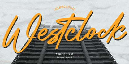 Westclock is a Script font. With regular felt-tip stroke, fun character with a bit of ligatures. To give you an extra creative work. Westclock font support multilingual more than 100+ language. This font is good for logo design, Social media, Movie Titles, Books Titles, a short text even a long text letter and good for your secondary text font with sans or serif. Make a stunning work with Westclock font. Cheers, MaulanaCreative
 - Channel Surfing JNL by Jeff Levine,
$29.00In 1999, Jeff Levine released a freeware font called "Channel Tuning JL" scanned from drawings made with a felt tip marker and designed as if the letters were breaking up due to poor reception such as on pre-digital TV sets. Over a decade later, Jeff has totally reworked the font—giving it cleaner lines, an extended character set and renaming it Channel Surfing JNL to set it apart from the roughly-drawn original. - Prestiggio by Rekord,
$39.00 With the very high contrast, elegant proportions, many alternate glyphs and ligature overload, Prestiggio is an instant fashionizer. Prestiggio ships with 95 discretionary ligatures (uppercase and lowercase), alternate characters, old-style figures, pictograms, arrows, prebuilt words and support for 85 Latin-based languages. The characters can be replaced automatically with the stylistic sets function, but you will get the best results using the glyphs palette. Recommended for editorial, book, poster and packaging use.
 - Prince Of Darkness by Comicraft,
$19.00 The 52 characters assembled by this Gothic font, Prince of Darkness, were once interred in coffins onboard the Russian cargo ship Demeter, when it set sail for the sleepy shores of Whitby, Northern England ages ago. Hunted down by Vampire Hunters for century after century, this noble Transylvanian set has hidden for years in England and Eastern Europe. Now, Prince of Darkness is available as a font with more Layers than Dracula has Lairs.
 - Raccoon Coat JNL by Jeff Levine,
$29.00 A piece of hand lettered sheet music from the era of the "Roaring Twenties" served as a model for Raccoon Coat JNL. It was a time of Prohibition, bathtub gin, flappers and college boys decked out in beanies and raccoon coats. College pennants, ukuleles and "23 Skidoo" were all part of the youth culture during this period; which gave us such dances at the Charleston, the Black Bottom and the Lindy Hop.
 - Al Blue Cashews by Aluyeah Studio,
$125.00 Hello Aluyeaholics! Blue Cashews' alternates are inspired by the curved shape of a cashew with a blunt tip. Blue Cashews give the impression that we often see in the packaging of snacks, cereals, milk, and so on. So warm, sweet, fresh, crunchy and full of love!Coming with 220+ stunning and super easy to use alternates and ligatures. To get results like the preview just type B.2l.3ue.2 C.2ash.2ew.2s.3
 - Spaghetti Western by Comicraft,
$19.00 If you're a man with no name and you like your Westerns a little more continental, we've got a Fistful of Fonts for you! Load up your guns with our dynamite new offering, SpaghettiWestern. Lip synch the Good, the Bad AND the Ugly scripts you're presented with and we guarantee that Spaghetti Western will make Spanish lettering look a little bit more Mexican. Don't try to understand 'em, just rope and throw and grab 'em!
 - ZenoPotion AOE by Astigmatic,
$19.95ZenoPotion is a geometric styled typeface influenced by alien stories and nostalgia. It carries a techno look with a regular lined top and dipped thick bottom throughout, highly readble, though not best for large bodies of text. Use the alien technology, let ZenoPotion be the type for your designs and stories. From the far reaches of space, another lifeform sent a message, now you can use their typestyle to convey your own! - Kyliewest by Maulana Creative,
$11.00 Kyliewest is a signature script font. With regular felt-tip stroke, fun character with a bit of ligatures. To give you an extra creative work. Kyliewest font support multilingual more than 100+ language. This font is good for logo design, Social media, Movie Titles, Books Titles, a short text even a long text letter and good for your secondary text font with sans or serif. Make a stunning work with Kyliewest font. Cheers, MaulanaCreative
 - Miss McGee by The Ampersand Forest,
$35.00 Miss McGee is equal parts Grotesque and Geometric, which gives here a no-nonsense, midcentury feel. Her letterforms are strong, wide in profile, and legible, making her a great choice for both text and display! She supports Western European, Cyrillic, and monotonic Greek, and has a full set of true small caps in each. She also has useful ligatures and alternates! Miss McGee is a companion typeface to Mr Chips, also from The Ampersand Forest!
 - Front Row JNL by Jeff Levine,
$29.00 Front Row JNL is an all-caps reinterpretation of Morris Fuller Benton's 1937 type design "Empire", and is available in both regular and oblique versions. As is often the case when a digital type font is based on a few letter examples found on a printed sample [in this case, the sheet music of the 1946 Guy Lombardo hit "What More Can I Ask For"], the missing characters were drawn from scratch.
 - Resistance Is Lowered by Comicraft,
$19.00 Lower your shields and surrender your ships. You will talk to your central world authority in upper AND lower case, and order global surrender. Your culture will adapt to serve us in sentence case. You will not shout in UPPER CASE as before. You will be upgraded. You will become like us. Upgrading RESISTANCE IS FUTILE to RESISTANCE IS LOWERED is compulsory. There is no escape. Artwork from Monster Truck by Shaky Kane
 - Payland by Rillatype,
$14.00 Payland is a monoline script and is perfect for logotype or quotes that need a monoline style font. Payland contains 2 styles: Regular, if you're big fan of simplicity and clean design, and Rough one for you who want a little bit of vintage touch on your design. On top of that, this font has 11 stylistic alternates! If you have any question, please feel free to hit us on rillatype@gmail.com Thank you!
 - Poseidon by Club Type,
$36.99 Ancient Olympian god of the sea, brother of Zeus; Poseidon is the bearer of a trident, the three pronged spear of tunny fishers and is drawn along by monstrous sea creatures-half horse, half serpent. Around him travels an entire retinue of dolphines, nereids, seals and different spirits of the sea. Likewise, the Poseidon font family is accompanied by the waved serifs and flourishes that enable its character to retell these ancient Greek myths.
 - Patrol Car Stencil JNL by Jeff Levine,
$29.00 Comic books based on popular characters have been around pretty much since the advent of comic books themselves. An edition of the "Car 54 Where Are You?" series published by Dell (and based on the hit TV show created by Nat Hiken) displayed "Car 54" in a bold hand lettered stencil design on the cover. These few characters became the inspiration for Patrol Car Stencil JNL, which is available in both regular and oblique versions.
 - MVB Emmascript by MVB,
$39.00Kanna Aoki drew the letters for MVB Emmascript while on a picnic near the Conservatory of Flowers in San Francisco’s Golden Gate Park. Mark van Bronkhorst adapted the writing as a font that maintains a very natural scrawl. Later a bold weight was added. MVB Emmascript has been used to add a lighthearted, human touch to everything from fiction paperbacks to potato chip packaging. The typeface is named for Aoki's 1968 Volkswagen, Emma. - Jillstone by Maulana Creative,
$12.00 Jillstone is an Exspressive slanted signature script font. With regular felt-tip stroke, fun character with some of ligatures. To give you an extra creative work. Jillstone font support multilingual more than 100+ language. This font is good for logo design, Social media, Movie Titles, Books Titles, a short text even a long text letter and good for your secondary text font with sans or serif. Make a stunning work with Jillstone font. Cheers, MaulanaCreative
 - Bauhaus Bugler Soft by Breauhare,
$35.00 Take Bauhaus Bugler, dip it in chocolate, and what do you get? Bauhaus Bugler Soft, of course! Or dip it in butter! You can achieve all sorts of yummy, appealing images with the softness of Bauhaus Bugler Soft, whether it be food, cosmetics, fabric softener, or any number of other fluffy things! Unlike its fellow Bugler fonts, Bauhaus Bugler Soft’s design never appeared in Harry Warren’s 6th grade class newsletter, The Broadwater Bugler, but its design came about during that same period in 1975. Because of this, it has been officially designated an honorary Bugler font! Its theme of broad curves that leap over and under conjure visions of fashion and high-end department stores with their dress boxes and shopping bags, plus hair products, cosmetics, couture, and other stylish personal merchandise of the highest caliber. Bauhaus Bugler Soft also has an art deco flavor, especially when all capitals are used. It comes with two alternate versions of the upper and lower Y to give users more freedom of choice. Put Bauhaus Bugler Soft in your “haus” today! Digitized by John Bomparte.
 - Hinnual by Jipatype,
$27.00 Hinnual เป็นฟอนต์ที่ผสมผสานระหว่างรูปทรงสี่เหลี่ยมและทรงกลมเพื่อสร้างสไตล์ที่ไม่เหมือนใคร ชื่อมาจากคำไทย 2 คำ คือ Hin แปลว่า หิน และ Nual แปลว่า อ่อน ผสมผสานองค์ประกอบที่แข็งและอ่อนนี้สะท้อนให้เห็นในแบบอักษร ซึ่งมีเส้นที่สะอาดตาและเส้นคมซึ่งถูกทำให้อ่อนลงด้วยมุมโค้งมน ฟอนต์มีให้เลือกถึง 18 แบบ มีตัวเลือกหลากหลายให้คุณได้เลือกใช้ Hinnual เหมาะอย่างยิ่งสำหรับใช้ในพาดหัวและพาดหัวย่อย ซึ่งลักษณะที่โดดเด่นสามารถช่วยดึงดูดความสนใจของผู้อ่านได้ เส้นสายที่สะอาดตาและสไตล์ที่เป็นเอกลักษณ์ยังทำให้เป็นตัวเลือกที่ยอดเยี่ยมสำหรับแบรนด์ โลโก้ และงานออกแบบอื่นๆ ที่ต้องการภาพลักษณ์ที่น่าจดจำ โดยรวมแล้ว Hinnual เป็นฟอนต์อเนกประสงค์และสะดุดตาที่ผสมผสานองค์ประกอบทั้งความแข็งแกร่งและความนุ่มนวล การออกแบบที่เป็นเอกลักษณ์ทำให้เป็นตัวเลือกที่ยอดเยี่ยมสำหรับนักออกแบบที่ต้องการสร้างผลงานที่น่าจดจำ Hinnual is a font that combines the square and rounded shapes to create a unique visual style. Its name comes from two Thai words - Hin, which means stone, and Nual, which means soft. This juxtaposition of hard and soft elements is reflected in the font's design, which features clean, sharp lines softened by rounded corners. The font comes in 18 styles, providing a range of options for designers to choose from. Hinnual is particularly well-suited for use in headlines and sub-headlines, where its bold and distinctive appearance can help to grab the reader's attention. Its clean lines and unique style also make it a great choice for branding projects, logos, and other design elements that require a memorable. Overall, Hinnual is a versatile and eye-catching font that combines elements of both strength and softness. Its unique design make it an excellent choice for designers looking to create impactful visual content.
 - Compendium by Sudtipos,
$99.00 Compendium is a sequel to my Burgues font from 2007. Actually it is more like a prequel to Burgues. Before Louis Madarasz awed the American Southeast with his disciplined corners and wild hairlines, Platt Rogers Spencer, up in Ohio, had laid down a style all his own, a style that would eventually become the groundwork for the veering calligraphic method that was later defined and developed by Madarasz. After I wrote the above paragraph, I was so surprised by it, particularly by the first two sentences, that I stopped and had to think about it for a week. Why a sequel/prequel? Am I subconsciously joining the ranks of typeface-as-brand designers? Are the tools I build finally taking control of me? Am I having to resort to “milking it” now? Not exactly. Even though the current trend of extending older popular typefaces can play tricks with a type designer’s mind, and maybe even send him into strange directions of planning, my purpose is not the extension of something popular. My purpose is presenting a more comprehensive picture as I keep coming to terms with my obsession with 19th century American penmanship. Those who already know my work probably have an idea about how obsessive I can be about presenting a complete and detailed image of the past through today’s eyes. So it is not hard to understand my need to expand on the Burgues concept in order to reach a fuller picture of how American calligraphy evolved in the 19th century. Burgues was really all about Madarasz, so much so that it bypasses the genius of those who came before him. Compendium seeks to put Madarasz’s work in a better chronological perspective, to show the rounds that led to the sharps, so to speak. And it is nearly criminal to ignore Spencer’s work, simply because it had a much wider influence on the scope of calligraphy in general. While Madarasz’s work managed to survive only through a handful of his students, Spencer’s work was disseminated throughout America by his children after he died in 1867. The Spencer sons were taught by their father and were great calligraphers themselves. They would pass the elegant Spencerian method on to thousands of American penmen and sign painters. Though Compendium has a naturally more normalized, Spencerian flow, its elegance, expressiveness, movement and precision are no less adventurous than Burgues. Nearing 700 glyphs, its character set contains plenty of variation in each letter, and many ornaments for letter beginnings, endings, and some that can even serve to envelope entire words with swashy calligraphic wonder. Those who love to explore typefaces in detail will be rewarded, thanks to OpenType. I am so in love with the technology now that it’s becoming harder for me to let go of a typeface and call it finished. You probably have noticed by now that my fascination with old calligraphy has not excluded my being influenced by modern design trends. This booklet is an example of this fusion of influences. I am living 150 years after the Spencers, so different contextualization and usage perspectives are inevitable. Here the photography of Gonzalo Aguilar join the digital branchings of Compendium to form visuals that dance and wave like the arms of humanity have been doing since time eternal. I hope you like Compendium and find it useful. I'm all Spencered out for now, but at one point, for history’s sake, I will make this a trilogy. When the hairline-and-swash bug visits me again, you will be the first to know. The PDF specimen was designed with the wonderful photography of Gonzalo Aguilar from Mexico. Please download it here http://new.myfonts.com/artwork?id=47049&subdir=original
 - Dancin' by ITC,
$29.00Dancin' is yet another unusual typeface from American designer David Sagorski. Based on his own style of handwriting, Dancin' is an inventive, carefree typeface ornamented with dots and unusual strokes. - Aitos by Monotype,
$29.99Kevin Simpson was five years old when the stylized "E" of the Electrolux vacuum cleaner logo caught his eye. This is his earliest recollection of an interest that ultimately became an obsession. Type remains his major preoccupation, and he admits to attempting to work a good typeface design into any project where he can get away with it. Aitos was inspired by a metal sculpture Simpson saw while driving through the French countryside. "The statue was very strong. It was heavily weathered and had obviously been there for some time, yet it also seemed very delicate and light." Aitos, like the statue, is a rugged design. At first glance, it is chunky and bold, perhaps a little jarring. If you look again, however, you'll see it has refined qualities. Aitos commands attention - yet is still affable. - Genre by Storm Type Foundry,
$26.00The official terseness and grey of Neo-Classical type faces will stand out when we narrow them. The consistently vertical shading of the letters suppresses one's desire for eccentricity, just like tea with bromine. It would, however, be wrong to consider Bodoni as the originator of this - vertically shaded - trend in type face production. In his Manual we can also find type faces with a slanted axis of shade, picturesque italics and a number of normal, more human type faces. It remains a mystery why his name is connected only with one of his many works. Genre's basic design is fairly light in colour, which is why it looks good in illustrated magazines and short texts and directly calls for graphically striking, contrasting headings. It shows off beautifully next to photographs, on diplomas and on printed materials connected with a person's death. - Konrad Kachelofen by Proportional Lime,
$9.99 Konrad Kachelofen was a printer in the city of Leipzig beginning around 1483. He printed many works by contemporary authors and also many of the classics. He acquired an unusually large amount of typefaces for his shop, a place that included a wine bar and book store. This type face is based on Typ.11:340G GfT510 Gesamtkatalog der Wiegendrucke and is similar to Proportional Lime’s “Kachelofen'' font. The major differences are that the whole miniscule set is slimmer and the majuscule set has different style glyphs and this face was used solely for titles and section headings because of its sharper and clearer appearance at large point values. Konrad probably died in 1529 after passing his business on to his son-in-law Melchior Lotter, who also went on to fame as an industrious and illustrious printer.
 - Architype Stedelijk by The Foundry,
$99.00 Architype Crouwel is a collection of typefaces created in collaboration with Wim Crouwel, following his agreement with The Foundry, to recreate his experimental alphabets as digital fonts. Crouwel's most recognized work was for the Van Abbe and Stedelijk museums (1954 –72) where he established his reputation for radical, grid-based design. Stedelijk first appeared in the seminal Vormgevers poster, commissioned by the Stedelijk Museum, Amsterdam in 1968. Crouwel created a rigid grid system across the poster of 57 vertical by 41 horizontal lines, also forming the basis for the construction of the letterforms. Although all hand drawn, the resulting typeface had a machine-made appearance. This striking black and white poster with its visible grid became one of Crouwel's most iconic designs. Architype Stedelijk now re-creates these letterforms as a single alphabet typeface in a digital font.
 - Ongunkan Enochian Script by Runic World Tamgacı,
$60.00 I drew this font staying true to the original design. The letter table in the relevant book was taken as reference. Enochian (/ɪˈnoʊkiən/ ə-NOH-kee-ən) is an occult constructed language[3] — said by its originators to have been received from angels — recorded in the private journals of John Dee and his colleague Edward Kelley in late 16th-century England.[4] Kelley was a scryer who worked with Dee in his magical investigations. The language is integral to the practice of Enochian magic.
 - Tourist Postcard JNL by Jeff Levine,
$29.00 Alf Becker graced many issues of “Signs of the Times” (a trade magazine for the sign industry) with his innovative hand lettered alphabets for others to use as design inspirations. His 134th submission was titled “Post Card Type”, a condensed thick-and-thin stylized Art Deco design. This served as the inspiration for Tourist Postcard JNL, which is available in both regular and oblique versions. Thanks to Tod Swormstedt of S.T. Media Group and the American Sign Museum for providing the work image for this type revival.
 - Shinemoon by Scratch Design,
$14.00 Introducing, Shinemoon, a futuristic font by Scratch Design Shinemoon is a sans-based font with futuristic hi-tech lowercase & uppercase that will make your design look futuristic and modern. This font will be suitable for science-fiction movie posters, advertising, or projects that match with hi-tech, robots, space, future, planet or race. You can mix and match the uppercase and lowercase to make your design more stunning and stand out. This font is also included with ligatures, alternates and multi-language. Enjoy this futuristic font!
 - Bayview JNL by Jeff Levine,
$29.00Around the turn of the 20th Century, the Inland Type Foundry produced a display face named Studley. It was a variation on a design by another foundry called Florentine. A condensed face with a bold, clean look, the design resembled the warmth and feel of a classic wood type. Best applied to headlines and titles, the font reads amazingly well at even 18 point renderings. Jeff Levine had added his own personal touch to his digital version of this old favorite and renamed it Bayview JNL. - P22 FLW Terracotta by P22 Type Foundry,
$29.95The lettering and 100 extras for this font set, the third in P22’s Frank Lloyd Wright series, are derived from letterforms and decorative embellishments found in Wright’s early work (1893–1910) and in his book, The House Beautiful (1896–97). Wright based his delicate graphic designs on stylized natural plant forms. Users go this font can adorn their graphics with these beautiful motifs. Terracotta Regular and Terracotta Alt have been remastered and now contain almost 400 characters including support for Western and Central European languages. - Bigfoot by K-Type,
$20.00 Bigfoot K-Type is a whole font based on the slab capitals used by Victor Moscoso in his 1960s psychedelic rock posters. Capital A alternatives can be found at keystrokes ± and §.