10,000 search results
(0.018 seconds)
- Megatropolis by Just My Type,
$35.00 Introducing Megatropolis : intellectual, architectural, urban and urbane. What started as an idea where the counters would be letters (3 scribbled glyphs on a piece of scrap paper), has grown into a mighty font family of eight stackable fonts. First came Megatropolis itself, a Deco font within a Deco font; Double Deco, you might say. In Illustrator, you can deconstruct it to make solid letters, outline letters or just the inset letters on their own, and you can stack them how you wish. Or you can get the whole Megatropolis family with Black , Outline , Inset , Smog , Shade and Shade with Inset and keep them all separate stackable, editable fonts. In addition, there’s Megatropolis Benday (available in TT only), with its fabulous stackable comic dots. Megatropolis is a typographer’s playground.
 - Lunar Modular by Comicraft,
$19.00 TOUCHDOWN! This is not a Hoax, not a What If, not an Imaginary Font! The Eagle has Landed... Comicraft's latest manned mission: Space Age Faces for Space Age Spaces! Our Apollo Modules have settled in the moondust and our Astronauts are buckled up in the Rover collecting little rocks and looking for suitable spots to play golf. We invested billions and billions of dollars to send these fonts into space using the largest and most powerful rockets ever built, and rest assured, our Orbiter is coated with a phenolic epoxy resin ablative heatshield to protect you for your journey back to Earth. Features: Six fonts (Modular, Modular-Bold, Orbiter, Orbiter-Bold, Rover, Rover-Bold) with upper and lower case characters. Opentype version of Orbiter also includes 52 auto-ligatures.
 - Urbanchrome by Vintage Voyage Design Supply,
$15.00 • Introduce you the first SVG font in Vintage Voyage collection. • Trendy all-caps cinematic sans in four styles. Inspired by 80s multimedia era typographic like your old VHS cassette package design in your mama's house attic. Perfect choice for your movie titles, party flyers, exhibition identity or action style advertisement. • Four styles: Clean, Roughen, Outline and SVG textured. SVG was made with Hand Made grunge texture. • Multilingual. • If you don't know how to use SVG fonts Jeremy from The Hustle Supply has a useful video about it here: https://youtu.be/Qed4f2UAChU Please, Pay Attention: Myfonts.com doesn’t support the heavy svg files. After purchase this family just send me your order number to contact@vintagevoyagedesign.com and i’ll send you the link to download the OTF SVG file within 24 hours.
 - Methalia by Romie Creative,
$15.00 Methalia modern script typeface. Contains a complete set of lowercase, uppercase, alternative, ligatures, punctuation, numbers and multilingual support. Work in sync with Methalia to create awesome calligraphic creations. You can use it for a variety of purposes: logos, wedding invitations, titles, signatures, t-shirts, letterheads, signage, labels, posters, etc. How to access all alternative characters, using the Windows Character Map with Photoshop: https://www.youtube.com/watch?v=Go9vacoYmBw How to access all alternative characters using Adobe Illustrator: https://www.youtube.com/watch?v=XzwjMkbB-wQ thank you
 - Fathoni by Letterfreshstudio,
$14.00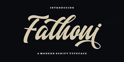 Fathoni is a modern handwritten calligraphy script. It contains the complete set of lowercase, uppercase, alternative, ligature, punctuation, numbers, and multilingual support. Work in harmony with Fathoni to create extraordinary calligraphy creations. You are welcome to use it for various purposes: logos, wedding invitations, titles, signatures, t-shirts, letterheads, nameplates, labels, posters, and more. How to access all alternative characters, using Windows Character Map with Photoshop https://www.youtube.com/watch?v=Go9vacoYmBw How to access all alternative characters using Adobe Illustrator: https://www.youtube.com/watch?v=XzwjMkbB-wQ
 - Ranger Script by Letterfreshstudio,
$12.00 Ranger Script is a modern handwriting calligraphy script. Contains a complete set of lowercase, uppercase, alternative, ligature, punctuation, numbers, and multilingual support. Works in harmony with Ranger Script to create awesome calligraphy creations. You are welcome to use it for various purposes: logos, wedding invitations, titles, signatures, t-shirts, letterheads, signboards, labels, posters etc. How to access all alternative characters, using Windows Character Map with Photoshop: https://www.youtube.com/watch?v=Go9vacoYmBw How to access all alternative characters using Adobe Illustrator: https://www.youtube.com/watch?v=XzwjMkbB-wQ
 - Girard by House Industries,
$33.00 Whatever the medium, Girard’s love for typography was the common thread that wove his work together. We are honored that the Girard family has entrusted us to celebrate and expand upon the legacy of this design icon with this collection of fonts. The Girard Slab family gracefully synthesizes illustrative sensibilities into a practical typographic framework. Slab’s three widths and four weights ensure versatility in a modern editorial setting while its gentle curves transcend the sterility of traditional typography to add an unprecedented warmth and personality. From boutique chocolate packaging to the titling sequence for an indie vegan superhero cartoon, Girard Script deftly adds a contemporary sophistication to text and display settings. Inspired by a workhorse lettering style that helped Alexander Girard implement thousands of design elements in his overhaul of the Braniff identity system, Girard Sky pulls its weight in any contemporary application. In Girard Sansusie, each character stands alone as an illustrative element while coming together with its counterparts as a whimsical yet functional typeface. FEATURES: The ligatures feature substitutes specially-drawn letter combinations that combine two, three or even four characters to create smoother transitions and simulate lettering sensibilities. Girard Slab’s three widths and four weights ensure versatility in a modern editorial setting while its gentle curves transcend the sterility of traditional typography to add an unprecedented warmth and personality. Copious alternate characters and “smart” OpenType programming allow Sansusie to escape the rigid confines of typography to come alive as if flowing from Girard’s sketchpad. This animation shows a sampling of the swash characters available in the font. GIRARD CREDITS: Typeface Design: Alexander Girard, Ben Kiel, Ken Barber, Laura Meseguer Typeface Production: Ben Kiel Typeface Direction: Christian Schwartz, Andy Cruz, Ken Barber Like all good subversives, House Industries hides in plain sight while amplifying the look, feel and style of the world’s most interesting brands, products and people. Based in Delaware, visually influencing the world.
 - Biome by Monotype,
$29.99 In the sketches that formed the basis for his typeface Biome, Crossgrove experimented with inner and outer shapes in different styles, adapted letters to the form of the super-ellipse, and added curves only to remove these again. His challenge was to find a harmonious and coherent approach that provided sufficient contrast with existing fonts. Biome is essentially in the sans serif tradition and the letters exhibit only minor variations in terms of line thickness. There is still a suggestion of the super-ellipse at many points, but this never becomes the predominant design factor. While most of the terminals of the vertical strokes are only slightly rounded, the horizontals and diagonals have pronounced arches and it is these that basically determine the round and soft character of the typeface. The more unconventionally shaped letters, such as the lowercase 'g' with its two semi-open counters and the 'k' and 'x' with their crossbars, provide Biome with an individual personality. And this effect is emphasized by the generously rounded links in the 'v' and 'w' and the uppercase 'M' and 'N'. Biome has been designed as a typeface super-family. From the near hairline Extra Light to the amply proportioned Ultra, there are seven clearly differentiated weights and three tracking widths. There are oblique italic versions of all variants. The range includes small caps and numeral sets containing lowercase and uppercase digits. With its available range of characters, Biome can be used to set texts in all Eastern European languages. Although the remarkable individuality of Biome is most clearly apparent in the larger point sizes, this typeface is not just suitable for producing headlines and logos. Biome's elegant visual effects mean that it is equally comfortable in short texts while its large x-height and generous counters make it readily legible even in the small font sizes. Biome is a contemporary typeface that employs mid-20th century futurist elements which ironically give it a retro feel.
 - Mundo Serif by Monotype,
$50.99 With designs drawn specifically for comfortable reading in everything from on-screen digital content to print in periodicals and books, Mundo Serif is ready to take on just about any project. Carl Crossgrove drew the suite of typefaces to complement his Mundo Sans family’s classic humanistic design traits – and added a subtle modern influence. Restrained stroke modulation, generous counters, commanding x-height and tall ascenders ensure that content set in Mundo Serif is both legible and easy on the eyes. While primarily designed for text copy in print and on screen, Mundo Serif becomes a powerful display type tool in the lightest and boldest weights. Headlines, navigational links and banners are naturals for this versatile collection of typefaces. Mundo Serif is a large family. Nine weights, each with an italic companion, enable precise typographic tuning. Captions, subheads, pull quotes and long-form copy can be melded to create a welcoming page of modulated text. For best results in digital environments, skipping a weight – or even two – ensures hierarchical clarity. Crossgrove did extensive testing of Mundo Serif to ensure the best possible on-screen readability. To further guarantee optimal digital imaging of the family, he gave the design generous inter-character spacing and slightly expanded intricate characters like the lowercase a and g. If the goal is diversified or multi-platform branding, look no further than Mundo Sans. The two designs harmonize with each other perfectly in weight, typographic color and proportion. Both designs benefit from large international character set that includes support for most Central European and many Eastern European languages. For a stronger contrast, pair Mundo Serif with virtually any sans serif grotesque design. Crossgrove has designed a variety of typefaces ranging from the futuristic and organic Biome™ to the warm, clean lines of the Mundo Sans. His work for Monotype also often takes Crossgrove into the realm of custom fronts for branding and non-Latin scripts.
 - Monterchi by Zetafonts,
$39.00 In 1459, while visiting his dying mother, Italian painter Piero della Francesca spent seven days creating a fresco of a pregnant madonna in a small country church in the hilltown of Monterchi (Italy). Hailed today as one of the masterpieces of Italian Renaissance, the fresco was given a new branding in 2019 by Art Director Riccardo Falcinelli who asked the Zetafonts team to develop a custom font for the project. The resulting typeface system, designed by Cosimo Lorenzo Pancini together with Andrea Tartarelli and Maria Chiara Fantini as a rework of Francesco Canovaro original Beatrix Antiqua, is a 50-weights ode to the beauty of classical roman letterforms, that pairs elegant alternates and quirky ligatures with an array of design options for clear and effective editorial, signage, logo and wayfinding design. The base display family, Monterchi, allows endless design expressions with a range of six weights from the slender thin to the strong extrabold, all with matching italics and an array of over one hundred discretionary ligatures. A fine-tuned companion Monterchi Text has been developed to excel in body use, with a larger x-height and wider spacing - clear and legible even at small sizes. The use range of the family is enriched by Monterchi Serif and Monterchi Sans that feature different contemporary interpretations of the same classical geometric skeleton, allowing for layered editorial design and variation. All the fifty fonts in the Monterchi Type System feature an extended character set of over 1100 glyphs covering over 200 languages using the Latin alphabet, as well as Greek and Russian Cyrillic. Open Type features include small caps, positional figures, alternate letterforms, stylistic sets and discretionary ligatures. With his elegant, historical aesthetic, Monterchi embodies the spirit of early Renaissance and the humanist obsession with constructed and geometric beauty - still managing to function as a workhorse family, ready to help any designer in need of a timeless classic look, or looking for the right ligature to transform a simple word into a striking wordmark.
 - Metroblack #2 by Linotype,
$29.00American graphic designer William Addison Dwiggins' (W.A.D. for short) first typefaces were the Metro family, designed from 1927 onward. The project grew out of Dwiggins' dissatisfaction with the new European sans serif typefaces of the day, such as Futura, Erbar, and Kabel, a feeling he expressed in his seminal book Layout in Advertising. Urged by Mergenthaler Linotype to create a solution for the problem, Dwiggins began a professional relationship that would span over the next few decades. The first Metro family typeface to be released was Metroblack, brought to market by Linotype in 1929 (Metroblack #2™ the only one of the two versions that Mergenthaler Linotype eventually put into production which is available in digital form). With more of a humanist quality than the geometric styles popular in Europe at the time, Dwiggins drew what he believed to be the ideal sans serif for headlines and advertising copy. Metroblack has a warmer character than the Modernists' achievements, and the type is full of mannered curves and angled terminals (Metroblack also has an astoundingly beautiful Q). The weights of the Metro family, Metromedium #2™ and Metrolite #2™, were each designed by Mergenthaler Linotype's design office under Dwiggins' supervision. In 2012 Toshi Omagari reworked the Metro family as "Metro Nova" with many weights into a modern type family that even contains the alternate characters from the origin Metro family from Dwiggins. Despite having been created more than three-quarters of a century ago, the Metro family types have aged well, and remain a popular sans serif family. Although spec'd less often than other bestsellers, like Futura, Metro continues to find many diverse uses. The typeface has appeared throughout Europe and the North America for decades in newspapers and magazines, and can even help create a great brand image when used in logos and corporate identity. Dwiggins ranks among the most influential graphic designers and typeface designers of the 20th Century. He has several other quality fonts in the Linotype portfolio, including the serif text faces Electra™ and New Caledonia™, as well as Caravan™, a font of typographic ornaments. - P22 Operina by IHOF,
$24.95 Operina is based on a 16th-century lettering model of the scribe Ludovico degli Arrighi (Vicentino Ludovico degli Arrighi) used in his 1522 instructional lettering book, "La Operina da Imparare di scrivere littera Cancellarescha." This book contains what is considered to be the earliest printed examples of Chancery Cursive. Rather than try to reproduce a perfect, smooth, type-like version of Ludovico's hand, which has been attempted in the past, the designer opted to leave in some rough edges and, thereby, create a look that mimics the endearing artifacts of quill and ink lettering on parchment. When reviving an old style, a designer is faced with many challenging decisions, such as whether to aim for ultimate authenticity or to modify the alphabet for modern use. The decision here was to create a font that resembles the 16th-century Italian hand-lettering master's, but is also useful to the contemporary user. Because the letters U u W w J j and our modern Arabic numerals were not in use during the advent of these original letterforms, these had to be interpolated. To make a complete and useable font set, we also had to fashion many of the extra and diacritical characters to match the look of the alphabet. There are three fonts in this set: Romano(simple), Corsivo(more complex), and Fiore(swash). Romano is the most subdued, it contains Roman looking caps and has lining figures. Corsivo is more elaborate, it has more decorative capital letters and an alternate version of the lowercase with longer ascenders and descenders, and old style figures. Fiore, the swash font, is the most elaborate with the longest ascenders and descenders. You may not wish to use the Fiore version on its own, especially as all caps; it is meant to enhance the other two alphabets because it contains the most elaborate capitals and has many extra ligatures. P22 Operina Pro is an OpenType version that contains over 1200 characters. It features Small Caps, Old Style Figures, full European, Cyrillic and Greek character sets and a new OpenType first with automatic Roman Numerals. Just type any number and with the feature, it will convert to Roman Numerals!
 - ITC Aram by ITC,
$29.99Jana Nikolic was finishing her degree program at the Faculty of Applied Arts, in Belgrade, with a final project that would combine her two majors: type and book design. Three stories from William Saroyan's My Name Is Aram would provide the text for the book, to be set in a typeface that Nikolic would design. Nikolic knew something special was happening the moment she put pen to paper. The letters just emerged," she recalls. "I started to explore a few new pens and found one I loved. I was able to make its tip bend with pressure." Like the family Saroyan writes about, the design flowing from Nikolic's pen would be simple but a little quirky. "When there were a whole bunch of little black letters around me," continues Nikolic, "I saw that this was going to be a very interesting typeface family." Nikolic drew Latin and Cyrillic letters, lowercase and capital letters, wide letters and narrow letters. She was surprised at how quickly and easily the design came. "There were no badly written letters," she says. "I hardly had to rework them and they fit together remarkably well." ITC Aram's standard character complement consists of one set of lowercase letters and two sets of capitals: one narrow and the other wide. The wide caps can be used with the standard lowercase, or mixed with the narrow caps for a variation on "cap and small cap" copy. The ITC Aram create the opportunity to mix and combine the letters into playful typographic expressions. Words and sentences that twinkle; text that seems light and alive - one runs the risk of creating work that is both delightful and charming when setting copy in ITC Aram." - Kurly by Bogusky 2,
$34.50I was working on an unrelated job with curls and wondered how I could apply them to a font. Well, here it is, all pair-kerned. A little silly but fun. - Weeneez JNL by Jeff Levine,
$29.00 Weeneez JNL is an out-and-out novelty font made entirely of hot dogs. The font contains only the alphabet and numerals and a few other symbols including basic punctuation marks.
 - Charly Dreams by Awan Senja,
$14.00 Charly Dreams is a sweet, colorful and friendly display font. Add it to your most creative ideas and notice how it makes them stand out! The only limit is your imagination!
 - LiebeRuth by LiebeFonts,
$29.90 LiebeRuth is your 100 percent hand-made organic type. She absolutely loves to be typeset in large *and* small sizes, because Legibility is her middle name. (Yes, we know it’s not a typical girl’s name.) She is friendly and polite, but she also has a few quirks. Her friends are impressed with how natural she manages to look every day. Her four weights ensure that Ruth has the right boldness for any context: birthday invitation, personal correspondence, photo album, or billboard ad. During the creation of this font, her designer ate plenty of healthy, organic foods. We think this is the reason why Ruth looks so fresh and lively. And of course Ruth has been designed with lots of Liebe (which is German for “love”—and she speaks many other languages, too). One more thing Ruth is marvelous at: showing off her curly-swirly swashed alternative letterforms that can be activated via OpenType. (Please make sure your software supports OpenType if you wish to use the advanced features.) Each style contains more than 560 gluten-free glyphs—now that is great value! If you like this font, you may want to look at LiebeRuth’s bolder sister LiebeDoni and our best-sellers LiebeErika and LiebeKlara. Or add in some LiebeOrnaments to prepare a curly-licious feast. By the way: LiebeRuth also gets along great with our wide range of illustrative fonts, including LiebeCook, LiebeFish, and LiebeTweet.
 - Bluestar by Melvastype,
$29.00 Bluestar is a roundhand script with modern touch. It has round terminals and quite low stroke contrast. It has five weights in upright and italic styles. Bluestar has two sets of capital letters; one is more basic and subtle and the other (Stylistic Set 1) is bigger and fancier. Bluestar has also lots of alternates for ascender, descenders, end swashes etc. to give a good amount of possibilities to play with and make some unique designs. It also has few options for tails and underlines.
 - Metron by Storm Type Foundry,
$52.00 Metron is so far the most ambitious typeface made to order in the Czech Republic. Despite the fact that for a number of years it has not been used for the purpose for which it was designed, every inhabitant of Prague is still well aware of its typical features. Metron Pro was commissioned by the Transport Company of the Capital City of Prague in 1970 to be used in the information system of the Prague Metro. It was first published in the manual of the Metroprojekt company in 1973 and then used to the full, under the author’s supervision, for lines “A” and “C”. Since 1985 Rathouský's system has been disappearing from the Prague Metro; it survives only in the form of metal letters at its stations and at some stations of the Czechoslovak Railways. In 2014 we're mentioning the 90th birthday of Jiří Rathouský. It’s a good opportunity for updating and re-introducing his Metron. Extended was the choice of figures and fractions, new currency signs added, diacritics revised, etc., but above all the newly designed Cyrillics including true SmallCaps. Now we have six weights plus italics, where the tone of the basic style is even closer to the original. Ten years back we've had the feeling that this typeface should again take a part of Prague’s traffic system and today, when revisiting of all the fonts, the feeling turned to certainty. The main feature of this typeface is namely a noticeability a property above all welcomed in rush of platforms.
 - Swarha by Gumpita Rahayu,
$18.00 Built in 1930 - 1935 by Dutch architect Wolff Schoemaker, the Swarha Islamic Building was originally used as a lodging for the honoured guest country and the journalists for Asia-Africa Conference in 1955. This building has an important role as one of Bandung historical art deco heritage, with the art deco typefaces styles on it's singage in this building, giving it a more classic west and east taste. Wolff Schoemaker was trying to combine the elements between eastern and western culture in design. One of his works was the Swarha Islamic Building in a circular design with rounded and high dynamic angle. Unfortunately the Swarha Islamic Building has been abandoned and and less attentioned by the local people itself to preserve this historic building. So I'm trying to raise the value of the historical heritage by creating this typefaces. This typefaces was inspired by the Swarha Building characteristic itself with its solid construction and dynamic, by adding classic taste on each characters. Available in two styles, Neue and Rounded represents the classic architectural Swarha Islamic Building styles with tropical Bandung Art Deco taste. This typeface is highly usable as a display type for your designs, and will fit with movie titles, magazines, your classic shops logo and signage designs, or you can use this typefaces as your web pages headlines. The characters of this typefaces are only in uppercase style, but it built with small caps on the lowercase featured, and additional Opentype Features were loaded, some stylistic alternates, accessible catchwords in the discretionary ligatures, and standard ligatures.
 - Updock by TypeSETit,
$24.95 What's Updock, you say? This script style has a slightly playful look. Because it has virtually no slant to it.
 - Zambeza by Putracetol,
$28.00 Introducing Zambeza, a modern display font that draws inspiration from vintage posters and combines it with elegant typography styles. With Zambeza, you can create unique letter combinations for lettering with a wide range of options. The font comes with open type features, including alternate glyphs and end swashes, providing you with creative freedom for your lettering designs. Zambeza is perfect for various design applications, such as logotypes, headings, covers, posters, logos, quotes, product packaging, headers, merchandise, social media graphics, greeting cards, and more. Its versatile design makes it suitable for different creative projects, adding a touch of modernity and vintage charm. To access the alternate glyphs, you will need a software program that supports OpenType features, such as Adobe Illustrator CS, Adobe Photoshop CC, Adobe InDesign, or Corel Draw. This allows you to fully utilize the font's design possibilities and create unique compositions. Your zip package will include the Zambeza font files in otf, ttf, and woff formats, providing compatibility for different design projects. The font includes uppercase and lowercase letters, numerals, punctuation, and symbols, giving you all the essential elements for your designs. Zambeza also supports multilanguage characters, making it suitable for designing in various languages. Whether you're creating designs in English, Spanish, French, or any other language, Zambeza has you covered. In summary, Zambeza is a modern display font that combines vintage inspiration with elegant typography styles. With its open type features, multilanguage support, and versatile design applications, Zambeza is a great choice for your creative projects. Thank you for choosing Zambeza from our collection. Happy designing!
 - Stubble by Aah Yes,
$12.00Stubble is a distressed grunge font with many useful variations that make things easy. It comes in both a Regular and Bold version, and a Smudged version as if the print block has slipped a little bit just at the vital moment. Also there’s 2 jumbled versions with the letters and numbers, and some punctuation, at odd angles and slightly off-whack; there’s 2 versions with little bits of overprint on most of the main characters (as if the corners of the block or stamp have just caught the paper); a couple of Caps Only versions; plus condensed and expanded versions of the main faces. The Bold version is not an exact expanded version of the Regular version, please note, the characters are different (i.e. the misprinting is different) in the two weights. Western and Central European accented characters are included, and there’s a set of replacements for double-letter combinations such as bb, dd and OO, TT, so that 2 different letters will appear - which avoids having exactly the same grunge letter appearing twice in succession (20 or more pairings for each case, all the pairings that reasonably exist) which work as ligature replacements. The whole family constitutes a comprehensive package that offers a great variety of ways of presenting a grunge typeface for display, headlines and posters, while maintaining the thread of the same sans-serif style. The zip package contains both the TTF and OTF versions of the font. Install only one version on the same machine, installing both versions may produce all sorts of erratic behavior. - Caslon Antique by GroupType,
$19.00 Caslon Antique is a decorative American typeface that was designed in 1894 by Berne Nadall. It was originally called "Fifteenth Century", but was renamed "Caslon Antique" by Nadall's foundry, Barnhart Bros. & Spindler, in the mid-1920s. The design of the typeface is meant to evoke the Colonial era. Early printers would reuse metal type over and over again, and the faces would become chipped and damaged from use. Caslon Antique emulates this look. Despite the name, it is not a member of the Caslon family of typefaces. The renaming is believed to have been a marketing maneuver to boost the popularity of a previously unpopular typeface by associating it with the highly popular Caslon types. Caslon Antique is popular today when a "old-fashioned" or "gothic" look is desired. It is used by the musical group The Sisters of Mercy on their albums, for the logo of the musical Les Misérables, and for the covers of the books in A Series of Unfortunate Events. It is also frequently used on historical displays. It was used for the previous edition of the Warhammer Fantasy Role-Play. Most recently, it has been used on promotional material for the smash musical Monty Python's Spamalot on Broadway, the West End, and its tour of the United States. British 80's band The The also used the font in several of their music videos, usually displaying several lyrics from the song in the opening scenes. It used on the cover of Regina Spektor's album, Begin to Hope. This description was sourced (in part) from Wikipedia, the free encyclopedia.
 - Mrs Eaves XL Serif by Emigre,
$59.00 Originally designed in 1996, Mrs Eaves was Zuzana Licko’s first attempt at the design of a traditional typeface. It was styled after Baskerville, the famous transitional serif typeface designed in 1757 by John Baskerville in Birmingham, England. Mrs Eaves was named after Baskerville’s live in housekeeper, Sarah Eaves, whom he later married. One of Baskerville’s intents was to develop typefaces that pushed the contrast between thick and thin strokes, partially to show off the new printing and paper making techniques of his time. As a result his types were often criticized for being too perfect, stark, and difficult to read. Licko noticed that subsequent interpretations and revivals of Baskerville had continued along the same path of perfection, using as a model the qualities of the lead type itself, not the printed specimens. Upon studying books printed by Baskerville at the Bancroft Library in Berkeley, Licko decided to base her design on the printed samples which were heavier and had more character due to the imprint of lead type into paper and the resulting ink spread. She reduced the contrast while retaining the overall openness and lightness of Baskerville by giving the lower case characters a wider proportion. She then reduced the x-height relative to the cap height to avoid increasing the set width. There is something unique about Mrs Eaves and it’s difficult to define. Its individual characters are at times awkward looking—the W being narrow, the L uncommonly wide, the flare of the strokes leading into the serifs unusually pronounced. Taken individually, at first sight some of the characters don’t seem to fit together. The spacing is generally too loose for large bodies of text, it sort of rambles along. Yet when used in the right circumstance it imparts a very particular feel that sets it clearly apart from many likeminded types. It has an undefined quality that resonates with people. This paradox (imperfect yet pleasing) is perhaps best illustrated by design critic and historian Robin Kinross who has pointed out the limitation of the “loose” spacing that Licko employed, among other things, yet simultaneously designated the Mrs Eaves type specimen with an honorable mention in the 1999 American Center for Design competition. Proof, perhaps, that type is best judged in the context of its usage. Even with all its shortcomings, Mrs Eaves has outsold all Emigre fonts by twofold. On MyFonts, one of the largest on-line type sellers, Mrs Eaves has been among the 20 best selling types for years, listed among such classics as Helvetica, Univers, Bodoni and Franklin Gothic. Due to its commercial and popular success it has come to define the Emigre type foundry. While Licko initially set out to design a traditional text face, we never specified how Mrs Eaves could be best used. Typefaces will find their own way. But if there’s one particular common usage that stands out, it must be literary—Mrs Eaves loves to adorn book covers and relishes short blurbs on the flaps and backs of dust covers. Trips to bookstores are always a treat for us as we find our Mrs Eaves staring out at us from dozens of book covers in the most elegant compositions, each time surprising us with her many talents. And Mrs Eaves feels just as comfortable in a wide variety of other locales such as CD covers (Radiohead’s Hail to the Thief being our favorite), restaurant menus, logos, and poetry books, where it gives elegant presence to short texts. One area where Mrs Eaves seems less comfortable is in the setting of long texts, particularly in environments such as the interiors of books, magazines, and newspapers. It seems to handle long texts well only if there is ample space. A good example is the book /CD/DVD release The Band: A Musical History published by Capitol Records. Here, Mrs Eaves was given appropriate set width and generous line spacing. In such cases its wide proportions provide a luxurious feel which invites reading. Economy of space was not one of the goals behind the original Mrs Eaves design. With the introduction of Mrs Eaves XL, Licko addresses this issue. Since Mrs Eaves is one of our most popular typefaces, it’s not surprising that over the years we've received many suggestions for additions to the family. The predominant top three wishes are: greater space economy; the addition of a bold italic style; and the desire to pair it with a sans design. The XL series answers these requests with a comprehensive set of new fonts including a narrow, and a companion series of Mrs Eaves Sans styles to be released soon. The main distinguishing features of Mrs Eaves XL are its larger x-height with shorter ascenders and descenders and overall tighter spacing. These additional fonts expand the Mrs Eaves family for a larger variety of uses, specifically those requiring space economy. The larger x-height also allows a smaller point size to be used while maintaining readability. Mrs Eaves XL also has a narrow counterpart to the regular, with a set width of about 92 percent which fulfills even more compact uses. At first, this may not seem particularly narrow, but the goal was to provide an alternative to the regular that would work well as a compact text face while maintaining the full characteristics of the regular, rather than an extreme narrow which would be more suitable for headline use. Four years in the making, we're excited to finally let Mrs Eaves XL find its way into the world and see where and how it will pop up next.
 - Downtown Elegance - Personal use only

- Olio by Little Fonts,
$15.00 Olio is a chunky geometric sans serif typeface. The bold version takes inspiration from classic geometric fonts like Futura and works well when creating clean, balanced typography. The inline version is the same font with a stylish and decorative stripe effect to each character. Olio inline is a nod towards graphic design champion Lance Wyman and his typographic treatment for the iconic Mexico 68 Olympic identity. Although both versions are designed in reference to great (timeless) graphic design from the past, they have a contemporary finish making them suitable for any design purpose or application.
 - Rennie Mackintosh Venezia by CRMFontCo,
$20.00Derived from the world famous Rennie Mackintosh Font, the Venezia version gives a very modern look to this classic font, especially when filled with a gradient fill in a graphics package such as Photoshop or CorelDraw - although it even looks great "out of the box". The Venezia name comes from the native name of the city of Venice - one of several Italian cities Mackintosh visited on a sketching tour of Italy early in his architectural career. Venice was also one of the venues of an exhibition of Mackintosh's work on a European tour. - Mentor-51 by Pilot,
$10.00 While developing one of their own IP's, Pilot needed a typeface which reflected a developing story with a science fiction theme. Mentor-51 is proudly the first release born out of this IP. It was created by designer and Pilot co-founder Bill Concannon and Brendan Keohane, a graphic designer at the studio. Pilot, located at Boston Design Center, is home to graphic designers and illustrators who enjoy the mix of the two disciplines. Pilot's primary goal is effective brand development through telling brand stories using strategy and art.
 - Module 4-4 by Sébastien Truchet,
$40.00 Sébastien Truchet designed a modular typographic system during his last year in the School of Fine Arts of Besançon. The system is made of a unique grid and 6 modules which are the components to build several typefaces. The most radical is the "2-2". The last one is the "10-12". This is the 4-4. It is built into a square grid. Four modules in width and in height. This font proposes to you two appearances : the caps are blackest and the small letters are more open.
 - NuOrder by The Northern Block,
$29.00 NuOrder is a modern-day sans-serif typeface with humanist bones. The design incorporates a dynamic structure with minimal contrast and a natural stroke path to promote easy reading—resulting in a warm well-balanced typeface best suited for a wide range of applications in a hi-tech era. Details include nine weights with matching italics and over 550 characters per style. Opentype features consist of five variations of numerals, including inferiors, superiors, fractions, alternate lowercase a and g, and language support covering Western, South, and Central Europe.
 - Koren Siddur by Masterfont,
$59.00 This is a unique design by Elyahu Koren. He wanted to design another version of his Koren Tanakh sacred font that was for Biblical use only. So he designed Koren Siddur to be used for page numbers etc. OpenType Pro Excellent support for Niqqud (Vowels). All marks are programmed to fit each glyph's shape and width. OpenType Pro includes new advanced features like Dagesh Hazak, ShevaNa, Qamatz Katan, Holam Haser and wide letters. Best used with Adobe InDesign CC that support complex Hebrew text. Please check these advanced features in this link: tinyurl.com/2fbkuy95
 - Zosimo Pro by Delicious Type,
$49.00 Zosimo is a neo-grotesque typeface created by designer Ron Gilad (Delicious Type) in cooperation with renowned typographer Oded Ezer based on his ubiquitous Alchemist typeface. Carefully drawn curves, robust shapes and a range of OpenType features make Zosimo a great choice for designing logotypes, signage, titling, texts and more. Zosimo now comes in three families: Standard (full Latin support), Cyrillic (basic Latin and Cyrillic) and Pro (all included). Totalling in 9 weights, roman and italic, Zosimo can accommodate all your type-related design needs in one big happy family.
 - Drowsy Lunch by PizzaDude.dk,
$15.00 The inspiration for this font (as well as the name!) comes from a London cafe I visited years ago. I was fascinated with the handwritten menu - irregular and awkward, yet refreshingly charming. I did my best to recall that particular look by adding 4 slightly different versions of each lowercase letter. The name of the font comes from the speed of the waiter...or the lack of it! But luckily he took his time, otherwise I wouldn't have had the time to really look at the handwritten menu! :)
 - Freya by MysticalType,
$10.00 Freya is a strong font family and sophisticated sans serif. His firm and uncompromising style are felt through letters that are controlled with a modern touch. Hardline balance and smooth curves. Each font in the family can stand alone, dynamic, and authoritative as they wish. It offers extensive language support, ALL Central & Western European Languages, Vietnamese and African languages. Freya works very well in all brands, logos, magazines, films. Different weights give you a full range to explore a number of applications, while the fonts described giving a real modern feel to any project.
 - F2F Whale Tree by Linotype,
$29.99Heavy techno music, a personal computer, a font creation program and some inspiration had been the sources to the Face 2 Face font series. Thomas Nagel and his friends had the demand to create new unusual faces that should be used in the leading german techno magazine Frontpage" Even typeset in 6 point to nearly unreadability it was a pleasure for the kids to read and decrypt the messages. WhaleTree is a hommage to Walbaum. The word is a gemanized translation where Wal means Whale and Baum means Tree. :-)" - Walison by Gatype,
$15.00 Hi Presenting Everyone We are proud to present our new font. The new Walison natural look with a classy and modern style makes this font look elegant, natural, stylish. Walison will be perfect for invitations, logos & branding, photography, advertising, watermarks, social media posts, product packaging, product designs, labels, wedding designs, stationery, special events or anything else needed to create a theme. Walison is built with OpenType features and includes initial and final language styles, alternative characters for most lowercase letters, numbers, punctuation marks, alternatives, ligatures, and also supports other languages. Enjoy!
 - Rastalia by Romie Creative,
$15.00 Hi everyone, I would like to introduce my newest font. Rastalia Script is a beautiful modern calligraphy typeface, I hope you will be interested in this font, if you want to use it for your work. This font can be used easily and simply because there are many features in it. contains a complete set of upper and lowercase letters, a wide variety of punctuation marks, numbers, and multilingual support. fonts also contain a lot ligatures and many others contain alternative Style Sets like the heart swash alternative.
 - Aldus by Linotype,
$29.99 Aldus was designed by Hermann Zapf and appeared with the font foundry D. Stempel AG in Frankfurt am Main in 1954. Zapf named this font after the famous Venetian printer Aldus Manutius, whose work is among the most important of the Renaissance period as well as Zapf’s inspiration for Aldus. Linotype Aldus was introduced by Linotype Library as a text font lighter than Palatino. Zapf’s goal with his Palatino and Aldus was to create a new form of Old Face typeface. This font gives text the feeling of elegance which was typical of the Renaissance.
 - Bauer Bodoni by URW Type Foundry,
$39.99 Giambattista Bodoni of Parma designed and cut his typefaces circa 1790. The Bodoni types were the first of the Modern type designs in which hairlines contrast sharply with bolder stems, and serifs are unbracketed. The Bauer Bodoni font family derives from a cutting for metal type in 1926, retaining many of the original features. As with all versions of this typeface, the contrast between thick and thin strokes of Bauer Bodoni should be taken into consideration as the thin strokes can appear to fade out under certain printing processes.
