10,000 search results
(0.025 seconds)
- Skid Row by ITC,
$29.00Skid Row is the work of Japanese designer Akira Kobayashi and named after a song from his favorite film, Little Shop of Horrors. It is an informal script typeface whose unique, streaky appearance was first drawn with a brush and then refined to give the typeface an even texture. Skid Row is particularly effective in large display applications. - LTC Record Title by Lanston Type Co.,
$24.95 Record Title was designed by Frederic Goudy in 1927 as a proprietary commission for the Architectural Record magazine. Based on classic Roman letter proportions, Goudy considered this one of his most successful commissions ever. It is an all caps titling face originally digitized by Jim Rimmer for Lanston in 2001. It was remastered in early 2007.
 - Ladislav by Suitcase Type Foundry,
$39.00 The Ladislav font revitalises Sutnar’s legacy, while not explicitly copying any of his original fonts. It however keeps true to their technicist character and initial principles of character creation - a simple modular system of combined geometrical segments. This approach affects all round shapes of capital and lowercase letters, as well as the shapes of the majority of numbers.
 - Mouse Paw by Alexander Sharkov,
$5.00 My home mouse, Hector, drew this wonderful font for kids. He tried very hard and hopes that you will like the result of his work! This font is perfect for advertising various children's brands, decorating children's books, and generally any children's projects! Hector and I believe that the font Mouse Paw will help you in any business.
 - Circles JY by JY&A,
$39.00Based on electrical circuitry, David Philpott's Circles typefaces are oddly legible, even though one might think they were destined for display usage only. The circle is the base form, repeated throughout the design. Originally drafted during his time at the Massey University School of Design, subsequent refinements have turned Circles into two complete fonts with a full character set. - Eckhardt Inline JNL by Jeff Levine,
$29.00Jeff Levine's Eckhardt Inline JNL furthers a "mini series" of fonts and lettering styles popularized by sign painters and show card writers. Named in honor of the late Albert Eckhart, Jr. (owner of Allied Signs in Miami, Florida until his passing), this inline sans serif more closely resembles hand lettering than "perfectly designed" display type. Limited character set. - Bodwars by Sarid Ezra,
$17.00 Bodwars is a sans based font with unique shape that will make your design looks hi-tech and modern. You can use this font for any purpose, especially to make logotype and sci-fi movie poster. You can mix and match the uppercase and lowercase to make your logo more stand out. This font also support multi language.
 - Wile by Monotype,
$29.99This exclusive Monotype design by Cynthia Hollandsworth is named after a popular executive, Don Wile of Agfa Compugraphic as a gift on his retirement. Agfa Wile is a classic Old Style font with wedge-shaped serifs and open proportions, and is suitable for both text and display uses. Agfa Wile's capital letters are influenced by inscriptional forms. - ITC Farmhaus by ITC,
$29.99ITC Farmhaus is the work of British designer Tim Donaldson and is, in his own words, Neil Young meets Paul Renner." Donaldson borrowed the perfect circles and clean lines of Renner's drawings for Futura and gave them jagged edges and uneven, thick strokes. Farmhaus contains one set of capitals and two sets of lower case letters." - Beynkales by Scriptorium,
$18.00Now here's a font with an unusual backstory. You may recall that a while ago we discovered that Tim Burton was using an outdated version of one of our fonts for the interior titles in his The Corpse Bride. Well, our quest to get hold of him didn't bear any immediate fruit, but in a totally unrelated event we were contacted by the graphic arts company working with the overseas distributors for The Corpse Bride and it turned out that they needed a font based on the main title of the movie so they could keep the same style when they retitled it into other languages. The original title was either hand lettered or a heavily modified font, bearing some resemblance to our Ligeia and Tuscarora fonts, so we had to create a whole font more or less from scratch and extrapolate most of the letters from the very limited sample in the original title by identifying certain consistent characteristics and building new characters around them. It was a lot of work, but the good news is that they didn't want exclusivity, so we've got the font to add to our collection. We ended up calling it Beynkales which means 'Bone Bride' in Yiddish, which makes sense given the context of the movie. So here it is, in all its tattered glory, and bound to end up in our Halloween font selection later this year as well. Beynkales Alternate is a companion font that includes a full set of alternative upper and lower case characters which can be used on their own or in combination with the characters from Beynkales to create a more varied and handwritten look. - Cresci Exemplar Pro by California Type Foundry,
$47.00 Cresci Exemplar™ was originally designed by Giovanni Francesco Cresci, the 16th century Milanese writing master. These letters from his book Essemplare are some of the most elegant capitalis monumentalis ever produced and served as a model for later inscriptions on statues and monuments all throughout Italy. Painstakingly made from multiple high-resolution references, Cresci Exemplar™ Pro, accurately matches the master’s original lines. It can be used at large sizes without sacrificing elegance. Cresci’s attention to detail and delicate curves allow his titling capitals to stand out and elevate text. The numbers of Cresci Exemplar™ Pro have been professionally designed to match and complement the letterforms of Cresci’s original alphabet. Symbols have either been faithfully transcribed or thoughtfully designed both to be pleasing to today’s reader and congruent with classic lines. Released for the 450th anniversary of Cresci’s Il Perfetto Scrittore.
 - F2F Monako Stoned by Linotype,
$29.99The Face2Face (F2F) series was inspired by the techno sound of the mid-1990s, personal computers and new font creation software. For years, Alexander Branczyk and his friends formed a unique type design collective, which churned out a substantial amount of fresh, new fonts, none of which complied with the traditional rules of typography. Many of these typefaces were used to create layouts for the leading German techno magazine of the 1990s, Frontpage. Branczyk and his fellows would even set in type at 6 points, in order to make it nearly unreadable. It was a pleasure for the kids to read and decrypt these messages! F2F Monako Stoned was inspired by the Apple system font Monaco, and is one of 41 Face2Face fonts included in the Take Type 5 collection from Linotype. Branczyk designed 16 of these himself." - Bayer Sans by Victory Type,
$20.00Bayer Sans, is based on the typography of the Austrian-born artist Herbert Bayer. Bayer worked as a teacher and graphic designer at the Bauhaus, a revolutionary German art school, during the 20's. His specialty was commercial art and he had many "radical" views on typography and its interaction with society. Bayer felt that written language should be merely a graphic version of spoken language. Thus, he advocated a single alphabet without majuscules and miniscules. Bayer's designs are simple, geometric letterforms that lend themselves to lowercase form. This font, based on the typography of Bayer and his students at the Bauhaus Werkstatt (studio), was digitally modeled by Noah Rothschild. Bayer Sans features a complete character set including European characters, alternate letters with adjusted widths and designs and ligatures. Included are the "f" characters and a special linked double-o. - Graphique Next by profonts,
$41.99 The original Graphique Pro was designed by the famous Swiss designer Hermann Eidenbenz in 1945 and included one outline shadow style. His idea of a very narrow, very economic headline font became increasingly more popular over the last decades and since the recent trend of layered fonts his idea is more up-to-date than ever. profonts studio now took the idea of the Graphique Pro to its next level: Graphique Pro Next. This layered type family consists of 8 styles which can be combined in plenty of ways to create unique designs. The fonts thereby preserve the outstanding and timeless drawings of the original Graphique Pro font and will add an aesthetic and fresh look to every project. Please have a look at the Graphique Pro Next Type Specimen for more details about the language support and font layer combinations.
 - Heroe by Lián Types,
$37.00 DESCRIPTION Now my feelings about didones are more than evident. After some years of roman-abstinence (1) I present Heroe, an interesting combination of elegance and sensuality. Heroe, spanish for hero, takes some aspects of roman typefaces to the extreme like my main inspiration, the great Herb Lubalin, did in the majority of his works: Thins turned into hairlines, altered proportions (for display purposes), unique ball terminals, poetic curves and a graceful way of placing them together on a layout. Its classy style makes the font perfect for a wide range of uses. Imagine Heroe Inline (my favorite) dancing over a bottle of perfume; printed on the cover of a fashion magazine; lighting wedding invitations up. Its partner, Heroe Monoline, may help you to make more elaborated pieces of design. Just combine it with Heroe, or Heroe Inline and see how perfect they match. TECHNICAL The difference between Pro and Std styles is the quantity of glyphs. While Pro styles have all the decorative characters available, Standard ones have only the basic set of them. Heroe Monoline Big and Heroe Monoline Small were made for better printing purposes. If you need to print the font in small sizes, then your choice should be Small. Heroe Monoline has the same alternates (and open-type code) as Heroe Pro and Inline, plus some decorative ligatures. NOTES (1) After fonts like Breathe , Aire , and the award winning Reina , I started experimenting with scripts a little more. Erotica , Bird Script and Dream Script are examples of that.
 - ITC Bodoni Seventytwo by ITC,
$29.99Giambattista Bodoni (1740-1813) was called the King of Printers; he was a prolific type designer, a masterful engraver of punches and the most widely admired printer of his time. His books and typefaces were created during the 45 years he was the director of the fine press and publishing house of the Duke of Parma in Italy. He produced the best of what are known as modern" style types, basing them on the finest writing of his time. Modern types represented the ultimate typographic development of the late eighteenth and early nineteenth centuries. They have characteristics quite different from the types that preceded them; such as extreme vertical stress, fine hairlines contrasted by bold main strokes, and very subtle, almost non-existent bracketing of sharply defined hairline serifs. Bodoni saw this style as beautiful and harmonious-the natural result of writing done with a well-cut pen, and the look was fashionable and admired. Other punchcutters, such as the Didot family (1689-1853) in France, and J. E. Walbaum (1768-1839) in Germany made their own versions of the modern faces. Even though some nineteenth century critics turned up their noses and called such types shattering and chilly, today the Bodoni moderns are seen in much the same light as they were in his own time. When used with care, the Bodoni types are both romantic and elegant, with a presence that adds tasteful sparkle to headlines and advertising. ITC Bodoni™ was designed by a team of four Americans, after studying Bodoni's steel punches at the Museo Bodoniana in Parma, Italy. They also referred to specimens from the "Manuale Tipografico," a monumental collection of Bodoni's work published by his widow in 1818. The designers sought to do a revival that reflected the subtleties of Bodoni's actual work. They produced three size-specific versions; ITC Bodoni Six for captions and footnotes, ITC Bodoni Twelve for text settings, and ITC Bodoni Seventytwo - a display design modeled on Bodoni's 72-point Papale design. ITC Bodoni includes regular, bold, italics, Old style Figures, small caps, and italic swash fonts. Sumner Stone created the ornaments based on those found in the "Manuale Tipografico." These lovely dingbats can be used as Bodoni did, to separate sections of text or simply accent a page layout or graphic design." - ITC Bodoni Twelve by ITC,
$29.99Giambattista Bodoni (1740-1813) was called the King of Printers; he was a prolific type designer, a masterful engraver of punches and the most widely admired printer of his time. His books and typefaces were created during the 45 years he was the director of the fine press and publishing house of the Duke of Parma in Italy. He produced the best of what are known as modern" style types, basing them on the finest writing of his time. Modern types represented the ultimate typographic development of the late eighteenth and early nineteenth centuries. They have characteristics quite different from the types that preceded them; such as extreme vertical stress, fine hairlines contrasted by bold main strokes, and very subtle, almost non-existent bracketing of sharply defined hairline serifs. Bodoni saw this style as beautiful and harmonious-the natural result of writing done with a well-cut pen, and the look was fashionable and admired. Other punchcutters, such as the Didot family (1689-1853) in France, and J. E. Walbaum (1768-1839) in Germany made their own versions of the modern faces. Even though some nineteenth century critics turned up their noses and called such types shattering and chilly, today the Bodoni moderns are seen in much the same light as they were in his own time. When used with care, the Bodoni types are both romantic and elegant, with a presence that adds tasteful sparkle to headlines and advertising. ITC Bodoni™ was designed by a team of four Americans, after studying Bodoni's steel punches at the Museo Bodoniana in Parma, Italy. They also referred to specimens from the "Manuale Tipografico," a monumental collection of Bodoni's work published by his widow in 1818. The designers sought to do a revival that reflected the subtleties of Bodoni's actual work. They produced three size-specific versions; ITC Bodoni Six for captions and footnotes, ITC Bodoni Twelve for text settings, and ITC Bodoni Seventytwo - a display design modeled on Bodoni's 72-point Papale design. ITC Bodoni includes regular, bold, italics, Old style Figures, small caps, and italic swash fonts. Sumner Stone created the ornaments based on those found in the "Manuale Tipografico." These lovely dingbats can be used as Bodoni did, to separate sections of text or simply accent a page layout or graphic design." - ITC Bodoni Ornaments by ITC,
$29.99Giambattista Bodoni (1740-1813) was called the King of Printers; he was a prolific type designer, a masterful engraver of punches and the most widely admired printer of his time. His books and typefaces were created during the 45 years he was the director of the fine press and publishing house of the Duke of Parma in Italy. He produced the best of what are known as modern" style types, basing them on the finest writing of his time. Modern types represented the ultimate typographic development of the late eighteenth and early nineteenth centuries. They have characteristics quite different from the types that preceded them; such as extreme vertical stress, fine hairlines contrasted by bold main strokes, and very subtle, almost non-existent bracketing of sharply defined hairline serifs. Bodoni saw this style as beautiful and harmonious-the natural result of writing done with a well-cut pen, and the look was fashionable and admired. Other punchcutters, such as the Didot family (1689-1853) in France, and J. E. Walbaum (1768-1839) in Germany made their own versions of the modern faces. Even though some nineteenth century critics turned up their noses and called such types shattering and chilly, today the Bodoni moderns are seen in much the same light as they were in his own time. When used with care, the Bodoni types are both romantic and elegant, with a presence that adds tasteful sparkle to headlines and advertising. ITC Bodoni™ was designed by a team of four Americans, after studying Bodoni's steel punches at the Museo Bodoniana in Parma, Italy. They also referred to specimens from the "Manuale Tipografico," a monumental collection of Bodoni's work published by his widow in 1818. The designers sought to do a revival that reflected the subtleties of Bodoni's actual work. They produced three size-specific versions; ITC Bodoni Six for captions and footnotes, ITC Bodoni Twelve for text settings, and ITC Bodoni Seventytwo - a display design modeled on Bodoni's 72-point Papale design. ITC Bodoni includes regular, bold, italics, Old style Figures, small caps, and italic swash fonts. Sumner Stone created the ornaments based on those found in the "Manuale Tipografico." These lovely dingbats can be used as Bodoni did, to separate sections of text or simply accent a page layout or graphic design." - ITC Bodoni Brush by ITC,
$29.99Giambattista Bodoni (1740-1813) was called the King of Printers; he was a prolific type designer, a masterful engraver of punches and the most widely admired printer of his time. His books and typefaces were created during the 45 years he was the director of the fine press and publishing house of the Duke of Parma in Italy. He produced the best of what are known as modern" style types, basing them on the finest writing of his time. Modern types represented the ultimate typographic development of the late eighteenth and early nineteenth centuries. They have characteristics quite different from the types that preceded them; such as extreme vertical stress, fine hairlines contrasted by bold main strokes, and very subtle, almost non-existent bracketing of sharply defined hairline serifs. Bodoni saw this style as beautiful and harmonious-the natural result of writing done with a well-cut pen, and the look was fashionable and admired. Other punchcutters, such as the Didot family (1689-1853) in France, and J. E. Walbaum (1768-1839) in Germany made their own versions of the modern faces. Even though some nineteenth century critics turned up their noses and called such types shattering and chilly, today the Bodoni moderns are seen in much the same light as they were in his own time. When used with care, the Bodoni types are both romantic and elegant, with a presence that adds tasteful sparkle to headlines and advertising. ITC Bodoni™ was designed by a team of four Americans, after studying Bodoni's steel punches at the Museo Bodoniana in Parma, Italy. They also referred to specimens from the "Manuale Tipografico," a monumental collection of Bodoni's work published by his widow in 1818. The designers sought to do a revival that reflected the subtleties of Bodoni's actual work. They produced three size-specific versions; ITC Bodoni Six for captions and footnotes, ITC Bodoni Twelve for text settings, and ITC Bodoni Seventytwo - a display design modeled on Bodoni's 72-point Papale design. ITC Bodoni includes regular, bold, italics, Old style Figures, small caps, and italic swash fonts. Sumner Stone created the ornaments based on those found in the "Manuale Tipografico." These lovely dingbats can be used as Bodoni did, to separate sections of text or simply accent a page layout or graphic design." - ITC Bodoni Six by ITC,
$40.99Giambattista Bodoni (1740-1813) was called the King of Printers; he was a prolific type designer, a masterful engraver of punches and the most widely admired printer of his time. His books and typefaces were created during the 45 years he was the director of the fine press and publishing house of the Duke of Parma in Italy. He produced the best of what are known as modern" style types, basing them on the finest writing of his time. Modern types represented the ultimate typographic development of the late eighteenth and early nineteenth centuries. They have characteristics quite different from the types that preceded them; such as extreme vertical stress, fine hairlines contrasted by bold main strokes, and very subtle, almost non-existent bracketing of sharply defined hairline serifs. Bodoni saw this style as beautiful and harmonious-the natural result of writing done with a well-cut pen, and the look was fashionable and admired. Other punchcutters, such as the Didot family (1689-1853) in France, and J. E. Walbaum (1768-1839) in Germany made their own versions of the modern faces. Even though some nineteenth century critics turned up their noses and called such types shattering and chilly, today the Bodoni moderns are seen in much the same light as they were in his own time. When used with care, the Bodoni types are both romantic and elegant, with a presence that adds tasteful sparkle to headlines and advertising. ITC Bodoni™ was designed by a team of four Americans, after studying Bodoni's steel punches at the Museo Bodoniana in Parma, Italy. They also referred to specimens from the "Manuale Tipografico," a monumental collection of Bodoni's work published by his widow in 1818. The designers sought to do a revival that reflected the subtleties of Bodoni's actual work. They produced three size-specific versions; ITC Bodoni Six for captions and footnotes, ITC Bodoni Twelve for text settings, and ITC Bodoni Seventytwo - a display design modeled on Bodoni's 72-point Papale design. ITC Bodoni includes regular, bold, italics, Old style Figures, small caps, and italic swash fonts. Sumner Stone created the ornaments based on those found in the "Manuale Tipografico." These lovely dingbats can be used as Bodoni did, to separate sections of text or simply accent a page layout or graphic design." - Melinda Script by Gatype,
$12.00 The Melinda is a smooth, elegant and flowing handwritten font. It has a beautifully balanced character, it fits into many designs. Melinda features a varied baseline, smooth lines, gorgeous glyphs, and stunning alternatives. Hand-drawn design elements allow you to create many beautiful typographic designs in an instant like branding, web design and editorial, prints, crafts, quotes, It's great for logotypes, wedding invitations, romantic cards, labels, packaging, spelling of names and others. Add to your most creative ideas and watch how they bring them to life! Melinda includes OpenType stylistic alternates, ligatures and International support for most Western Languages.To enable the OpenType Stylistic alternates, you need a program that supports as Adobe Illustrator CS, Adobe Indesign & CorelDraw X6-X7, Microsoft Word 2010 or later versions. How to access all alternative characters using Adobe Illustrator: https://www.youtube.com/watch?v=XzwjMkbB-wQ Melinda is coded with PUA Unicode, which allows full access to all the extra characters without having special designing software. Mac users can use Font Book , and Windows users can use Character Map to view and copy any of the extra characters to paste into your favorite text editor/app. How to access all alternative characters, using Windows Character Map with Photoshop: https://www.youtube.com/watch?v=Go9vacoYmBw
 - Classical Calligraphy by HKL Studio,
$19.00 Classical Calligraphy Script With Ornament Is a calligraphy Vintage script font that comes with beautiful alternate characters. copper plate mix calligraphy with handlettering style. to show its performance. Classical Calligraphy is attractive as a typeface that is smooth, clean, feminine, sensual, glamorous, simple and very easy to read. Classical Calligraphy Script comes with a Clean and Aged version, beautifully binding upper and lower case, binding and loved by many finishes. It has Multilingual support (Western European characters) and works with the following languages: English, Danish, Dutch, Estonian, Finnish, French, German, Hungarian, Icelandic, Norwegian, Polish, Portuguese, Spanish, Swedish. In my example I show how this script can be used. It's perfect for logos, wedding invitations, alcohol labels, romantic cards, and more. Products include: Classical Calligraphy Script, Classical Calligraphy Extras Ornament Alternate Upper & Lower Case Style Binding, as well as a touch of ornament make this font look elegant. Recommended for use in Adobe Illustrator or Photoshop. Special features don't work in Microsoft Word. How to access all alternative characters using Adobe Illustrator: https://www.youtube.com/watch?v=XzwjMkbB-wQ How to use font style set in Microsoft Word 2010 or later version: https://www.youtube.com/watch?v=NVJlZQ3EZU0 There are additional ways to access the alternative/swash, using the Character Map (Windows), Nexus Font (Windows) Font Book (Mac) or a software program such as PopChar (for Windows and Mac). How to access all alternative characters, using Windows Character Map with Photoshop: https://www.youtube.com/watch?v=Go9vacoYmBw If you need any help or suggestions please contact me via email: creativescaleup@gmail.com
 - Night Empty by Ahmad Jamaludin,
$17.00 We're presenting our new italic seventies retro font, Night Empty! Night Empty - A Italic Seventies Retro that has both retro and soft bold italic. This font has smooth curves and clean lines to make your project more nostalgic feels. This font will make your project looks retro, chic, and presentable. Night Empty - Have 37 beautiful alternates and ligatures which consist of 4 stylistic sets. Comes with alternatives and ligatures, and helps to create stunning logos, quotes, posts, blog posts, branding projects, magazine imagery, wedding invitations, and much more. Super-versatile, have a scroll through all the previews to see how wide the range of uses that can be with Night Empty, it's so limitless! What you get : Letters, numbers, symbols, and punctuation Has 37 beautiful alternates and ligatures Use in many programs even in Canva Multilingual Support Language Support: Danish, English, Estonian, Filipino, Finnish, French, Friulian, Galician, German, Gusii, Indonesian, Irish, Italian, Luxembourgish, Norwegian Bokmål, Norwegian Nynorsk, Nyankole, Oromo, Portuguese, Romansh, Rombo, Spanish, Swedish, Swiss-German, Uzbek (Latin) Come and say hello over on Instagram! https://www.instagram.com/dharmas.studio/ Dharmas Studio
 - Shabby Chic by Resistenza,
$39.00 The softening of edges in the Shabby Chic aesthetic are markers of age, warmth, authenticity and use. The charming style popular with Bohemians and artisans has a soft, relaxed and romantic feeling. Resistenza used their highly successful monolinear script Mina as the basis to explore how to recreate the spirit and charm of the Shabby Chic design style in a typeface. Drawn by hand with dry brush pen for rustic warmth and distressed edges. Shabby Chic has long connections between letters creating a visual rhythm that echoes the form and pace of gentle waves lapping at a seashore. Each character has an expressive touch, OpenType enabled alternates, for character combinations, initial and final forms allow effortless customisation, flair and a realistic handwritten-sign appearance. (The alternates are accessible by turning on 'Stylistic Alternates' and 'Ligatures' buttons on in Photoshop's Character panel, or via any software with a glyphs panel, e.g. Adobe, Quark...etc) Introduce some rustic romance to your font library. Shabby Chic is perfect for cards, invitations, labels and logos where you want to convey intimate, friendly, warm and genuine sentiment.
 - Moontok by Ardyanatypes,
$15.00 Hello, Let's play with Moontok! a handmade font with a fun, sweet, also playful type character that gave extra cuteness and perky at once. Like how it named, the cheerful shape bring imaginations to fluffiness, sweetness, cuties, cookies, coffee latte smells, cheesecake, happy kids, even refresh summer trip Moontok has an OpenType feature that will automatically change each character into stunning ligatures, easy! The alternates tail bring cheerful accent to your wondrous display composition, both make more flexible exploring your needs and also including sexy punctuations Even the font shape has a fun impression, the clear bold line still fit to represent something cool and fresh also making it very easy to read and applied in various design styles such as crunchy poster designs, snacks packaging, logos, promotional artworks, storybooks, business cards, website header, and many more design projects. Moontook has its own charm of cheerfulness itself moreover combined with sharp and funny color. It will so easy to remember, catchy and flawless. wanna play more? jump up to try your words Happy summer times!
 - Syarlina by Stripes Studio,
$14.00 Introducing the latest font Syarlina Script with a kind of modern hand scratches, I hope you are interested in this font. It can easily and simply be used because there are a lot of features in it: Syarlina Script contains a complete set of lower and uppercase letters, assorted punctuation, numbers, multilingual support and also several ligatures and alternate style Stylistic. To enable the OpenType Stylistic alternates, you need a program that supports OpenType features such as Adobe Illustrator CS, Adobe Indesign & CorelDraw X6-X7, Microsoft Word 2010 or later versions. And there are additional ways to access alternates/swashes, using Character Map (Windows), Nexus Font (Windows), Font Book (Mac) or a software program such as PopChar (for Windows and Mac). How to access all alternative characters using Adobe Illustrator: https://www.youtube.com/watch?v=XzwjMkbB-wQ How to access all alternative characters, using Windows Character Map with Photoshop: https://www.youtube.com/watch?v=Go9vacoYmBw This Font has given PUA unicode. Thank you for your purchase!
 - Brilliant Garden by Romie Creative,
$15.00 Brilliant Garden is a soft and sweet calligraphic typeface, with characters dancing along its basic lines. It has a casual and elegant touch. Can be used for various purposes such as logos, wedding invitations, headings, t-shirts, letterheads, signage, labels, news, posters, badges etc. Files include: OpenType features with alternative styles, ligatures, and multiple language support. To enable the OpenType Stylistic alternative, you need a program that supports OpenType features such as Adobe Illustrator CS, Adobe Indesign & CorelDraw X6-X7, Microsoft Word 2010 or later. How to access all alternative characters, using the Windows Character Map with Photoshop: https://www.youtube.com/watch?v=Go9vacoYmBw How to access all alternative characters using Adobe Illustrator: http://youtu.be/iptSFA7feQ0 There are additional ways to access alternatives/swashes, using the Character Map (Windows), Nexus Font (Windows), Font Book (Mac) or a software program such as PopChar (for Windows and Mac). Need help? If you need help or advice, please contact me by email. Thank You!
 - Redynand Script by Strong,
$21.00 Redynand Script is a soft and sweet Bold typeface, with characters dancing along the baseline. It has a casual and elegant touch. Can be used for various purposes such as logos, wedding invitations, headings, t-shirts, letterheads, signage, labels, news, posters, badges etc. OpenType features with alternative styles, ligatures, and multiple language support. To enable the OpenType Stylistic alternative, you need a program that supports OpenType features such as Adobe Illustrator CS, Adobe Indesign & CorelDraw X6-X7, Microsoft Word 2010 or later. How to access all alternative characters, using the Windows Character Map with Photoshop: https://www.youtube.com/watch?v=Go9vacoYmBw How to access all alternative characters using Adobe Illustrator: http://youtu.be/iptSFA7feQ0 There are additional ways to access alternatives/swashes, using the Character Map (Windows), Nexus Font (Windows), Font Book (Mac) or a software program such as PopChar (for Windows and Mac). Need help? If you need help or advice, please contact me by email. Thank you!
 - Melisenda Script by Stripes Studio,
$13.00 Melisenda Script with the kind of modern hand writing, I hope you are interested in this font. This font can be used easily and simply because there are a lot of features in it and therefore contain a complete set of letters lower and uppercase letters, assorted punctuation, numbers, and multilingual support. It also contains several ligatures and alternate style stylistic characters. To enable the OpenType Stylistic alternates, you need a program that supports OpenType features such as Adobe Illustrator CS, Adobe Indesign & CorelDraw X6-X7, Microsoft Word 2010 or later versions. And there are additional ways to access alternates/swashes, using Character Map (Windows), Nexus Font (Windows), Font Book (Mac) or a software program such as PopChar (for Windows and Mac). How to access all alternative characters using Adobe Illustrator: https://www.youtube.com/watch?v=XzwjMkbB-wQ How to access all alternative characters, using Windows Character Map with Photoshop: https://www.youtube.com/watch?v=Go9vacoYmBw This Font has given PUA unicode Thank you for your purchase!
 - Showboat by Canada Type,
$25.00You are looking at the friendliest, happiest and most faithful of puppies. It comes to greet you as soon as your eyes see it, radiates its joy, wags its tail, jumps in circles, and begs to be played with. Showboat is a very unique bragger of a font. Its bouncy metrics and whimsical shapes are a sure formula for attention. People will soak it in and feel happy while they do. How can anyone greet such happy letters with anything other than a smile? No matter how many fonts your design box has, you can be sure that none of them is this radiant, lively or cute. This happy camper comes in four fonts: two weights and a large number of corresponding ligatures and alternates. Showboat can be used in a vast number of design applications; flyers and webs for parties, pre-teen and teen events, scrapbooking, candy branding, posters, children's publications and web sites, pet stores and products, toys, and many many other things. - Hamidha Script by Gatype,
$14.00 Hamidha is suitable use for market design developed at this time, this font has a model Trendy, natural and gentle, with this font you can take advantage of the opportunity in every moment of one wonderful way to highlight the celebration of the feast of your best, because this font will be advocates for purposes such as wedding invitations, party, graduation, birthday, gathering, etc. you need a program that supports Adobe Illustrator CS, Adobe Indesign & CorelDraw X6-X7, Microsoft Word 2010 or a later version. How to access all alternative characters using Adobe Illustrator: https://www.youtube.com/watch?v=XzwjMkbB-wQ Hamidha is coded with PUA Unicode, which allows full access to all additional characters without having to design any special software. Mac users can use Font Book, and Windows users can use Character Map to view and copy any additional characters for pasting into your favorite text editor / application. How to access all alternative characters, using the Windows Character Map with Photoshop: https://www.youtube.com/watch?v=Go9vacoYmBw
 - Rasfire by Nathatype,
$25.00 Do you need versatile font for your design? Meet Rasfire, a serif font family that makes your design project becomes a delightful experience. Everything you need is already here. It generates simple and modern vibes. What's particularly nice about this font is how it works equally good in header or smaller text. With 8 different styles to this font family, ranging from thin to extra bold, you have variety of ways, you can put this simply-styled serif to use. It is also has more fascinating features that helps you maximize your design. Features: Multilingual Supports Numerals and Punctuations PUA Encoded It can be used for many design projects, such as poster, logo, book cover, branding, heading, printed product, merchandise, quotes, social media campaign, etc. Learn more about how to use it by seeing the font preview. Thank you for purchasing our fonts. Please don’t hesitate to contact us, if you have any further question or issues. We’re happy to help. Happy Designing.
 - Arteliria Script by Rifa Studio,
$16.00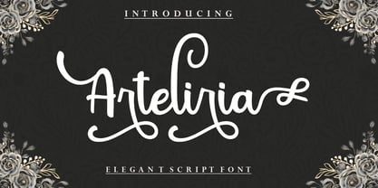 Arteliria Script is a soft and sweet calligraphic typeface, with the characters dancing along the baseline. It has a casual and elegant touch. Can be used for various purposes such as logos, wedding invitations, headings, t-shirts, letterheads, signage, labels, news, posters, badges etc. OpenType features with alternative styles, ligatures, and multiple language support. To enable the OpenType Stylistic alternative, you need a program that supports OpenType features such as Adobe Illustrator CS, Adobe Indesign & CorelDraw X6-X7, Microsoft Word 2010 or later. How to access all alternative characters, using the Windows Character Map with Photoshop: https://www.youtube.com/watch?v=Go9vacoYmBw How to access all alternative characters using Adobe Illustrator: http://youtu.be/iptSFA7feQ0 There are additional ways to access alternatives/swashes, using the Character Map (Windows), Nexus Font (Windows), Font Book (Mac) or a software program such as PopChar (for Windows and Mac). Need help? If you need help or advice, please contact me by email. Thank You!
 - Bosterina by Gatype,
$12.00 Bosterina is a script typeface with a noble, vintage look., this font has a model Trendy, natural and gentle, with this font you can take advantage of the opportunity in every moment of one wonderful way to highlight the celebration of the feast of your best, because this font will be advocates for purposes such as wedding invitations, party, graduation, birthday, gathering, etc. you need a program that supports Adobe Illustrator CS, Adobe Indesign & CorelDraw X6-X7, Microsoft Word 2010 or a later version. How to access all alternative characters using Adobe Illustrator: https://www.youtube.com/watch?v=XzwjMkbB-wQ Bosterina is coded with PUA Unicode, which allows full access to all additional characters without having to design any special software. Mac users can use Font Book, and Windows users can use Character Map to view and copy any additional characters for pasting into your favorite text editor / application. How to access all alternative characters, using the Windows Character Map with Photoshop: https://www.youtube.com/watch?v=Go9vacoYmBw
 - Blantone by Nk Studio,
$18.00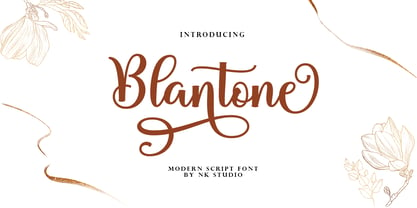 Blantone Script is a soft and sweet calligraphic typeface, with the characters dancing along the baseline. It has a casual and elegant touch. Can be used for various purposes such as logos, wedding invitations, headings, t-shirts, letterheads, signage, labels, news, posters, badges etc. OpenType features with alternative styles, bindings, and multiple language support. To enable the OpenType Stylistic alternative, you need a program that supports OpenType features such as Adobe Illustrator CS, Adobe Indesign & CorelDraw X6-X7, Microsoft Word 2010 or a later version. How to access all alternative characters, using the Windows Character Map with Photoshop: https://www.youtube.com/watch?v=Go9vacoYmBw How to access all alternative characters using Adobe Illustrator: http://youtu.be/iptSFA7feQ0 There are additional ways to access alternatives/swashes, using the Character Map (Windows), Nexus Font (Windows), Font Book (Mac) or a software program such as PopChar (for Windows and Mac). Need help? If you need help or advice, please contact me by email. Thank You!
 - Authemia by Skinny Type,
$15.00 Authemia is a font duo Script, Sans, and plus Extras typeface with characters dancing along its baseline. It has a casual and elegant touch. Can be used for various purposes such as logos, wedding invitations, headings, t-shirts, letterheads, signage, labels, news, posters, badges etc. OpenType features with alternative styles, ligatures, and multi-language support. To enable OpenType Stylistic alternates, you need a program that supports OpenType features such as Adobe Illustrator CS, Adobe Indesign & CorelDraw X6-X7, Microsoft Word 2010 or a later version. How to access all alternative characters, using the Windows Character Map with Photoshop: https://www.youtube.com/watch?v=Go9vacoYmBw How to access all alternative characters using Adobe Illustrator: http://youtu.be/iptSFA7feQ0 There are additional ways to alternate / swash, using the Character Map (Windows), Nexus Font (Windows), Font Book (Mac) or a software program like PopChar (for Windows and Mac). Need help? If you need help or advice, please contact me via email. Thank you!
 - Ithalia script by Rotterlab Studio,
$12.00 Ithalia Script - a new fresh & modern script with a handmade calligraphy style, decorative characters and a dancing baseline! So beautiful on invitation like greeting cards, branding materials, business cards, quotes, posters, and more design concept! The alternative characters were divided into several OpenType features such as Swash, Stylistic Sets, Stylistic Alternates, and Ligature. The OpenType features can be accessed by using OpenType savvy programs such as Adobe Illustrator, Adobe Photoshop , Corel Draw X version, And Microsoft Word. And this Font has given PUA code (specially coded fonts). so that all the alternate characters can easily be accessed in full by a craftsman or designer. How to access all alternative characters using Adobe Illustrator: https://www.youtube.com/watch?v=XzwjMkbB-wQ There are additional ways to access alternates/swashes, using Character Map (Windows), Nexus Font (Windows), Font Book (Mac) or a software program such as PopChar (for Windows and Mac). How to access all alternative characters, using Windows Character Map with Photoshop: https://www.youtube.com/watch?v=Go9vacoYmBw
 - Rainbow by Nk Studio,
$20.00 Rainbow is a soft and sweet script typeface, with the characters dancing along its baseline. It has a casual and elegant touch. Can be used for various purposes such as logos, wedding invitations, headers, t-shirts, letterheads, signboards, labels, news, posters, badges etc. OpenType features with alternate styles, ligatures and multi-language support. To activate the OpenType Stylistic alternative, you need a program that supports OpenType features such as Adobe Illustrator CS, Adobe Indesign & CorelDraw X6-X7, Microsoft Word 2010 or a later version. How to access all alternative characters, using the Windows Character Map with Photoshop: https://www.youtube.com/watch?v=Go9vacoYmBw How to access all alternative characters using Adobe Illustrator: http://youtu.be/iptSFA7feQ0 There are additional ways to swap / swap, using Character Map (Windows), Nexus Fonts (Windows), Font Book (Mac) or a software program such as PopChar (for Windows and Mac). Need help? If you need help or advice, please contact me via email. Thank you!
 - Melya by Stripes Studio,
$12.00 Melya Script, a modern hand writing, I hope you are interested in this font. It can be used easily and simply because there are a lot of features in it and contains a complete set of letters in lower and uppercase, assorted punctuation, numbers, and multilingual support. It also contains several ligatures and alternate style stylistic characters. To enable the OpenType Stylistic alternates, you need a program that supports OpenType features such as Adobe Illustrator CS, Adobe Indesign & CorelDraw X6-X7, Microsoft Word 2010 or later versions. And there are additional ways to access alternates/swashes, using Character Map (Windows), Nexus Font (Windows), Font Book (Mac) or a software program such as PopChar (for Windows and Mac). How to access all alternative characters using Adobe Illustrator: https://www.youtube.com/watch?v=XzwjMkbB-wQ How to access all alternative characters, using Windows Character Map with Photoshop: https://www.youtube.com/watch?v=Go9vacoYmBw Melya Script has given PUA unicode. Thank you for your purchase!
 - ITC Stone Sans II by ITC,
$45.99 The ITC Stone Sans II typeface family is new from the drawing board up. Sumner Stone, who designed the original faces in 1988, recently collaborated with Delve Withrington and Jim Wasco of Monotype Imaging to update the family of faces that bears his name. Sumner was the lead designer and project director for the full-blown reworking – and his own greatest critic. The collaborative design effort began as a relatively simple upgrade to the ITC Stone Sans family. As so often happens, however, the upgrade proved to be not so simple, and grew into a major design undertaking. “My initial intent,” recalls Sumner, “was to provide ITC Stone Sans with even greater versatility. I planned to add an additional weight, maybe two, and to give the family some condensed designs.” As Sumner began to look more closely at his twenty-year-old typeface, he decided that it would benefit from more extensive design improvements. “I found myself making numerous refinements to character shapes and proportions,” says Sumner. “The project scope expanded dramatically, and I’m pleased with the final result. The redesign has improved both the legibility and the overall appearance of the face.” The original ITC Stone Sans is part of the ITC Stone super family, along with ITC Stone Serif and ITC Stone Informal. In 2005 ITC Stone Humanist joined the family. All of these designs have always offered the same three weights: Medium, Semibold, and Bold – each with an italic counterpart. Over time, Stone Sans has emerged as the godfather of the family, a powerful design used for everything from fine books, annual reports and corporate identity programs, to restaurant menus, movie credits and advertising campaigns. ITC Stone Sans, however, lacked one attribute of many sans serif families: a large range of widths and weights. “These fonts had enjoyed great popularity for many years – during which graphic designers repeatedly asked for more weights and condensed designs in the family,” says Sumner. “Their comments were the impetus.” ITC Stone Sans II includes six weights ranging from an elegant Light to a commanding Extra Bold. An italic counterpart and suite of condensed designs complements every weight. In all, the new family encompasses 24 typefaces. The ITC Stone Sans II family is also available as a suite of OpenType Pro fonts, allowing graphic communicators to pair its versatile design with the capabilities of OpenType. These fonts offer automatic insertion of ligatures, small caps and use-sensitive figure designs; their extended character set also supports most Central European and many Eastern European languages. ITC Stone® Sans II font field guide including best practices, font pairings and alternatives.