10,000 search results
(0.013 seconds)
- Zulia Pro by Sudtipos,
$59.00 Zulia is located in the west of Venezuela and it is the state in where Joluvian grew up. It is a region of sunshine, high temperatures, oil and cheerful people, although we choose the name to honor his mother who is from there (zuliana) and who is proud of her land and everything that it represents the area. Zulia is also his first typographic project. It is based on two of his favourite calligraphic styles: italic and brush pen. He started with simple and contrasted strokes on paper with brush and marker. After that he developed the full alphabet and its various options for each letter, starting from a set of handmade forms that could be connected in different ways according to the user needs. What motivates him to involve this style was to create a differentiation with his daily work by generating a heavier type, contrasted and low rise. Zulia finally got life of its own with the participation of Alejandro Paul and a feedback of techniques and skills that were generated with the duo work. Zulia is not just a typeface, Zulia is his love of letters.
 - Beverly Catherine by Attract Studio,
$16.00 Beverly Catherine is a bold hand-drawn all-caps marker font that has really original brush edges and is rough in every stroke. Great for logos, merchandise, product packaging, quotes, comic book text, and hard-hitting titles. It also includes multilingual support.
 - Channelley Script by dotHK Studio,
$25.00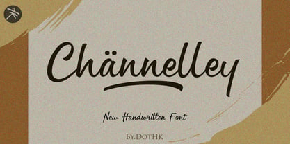 Channelley is a casual and clean brush script font. It has a trendy style and it will be a tremendous hit for each of your branding, product packaging, invitations, quotes, t-shirts, label, poster, logos or anything else that you wish to design.
 - Seagrass BF by Bomparte's Fonts,
$39.00 Inspired by lettering styles of the 1930s, Seagrass BF is jazzy and jumping as a Lindy Hop. As such it captures I believe, something of the spirit of that age, yet somehow retains a fresh, contemporary feel. Headlines, logos, packaging, signage and branding are just a few of many usages. Seagrass BF contains Stylistic Alternates and Stylistic Sets for uppercase letters Y and Z, as well as ampersand (&). Other OpenType features include Standard Ligatures and Contextual Alternates. These features should at all times be employed to optimize the appeal of your word settings. So whenever your visual communication demands an energetic, vibrant voice please consider Seagrass BF.
 - Notes by Resistenza,
$39.00 Notes Is a handwritten-Italic font style, casual and fresh. Our recipe for this project is a perfect blend of typography and handwriting. Works well in small sizes and has several ligatures. Notes Family has many cuts, Pen, Pencil, Marker and Felt Tip. This font family can be used for many purposes like publishing, quick notes, adding captions, signage.
 - VLNL Gaufre by VetteLetters,
$35.00 VLNL Gaufre is a pixel-based font with holes designed by Donald Roos. Each character is built on a grid of doughnut-like elements, which makes it look like a kind of dried dog food, or Belgian waffles. Despite the grid Gaufre still has enough warmth due to the doughy, slightly rounded corners. And because it’s prepared with a hot waffle iron of course. The end result is a merry, chunky typeface that smells of doughnut. Use it for logos or headlines, just add butter and sugar or, better still, top it with whipped cream and cherries. Yummie!
 - Gabriel Bautista by Comicraft,
$29.00 Comix Gorilla GABRIEL BAUTISTA is the artist of John JG Roshell's CHARLEY LOVES ROBOTS series. His incredible watercolors graced the pages of ELEPHANTMEN #50. In some circles he is known as "Galvo" or "Gabo" and he has brought his brofu color skills to the pages THE SPIRIT, ALL STAR WESTERN and also illustrated JESUS CHRIST, IN THE NAME OF THE GUN. He is also the creator of comic battling site ENTERVOID.COM and indy press PULPOPRESS.COM. He loves his girl, his dog lulu and his font.
 - MoxyRoxie - Unknown license

- Generous Hospitality by Dear Alison,
$19.00 While there can be similar handwriting styles out there, no two handwritings are exactly the same. I like to think that I have the same handwriting style as my father, but I had never seen him write with lowercase letters, only in all capitals, except when signing his name on something in cursive. I recently came across a letter my father had written long ago to a friend. It was returned to sender, yet he kept it intact. The letter primarily thanked his friend for his hospitality when my father unexpectedly dropped in for a visit while traveling. I was so taken by the handwriting, that I decided to make it into a font, not only to remember my father, but also to forever preserve his handwriting. Generous Hospitality not only taps into the character of the person the letter was written to, it also reflects the personality of my father. If you are looking for a masculine handwriting type style for your designs, I think this font could be a nice fit.
 - London Doodles by Outside the Line,
$19.00 London is always hip. With William and Kate and the 2012 Summer Olympics it made sense that London Doodles would be second in the City Series following Paris Doodles. 29 illustrations and a script word London. Kate’s ring, the Queen’s carriage, crown, skyline, cityscapes, cars, double-decker bus, castles, bridge, tea items, flag and more.
 - FrankieDos by Type-Ø-Tones,
$40.00 Following in the footsteps of his brother Frankie, FrankieDos entered our catalogue a few years later. FrankieDos follows the same pattern: how to imitate analogic features in a vector-based typeface.
 - Saskia Pro by RMU,
$30.00 A tribute to Jan Tschichold. His hot-metal font Saskia was released in 1931 by Schelter & Giesecke. This elegant italic font was finally redrawn, extended and digitized for present-day use.
 - Astrotype by Linotype,
$29.99Astrotype is an excellent choice for use in astronomical or astrological literature – books, journals, magazines, etc. It can be used effectively both within the text and in accompanying graphics. Using all weights also opens up a number of illustrative possibilities, for instance on posters or tarot cards. Clarity, homogeneity and pure simplicity give Astrotype its unique character. Based on the same elements and with consistant proportions, the characters display a natural elegance and harmony. The type really stands out through the ease with which it can be integrated into text and the many creative possibilities of combinations of different weights. For instance, try placing Astrotype N dot over Astrotype P dot and using different colors – perfect for onscreen buttons, icons or decorations. - Letterpress Text by Chris Costello,
$22.75 This font is based on the popular and timeless Caslon design and was carefully digitized from the pages of an early 19th century book. I was excited to see some unique design treatments of characters such as the lower case italic 'p', the question mark, and various swash caps that I had never seen before. During the conversion process, I made sure to preserve the worn look of faded ink on old paper by maintaining a subtle level of decay and opacity with each character. For missing characters not found in the book, I created new characters that were faithful to the style of the rest of the family. Used as a text font, The Letterpress Text Family successfully reproduces the appearance of old letterpress lithography.
 - Business Helpers JNL by Jeff Levine,
$29.00 Duluth, Minnesota's Horace P. Brouillet Syndicate (later known as Syndicuts, Inc.) was one of a number of stock cuts providers to the letterpress trade in the decades preceding paper, then electronic clip art. Brouillet's "Typeps" catalogs offered a wide range of images covering numerous subjects, as well as cartoons, catch words and automotive logos. Many of these images have been reproduced in a number of royalty-free clip art publications over the years. Twenty-Six of these newly-redrawn catch words are found within Business Helpers JNL in two styles. On the capital keys are the original white-on-black designs, modeled from the vintage source material. The lower case keys have the phrases separated from the decorative ovals and are in black type.
 - Hawaii Summer by Gravitype,
$14.90 Hawaii Summer is a fresh and playful display font, designed to bring a unique style to your projects. Its natural look makes it perfect to be integrated into exotic environments, thanks to the warm vibes that its lines transmit. It is suitable in multiple situations, like for: food and beverage, bar signs, packaging, t-shirts, flyers, magazines, posters, ad campaigns, social media, banners, etc... Stylistic alternates are included for letters: “m” to be the inverse of “w” and thus be more symmetrical, for example, if a logo design requires it “p” and “r” with a slightly decreased contrast to appear neater, especially for big size text like headlines Hawaii Summer supports multiple languages to be tourist-friendly ;) Get ready for the summer!
 - House Of Cards by Dharma Type,
$19.99 House of Cards is inspired by and based on retro Hamilton’s Teniers typeface which is popular wooden type fonts of the 19th century. To make natural and contemporary impressions, the original lowercase design was slightly changed from the original but all glyphs had been designed carefully to be retro-looking of the old time and to fill all with nostalgia. This modern wood type includes 2 weights and their matching italic style and all style have sprayed ends(beginning) alternates for F, H, P, U, f, h, m, n, t, u, and w which can be accessed by using OpenType Stylistic alternates or swash alts. House of Cards will be the best solution for posters, titles and anywhere you need vintage lettering.
 - Deutsche Schrift by Alter Littera,
$25.00 A comprehensive and faithful rendition of Rudolf Koch’s first release, usually referred to as “Fette Deutsche Schrift” or "Koch-Schrift". In addition to the regular character set, the font includes a large number of alternates and ligatures, plus two sets of ornamental initials (Initialen mit Zierstrichen und Punkten zur Koch-Schrift, and Initialen zur halbfetten deutschen Schrift von Rudolf Koch). The main sources used during the font design process were a sample page from Hendlmeier, W. (1994), Kunstwerke der Schrift, Hannover: Bund für Deutsche Schrift und Sprache (p. 164), and several specimen sheets from the Gebrüder Klingspor Type Foundry for Koch’s “Deutsche Schrift” type family. Specimen, detailed character map, OpenType features, and font samples available at Alter Littera’s The Oldtype “Deutsche Schrift” Font Page.
 - Tecna Dark Down Triangle BNF by Descarflex,
$30.00 The Tecn@ Dark&Light Triangle Background Nomenclature Font family is differentiated by the direction of the triangle tip in the 4 cardinal points. The family were designed to head, enumerate, indicate or highlight writings or design plans, for this reason, the characters are available only in capital letters and some signs or symbols that can serve such purposes. A triangle or empty character is included so that the user can use it overlaying any character of his choice or to be used alone.
 - Glupsk by Hökarängens Bokstavsfabrik,
$19.00 Do you remember that kid from Lord of the Flies? Why do I even remember that kid, I’m too young for that. However, his name was Piggy, and I wanted to make a typeface that resembled him. So this is my tribute to Piggy who got killed by that falling plastic rock in the movie. May he live forever through this typeface, on birthday cards, or maybe some sweet candy packaging or why not through an graphic identity for a toy company?
 - Tecna Light Down Triangle BNF by Descarflex,
$30.00 The Tecn@ Dark&Light Triangle Background Nomenclature Font family is differentiated by the direction of the triangle tip in the 4 cardinal points. The family were designed to head, enumerate, indicate or highlight writings or design plans, for this reason, the characters are available only in capital letters and some signs or symbols that can serve such purposes. A triangle or empty character is included so that the user can use it overlaying any character of his choice or to be used alone.
 - Tecna Light Left Triangle BNF by Descarflex,
$30.00 The Tecn@ Dark&Light Triangle Background Nomenclature Font family is differentiated by the direction of the triangle tip in the 4 cardinal points. The family were designed to head, enumerate, indicate or highlight writings or design plans, for this reason, the characters are available only in capital letters and some signs or symbols that can serve such purposes. A triangle or empty character is included so that the user can use it overlaying any character of his choice or to be used alone.
 - Tecna Dark Right Triangle BNF by Descarflex,
$30.00 The Tecn@ Dark&Light Triangle Background Nomenclature Font family is differentiated by the direction of the triangle tip in the 4 cardinal points. The family were designed to head, enumerate, indicate or highlight writings or design plans, for this reason, the characters are available only in capital letters and some signs or symbols that can serve such purposes. A triangle or empty character is included so that the user can use it overlaying any character of his choice or to be used alone.
 - Tecna Dark Left Triangle BNF by Descarflex,
$30.00 The Tecn@ Dark&Light Triangle Background Nomenclature Font family is differentiated by the direction of the triangle tip in the 4 cardinal points. The family were designed to head, enumerate, indicate or highlight writings or design plans, for this reason, the characters are available only in capital letters and some signs or symbols that can serve such purposes. A triangle or empty character is included so that the user can use it overlaying any character of his choice or to be used alone.
 - Tecna Light Right Triangle BNF by Descarflex,
$30.00 The Tecn@ Dark&Light Triangle Background Nomenclature Font family is differentiated by the direction of the triangle tip in the 4 cardinal points. The family were designed to head, enumerate, indicate or highlight writings or design plans, for this reason, the characters are available only in capital letters and some signs or symbols that can serve such purposes. A triangle or empty character is included so that the user can use it overlaying any character of his choice or to be used alone.
 - Tecna Light Up Triangle BNF V1.0 by Descarflex,
$30.00 The Tecn@ Dark&Light Triangle Background Nomenclature Font family is differentiated by the direction of the triangle tip in the 4 cardinal points. The family were designed to head, enumerate, indicate or highlight writings or design plans, for this reason, the characters are available only in capital letters and some signs or symbols that can serve such purposes. A triangle or empty character is included so that the user can use it overlaying any character of his choice or to be used alone.
 - Saltpetre by Magpie Paper Works,
$32.00 Inspired by late 18th century type specimens, Saltpetre is a grounded yet rustic typeface. His letters have been hand-inked with antique dip pens and playfully spaced for a charming, irregular look. In addition to a set of 26 upper case letters, the font includes a variety of period graphics, interlocking decorative borders, numerals, punctuation, currency figures and multi-lingual support. Saltpetre is extremely versatile and excels at display, as well as specialized uses such as cartography and historical reproduction.
 - Subway Circle by Hanoded,
$15.00 My eldest son Sam always wanted to visit Japan and he has been saving up for a ticket for years now. We should have traveled there this year, but due to the pandemic, that was impossible. We’re now trying to go next year. Sam and I did make some kind of itinerary and I told him how we were going to get around, as I have been to Japan many times. I told him about the Shinkansen trains, the cute Tram in Nagasaki and the immense subway system in Tokyo. One of the lines in Tokyo is the so-called Yamanote Circle Line, which I have used on numerous occasions. A new font name was born and it stuck to this particular font! Subway Circle is a 100% handmade font. It is rounded, slightly slanted and comes with a sunny disposition. I am sure that, when you use it, you will find your 生きがい… ;-)
 - Simplo by Durotype,
$49.00 Simplo: the ‘Italian Futura’. Simplo is a geometric sans serif typeface, built in sixteen styles. It is a tribute to the 1930s typeface Semplicità, designed by Nebiolo’s Alessandro Butti. Although many details of Simplo differ from Semplicità, it preserves the spirit of the original. Simplo is ideal for use in display sizes. It is also quite legible in text, and is well suited for graphic design and corporate identity design. Simplo has sixteen styles, extensive language support, eight different kinds of figures, sophisticated OpenType features — so it’s ready for advanced typographic projects. The most notable characteristics of this typeface are the ‘t’ and the ‘f’. The ‘t’ is the culmination of simplicity: a vertical line with just a simple right-side crossbar. The ‘f’ also has just a right-side crossbar, and is really tall: it reaches both the highest and lowest vertical position of the typeface. The top of the distinctive ‘s’, is much narrower than its bottom. The ‘a’, ‘b’, ‘d’, ‘g’, ‘p’, ‘q’, and ‘u’ are spurless, and show a family resemblance with Hans Reichel’s 1990s typeface Dax. However, these letters are rounder and more geometric than Dax’s counterparts, because of Dax’s higher x-height and narrower design. In Paul Shaw’s Imprint article about typefaces that have been overlooked and/or underappreciated, “Overlooked Typefaces”, he concluded his discussion of Semplicità as follows: “These idiosyncrasies suggest that Semplicità might find a warm reception today, given the current love affair with Gotham, Neutraface and Proxima—and the resurgence of ITC Avant-Garde Gothic.” Free demo font available. For more information about Simplo, download the PDF Specimen Manual.
 - Roloi by Mayfield Type Foundry,
$15.00 Originally inspired by the numerals on a vintage clock face, Roloi is a layered numbers font in the deco lettering style, and includes a full set of automatic clock symbols. Its geometric forms are typical of the deco style, but stop well-short of pure geometry. The irregular stroke and character widths work together to give the forms a warm and energetic, yet cohesive, feel. Roloi offers two layering styles—the personable Fill and the more dynamic Inline. Designed to be layered over the background Regular style, they both lend the forms an added level of interest. Roloi also includes a clock symbol for any and every time of day, rounded to the nearest five-minutes. The regular weight provides the circular clock background, while the Fill and Inline styles produce the clock hands. If ligatures are activated in your text-editing program, type out any time—such as 9:32, 12:05, etc.—and the proper clock symbol will be automatically substituted. Go ahead, type any time out below! To stop the automatic clock symbol substitution, simply deactivate ligatures. Because the clock symbols are standard ligatures, every major modern browser will support their use on the web. With some programing they could even be used to make a lightweight, text-only clock. In addition to the clock symbols and basic numerals, Roloi’s glyph range covers numeric superiors and inferiors, standard and arbitrary fractions, currency symbols, all of the punctuation and symbols commonly associated with currency, unicode clock Face symbols, the A M P / a m p letters, and alternates of the 1, 2, and 4, accessible by selecting Stylistic Set 1.
 - Wickenburg by VersusTwin,
$21.99 Wickenburg is a rough and tumble grunge slab typeface that has taken a lickin' but keeps on coming back for more. It is a powerful heavyweight serif that makes a strong design statement. Pick up this bad boy and take him for a ride!
 - Manganese by Comicraft,
$29.00The entire Headquarters Building of Active Image Comicraft has been ripped from the ground by a giant lizard monster which has unexpectedly risen from the sea! It has the power of bodily transformation! By merely willing it, it can transform its atomic structure into any form and shape. It is completely hostile. It regards our entire island nation as its enemy. Run! RUN! Run from the Giant Monster! - Smart Frocks NF by Nick's Fonts,
$10.00 A sign in a London storefront, ca. 1930, pitching—surprise!—Smart Frocks provided the visual cues for designing this typeface. Singularly stylish, hip and haughty and decidedly Deco, this is the smart font to use! This font contains the complete Latin language character set (Unicode 1252) plus support for Central European (Unicode 1250) languages as well.
 - Morning Cookie by Bogstav,
$17.00 Yet again, a font inspired by my work as a kindergarten teacher! The other day, I had a conversation with some of the kids, about what they ate for breakfast. Some had oatmeal, some bread and others yogurt. But this kid - he insisted that every morning, his mother would serve him cookies, “morning cookies”. It sounded too good to be true, and when I asked his mother, it turned out that “cookies” were actually bread, but to make it sound more appetising, they called it cookies! The letters are rounded and in some way quite naive, but still clear and legible. With an extreme ascender and descender, the font stands out with its oddities. I’ve added 3 different versions of each lowercase letter!
 - Nono by Wiescher Design,
$39.50 Nono is the nickname of my oldest son, Konstantin. His little brother could not really speak yet, but he was always looking for him and said something to the tune of, "wea is a nono". From that time on I call Konstantin Nono. I designed a handwritten script with his real name, that i named Konstantin. Now I made this slick version of that script – hence – Nono! I made three basic sets of characters plus a smallcaps version. To top things off, I designed a set of endletters that I throw in for free. Everything can be mixed! I sell single cuts but the best deal would be the entire packet, it goes for a very fair price. Your generous typedesigner, Gert Wiescher
 - Batam Brush by Sulthan Studio,
$12.00 Batam brush - Is pure handwriting using a brush which we dipped in ink and then scratched on paper naturally and I made these letters as they are without being repaired in the slightest. this font looks like life in the harsh wilderness still has to survive.
 - Capzule by Bogusky 2,
$24.50The capsule shape has long been a favorite of mine. So, why not use it as the basis for a font design. And if you hit the cap bar key, you'll find a hidden capzule. Take two and catch some Zs before you resume surfing for fonts. - Jacob Riley by Magpie Paper Works,
$32.00 Jacob Riley is based on antique 18th century printers’ specimens and has been hand-illustrated with calligraphy nibs dipped in walnut ink. A goodly fellow, Jacob delights in uses varied and sundry including personal correspondence, rustic decor, graphic display and even amongst the pages of children’s books.
 - CA Sensuell by Cape Arcona Type Foundry,
$37.00 Stefan Claudius developed this font while he was sitting in a small chalet in Denmark with a hot wood-oven and nothing but snow outside. Probably the amount of white led him to make it so thin and to have as much space between the lines as possible. If you have that in mind, it looks best in large sizes.
 - Dinosaur Cake by Hanoded,
$10.00 My son Sam’s birthday is coming up and we need to think of a cake. He’s old enough not to want a themed cake, but I suddenly remembered that we gave him a dinosaur cake for his second birthday! Dinosaur Cake? That’s a totally cool name for a font! So here it is: Dinosaur Cake - The Font. It’s a cute little handmade font, which looks like it was cut out of paper, but I have to disappoint you this time: it was not cut out.
