10,000 search results
(0.021 seconds)
- Claridge by Monotype,
$29.99Claridge was designed by Adrian Williams and released in 1979. The lowercase g of the Claridge font has a distinctive central join to the loop. - Contra Sans by Wiescher Design,
$16.50 Contra Sans is the base of my Contra family of fonts. It has just sufficient contrast to make for easy reading and an interesting appearance.
 - Palatino Nova Paneuropean by Linotype,
$67.99Palatino® Nova is Prof. Hermann Zapf's redesign of his own masterpiece, Palatino. The original Palatino was cut in metal by August Rosenberger at D. Stempel AG typefoundry in Frankfurt, and released in 1950. Palatino was later adapted for mechanical composition on the Linotype machine, and became one of the most-used typefaces of the 20th Century. Palatino was designed for legibility, and has open counters and carefully weighted strokes. The type was named after Giambattista Palatino, a master of calligraphy from the time of Leonardo da Vinci. Palatino is a typeface based on classical Italian Renaissance forms. A modern classic in its own right, Palatino is popular among professional graphic designers and amateurs alike, working well for both text and display typography. Hermann Zapf and Akira Kobayashi redeveloped Palatino for the 21st Century, creating Palatino Nova. Released by Linotype in 2005, the Palatino Nova family is part of Linotype's Platinum Collection. Palatino Nova includes several weights (Light, Regular, Medium, and Bold), each with companion italics. Four styles (Regular, Italic, Bold, and Bold Italic) have Greek and Cyrillic glyphs built into their character sets. The Palatino Nova family also includes revised versions of Aldus (now called Aldus Nova), as well as two titling weights. The first titling weight, Palatino Nova Titling, is based on Hermann Zapf's metal typeface Michelangelo, including Greek glyphs from Phidias Greek. The heavier titling weight, Palatino Nova Imperial, is based on Sistina. The fonts in the Palatino Nova family support all 48 Western, Central, and Eastern European languages. Additional features: ligatures and historical ligatures, Small Caps, ornaments, and a range of numerals (proportional & tabular width lining and Old style Figures, fractions, inferiors, and superiors)." - Univers Next Cyrillic by Linotype,
$49.00 Linotype Univers is a completely reworked version of the original Univers typeface family designed by Adrian Frutiger in 1957. After a long process of painstakingly detailed revision, Frutiger and the design staff at Linotype completed this large joint project in 1997. The result: a brilliant and cohesive font family of 63 weights and styles including the 4 monospaced typewriter weights. All the existing weights were completely redrawn, with careful attention paid to making the proportions more consistent with each other and improving fine details such as curves and thick-to-thin stroke ratios. The family was expanded from 27 to 63 weights, providing a much larger framework to graphic designers for choosing just the right style. The bold and condensed weights were reworked for improved legibility and on-screen application. The stroke weights were revised for consistency within each face as well as in relationship to the other weights. By following Frutiger's original designs, the humanist character of the sans serif Univers now comes through more distinctly. The systemized numbering system has also been updated. With its sturdy, clean forms Univers can facilitate an expression of cool elegance and rational competence. In fact, the strong familial relationships between all the styles and weights make it a serviceable choice for large graphic design projects that require versatility with consistency. Frutiger was successful in staying true to his initial aims; the new Linotype Univers does indeed work in longer texts as well as for display settings. In 2010 the typeface family was extended and renamed into a more logical naming of "Univers Next" to fit better in the Platinum Collection naming.
 - Univers Next Paneuropean by Linotype,
$89.00 Linotype Univers is a completely reworked version of the original Univers Univers typeface family designed by Adrian Frutiger in 1957. After a long process of painstakingly detailed revision, Frutiger and the design staff at Linotype completed this large joint project in 1997. The result: a brilliant and cohesive font family of 63 weights and styles including the 4 monospaced typewriter weights. All the existing weights were completely redrawn, with careful attention paid to making the proportions more consistent with each other and improving fine details such as curves and thick-to-thin stroke ratios. The family was expanded from 27 to 63 weights, providing a much larger framework to graphic designers for choosing just the right style. The bold and condensed weights were reworked for improved legibility and on-screen application. The stroke weights were revised for consistency within each face as well as in relationship to the other weights. By following Frutiger's original designs, the humanist character of the sans serif Univers now comes through more distinctly. T he systemized numbering system has also been updated. With its sturdy, clean forms Univers can facilitate an expression of cool elegance and rational competence. In fact, the strong familial relationships between all the styles and weights make it a serviceable choice for large graphic design projects that require versatility with consistency. Frutiger was successful in staying true to his initial aims; the new Linotype Univers does indeed work in longer texts as well as for display settings. In 2010 the typeface family was extended and renamed into a more logical naming of "Univers Next" to fit better in the Platinum Collection naming.
 - Palatino Nova by Linotype,
$50.99 Palatino® Nova is Prof. Hermann Zapf's redesign of his own masterpiece, Palatino. The original Palatino was cut in metal by August Rosenberger at D. Stempel AG typefoundry in Frankfurt, and released in 1950. Palatino was later adapted for mechanical composition on the Linotype machine, and became one of the most-used typefaces of the 20th Century. Palatino was designed for legibility, and has open counters and carefully weighted strokes. The type was named after Giambattista Palatino, a master of calligraphy from the time of Leonardo da Vinci. Palatino is a typeface based on classical Italian Renaissance forms. A modern classic in its own right, Palatino is popular among professional graphic designers and amateurs alike, working well for both text and display typography. Hermann Zapf and Akira Kobayashi redeveloped Palatino for the 21st Century, creating Palatino Nova. Released by Linotype in 2005, the Palatino Nova family is part of Linotype's Platinum Collection. Palatino Nova includes several weights (Light, Regular, Medium, and Bold), each with companion italics. Four styles (Regular, Italic, Bold, and Bold Italic) have Greek and Cyrillic glyphs built into their character sets. The Palatino Nova family also includes revised versions of Aldus (now called Aldus Nova), as well as two titling weights. The first titling weight, Palatino Nova Titling, is based on Hermann Zapf's metal typeface Michelangelo, including Greek glyphs from Phidias Greek. The heavier titling weight, Palatino Nova Imperial, is based on Sistina. The fonts in the Palatino Nova family support all 48 Western, Central, and Eastern European languages. Additional features: ligatures and historical ligatures, Small Caps, ornaments, and a range of numerals (proportional & tabular width lining and Old style Figures, fractions, inferiors, and superiors)."
 - Today Sans Now by Elsner+Flake,
$59.00 With the publication of the “Today Sans Now” Elsner+Flake extends its offering of the “Today Sans Serif” type family, developed in 1988 by Volker Küster for Scangraphic, by another cut so that the gradation of the stroke width can now be more finely calibrated. The type complement is available for 72 Latin-based languages as well as Cyrillic. Where available, small caps were integrated, and mathematical symbols as well as fractions were included. In order to make the symbols for text applications in regard to headlines more flexible, the insertions which were formerly added, for technical reasons in order to sharpen the corners, were eliminated, and the optical size adjustments of the vertical and diagonal stem endings (I, v, H, V) to the horizontal bars (z, Z) were scaled back. Already since the end of 1984, Volker Küster experimented with broad sticks of chalk and a broad felt pen in order to develop a new sans serif typeface which, in the interest of easy legibility, would be built on the basic structures and proportions of the Renaissance-Antiqua. Using a normal angle of writing, his experiments lead to the form structure of the characters: a small contrast between bold and light weights, serif-like beginning and end strokes in some of the lower-case characters, and the typical, left-leaning slant of all round lower-case letters and the typical left-leaning axis of all round letter forms. In this way, a rhythmization of a line of type was achieved which created a lively image without being “noisy”. With this concept, Volker Küster has enlarged the Sans Serif by a distinctive, trend-setting form variation.
 - Cohen by TripleHely,
$16.00 Hello! Let me introduce Cohen – a handwritten font named in memory of the great poet and singer Leonard Cohen. On the day he passed away I did my routine calligraphy practice and wrote a part of his song 'Night Comes On'. You may see this work in presentation pictures, and after time I designed a font based on this calligraphy. Cohen signature font is perfect for logos, branding, web, blog headlines, invitations, magazine and book design, product packaging – or for any text on postcards and on your favorite photos. Cohen includes: a standard set of characters with wide multilingual support: Western-, Central- and Eastern-European, Baltic, Turkish, Latin-type Africans, and Asian (94 languages in total) two additional character sets: lowercase letters with alternates shapes and lowercase letters with a little end-swash - for the position at the end of a word 39 ligatures for double letters and frequent combinations Cohen has a large number of embedded context-dependent auto-replacement features that give the text a natural, handwritten look and correct inharmonious combinations of letters. These features work well in many apps (even simple ones like Notepad/TextEdit), and if you need to customize their application – you could use programs that support OpenType features (for example, Adobe apps or CorelDraw). All these additional glyphs are PUA-encoded, so if your software does not support OpenType — you could access them through Character Map (Windows) or Font Book (Mac). I hope you will like Cohen and create great designs with it! And if you have any questions, feel free to contact me via e-mail: triple.hely@gmail.com
 - Baskerville Neo by Storm Type Foundry,
$69.00 One of the most widely used typefaces in the world is actually a legacy of 18th century aesthetics, representing the spirit of late Baroque design, architecture, fashion and society. It has been created and printed for millions of readers around the world for more than two and a half centuries. It influenced many modern typographers. It shaped culture, education, entertainment and science, but also the development of typography itself. As a calligrapher and technical innovator, Baskerville invented new design, papermaking and printing methods, and his typography is very natural and legible to this day. Graphic design today calls for clean and minimalistic solutions, where the use of historical typefaces can achieve a vivid contrast with contemporary elements on the page or screen. Baskerville is undoubtedly the best choice for any kind of publishing house. In keeping with the original inventor’s spirit of excellence, we hereby offer its most advanced digital version. This is not a precise remake of rare Baskerville prints or a restoration of the original punches cut by John Handy, but rather our ideal essence of transitional typography. The old masters were limited by the technology of the time, but today we can dare to have very fine lines, unlimited ligatures, size variations and sophisticated OpenType functions. Drawing, programming, proofing and testing took us many years of development and brought thousands of new letters and dozens of language options. We are convinced that your readers will enjoy this font mainly for reading extensive works, but also for creating corporate identity, orientation systems and cultural posters. Baskerville is perfectly modern in its antiquity, striking in its modesty and timeless in its transiency.
 - Ah, Fh_Ink by Fictionalhead! Picture this: It's like taking a dip into a pool of creativity and emerging with ink-stained fingers, ready to leave your mark on the world. Fictionalhead has crafted som...
- Boldini by Luxfont,
$18.00 Introducing the unique family of COLORED fonts "Boldini" with minimalistic clean letters of a harmonious form in the style of modern POP culture. You no longer need to adjust the gradient for each letter, letters are immediately printed in gradient! Gradient fonts is perfect for headlines for fashion websites, magazines, and print design, and the basic solid font is suitable for branding boutique signs as well as for large amounts of text, because the font is very readable in a small size. Font family has two thicknesses - bold & regular, 6 gradient directions, gradient fonts also 2 type - with transparency and without transparency, as well as 2 basic monochrome fonts. Font consists of letters of the same height without division into uppercase and lowercase glyphs. *See also these fonts, which based on this family: Culoare & Anaglyph. Which means that if necessary you can combine these families and they will be absolutely stylistically identical and complement each other. Check the quality before purchasing and try the FREE DEMO version of the font to make sure your software supports color fonts. Features: Such color combinations in gradients are universal and very convenient for repainting. IMPORTANT: - OTF SVG fonts contain vector letters with gradients and transparency. - Multicolor OTF version of this font will show up only in apps that are compatible with color fonts, like Adobe Photoshop CC 2017.0.1 and above, Illustrator CC 2018. Learn more about color fonts & their support in third-party apps on www.colorfonts.wtf - Don't worry about what you see all fonts in black and not in multicolor in the tab “Individual Styles” - all fonts are working and have passed technical inspection, but not displayed in multicolor they, just because the website MyFonts is not yet able to show a preview of colored fonts. Then if you have software with support colored fonts - you can be sure that after installing fonts into the system you will be able to use them like every other classic font. Question/answer: How to install a font? The procedure for installing the font in the system has not changed. Install the font as you would install the classic OTF | TTF fonts. How can I change the font color to my color? · Adobe Illustrator: Convert text to outline and easily change color to your taste as if you were repainting a simple vector shape. · Adobe Photoshop: You can easily repaint text layer with Layer effects and color overlay. Try to experiment, it is so interesting and very easy! ld.luxfont@gmail.com
 - Andalucia by Pista Mova,
$15.00 Andalucia is a calligraphic script font that comes with beautiful alternate characters. copper plate calligraphy mix with handlettering style. Designed to convey stylish elegance. Andalucia is attractive because it is subtle, clean, feminine, sensual, glamorous, simple and very easy to read. The classic style is very suitable to be applied in all types of formal work such as invitations, labels, menus, logos, fashion, make up, stationery, letterpress, romantic novels, magazines, books, greeting/wedding cards, packaging, labels. Andalucia features a glyph and alternate characters. including multiple language support. It features OpenType with styling, binding, and character strokes, allowing you to mix and match letter pairs to match your design. Files include: To enable the OpenType Stylistic alternative, you need a program that supports OpenType features such as Adobe Illustrator CS, Adobe Indesign & CorelDraw X6-X7, Microsoft Word 2010 or a later version. (Windows), Font Book (Mac) or a software program such as PopChar (for Windows and Mac). How to access all alternative characters using Adobe Illustrator: https://www.youtube.com/watch?v=XzwjMkbB-wQ How to use the font style set in Microsoft Word 2010 or later: https://www.youtube.com/watch?v=NVJlZQ3EZU0 There are additional ways to access the alternative/swash, using Character Maps (Windows), Nexus Fonts (Windows) Font Book (Mac) or a software program such as PopChar (for Windows and Mac). How to access all alternative characters, using the Windows Character Map with Photoshop: https://www.youtube.com/watch?v=Go9vacoYmBw If you need help or advice, please contact me. Thank you for your purchase!
 - Gladista Script by Attract Studio,
$10.00 Gladista is a calligraphy script font that comes with lovely alternates character. a mixture of from copperplate calligraphy with handlettering style. Designed to convey style elegance. Gladista is attractive like a smooth, clean, feminine, sensual, glamorous, simple and highly legible typeface. Its classic style is perfect to be applied in any type of formal pieces such invitations, labels, menus, Logos, fashion, make up, stationery, letterpress, romantic novels, magazines, books, greeting / wedding cards, packaging, labels. Gladista features 360+ glyphs and 155 alternative characters. including multiple language support. With OpenType features with stylistic alternates, ligatures and swash characters, that allows you to mix and match pairs of letters to fit your design, and also a touch of ornament makes this font look elegant. To enable the OpenType Stylistic alternates, you need a program that supports OpenType features such as Adobe Illustrator CS, Adobe Indesign & CorelDraw X6-X7, Microsoft Word 2010 or later versions. (Windows), Font Book (Mac) or a software program such as PopChar (for Windows and Mac). How to access all alternative characters using Adobe Illustrator: https://www.youtube.com/watch?v=XzwjMkbB-wQ How to use stylistic sets fonts in Microsoft Word 2010 or later versions: https://www.youtube.com/watch?v=NVJlZQ3EZU0 There are additional ways to access alternates / swashes, using the Character Map (Windows), Nexus Font (Windows) Font Book (Mac) or a software program such as PopChar (for Windows and Mac). How to access all the alternative characters, using the Windows Character Map with Photoshop: https://www.youtube.com/watch?v=Go9vacoYmBw If you need help or advice, please contact me by e-mail.
 - Bringline Script by Hrz Studio,
$15.00 Bringline Script is a calligraphic script font that comes with beautiful alternate characters. copper plate calligraphy mix with hand lettering style. Designed to convey stylish elegance. Bringline Script is attractive because it is subtle, clean, feminine, sensual, glamorous, simple and very easy to read. The classic style is very suitable to be applied in all types of formal work such as invitations, labels, menus, logos, fashion, make up, stationery, letterpress, romantic novels, magazines, books, greeting/wedding cards, packaging, labels. Bringline Script features a glyph and alternate characters. including multiple language support. It features OpenType with styling, binding, and character strokes, allowing you to mix and match letter pairs to match your design. Files include: To enable the OpenType Stylistic alternative, you need a program that supports OpenType features such as Adobe Illustrator CS, Adobe Indesign & CorelDraw X6-X7, Microsoft Word 2010 or a later version. (Windows), Font Book (Mac) or a software program such as PopChar (for Windows and Mac). How to access all alternative characters using Adobe Illustrator: https://www.youtube.com/watch?v=XzwjMkbB-wQ How to use the font style set in Microsoft Word 2010 or later: https://www.youtube.com/watch?v=NVJlZQ3EZU0 There are additional ways to access the alternative/swash, using Character Maps (Windows), Nexus Fonts (Windows) Font Book (Mac) or a software program such as PopChar (for Windows and Mac). How to access all alternative characters, using the Windows Character Map with Photoshop: https://www.youtube.com/watch?v=Go9vacoYmBw If you need help or advice, please contact me. Thank you for your purchase!
 - Floral Decay by Mircea Boboc,
$22.00 This is Floral Decay, your seasonal autumn font with jaded, weathered, and earthy contours of rustic lettering. As they blend into words, the characters evoke floral arrangements of a decaying beauty. It is versatile, playful, and perfect for Graphic Design decorations! This font is unique because, in order to create it, I had to answer some tricky questions: What makes autumn… autumn? Capturing the essence of the other seasons into your letters comes easier. For instance, in order to suggest summer, you only need to draw a few flowers. How about autumn? You could garnish your letters with a few grapes, you might think, but it would only result in a grape-themed font. The notion that is more directly associated with autumn is the image of falling and withering leaves, which brought me to the second question. How exactly are you going to create something beautiful out of a somewhat morbid premise, like wilted leaves? Well, I soon realized that by creating a handwritten font and preserving the right imperfections, you can actually portray collateral beauty. In this context, asymmetry is important because it suggests decay. Further on, the design concept required the letters to come very close together, so that every typed word can be regarded as a floral arrangement. How close together, though? As much as possible without confusing one with the other, risking a lack of legibility. Therefore, in contrast with the demo version of this font, this actual version provides the ideal kerning.
 - Authemart by Great Studio,
$17.00 Introducing a new quality calligraphy font is Authemart Script. High-quality script fonts come with modern and vintage touches in them. Inspired by a mixture of copper calligraphy with handlettering style. OpenType feature with Stylistic Alternatives, Swash, Ligatures, Stylistic sets. It allows you to mix and match letter pairs to fit your design, and also comes with modern ornaments to make this font look elegant and perfect. Authemart is attractive like a smooth, clean, feminine, sensual, glamorous, simple and very easy to read. The classic style is perfect to be applied in various formal forms such as invitations, labels, menus, logos, fashion, make up, stationery, letterpress, romantic novels, books, greeting / wedding cards, packaging, labels, and more. Authemart also supports in pragram, Adobe Illustrator, Adobe Photoshop, Adobe InDesign, Corel Draw X version, Microsoft Word, Language Support : Albanian, Basque, Breton, Chamorro, Danish, Dutch, English, Faroese, Finnish, French, Frisian, Galician, German, Icelandic, Italian, Malagasy, Norwegian, Portuguese, Spanish, Swedish. How to access all alternative characters using Adobe Illustrator: • https://www.youtube.com/watch?v=XzwjMkbB-wQ How to use stylistic sets fonts in Microsoft Word 2010 or later versions: • https://www.youtube.com/watch?v=NVJlZQ3EZU0 There are additional ways to access alternates / swashes, using the Character Map (Windows), Nexus Font (Windows) Font Book (Mac) or a software program such as PopChar (for Windows and Mac). How to access all the alternative characters, using the Windows Character Map with Photoshop: • https://www.youtube.com/watch?v=Go9vacoYmBw Need help? If you need help or advice, please contact me by e-mail : "Greatstudio92@gmail.com" Thank you for your purchase!
 - Vinyle by Lián Types,
$37.00 Bold, rounded and super cool. Those are the attributes of my latest font “Vinyle”, french for vinyl. In this epoque where all fields of Design are giving a lot of importance and attention to Typography and Lettering, I felt it was my duty to contribute with something that could really stand alone and ‘say something else’ that just words to be read. I've found that lately in the world, regarding a finished piece of design, the role of Typography (and of letters in general) went from being secondary, (like a minor player or a supporting actor) to the most important one. People are starting to understand the beauty of a well-done letter: they want their storefronts with unique scripts, they want to drink coffee surrounded by lettered blackboards, they want to buy books with astonishing covers with swashes ‘por doquier’. I'm more than happy to be alive in a present where even the most unimaginable friends of mine, (who couldn't spot differences between comic sans and helvetica before) are now conscious of the importance of a letter, or let’s say: Of the ‘voice’ of Typography. With Vinyle I tried to make a font with power. Following the nowadays trend of, let me say, “the vintage sans renaissance”. This time I put my brushes and nibs aside and experimented with something new. It wasn't easy, if you will pardon, for me to see swashes all over the place withouth the classic calligraphic ‘thick and thins’, but with after some weeks of work I started to love them. Like I already showed you in other creations (1) let me finish with the phrase: GEOMETRY IS SEXY! TIPS Vinyle has a lot of attitude, it shouts “here I am!” it really can ‘design an entire piece’ for you with just a word or two: It was designed with a 10 degree slant on purpose so the user may rotate it (like on the posters) that amount of degrees in order to see better results. Use Vinyle with the ‘fi’ standard ligatures activates for better kerning and ligatures! NOTES (1) See my font Selfie , the ‘little sister’ of Vinyle.
 - Protipo by TypeTogether,
$35.00 Protipo helps information designers work smarter. Veronika Burian and José Scaglione’s Protipo type family is an information designer’s toolbox: a low-contrast sans of three text widths with a separate headline family, accompanied by an impressive two-weight icon set, and working with the advanced variable (VAR) font format. From annual reports and wayfinding to front page infographics and poster use, designers consistently turn to the simplicity and starkness of grotesque sans fonts to get their point across. Protipo is made for such environments. When designing information you may start with the headline, which in the case of this family is called Protipo Compact and comes in eight weights. From Hairline to Black, set it large, overlap it, or let it run off the page. Protipo Compact was made to hit hard and attract attention with a different character set and different proportions than the three text fonts. It sets the stage for what’s to come. Great information designers are aces at melding form and function, so we’ve stacked the Protipo family with Narrow, Regular, and Wide versions as a way of organising your information and directing the reader. Each width has seven distinct weights (light to bold) and italics, while maintaining the round-rect shapes of its DNA. Subtle details amplify its place in the typographic universe, like an ‘a’ and ‘e’ that go from solid to supple when italicising, an ‘f’ that gains an italic descender, two versions of the lowercase ‘r’ and ‘l’, and clipped corners on diagonals to keep the tight fit inherent to this kind of design work. Protipo is not meant to be loudmouthed, but stakes its claim through refinement, breadth, and impact. Some changes at first don’t seem substantial, but the Protipo family doesn’t handle text like most in its category. Protipo helps readers find and process data in a clear and unequivocal way and accounts for the complexity involved in rendering large amounts of information while still appealing to aesthetics. Protipo is ideal in all informative situations: apps, infographics, UI, wayfinding, transport, posters, display, and even internet memes. Add to all this the icon sets and upcoming variable font capability, and you’re assured a level of creativity, productivity, and impact on a much greater scale.
 - "So Run Down" is a distinctive font created by Ray Larabie, a prominent type designer known for his broad range of typographic styles. This particular font stands out for its rugged and somewhat dist...
- Explosion by Suomi,
$25.00 This font is an experiment in building dynamics into a typeface. Explosion has two variants to be put on top of each other for more dimension.
 - Zafran Arabic by Boharat Cairo,
$20.00 Zafran is an elegant industrial display typeface, full of curves and sharp angles, the typeface has an oblique feeling and unified spaces that create neat alignments.
 - Lelet Script by aRc,
$10.00 Lelet Script is a TrueType font inspired by my mother’s exquisite handwriting. It has a graceful, smooth look that makes it very legible for any project.
 - Phyllis by URW Type Foundry,
$35.00 Phyllis was designed by Heinrich Wieynck in 1904. The Phyllis font has a suite of alternative initials that provide a flourish to an otherwise modest script.
 - Sweet and Fresh by Gleb Guralnyk,
$12.00 This smooth, modern typeface named "Sweet & Fresh" has a trendy look with nice rounded shapes and multi-lingual support. Thank you and have a nice day!
 - Pelago by Adobe,
$35.00Pelago is a semi-formal sans-serif type family by Adobe Principal Designer Robert Slimbach. The family has a crisp contemporary appearance and an understated elegance. - FT Supervisor by Fenotype,
$29.95 Supervisor is a compact and tough retro font. The font has small caps and plenty of automatic ligatures. Supervisor will rock your record covers and posters.
 - Caora by Phoenix Group,
$13.00 Caora is a font with strong lines with a sweet and versatile border, this font has a minimalist theme and is perfect for clean design needs.
 - Skuul by Typoforge Studio,
$28.00 The inspiration for the designing of the font Skuul was Letraset in 1981. Font Skuul, for each character has three alternative characters with their automatic replacement.
 - Alien Segment by PizzaDude.dk,
$20.00Alien Segment has got rounded corners and even though being built up upon geometry, it deserves rich text - and works well in both upper- and lowercase. - Emanuela by TrueBlue,
$32.00 An elegant calligraphic font, ideal for any defined artworks. This font has an impressive set of characters and alternative forms and extensive set of OpenType features.
 - Van Alt JNL by Jeff Levine,
$29.00Looking similar to a Deco-era classic typeface, Van Alt JNL has slightly different character shapes, but pays due respect to its inspiration by the original... - Bathilda by Subectype,
$14.00 The Bathilda is a monoline script font with an elegant style. It has good readability and is perfect for logos, invitations, wedding, signatures, and much more!
 - Fordham JNL by Jeff Levine,
$29.00 Fordham JNL is a slab serif typeface in regular and oblique versions that has a casual, informal look reminiscent of 50s and 60s-era ad headlines.
 - Road Racer by Creativework Studio,
$12.00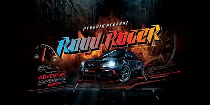 Road Racer is an esport style font that has a sporty character, very suitable for automotive design projects, sports and all products with a dynamic character.
 - Phyllis by Monotype,
$29.99Phyllis was designed by Heinrich Wienyk in 1904. The Phyllis font has a suite of alternative initials that provide a flourish to an otherwise modest script. - Fango by Typo5,
$16.95A heavy one. For major impact use it only in caps, however typing randomly upper and lower case has interesting results too. Play with it please. - Mixink Std by MIX.Jpg,
$14.00 Mixink Std is a serif font features amazing swashes. It has a vintage feel and look that makes it perfect for any retro and nostalgic project.
 - Stonegert by Oleg Gert,
$15.00 Stonegert – playful, friendly, Light, pleasant, handwritten typeface - has two weights, regular and boldWell suited for the design of children's products, magazines, instagram posts and design layouts
 - Merendina by Resistenza,
$29.00 Merendina has a geometric construction with an handwritten touch. This family contains regular and slanted and 6 weights. Do not miss all the alternates and swashes.
 - Solomonk by Etewut,
$30.00 Solomonk is a hand-drawn script with extended latin. • All European languages are supported. • Basic alphabet has alternates. (a→α) • Solomonk can be connected and disconnected