10,000 search results
(0.018 seconds)
- Annadalea by EVCco,
$12.00 This typeface pays homage to numerous Victorian and Art Nouveau predecessors, while straying somewhat beyond their usual conventions. All lowercase letters ascend in unison, whereas capitals descend below the baseline. A rigid set of uniform strokes keeps the chaos reigned in, while various calculated inconsistencies affect a vaguely hand-drawn quality to this quirky, downright decadent font. Comes packaged with the standard complement of alpha-numeric glyphs, punctuation marks, mathematical symbols, and Western European diacritics.
 - Zuume Edge by Adam Ladd,
$25.00 Zuume Edge is a condensed, display sans serif ideal for eye-catching headlines, branding, packaging, logos, sports, and entertainment, and anywhere else you need maximum impact. The wide weight range offers versatility — the lighter weights bring a sharp, technical feel while the heavier weights pack a visual punch. The notched and extended ink traps add function and visual interest and the Cut styles have sliced horizontal strokes for more movement, aggression, and speed.
 - Blaq by Resistenza,
$39.00 Inspired by Henry W. Troy, BLAQ is a new version of Trojan Text not available as font. Is an ornamental blackletter alphabet. Works great in headlines and other ‘masculine’ like design settings. The Victorian Gothic or Neo-Gothic is an architectural movement that began in the 1740s in England. Its popularity grew rapidly in the early nineteenth century. The revived Gothic style was not limited to architecture. We recommend to combine Blaq with: Turquoise Nautica
 - HoTom by Linotype,
$29.99Linotype Ho Tom is part of the Take Type Library, which features winners of Linotype’s International Digital Type Design Contest from 1994 to 1997. Designed by Thomas Hoffman, this font’s historical roots are easily traced to the slab serif style. Ho Tom was originally intended as a lettering system for a project in the center of the old East Berlin. This explains the stable, angular characters and the consistent rectangular base forms, which also makes Ho Tom a very legible font, suitable for longer texts. - Binario by Tarallo Design,
$14.99 Binario is a simple and friendly font with three weights and matching obliques. The geometric and modular characteristics of this typeface subtly reference the Art Deco and early modernist periods. It is an ideal choice for achieving a clean, distinctive, and contemporary aesthetic, making it suitable for branding, posters, and screen-based designs. The light weight of Binario is good for body text. The regular weight exudes confidence, making it suitable for both body and heading text. For impactful headlines, the bold weight is superb. The clear weight distinction of this family make it easy to create organized text. Binario was designed in Siena, Italy taking some inspiration from train stations and shop signage. The name Binario means train platform in Italian. Other aspects that informed the design of this font are modularity and efficiency. The interior rounded forms of the letters (counterforms) are based on shape of the Roman arch. Binario has a sibling, Binario Soft. This version has gently rounded stroke ends, which make a softer impression on the page.
 - Delphi by Positype,
$22.00 Delphi grew from a logotype Lily Feinberg produced using Greek-column-inspired letterforms. As that concept expanded to include more and more letters, the typeface had its beginnings. Intertwined, kinetic, and deliberate, Delphi carves itself onto the page and screen, encouraging variation and experimentation. The letterforms’ unique construction and predispostion for experimentation inspired two varying sets: Delphi Dio, comprised of two-line strokes, and Delphi Tria, built of both 2- and 3-line strokes. With a design as elaborate, yet tightly tuned as this, the desire to add more and more was irresistible—you'll see a number of stylistic, swash, and titling alternates (and even more hidden away in further stylistic sets). Because Dio and Tria could only hold so much, alternate cuts were produced to better organize your options: the Delphi Alt fonts feature certain letter styles and stylistic alternate sets distinct from those in Delphi. Delphi’s sophisticated, striking letterforms make it an ideal display face for use at large sizes, and with so many unique details and alternate letterforms, it’s simply fun to use.
 - Corpo Sans by Borutta Group,
$19.00 Corpo Sans is REFRESHED version of my old font Korpo Sans. Corpo Sans is a sans type family with a friendly feel. This type contains 12 variants with 6 weights.The high contrast and high x height is perfect for headlines and display uses. Corpo Sans is great complement for Corpo Serif.
 - Fawazeernelly by MAKYN,
$20.00 FawazeerNelly is a Bilingual Display Typeface, the Arabic font is based on Kufi Maghribi script with high contrast strike thicknesses. And the Latin font is an italic high contrast font that compliments the Arabic. They work best for titles and Poster Designs. It is an Authentic Design with a modern flavor.
 - Gyoza by Ahmad Jamaludin,
$15.00 Introducing Gyoza - Font Family (4 Fonts) Gyoza - was designed in late 2022 and published on January 2023. The Typeface was inspired by the 90’s playful cartoons and comic books. This font comes with 4 weights; Regular, Semibold, Bold, and Black. Gyoza - available with the variable fonts in weights and the Ink Trap. With the regular style, you'll have the correct anatomy of the fonts. with the Ink Trap style, it added more extreme space on the Ink Trap. Gyoza - contains everything you need to create stunning typography – from headline fonts to body text fonts - all in one place. Whether you're starting out or you've been designing for years, Gyoza has everything you need. Can be used for modern and vintage designs, and also can be easily paired with some graphic elements (Illustration, Photography) this font is perfect for, Logotype, Branding, Title, and Packaging. So take your design skills up a notch and get started on some fresh new projects with Gyoza today! Similar Item: Gunydrops : LINK HERE Kelpo : LINK HERE Swipe : LINK HERE Replay : LINK HERE What you get : Gyoza Regular Gyoza Semibold Gyoza Bold Gyoza Black Features : Ligatures Instructions ( Access special characters, even in circuit design ) Letters, numbers, symbols, and punctuation No special software is required to use this typeface even work in Canva Multilingual Support Language Support: Danish, English, Estonian, Filipino, Finnish, French, Friulian, Galician, German, Gusii, Indonesian, Irish, Italian, Luxembourgish, Norwegian Bokmål, Norwegian Nynorsk, Nyankole, Oromo, Portuguese, Romansh, Rombo, Spanish, Swedish, Swiss-German, Uzbek (Latin) Please contact us if you have any questions. Enjoy crafting and thanks for supporting us! Come and say hello over on Instagram! https://www.instagram.com/dharmas.studio/ Regards, Dharmas Studio
 - CoffeeTin - Unknown license

- ITC Pioneer by ITC,
$40.99A set of blocky shadowed outline capitals designed by Tom Carnase for ITC. - Bitmap by Tipos do aCASO,
$22.90Building a modular digital typeface is like playing with the pieces of a Lego. Possible combinations are induced by the shapes of the pieces. All designers must have tried something like this once. Bitmap is a simple unpretentious font. It is the first pixel font made by the Brazilian typeface designer Buggy in 2001. - Air Crash by Jehansyah,
$12.00 Air Crush is a modified font of the previous design, I tried to give it a touch of brush, because it will look very strong and bold, and after finishing this boomb the result, looks very energized and very exotic, very suitable for all kinds of designs, titles, books, movies, t-shirts, and much more
 - Richmond Hill by BA Graphics,
$45.00A great look for formal announcements, business, high-end ads and many other applications. - Mochary by Mans Greback,
$59.00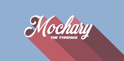 A beautiful and high-quality script font with contextual and stylistic alternates and ligatures.
 - Maxim MF by Masterfont,
$59.00 A special high contrast font with unique geometrical shapes for logos, titles, signage etc.
 - AleKoteret MF by Masterfont,
$59.00 This high readable font family is highly suitable for headlines as well as text.
 - SK Gunaydin by Salih Kizilkaya,
$9.99 SK Gunaydin is a display sans serif font family designed by Salih Kızılkaya in 2022. Thanks to its high contrast ratio, it offers high readability in all the media you need. It contains a total of 3120 glyphs, 624 glyphs in each font, and offers full support for languages using the Latin alphabet. This font family, which includes 3 different styles, classic, outline and shadow, and 5 different fonts, contains all the characters you will need in designs. You can visit the Behance prohe page for high resolution versions of the project images.
 - Solitas Contrast by insigne,
$39.00 This sleek, high contrast typeface means business, but it looks great on any project, no matter how big or small. Solitas Contrast was developed because existing high contrast sans options were neither modern nor crisp. This design challenge was solved through a series of typefaces: the original low-contrast Solitas, its serifed cousins, and now a high contrast sans—each carefully considered for an organic and free flowing look. It evokes a Dutch or european feel. Solitas Contrast is a modern, clean sans-serif with a distinctive style and impact.
 - Saphile by Craft Supply Co,
$20.00 Saphile – The Epitome of Elegant Sans Serif Elegance in Every Detail Saphile, an elegant sans serif font, stands out with its gracefully angled stem ends and terminals, coupled with high contrast, making it the perfect choice for luxurious designs. A Typeface of Luxury Saphile is more than just a font; it embodies luxury. Its sleek design and high contrast add an opulent touch to any project it graces. Tailored for Luxury Designs Designed with luxury in mind, Saphile elevates the visual appeal of high-end branding, premium packaging, and more.
 - Proteron - Unknown license

- Tuesday - Unknown license

- Fulcanelli by Illuminaut Designs,
$10.00 A clean and balanced humanist grotesque. Like many an alchemical process, this font had to be designed and redesigned from the ground up many times. Each time it blew up in the designer's face until finally the conditions and process were in perfect alignment and this new font was born.
 - Eurotypo BKL by Eurotypo,
$28.00 Eurotypo BKL is a family of fonts inspired in on one of the most beautiful British Typography ever done. This version of Baskerville tries to reflect the taste of his fine style, compatible with the bluntness of the digital present. As many other designers and foundries, our intention has been to represent the atmosphere of Baskerville's style, than simply relive the shapes of its letters. Actually, capitals fits almost to a square proportions, lowercases are more open, ascenders and descenders are shorter, offering more space for enlarge the "x" high. The beauty of his letterforms can enrich headlines; this font can also be used as body text for its good legibility and accurate kerning. John Baskerville (1706-1775) was born 1706 in Wolverley, England. He was a great typographer and printer who published a remarkable edition of Virgil in 1757. His typefaces were greatly admired by Benjamin Franklin; He also has improved and developed many innovations in printing, paper and ink production. Baskerville’s typefaces are regarded as transitional types that represents the link between Old Roman Style and Modern Roman typography.
 - Fast Rewind by Wing's Art Studio,
$20.00 Fast Rewind: A Timeless Handwritten Script Font A handwritten brush script with a versatile, relaxed and nostalgic feel. This illustrative brush script owes its inspiration to the 1950s art direction typical of mainstream magazines and book covers. A relaxed hand-lettered title was often paired with illustrations of handsome couples or escapist scenes, encouraging readers to settle into the latest gripping story from authors such as Ray Bradbury, Donald Westlake or Arthur Miller. Fast Rewind aims to repurpose this vintage look for contemporary designers with two handwritten fonts, drawn in ink and brush, and then digitally mastered to maintain those all-important human imperfections. Included are the Regular and Alternative designs, with a complete set of uppercase and lowercase characters, along with numbers, symbols and language support. Also included are a variety of underlines and illustrations as seen in these visuals. Each style also comes with its own selection of extra glyphs to helps you achieve the perfect flow between characters and avoid tell-tale repetition. Thanks to all the great photographers who provided images for these visuals.
 - Wonderworld by Mans Greback,
$69.00 Wonderworld is an antique calligraphy typeface. This medieval font brings you back to the magic times of stories about knights and kings, with thin fractur letterforms and sharp edges. Use it for a blackletter logotype or headline to give your work that genuine Middle Ages look. The Wonderworld family consists of four high-quality fonts: Regular, Italic, Bold and Bold Italic The font is built with advanced OpenType functionality and has a guaranteed top-notch quality, containing stylistic and contextual alternates, ligatures and more features; all to give you full control and customizability. It has extensive lingual support, covering all Latin-based languages, from Northern Europe to South Africa, from America to South-East Asia. It contains all characters and symbols you'll ever need, including all punctuation and numbers.
 - Linotype Nautilus by Linotype,
$29.99According to Hellmut G. Bomm "Nautilus was based on a handwritten type used for the text Li. Das Helle, Klare from the I Ging. "The intention was to create a clear, highly legible typeface. While the even strokes of sans serif types eventually tire the eyes in long texts, the marked stroke contrast of Nautilus lends the type its legibility. The characters were drawn with a broad tipped pen, and like an antiqua type, the forms of Nautilus display a variety of elements. The narrow figures with relatively large spaces between them create an overall open appearance and allow a large quantity of text to fit into a small space. "The headstrong forms of Nautilus make this an excellent display type. The italic weights are independent typefaces with hints of a handwritten character." - Crescent by TrendGFX Design Studios,
$20.00 The most sensational design of the decade is now at large. These high-definition fonts can be used for titles, banners, tattooing, logotypes and many more places. Be it domestic or industrial, formal or informal, it can be used in every field imaginable. It has a sensational, funky style and remarks the current youth's style. Such a font style has never been seen by the world, until today. These designs are 100% original and handmade. I searched a million miles but found this as the most appropriate idea for the world of font types at this time. It's the coolest, funkiest and the best font ever made. It's the era of graffiti and 3D, and we've combined both to give you CRESCENT.. So, use it, love it, buy it!
 - Deutsche Bahn AG by Linotype,
$40.99Pi fonts which had been used for the time tables of the Deutsche Bahn - Miau by Cuchi, qué tipo,
$5.95 “Miau” is a display typeface designed by “Cuchi, ¡qué Tipo”! (Hey, what a type!”). Its name comes from the onomatopoeia of "Meow" in Spanish, and it is only to be used for letters or single words. It is built from the basic skeleton of cursive script letters, and its origin and main concept is based on experimenting with shapes that play the limit of readability. Being a variable format typeface, we have from the thinnest and lightest version ("Hiss"), to the thickest, dense and compact ("Purr"), passing through the average ("meow"). The final result of this experimentation is defined into a very contemporary typeface with a geometric, modular and “no-terrestrial” flavour. It aims to be a representation of the times we live about typographic design, a whole explosion of implausible experiments and formals researches.
 - Du by sugargliderz,
$20.00 Du is a self hommage to Uncertain Felttip. Uncertain, made in 2008, is a typeface which reproduced faithfully the style in which I am writing on copy paper, usually using the felt-tip pen. This time, I wrote the new family by the same method but using the tablet PC and the touch pen. Although, as for some characters, Uncertain differs in a form, it is the result of reflecting my hand writing. I wrote all the characters. If it is original, all the characters diverted and composed, for example, characters, such as Aacute and Agrave, are written. Different specification from Uncertain is family composition. Although Uncertain had only 3 weight, 7 weight were designed for Du. This way a user can choose his favorite weight because the variation of weights increased.
 - Astralaga by SG Type,
$19.00 Elegant, graceful, and timeless. Astralaga is a versatile font family with a timeless, classic appeal, over 50 alternates & ligatures and multilingual support. Every letter has been hand-drawn and crafted with the upmost care. The variety of weights provide a range of choices that will help you find the best typographic character for your project. All 5 weights are well-suited for large display uses and high impact headlines. The available stylistic alternates and ligatures offer a number of different options that give your project a unique look. This high contrast serif typeface features a total of 1850 glyphs and offers comprehensive language support. THE 5 WEIGHTS OF ASTRALAGA Astralaga Light – very delicate and elegant Astralaga Regular – a classic beauty with gorgeous shapes Astralaga Medium – a great midground between lights and bolds Astralaga Semibold – high contrast and high impact Astralaga Bold – pure boldness and elegance FEATURES 5 weights High contrast 40 ligatures per weight 11 alternate glyphs per weight 1850 glyphs Comprehensive language support OpenType features: Access All Alternates, Discretionary Ligatures, Fractions, Kerning, Standard Ligatures, Stylistic Alternates, Stylistic Set 1, Superscript
 - Kandel 205 by Talbot Type,
$19.50 Kandel 205 is a geometric, tri-line, display and headline font available in a family of three weights. Its bold, graphic styling gives it great stand-out qualities and a highly individual look. It’s particularly well suited to bringing energy to designs, or for designs with a sporting theme. It’s also available with character variations as Kandel 105 .
 - Urban Vibe by DainType,
$15.00 We tried to implement graffiti that is common in our city. Everyone wants to express themselves. Whether in writing, painting on canvas or on the street, everything must be respected as art. It can be useful when you want to express graffiti art, but also consider readability. You can also work easily with three color fonts.
 - Devama SRF by Stella Roberts Fonts,
$25.00 Devama SRF was designed by Typodermic's Ray Larabie and provided for Stella Roberts Fonts. Available in Regular, Backlash and Forward, this typeface evokes a retro-80s look while still remaining clean and fresh. The net profits from my font sales help defer medical expenses for my siblings, who both suffer with Cystic Fibrosis and diabetes. Thank you.
 - Theater Lights JNL by Jeff Levine,
$29.00 Vintage sheet music for the title song from the film "Forty Second Street" was the inspiration for Theater Lights JNL. While the idea of letters comprised of circles (to simulate bulbs) can be both vintage [as in marquee lights] or modern [simulating dot matrix printers], it is always a fun approach to a tried-and-true style.
 - Fd Twist by Fortunes Co,
$9.00 The Twist font is a bold typeface with a playful appearance. I tried to combine 2 fonts inspired by TV broadcasts, mid-century storybooks. It is suitable for broadcast, labels, logos, magazines, clothing and other commercial purposes. You can choose from three styles, regular, round, and rough, so you can get the retro/modern look you want
 - Mouse Paw by Alexander Sharkov,
$5.00 My home mouse, Hector, drew this wonderful font for kids. He tried very hard and hopes that you will like the result of his work! This font is perfect for advertising various children's brands, decorating children's books, and generally any children's projects! Hector and I believe that the font Mouse Paw will help you in any business.
 - Buro by Corentin Noyer,
$34.00 The Buro is a text font, monospace, sans-serif with rounded endings. It is characterized by its monolinear outline (slight optical corrections) and its discontinuous Roman structure. He tries to reproduce the outline of a letter drawn with a pen. The design of the Buro is inspired by the cursive letters used in Olympia typewriters of the 1950s.
 - Kandel 105 by Talbot Type,
$19.50 Kandel 105 is a geometric, tri-line, display and headline font available in a family of three weights. Its bold, graphic styling gives it great stand-out qualities and a highly individual look. It’s particularly well suited to bringing energy to designs, or for designs with a sporting theme. It’s also available with character variations as Kandel 205 .


