10,000 search results
(0.015 seconds)
- High Hopes by Ana's Fonts,
$15.00 High Hopes is a quirky handmade serif font with variations that show up "randomly" through contextual alternates, true italics and ornaments. Use this font in designs such as postcards and notes, posters, logotypes, social media posts, branding and packaging. High Hopes includes: Regular font with three contextual alternates for each letter Italic font with three contextual alternates for each letter Ornaments font with swashes and frames
 - Stone Hinge by Typadelic,
$- - High Beasty by Figuree Studio,
$23.00 High Beasty is an extremely-strong bold script that comes from hand scratches to get natural writing. With the main style of the hand-lettering script and detailing effect. High Beasty is very suitable for use in various media such as; packaging, logos, labels, posters, shirt designs, wisdom quotes, bulletins, typography, and many other media, especially with retro or vintage look. Features: PUA Encoded open Support for MAC or PC Simple installation for Adobe Illustrator, Corel Draw, Photoshop, or Procreate (New Updated) Support Multilanguage That's it! If you have any questions don't hesitate to ask! Stay Classy! Figuree Studio
 - High Dreaming by Haksen,
$15.00 High Dreaming is a stylish modern and natural handwritten script font with casual chic flair. It is perfect for branding, wedding invites and cards, and maybe for red wine label. High Dreaming includes full set of gorgeous uppercase and lowercase letters, numerals, a large range of punctuation and ligatures. All lowercase letters of High Dreaming Regular include ending swashes, giving realistic hand-lettered style. What you get? You will get: High Dreaming OTF High Dreaming Alternate OTF In order to use the beautiful swashes, you need a program that supports OpenType features such as Adobe Illustrator CS, Adobe Photoshop CC, Adobe Indesign and Corel Draw. but if your software doesn't have Glyphs panel, you can install additional swashes font files: Thanks and have a great day, Haksen
 - High Tea by Hanoded,
$15.00 High Tea is a handmade typeface, which was inspired by a 1930's menu from a classy restaurant. High Tea is a classy font, with some unique letters and an overall 'Upper Crust' feel to it. It is ideal for headlines and posters. Care for a spot of milk in your Oolong, darling?
 - Blue Rays - Personal use only

- Mai Tai - Unknown license

- Katsuji Tai by Kerry Colpus Designs,
$25.00 Katsuji tai means typeface in Japanese. The font was created by taking Japanese letters and manipulated them to look like english letters.
 - Tri-Font by Greiner grafik,
$54.24 By the arrangement of single triangles Tri-Font gets a folded, handmade, geometric and modern effect. Tri-Font is perfectly suitable for use in anything from guidance systems to signage and was made for optimal readability both on screen and in print. The font family consists of a total of 350 glyphs and contains the font styles Triangle // Outline // Body. In Deutsch Die Tri-Font bekommt durch die Anordnung einzelner Dreiecke eine gefaltete, handwerkliche, geometrische und moderne Wirkung. Tri-Font eignet sich wunderbar für den Einsatz in Leit- und Orientierungssystemen. In der Displayanwendung wie auch im Printbereich ist sie angenehm zu lesen. Die Schriftfamilie besteht insgesamt aus 350 Glyphs und beinhaltet die Schriftschnitte Triangle // Outline // Body.
 - Ray Brooks by Maulana Creative,
$13.00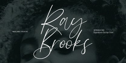 Ray Brooks is an expressive modern signature script font. With light high contrast stroke, fun character. To give you an extra creative work. Ray Brooks font support multilingual more than 100+ language. This font is good for logo design, Social media, Movie Titles, Books Titles, a short text even a long text letter and good for your secondary text font with sans or serif. Make a stunning work with Ray Brooks font. Cheers, Maulana Creative
 - Ray Harts by Maulana Creative,
$12.00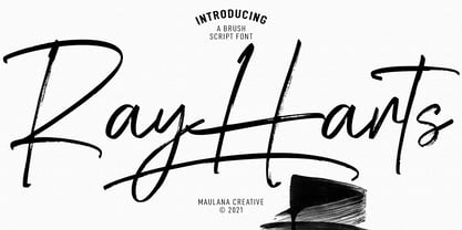 Converon is a decorative cubical display font. With bold sharp edges stroke, fun character with a bit of ligatures. To give you an extra creative work. Converon font support multilingual more than 100+ language. This font is good for logo design, Social media, Movie Titles, Books Titles, a short text even a long text letter and good for your secondary text font with sans or serif. Make a stunning work with Converon font. Cheers, MaulanaCreative
 - Altemus Rays by Altemus Creative,
$11.00 A collection of 174 ray sunray and corner ray designs.
 - Ray Johnson by K-Type,
$20.00 The Ray Johnson font was inspired by the Father of Mail Art. It's based on the block lettering style used by Ray to add the names of his correspondents to their bunny head portraits (the film How to Draw a Bunny is a superb introduction). The font includes blank bunny heads and other Ray Johnson graphics as scalable vector images, and separate bitmap images are also provided as jpegs and gifs.
 - Moon Rays by Epiclinez,
$18.00 Moon Rays is a bold and playful display font, suitable for all children's designs, product packaging, stationary art, apparel designs, and more fun and creative ideas! So what's included: Basic Latin A-Z & a-z. Numbers, symbols, and punctuations Multilingual Support. Accented Characters : ÀÁÂÃÄÅÆÇÈÉÊËÌÍÎÏÑÒÓÔÕÖØŒŠÙÚÛÜŸÝŽàáâãäåæçèéêëìíîïñòóôõöøœšùúûüýÿžß Thank You.
 - Man Ray by Andinistas,
$29.00 ManRay is a photogenic typefamily of 6 fonts designed by @andinistas, with more than 2600 glyphs distributed in 3 Scripts and 3 Caps. Its shapes are ideal for attention-grabbing and for its eloquent character set, each style is presented with three levels of erosion planned with meticulous dotted texture bézier drawing, diagonal texture, and vertical texture pattern. ManRay Script, Script2, Script3 is based on calligraphy made with a fine tip brush and therefore communicates pleasant and attractive ideas. Its capital letters measure three times the height of the lower case and stand out for its artistic curved lines ideal for writing on photos, logos, labels, packaging, posters, covers of food products, spirits, organic teas, etc. In that order, it also offers other expressive alternate letters that activate spontaneously, and each of the three styles is case-infinite with and without Swash, Stylistic, and Titling Alternates. ManRay Caps, Caps2, Caps3 are inspired by calligraphic Roman letters drawn with a brush with a square tip and are equipped with descending flourishes for word start and end. The core of ManRay mixes the ideas of Ed Benguiat and Ross F. George and its name is a tribute to the Dada hero who changed history a century ago by working against the conventions of art and photography.
 - Tai Qin by ComGlyph,
$60.00 TaiQin is inspired by Chinese calligraphy to design both English and Thai typefaces. It offers 4 basic weights and a variable font. In addition, I have also designed alternatives for certain Thai glyphs.
 - Death Ray by AquaType,
$- A typeface to be reckoned with. It's sharp lines and unruly angles are perfect for concert posters, blackmail, and wedding invitations. Keep punk alive and support your local electro goth band by using Death Ray. Available in only uppercase because all messages that merit Death Ray's use must command that sort of attention. And who said type shouldn't be expressive.
 - Fujita Ray - Personal use only

- Bim - Personal use only

- Tips by Linotype,
$29.00The symbol family Tips, (which stands for “Type-Image-Piktogramm-Schrift” in German, or type-image-pictogram-font in English) contains six different fonts of pictograms and stylized icons. Tips Active is full of sports pictograms, which are similar to those that were designed for the 1972 Olympic Games in Munich. Tips Astro contains astrological signs. Tips BCom depicts icons for use in business communication or web design. Tips Count is a font featuring numbers inside of various circles. Tips This Way and Tips Travel are both collections of pictograms for use in navigation and other signage systems. - Tip by Suomi,
$40.00 New, slightly calligraphic sans family with seven weights, Roman and Italic, all with Old Style Numerals and Small Caps, for both headlines and body text use.
 - Zim by Scholtz Fonts,
$19.00 Zim is a bold, earthy font, named for the Great Zimbambwe ruins (a World Heritage site). Its solid silhouette represents the timelessness of this ancient structure. The font is very readable, and its bold, rugged shape make it ideal for display purposes, for posters and headlines. Fully professional, it contains a complete set of 255 characters — Upper and Lower case, all numerals, punctuation, symbols and accented characters. It is suitable for layout work in all major European languages — Spanish, Portuguese, German, French, Swedish and Italian (to name a few). The characters are spaced for readability and have been carefully kerned.
 - Times by Linotype,
$40.99In 1931, The Times of London commissioned a new text type design from Stanley Morison and the Monotype Corporation, after Morison had written an article criticizing The Times for being badly printed and typographically behind the times. The new design was supervised by Stanley Morison and drawn by Victor Lardent, an artist from the advertising department of The Times. Morison used an older typeface, Plantin, as the basis for his design, but made revisions for legibility and economy of space (always important concerns for newspapers). As the old type used by the newspaper had been called Times Old Roman," Morison's revision became "Times New Roman." The Times of London debuted the new typeface in October 1932, and after one year the design was released for commercial sale. The Linotype version, called simply "Times," was optimized for line-casting technology, though the differences in the basic design are subtle. The typeface was very successful for the Times of London, which used a higher grade of newsprint than most newspapers. The better, whiter paper enhanced the new typeface's high degree of contrast and sharp serifs, and created a sparkling, modern look. In 1972, Walter Tracy designed Times Europa for The Times of London. This was a sturdier version, and it was needed to hold up to the newest demands of newspaper printing: faster presses and cheaper paper. In the United States, the Times font family has enjoyed popularity as a magazine and book type since the 1940s. Times continues to be very popular around the world because of its versatility and readability. And because it is a standard font on most computers and digital printers, it has become universally familiar as the office workhorse. Times™, Times™ Europa, and Times New Roman™ are sure bets for proposals, annual reports, office correspondence, magazines, and newspapers. Linotype offers many versions of this font: Times™ is the universal version of Times, used formerly as the matrices for the Linotype hot metal line-casting machines. The basic four weights of roman, italic, bold and bold italic are standard fonts on most printers. There are also small caps, Old style Figures, phonetic characters, and Central European characters. Times™ Ten is the version specially designed for smaller text (12 point and below); its characters are wider and the hairlines are a little stronger. Times Ten has many weights for Latin typography, as well as several weights for Central European, Cyrillic, and Greek typesetting. Times™ Eighteen is the headline version, ideal for point sizes of 18 and larger. The characters are subtly condensed and the hairlines are finer. Times™ Europa is the Walter Tracy re-design of 1972, its sturdier characters and open counterspaces maintain readability in rougher printing conditions. Times New Roman™ is the historic font version first drawn by Victor Lardent and Stanley Morison for the Monotype hot metal caster." - Tim Sale Brush by Comicraft,
$19.00 These handletterered brush fonts were created by Tim Sale and fontmeister JG Roshell for our bestselling book, TIM SALE: BLACK AND WHITE!
 - Xray Ted [skew] - Unknown license

- Avenir Next Thai by Linotype,
$79.00 Avenir Next Pro is a new take on a classic face—it’s the result of a project whose goal was to take a beautifully designed sans and update it so that its technical standards surpass the status quo, leaving us with a truly superior sans family. This family is not only an update though; in fact it is the expansion of the original concept that takes the Avenir Next design to the next level. In addition to the standard styles ranging from ultralight to heavy, this 32-font collection offers condensed faces that rival any other sans on the market in on and off—screen readability at any size alongside heavy weights that would make excellent display faces in their own right and have the ability to pair well with so many contemporary serif body types. Overall, the family’s design is clean, straightforward and works brilliantly for blocks of copy and headlines alike. Akira Kobayashi worked alongside Avenir’s esteemed creator Adrian Frutiger to bring Avenir Next Pro to life. It was Akira’s ability to bring his own finesse and ideas for expansion into the project while remaining true to Frutiger’s original intent, that makes this not just a modern typeface, but one ahead of its time. Avenir Next Variables are font files which are featuring two axis, weight and width. They have a preset instance from UltraLight to Heavy and Condensed to Roman width. The preset instances are: Condensed UltraLight, Condensed UltraLight Italic, Condensed Thin, Condensed Thin Italic, Condensed Light, Condensed Light Italic, Condensed, Condensed Italic, Condensed Demi, Condensed Demi Italic, Condensed Medium, Condensed Medium Italic, Condensed Bold, Condensed Bold Italic, Condensed Heavy, Condensed Heavy Italic, UltraLight, UltraLight Italic, Thin, Thin Italic, Light, Light Italic, Regular, Italic, Demi, Demi Italic, Medium, Medium Italic, Bold, Bold Italic, Heavy, Heavy Italic.
 - Passenger Train JNL by Jeff Levine,
$29.00 A 1940s travel poster for the Florida East Coast Railway (which then carried passengers but is now a freight line) had the railroad’s name hand lettered in a bold Art Deco sans. This inspired Passenger Train JNL, which is available in both regular and oblique versions.
 - Rebel Train Goes by Dharma Type,
$14.95 Based on retro vinyl records in the middle of 20th century. There are three other fonts designed by in the same concept. -Word From Radio -African Elephant Trunk -Moon Star Soul -Rebel Train Goes
 - Mule Train JNL by Jeff Levine,
$29.00 Instead of being directly based on classic wood or metal type examples, Mule Train JNL takes a roundabout route in its development. Images of a set of letters and numbers cut from plywood (which in turn were based on a vintage type design) served as the work models. Mule Train JNL is available in both regular and oblique versions.
 - Greycliff Thai CF by Connary Fagen,
$35.00 Greycliff Thai CF adapts Greycliff's popular soft, geometric design to the Thai script. Both Latin and Thai scripts are included, allowing for visually cohesive multiple-script applications. Greycliff Thai CF includes nine weights, obliques, and full Thai diacritics. Greycliff Thai CF works as a complete, self-contained type system, with both Latin and Thai scripts included and designed to compliment one another. All typefaces from Connary Fagen include free updates, new features, and free technical support.
 - Nimbus Sans Thai by URW Type Foundry,
$49.99 The Nimbus Sans Thai has been designed contemporarily and fittingly to the Latin Nimbus Sans family. It includes four upright and three cursive styles and the necessary OTF language features. Nimbus Sans Thai also covers the full Latin character range. Both scripts are perfectly combinable. Nimbus Sans is one of the best supported and most favored URW fonts ever. It is available as a Global Font in 4 weights and contains up to 65.000 characters per font.
 - Training Film JNL by Jeff Levine,
$29.00 The title card “Airplane Hydraulic Brakes” in the beginning of a WWII armed services training film had the words "hydraulic brakes" hand lettered in an Art Deco slab serif style. This served as the model for Training Film JNL, which is available in both regular and oblique versions.
 - Trail Boss JNL by Jeff Levine,
$29.00 Trail Boss JNL emulates vintage wood type and was inspired by a few visual examples found online. The erratic widths of the letters are part of the intrinsic charm of this kind of lettering.
 - Old Trail JNL by Jeff Levine,
$29.00 An image of an antique metal marking stencil [circa late 1890s or early 1900s] reading “Folck’s Roller Mills #196 New Surprise manufactured by Wolfe Brothers, Cumberland, MD” had the words “New Surprise” rendered in a Western/Victorian typeface. Those letters served as the model for Old Trail JNL, which is available in both regular and oblique versions.
 - Train Of Thought by Pesic,
$29.00 Train of thought is a decorative font based on vintage and retro posters of the 19th and 20th centuries. Contains all Latin and Cyrillic glyphs. It is very modern, and it is intended for the use of creating logos and T-shirt designs as well as highlighting the essential elements on billboards, magazines, etc. Today's digital designers can use these stencil patterns to embellish text set in other alphabet stencils or by themselves to evoke the feeling of rustic Americana. Train of the thought is extremely detailed, and looks good in both small and large dimensions. It also contains a set of symbols, which you can use to further emphasize the essential elements.
 - Overland Trail JNL by Jeff Levine,
$29.00 Overland Trail JNL is Jeff Levine Fonts’ interpretation of “Italian”, first introduced in 1821 by the Caslon & Catherwood Type Foundry. Unique and somewhat similar to Faux Pas JNL with its eccentric stroke weights (opposite what is considered normal for serif fonts), the typeface features a design most associated with the Old West. Overland Trail JNL is available in both regular and oblique versions.
 - Neue Frutiger Thai by Linotype,
$79.00 Neue Frutiger Thai was created by Anuthin Wongsunkakon and a team of designers and font engineers from the Monotype Studio, under the direction of Monotype type director Akira Kobayashi. The family is available in 10 weights from Ultra Light to Extra Black in both Traditional (loop terminals) and Modern (loop-less terminals) styles. Neue Frutiger Thai embodies the same warmth and clarity as Adrian Frutiger's original design, but allows brands to maintain their visual identity, and communicate with a consistent tone of voice, regardless of the language. It is part of the Neue Frutiger World collection, offering linguistic versatility across environments – suited to branding and corporate identity, advertising, signage, wayfinding, print, and digital environments.
 - Cattle Trail JNL by Jeff Levine,
$29.00 Modeled after an image of an almost complete set of Latin Condensed wood type, Cattle Trail JNL is available in both regular and oblique versions.
 - Western Trail JNL by Jeff Levine,
$29.00 For decades, Samuel Welo’s “Studio Handbook for Artists and Advertisers” was a source of inspiration for sign painters, graphic artists and designers. In later years, many digital revivals of Welo’s hand lettered typography have been made available. Western Trail JNL is the latest member of such digital fonts, and is available in both regular and oblique versions.
 - Neue Helvetica Thai by Linotype,
$149.00Neue Helvetica® is a melding of aesthetic and technical refinements that result in superior design proportions, improved legibility and an expanded range of uses beyond the original Helvetica typefaces Neue Helvetica World fonts enable the setting of pan-European languages, in addition to Arabic, Armenian, Cyrillic, Georgian, Greek, Hebrew, Thai and Vietnamese. The Cyrillic fonts include full support of the Unicode block, including characters for Bulgarian, Mazedonian, Serbian and Ukrainian. Other Monotype global fonts can be paired with Neue Helvetica World to create a more comprehensive global typographic solution. A few examples follow: Devanagari: Saral Devanagari Japanese: Tazugane Gothic or Yu Gothic Korean: YD Gothic 100 or YD Gothic 700 Simplified Chinese: M Ying Hei PRC or M Hei PRC Traditional Chinese: M Ying HK or M Hei HK Click here to download a brochure with more information on Neue Helvetica World.


