10,000 search results
(0.036 seconds)
- Fairy Heart by Namara Creative Studio,
$9.00 Cute and lovely display font that comes with a unique style to make it suitable for any purpose, such as handicrafts, product packaging, quotes, product design, craftsmen, labels or any other projects which need a playful and lovely touch.
 - Fiendstar by AVP,
$29.00Initially created as a less quirky alternative to GillSans Schoolbook, Fiendstar has been developed into a family of widths, weights and styles. High legibility makes it suitable for signs and school books, especially for readers with poor reading ability. - Old Fat Boy by Gleb Guralnyk,
$14.00 Hello! Introducing a creative all caps font named Old Fat Boy. It's a vintage shape smooth typeface with authentique 90's style look. This font includes lots of multilingual characters (check out a screenshot with available letters and signs).
 - HU BlueoceanKR by Heummdesign,
$25.00 This is a headline typeface created by imagining the appearance of waves in a square glass tube. It is a typeface that adds a wave shape to the gothic style in a full square module. HU BlueoceanKR includes Korean.
 - Leshy by ParaType,
$25.00An original volume decorative typeface that imitates broken stones. It was inspired by graffiti letterforms. Solid and inverted styles are available. Designed by Fedor Saveliev and Olga Ryabihina in 2003 and licensed by ParaType. For use in display typography. - Cool Sensation by Arendxstudio,
$13.00 Cool Sensation - Graffiti Font is a free style font that has the characteristics of street art that shows freedom and is filled with unique characters Features : • Character Set A-Z • Numerals & Punctuations (OpenType Standard) • Accents (Multilingual characters) • Ligature • Alternate
 - Funky Star by Arendxstudio,
$13.00 Funky Star - Graffiti Font is a free style font that has the characteristics of street art that shows freedom and is filled with unique characters Features : • Character Set A-Z • Numerals & Punctuations (OpenType Standard) • Accents (Multilingual characters) • Ligature • Alternate
 - Retorica by Type-Ø-Tones,
$40.00 Retorica, by Enric Jardí. With its simple geometry, Retorica stands out as our Art Déco typeface. Retorica has two styles: one solid version and one hollowed. In addition, each one has a Small Caps set, available by OT features.
 - Star Blast by Blankids,
$19.00 Introducing of our new product the name is Star Blast a Playful Cartoon Font, Star Blast inspired by playful style with a fun theme very good for kids theme design. FEATURES : Uppercase Lowercase Number Punctuation Multilingual PUA Encode Opentype
 - Sometype Mono by Dharma Type,
$- Sometype Mono is a free monospaced font family for coding and tabular layout which can be used for commercial purpose for free. So far, Sometype Mono consists of 6 style. Regular, Italic, Medium, Medium Italic, Bold and Bold Italic.
 - Lyu Lin by Stefan Stoychev,
$25.88 LyuLin is a modern sans-serif font and contains 24 styles. Available in 6 weights and its italics and condensed forms. LyuLin Heavy Italic weight and LyuLin Light Condensed are free, so you can use them for your projects.
 - Easter Gift by Sakha Design,
$14.00 Easter Gift is a fun and playful display font. It has a cute style and great readability. It’s perfect for cards, branding, stationery, blog design, custom art, quote, custom stamps, custom embossers, book, apparel, packaging, headline, or much more!
 - Birka by Linotype,
$29.99Birka is the first typeface I designed from scratch. It took a whole year of my weekend and evening hours and is the typeface that teached me everything I know about type design. It is easy too see that I had Garamond in mind when drawing it. Birka is beautiful" was the comment of the well known Swedish designer Bo Berndal when he first saw it. That comment gave me the courage to design more and more typefaces. In a Danish article about Scandinavian type design, Birka was taken as example of a typical Swedishness in typography. I am not sure what the writer had in mind, but it surely sounded well. Birka has its name from the ancient Viking town Birka, whose remains are found not far away from Stockholm. Birka was released in 1992." - Linotype Aspect by Linotype,
$29.99The letters in the Linotype Aspect Family fonts seem to be experiments in the handcrafting of letters with just a few basic geometric forms. For instance, the bowls of the letters C, D, and G in Linotype Aspect Intro are all made up of narrow half circles. Features like this make Linotype Aspect Intro perfectly suited for headlines and short passages of text. Its quirkiness is sure to lend a smile to the faces of your readers. For shorter headlines with larger point sizes, try setting your text in Linotype Aspect Regular, the second member of the Linotype Aspect family. Linotype Aspect Regular uses the same basic letterforms as Linotype Aspect Intro, but reverses them out in white, and places them over bulbous black shapes. The Linotype Aspect family was developed by German designs Hans-Jürgen Ellenberger in 1999. - Slm by Antiochus,
$30.00 We produce original printing press letter fonts, for example from the journal Southern Literary Messenger (circa 1830 - 1870). The only one in the world. What makes our fonts so attractive to the eye, are the myriad imperfections. It's not an approximation to the printing-press letters--- these are the actual letters, complete with all their manifold differences. If you look closely you will notice that the letter 'e' say, each time it is printed, is slightly different. These differences arise from the mechanical action of the inked-wooden press on the paper, and cannot be faked by artificial means. The eye subconsciously picks up this text as the actual printing press letters. Edgar Allan Poe published many of his great works in the Southern Literary Messenger, as did many other great nineteenth century writers, ie. Henry Wadsworth Longfellow, Nathaniel Hawthorne &c.
 - Acton by Device,
$29.00 Acton is a deceptively simple, grid-based design. Though derived from a 2 by 3 arrangement of blocks, it uses white spaces to allow for more complex shapes – for example as the R – where the underlying 3 by 5 arrangement is apparent. It also departs from this strict grid-based logic for characters such as the the T, L, f and r, whose cross-bars are shorter than they would otherwise be in order to promote optical evenness. No elegant solution could be found for the V, which in geometric fonts can appear very similar to the U, lacking as it does the cross-bar that can differentiate a square A from the capital form of the n. However, the resultant diagonal retroactively proved useful on the lower-case e and a, characters that otherwise would have more uninteresting design solutions.
 - Patzcuaro by Storm Type Foundry,
$28.00Patzcuaro is a summer resort by a lake of the same name. It is situated 370 km west of Ciudad de Mexico and a visitor from Europe, on seeing it, will be reminded of the Austrian Rust or the South Bohemian Trebon. The town's colonial architecture is protected as a historical monument, the reddish-brown tint of the footings of the buildings, their white facades and even the type of lettering with red initials is prescribed - and these regulations are also complied with as far as cars are concerned. This colour scheme is splendid in combination with the rich gamut of greys of the stone window jambs, vaults, lintels and pillars. Joking apart, even the local petrol station is 16th-century in appearance. Patzcuaro Regular is a cosy, welcoming type face which is good for use on labels. - Gerig by Twinletter,
$18.00 Gerig is a unique, stylish, and fun font that is unlike most other fonts. Having an anatomical shape between thin and thick lines makes it beautiful and visually unique from most other fonts make your project more stunning by adding this font. It is a font that every designer, writer, and programmer should have in their library. because this font is unique, stylish, and fun. Cool ligature and alternative fonts help add a unique flair to your project. Make the most of your designs by using this font today. What’s Included : Standard glyphs Iso Latin 1 Simple installations We highly recommend using a program that supports OpenType features and Glyphs panels like many Adobe apps and Corel Draw, so you can see and access all Glyph variations. PUA Encoded Characters – Fully accessible without additional design software. Fonts include Multilingual support
 - Valenteena by Ingrimayne Type,
$9.95 Valenteena is in the spirit of the 19th century, but there are no other typefaces quite like it. It is geometric, using distorted hearts to form the letters. The lower-case letters are smaller versions of the upper-case letters. The overlay variant is derived by breaking ValentinaContour into its parts: the inner letter, the white inner border, and the black outer border. To use them one must have a program that allows layers of letters. Type in and format the inside variant to get the message you want. Also select the color you want this layer to have. Copy this layer twice, formatting one to the medium and and the other to outside. Color each of them in the colors you want and them combine the three layers, placing them so the letters exactly align. You will get letters with three colors.
 - Lamar Pen by Three Islands Press,
$39.00 Mirabeau Buonaparte Lamar had an exotic name for a historic Texan, but he left his mark beginning in 1836, the year of Texas independence and the first year that pioneers other than mountain men made their way West. Lamar went on to become the young republic’s first elected vice-president (to President Houston) and second president -- and to author a number of interesting letters in his elegant, stylish hand. (Mirabeau B. Lamar grew up a well-to-do southerner from Georgia, and his penmanship shows it.) One of the most interesting aspects of designing old handwriting fonts, to me, is pausing to reflect on the actual moment that the letter-writer is sitting at his or her desk or table, pen in hand, putting thoughts to words -- 150 to 200 years ago. Has a complete character set, and plenty more.
 - Escritura by Vanarchiv,
$30.00 The handwriting typeface Escritura was created for editorial purposes and the letter forms are influenced by chancery handwriting from the Italian Renaissance. The asymmetrical shapes of the undulating serifs cause the characters to have a large aperture. Originally designed for display sizes, the typeface also comes in a text version for small sizes. With taller vertical proportions, the text version has slightly longer serifs and increased white space between the characters to optimize legibility in small sizes. Ascenders and descenders and serifs are shorter in the display version, which has more economical letter spacing resulting in a visually compact text image. The stress in the letter strokes create changing widths according to their direction, improving the calligraphic rhythm in the characters. The oblique crossbar as well as other typographic details lend the typeface that typical Renaissance atmosphere.
 - Quinella by Eclectotype,
$40.00 Plumper than a misguided Z-lister's dodgy lip job, this is Quinella, named after the cheffy scoops of ice cream and the like, quinelles. It's a cute, fat script with a seventies vibe but a personality all of its own. It's non-connecting in the usual sense, but the letters overlap to make the white space as tiny as possible. Ligatures (standard and discretionary) make smoother solutions for quite a few pairs and trios, and every upper case letter has a more exuberant swash alternate. The contextual alternates feature substitutes in an alternate t for a better fit with certain letters. Fonts don't come much more voluptuous than this. The full-fat, creamy appearance makes it perfect for food packaging, but don't let it end there; it'll make memorable logos, unmissable headlines, and posters with more punch.
 - Smarty Pants by Burghal Design,
$29.00Remember that kid in your class who always knew the right answer, who always had their hand raised? The first kid to finish the test, the kid who LIKED the pop quiz, the kid who did the homework five seconds after the teacher wrote the assignment on the board and was guaranteed to get an an A+, even though they NEVER studied? THAT kid? Burghal Design has a font that both remembers and salutes that kid, that teacher's pet, that know-it-all: SmartyPants. SmartyPants comes in regular, bold, and because bold just isn't bold enough for SmartyPants, super bold. There's also SmartyPants Doodles, with 90 pictures of SmartyPants stuff (such as a safety pin, a doghouse, an inkwell, and even a couple of cooties), and SmartyPants Snowflakes, with a whopping 182 dingbats to choose from. - Bell MT by Monotype,
$39.00 Monotype’s hot metal Bell series from 1931 was based on original types made by the punchcutter Richard Austin for the foundry of John Bell in the 1780s. The different sizes of Monotype’s series were not all based on the same model. As type historian James Mosley wrote on Typophile, “For 18 point and above (the metal type was cut in sizes up to 36 point) Monotype’s model was a larger type [than the model used for the text sizes], the ‘Great Primer’ cut by Austin. This has greater contrast in the capitals and a flat foot to letter a.” The digital Bell closely follows the design of the hot metal 18pt version, and is therefore somewhat lighter in color than the text sizes of Monotype’s original metal face. James Mosley’s Typophile article can be found here.
 - Architype Stedelijk by The Foundry,
$99.00 Architype Crouwel is a collection of typefaces created in collaboration with Wim Crouwel, following his agreement with The Foundry, to recreate his experimental alphabets as digital fonts. Crouwel's most recognized work was for the Van Abbe and Stedelijk museums (1954 –72) where he established his reputation for radical, grid-based design. Stedelijk first appeared in the seminal Vormgevers poster, commissioned by the Stedelijk Museum, Amsterdam in 1968. Crouwel created a rigid grid system across the poster of 57 vertical by 41 horizontal lines, also forming the basis for the construction of the letterforms. Although all hand drawn, the resulting typeface had a machine-made appearance. This striking black and white poster with its visible grid became one of Crouwel's most iconic designs. Architype Stedelijk now re-creates these letterforms as a single alphabet typeface in a digital font.
 - Zebramatic by Harald Geisler,
$14.99 Zebramatic - A Lettering Safari Zebramatic is a font for editorial design use, to create headlines and titles in eye-catching stripes. Constructed to offer flexible and a variety of graphical possibilities, Zebramatic type is easy to use. The font is offered in three styles: POW, SLAM and WHAM. These styles work both as ready-made fonts and as patterns to create unique, individualized type. The font design’s full potential is unleashed by layering glyphs from two or all three styles in different colors or shades. Working with the different styles I was reminded of the late Jackson Pollock poured paintings—in particular the documentation of his painting process by Hanz Namuth and Paul Falkernburg in the film Jackson Pollock 51. In Pollock’s pictures the complex allure arises from how he layered the poured and dripped paint onto the canvas. Similar joyful experience and exciting results emerge by layering the different styles of Zebramatic type. Texture In the heart of the Design is Zebramatics unique texture. It is based on an analog distorted stripe pattern. The distortion is applied to a grade that makes the pattern complex but still consistent and legible. You can view some of the initial stripe patterns in the background of examples in the Gallery. Zebramatic POW, SLAM and WHAM each offer a distinct pallet of stripes—a unique zebra hide. POW and WHAM use different distortions of the same line width. SLAM is cut from a wider pattern with thicker stripes. The letter cut and kerning is consistent throughout styles. Design Concept Attention-grabbing textured or weathered fonts are ideal for headlines, ads, magazines and posters. In these situations rugged individuality, letter flow, and outline features are magnified and exposed. Textured fonts also immediately raise the design questions of how to create alignment across a word and deal with repeated letters. Zebramatic was conceived as an especially flexible font, one that could be used conveniently in a single style or by superimposing, interchanging and layering styles to create a unique type. The different styles are completely interchangeable (identical metrics and kerning). This architecture gives the typographer the freedom to decide which form or forms fit best to the specific project. Alignment and repetition were special concerns in the design process. The striped patterns in Zebramatic are carefully conceived to align horizontally but not to match. Matching patterns would create strong letter-pairs that would “stick out” of the word. For example, take the problematic word “stuff”. If Zebramatic aligned alphabetically, the texture of S T and U would align perfectly. The repeated F is also a problem. Imagine a headline that says »LOOK HERE«. If the letters OO and EE have copied »unique« glyphs - the headline suggests mass production, perhaps even that the designer does not care. Some OpenType features can work automatically around such disenchanting situations by accessing different glyphs from the extended glyph-table. However these automations are also repeated; the generated solutions become patterns themselves. Flip and stack To master the situation described above, Zebramatic offers a different programmatic practice. To eliminate alphabetic alignment, the letters in Zebramatic are developed individually. To avoid repetition, the designer can flip between the three styles (POW, SLAM, WHAM) providing three choices per glyph. Stacking layers in different sequences provides theoretical 27 (3*3*3) unique letterforms. A last variable to play with is color (i.e. red, blue, black). Images illustrating the layering potential of Zebramatic are provided in the Gallery. The design is robust and convenient. The font is easily operated through the main font panel (vs. the hidden sub-sub-menu for OpenType related features). The process of accessing different glyphs is also applicable in programs that do not support OpenType extensively (i.e. Word or older Versions of Illustrator). International Specs Zebramatic is ready for your international typographic safari. The font contains an international character set and additional symbols – useful in editorial and graphic design. The font comes in OpenType PostScript flavored and TrueType Format.
 - TT Nooks by TypeType,
$39.00 TT Nooks useful links: Specimen | Graphic presentation | Customization options TT Nooks is an experimental font family that includes a high contrast serif, TT Nooks, and an upright italic, TT Nooks Script. Despite the difference in style, both subfamilies get along well, which is partially thanks to their similar proportions. Each of the subfamilies includes 4 weights: Light, Regular, Bold and Black. The main subfamily is TT Nooks—a stylish high-contrast serif with a light touch of self-centeredness. If TT Nooks were a person, it would be an elegant lady with an independent and firm personality. In the original sketches of TT Nooks there were traces of a broad pen, but in the course of further evolution the typeface moved away from this style, retaining only the high contrast of strokes. In addition, in the process of design searches TT Nooks has obtained a touch of geometricity. The serifs in TT Nooks stand out especially visibly thanks to their geometric shape that resembles slippers. In addition to their peculiarity, such serifs add stability to the font and allow better compensation of the black and white ratio within the letters. TT Nooks has small capitals for Latin and Cyrillic alphabets, as well as a set of stylistic alternates (including some figures) that makes the typeface a bit more geometric. In addition, we have drawn more than 25 ligatures, including ligatures for capital letters, slashed zero and many other useful OpenType features. TT Nooks Script is a complementary family designed to harmoniously extend the main family and expand its scope. The forms of the characters in bold and light fonts of TT Nooks Script are quite different. For example, Black & Bold have high contrast strokes and an open aperture, and in Regular & Light the aperture of the characters is closed. TT Nooks also has small capitals for Latin and Cyrillic alphabets, ligatures, oldstyle figures and other OpenType features. In light faces, TT Nooks Script is more humanist and has artifacts inherent to the continuous movement of a flat pen. In bold faces, TT Nooks Script has a very dense and dynamic typing rhythm, and the shape of the letters begins to geometrize. We had had the difficult task of preserving the continuity of forms between bold and light faces, and we have managed to solve it thanks to the found rhythm, which united different fonts, and proximate stylistic solutions.
 - Adoha by Letterena Studios,
$17.00 Proudly present Adoha Typeface. A modern and classic serif typeface featuring its own unique style & modern look. This typeface is perfect for an elegant & luxury logo, book or movie title design, fashion brand, magazine, clothing, lettering, quote, and so much more.
 - Poxy by Something and Nothing,
$10.00 Poxy is a black weight display font with 3 styles available. Built with particles, including circles, hexagons and stars. An Alternate Stylistic Set offers the option to make letters, numbers and symbols float away at the the top of each glyph.
 - Pen Nib Western JNL by Jeff Levine,
$29.00 Inspired by the hand lettered phrase “the pen is mightier than the sword” in a 1923 promotional blurb for Speedball lettering pens, Pen Nib Western JNL recreates the decorative style of this vintage artistic gem in both regular and oblique versions.
 - Cinzeled Victorian Alphabet by Intellecta Design,
$28.90 Cinzeled Victorian Alphabets is a bold and imposing display font. Add it to your creative ideas and notice how it makes them stand out! Letters crafted to obtain the cinzeled style from the press works from XVIII and XIX centurys.
 - Bruce 1490 by Intellecta Design,
$26.90 The ornamental ribbons come from our research at the 1490 font style of the 1882 George Bruce’s rare catalogue, from Intellecta’s collection of rare books and catalogues. The type here used to compound the work is the GrasVibertTwo from Intellecta.
 - Jungoat by BonjourType,
$12.00 Give your designs an authentic handmade feel. The Jungoat font is perfect for stationery, logos, social media or just using the word background above. Featured fonts: Uppercase, Lowercase, Numbers, Symbols, Accents, Alternative Styles, Swash, and also supports multilingual Thank you!
 - Arthouse Display Pro by FHFont,
$19.00 Arthouse is a display font with a vintage style. It includes OpenType features such as standard ligatures, discretionary ligatures, stylistic sets, decorative elements, and is suitable for various designs, and weddings, events, t-shirts, logos, badges, stickers, and awesome work.
 - Editorial Comment JNL by Jeff Levine,
$29.00Editorial Comment JNL is another wood type in the Grotesk (also spelled Grotesque) style of sans serif faces. Popular in newspaper headlines as well as posters, the slightly irregular stroke widths add an old-fashioned charm to any print project. - Strash by Sesa Grafika,
$15.00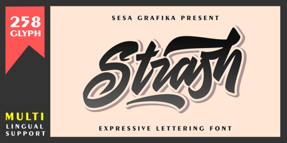 Strash is is designed with a natural expressive handwriting style. This font is perfect for Logo Branding, tshirt design, posters and so much more! Remember that the font is PUA encoded, meaning you can access all delightful glyphs and swashes effortlessly.
 - Cloverdale JNL by Jeff Levine,
$29.00Cloverdale JNL is another addition to Jeff Levine's revivals of classic wood type fonts from the 1800s. Bold, broad and in the "cowboy" style, this typeface goes well with projects featuring the Old West, Victorian times or old-fashioned nostalgia. - The Glamz by Just Font You,
$16.00 Meet The Glamz, a brand new auto-chic font. Designed to fulfil your trend-catching things with the edgy style and undeniable artsy look. Perfectly fit for your fashion branding stuff, handwriting logo, inspirational quote poster, oh well you name it.
 - Gilgamesh by ITC,
$29.99Gilgamesh is the work of British designer Michael Gills, based largely on his calligraphic experiments and named after a poem from Middle Eastern mythology, The Epic of Gilgamesh". Gilgamesh offers functionality with style and will give emphasis to any typographic design." - Martend by Balevgraph Studio,
$12.00 Martend elegant classic sans serif typeface with many style alternatives to choose from. This typeface is perfect for elegant logos, interior magazines, beauty products, packaging products, quotes, and more. What's Included? Uppercase, Lowercase, Numbers, Punctuation Ligatures & Alternates Multilingual support PUA encoded