4,195 search results
(0.026 seconds)
- 1890 Registers Script by GLC,
$38.00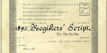 This script font was inspired by the “Ronde” French script. It was in use from 1700s to 1900s (until 1960s in special circumstances) for registers, legal documents and texts, certificates, labels and other documents that must be particularly legible. Today in France, it is still being used for menus, advertising, and labels. The present version is a late 19th Century pattern. This font supports very strong enlargements as well as small sizes. When printed, it remains perfectly legible and elegant from 9/11 pts even if using an ordinary inkjet printer.
 - Madley by Kimmy Design,
$25.00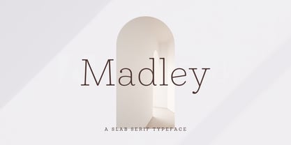 Madley is a contemporary slab serif typeface. Featuring monolinear stems, elongated block serifs and teardrop terminals, the type family goes from a delicate Hairline weight to a heavy Black weight. Because of its range in weights and extensive Opentype features, it’s a perfect font for both text and display text settings. Alternative features include a wide array of swashes assigned up to 11 for select characters, combining ligatures in capital unicase settings, and stylistic alternates for some letters. To see more, please check out the User Guide and Specimen booklet.
 - Santa by Typo5,
$12.95Born as a revival of an Egyptian typeface, this hand-drawn typeface is is perfect for headers and even as a body text. It manages to keep the neutrality required for a legible typeface and having slight details that makes it unique. All the details are hand drawn, and it comes in 3 versions: Santa 01 Black, with the original inked look Santa 02 Line, an sketch version of the font, Santa 03 Out, an outline version with subtle different strokes. A Santa Pack is available including all the 3 styles. - The Postgates by Sarid Ezra,
$15.00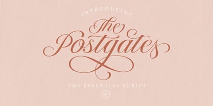 Introducing, The Postgates, An Essential Font! The Postgates is a classic script font that contain a lot stylistic alternate, swash, etc to create your own customized lettering. You can feel the elegant and luxury from this font. It's time to try a new classic script. Use this font for your fashion brand now! Also The Postgates support multi language. This font is also support PUA. Features Uppercase & Lowercase Number & Symbol Multi language Up to 11 Alternates for each characters PUA Encoded Don't hesitate to send me an email at saridezra@gmail.com Happy Creating!
 - Tropika Island by Aiyari,
$30.00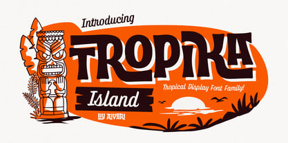 Introducing a new Tropical Display Font Family called Tropika Island, inspired from my previous typeface (Dreadful Font Family & Saturday Night Font Family) combined with Midcentury Tiki Art Signage. The special features on Tropika Island is Tropika Interlock that comes with 3224 pair of ligatures, Stylistic Alternate, & Stylistic Set 01-03. Tropika Casual is complementary and contains OpenType features as ligatures, Terminal forms, Initial forms, Stylistic Alternates. Tropika Island Font Family is best used for headings, logo types, apparel design, invitations, posters, flyers, greeting cards, packaging, book covers, printed quotes, cover album, movie, and more.
 - Meliana Script by Arterfak Project,
$13.00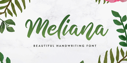 Meliana is a joyful handwriting font, created with a freestyle hand-lettering and a bit bouncy letterform that gives cute and friendly looks. Inspired by children's style and natural handwriting, Meliana Script is suitable for logo, packaging, quote, apparel, cards, invitation, wedding, branding, poster, and more! Meliana is equipped with lots of alternates, there are ligatures, alternates, and stylistic set 01 - 06 that you can mix and match to get more variation of typographic design! You can combine the font with Meliana Extras, containing the swash and doodles.
 - VLNL Melk by VetteLetters,
$29.99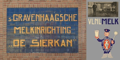 At VetteLetters we like food but we also appreciate our drinks. Yes, of the non-alcoholic kind as well. Like milk. Contrary to what Arnold Schwartzenegger once said, Milk is not just for babies. It contains a whole lot of stuff that is genuinely good for you. Like proteins, carbohydrates, minerals (calcium a.o.) and many vitamins. One time visiting The Hague, Donald DBXL spotted a tile tableau on a brick wall, advertising a dairy factory called ‘De Sierkan’. Yellow sans serif letters on a bright blue background, dating back to the late 19th century, immediately grabbed DBXL’s attention. Especially because the tableau showed both regular and bold letters with some lovely peculiarities here and there. De Sierkan appeared to have been a milk factory solely operating in The Hague from 1879 until 1961. A number of these wall adverts are still to be seen in The Hague streets today. Photos were taken for later reference. Later is now, the lettering has been digitized, missing characters added, and VLNL Melk sees the light of day. VLNL Melk is an all-caps geometric display sans serif family of three weights, Regular, Bold and Black. The basic shape of the letters is a rectangle with rounded corners, leaving a sturdy no-nonsense look and feel. It has a distinct historic aura, but with both feet in this digital day and age. It can equally well be used for the logo of a hipster coffee place, as the cover of a historic novel. Actually, VLNL Melk kan be applied in a wide range of designs like logos, posters, flyers, book covers and magazine headlines.
 - Bebas Neue - 100% free

- LOVE-BOX - Personal use only

- Indulta SemiSerif - Personal use only

- Monserga FFP - Personal use only

- Disoluta - Personal use only

- Lucemita - Personal use only

- CLIMAXED - Personal use only

- Apex Pro by Artyway,
$18.00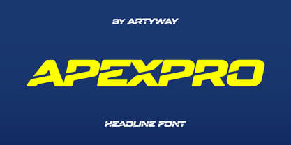 Unleash the Power of Motion and Speed with the ApexPro font – a dynamic, sporty font designed for those who crave action, speed, and innovation. This typeface is meticulously crafted to embody the essence of the automotive world, fitness, and cutting-edge technology. Key Features: Style: The ApexPro boasts a rounded and soft appearance with bold, italic, and slashed elements, giving it a sporty and energetic vibe. The letters are carefully crafted, providing a clean and sharp visual for maximum impact. Design Elements: Inspired by the sleek lines of high-speed vehicles, the font carries a rounded, beveled, and cutout aesthetic, adding a touch of modernity and innovation. The use of military and stencil elements infuses a sense of power and dynamism. Versatility: The ApexPro is not just a font; it's a statement. Perfect for automotive enthusiasts, gym-goers, and tech aficionados, it seamlessly blends into various contexts such as sports events, gaming interfaces, and futuristic designs. Target Audience: The ApexPro is tailored for individuals who appreciate the fusion of technology, speed, and style. The target audience includes: Age: 18-35, seeking dynamic and trendy design elements. Gender: Unisex, appealing to both males and females. Needs: Graphic designers, gamers, fitness brands, and automotive enthusiasts looking for a font that embodies speed and action. Why the ApexPro font? For Speed Enthusiasts: The ApexPro brings the thrill of high-speed action to your designs. For Fitness Brands: Reflect the energy and dynamism of your fitness brand with the ApexPro. For Gaming Interfaces: Elevate your gaming experience with a font that resonates with movement and power. File Inclusions: Languages Covered: Multilingual support for a global audience. Numbers, Symbols, and Punctuation: A comprehensive set for versatile use. Lowercase Letters: Lowercase letters for a balanced and cohesive look. Fuel your creativity with the ApexPro – the font that doesn't just communicate, but accelerates your message. Download now for an experience that goes beyond the ordinary.
 - Basel Neue by Isaco Type,
$30.00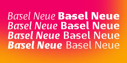 Basel Neue is the complete redesign of BaselSans ITD font, the first typeface of Isaco Type foundry, launched in 2009. As with the predecessor version, Basel Neue is a legible and discrete typeface, a sans serif with thickness variation and humanistic touch. The family consists of 8 styles, 4 weights plus their respective italic versions. Download the “OT Features” pdf to know and take advantage of all font features as best as possible (in OpenType-savvy applications)! You can also view all symbols in the glyph panel of your program, or in Character Map tool (Win) or Character Viewer/Palette (Mac). 1) Basel Neue has ligatures strategically chosen. Herbert S. Zim, in the book “Codes and secret writing”, elected the most common letter pairs of English, that in the Basel Neue became discretionary ligatures. And, of course, it also has standard ligatures. 2) It’s a fun typeface. Basel Neue has a set of emoticons and fun symbols that can be activated by discretionary ligatures. Type “:-)” and a smileface appears. Type “8-)” and a smiley with glasses appears. Type “ ”, “ ” and “ ” and a telephone, star and heart appears. Or “ ”... and a graceful corresponding symbol will appear. 3) Basel Neue contains lots of useful glyphs and features. All versions have 12 recycling symbols, 7 to different types of plastic, and over 30 currency symbols. It also has fractions, old style-, lining-, tabular numbers and other OpenType features. 4) It has an organized and large character set. The fonts have extended character set to support CE, Baltic, Turkish as well as Western European languages. If you work with languages like Catalan, German, Croatian, Romanian, Dutch, Turkish, for example, the font will use the correct ligatures or characters used in these languages. 5) It’s rigorously tested. Basel Neue is available in OpenType PS e TT flavors and each version undergoes a battery of tests, with a systematic review of nodes, curves, spacing and internal data. This eliminates the possibility of errors in the font.
 - Dynatype by Alphabet Soup,
$60.00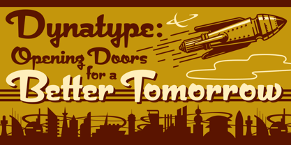 Suddenly...it’s the World of Tomorrow! With the push of a button Dynatype automates your typesetting experience. Dynatype is actually Two fonts in One–without switching fonts you can instantly change from Dynatype’s “regular” style to its alternate connecting version with the simple push of a button. For more details download “The Dynatype Manual” from the Gallery Section. What is Dynatype? Dynatype is the upright, slightly more formal cousin of Dynascript. It shares many of the characteristics of it’s slightly older relation, but is drawn entirely from scratch and has it’s own unique character. Dynatype may be reminiscent of various mid-century neon signage, and of sign writing, Speedball alphabets and even baseball scripts. Its design also takes some cues from a historical typographic curiosity that began in Germany in the ‘20s and which lasted into the ‘60s—when Photo-Lettering gave it the name "Zip-Top". Basically it was believed to be the wave of the future—that by weighting an alphabet heavier in its top half, one could increase legibility and reading speed. The jury’s still out on whether or not there’s any validity to this notion, but I think you’ll agree that in the context of this design, the heavier weighting at the top of the letters helps to create some uniquely pleasing forms, and a font unlike any other. Typesetters across the planet will also be able to set copy in their language of choice. Dynatype’s 677 glyphs can be used to set copy in: Albanian, Basque, Catalan, Cornish, Croatian, Czech, Danish, Dutch, Esperanto, Estonian, Faroese, Finnish, French, Galician, German, Hungarian, Icelandic, Indonesian, Irish, Italian, Kalaallisut, Latvian, Lithuanian, Malay, Maltese, Manx, Norwegian Bokmål, Norwegian Nynorsk, Oromo, Polish, Portuguese, Slovak, Slovenian, Somali, Spanish, Swahili, Swedish, Turkish, and Welsh—and of course English. Sorry! Off-world languages not yet supported. PLEASE NOTE: When setting Dynatype one should ALWAYS select the “Standard Ligatures” and “Contextual Alternates” buttons in your OpenType palette. See the “Read Me First!” file in the Gallery section.
 - Steinweiss Script by Alphabet Soup,
$59.00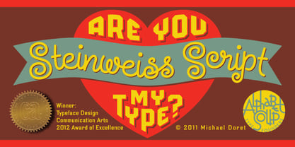 Steinweiss Script began its journey towards daylight when Michael Doret was asked by Taschen Publishing to do cover lettering for the huge commemorative edition they were putting together on the work of Alex Steinweiss—“The Inventor of the Modern Album Cover”. The lettering was to be created to appear similar to the famous “Steinweiss Scrawl” the calligraphy that Steinweiss had used on countless album covers. While designing this piece of lettering, Michael realized that there was great potential for a font that was designed in the spirit of that famous “scrawl”. Through his contacts at Taschen Publishing, he was fortunate enough to be able to contact the Steinweiss family, and get the official Steinweiss approval to proceed with his “Steinweiss Script” project. Michael decided that in addition to giving the font his name as an homage, that he would donate a portion of the proceeds from the sale of this font to the man himself: Alex Steinweiss. Read more about the background of Steinweiss Script in Steven Heller’s article in Imprint. Steinweiss Script is a family of fonts in three weights: Light, Medium, and Bold. Additionally, within each weight there are three variations: Simple, Fancy, and Titling. These variations relate to the size/ratio of the caps to the lowercase, the complexity of those caps, and the size of the ascenders/descenders on the lowercase characters. These variations add usefulness to the font, making it accessible not just for headlines, but for longer passages of text as well. For a better understanding of its unique features please download The Steinweiss Script Users Guide from the Gallery section. PLEASE NOTE: the three Steinweiss Script fonts are cross-platform fonts which depend to some extent on certain advanced OpenType features, therefore they can be used to their full potential only with programs that support those features. When setting Steinweiss Script one should almost ALWAYS select the “Standard Ligatures" and “Contextual Alternates” buttons in your OpenType palette. See the “Read Me First!” file in the Gallery section.
 - Sofia Pro Condensed by Mostardesign,
$25.00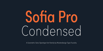 A geometric sans for space saving typography Sofia Pro Condensed is the condensed version of the popular Sofia Pro font family. This typeface was completely drawn with the look of the original normal-width version. Sofia Pro Condensed contains 16 styles from Ultra Light to Black (Ultra Light, Extra Light, Light, Regular, Medium, Semi Bold, Bold and Black) with an alternative glyph set to improve its use in different graphic contexts. This typeface will be suitable for many projects such as titles, subtitles, long editorials, brand building, mobile applications, ebooks, websites or company signage. Its contemporary aspect and its condensed style will also be suitable for editorial projects who needs to save space. Sofia Pro Condensed also has many powerful OpenType features such as case sensitivite forms, old style and tabular figures, ligatures, capital spacing, fractions and alternative characters to give personality to graphic design projects. Designed also for complex editorial content, this typeface has a powerful home kerning system called “Pro Kerning”. With more than 1500 pairs of glyphs in many languages, Pro Kerning optimizes headlines, subtitles, texts as well as long paragraphs in real time. In addition to all the features of its kind, Sofia Pro Condensed is part of a very complete “type system” with style variants such as the normal-width-version (Sofia Pro), the soft version (Sofia Soft) or the rough version (Sofia Rough). With all these typefaces, you have more than 40 styles to make your own vibrant and professional graphics or web creations while maintaining consistency in your creations. The OpenType features of Sofia Pro Condensed have an extended character set to support Central and Eastern European as well as Western European languages, Cyrillic and Greek. For more info about the powerful opentype features and the complete character map of Sofia Pro Condensed, download the PDF specimen to get a detailed view of all features.
 - Oktah Round by Groteskly Yours,
$25.00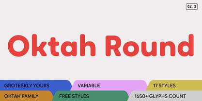 Oktah Round Overview: 1600+ characters per font 16 static fonts 1 variable fonts Extensive OpenType features Support for 220+ Languages (Latin & Cyrillic) Special Symbols, Alternate Sets, and Features Free Trial Fonts Available Oktah Round is a rounded version of Oktah Neue. Oktah Round is soft and friendly, modern and warm. It's a typeface that combines human touch with high functionality. Oktah Round comes equipped with 1600+ characters per font and is available in 16 styles (from Thin to Black), and as a variable font that allows you to change weight and slant angle. Oktah Round supports more than 200 Latin languages and has amazing support for Cyrillic languages like Bulgarian, Serbian, Ukrainian, Macedonian, Russian, and others. Relying heavily on the geometric forms and proportions first introduced in Oktah, this rounded version does more than just smooth out a few corners. To make curves sharper and more uniform, some terminals were modified. Other visual features (like curving tails in 'l' and 't') were dropped to create more clear cut look. Oktah Round is perfectly balanced and finely tuned to be the font you'd want to use again and again. The variety or styles and availability of a variable font give Oktah Round a potential to be used across multiple mediums. Oktah Round supports most Latin based languages, it also has support for Extended Cyrillic. The remainder of the extensive 1600+ glyph character set is reserved for punctuation, numbers, special symbols, and all sorts of additional symbols like squared numbers, geometric shapes, etc. All characters are evenly spaced and carefully kerned, so that there are no overlaps or glaring gaps in any language. OpenType features include Legible Alternates, Case Sensitive Punctuation, Fractions, Sub- and Superscript, Black and White Circled Figures, Ligatures, Oldstyle Figures, Tabular Figures and many others. The variable font incorporates both axes (Weight and Slant) and can be used for web and graphic design alike. 16 static font styles can be purchased separately or as part of Oktah Round family. Two fonts can be downloaded free of charge.
 - Gameness by Typodermic,
$11.95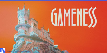 Step back into the 1990s with Gameness, the font that embodies the spirit of the era’s gaming culture. Inspired by the Game Boy box art for Final Fantasy Adventure, Gameness evokes a sense of nostalgia while still looking fresh and modern. But this isn’t just any retro font. Gameness is sleek and sophisticated, with a narrow elegance that sets it apart from other throwback designs. Its tall letters are perfect for headlines, logos, and branding materials, giving your projects a bold, confident look. For clients who demand only the best, Gameness comes with an alternate barred “A”, adding even more versatility to your designs. And in OpenType-enabled applications, the “S” shape subtly alters to match the adjacent letters, ensuring a smooth, harmonious look every time. So why settle for ordinary fonts when you can make a statement with Gameness? Download it now and bring a touch of retro cool to your next project. Most Latin-based European writing systems are supported, including the following languages. Afaan Oromo, Afar, Afrikaans, Albanian, Alsatian, Aromanian, Aymara, Bashkir (Latin), Basque, Belarusian (Latin), Bemba, Bikol, Bosnian, Breton, Cape Verdean, Creole, Catalan, Cebuano, Chamorro, Chavacano, Chichewa, Crimean Tatar (Latin), Croatian, Czech, Danish, Dawan, Dholuo, Dutch, English, Estonian, Faroese, Fijian, Filipino, Finnish, French, Frisian, Friulian, Gagauz (Latin), Galician, Ganda, Genoese, German, Greenlandic, Guadeloupean Creole, Haitian Creole, Hawaiian, Hiligaynon, Hungarian, Icelandic, Ilocano, Indonesian, Irish, Italian, Jamaican, Kaqchikel, Karakalpak (Latin), Kashubian, Kikongo, Kinyarwanda, Kirundi, Kurdish (Latin), Latvian, Lithuanian, Lombard, Low Saxon, Luxembourgish, Maasai, Makhuwa, Malay, Maltese, Māori, Moldovan, Montenegrin, Ndebele, Neapolitan, Norwegian, Novial, Occitan, Ossetian (Latin), Papiamento, Piedmontese, Polish, Portuguese, Quechua, Rarotongan, Romanian, Romansh, Sami, Sango, Saramaccan, Sardinian, Scottish Gaelic, Serbian (Latin), Shona, Sicilian, Silesian, Slovak, Slovenian, Somali, Sorbian, Sotho, Spanish, Swahili, Swazi, Swedish, Tagalog, Tahitian, Tetum, Tongan, Tshiluba, Tsonga, Tswana, Tumbuka, Turkish, Turkmen (Latin), Tuvaluan, Uzbek (Latin), Venetian, Vepsian, Võro, Walloon, Waray-Waray, Wayuu, Welsh, Wolof, Xhosa, Yapese, Zapotec Zulu and Zuni.
 - Arrow Hero by Alit Design,
$21.00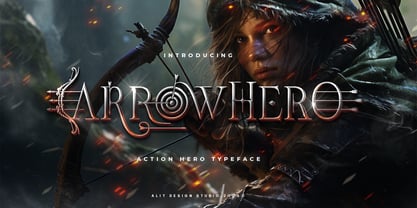 Introducing "Arrow Hero" - A Typeface of Elegance and Adventure Unleash the power of elegance and adventure with our latest font creation, "Arrow Hero." This unique serif font seamlessly blends the mystique of archers, the allure of elves, and the boldness of superheroes. Crafted with precision, this font is more than just letters; it's a journey into a world where every curve and angle tells a story of heroic feats and enchanted realms. Key Features: Elegant Serif Design: The Arrow Hero font boasts a sophisticated serif style that adds a touch of refinement to your projects. Each letter is meticulously crafted to exude an aura of strength and grace, perfectly suited for a variety of design applications. Illustrated Elements: Dive into the fantastical with Arrow Hero's unique illustrations. Arrows gracefully adorn each character, symbolizing precision and direction. Delicate elf ears and majestic wings enhance the overall aesthetic, creating a harmonious balance between the worlds of archers, elves, and superheroes. Versatile Usage: Whether you're working on branding, book covers, invitations, or digital designs, Arrow Hero is a versatile font that adapts to various contexts. Elevate your projects with a touch of magic and heroism that this font effortlessly provides. Tailored for Storytelling: Arrow Hero is not just a font; it's a storyteller. Use it to bring narratives to life, creating visual experiences that resonate with the mythical and the extraordinary. Let the characters on your screen or page become heroes in their own right, guided by the elegance of Arrow Hero. Multiple Styles: The font comes in various styles and weights, allowing you to express different moods and atmospheres within your designs. Whether you're aiming for a bold statement or a subtle enchantment, Arrow Hero has the right style for you. Elevate your design projects to new heights with Arrow Hero, where the elegance of serif meets the magic of arrows, wings, and elf ears. Download this font today and embark on a design journey that transcends the ordinary, celebrating the hero within every letter.
 - Quadrillion by Typodermic,
$11.95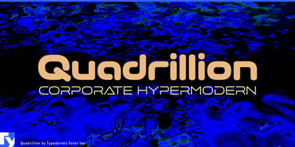 Looking for a typeface that’s out of this world? Look no further than Quadrillion. With its wide, capsule-like design and futuristic aesthetic, Quadrillion is the perfect choice for designers who want to infuse their message with an otherworldly character. Inspired by the capital letterforms of Ethnocentric, a popular headliner from 1999, Quadrillion is a techno typeface with a distinctly plastic presence. Its six weights and italics allow for a wide range of design options, making it the perfect choice for any project that requires a bold, modern look. Whether you’re designing a cutting-edge website, creating eye-catching advertising materials, or putting together a sleek and stylish brand identity, Quadrillion is the typeface you need to make your message stand out. So why wait? Download Quadrillion today and start designing your future! Most Latin-based European, Vietnamese, Greek, and most Cyrillic-based writing systems are supported, including the following languages. Afaan Oromo, Afar, Afrikaans, Albanian, Alsatian, Aromanian, Aymara, Azerbaijani, Bashkir, Bashkir (Latin), Basque, Belarusian, Belarusian (Latin), Bemba, Bikol, Bosnian, Breton, Bulgarian, Buryat, Cape Verdean, Creole, Catalan, Cebuano, Chamorro, Chavacano, Chichewa, Crimean Tatar (Latin), Croatian, Czech, Danish, Dawan, Dholuo, Dungan, Dutch, English, Estonian, Faroese, Fijian, Filipino, Finnish, French, Frisian, Friulian, Gagauz (Latin), Galician, Ganda, Genoese, German, Gikuyu, Greenlandic, Guadeloupean Creole, Haitian Creole, Hawaiian, Hiligaynon, Hungarian, Icelandic, Igbo, Ilocano, Indonesian, Irish, Italian, Jamaican, Kaingang, Khalkha, Kalmyk, Kanuri, Kaqchikel, Karakalpak (Latin), Kashubian, Kazakh, Kikongo, Kinyarwanda, Kirundi, Komi-Permyak, Kurdish, Kurdish (Latin), Kyrgyz, Latvian, Lithuanian, Lombard, Low Saxon, Luxembourgish, Maasai, Macedonian, Makhuwa, Malay, Maltese, Māori, Moldovan, Montenegrin, Nahuatl, Ndebele, Neapolitan, Norwegian, Novial, Occitan, Ossetian, Ossetian (Latin), Papiamento, Piedmontese, Polish, Portuguese, Quechua, Rarotongan, Romanian, Romansh, Russian, Rusyn, Sami, Sango, Saramaccan, Sardinian, Scottish Gaelic, Serbian, Serbian (Latin), Shona, Sicilian, Silesian, Slovak, Slovenian, Somali, Sorbian, Sotho, Spanish, Swahili, Swazi, Swedish, Tagalog, Tahitian, Tajik, Tatar, Tetum, Tongan, Tshiluba, Tsonga, Tswana, Tumbuka, Turkish, Turkmen (Latin), Tuvaluan, Ukrainian, Uzbek, Uzbek (Latin), Venda, Venetian, Vepsian, Vietnamese, Võro, Walloon, Waray-Waray, Wayuu, Welsh, Wolof, Xavante, Xhosa, Yapese, Zapotec, Zarma, Zazaki, Zulu and Zuni.
 - Cornpile by Typodermic,
$11.95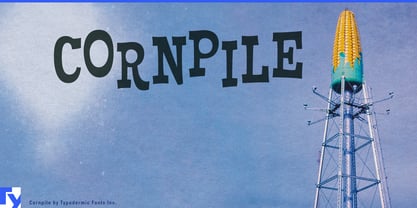 Introducing Cornpile, the corn-tastic slab-serif typeface that will have your message popping off the page like kernels in a popcorn machine! With its quirky cartoon style, Cornpile is perfect for adding a touch of humor and fun to any design project. In OpenType savvy applications, Cornpile’s letters and numerals automatically bounce, adding an extra level of zaniness to your text. And with six wacky weights and italics to choose from, you can mix and match to create a truly unique and eye-catching design. Whether you’re designing a logo for a local corn festival, creating a fun and playful poster for a children’s event, or just looking to add some whimsy to your latest project, Cornpile is the perfect typeface for the job. So why wait? Download Cornpile today and let your creativity pop! Most Latin-based European, Vietnamese, Greek, and most Cyrillic-based writing systems are supported, including the following languages. Afaan Oromo, Afar, Afrikaans, Albanian, Alsatian, Aromanian, Aymara, Azerbaijani, Bashkir, Bashkir (Latin), Basque, Belarusian, Belarusian (Latin), Bemba, Bikol, Bosnian, Breton, Bulgarian, Buryat, Cape Verdean, Creole, Catalan, Cebuano, Chamorro, Chavacano, Chichewa, Crimean Tatar (Latin), Croatian, Czech, Danish, Dawan, Dholuo, Dungan, Dutch, English, Estonian, Faroese, Fijian, Filipino, Finnish, French, Frisian, Friulian, Gagauz (Latin), Galician, Ganda, Genoese, German, Gikuyu, Greenlandic, Guadeloupean Creole, Haitian Creole, Hawaiian, Hiligaynon, Hungarian, Icelandic, Igbo, Ilocano, Indonesian, Irish, Italian, Jamaican, Kaingang, Khalkha, Kalmyk, Kanuri, Kaqchikel, Karakalpak (Latin), Kashubian, Kazakh, Kikongo, Kinyarwanda, Kirundi, Komi-Permyak, Kurdish, Kurdish (Latin), Kyrgyz, Latvian, Lithuanian, Lombard, Low Saxon, Luxembourgish, Maasai, Macedonian, Makhuwa, Malay, Maltese, Māori, Moldovan, Montenegrin, Nahuatl, Ndebele, Neapolitan, Norwegian, Novial, Occitan, Ossetian, Ossetian (Latin), Papiamento, Piedmontese, Polish, Portuguese, Quechua, Rarotongan, Romanian, Romansh, Russian, Rusyn, Sami, Sango, Saramaccan, Sardinian, Scottish Gaelic, Serbian, Serbian (Latin), Shona, Sicilian, Silesian, Slovak, Slovenian, Somali, Sorbian, Sotho, Spanish, Swahili, Swazi, Swedish, Tagalog, Tahitian, Tajik, Tatar, Tetum, Tongan, Tshiluba, Tsonga, Tswana, Tumbuka, Turkish, Turkmen (Latin), Tuvaluan, Ukrainian, Uzbek, Uzbek (Latin), Venda, Venetian, Vepsian, Vietnamese, Võro, Walloon, Waray-Waray, Wayuu, Welsh, Wolof, Xavante, Xhosa, Yapese, Zapotec, Zarma, Zazaki, Zulu and Zuni.
 - Zolasixx by Typodermic,
$11.95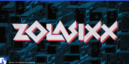 Welcome to the world of Zolasixx, an angular techno typeface inspired by the diagonal strokes and sharp angles of the iconic Zaxxon logo, bringing a retro, arcade-style aesthetic to your designs. With Zolasixx, you can unlock a whole new level of customization thanks to our interlocking letter combinations, which can be switched up using OpenType-savvy programs. This feature allows you to personalize the font and make it truly your own, creating a look that is both unique and professional. Zolasixx’s high-tech, harsh angularity will lend your message an aggressive technological voice that is sure to stand out from the crowd. But there’s also a whimsical sense of creativity to our font, giving you the perfect balance between playfulness and professionalism. Whether you’re designing a video game, a website, or a marketing campaign, Zolasixx is the perfect choice for anyone looking to make a bold statement. So why settle for boring, cliché fonts when you can take your designs to the next level with Zolasixx? Download it today and start creating! Most Latin-based European writing systems are supported, including the following languages. Afaan Oromo, Afar, Afrikaans, Albanian, Alsatian, Aromanian, Aymara, Bashkir (Latin), Basque, Belarusian (Latin), Bemba, Bikol, Bosnian, Breton, Cape Verdean, Creole, Catalan, Cebuano, Chamorro, Chavacano, Chichewa, Crimean Tatar (Latin), Croatian, Czech, Danish, Dawan, Dholuo, Dutch, English, Estonian, Faroese, Fijian, Filipino, Finnish, French, Frisian, Friulian, Gagauz (Latin), Galician, Ganda, Genoese, German, Greenlandic, Guadeloupean Creole, Haitian Creole, Hawaiian, Hiligaynon, Hungarian, Icelandic, Ilocano, Indonesian, Irish, Italian, Jamaican, Kaqchikel, Karakalpak (Latin), Kashubian, Kikongo, Kinyarwanda, Kirundi, Kurdish (Latin), Latvian, Lithuanian, Lombard, Low Saxon, Luxembourgish, Maasai, Makhuwa, Malay, Maltese, Māori, Moldovan, Montenegrin, Ndebele, Neapolitan, Norwegian, Novial, Occitan, Ossetian (Latin), Papiamento, Piedmontese, Polish, Portuguese, Quechua, Rarotongan, Romanian, Romansh, Sami, Sango, Saramaccan, Sardinian, Scottish Gaelic, Serbian (Latin), Shona, Sicilian, Silesian, Slovak, Slovenian, Somali, Sorbian, Sotho, Spanish, Swahili, Swazi, Swedish, Tagalog, Tahitian, Tetum, Tongan, Tshiluba, Tsonga, Tswana, Tumbuka, Turkish, Turkmen (Latin), Tuvaluan, Uzbek (Latin), Venetian, Vepsian, Võro, Walloon, Waray-Waray, Wayuu, Welsh, Wolof, Xhosa, Yapese, Zapotec Zulu and Zuni.
 - Textus Receptus by Lascaris,
$60.00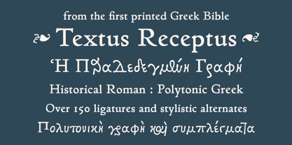 Textus Receptus is a historical revival based on the Roman and Greek types used by Johann Bebel (and later also Michael Isengrin) in Basel in the 1520s. The Roman is a low-contrast medium-to-heavy Venetian reminiscent of Jenson or Golden Type. The unusual polytonic Greek, not previously digitized, is lighter in weight and supplied with all the ligatures and variants of the original. Yet when used without historial forms the Greek has a surprisingly contemporary feel: it’s quirky and playful as a display face, but still easily legible in running text. Bebel’s Greek extended and refined the one used for the first printed Greek New Testament, Desiderius Erasmus’ Novum Instrumentum Omne, published in Basel in 1516 by Johann Froben. The name of the font was chosen in honor of this edition, which was so influential that it was later called the Textus Receptus (the “received text”), serving as the basis for Luther’s German Bible in 1522 and much subsequent scholarship for over 300 years. Following 16th century practice, Textus Receptus contains 130 ligatures and stylistic alternates for Greek, accessible either with OpenType features or with five stylistic sets. The Greek capitals, often printed bare in early editions, have been equipped with accents and breathings for proper polytonic or monotonic typesetting. The Roman includes both standard and historical ligatures along with the abbreviations and diacritics typically employed in early printed Latin. For expanded language coverage it has the entire unicode Latin Extended‑A range and part of Latin Extended-B. The capital A is surmounted by a horizontal stroke, as in some 16th century Italian designs, and the hyphen and question mark have both modern and historical form variants. Mark-to-base positioning correctly renders fifty combining diacritics, and with mark-to-mark positioning the most common diacritics may be stacked, permitting, for example, accents and breathings on top of length-marked vowels. Numerals include old-style, proportional lining and tabular lining. For further details, please download the 31-page Textus Receptus User Guide.
 - Bardamu by Groteskly Yours,
$25.00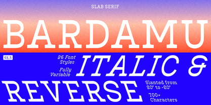 Bardamu is a variable slab serif font family designed by Eugene Tantsurin and Anna Remm, and released by Groteskly Yours Studio. Bardamu is a type family that is open to interpretation and experimentation, yet this ambiguity does little to hide its inherent friendliness and good vides. Bardamu can easily be used in a variety of projects and feel at home both in graphic design, branding, web design or editorial design. Thanks to its unique letterforms and eye-catching design choices, it can be that final touch that makes your brand pop! One of the standout qualities of Bardamu is its remarkable versatility. Bardamu comes in 25 styles, allowing users to choose a style that best fits their needs. In addition to that, it offers a wide range of styles, from sleek backward-slanted italics at -20° to elegant upright styles, as well as regular 20° italics. For static fonts, there are two extra subfamilies available (10° Half Italic and 10° Half Reverse) that can be used for creating more complex hierarchy in any text. With a total of 25 static fonts and 1 Variable font, Bardamu is the perfect workhorse display slab serif with unlimited typesetting capabilities. Each font in the Bardamu family boasts an extensive 700+ character set, encompassing all major Latin-based languages, punctuation marks, symbols, and even supplementary characters. Bardamu takes flexibility to a whole new level with its incredible OpenType features that further enhance its versatility. With features such as Case-Sensitive Punctuation, Stylistic Alternates, Sub- and Superscript, Tabular Figures, and Localised Forms, you can fine-tune every detail of your design to perfection. Moreover, the multiple stylistic sets available in Bardamu allow you to switch between various versions of the same glyph effortlessly. Bardamu type family includes 25 static styles as well as a variable font. All styles can be purchased separately or as a full family package. Two styles can be downloaded free of charge. If you'd like to explore Bardamu further, we also offer free trials upon request.
 - URLOP by Mikołaj Grabowski,
$9.00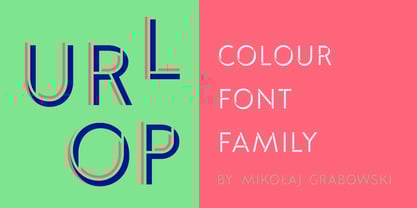 Colour is more fun than black, but multicolour is even better. Let me introduce URLOP, a wide type family suitable for your fancy posters, headlines, covers, illustrations, websites, initials, blackmails, chronicles, signboards, poems and many others. Twelve basic styles, which make the overall construction, give a wide range of opportunities. All of them, being able to mix with each other, vary from a thin INSIDE, through a medium FILL, to a double-stem PLUS styles. And then comes a range of colour fonts, so you don’t have to waste any of your precious time for experiments, because I’ve already done it for you! URLOP is an all-caps display collection consisting of three sub-families of fonts, divided by the usage they are designed for. First of all, there is a wide range of alphabets made in the new OpenType-SVG colour fonts format. This is quite a novelty and a very promising technology at the same time. It allows designers to store colour information inside the font. Due to my experience with layered colour thinking that I explored in my first family - Epilepsja , I decided to make several preset layer combinations in this auspicious format. This sub-group is tagged RGB. Make sure that your field of usage and software support OT-SVG format. However, if you feel a need to experiment in the old-fashioned way, you may buy separate layers under the DIY tag. The last group is very similar to the DIY, but it was optimized to look better when standing without other layers. It’s called PRO*. All styles cover Latin alphabets of Europe, basic Cyrillic and Greek sets. Have fun! Before using the font, read the instructions and specimen attached to font files in the purchased package or download them from the Gallery tab on this site. This will help you avoid making unexpected mistakes when combining layers. *PRO subfamily release planned in 2019.
 - Dynascript by Alphabet Soup,
$60.00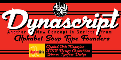 Typography enters the Space Age! Dynascript brings the ease of “Pushbutton Automatic” to your typesetting experience. Dynascript is actually Two fonts in One–without switching fonts you can instantly change from Dynascript’s connecting font to the non-connecting italic with the simple push of a button. For more details download “The Dynascript Manual” from the Gallery Section. What is Dynascript? Dynascript is the slanted script cousin of Dynatype. It shares many of the characteristics of it’s sibling, but is drawn entirely from scratch and has it’s own unique character. To some it may be reminiscent of various mid-century neon signage, and of sign writing, Speedball alphabets and even baseball scripts. The design of Dynascript also takes some cues from a historical typographic curiosity that began in Germany in the ‘20s and which lasted into the ‘60s—when Photo-Lettering gave it the name "Zip-Top". Basically it was believed to be the wave of the future—that by weighting an alphabet heavier in its top half, one could increase legibility and reading speed. The jury’s still out on whether or not there’s any validity to this claim, but I think you’ll agree that in the context of this design, the heavier weighting at the top of the letters helps to create some uniquely pleasing forms, and a script unlike any other. Typesetters across the planet will also be able to set copy in their language of choice. Dynascript’s 694 glyphs can be used to set copy in: Albanian, Basque, Catalan, Cornish, Croatian, Czech, Danish, Dutch, Esperanto, Estonian, Faroese, Finnish, French, Galician, German, Hungarian, Icelandic, Indonesian, Irish, Italian, Kalaallisut, Latvian, Lithuanian, Malay, Maltese, Manx, Norwegian Bokmål, Norwegian Nynorsk, Oromo, Polish, Portuguese, Slovak, Slovenian, Somali, Spanish, Swahili, Swedish, Turkish, and Welsh—and of course English. Sorry! Off-world languages not yet supported. PLEASE NOTE: When setting Dynascript one should ALWAYS select the “Standard Ligatures" and “Contextual Alternates” buttons in your OpenType palette. See the “Read Me First!” file in the Gallery section.
 - ATF Franklin Gothic by ATF Collection,
$59.00 ATF Franklin Gothic® A new take on an old favorite Franklin Gothic has been the quintessential American sans for more than a century. Designed by Morris Fuller Benton and released in 1905 by American Type Founders, Franklin Gothic quickly stood out in the crowded field of sans-serif types, gaining an enduring popularity. Benton’s original design was a display face in a single weight. It had a bold, direct solidity, yet conveyed plenty of character. A modern typeface in the tradition of 19th-century grotesques, Franklin Gothic was drawn with a distinctive contrast in stroke weight, giving it a unique personality among the more mono-linear appearance of later geometric and neo-grotesque sans-serif types. Franklin Gothic has been interpreted into a series of weights before, most notably with ITC Franklin Gothic. But as the original type was just a bold display face (later accompanied by a few similarly bold widths and italics), how Benton’s design is expanded to multiple weights and styles as a digital type family can vary significantly. Benton designed several gothic faces that harmonize with one another, including Franklin Gothic, News Gothic, and Monotone Gothic, that can serve as models for new interpretations of his work. With ATF Franklin Gothic, Mark van Bronkhorst looked to Benton’s Monotone Gothic—originally a single typeface in a regular weight, and similar to Franklin Gothic in its forms—as the basis for lighter styles. ATF Franklin Gothic may appear familiar given its heritage, but is a new design offering a fresh take on Benton’s work. The text weights are wider and more open than some previous Franklin Gothic interpretations, and as a result are quite legible as text, at very small sizes, and on screen. ATF Franklin Gothic maintains the warmth and the spirit of a Benton classic while offering a suite of fonts tuned precisely for contemporary appeal and utility. The 18-font family offers nine weights with true italics, a Latin-extended character set, and a suite of OpenType features. Download the PDF specimen for ATF Franklin Gothic.
 - Oktah by Groteskly Yours,
$15.00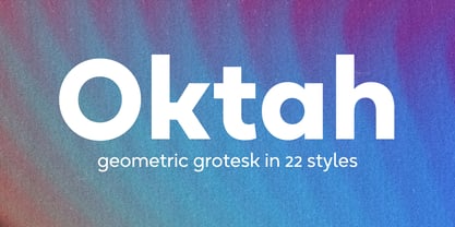 Oktah is a geometric grotesk that comes both as a variable font and 22 static fonts: 11 uprights and 11 matching italics, which make it a great tool for those seeking a versatile font with a strong character and high legibility. Throw in a very pleasing look, elegant curves and a wide range of weights, and you'd get what Oktah aspires to be: a perfect typographic tool for every need.In Oktah, elegant geometric curves meet bold strokes and wide apertures. Round letters are nearly circular, but, to boost readability, slight changes were introduced for optical compensation. Oktah is also equipped with amazing OpenType features: case sensitive punctuation, ligatures, fractions, superscript and subscript figures, two kinds of circular figures, stylistic & contextual alternatives and much more! Oktah supports all major European languages, as well as Vietnamese and some dozens of foreign languages that you may encounter in your designs. We've got all that covered. The glyph count for each of the styles is 800+ characters. Two styles (Extra Light and Bold Italic) are free to try and experiment with. If you need wide language support and more extensive OpenType features, consider taking a look at Oktah Neue, a bigger version of the classic Oktah.
 - Kuenstler 480 by ParaType,
$30.00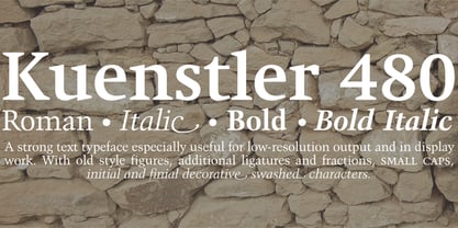 The Bitstream version of Trump Mediaeval of Linotype, 1954-60, by Georg Trump, a prolific German type designer. It seems to be his best typeface. It has a vigorous and assumed oldstyle roman and italic that is the sloped roman, except for the letters a, e, f. With its crisp angularity and wedge-shapes serifs, Trump Mediaeval appears carved in stone. It is a strong text typeface that is highly legible and especially useful for low-resolution output. It is useful in display work too. Cyrillic version developed for ParaType by Vladimir Yefimov and Isabella Chaeva and released in 2010. Cyrillic italics maintain the main feature of Trump Mediaeval to be the sloped roman, except for the letters г, д, и, й, n, т. There are old style figures, additional ligatures and fractions available at all styles and small caps at the Roman 55. Black style was added in 2011 by Vladimir Yefimov.
 - Plinc Hasler Circus by House Industries,
$33.00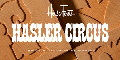 Hasler Circus packs amusement park, Old West, folk art, and tattoo shop all into one colorful font. Characteristic of reverse-contrast faces, Hasler Circus swaps the weight of its stems and serifs creating an unexpected yet charming rhythm. The font also features an added bonus: split stroke endings to crank up the flavor. Inject a dose of novelty into toy packaging, candy wrappers, cook books, vintage signs, or festival marketing. Drawn in the 1950s for Photo-Lettering, Inc. by influential British designer and typographer Charles Hasler, Circus was digitized by Erik van Blokland in 2011, with a helping hand from Ken Barber. HASLER CIRCUS CREDITS: Typeface Design: Charles Hasler Typeface Digitization: Erik van Blokland, Ken Barber Typeface Production: Ben Kiel Like all good subversives, House Industries hides in plain sight while amplifying the look, feel and style of the world’s most interesting brands, products and people. Based in Delaware, visually influencing the world.
 - Bilcase by Ilham Herry,
$20.00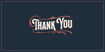 The Bilcase font family is a layered condensed font family that comes from vintage logos, labels, packages, and signage. This collection of styles has 5 type layers and vintage scrolls, panels, and ornaments. Combine these to create label designs, headlines, logotypes, signage, posters, greeting cards, letterheads, T-shirts... the applications are endless. This font family is available in 2 styles. Bilcase has font layers with contextual, stylistic alternates and ligatures. You will get special capital letters when you activate the contextual alternate feature. Bilcase Extras is the expanded version of the main font with panels, ribbons, and ornaments. You can access the ornaments by activating the ligature feature. Type the letter “p” for the panel, “r” for ribbon and “o” for ornament and add numbers to each code, e.g. “p1, p2, p11, r2, o2”. Complete information is in the pdf file. http://bit.ly/2OClGjY. You can also try it in the font tester below.
 - A Day That Feels Better by Clevus,
$14.00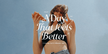 Proudly present A Day That Feels Better Typeface, created by ClevUs, A nostalgic serif & calligraphic italic that has own unique style & modern look. This typeface is perfect for an elegant & luxury logo, book or movie title design, fashion brand, magazine, clothes, lettering, quotes, and so much more. Font Features : Letters, numbers, symbols, and punctuation 101 alternates and ligatures No special software required they may be used even in Canva, any basic program /website apps that allows standard fonts That's it folks! Multilingual Support Language Support: Danish, English, Estonian, Filipino, Finnish, French, Friulian, Galician, German, Gusii, Indonesian, Irish, Italian, Luxembourgish, Norwegian Bokmål, Norwegian Nynorsk, Nyankole, Oromo, Portuguese, Romansh, Rombo, Spanish, Swedish, Swiss-German, Uzbek (Latin) Follow My Shop For Upcoming Updates Including Additional Glyphs And Language Support. And Please Message Me If You Want Your Language Included or If There Are Any Features or Glyph Requests, Feel Free to Send me A Message. Have a Good Day !
 - Modulate by Stiggy & Sands,
$24.00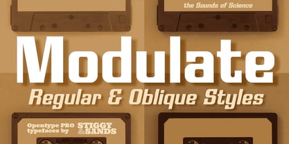 A Blocky Geometric Techical typestyle Modulate began as a digitization of a film typeface from LetterGraphics in the early 70's known as "Cadence". The original specimen included standard Capitals and Lowercase, Numerals and minimal Punctuation, a bare bones character set, previous only available on film and only in an upright stance. We've fleshed out the Modulate typeface to include a full standard character set, an extended international set, and a handful of alternate character styles. We've also added an oblique style that suits its techno design. Both vintage and modern feeling, with a dynamic techno presence, Modulate draws attention without being outlandish. See the 5th graphic for a comprehensive character map preview. Bare Bones Opentype features include: - Standard fi and fl ligatures - Stylistic Alternates Letterforms for: EFLTZ and ftz characters - Approx. 411 Character Glyph Set: Modulate comes with a glyphset that includes standard & punctuation, international language support, and minimal additional features.
 - Rosenbaum by SIAS,
$34.90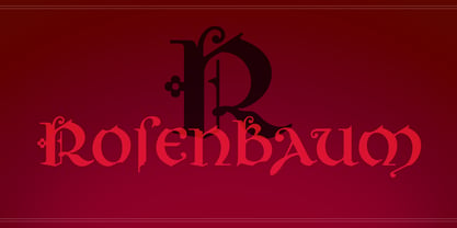 The design of Rosenbaum started with the idea of an eclectic merger of didone stroke pattern and contrast, uncial letterforms and blackletter appearance. It was a destillation experiment. It happened around christmas in 2011. The result is a unique typeface which strongly evokes a peculiar pastiche mood without being any historical in the strict sense of the word. It’s all about the fun to mix ingredients and to freely create reminiscences in a new way. Rosenbaum is a typeface like a fairytale – one of a kind, strangely poetic and incredibly true at once… Use Rosenbaum for emotional typographics, for fairytale books and stories, for headings and invitations, for distinctive labels or menu cards, for Wave Gothic publishing … you will know best! Both Rosenbaum Eins and Rosenbaum Rose contain all characters needed for any European language. They both contain the same range of additional symbols and ornaments, some of them are zero-width calligraphic embellishments designed for direct combination with the letters, even inside of words.
 - Brocha by Latinotype,
$26.00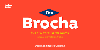 I made the first sketches for Brocha when I first visited Easter Island in 2011. I took inspiration from pre-Columbian art for such sketches, but I must say that they were kind of rough and clumsy; it was an experimental and limited-use typeface. It took a long time, but thanks to my learning about type design gained over the years, I have finally been able to complete my project. I have made sure to preserve the Latin American spirit of my original designs in order to give my final typeface an expressively handmade, highly humanist look. Brocha is a display sans with friendly design ideal for high-impact headlines, logotypes or use on cookies packaging designs. Brocha consists of 2 subfamilies: one basic and one alternative. Each subfamily comes in 8 weights plus italics. The Alt version is highly recommended for those art directors who look for more varied fonts when designing.
 - NEON CLUB MUSIC by TypoGraphicDesign,
$19.00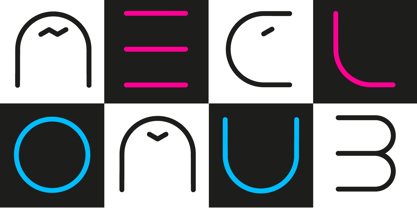 The typeface Neon Club Music is designed in 2011 for an Logo-Design of a electronic music label from South Germany. 324 glyphs incl. decorative extras like arrows, dingbats, emojis, symbols, geometric shapes, decorative ligatures (type the word #SMILE for ☺ or #LOVE for ♥ as OpenType-Feature dlig) and stylistic alternates (as OpenType-Feature salt. For use in logos, magazines, posters, advertisement plus as webfont for decorative headlines. The font works best for display size. Have fun with this font & use the DEMO-FONT (with reduced glyph-set) FOR FREE! CONCEPT/CHARACTERISTICS The geometric and rounded character of the typeface is a very unique futuristic sci-fi atmosphere. The sans-serif monoline letter-forms looks very modern, clean, fresh and fancy. APPLICATION AREA The fancy, geometric & round party, music & movie font “NEON CLUB MUSIC” would look good at display size for party flyer & movie poster, music covers or headlines in magazines or websites…
 - The B de Bonita Shadow font by deFharo is a testament to the intricate craftsmanship of modern typography, blending the warmth of vintage aesthetics with the sharpness of contemporary design. Conceiv...


