10,000 search results
(0.061 seconds)
- Berghan by Craft Supply Co,
$15.00 Berghan is a modern grotesk sans serif features thick and thin contrast details for contemporary nuances. It can be used to create almost all types of design projects like print materials. Just use your imagination and your project will become more alive and look great than ever with this typeface. You want to make a greeting card or a package design, or even a brand identity, craft design, any DIY project, book title, wedding font, pop vintage design, retro design or any purpose to make your art / design project look pretty and trendy? Feel free to play with this typeface!
 - Hollirood by Letterara,
$16.00 Hollirood is a stylish and elegant serif font. It is suitable for a wide variety of designs due to its neat and clean style. Incredibly versatile, this font fits a vast pool of designs, elevating them to the highest levels. Comes with some alternates and ligatures, so you can combine them to make a perfect typography design. It is ideal for your upcoming projects. Such as luxury logo and branding, classy editorial design, magazines, Packaging, poster, movie, cosmetic brand, fashion promotions, art gallery branding, and more. This font is PUA encoded which means you can access all of the glyphs.
 - Jazz Guitar JNL by Jeff Levine,
$29.00 Latin music was all the rage in the United States from the 1930s through the 1950s and songs with a “South of the Border” or “Old Mexico” theme were plentiful. The 1940 sheet music for “Make Love with a Guitar” evoked the idea of serenading one’s lovely lady on horseback while strumming the guitar. ..at least if you went by the by the illustration under the song’s name. As the hand lettered title was rendered in an Art Deco design, it became the basis for Jazz Guitar JNL [which seemed a more befitting name], and is available in both regular and oblique versions.
 - Sign Painter by House Industries,
$33.00 For decades, the handletterer’s craft has been indispensable to the advertising and design trades. As prevailing tastes changed and new technologies emerged, commercial art saw the fateful demise of this lost skill. Now, House Industries is proud to offer the Sign Painter font kit, a collection of six timeless display typefaces along with an assortment of eye-catching advertising type treatments in font format. Like all good subversives, House Industries hides in plain sight while amplifying the look, feel and style of the world’s most interesting brands, products and people. Based in Delaware, visually influencing the world.
 - Copenhagen Grotesk by David Engelby Foundry,
$- From Weimar to København/Copenhagen, picking up some decadent traits on its journey. The design of Copenhagen Grotesk is inspired by the great German grotesque type design history, although it will not fall into ranks in all aspects. Indeed, Copenhagen Grotesk will not be put into one single time pocket of style, so you'll notice that there's a hint of art deco style in its capital letters. The visual expression is first and foremost firmly rooted in the style of Scandinavian design, so feel free to use Copenhagen Grotesk for functional typographic design in relation to multiple media types.
 - Narfest by Keristyper Studio,
$14.00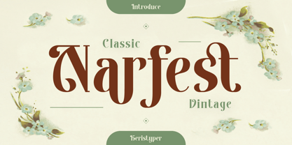 Narfest is a classic vintage serif font with an art nouveau style, in feminine and unique characteristics. This font is good for logo design, Social media, Movie Titles, Books Titles, short text even long text letters, and good for your secondary text font with script, sans, or serif. **Featured:** * Standard Uppercase & Lowercase * Numeral & Punctuation * Multilingual : ä ö ü Ä Ö Ü ß ¿ ¡ * Alternate & Ligature * PUA encoded We recommend programs that support the OpenType feature and the Glyphs panel such as Adobe applications or Corel Draw. so you can use all the variations of the glyphs. Hope you enjoy our fonts!
 - Marydale by Three Islands Press,
$29.00 While helping produce a trade magazine years ago, I admired the hand-lettering of the art director -- a woman named Marydale -- and suggested she let me model a font after her penmanship. She agreed and drew out the alphabet, and I launched an old copy of Fontographer and (to shorten a long story) ended up developing my very first digital typeface. Which has since, astonishingly, become famous worldwide. So now the real Marydale gets the mixed blessing of seeing her handwriting (and name) plastered all over the planet. Full release has regular, bold, and black weights.
 - Blacket by Letterara,
$16.00 Blacket is a stylish and elegant serif font. It is suitable for a wide variety of designs due to its neat and clean style. Incredibly versatile, this font fits a vast pool of designs, elevating them to the highest levels. Comes with some alternates and ligatures, so you can combine them to make a perfect typography design. It is ideal for your upcoming projects. Such as luxury logo and branding, classy editorial design, magazines, Packaging, poster, movie, cosmetic brand, fashion promotions, art gallery branding, and more. This font is PUA encoded which means you can access all of the glyphs.
 - Midfonde by Letterhend,
$19.00 Midfonde is a display typeface inspired by art deco style. This type of font perfectly made to be applied especially in logo, headline, signage and the other various formal forms such as invitations, labels, logos, magazines, books, greeting / wedding cards, packaging, fashion, make up, stationery, novels, labels or any type of advertising purpose. Features : uppercase & lowercase numbers and punctuation multilingual alternates / swashes and ligatures PUA encoded We highly recommend using a program that supports OpenType features and Glyphs panels like many of Adobe apps and Corel Draw, so you can see and access all Glyph variations.=
 - Hintown by Letterhend,
$17.00 Hintown is a unique serif with classy and classic look with vintage feel, inspired by art deco and 1900 signages. This font perfectly made to be applied especially in logo, and the other various formal forms such as invitations, labels, logos, magazines, books, greeting / wedding cards, packaging, fashion, make up, stationery, novels, labels or any type of advertising purpose. Features : uppercase and lowercase numbers and punctuation multilingual PUA encoded We highly recommend using a program that supports OpenType features and Glyphs panels like many of Adobe apps and Corel Draw, so you can see and access all Glyph variations.
 - Go Home JNL by Jeff Levine,
$29.00 Sheet music for another one of those songs from the early part of the 20th Century with a wonderfully wordy hand lettered title was the model for the Art Nouveau flavored Go Home JNL, which is available in both regular and oblique versions. 1908's "I Used to be Afraid to Go Home in the Dark (Now I'm Afraid to Go at All)" is comprised of eighteen words. It may have been a mouthful to request from the local sheet music shop, but the lettering on its cover made it a great candidate for preserving as a digital typeface.
 - Floorwalker JNL by Jeff Levine,
$29.00 On February 15, 1926, the Display Material Company of St. Paul Minnesota patented a sign making outfit consisting of a series of stencils in various sizes and styles, paints, brushes, instructions for use and all stored inside a convenient wooden case. Sold to any business in need of making many signs at low cost, this versatile stencil set enabled many a merchant to produce posters, show cards and price tags for pennies over what a commercial sign shop would charge. Floorwalker JNL is the digital version of one of these stencil fonts, solidified into a pre-Art Deco-era typeface.
 - Chipperly by Greater Albion Typefounders,
$16.95 Chipperly is a brand new face inspired by the art of the Edwardian poster, especially travel posters. It’s good for clear ad legible headings which need a gentle and unobtrusive period touch, and is the latest is Greater Albion’s line of faces to explore the ‘small capitals’ idea. In its regular weight, Chipperly’s glyphs are semi-shaded within an outer outline giving a distinctive look, while the Heavy weight maintains the separate outline but is completely filled. The Light form is an outline alone. All forms unite period elegance with the modern need for clear readiility.
 - Amagusi by Miracledsign,
$15.00 Amagusi is a font that is inspired by Japanese culture with all its uniqueness and beauty that makes the bamboo curtain country very loved by many people, as well as in the art of writing kanji which has its own aesthetic value. The amagasi font is formed and made by combining the contours and anatomy of kanji letters so that it has a very beautiful value when used in a sentence and is very attractive to readers who see it and of course it will make your product more elegant and appreciated by everyone who sees it.
 - Rosemary Love by HRDR,
$15.00 Rosemary Love is a modern brush font. Every single letter has been crafted with love to make your text look beautiful. Rosemary Love is perfect for invitations, business cards, inspirational quotes, posters, blog headers, wedding design, packaging, wall art, custom printables and a lot more! This font can run on any software but works better if using design software that have program to access all special characters (Stylistic Set01 - Stylistic Set04 & Ligatures) such as Adobe Illustrator, Photoshop, In Design, Corel draw etc. The file is OpenType, PUA Encoded (Use character Map for Windows OS, use Font Book for Mac OS).
 - VVDS Clementia by Vintage Voyage Design Supply,
$15.00 • Clementia – a stylish condensed serif font with Art Deco mood and huge variety of stylistic alternates and ligatures. Thereby your typographic gets a unique and authentic style for a vide variety of projects. Cafe's menu, wedding invitation, branding, magazine's headers, t-shirt prints, posters - all these projects will breathe uniqueness. Your typography may be more discreet with basic stylistic set or it can be more playful, artistic and expressive with any of ligatures or stylistic alternates. • 970 Glyphs total; True Italics; Open Type Features as stylistic alternates, ligatures, old style / tabular / fraction / superior figures, manicules and small caps; Multilingual (Include alternates)
 - StoneWash by Scholtz Fonts,
$15.00 StoneWash is a funky, grunge font, with a monumental marble finish. The font combines an “old as the hills grunge” look with IN YOUR FACE, modern lines. It has a look of very old, washed out denim, about to disintegrate. StoneWash has all of the grunge characteristics: -- it’s dirty and corroded -- it’s coarse & broken -- it’s rough & pitted It also has the characteristics of an African style font: -- it’s ethnic -- it’s irregular -- it’s primitive -- it’s rustic -- it’s vibrant Use StoneWash for a great variety of applications: -- think advertisements - think flyers - think graffiti art - think posters - think magazine pages. You have to have StoneWash.
 - Voger by Jafar07,
$14.00 VOGER is a work of art in the form of a modern serif font, with a design that exudes a clean, timeless elegance. With its upright and meaningful serif lines, "Voger" combines classic elements with a subtly refreshing modern aesthetic. Its enduring beauty meets a gentle touch of luxury, making "Voger" an ideal choice for various exclusive design projects. The simplicity and clarity in its design ensure that your message always appears clearly, regardless of size or medium. Moreover, "Voger" comes with a variety of unique alternate letters and ligatures, providing richness and creative flexibility in all your design creations.
 - Bornland by Letterhend,
$14.00 Introducing Bornland, a dynamic font that embodies a sporty and urban street art aesthetic. With its bold and energetic script style, this font brings a sense of edgy flair to any design project. Perfect for sports-themed branding, apparel, posters, and urban-inspired designs, Bornland adds a vibrant and expressive touch to capture attention and create a visually captivating experience. Features : Uppercase & lowercase Numbers and punctuation Alternates & Ligatures Multilingual PUA encoded We highly recommend using a program that supports OpenType features and Glyphs panels like many of Adobe apps and Corel Draw, so you can see and access all Glyph variations.
 - Jugendstil Flowers by Intellecta Design,
$19.90Jugendstil Flowers are a collection of dingbats fonts with ornaments, leitmotivs and fleurons, free inspired in the visual style from the golden age of the Art-Nouveau graphic movement. A beautiful work with and organic forms and sensibility with the taste of the vegetal world, by Chyrllene K, who brings you a extra gift : Buying the three fonts (family pack) you get a special free bonus: the Victorian Advertising EPS PACK with ten amazing artworks (in eps) inspired in the Victorian ages magazine advertisings (see the banners). See all the glyphs from Jugendstil Flowers in the pdf brochure at the gallery section. - Aringgo by Letterara,
$15.00 Aringgo is a stylish and elegant serif font. It is suitable for a wide variety of designs due to its neat and clean style. Incredibly versatile, this font fits a vast pool of designs, elevating them to the highest levels. Comes with some alternates and ligatures, so you can combine them to make a perfect typography design. It is ideal for your upcoming projects. Such as luxury logo and branding, classy editorial design, magazines, Packaging, poster, movie, cosmetic brand, fashion promotions, art gallery branding, and more. This font is PUA encoded which means you can access all of the glyphs.
 - Petulante by PintassilgoPrints,
$20.00 Petulante is a striking and creative hand-drawn face with a scribbled feel. It's an all-caps font and brings two options for each letter and numeral for a more organic and natural look. There are yet a few ornaments to add an extra something here and there. Petulante is ideal for book covers, packaging, apparel, album art, posters, or any situation where you want a stylish and uncommon hand-crafted look. And let's not forget to mention the broad language coverage: Petulante speaks more than 208 languages, including Russian and Greek. Yes, just take it everywhere!
 - ITC Greengate by ITC,
$29.99ITC Greengate is the result of a time-traveling, intercontinental collaboration--one between 21st century South African designer Richard Every, and early 20th century Scottish artist Jessie Marion King. Jessie Marion King (1875-1949) began her professional career as a book designer and illustrator, but over time her creativity found its outlet in many forms, including posters, jewelry, ceramics, wallpaper, fabrics, murals, interior design and costumes. After eventually settling in Kirkcudbright, Scotland, she founded Green Gate Close, a center for women artists. Although her style is reminiscent of the Art Nouveau artist, Aubrey Beardsley, King's aesthetic was an offshoot of the “Glasgow Style,” a Scottish hybrid of the Arts and Crafts movement and Art Nouveau. Often, her illustrations included hand lettering. It was just this kind of lettering that gave Richard Every his inspiration for ITC Greengate. When he saw some children's book illustrations that King created in 1898, he knew on the spot he had to complete the hand lettering as a typographic font. He began working on the typeface in 1996, but it took six years to be released as an ITC typeface. Every simplified and harmonized King's letterforms slightly and, most importantly, added a suite of lowercase characters. The result is a somewhat earthy Art Nouveau design, with a character quite distinct from typical digital revivals. Every's career has been as diverse as King's. He was born in Durban, South Africa and studied graphic design at ML Sultan Technikon in Durban. He's been an art director, freelance designer, the owner and manager of a nightclub and co-manager of a South African band. “Through it all,” he says, “typography has always been one of my passions.” - CoasterPoster by Nick Curtis stands as a tribute to the vibrant and boisterous spirit of vintage amusement parks and circuses, encapsulating the essence of fun and excitement through its design. As y...
- The font BENS ALIENS, masterfully created by SpideRaY, stands as a striking testament to the fascinating world of typography that straddles the realms of fantasy and functionality. This typeface draw...
- Monoment, designed by the renowned typeface designer Måns Grebäck, stands as a testament to the intersection of tradition and modernism in the world of typography. Characterized by its sleek and refi...
- AnglicanText by Dieter Steffmann is a captivating font that seems to bridge the old with the new, wrapping centuries of typography tradition in a package that's both accessible and enchanting for con...
- Public Secret DEMO, created by David Kerkhoff, reflects an intriguing blend of mystery and openness, as its name intriguingly suggests. This typeface navigates the delicate balance between revealing ...
- Bleeding Freaks is a font that resonates with the essence of horror, suspense, and a touch of macabre artistry. It's a font that belongs to the decorative or display category, crafted with the intent...
- Hit by Typodermic,
$11.95 Hey there! Are you looking for a typeface that exudes rugged individuality? Look no further than Hit! This display font boasts a textured design that gives your words a raw and weathered edge. With Hit, you can add a touch of crusty confidence to any message. Whether you’re creating a bold poster or a striking logo, this typeface will help you stand out from the crowd. Its unique, rough aesthetic is perfect for brands and designs that want to convey a sense of personality and authenticity. But don’t let its rough edges fool you—Hit also has a playful side. Its levity adds a touch of humor and lightheartedness to any design. Plus, its versatility means it can be used for a wide range of projects—from vintage-inspired graphics to contemporary designs with a twist. Overall, Hit is a typeface that dares to be different. So why not let your words stand out with its textured design? Give your message the voice it deserves with this intriguing and rugged typeface. Most Latin-based European writing systems are supported, including the following languages. Afaan Oromo, Afar, Afrikaans, Albanian, Alsatian, Aromanian, Aymara, Bashkir (Latin), Basque, Belarusian (Latin), Bemba, Bikol, Bosnian, Breton, Cape Verdean, Creole, Catalan, Cebuano, Chamorro, Chavacano, Chichewa, Crimean Tatar (Latin), Croatian, Czech, Danish, Dawan, Dholuo, Dutch, English, Estonian, Faroese, Fijian, Filipino, Finnish, French, Frisian, Friulian, Gagauz (Latin), Galician, Ganda, Genoese, German, Greenlandic, Guadeloupean Creole, Haitian Creole, Hawaiian, Hiligaynon, Hungarian, Icelandic, Ilocano, Indonesian, Irish, Italian, Jamaican, Kaqchikel, Karakalpak (Latin), Kashubian, Kikongo, Kinyarwanda, Kirundi, Kurdish (Latin), Latvian, Lithuanian, Lombard, Low Saxon, Luxembourgish, Maasai, Makhuwa, Malay, Maltese, Māori, Moldovan, Montenegrin, Ndebele, Neapolitan, Norwegian, Novial, Occitan, Ossetian (Latin), Papiamento, Piedmontese, Polish, Portuguese, Quechua, Rarotongan, Romanian, Romansh, Sami, Sango, Saramaccan, Sardinian, Scottish Gaelic, Serbian (Latin), Shona, Sicilian, Silesian, Slovak, Slovenian, Somali, Sorbian, Sotho, Spanish, Swahili, Swazi, Swedish, Tagalog, Tahitian, Tetum, Tongan, Tshiluba, Tsonga, Tswana, Tumbuka, Turkish, Turkmen (Latin), Tuvaluan, Uzbek (Latin), Venetian, Vepsian, Vietnamese, Võro, Walloon, Waray-Waray, Wayuu, Welsh, Wolof, Xhosa, Yapese, Zapotec Zulu and Zuni.
 - Anke Calligraphic FG - Unknown license

- Fleischmann Gotisch PT by preussTYPE,
$29.00 Johann Michael Fleischmann was born June 15th, 1707 in Wöhrd near Nuremberg. After attending Latinschool he started an apprenticeship as punchcutter in the crafts enterprise of Konstantin Hartwig in Nuremberg, which ought to last six years. For his extraordinary talent Fleischmann completed his apprenticeship after four and a half years, which was very unusual. 1727 his years of travel (very common in these days) began, during which he perfected his handcraft by working in different enterprises as journeyman. First location was Frankfurt/Main where he worked for nearly a year at the renowned type foundery of Luther and Egenolff. Passing Mainz he continued to Holland, where he arrived in November 1728 and stayed till he died in 1768. In Amsterdam he worked for several type founderies, among others some weeks for Izaak van der Putte; in The Hague for Hermanus Uytwerf. Between 1729 and 1732 he created several exquisite alphabets for Uytwerf, which were published under his own name (after his move to Holland Fleischmann abandoned the second n in his name), apparently following the stream of the time. After the two years with Uytwerf, Fleischmann returned to Amsterdam, where he established his own buiseness as punchcutter; following an advice of the bookkeeper and printer from Basel Rudolf Wetstein he opened his own type foundery 1732, which he sold in 1735 to Wetstein for financial reasons. In the following Fleischmann created several types and matrices exclusively for Wetstein. In 1743 after the type foundery was sold by Wetstein’s son Hendrik Floris to the upcoming enterprise of Izaak and Johannes Enschedé, Fleischmann worked as independent punchcutter mostly for this house in Haarlem. Recognizing his exceptional skills soon Fleischmann was consigned to cutting the difficult small-sized font types. The corresponding titling alphabets were mostly done by Jaques-Francois Rosart, who also cut the main part of the ornaments and borders used in the font examples of Enschedé. Fleischmann created for Enschedé numerous fonts. The font example published 1768 by Enschedé contains 3 titling alphabets, 16 antiquacuts, 14 italic cuts, 13 textura- and 2 scriptcuts, 2 greek typesets (upper cases and ligatures), 1 arabic, 1 malayan and 7 armenian font systems, 5 sets of musicnotes and the poliphonian musicnotesystem by Fleischmann. In total he brought into being about 100 alphabets - the fruits of fourty years of creative work as a punchcutter. Fleischmann died May 27th, 1768 at the age of 61. For a long time he was thought one of the leading punchcutters in Europe. A tragedy, that his creating fell into the turning of baroque to classicism. The following generations could not take much pleasure in his imaginative fonts, which were more connected to the sensuous baroque than to the bare rationalism of the upcoming industrialisation. Unfortunately therefore his masterpieces did not survive the 19th century and person and work of Fleischmann sank into oblivion. The impressive re-interpretation of the Fleischmann Antiqua and the corresponding italics by Erhard Kaiser from Leipzig, which were done for the Dutch Type Library from 1993 to 1997, snatched Fleischmann away from being forgotten by history. Therefore we want to place strong emphasis on this beautiful font. Fleischman Gotisch The other fonts by Fleischmann are only known to a small circle of connoisseurs and enthusiasts. So far they are not available in adequat quality for modern systems. Same applies the "Fleischman Gotisch", which has been made available cross platform to modern typeset-systems as CFF Open Type font through the presented sample. The Fleischman Gotisch has been proved to be one of the fonts, on which Fleischmann spent a good deal of his best effort; this font simply was near to his heart. Between 1744 and 1762 he created 13 different sizes of this font. All follow the same principles of forms, but their richness of details has been adapted to the particular sizes. In later times the font was modified more or less sensitive by various type founderies; letters were added, changed to current taste or replaced by others; so that nowadays a unique and binding mastercopy of this font is missing. Likewise the name of the font underwent several changes. Fleischmann himself probably never named his font, as he did with none of his fonts. By Enschedé this textura was named Nederduits, later on Nederduitsch. When the font was offered by the german type foundery Flinsch in Frankfurt/Main, the more convenient name of Fleischmann-Gotisch was chosen. In his "Masterbook of the font" and his "Abstract about the Et-character" Jan Tschichold refered to it as "Duyts" again. To honour the genious of Johann Michael Fleischmann we decided to name the writing "Fleischmann Gotisch PT" (unhyphenated). Developing the digital Fleischman Gotisch I decided not to use one of the thirteen sizes as binding mastercopy, but corresponding to the typical ductus of the font to re-create an independent use of forms strongly based on Fleischmann´s language of forms. All ascenders and descenders were standardised. Some characters, identified as added later on, were eliminated (especially the round lower case-R and several versions of longs- respectively f-ligatures) and others were adjusted to the principles of Fleischmann. Where indicated the diverse characters were integrated as alternative. They can be selected in the corresponding menu. All for the correct german black letter necessary longs and other ligatures were generated. Through the according integration into the feature-code about 85% of all ligatures in the type can be generated automatically. Problematic combinations (Fl, Fk, Fh, ll, lh, lk, lb) were created as ligatures and are likewise constructed automatically. A historically interesting letter is the "round r", which was already designated by Fleischmann; it is used after preceding round letters. Likewise interesting is the inventive form of the &-character, which is mentioned by Tschichold in his corresponding abstract. Nevertheless despite all interpretation it was very important to me to maintain the utmost fidelity to the original. With this digital version of a phantastic texturfont of the late baroque I hope to contribute to a blossoming of interest for this genious master of his kind: Johann Michel Fleischmann. OpenType features: - Unicode (ISO 10646-2) - contains 520 glyphes - Basic Latin - Latin-1 Supplement - Latin Extended-A - Latin Extended-B - Central European Glyhps - Ornaments - Fractions - Standard ligatures - Discretionary ligatures - Historical ligatures - Kerning-Table
 - Bandit Crime by Yoga Letter,
$20.00 "Bandit Crime" is an elegant and professional graffiti font. This font is equipped with uppercase, lowercase, numerals, punctuation, and multilingual support. Very suitable for logos, stickers, banners, branding, tattoos, Christmas, urban art, street art, wall art, film titles, business branding, and others.
 - Maiers Nr. 8 Pro by Ingo,
$27.00 A handwritten ”font for technicians“ from ca. 1900. Very geometrical, rigid forms borrowed from the typical characteristics of Jugendstil / Art Nouveau. This script is found in an old magazine which was issued sometime in the years shortly before WWI. The original copy, produced by means of a galvanized plate, is just 7 centimeters wide. It served as the model for technical professions in which, at that time, the captions of drawings were still done by hand. ingoFonts has not only digitized this beautiful typeface, we have also extended it to a whole family. In »Maier’s Alte Nr. 8« special attention was given to ensure the ”uneven“ edges, typical of handwritten script, remained effectively noticeable even in the digitized form. As a result, this ”technical“ font retains a handmade touch, while »Maier’s Neue Nr. 8« is the clean version with exact contours. The Art Nouveau forms, which are characteristic for the period of origin around the turn of the century around 1900, look especially pretty. The high degree of abstraction also seems strange in Maier's No. 8, especially when the age of the original is known. It is generally assumed that it was not until the Bauhaus in the late 1920s that such "modern" typefaces were created. Maier's No. 8 is a generation older! So many of today's supposedly "ultramodern" typefaces look quite old in comparison. In addition to the original two weights, Light and Bold, the Maiers Neue Nr. 8 got a regular and a extra-bold weight. Furthermore, the Neue is also available in italics. Although this is only a slanted version, unlike common practice, it is inclined to the left. Maier’s Nr. 8 Pro is suitable for all European languages. It includes ”Latin Extended-A,“ for Central and Eastern Europe incl. Turkish, and even Cyrillic and Greek, too. The font includes several stylistic alternates as well as a number of ligatures.
 - Billion Dreams by Mans Greback,
$59.00 Billion Dreams is a cool logotype script font. It has thick brush strokes that gives character and personality to any graphic. It contains stylistic alternates, swash alternates, ligatures and swash characters -- all to give the font a great variability and avoid repetitiveness. It has an extensive lingual support, covering all European Latin scripts. The font contains all characters you'll ever need, including all punctuation and numbers.
 - Altemus Rules by Altemus Creative,
$11.00 Rules is a collection of 174 geometric and shape rule designs including all flips and flops. Rules Two is a collection of 174 underlined geometric and shape rule designs including all flips and flops. Rules Three is a collection of 174 loop rule designs including all flips and flops. Rules Four is a collection of 174 classic and scotch rule designs including all flips and flops.
 - Osnova by AndrijType,
$18.75 The common Slavic word Osnova means basis in English. This universal but still distinctive typeface can make a good foundation for any design project. There is the main Osnova version and separated faces Osnova Alt, Osnova Fancy and Osnova Small Caps for Western Latin, Greek and Cyrillic languages.
 - Fette Kanzlei by RMU,
$30.00 Fette Kanzlei is a beautiful mid-19th century blackletter font with a touch of calligraphy which has been brought back into life again. The long s can be reached by typing alt plus b or by activating the OT feature historical forms. This font also contains oldstyle numerals.
 - Daily Sans by Up Up Creative,
$15.00 Introducing Daily Sans, a complete sans serif font family with 10-weights, plus italics (20-fonts total). Daily Sans was designed to be an everyday-use geometric typeface with excellent legibility and a neutral tone. It's a perfect go-to for branding, web, and print design projects and can stand out on its own or play a supporting role in font pairings. It’s great for body/paragraph type as well as for larger display type. Because the goal was to create a font you can truly use for any project, purpose, or occasion, Daily Sans includes a wide range of weights starting from the very thin Hairline all the way through to the very bold Heavy. This means that you’re always able to find just the right weight for your needs, and it makes creating type hierarchies a breeze. Daily Sans comprises 20 fonts, each with approximately 450 glyphs - including 16 standard and discretionary ligatures, three ampersand variants, a full set of arrows, and more - and supports over 200 languages. The OpenType features can be very easily accessed by using OpenType-savvy programs such as Adobe Illustrator and Adobe InDesign. (To access these awesome features in Microsoft Word, you'll need to get comfortable with the advanced tab of Word's font menu.) PLEASE ENJOY! I can't wait to see what you make with Daily Sans. Feel free to use the #upupcreative and #dailysansfont tags to show me what you've been up to.
 - Quercus Whiteline by Storm Type Foundry,
$69.00 Quercus is characterised by open, yet a little bit condensed drawing with sufficient spacing so that the neighbouring letters never touch. It has eight interpolated weights with respective italics. Their fine gradation allows to find an exact valeur for any kind of design, especially on the web. Quercus serif styles took inspiration from classicistic typefaces with vertical shadows, ball terminals and thin serifs. The italics have the same width proportion as upright styles. This “modern” attitude is applied to both families and calls for use on the same page, e g in dictionaries and cultural programmes. Serif styles marked by “10” are dedicated to textual point sizes and long reading. The sans-serif principle is rather minimalistic, with subtle shadows and thinned joints between curved shapes and stems. Quercus family comprises of the usual functionality such as Small Caps, Cyrillics, diacritics, ligatures, scientific and aesthetic variants, swashes, and other bells & whistles. It excels in informational and magazine design, corporate identity and branding, but it’s very well suited for book covers, catalogues and posters as well. When choosing a name for this typeface I've been staring out from my studio window, thinking helplessly without any idea in sight. Suddenly I realised that all I can see is a spectacular alley of oaks (Quercus in Latin) surrounding my house. These oaks were planted by the builders of local ponds under the leadership of Jakub Krčín in the fifteenth century.
