3,206 search results
(0.031 seconds)
- Al Mahdis by Mightyfire,
$15.00 We're proudly introduce Al Mahdis, the arabic-style font. Starting from the idea of making an Arabic font that remains clean and easy to read, Al Mahdis was born. This font is very suitable for writing calligraphy, book titles, or even your business logo. We're honored and hope the Al Mahdis font can be part of your special work. Thank You :)
 - Ebenezer by Typodermic,
$11.95 Welcome to the world of darkness and fear, where shadows dance and nightmares come to life. Introducing Ebenezer, the typeface that will send shivers down your spine and make your message stand out like never before. With Goldburg-inspired letterforms and intricate, eerie details, Ebenezer is the perfect choice for any project that requires a macabre touch. Each character is carefully crafted to evoke a sense of dread and terror, making it the perfect typeface for horror movies, Halloween-themed designs, or any project that requires a dark and ominous feel. But Ebenezer is more than just a typeface. With its OpenType ligatures, common character sequences are automatically substituted with bespoke combos, ensuring that your message has an even more ghastly impact. Each word becomes a work of art, with letters combining and twisting into haunting shapes that will leave your audience speechless. So embrace the darkness and let Ebenezer lead the way. Its spooky, highly detailed design will take your project to the next level, ensuring that your message is unforgettable and truly terrifying. Whether you’re designing a poster, creating a logo, or simply looking to add a touch of macabre elegance to your text, Ebenezer is the perfect choice. Most Latin-based European writing systems are supported, including the following languages. Afaan Oromo, Afar, Afrikaans, Albanian, Alsatian, Aromanian, Aymara, Bashkir (Latin), Basque, Belarusian (Latin), Bemba, Bikol, Bosnian, Breton, Cape Verdean, Creole, Catalan, Cebuano, Chamorro, Chavacano, Chichewa, Crimean Tatar (Latin), Croatian, Czech, Danish, Dawan, Dholuo, Dutch, English, Estonian, Faroese, Fijian, Filipino, Finnish, French, Frisian, Friulian, Gagauz (Latin), Galician, Ganda, Genoese, German, Greenlandic, Guadeloupean Creole, Haitian Creole, Hawaiian, Hiligaynon, Hungarian, Icelandic, Ilocano, Indonesian, Irish, Italian, Jamaican, Kaqchikel, Karakalpak (Latin), Kashubian, Kikongo, Kinyarwanda, Kirundi, Kurdish (Latin), Latvian, Lithuanian, Lombard, Low Saxon, Luxembourgish, Maasai, Makhuwa, Malay, Maltese, Māori, Moldovan, Montenegrin, Ndebele, Neapolitan, Norwegian, Novial, Occitan, Ossetian (Latin), Papiamento, Piedmontese, Polish, Portuguese, Quechua, Rarotongan, Romanian, Romansh, Sami, Sango, Saramaccan, Sardinian, Scottish Gaelic, Serbian (Latin), Shona, Sicilian, Silesian, Slovak, Slovenian, Somali, Sorbian, Sotho, Spanish, Swahili, Swazi, Swedish, Tagalog, Tahitian, Tetum, Tongan, Tshiluba, Tsonga, Tswana, Tumbuka, Turkish, Turkmen (Latin), Tuvaluan, Uzbek (Latin), Venetian, Vepsian, Võro, Walloon, Waray-Waray, Wayuu, Welsh, Wolof, Xhosa, Yapese, Zapotec Zulu and Zuni.
 - ITC Jambalaya by ITC,
$29.99The talented designer of the well-known Formata typeface, Bernd Möllenstädt was born on February 22, 1943 in Germany. He has lived in Westfalia, Berlin and Munich, Germany, and now permanently resides in Munich. From his earliest years he was interested in typography, first studying as a typesetter (1961-64) and then a student of graphic design (1964-1967). In 1967 Möllenstädt joined the Berthold typefoundry and his career as one of the leading type personalities began. One year after joining Berthold, he became the head of the type design department. For 22 years he worked as the head of that department, under the leadership of Günter Gerhard Lange. Upon Lange’s retirement in 1990, Möllenstädt ascended to the type directorship of Berthold where he was responsible for type design and font mastering. Möllenstädt designed two typeface for the Berthold Exklusiv Collection, Formata (1988) and Signata (1994). Under license from Berthold, Adobe marketed Formata as part of the Adobe Type Library. Formata is now one of the most successful sans serifs in the world, used both in American and European magazines, as well as newsletters in the Far East (Gulf New Kuwait). Formata also was chosen as the corporate typeface of Postbank, Allianz, VW Skoda, Infratest Burke, etc. In addition to his work for Berthold, Möllenstädt has lectured at local Munich schools on typography and graphic design, and designed corporate type identities and diverse logos for major corporations, including Allianz, Commerzbank, Mauser Officer and Hoepfner. Möllenstädt continues his association with Berthold as a designer. He most recently completed small caps and fractions for Formata. He also has substantially contributed to Berthold's Euro symbol program (e.g. adding the Euro symbol design-specific to the most popular families). Möllenstädt currently is working on a new Berthold Exklusiv design. - Generis Slab by Linotype,
$29.00The idea for the Generis type system came to Erik Faulhaber while he was traveling in the USA. Seeing typefaces mixed together in a business district motivated him to create a new type system with interrelated forms. The first design scheme came about in 1997, following the space saving model of these American Gothics. Faulhaber then examined the demands of legibility and various communications media before finally developing the plan behind this type system. Generis’s design includes two individually designed styles; each of with is available with and without serifs, giving the type system four separate families. Each includes at least four basic weights: Light, Regular, Medium, and Bold. Further weights, small caps, old style figures, and true italics were added to each family where needed. The Generis type system is designed to meet both optical criteria and the highest possible measure of technical precision. Harmony, rhythm, legibility, and formal restraint make up the foreground. Generis combines aesthetic, technical, and economic advantages, which purposefully and efficiently cover the whole range of corporate communication needs. The unified basic form and the individual peculiarity of the styles lead to Generis’ systematic, total-package concept. The clear formal language of the Generis type system resides beneath the information, bringing appropriate typographic expression to high-level corporate identity systems, both in print and on screen. The condensed and aspiring nature of the letterforms allows for the efficient setting of body copy, and the economic use of the page. A range of accented characters allows text to be set in 48 Latin-based languages, offering maximal typographic free range. This previously unknown level of technical and design execution helps create higher quality typography in all areas of corporate communication. Optimal combinations within the type system: Generis Serif or Generis Slab with Generis Sans or Generis Simple. - Generis Serif by Linotype,
$29.00The idea for the Generis type system came to Erik Faulhaber while he was traveling in the USA. Seeing typefaces mixed together in a business district motivated him to create a new type system with interrelated forms. The first design scheme came about in 1997, following the space saving model of these American Gothics. Faulhaber then examined the demands of legibility and various communications media before finally developing the plan behind this type system. Generis’s design includes two individually designed styles; each of with is available with and without serifs, giving the type system four separate families. Each includes at least four basic weights: Light, Regular, Medium, and Bold. Further weights, small caps, old style figures, and true italics were added to each family where needed. The Generis type system is designed to meet both optical criteria and the highest possible measure of technical precision. Harmony, rhythm, legibility, and formal restraint make up the foreground. Generis combines aesthetic, technical, and economic advantages, which purposefully and efficiently cover the whole range of corporate communication needs. The unified basic form and the individual peculiarity of the styles lead to Generis’ systematic, total-package concept. The clear formal language of the Generis type system resides beneath the information, bringing appropriate typographic expression to high-level corporate identity systems, both in print and on screen. The condensed and aspiring nature of the letterforms allows for the efficient setting of body copy, and the economic use of the page. A range of accented characters allows text to be set in 48 Latin-based languages, offering maximal typographic free range. This previously unknown level of technical and design execution helps create higher quality typography in all areas of corporate communication. Optimal combinations within the type system: Generis Serif or Generis Slab with Generis Sans or Generis Simple. - Generis Simple by Linotype,
$39.00The idea for the Generis type system came to Erik Faulhaber while he was traveling in the USA. Seeing typefaces mixed together in a business district motivated him to create a new type system with interrelated forms. The first design scheme came about in 1997, following the space saving model of these American Gothics. Faulhaber then examined the demands of legibility and various communications media before finally developing the plan behind this type system. Generis’s design includes two individually designed styles; each of with is available with and without serifs, giving the type system four separate families. Each includes at least four basic weights: Light, Regular, Medium, and Bold. Further weights, small caps, old style figures, and true italics were added to each family where needed. The Generis type system is designed to meet both optical criteria and the highest possible measure of technical precision. Harmony, rhythm, legibility, and formal restraint make up the foreground. Generis combines aesthetic, technical, and economic advantages, which purposefully and efficiently cover the whole range of corporate communication needs. The unified basic form and the individual peculiarity of the styles lead to Generis’ systematic, total-package concept. The clear formal language of the Generis type system resides beneath the information, bringing appropriate typographic expression to high-level corporate identity systems, both in print and on screen. The condensed and aspiring nature of the letterforms allows for the efficient setting of body copy, and the economic use of the page. A range of accented characters allows text to be set in 48 Latin-based languages, offering maximal typographic free range. This previously unknown level of technical and design execution helps create higher quality typography in all areas of corporate communication. Optimal combinations within the type system: Generis Serif or Generis Slab with Generis Sans or Generis Simple. - Generis Sans by Linotype,
$29.00The idea for the Generis type system came to Erik Faulhaber while he was traveling in the USA. Seeing typefaces mixed together in a business district motivated him to create a new type system with interrelated forms. The first design scheme came about in 1997, following the space saving model of these American Gothics. Faulhaber then examined the demands of legibility and various communications media before finally developing the plan behind this type system. Generis’s design includes two individually designed styles; each of with is available with and without serifs, giving the type system four separate families. Each includes at least four basic weights: Light, Regular, Medium, and Bold. Further weights, small caps, old style figures, and true italics were added to each family where needed. The Generis type system is designed to meet both optical criteria and the highest possible measure of technical precision. Harmony, rhythm, legibility, and formal restraint make up the foreground. Generis combines aesthetic, technical, and economic advantages, which purposefully and efficiently cover the whole range of corporate communication needs. The unified basic form and the individual peculiarity of the styles lead to Generis’ systematic, total-package concept. The clear formal language of the Generis type system resides beneath the information, bringing appropriate typographic expression to high-level corporate identity systems, both in print and on screen. The condensed and aspiring nature of the letterforms allows for the efficient setting of body copy, and the economic use of the page. A range of accented characters allows text to be set in 48 Latin-based languages, offering maximal typographic free range. This previously unknown level of technical and design execution helps create higher quality typography in all areas of corporate communication. Optimal combinations within the type system: Generis Serif or Generis Slab with Generis Sans or Generis Simple. - "VladTepesII (Vlads Dad)" designed by Bolt Cutter Design, conjures an image of a font that is deeply rooted in historical grandeur and mystery, much like the legacy of Vlad the Impaler, the inspirati...
- Hatchet Job by Wing's Art Studio,
$10.00 Hatchet Job - A Halloween Brush Font Unleashed onto an unsuspecting public this Halloween, Hatchet Job is a brush font inspired by the slasher and cabin-in-the-woods horror movies and comics typical of the 1970s and 80s. This textured all-caps design takes its visual style from old cabins, ghost ships and axe-splintered wood that can only spell danger! With a bold brush strokes and frayed edges, it offers the tools to leave your readers nerves in tatters! The Hatchet Job font family includes all-caps uppercase and lowercase characters, along with numerals, punctuation, symbols and language support. Also included are a complete set of alternative characters and additional paint marks, drips and splashes. Wingsart Studio Design Tip! The uppercase and lowercase characters work great when mixed in an alternating fashion, with shapes that combine to create a dynamic, un-hinged look that's perfect for the Halloween season. Add the alternatives and paint marks into the mix and you'll have yourself a title or header design that looks truly custom-made.
 - Night Visions by Wing's Art Studio,
$14.00 Night Visions: An Unsettling Hand-Drawn Brush Script Font Night Visions is a hand-drawn script font with a loose style typical of late night horror and thriller movie posters. It’s designed to look as though ink has been laid with the nervous flick of the artists brush, giving a random, imperfect, but elegant result. This font comes with the flowing script of the regular version or a complete set of non-script alternatives. Added to which there are additional character alternatives and special ligatures to experiment with for a truly hand-made look. Each version comes with a full set of uppercase and lowercase characters along with numerals, punctuation and language support. I recommend this font for anyone about to design a header or title that needs an authentically hand-made look. It’s the perfect choice for movie titles or posters, album covers, comic books, t-shirts or editorials. It’s a font that rewards experimentation and offers many options for your designs. Check out the visuals for usage ideas.
 - The Abduction2000 font, created by the imaginative mind behind the alias PizzaDude, is a font that encapsulates the quirkiness and creativity of the late 90s and early 2000s design ethos. This font i...
- ChrisMaster - Personal use only

- Cags Hetonal by Imoodev,
$20.00 Cags Hetonal is a rounded sans serif font with visual elegance, smooth curves, and beautiful ligatures clear, making your work look true and attractive. A very versatile font that works in both large and small sizes. This font is suitable for a wide variety of projects such as invitations, logos, branding, magazine, photography, card, product packaging, mugs, quotes, poster, labels, signatures, and more. A font that is perfect for all business sectors including personal projects, studio, corporate, creative agency, industrial, company, etc.
 - Akoher by Imoodev,
$20.00 Akoher is a vintage display font with visual elegance, smooth curves, and beautiful ligatures clear, making your work look true and attractive. A very versatile font that works in both large and small sizes. This font is suitable for a wide variety of projects such as invitations, logos, branding, magazine, photography, card, product packaging, mugs, quotes, poster, labels, signatures, and more. A font that is perfect for all business sectors including personal projects, studio, corporate, creative agency, industrial, company, etc.
 - HS Dream by Hiba Studio,
$50.00 HS Dream is based on some modern lines of Kufi calligraphy which supports Arabic, Persian. The typeface has been optimized for corporate identity work and modern projects when a contemporary and simple look is requested. It is an Opent type Arabic font and features four stylistic sets. This font consists of four weights (light, regular, medium and bold) which can constitute a striking addition to the library of Arabic fonts models that meet the purposes of various designs for all taste.
 - Eskos Display by Pesotsky Victor,
$10.00 Eskos Display is a bright and eye-catching headline set. It is designed specifically to attract attention and be the base of the composition. It is deliberately diagonal and gives a sharp oblique texture to the texts. Such an exciting font will be perfect for posters, headlines on media sites or magazines, and it can also be the base for a corporate identity. The font supportsBasic Latin, Cyrillic and more than 100 languages all together. Eskos Display was designed by Viktor Pesotsky.
 - Jokelyn Display by FoxType,
$35.00 Introducing Jokelyn Display new generation Decorative Typeface. Jokelyn Typeface created with the vision of to attract the audience to your brand. The finest details of this typeface are methodically and mathematically created. Jokelyn is created with all the tasks of a corporate font and also for the usage in a variety of projects, including branding, logos, titles, headlines, posters, screens, display, digital ads, and everything else. We are putting a lot of effort on this font as a long-term project.
 - Linotype Bariton by Linotype,
$29.00Linotype Bariton is part of the Take Type Library, chosen from contestants of Linotype’s International Digital Type Design Contests of 1994 and 1997. Designer Alexej Chekoulaev designed his font in one weight to mirror the Zeitgeist of the early 1930s. The characters of this extremely bold font are based on the form of a rectangle though its rounded edges soften its look a bit. Linotype Bariton should be used only in larger point sizes in headlines which should really catch the eye. - Heno Disquel by Imoodev,
$20.00 Heno disquel is sans serif style font with visual elegance, smooth curves, and beautiful ligatures clear, making your work look true and attractive. A versatile font that works in both large and small sizes. This font is suitable for a wide variety of projects such as invitations, logos, branding, magazine, photography, card, product packaging, mugs, quotes, poster, labels, signatures, and more. A font which is perfect for all business sectors including personal projects, studio, corporate, creative agency, industrial, company, etc.
 - Smilodon by astroluxtype,
$20.00 Smilodon an ancient distressed font made with raptor claws, cat’s teeth, stone and sky? It's a corroded, distressed, punk scrawl with lots of attitude. This is a basic minimal glyph set with uppercase and lowercase forms. This is a headline display font suggested use would be 60 point or larger. Note: The metric and kerning on this font is extremely tight spacing and user should letterspace to desired width within application type controls. This monster cat is pre-historic indeed.
 - Anes Ramuk by Imoodev,
$20.00 Anes Ramuk is modern typography fonts with visual elegance, smooth curves, and beautiful ligatures clear, making your work look true and attractive. A very versatile font that works in both large and small sizes. This font is suitable for a wide variety of projects such as invitations, logos, branding, magazine, photography, card, product packaging, mugs, quotes, poster, labels, signatures, and more. A font that is perfect for all business sectors including personal projects, studio, corporate, creative agency, industrial, company, etc.
 - Paes Qimoe by Imoodev,
$20.00 Paes qimoe is aesthetic display font with visual elegance, smooth curves, and beautiful ligatures clear, making your work look true and attractive. A very versatile font that works in both large and small sizes. This font is suitable for a wide variety of projects such as invitations, logos, branding, magazine, photography, card, product packaging, mugs, quotes, poster, labels, signatures, and more. A font which is perfect for all business sectors including personal projects, studio, corporate, creative agency, industrial, company, etc.
 - Matura by Monotype,
$29.99 Matura font was designed by the Hungarian wood engraver and type designer Imre Reiner in 1938 and released by the Monotype Corporation. Matura font is a bold upright script that looks as if it were written with a broad-edged pen. A set of vibrant near-flourished capitals, called scriptorial capitals, broadens the usual range of script faces. Matura's distinctive lines make it appropriate for advertising uses as well as text headings, and for informal work like cards, invitations, and announcements.
 - Kods Hulling by Imoodev,
$20.00 Kod's hulling is rounded sans serif with visual elegance, smooth curves, and beautiful ligatures clear, making your work look true and attractive. A very versatile font that works in both large and small sizes. This font is suitable for a wide variety of projects such as invitations, logos, branding, magazine, photography, card, product packaging, mugs, quotes, poster, labels, signatures, and more. A font that is perfect for all business sectors including personal projects, studio, corporate, creative agency, industrial, company, etc.
 - Dancing Rose by FoxType,
$50.00 Introducing Dancing Rose new generation Display Typeface. Dancing Rose Typeface created with the vision of to attract the audience to your brand. The finest details of this typeface are methodically and mathematically created. Dancing Rose is created with all the tasks of a corporate font and also for the usage in a variety of projects, including branding, logos, titles, headlines, posters, screens, display, digital ads, and everything else. We are putting a lot of effort on this font as a long-term project.
 - Quiet Time by ParaType,
$25.00The font was developed as a part of a corporate identity project for a pillow shop on the base of existing logo. It’s an attempt to reflect the space of a dream -- virtual reality where objects don’t have solid shapes, but present just hardly noticed disappearing contours. This idea determines the design of letters that resemble illustrations rather then alphabetical symbols and are based on ultra thin stems. The font was designed by Elena Kolesnikova and released by ParaType in 2009. - Werner Display by FoxType,
$15.00 Introducing **Werner Display** new generation Decorative Typeface. Werner Typeface created with the vision of to attract the audience to your brand. The finest details of this typeface are methodically and mathematically created. Werner is created with all the tasks of a corporate font and also for the usage in a variety of projects, including **branding, logos, titles, headlines, posters, screens, display, digital ads**, and everything else. We are putting a lot of effort on this font as a long-term project.
 - Aberlo Display by FoxType,
$35.00 Aberlo Display new generation Typeface. Aberlo Dispaly Typeface created with the vision of attract the audience to your brand. The finest details of this typeface are methodically and mathematically created. Aberlo is created with all the tasks of a corporate font and also for the usage in a variety of projects, including branding product, logos, titles, headlines, posters, screens, display, digital ads, and everything else. We are putting a lot of effort on this font as a long-term project.
 - Ela Demiserif by Wiescher Design,
$39.50Ela Demiserif is the typeface I originally designed for the business of my second wife and mother of my two sons; her name is, of course, Michaela. Ela - the typeface - is suitable for magazines, newspapers, posters, advertiments, books, text, documentation/business reports, business correspondence, multimedia, and corporate design. Because lately this typeface became very popular I decided to extend it to eight weights and I added italic and smallcaps versions to it. So now Ela is a full fledged typeface. - Diegolk by Imoodev,
$20.00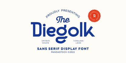 Diegolk is a sans serif fonts with visual elegance, smooth curves, and beautiful ligatures clear, making your work look true and attractive. A very versatile font that works in both large and small sizes. This font is suitable for a wide variety of projects such as invitations, logos, branding, magazine, photography, card, product packaging, mugs, quotes, poster, labels, signatures and more. A font that is perfect for all business sectors including personal projects, studio, corporate, creative agency, industrial, company, etc.
 - SF Rasmi by Sultan Fonts,
$29.99 Rasmi font It is a font for print and the web. Especially for coordinating university and school books, scientific research, exams, government and corporate correspondence, and coordinating financial, judicial, and diplomatic documents. The Rasmi font family includes four weights: thick for headlines, bold for subheadings, medium for body text, and thin for footnotes and explanations. The font supports Arabic, Latin, Persian, Urdu, and Kurdish languages. The graphic designer can use Rasmi variable font to reach wider options in working with the text.
 - Campton by René Bieder,
$30.00 Campton is an unconventional typeface based on the first steps of the newly born sans serif genre in the early twentieth century. Its character draws inspiration from Gill Sans and Johnston Sans while combining it with contemporary elements. The result is a modern and unorthodox family that is perfectly suited for graphic design application ranging from editorial and corporate design to web and interaction design. Campton comes in nine weights with matching italics and is equipped with a wide range of opentype features.
 - Flockin Display by FoxType,
$50.00 Introducing Flockin Display new generation Decorative Typeface. Flockin Typeface created with the vision of to attract the audience to your brand. The finest details of this typeface are methodically and mathematically created. Flockin is created with all the tasks of a corporate font and also for the usage in a variety of projects, including branding, logos, titles, headlines, posters, screens, display, digital ads, and everything else. We are putting a lot of effort on this font as a long-term project.
 - Interstellar by Loshaj Foundry,
$10.00 Interstellar is inspired by science fiction movies and writings. My initial idea for the font was to be used for signage and user interfaces that would appear on spaceships and bases. However, Interstellar is very flexible and can be used in many creative ways. For example, it is perfectly suited for graphic design applications ranging from editorial, corporate, web, interaction, and product design. The font contains 400+ glyphs which includes uppercase letters, numbers, symbols, accented characters, and multiple language support. Check it out.
 - Magnitudes Variable by DuoType,
$90.00 Magnitude is a font inspired by classics like Eurostyle and Bank Gothic, with geometric characteristics and dynamics style. Designed to be used in a wide variety of applications such as advertising, corporate projects, branding and retail product design. The font is well-suited for headings, display use and short text. The Magnitudes family is available in 36 weights, ranging from light to heavy, to condensed and expanded with matching italics. The font contains a character set of 401 characters supporting 206 different languages.
 - Cemains by Imoodev,
$20.00 Cemains is a modern sans serif typeface with visual elegance, smooth curves, and beautiful ligatures clear, making your work look true and attractive. A very versatile font that works in both large and small sizes. This font is suitable for a wide variety of projects such as invitations, logos, branding, magazine, photography, card, product packaging, mugs, quotes, poster, labels, signatures, and more. A font that is perfect for all business sectors including personal projects, studio, corporate, creative agency, industrial, company, etc.
 - Beilu Moolli by Imoodev,
$20.00 Beilu moolli is beautiful modern fonts with visual elegance, smooth curves, and beautiful ligatures clear, making your work look true and attractive. A very versatile font that works in both large and small sizes. This font is suitable for a wide variety of projects such as invitations, logos, branding, magazine, photography, card, product packaging, mugs, quotes, poster, labels, signatures,s and more. A font that is perfect for all business sectors including personal projects, studio, corporate, creative agency, industrial, company, etc.
 - Flowy by Typesketchbook,
$49.00 Flowy is a romantic and delicate type, made up of four sub-families. Brush, Script, and Condensed imitate freehand writing using different tools. In these families, you can choose the original version which embodies freehand styles, the Clean option which offers a clean-cut edge and is more suitable for corporate assignments, or Rust which changes the texture. Meanwhile, two options, Clean and Ink, come with the Sans type. The complete family has 29 individual typefaces that serve your projects every purpose.
 - AT Move Strano by André Toet Design,
$39.95 STRANO Like the name indicates it’s a strange typeface. Just capitals (including punctuation marks and numbers), composed from early sketches for a corporate identity in 2005 by André Toet. The complete font was restyled and translated to a Monospaced version. It’s a quite versatile font: it can be used in a lot of different cases, not only in print but also in architecture and street furniture. Think about lettering on benches, bridges, buildings. Concept/Art Direction/Design: André Toet © 2017
 - Miller by FoxType,
$50.00 Introducing Miller Display new generation Decorative Typeface. Miller Typeface created with the vision of to attract the audience to your brand . The finest details of this typeface are methodically and mathematically created. Miller is created with all the tasks of a corporate font and also for the usage in a variety of projects, including branding, logos, titles, headlines, posters, screens, display, digital ads, and everything else. We are putting a lot of effort on this font as a long-term project.
