10,000 search results (0.02 seconds)
  1. Langó - Unknown license
  2. Langó - Unknown license
  3. Langó - Unknown license
  4. Antaviana - Unknown license
  5. Antaviana - Unknown license
  6. Antaviana - Unknown license
  7. Langó - Unknown license
  8. Antaviana - Unknown license
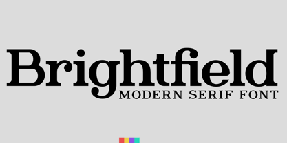
  9. Brightfield by Tadiar, $19.00
    Brightfield Font is classic and modern serif font carefully designed to excellent connections between letters. It is good for Text and Headers with lowercase and uppercase letters both! Please see the large preview images to see how it works.
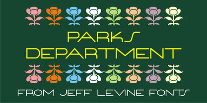
  10. Parks Department JNL by Jeff Levine, $29.00
    A WPA (Works Progress Administration) sponsored Water Carnival taking place in Central Park in the 1930s had "Department of Parks, City of New York" in the thin Art Deco hand lettering which is now available as Parks Department JNL.
  11. AdPro by Linotype, $29.99
    Roman Sehrer, a seasoned German advertising professional, digitized his handwriting to create this family of three fonts. Sehrer recommends this family for posters, logos, and restaurant menus. It works well with traditional sans serifs such as Helvetica or Univers.
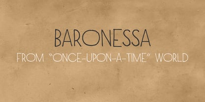
  12. Baronessa by Juraj Chrastina, $39.00
    Baronessa is a handmade font with a “once-upon-a-time” world feeling, warm and friendly but not excessively childish. No swashes or ornaments, subtle irregularity and carefully chosen letter shapes make it sweet and funny but not crazy.
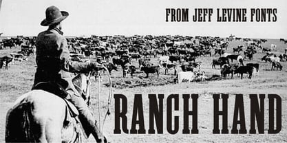
  13. Ranch Hand JNL by Jeff Levine, $29.00
    Ranch Hand JNL is a tall, condensed wood type with slab serifs. The font is somewhat bolder in weight than Nostrand JNL, but like its counterpart, fully captures the spirit and flavor of Nineteenth Century advertising, fliers and notices.
  14. Totem Forms by LMD, $20.00
    Totem Forms is based on a series of aluminum and rubber wall constructions currently showing in Europe and the United States. Mirek's work has been shown internationally for many years and this is his first foray into type development.
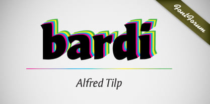
  15. Bardi by URW Type Foundry, $39.99
    Tilp Barde is a striking, moderately dynamic design suitable for many different typographic tasks. Its individual ductus is inspired by handwriting, however without calligraphic embellishment. There are no serifs but tiny endings which lead to think of wood-carving.
  16. Betabet by Elemeno, $25.00
    Betabet was drawn using traditional serif fonts as a guideline. The scribbled style and serifs combine to make an unusual font. Betabet does not look like handwriting, but works well where handwriting or script fonts might seem too insubstantial.
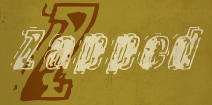
  17. Zapped by Cool Fonts, $24.00
    Zapped is a grungy font with a sort of extruded look. I was working on a poster for the punk band MAXILLA (they are hot check'm out). It looks like it came out of a war zone. Abuse it!
  18. Inkblock by Turtle Arts, $20.00
    Inkblock is based on various ink printing and rubbings from an ancient wood type set. Inkblock the alphabet has lots of detail, so looks great printed large. It's a good headline font or whenever an antique look is needed.
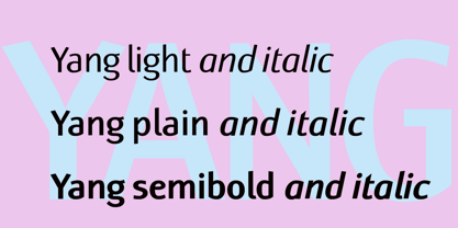
  19. Yang by Wiescher Design, $39.50
    Yang is a new Sans typeface that has a little bit of Ying in it. This combination makes it a very versatile font. Just give it a try and you will see. Yours working on the "Ying", Gert Wiescher
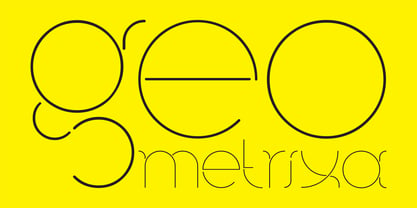
  20. MB GEOMETRIXA by Ben Burford Fonts, $25.00
    Inspired from geometric curves and circles, an audacious lower case display face with some alternate characters in Upper and Lower case glyphs. Great for Logos and Logotypes, headlines and larger text. Works well with smaller strap lines as well.
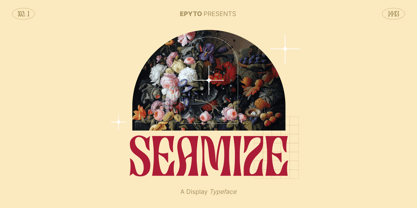
  21. Seamize by Epyto Type Co, $19.00
    Seamize is a display typeface, with a few experimental vibes and a semi-psychedelic feel. It works perfectly for creative projects such as logo, T-shirt/apparel, badge, invitation, packaging, headline, poster, magazine, greeting card, and many other purposes.
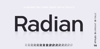
  22. Radian by Ayca Atalay, $8.00
    Radian is a modern geometric sans serif typeface that comes in 16 weights: 8 upright fonts and their matching italics. Radian works well in any graphic design project and purpose, both as a display typeface and in smaller sizes.
  23. Zaragoza by ITC, $29.99
    Zaragoza is the work of British designer Phill Grimshaw, a bold and beautifully rendered script which incorporated an internal zigzag decoration. Generous capitals harmonize with a lowercase that should be set close to reproduce the look of true handwriting.
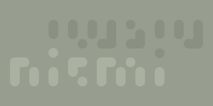
  24. Niemi by Blank Is The New Black, $10.00
    Niemi is a continuation of the work started with Versteeg. Where Versteeg was separated into individual circles, Huet connects these circles and adds a sharp geometric style. This creates a nice juxtaposition between the rounded ends, and sharp corners.
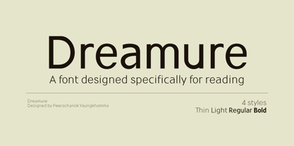
  25. Dreamure by Nexitype, $18.00
    Dreamure is a font designed specifically for reading on online platforms. With the fun and cheerful character of the font, Dreamure also gives you an easy-to-read design. Dreamure will help your work become attractive and user-friendly.
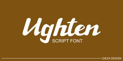
  26. Ughten by Dieza Design, $10.00
    Meet Ughten - a script with a huge personality. Warm, amiable and organic, yet elegant, Ughten is perfect if you want to convey individuality and style. Ughten works easily together to create visually appealing logos, packaging, presentations, headlines or editorials.
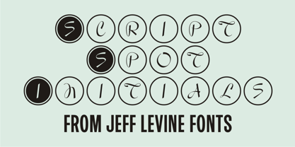
  27. Script Spot Initials JNL by Jeff Levine, $29.00
    Amidst the pages of the 1946 foreign-printed "100 Alphabets Publicitaires" ("100 Advertising Alphabets") was an example of a beautiful vertical script type design with a somewhat calligraphic look. This became the work model for Script Spot Initials JNL.
  28. Synchro by ITC, $29.99
    Synchro is the work of British designer Alan Birch. It is a futuristic typeface, which reproduces the look of electronic display systems. Synchro is an excellent choice for situations that require a font with an advanced, high-tech appearance.
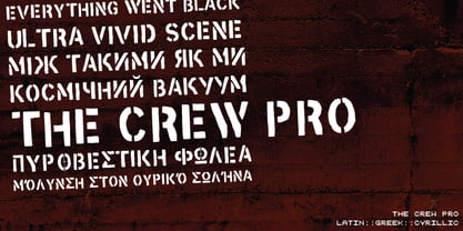
  29. The Crew Pro by The Type Fetish, $25.00
    The Crew Pro is based on the logo of the seminal punk band 7 Seconds. It was expanded to include extended Latin, extended Cyrillic and Greek alphabets so it will work with most languages in Europe and the Americas.
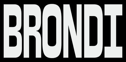
  30. Brondi by System B, $14.00
    Brondi is based on a wood type specimen from a french foundry, featuring a weird grotesque with inverted contrast and extremely tight spacing. It was used for large displays mainly in advertising. The font is a caps version only.
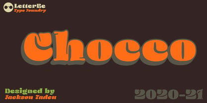
  31. Chocco by Oliveira 37, $26.00
    Chocco is a chunky and a fun display typeface. With an extra heavy but friendly personality, Chocco works well for posters, food packaging, children’s products and books, or any communications which needs to be friendly, fun, casual or loud.
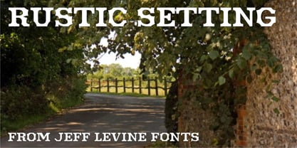
  32. Rustic Setting JNL by Jeff Levine, $29.00
    Rustic Setting JNL is the solidified version of Rustic Stencil JNL. Originally modeled from lettering on the cover a children's book, the solid version of this Western-inspired typeface is reminiscent of the classic wood types of the era.
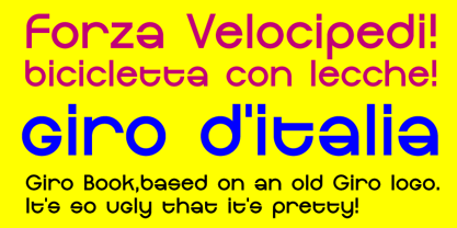
  33. Giro by Suomi, $25.00
    I saw an old logo for Giro d'Italia on telly, and was just smitten by the truly ugly type: just ruler and compass work, no intakes or optical corrections whatsoever. I just had to turn that into a font.
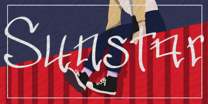
  34. Sunstar by Daily Studio, $14.00
    Sunstar is a multi-purpose font designed by Daily Studio. This font has its unique style in every letter. Making your works look spectacular. Perfect for headlines, logos, posters, and branding. Contain full uppercase, lowercase, punctuation, and multilingual lettes.
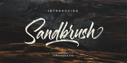
  35. Sandbrush by Typia Nesia, $20.00
    Sandbrush is a natural hand brushed font. Work great for any design needs : logo, branding, modern advertising design, logos, poster quote, book / cover Title, editorial design, website / blog, card, custom mug, pillow, t-shirts, and any hand-lettered needs.
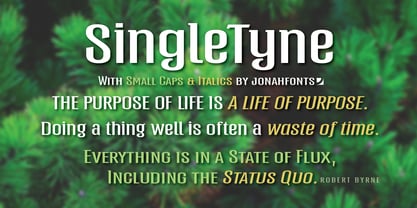
  36. Single Tyne by Jonahfonts, $35.00
    A single top serif creates a modern look between serifs and a single weight font. SingleTyne contains short ascenders and descenders for tight line spacing designed as a display face that also works well for short sentences and paragraphs.
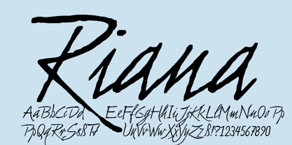
  37. Riana by Autographis, $39.50
    Riana is handwritten, scanned and then carefully worked over to keep the rough touch and the typical "fountainpen" look. The result is a very lively, expressive font. To me it has an Existentialist touch, but don't ask me why.
  38. SP Reka by Remote Inc, $39.00
    It was an unlikely union. Reka was a Maori maiden who made her home on the shores of Piha. I was a struggling actor who had spent the last six months in Bangkok, working as a cross-eyed prostitute.
  39. Presswood JNL by Jeff Levine, $29.00
    Presswood JNL was modeled from the title font used on the cover of a specimen book issued by the Delittle Wood Type Company of York, England. This bold, friendly sans serif is available in both regular and oblique versions.
  40. Antique by Storm Type Foundry, $26.00
    The concept of the Baroque Roman type face is something which is remote from us. Ungrateful theorists gave Baroque type faces the ill-sounding attribute "Transitional", as if the Baroque Roman type face wilfully diverted from the tradition and at the same time did not manage to mature. This "transition" was originally meant as an intermediate stage between the Aldine/Garamond Roman face of the Renaissance, and its modern counterpart, as represented by Bodoni or Didot. Otherwise there was also a "transition" from a slanted axis of the shadow to a perpendicular one. What a petty detail led to the pejorative designation of Baroque type faces! If a bookseller were to tell his customers that they are about to choose a book which is set in some sort of transitional type face, he would probably go bust. After all, a reader, for his money, would not put up with some typographical experimentation. He wants to read a book without losing his eyesight while doing so. Nevertheless, it was Baroque typography which gave the world the most legible type faces. In those days the craft of punch-cutting was gradually separating itself from that of book-printing, but also from publishing and bookselling. Previously all these activities could be performed by a single person. The punch-cutter, who at that time was already fully occupied with the production of letters, achieved better results than he would have achieved if his creative talents were to be diffused in a printing office or a bookseller's shop. Thus it was possible that for example the printer John Baskerville did not cut a single letter in his entire lifetime, for he used the services of the accomplished punch-cutter John Handy. It became the custom that one type founder supplied type to multiple printing offices, so that the same type faces appeared in various parts of the world. The type face was losing its national character. In the Renaissance period it is still quite easy to distinguish for example a French Roman type face from a Venetian one; in the Baroque period this could be achieved only with great difficulties. Imagination and variety of shapes, which so far have been reserved only to the fine arts, now come into play. Thanks to technological progress, book printers are now able to reproduce hairstrokes and imitate calligraphic type faces. Scripts and elaborate ornaments are no longer the privilege of copper-engravers. Also the appearance of the basic, body design is slowly undergoing a change. The Renaissance canonical stiffness is now replaced with colour and contrast. The page of the book is suddenly darker, its lay-out more varied and its lines more compact. For Baroque type designers made a simple, yet ingenious discovery - they enlarged the x-height and reduced the ascenders to the cap-height. The type face thus became seemingly larger, and hence more legible, but at the same time more economical in composition; the type area was increasing to the detriment of the margins. Paper was expensive, and the aim of all the publishers was, therefore, to sell as many ideas in as small a book block as possible. A narrowed, bold majuscule, designed for use on the title page, appeared for the first time in the Late Baroque period. Also the title page was laid out with the highest possible economy. It comprised as a rule the brief contents of the book and the address of the bookseller, i.e. roughly that which is now placed on the flaps and in the imprint lines. Bold upper-case letters in the first line dramatically give way to the more subtle italics, the third line is highlighted with vermilion; a few words set in lower-case letters are scattered in-between, and then vermilion appears again. Somewhere in the middle there is an ornament, a monogram or an engraving as a kind of climax of the drama, while at the foot of the title-page all this din is quietened by a line with the name of the printer and the year expressed in Roman numerals, set in 8-point body size. Every Baroque title-page could well pass muster as a striking poster. The pride of every book printer was the publication of a type specimen book - a typographical manual. Among these manuals the one published by Fournier stands out - also as regards the selection of the texts for the specimen type matter. It reveals the scope of knowledge and education of the master typographers of that period. The same Fournier established a system of typographical measurement which, revised by Didot, is still used today. Baskerville introduced the smoothing of paper by a hot steel roller, in order that he could print astonishingly sharp letters, etc. ... In other words - Baroque typography deserves anything else but the attribute "transitional". In the first half of the 18th century, besides persons whose names are prominent and well-known up to the present, as was Caslon, there were many type founders who did not manage to publish their manuals or forgot to become famous in some other way. They often imitated the type faces of their more experienced contemporaries, but many of them arrived at a quite strange, even weird originality, which ran completely outside the mainstream of typographical art. The prints from which we have drawn inspiration for these six digital designs come from Paris, Vienna and Prague, from the period around 1750. The transcription of letters in their intact form is our firm principle. Does it mean, therefore, that the task of the digital restorer is to copy meticulously the outline of the letter with all inadequacies of the particular imprint? No. The type face should not to evoke the rustic atmosphere of letterpress after printing, but to analyze the appearance of the punches before they are imprinted. It is also necessary to take account of the size of the type face and to avoid excessive enlargement or reduction. Let us keep in mind that every size requires its own design. The longer we work on the computer where a change in size is child's play, the more we are convinced that the appearance of a letter is tied to its proportions, and therefore, to a fixed size. We are also aware of the fact that the computer is a straightjacket of the type face and that the dictate of mathematical vectors effectively kills any hint of naturalness. That is why we strive to preserve in these six alphabets the numerous anomalies to which later no type designer ever returned due to their obvious eccentricity. Please accept this PostScript study as an attempt (possibly futile, possibly inspirational) to brush up the warm magic of Baroque prints. Hopefully it will give pleasure in today's modern type designer's nihilism.
Looking for more fonts? Check out our New, Sans, Script, Handwriting fonts or Categories
abstract fontscontact usprivacy policyweb font generator
Processing