10,000 search results
(0.071 seconds)
- Porchlight by Ana's Fonts,
$15.00 Porchlight is a soft serif font inspired by vintage French typography. It includes three weights: regular, semi bold and bold, with matching italics. It also includes bonus ornaments that complement the font beautifully, for elegant and easy designs. Included in this trendy font family: 6 fonts: regular, semibold and bold, plus italics, with over 300 glyps each, including small caps and lots of ligatures. ornaments font with 52 ornaments (13 different designs, mirrorred horizontally and vertically). borders font, with borders with different thickness. Use Porchlight in print layouts, logotype design, social media posts, branding and packaging.
 - Lancar by Twinletter,
$12.00 Lancar is a sans serif font family with lovely curving forms ideal for headings and text. The curves provide your project an exquisite and harmonious design, great for making your project look gorgeous. This font also comes with four families to help you with your job. With this typeface, you can make your project stand out. of course, your various design projects will be perfect and extraordinary if you use this font because this font is equipped with a font family, both for titles and subtitles and sentence text, start using our fonts for your extraordinary projects.
 - Karlie by DearType,
$40.00 Karlie is a neat combination of a friendly script & a modern all-caps serif in five widths. The font family is extremely versatile and is perfect for high-end logotypes and magazine headlines, let alone greeting cards, invitations, posters, book covers, ads and the various web and screen usages. The combination of two different font styles (script and serif) also performs very well on product packaging. As for the technical side, the Karlie family has extensive language support and includes a handful of ligatures, stylistic sets and swashes that add visual interest to every letter. We've also included some extras with ready-made words and symbols for more design freedom. The Karlie Font Family in a nutshell: - Karlie - a dancing baseline script with connecting letters - Karlie Alt - similar feel to Karlie, but with disconnected letters - Karlie Serif - a set of five serifs with different widths for a different impact - Karlie Extras - a set of additional designs that will add up to the family’s charm. The overall feel of the family is a combination of casual and sophisticated, thus making it perfect for modern-day applications.
 - Shnixgun by Typodermic,
$11.95 In the world of graphic design, the typeface is everything. It’s the foundation on which you build your message, the first impression your reader gets of your brand. And when it comes to creating a unique and memorable brand, there are few typefaces more distinctive than Shnixgun. Based on the venerable Franklin Card Gothic, this inky, textured typeface takes inspiration from the age-old tradition of metal type, infusing it with a modern, edgy twist. Its rustic, weathered appearance is the perfect choice for anyone looking to add a touch of authenticity to their work. But Shnixgun is more than just a pretty face. Thanks to its custom letter pairs, it breaks up the monotony of repetitive letters and adds a level of nuance and sophistication to your message. With Shnixgun, your words become more than just a series of letters—they become a work of art. But what really sets Shnixgun apart is its rusty texture. This is a typeface that wears its age proudly, with every letter infused with the character and patina of a bygone era. Whether you’re designing a vintage-style poster, a hand-crafted logo, or an art magazine spread, Shnixgun is the perfect choice for anyone looking to infuse their work with a sense of warmth, authenticity, and honesty. So don’t settle for a bland, soulless typeface. Let Shnixgun’s rusty glyphs permeate your message with affection and depth, and bring your designs to life with a touch of artistic flair. Most Latin-based European writing systems are supported, including the following languages. Afaan Oromo, Afar, Afrikaans, Albanian, Alsatian, Aromanian, Aymara, Bashkir (Latin), Basque, Belarusian (Latin), Bemba, Bikol, Bosnian, Breton, Cape Verdean, Creole, Catalan, Cebuano, Chamorro, Chavacano, Chichewa, Crimean Tatar (Latin), Croatian, Czech, Danish, Dawan, Dholuo, Dutch, English, Estonian, Faroese, Fijian, Filipino, Finnish, French, Frisian, Friulian, Gagauz (Latin), Galician, Ganda, Genoese, German, Greenlandic, Guadeloupean Creole, Haitian Creole, Hawaiian, Hiligaynon, Hungarian, Icelandic, Ilocano, Indonesian, Irish, Italian, Jamaican, Kaqchikel, Karakalpak (Latin), Kashubian, Kikongo, Kinyarwanda, Kirundi, Kurdish (Latin), Latvian, Lithuanian, Lombard, Low Saxon, Luxembourgish, Maasai, Makhuwa, Malay, Maltese, Māori, Moldovan, Montenegrin, Ndebele, Neapolitan, Norwegian, Novial, Occitan, Ossetian (Latin), Papiamento, Piedmontese, Polish, Portuguese, Quechua, Rarotongan, Romanian, Romansh, Sami, Sango, Saramaccan, Sardinian, Scottish Gaelic, Serbian (Latin), Shona, Sicilian, Silesian, Slovak, Slovenian, Somali, Sorbian, Sotho, Spanish, Swahili, Swazi, Swedish, Tagalog, Tahitian, Tetum, Tongan, Tshiluba, Tsonga, Tswana, Tumbuka, Turkish, Turkmen (Latin), Tuvaluan, Uzbek (Latin), Venetian, Vepsian, Võro, Walloon, Waray-Waray, Wayuu, Welsh, Wolof, Xhosa, Yapese, Zapotec Zulu and Zuni.
 - The Junos by Maulana Creative,
$14.00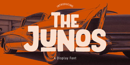 The Junos is a handwritten display sans font. With a bold stroke, rough and fun character with a bit of ligatures. To give you an extra creative work. The Junos font support multilingual more than 100+ language. This font is good for logo design, Social media, Movie Titles, Books Titles, a short text even a long text letter and good for your secondary text font with script or signature font. Make a stunning work with The Junos font. Cheers, MaulanaCreative
 - Fever Coaster by Maulana Creative,
$12.00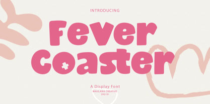 Fever Coaster Display Font is a casual handwritten font. With rough stroke, Condensed and fun character with a bit of ligatures. To give you an extra creative work. Fever Coaster font support multilingual more than 100+ language. This font is good for logo design, Social media, Movie Titles, Books Titles, a short text even a long text letter and good for your secondary text font with sans or serif. Make a stunning work with Fever Coaster font. Cheers, Maulana Creative
 - Belostika by Maulana Creative,
$14.00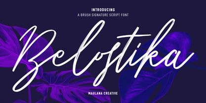 Belostika Brush Script Font is a modern smooth brush script font. With smooth brush stroke, fun character with a bit of ligatures and alternates. To give you an extra creative work. Belostika font support multilingual more than 100+ language. This font is good for logo design, Social media, Movie Titles, Books Titles, a short text even a long text letter and good for your secondary text font with sans or serif. Make a stunning work with Belostika font. Cheers, Maulana Creative
 - Frank Signature by Maulana Creative,
$12.00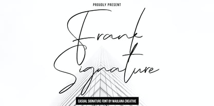 Frank Casual Signature Font is a modern feminine script font. With regular contrast stroke, fun character with some of ligatures. To give you an extra creative work. Frank Casual Signature Font support multilingual more than 100+ language. This font is good for logo design, Social media, Movie Titles, Books Titles, a short text even a long text letter and good for your secondary text font with sans or serif. Make a stunning work with Frank Casual Signature Font. Cheers, Maulana Creative
 - Hookypilots by Maulana Creative,
$12.00 Hookypilots Unique Handwritten Font Hookypilots is an expressive slanted handwritten display font. With bold stroke, fun character with a bit of ligatures and alternates. To give you an extra creative work. Hookypilots font support multilingual more than 100+ language. This font is good for logo design, Social media, Movie Titles, Books Titles, a short text even a long text letter and good for your secondary text font with sans or serif. Make a stunning work with Hookypilots font. Cheers, MaulanaCreative
 - Ollivette Elite by Chank,
$59.00Fly your inner geek flag with this cool new "Eleet" typewriter font. It's kinda like a wonky internet translator that converts normal text into leet-speak, so you can exchange encoded love notes with cyber-hackers and goofy-gamers. The actual glyphs in this font are interchangeable with the more logical Ollivette typewriter font, but here the characters have all been moved around to create stylized interpretation of similar glyphs. So "ELEET" could also be typed "31337". Except you don't have to think about it. Get it? Got it? Good! 3NJ0¥ TH15 ƒØÑ+ & U53 !† 0FT3N. - Ruth Clair by Typetemp Studio,
$20.00 RuthClair Lovely Script Calligraphy whisk you away for a romantic rendezvous with your love of handwritten scripts. A little bit chic, a little bit classy, RuthClair is a must-have for any script font collection. this Fotn comes with alternatives and ligatures that create stunning logos, quotes, posts, blog posts. branding projects, magazine imagery, wedding invitations, and much more Features : Multilanguange PUA Encoded Web Font Included Contact me with an inbox message If you have any question. Thank you! Happy Creating.
 - Alt Robotechnica by ALT,
$20.00 Robotechnica is my first ever pixel font, I was experimenting with pixel fonts for a while and I’m happy with the result.
 - BK Monolith by Konst.ru,
$- Font with perspective for names, logotypes, titles, headers, topics etc. Font includes only uppercase letters with two alternative designs for each letter.
 - Cutney by Twinletter,
$15.00 Introducing Cutney, a display typeface that has been meticulously developed to give the idea of a display that is fun, easy, and versatile to use. Use this font for your outstanding project, and you and your audience will be ecstatic to witness a stunning, proportionate presentation. Many viewers were taken aback, leaving you with a fantastic opportunity. This font is perfect for games, sporting events, branding, banners, posters, movie titles, book titles, quotes, logotypes, and more. of course, your various design projects will be perfect and extraordinary if you use this font because this font is equipped with a complimentary font family, both for titles and subtitles and sentence text, start using our fonts for your amazing projects.
 - Aviano Contrast by insigne,
$22.00 The Aviano series returns, refined and sophisticated with an extended, high-contrast sans-serif family. Aviano Contrast is a contemporary typeface radiating with luxury. It's classic elegance makes it perfect for high-end applications such as cosmetic, jewelry or fashion brands. Aviano Contrast's extended forms give the face a smart look, and the curves are carefully honed to be sinuous and seductive. This high-contrast face is in a class of its own, composed in the style of a classic Didone but lacking the typical serifs. Aviano Contrast comes in six different weights and is packed with OpenType features. Need swash forms? Ball terminals? Art Deco alternates inspired by the inscriptions and signage of the '20s and '30s? Aviano Contrast includes 230 alternate characters. Twelve style sets are available, including four complete sets of art deco-inspired alternates, small forms, swash, titling and a wide array of other alternates to make your designs unique. As a complement to these characters, Aviano Contrast also includes 40 discretionary ligatures for artistic typographic compositions. Please see the informative .pdf brochure to see these features in action. OpenType capable applications such as Quark or the Adobe Creative suite can take full advantage of the automatically replacing ligatures and alternates. This family also includes the glyphs to support a wide range of languages. The rest of the Aviano series pairs very well with this face. These include Aviano, Aviano Serif, Aviano Sans, Aviano Didone, Aviano Flare, Aviano Future and Aviano Slab.
 - Equa by Thousand Type Works,
$15.00 Equa is a font based on strict grid rules. The name "Equa" comes from the equal widths of the vertical strokes, inner spaces and counters and spaces between glyphs. Its geometric construction gives it a technical look with an art deco sensibility. A system of three "weight-widths" based various sized grids gives flexibility in uses, from large condensed headlines to small blocks of text.
 - Costumed Hero JNL by Jeff Levine,
$29.00 Comic books are filled with pages full of the daring adventures of crime fighters with colorful costumes, amazing abilities and wondrous powers. They have enthralled kids of all ages since the 1930s. Costumed Hero JNL emulates both the hand lettered cover titles of those vintage comics as well as the title credits from a 1960s television show based on one of these characters. With its non-conforming letter shapes and varying widths, the lighthearted look of classic comic title art can be yours. The font is available in both regular and oblique versions.
 - Adagio Sans by Borutta Group,
$25.00 The Adagio Family is a part of Mateusz Machalski's, Warsaw Academy of fine arts Master Degree Diploma in multimedia studio, conducted by Professor Stanisław Wieczorek and his brave PHD Jakub Wróblewski. Adagio is a modern type family. It consists of 3 main varieties: sans, serif and slab. Each one of them has it's own “true italic” set. All of the styles together have over 400 characters in 9 different thicknesses. The Adagio family was created mostly for company identities. The idea was to create a wide range of different varieties which are stylistically consistent. Adagio Sans - In its character, inspired by classical English typefaces. Sharp chamfers add a strong character. Thanks to delicate contrast and proportions of capitals, this variety has features of humanist grotesque. Thanks to large x length, and highly stretched descenders, it also works correct in longer text, while it’s strong detail is good for headlines. The Sans version is a great complement for Adagio Serif and Adagio Slab.
 - Worthington Arcade by Device,
$39.00 Worthington Arcade is a classically-proportioned capitals-only type incorporating a selection of ligatures and alternates. It loosely resembles the hand-painted architectural lettering of the 30s to the 50s, exemplified by the likes of Percy Smith’s interior signage for the BBC or George Mansell’s lettering for the University of London and the signs found on London’s bridges. However, rather than a slavish copy of any historical model, it is more an examination and evocation of certain idiosyncratic quirks of civic lettering of the period, and an attempt to create a peculiarly English titling typeface. The round letters, for example the O, Q and C, are wider than the perfect circle usually found in such designs, while the straight-sided characters, usually drawn on a square, are narrower. This lends the whole a subtle elegance that is also emphasized by the raised crossbars on the H, E and F and extended lower leg of the E. Includes old-style numerals.
 - Miss Mable by Cory Maylett Design,
$25.00 Miss Mable is a high-quality, well-proportioned contemporary typeface with variations in thick and thin strokes that contains a hint of previous decades. I wanted to create enough weights and widths to make the typeface suitable for a wide range of uses where a soft, stylish, and friendly look is appropriate. The Miss Mable type family consists of 44 fonts. The family encompasses seven weights across three widths in Roman and italics plus variable versions. Each font contains a complete set of characters for Western and Central European languages. In addition, OpenType features include dynamic fractions, alternate glyphs, ligatures, plus proportional, tabular, and old-style numerals. These high-quality fonts are fully compatible with Windows, Macintosh, and Linux. Also for sale are two Miss Mable variable fonts that include all Roman and italic glyphs of every width and weight plus everything in between. For example, if you need something slightly bolder than bold and a little wider than semi-condensed, the variable fonts make that possible without distortion. Variable technology is new, however. All modern web browsers support variable fonts, but support for most desktop software is still spotty.
 - TT Ricks by TypeType,
$19.00 Attention! Important information! There is no Cyrillic support in TT Ricks! TT Ricks useful links: Specimen | Graphic presentation | Customization options About TT Ricks: We are glad to present you the new font TT Ricks, which continues the line of trendy and yet affordable TypeType Starter Kit fonts. TT Ricks is a flamboyant elzevir-type serif, for which the words “cute” or “calm” are not a fitting definition. TT Ricks can be classified as a display title typeface that works especially well at large and medium sizes in packaging design, book graphics and posters. The typeface is inspired by the pre-digital font “De Vinne”, which was designed in 1892 by the designer Gustav F. Schroeder. We liked certain aspects of the historical prototype, but at the same time, when creating TT Ricks, we did not want to limit ourselves—on the contrary, we were eager to discover a completely new spirit and bring bright details to the font. The TT Ricks typeface stands out for its strong contrast, noticeable sharp serifs, narrow letterforms with a pronounced displacement of flows in the arches. The typeface has very dense spacing, and in the bold style, the text set begins to resemble Gothic by its richness and tension. Important visual features of TT Ricks are the dashing shapes of ascenders and descenders, the thin and sharp stroke endings, and the “elzevier legs” of the letters R K k. In the lowercase round characters c e s, you can notice the pronounced slope of the oval, which contrasts with the general set of the font. These "slanted" signs and ascenders and descenders of the letters f and y are designed to cut the monotony of a set and to entertain the reader's eyes. The TT Ricks typeface consists of three weights (Regular, Medium, Bold) and one variable font. Each style consists of 553 glyphs and contains 18 OpenType features. The most interesting features are stylistic alternates for the letters R K k with alternative short leg shapes, two sets of figures for working with upper and lower case characters, and a set of original icons that further reveal the spirit of the family. Please note! If you need OTF versions of the fonts, just email us at commercial@typetype.org Attention! Important information! There is no Cyrillic support in TT Ricks! TT Ricks OpenType features: aalt, ccmp, locl, numr, ordn, tnum, onum, lnum, pnum, case, liga, calt, ss01, ss02, ss03, ss04, ss05, ss06 TT Ricks language support: Acehnese, Afar, Albanian+, Aleut (lat), Alsatian, Aragonese, Arumanian+, Asu, Aymara, Azerbaijani +, Banjar, Basque +, Belarusian (lat), Bemba, Bena, Betawi, Bislama+, Boholano+, Bosnian (lat), Breton +, Catalan+, Cebuano+, Chamorro+, Chichewa, Chiga, Colognian+, Cornish, Corsican +, Cree, Croatian, Czech+, Danish, Dutch+, Embu, English+, Esperanto, Estonian+, Faroese+, Fijian, Filipino+, Finnish, French, Frisian, Friulian+, Gaelic, Gagauz (lat), Galician+, Ganda, German+, Gikuyu, Guarani, Gusii, Haitian Creole, Hawaiian, Hiri Motu, Hungarian+, Icelandic+, Ilocano, Indonesian+, Innu-aimun, Interlingua, Irish,
 - Bowling Script by Sudtipos,
$69.00 There is plenty of lyric and literature about looking over one's shoulder in contemplation. What would you have done differently if you knew then what you know now? This is the kind of question that comes out of nowhere. When it does and whether its context is personal or professional make very little difference. It's a question that can cause emotions to rise and passions to run hot. It can trigger priority shifts and identity crises. It's never easy to answer. Three years ago, I published a font called Semilla. My aim with that was to distill the work of Bentele, a lettering artist from early 1950s Germany. Picking such an obscure figure back then was my way of pondering the meaning and efficiency of objectivity in a world where real human events and existences are inevitably filtered through decades of unavoidably subjective written, printed and oral history. And maybe to pat myself on the back for surviving surprises mild and pleasant. Having been fortunate enough to follow my professional whims for quite some time now, I took another, longer look at my idea of distilling Bentele's work again. I suppose the concepts of established history and objectivity can become quite malleable when personal experience is added to the mix. I say that because there I was, three years later, second-guessing myself and opining that Bentele's work can be distilled differently, in a manner more suited to current cultural angles. So I embarked on that mission, and Bowling Script is the result. I realize that it's difficult to reconcile this soft and happy calligraphic outcome with the introspection I've blathered about so far, but it is what is. I guess even self-created first world problems need to be resolved somehow, and the resolution can happen in mysterious ways. Bowling Script is what people who like my work would expect from me. It's yet another script loaded with all kinds of alternation, swashing and over-the-top stuff. All of that is in here. These days I think I just do all that stuff without even blinking. But there are two additional twists. The more noticeable one is ornamental: The stroke endings in the main font are of the typical sharp and curly variety found in sign painting, while the other font complements that with ball endings, sometimes with an added-on-afterwards impression rather than an extension of the actual stroke. In the philosophical terms I was mumbling earlier, this is the equivalent of alternate realities in a world of historical reduxes that by their very nature can never properly translate original fact. The second twist has to do with the disruption of angular rhythm in calligraphic alphabets. Of course, this is the kind of lettering where the very concept of rhythm can be quite flexible, but it still counts for something, and experimenting with angular white space in a project of a very dense footprint was irresistible. After playing for a bit, I decided that it would interesting to include the option of using optically back-slanted forms in the fonts. Most scripts out there, including mine, have a rhythm sonically comparable to four-to-the-floor club beats. So the weirdly angled stuff here is your chance to do the occasional drumroll. Everyone knows we need one of those sometimes. Bowling Script and Bowling Script Balls fonts comes with 1600 characters and features extended Latin-based language support. There are also a basic version of both fonts without all the alternates and extra OpenType features. Bowling family ships in cross-platform OpenType format. We also want to present “Mute”, a visual essay narated by Tomás García and Valentín Muro, about digital life created specially to introduce Bowling Script.
 - Sultan Ruqah by Sultan Fonts,
$50.00 Sultan Ruqah is a attracting font, Designed by Sultan Maqtari. This is one font of the Sultan Fonts families that supports a variety of scripts including Arabic, Persian, Urdu, Uthmani, and Kurdish. The Sultan Ruqah has its own family with 8 unique fonts varying in weights and width. All characters, punctuation and styling have all been improved keeping in mind the required feel and beauty of the font for a wide corporate use, The 8 fonts include lots of styles.
 - Hasan Elham by Hiba Studio,
$59.00 Hasan Elham is modern Kufi font with a new idea with round shapes. It is a decorative font with mechanical proportions. It is useful for titles and graphic projects. It supported Arabic, Persian and Urdu.
 - Amellia by Haksen,
$12.00 Hello Font lovers, I just released my new font with the name "Amellia" "Amellia" is one of beauty script font with many alternate fonts. WHAT YOU GET? - Amellia otf with many alternates. As You can see in the preview. You will make many of version in every letters. Thanks for visited. Happy Designs
 - Neue Haas Grotesk Display by Linotype,
$33.99 The first weights of Neue Haas Grotesk were designed in 1957-1958 by Max Miedinger for the Haas’sche Schriftgiesserei in Switzerland, with art direction by the company’s principal, Eduard Hoffmann. Neue Haas Grotesk was to be the answer to the British and German grotesques that had become hugely popular thanks to the success of functionalist Swiss typography. The typeface was soon revised and released as Helvetica by Linotype AG. As Neue Haas Grotesk had to be adapted to work on Linotype’s hot metal linecasters, Linotype Helvetica was in some ways a radically transformed version of the original. For instance, the matrices for Regular and Bold had to be of equal widths, and therefore the Bold was redrawn at a considerably narrower proportion. During the transition from metal to phototypesetting, Helvetica underwent additional modifications. In the 1980s Neue Helvetica was produced as a rationalized, standardized version. For Christian Schwartz, the assignment to design a digital revival of Neue Haas Grotesk was an occasion to set history straight. “Much of the warm personality of Miedinger’s shapes was lost along the way. So rather than trying to rethink Helvetica or improve on current digital versions, this was more of a restoration project: bringing Miedinger’s original Neue Haas Grotesk back to life with as much fidelity to his original shapes and spacing as possible (albeit with the addition of kerning, an expensive luxury in handset type).” Schwartz’s revival was originally commissioned in 2004 by Mark Porter for the redesign of The Guardian, but not used. Schwartz completed the family in 2010 for Richard Turley at Bloomberg Businessweek. Its thinnest weight was designed by Berton Hasebe.
 - Noah by Fontfabric,
$39.00 [Noah PDF Type Specimen] [Download 4 Free Fonts] Noah is more than just another geometric sans. With sharp details and a distinctive arrangement, it further extends the limits of the x-height, providing unparalleled flexibility. The specific structure is paired with normal width proportions, moderate contrast and vertical stress – making Noah well suited for a wide range of typographic purposes. This type family consists of 72 fonts divided into four subfamilies with different x-heights – ranging from Noah Grotesque at the bottom, through Noah and Noah Text, and extending to the highest one – Noah Head. The entire set includes styles from Thin to Black, with matching true italics and supports Extended Latin and Cyrillic scripts in more than 130 languages. The inclusion of terminals with a humanistic flavor and typographic letter alternates, such as the binocular “g” or the geometric “a”, offers a blend of the best aspects of both geometric and grotesque typeface classics. Noah features 4 weights that are available completely FREE. Features: • Over 650 glyphs in 72 styles (Thin to Black) • Extended Latin and Cyrillic scripts for more than 130 languages; • 4 different x-heights; • Normal width proportions; • Moderate contrast and vertical stress; • Geometric characteristics and terminals with humanistic flavor.
 - FF Pastoral by FontFont,
$50.99 A sturdy workhorse with the grace of a gazelle, the FF Pastoral typeface family marries pure craftsmanship with rapturous excesses of form. With his fifteenth release under the FontFont brand, prolific French designer Xavier Dupré has filled a typographic toolbox with plentiful options ranging from a tender, feathery Thin to a robust, healthy Black. At a glance, FF Pastoral appears deceptively simple, particularly in the middle weights. That surface serenity is intentional and allows for easy reading and quick comprehension of short blocks of copy. Upon closer inspection, FF Pastoral is complex and nuanced, carrying a balanced tension in its forms. This plays particularly well in magazine spreads and corporate logos, where uniqueness is a virtue. In creating his latest design, Dupré drew inspiration from a tasteful mix of references, combining diverse elements with a deft hand. While its letter shapes were informed by humanist-geometric hybrid Gill Sans, FF Pastoral’s proportions have been optimized for contemporary typography. Slightly condensed but generously spaced, FF Pastoral features a tall x-height, open counters, and subtle, sprightly italics slanted at just 5°. Proportional oldstyle figures are the default in the family, with tabular and lining numbers and fractions accessible through OpenType features. Elegant details evocative of calligraphy judiciously pepper the FF Pastoral glyph set. The ‘e’ bears an oblique crossbar, while the right leg of the ‘K’ and the ‘R’ are insouciantly curved in both the upright and italic variants. Further flourishes appear throughout the italics, notably in the ‘T’ and the ‘Z’, the gloriously looped tail of the ‘G’, and an extraordinary ampersand. Sharp-eyed fans of Dupré’s work may feel like they’re in familiar territory, and they would be right. An early version of FF Pastoral sprang to life in 2017 as Malis, a family in four weights on the heavier side of the spectrum. Over time, Dupré refined his original design, expanding it with four lighter styles and including true italics for all. The lightest weights are ethereal, with exquisitely delicate strokes drawing the eye in and across a line of type. The most substantial styles are tremendous in their power, allowing text to make a deep impression in print or on screen. Fully fleshed out, FF Pastoral works sublimely in a vast array of text and display settings. Dupré sees his latest FontFont offering as a ‘cultural’ typeface, perfect for the pages of an oversized coffee-table book or business communications where warmth and informality will win the day. Born in Aubenas, France (1977), Xavier Dupré is a gifted user of type as well as an award-winning type designer and lettering artist. After training in graphic design in Paris, Dupré studied calligraphy and typography at the Scriptorium de Toulouse. Since releasing FF Parango in 2001, Dupré has published such FontFont classics as the FF Absara and FF Sanuk superfamilies, FF Megano, FF Tartine, and FF Yoga. A designer of Khmer fonts as well as Latin typefaces, Dupré splits his time between Europe and Asia.
 - Knocked by Crumphand,
$25.00 Introducing a new Slab Serif fonts "Knocked" Knocked fonts is an inspiration to College fonts, Varsity fonts, Athletic fonts and Retro fonts. this Knocked fonts is pretty good and good for experimenting with your design. comes with 3 styles; Regular, Rough and Stripes.
 - Bandy by NamelaType,
$19.00 Rounded and bended slab that's why we named this font "Bandy" This font is great for you to use as a display font and is suitable for body text. cool anyway if you use it for your design and printing needs. Available in many languages, and open type features, supported with Latin and standard Cyrillic. Build with 14 fonts with 7 sizes with matching Oblique and 2 Variables
 - Cottonwood Market by Make Media Co,
$18.00 Cottonwood Market is a sweet, upright calligraphy font with loads of decorative alternates and a charming signature feel. This lovely little calligraphy font is packed with alternates, ligatures, and an authentically inked texture. It’s both romantic and delicate, with thin lines and signature glyphs. Just check out that swanky ‘k!’ Cottonwood Market has plenty of personality for branding, bridal, merchandise, signage, signatures, and more! With over 90 ligatures and alternates to play with, you can have some serious fun with this font.
 - Retro Voice by BlessedPrint,
$20.00 Retro Voice is variable serif font meticulously crafted by BlessedPrint to evoke the nostalgic charm of the 80's. Drawing inspiration from trendy vintage magazine headlines, this font family boasts regular and italic versions. Retro Voice's variable font format provides you with boundless opportunities to fine-tune your typography. With the ability to adjust width, weight, and contrast, you can create a wide range of visual styles that cater to various design projects. No need to fumble with glyph panels; simply type a "+" after the letter to access alternate characters. This feature extends to all characters, thanks to our PUA encoding. Each character within Retro Voice has undergone a meticulous design process. Every curve, line, and thickness was refined to perfection through a precise and rigorous mathematical verification, resulting in a font that radiates luxury and elegance.
 - DynaGrotesk by Storm Type Foundry,
$55.00 The most exciting new feature of DynaGotesk is the Vintage Italics stylistic set, which activates the decorative forms. It includes the looped "w", curved ascenders and descenders of many lowercase letters. These can significantly change the feel of a poster or invitation. DynaGrotesk may look like a revival of an old typeface, but it is not. It uses only some historical reminiscences, sharp edges and curved shapes, but it’s completely original design aimed at ease of use. The bigger the size, the more evident and pronounced are the spicy details. In smaller and even smallest sizes it’s appearance is qieter, very well suited even for long portions of text. DynaGrotesk was created in 1995 with the use of Multiple Master interpolation. But the MM fonts never achieved the desired application in industry, so designers returned back to single fonts. Over the following decades, the font was modified several times as an old house, and the present re-animation includes the Variable font format. Since its first release in the mid-nineties, it is widely used in all areas of graphic industry from small publishing to international corporate identity. The warm character of DynaGrotesk derives from early sans-serif typefaces, those which appeared before Helvetica. All 60 styles contain common OTF features like Small Caps, various sorts of figures, ligatures, Cyrillics, Greek, and full Latin diacritics. Perfect for branding systems and corporate identities, lettering, as well as cultural posters and catalogs.
 - Hefuma by Twinletter,
$13.00 Introducing “Hefuma Font” – Where Playfulness Meets Typography! Dive into the world of creativity with Hefuma Font, a playful display font that’s set to infuse charm and imagination into your designs. Hefuma Font adds a delightful twist to your projects, making it ideal for anything from children’s books to eye-catching posters. Its whimsical style captures attention and brings a sense of joy to your work. Crafted with meticulous detail, Hefuma Font’s unique design invites readers to explore your content with curiosity. Its playful appearance radiates creativity, making it the perfect choice for projects that aim to stand out. With Hefuma Font, the possibilities are endless. Use it to inject a sense of fun into your designs and watch as your creations come to life with personality and flair. No matter the creative endeavor, Hefuma Font is your trusted companion for adding a playful touch to your work. Embrace the world of creativity, and let Hefuma Font elevate your designs to new heights. – PUA Encoded Characters – Fully accessible without additional design software.
 - IL Palamede by Notope,
$25.00 IL Palamede is a typeface with just one style, referring by its name to the French chess magazine Le Palamède. Connects with chess here not only the name. Each symbol is built on a 5x5 grid with 3x3 priority. At the same time, the logic here is higher than optical compensation, so you can observe here quite dense, for example "b". Thanks to this solution, the typed text is balanced in width, and it also creates the feeling of a chess cell, where black and white cells alternate. Connects with chess here not only the name. Each symbol is built on a 5x5 grid with 3x3 priority. At the same time, the logic here is higher than optical compensation, so you can observe here quite dense, for example, "s". Thanks to this solution, the typed text is balanced in width, and it also creates the feeling of a chess cell, where black and white cells alternate. Use this font for any purpose that includes winning or enjoying.
 - Segment A Type by Kobuzan,
$35.00 Segment A is a powerful display type family with 18 styles inspired by condensed European grotesques of 19th-century, but with clear geometric proportions. In Black weights, the letterforms are inspired by the aggressive industrial graphic design of the 1960s and 70s. Both have 3 axes and are adjustable in weight, width and 10˚ italic. It is a typeface with narrow proportions, distinctive character, high-quality outline and lots of details. Characters have oblique cuts, sharp tails and highly visible ink traps. All this makes the font more aggressive and edgy. The huge x-height with short ascenders and descenders allows this typeface to be used in blocks with minimal line spacing. Features: – Total glyph set: 631 glyphs; – 18 styles (3 weights x 3 widths + italic); – Support 210+ languages; – Latin Extended; – Cyrillic Basic + Bulgarian letters; OpenType features: – Proportional numerals, tabular numerals, superiors, fractions; – Punctuations and symbols; – Arrows; – Stylistic alternates (ss01-ss05); – Ligatures; – Case-sensitive forms.
 - Stint Pro by Stiggy & Sands,
$29.00 Our Stint Family was originally influenced by extra wide letterform styles and developed later to create an ultra condensed range of fonts and the widths in-between. Highly legible throughout its width & weight ranges, the Stint Pro Family is both perfect for powerful headlines and copy. It also works well for getting as much information as possible into limited realty websites with the ultra condensed widths, as well as when realty on websites and designs is less of a concern and the wider widths can play. A small caps feature within all of the widths and weights gives this family more versatility and a serious tone, while the Stylistic Alternates feature offers a Caps to SmallCaps feature. Reserved and straightforward, with subtle distinctive notes of its own, the Stint Pro Family presents a visually strong yet subdued visual dynamic. Opentype features include: - SmallCaps. - Full set of Inferiors and Superiors for limitless fractions. - Tabular, Proportional, and Oldstyle figure sets (along with SmallCaps versions of the figures). - Stylistic Alternates for Caps to SmallCaps conversion.
 - Dracula by Storm Type Foundry,
$37.00 The best way to radicalize your typographic expression is to use Blackletter! Gothic calligraphy had been used throughout all historical periods without much of the principal development the Latin typefaces underwent. However, since the invention of movable type, even now its slight variations over time can be seen. Blackletters are always used where emotions are required, be it spiritual literature, romantic novels, decadent poetry or extreme music. Dracula is a typeface dedicated to classical horror. I started to draw its letters along with my illustrations for Argo publishers in spring 2017. I needed a specific typeface for book cover and chapter titles to emphasize the mysterious atmosphere of the text. Sharp teeth and claws on a thin blackletter skeleton shall remind of the early vampirism in literature. Its slightly narrowed face enhances a thrilling feel of anguish and despair, whereas the darkest cut may work well on funeral announcements.
 - Rational by René Bieder,
$39.00 Rational is a contemporary representative of the Grotesk genre inspired by drawings dating back to the early 20th century. It is a highly utilitarian family focusing on clarity and simplicity by approaching the design with a strong modernist fused attitude. Rooted in Swiss traditional and pragmatic design, Rational contains ingredients like horizontal terminals and uniform widths which result in a highly functional and flexible font. This is juxtaposed with circular and subtle calligraphic elements creating a warm and approachable layer within an objective surrounding. With more than 800 glyphs per font, the family is optimized for numerous scenarios. It comes in 10 weights with matching italics containing opentype features like small caps, stylistic sets, case sensitive shapes, tabular figures and many more, making Rational the perfect choice for modern, contemporary and professional typography.
 - Lokales by Maulana Creative,
$16.00 Lokales is a fat handwritten display font. With bold stroke, fun character with a bit of ligatures and alternates. To give you an extra creative work. Lokales font support multilingual more than 100+ language. This font is good for logo design, Social media, Movie Titles, Books Titles, a short text even a long text letter and good for your secondary text font with sans or serif. Make a stunning work with Lokales font. Cheers, Maulana Creative