10,000 search results
(0.117 seconds)
- Andovine by Stringlabs Creative Studio,
$25.00 Andovine is a strong and powerful display font with a vintage feel. Fall in love with its raw authenticity. Andovine is a handbrush font with authentic style. This font is made with a brush pen with very careful techniques, so the results are charismatic and have enchanting characteristics.
 - French Typewriter by Typorium,
$15.00 French Typewriter is a slab serif typeface created in 2019 by Jean-Renaud Cuaz. It takes roots in the typewriting font styles with a French flair. In the history of this font style, early typewriters were initially thought to be replacements for printing and so featured proportional fonts, before being replaced by monospaced typefaces. French Typewriter was created with proportional design, departing from the constraint of identical width and space. Designed for vintage and modern use with a script influenced italic, French Typewriter provides a large range of weights from Extra Light to Black with matching italics offering a large palette of styles for both vintage and modern design. A series of swash capitales has been created for all 6 italic weights along with ligatures and alternative a, g, y signs to provide opportunities for attractive text design. Fine tuned kerning has been implemented to make this slab serif font family greatly legible in small size. Condensed styles will be available in 2019.
 - Rectal by Say Studio,
$15.00 Rectal - Modern Retro Serif Rectal is A Vintage Modern Retro Serif Rectal font is a well-balanced retro modern vintage font with a fancy, playful, unique, and versatile vintage serif family with 60+ alternates and Ligatures that you can combine to get curves and beautiful shapes easily just in seconds. It is a display font with moderate contrast that perfect for branding projects, logo, wedding designs, social media posts, advertisements, product packaging, product designs, label, photography, watermark, invitation, stationery, and any projects, it makes with a high level of legibility. What's Included: - Rectal Regular - Rectal Italic - Multingual Support - Ligature & Huge Stylistic alternates - Works on PC & Mac Recommended using Adobe Illustrator or Adobe Photoshop. Wish you enjoy our font and if you have any questions, don't hesitate to drop message & I'm happy to help :) Thanks. Have a wonderful Day Say Studio
 - Bumsy by Flavortype,
$24.00 Bumsy, A new carefully crafted Heavy Sans Serif Typeface. It’s Versatile, Fun, Cute and Beauty feel that you get in Bumsy. Bumsy Created with the happy and fun feeling, so the looks it represent how we feel. Bumsy comes with 3 width : Condensed, Narrow and Regular. if you want more width, you can also use the Variable Width. Bumsy also comes with beautiful swashes, Every glyphs for alternates are curated for the best and possible without eliminate characteristic of this fonts. Our creation on the display to give you a reference what it looks like on your project. such as Branding, Header, Logotype, Poster, Magazine, Packaging, Food Menus, and etc. It shows that Bumsy clearly can accommodate various design style.
 - 1715 Jonathan Swift by GLC,
$42.00 The famous Irish poet and novelist Jonathan Swift (Dublin 1667-1745) has a large personal library of which he noticed carefully the book list by himself. We have used a facsimile from this catalogue to reconstruct this present font, as one example of the poet’s personal hands but also as a typical example of the British quill pen handwriting from about mid 1600’s to the beginning of 1700’s . It is a “Pro” font containing Western (including Celtic) and Northern European, Icelandic, Baltic, Eastern, Central European and Turquish diacritics. The numerous alternates and ligatures allow to made the font looking as closely as possible to the real hand. Using an OTF software, the features allow to vary automatically almost each character of a word without anything to do but to select contextual alternates and standard ligatures and/or stylistic alternates options.
 - Organica Pro by Sudtipos,
$39.00 Just as most buildings are based on a structure of vertical columns, horizontal floors, square angles and the occasional arch, most Latin typefaces are designed within a largely uniform, static, alphabetic structure that provides a framework for playing with the style of the terminals —serif, sans-serif, slab-serif, flared, Tuscan— without significantly modifying the deep anatomy of the letters. Orgánica Pro, by contrast, proposes a different structure: curvilinear, subtle and sophisticated, beyond the typical «sticks and balls» model. Organic anatomy, in one word; deliberately dynamic and asymmetrical. Over this radically distinct structure, terminals play a characteristic, expressive role that challenges easy classifications: Is this a serif or a sans font? A semi-serif? A semi-sans? For text or display? Modern or ultra-modern? Joke or serious? All answers are valid. Anyway, its six stylistic variants allow for multiple, diverse uses in text setting, headings and logotypes. In spite of —or perhaps thanks to— its innovative, uncommon structure, Orgánica’s personality is sweet to the eyes, wittily elegant and surprisingly legible.
 - Pln Hyeonbatang by Ziwoosoft,
$300.00 Hyeonbatang is a modern and comfortable body typeface with readability and aesthetics with a slim designed letter width.
 - Once upon a time, in the mystical land of AEnigma, there was a font that decided it didn't want to play by the rules. Its name? Bandwidth Bandless BRK. This font was the digital equivalent of that qu...
- Sure thing! Rainy Days by PizzaDude is a truly special font that carries a unique essence, making it stand out in a sea of typefaces. At its core, Rainy Days embodies a playful yet slightly melanchol...
- Silicone by Typodermic,
$11.95 The world of typography has been forever transformed by the innovative and avant-garde typeface that is Silicone. Its unique, all-caps letterforms embody the futuristic essence that forward-thinking graphic designers crave. Silicone is a synthetic typeface that boasts a smooth, sleek surface with soft strokes and letterforms that will captivate the viewer’s attention. Each letter has been meticulously crafted to evoke a sense of calm and sophistication. With seven weights available, Silicone is a versatile typeface that can be tailored to meet the demands of any design project. Whether you need a chunky weight for a bold headline or a laser-thin weight for delicate body text, Silicone has got you covered. And let’s not forget about the italics! With its own distinct style, the italics add a touch of elegance and refinement to any composition. Silicone is more than just a typeface, it’s a high-tech voice that communicates your message with precision and style. Don’t settle for ordinary when you can elevate your designs to the extraordinary with Silicone. Most Latin-based European writing systems are supported, including the following languages. Afaan Oromo, Afar, Afrikaans, Albanian, Alsatian, Aromanian, Aymara, Bashkir (Latin), Basque, Belarusian (Latin), Bemba, Bikol, Bosnian, Breton, Cape Verdean, Creole, Catalan, Cebuano, Chamorro, Chavacano, Chichewa, Crimean Tatar (Latin), Croatian, Czech, Danish, Dawan, Dholuo, Dutch, English, Estonian, Faroese, Fijian, Filipino, Finnish, French, Frisian, Friulian, Gagauz (Latin), Galician, Ganda, Genoese, German, Greenlandic, Guadeloupean Creole, Haitian Creole, Hawaiian, Hiligaynon, Hungarian, Icelandic, Ilocano, Indonesian, Irish, Italian, Jamaican, Kaqchikel, Karakalpak (Latin), Kashubian, Kikongo, Kinyarwanda, Kirundi, Kurdish (Latin), Latvian, Lithuanian, Lombard, Low Saxon, Luxembourgish, Maasai, Makhuwa, Malay, Maltese, Māori, Moldovan, Montenegrin, Ndebele, Neapolitan, Norwegian, Novial, Occitan, Ossetian (Latin), Papiamento, Piedmontese, Polish, Portuguese, Quechua, Rarotongan, Romanian, Romansh, Sami, Sango, Saramaccan, Sardinian, Scottish Gaelic, Serbian (Latin), Shona, Sicilian, Silesian, Slovak, Slovenian, Somali, Sorbian, Sotho, Spanish, Swahili, Swazi, Swedish, Tagalog, Tahitian, Tetum, Tongan, Tshiluba, Tsonga, Tswana, Tumbuka, Turkish, Turkmen (Latin), Tuvaluan, Uzbek (Latin), Venetian, Vepsian, Võro, Walloon, Waray-Waray, Wayuu, Welsh, Wolof, Xhosa, Yapese, Zapotec Zulu and Zuni.
 - Benton Sans Std by Font Bureau,
$40.00 In 1903, faced with the welter of sanserif typefaces offered by ATF, Morris Fuller Benton designed News Gothic, which became a 20th-century standard. In 1995 Tobias Frere-Jones studied drawings in the Smithsonian and started a redesign. Cyrus Highsmith reviewed News Gothic, and with the Font Bureau studio expanded it into Benton Sans, a far-reaching new series, with matched weights and widths, offering performance well beyond the limits of the original; FB 1995-2012
 - Kommon Grotesk by TypeK,
$39.00 Introducing our foundry with the new Sans Serif typeface, Kommon™Grotesk, a super family with 96 styles. Different width from Extended to Compressed, variety of weights from Thin to Super, made Kommon™Grotesk suitable for multiple usage. The typeface was crafted till clean and simple. It has high legibility with modern and clear look to be use as text or display font. Kommon™Grotesk is effective displaying on many medias, both print and on screen.
 - Carlton by ITC,
$29.99Carlton is based on a typeface designed by Prof. F. H. Ehmcke. In 1908, Ehmcke released his Ehmcke-Antiqua design through the Flinsch typefoundry in Germany. Ehmcke-Antiqua was later distributed by the Bauer typefoundry in Frankfurt am Main. The Caslon Letter Foundry in England discovered the design and released their own typeface based upon the model, which they named Carlton. Carlton entered the Stephenson Blake program after they acquired the Caslon Letter Foundry in the late 1930s. As hot and cold metal typesetting became outdated technologies, Carlton and Ehmcke-Antiqua fell out of general use. In the 1990s, Letraset revived this classic design, distributing it under its English name, Carlton. Carlton's clean and generous capitals, as well as its understated yet detailed lower case, have found popularity again in recent years. The elegance of Carlton is best used for displays with large letter and word spacing. Carlton shows all of the hallmarks of a delicate serif typeface design; its forms capture a distinct moment that was common within Central European type design during the first third of the 20th Century. Carlton is similar to several other expressive typefaces from the early 1900s, including Bernhard Modern, Koch Antiqua, Locarno, and Nicolas Cochin." - LTC Italian Old Style by Lanston Type Co.,
$39.95LTC Italian Old Style is not to be confused with the English Monotype font also called Italian Old Style, which is an earlier design from 1911 based on William Morris’s Golden Type that is based on Nicholas Jenson’s Roman face. Goudy went back to Jenson’s original Roman and other Renaissance Roman faces for his inspiration and the result is what many consider to be the best Renaissance face adapted for modern use. Bruce Rogers was one of the biggest admirers of Italian Old Style and designed the original specimen book for Italian Old Style in 1924 using his trademark ornament arrangement. These ornaments are now contained in the pro versions of the Roman styles—Regular Pro and Light Pro. With most digitizations of old metal typefaces, one source size is often used as reference (as was Goudy’s method for his own cuttings of his Village foundry types) so that all sizes refer to one set of original artwork. The original hot metal fonts made by Lanston Monotype (from Goudy’s drawings) and other manufacturers used two or three masters for different size ranges to have optimal relative weights—smaller type sizes would need proportionally thicker lines to not appear thin and larger sizes would require thinner lines to not appear to bulky. The variations in size ranges can also be affected by the size of the cutter head in making the master patterns. The light weights of LTC Italian Old Style were digitized from larger display sizes (14, 18, 24, 30, 36 pt) and the regular weights were digitized from smaller composition sizes (8,10,12 pt). The fitting for the regular weights is noticeably looser to allow for better setting at small sizes. Very few font revivals take this approach. Italian Old Style, originally designed by Frederic Goudy in 1924, was digitized by Paul Hunt in 2007. In 2013, it has been updated by James Grieshaber and is now offered as a Pro font. The newly expanded Pro font includes all of the original ligatures, plus small caps and expanded language coverage in all 4 Pro styles. - Hawkes by Kimmy Design,
$15.00 Hawkes is an extensive handmade typeface family that comes with a bundle of weights, widths and styles, all designed to work cohesively. Here is a breakdown of the Hawkes family. Hawkes Sans: The primary subfamily is a sans-serif typeface that includes nine fonts: three weights (light, medium and bold) and three widths (narrow, regular and wide). Within this set are an array of stylistic features; including small capitals, character style alternatives, discretionary ligatures and contextual alternatives. See details below for more information on OpenType Features. Hawkes Variable Width Sans: The secondary subfamily is the same base sans-serif fonts but combined in variating widths. Essentially, it takes all three widths of each weight and randomly mixes them together. This creates a funky and creative alternative to the more traditional sans-serif set. The variations are for the uppercase, lowercase, small capitals, ligatures and numbers. Hawkes Script: The last subfamily is the script typeface. It’s a quirky script with variations of its own, including ligatures, swashes and contextual alternatives (again, see below for further details.) The script font works great as a complimentary style to the sans-serif, or on it’s own. FEATURES Alright, let’s get into all the extra goodies this typeface has to offer. Small Capitals: Small caps are short capital letters designed to blend with lowercase text. These aren’t just capital letters just scaled down but designed to fit with the weight of both the lowercase and capitals. With Hawkes, small caps can either sit on the baseline (in line with the base of the capital and lowercase) or to be lifted to match the height of the capital letters by applying the discretionary ligature setting in the OpenType panel. These small capitals have a dot underlining them that sit along the baseline. The feature offers a unique display affect that is great for logos, titles and other headline needs. Discretionary Ligatures: A discretionary ligature is more decorative and unique combination than a standard ligature and can be applied at the users discretion (as the name indicates.) The specific styling for these ligatures varies for different fonts. With Hawkes, they are used as an all capital styling feature, or to lift the small capitals to align with the height of the capitals. In the former setting, both lowercase and uppercase letters are first changed to all capitals, then a specialized set of letter combinations are transitioned so small characters are positioned within a main capital letter. These combinations only happen with main characters that include an applicable stem, such as C F K L R T Y. Some of these combinations include two or three characters. When Small Caps is turned ‘on’, this feature will lift the small caps to the height of the capital letter. For more information, please check out the user guide! Stylistic Alternatives: Stylistic alternates are a secondary form of a character, often used to enhance the look or style of a font. For Hawkes, these alternatives provide a slightly more handmade feel. A - the capital and small capital A will lose its pointed apex and become rounded. Think of it more as an upside-down U than an up-side-down V ;-) Oo, G, Ss, Cc- these characters’ topmost terminal becomes a loop. The O is applied automatically, the G S and C need to be turn on individually. Titling Alternatives: This feature does sort of the opposite of what it intends. Instead of being used for titling purposes, this feature makes the text look better in paragraph text settings. Kk Rr h n m - curved terminals on the are straightened e - the counter stroke also gets straightened from a more looping motion y - the shape of y is changed from a rounded character to a sharper apex (think more like a ‘v’ than ‘u’) Contextual Alternatives: Contextual alternates are glyphs designed to work within context of other adjacent glyphs. With Hawkes Sans, there are three slightly different variations per character. The feature rotates the application of each variation. This helps with organic authenticity, so if you have two e’s next to each other, they won’t look identical (reflecting the natural variations in handwriting and lettering.) With Hawkes Variable width fonts, I have created a contextual pattern that randomizes the widths of each character. So, when the feature is turned ‘on’ in the OpenType panel, the widths would alternate in a pattern such as: Narrow, Wide, Regular, Narrow, Regular Wide, Narrow, etc. It happens automatically so the user doesn’t have to think or worry about getting a random seed. With Hawkes Script, contextual alternates allow strokes to connect properly from one character to the next while maintaining a believable, natural flow. Connecting strokes are present for two letters next to each other but are replaced by a shorter stroke when located at the end of a word or sentence. Some characters have in-strokes when located at the start of a word. When a character is preceded by a capital letter that doesn’t connect, it too needs an in-stroke or altered spacing. This feature is complicated and messy, but luckily you don’t really have to think about it! I’ve done all the coding so all you have to do is turn ‘on’ the feature in the OpenType panel and you are off to the races! I’m just letting you know what’s happening behind the scenes. Swashes: These are just for Hawkes Script and provide tail swashes to the start and ends of letters. There are three different options. You can pick the basic option by turning ‘on’ the swash feature in the OpenType panel, or you can pick using the Glyph panel. Stylistic Sets: This feature work in new versions of Illustrator CC and InDesign CC. You can pick specific styling sets instead of turning on an entire feature. For example, let’s say you want to have a loopy S, but not a loopy C or O, you can just turn on the S in the Style Set. It also helps create the little drop box that pops up when you hover over a character, showing you the alternates associated with that character. This makes it easy to pick and choose specific styles you want in a word or headline. ---------- And there it is folks! That’s all the basic info on Hawkes, I know it’s been a lot and I appreciate you hanging on. If you are like me and need more of a visual reference to accessing all these goodies, I’ve made a user guide to help navigate Hawkes and everything it has to offer. Altogether this extensive family boasts 14 total fonts in a wide array of styles, weights and widths, making it a great addition to any handmade type collection. Enjoy!
 - Franie by That That Creative,
$50.00 Franie is a variable geometric sans serif font family with 72 styles. Fully customize the width, weight and italic angle. This modern clean typeface is perfect for contemporary layouts for print, magazines, posters, web, social media, branding logos, or whatever.
 - Abigaila Delinta by Letterena Studios,
$9.00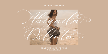 Abigaila Delinta feels equally charming and elegant. It will add a luxury spark to any design project that you wish to create! This font is PUA encoded which means you can access all of the amazing glyphs and ligatures with ease!
 - Nutnik by Hanoded,
$20.00 Nutnik was made using cut out cardboard letters, black paint and some brushes. The result is a highly legible, yet grungy font. It comes with all the diacritics you could possibly wish for and stylistic alternates for the lower case letters.
 - Mono Spec Stencil by Halbfett,
$30.00 Mono-Spec Stencil is a monospaced family of sans-serif type. At least in default settings, all characters across the typeface share a common width, which is immediately noticeable for its condensed nature. Mono-Spec Stencil is a sibling of a non-stencil family, simply named Mono-Spec. Characters in each are just as wide, allowing Mono-Spec Stencil to be used together with Mono-Spec, as a secondary typeface. As a typeface whose characters are stencil-shaped, this design channels the spirit of resistance and street culture. When you look at the family, remember that it ships in two different formats. Depending on your preference, you can install the typeface as a single Variable Font or use the family’s five static OpenType font files instead. Those weights run from Light through Bold. While the static-format fonts offer a good intermediary-step selection, users who install the Variable Font have vastly greater control over their text’s stroke width. The Mono-Spec Stencil Variable Font’s weight axis allows users to differentiate between almost 1,000 possible font weights. That enables you to fine-tune your text’s exact appearance on-screen or in print. Whatever format you choose, the Mono-Spec Stencil fonts are equipped with several OpenType features. The most striking of these can be activated via a Stylistic Set. That will replace several letters – like “B”, “E”, “F”, “H”, and “I” with double-width alternates. Those alternates take up as much space as two characters placed next to each other otherwise word. The effect of Mono-Spec Stencil’s double-width alternates is striking, and their use strikes a strong chord in any display typography applying them.
 - Herschel by Tried & True Supply Co.,
$30.00 Herschel ventures into the elaborate world of late 19th-century typography to bring its winsome charm and compelling aesthetics into modernity. Staying true to the spirit of its historical era of inspiration, Herschel was designed with extreme attention to detail. Although its aesthetic roots are firmly planted in the treasury of Gilded Age typography, it has been technically constructed to withstand all the rigorous demands that modern technology places on type today. Herschel’s nostalgic, flared, and gently bifurcated serifs shine brightest when employed as display type, but are suited well for any application where inimitable character is needed. Named after designer Brian Brubaker’s maternal grandfather, a retired dairy farmer of more than 60 years, Herschel is available in six delectable weights: Skim, One Percent, Two Percent, Whole, Creamline, and Butter. Features overview: • 800+ glyphs per weight • 120+ stylistic alternates • Upper and lower case • Titling/Drop capitals with multiple and contextual ligatures • Lining, oldstyle, proportional, and tabular figures • Standard and discretionary ligatures • Unique dingbats and special characters • International language support for 200+ latin-based languages, including Vietnamese
 - Neo Tech by Monotype,
$29.00 Neo Sans began as an intriguing assignment from a branding agency. The agency’s client wanted an “ultra modern” type family that was "futuristic without being gimmicky or ephemeral.” When a bureaucratic decision cancelled the project, Monotype staff designer Sebastian Lester decided to finish the design on his own. “I was left with a sketchbook full of ideas,” he said, “and thought it would be a shame not to see what came of them.” Lester decided that the principal ingredient of an "ultra modern" typeface was simplicity of character structure: a carefully drawn, monoline form, open letter shapes and smooth, strong curves. By further amplifying these qualities, he crossed the line from modern to futuristic. Two highly functional and versatile typefaces emerged. These are Neo Sans and Neo Tech, designs Lester describes as "legible without being neutral, nuanced without being fussy, and expressive without being distracting." Both the Neo Sans and the more minimalist Neo Tech families are available in six weights, ranging from Light to Ultra, with companion italics. Neo Tech offers a suite of alternate characters.
 - Fantini by Canada Type,
$29.95 Fantini is the revival and elaborate update of a typeface called Fantan, made in-house and released in 1970 by a minor Chicago film type supplier called Custom Headings International. In the most excellent tradition of seriously-planned American film faces back then, CHI released a full complement of swashes and alternates to the curly art nouveau letters. Fantan didn't fare much among the type scene's big players back then, but it did spread like electricity among the smaller ones, the mom-and-pop type shops. But by the late 1980s, when film type was giving up the ghost, most smaller players in the industry were gone, in some cases along with little original libraries that existed nowhere else and became instant rarities on their way to be forgotten and almost impossible to resurrect for future technologies. Fantini is the fun and curly art nouveau font bridging the softness and psychedelia of the 1960s with the flirtatious flare of the 1970s like no other face does. Elements of psychedelia and funk flare out and intermix crazily to create cool, swirly letters packed with a lot of joy and energy. This is the kind of American art nouveau font that made its comeback in the late 20th century and is now a standard visual in the branding drive of almost every consumer product, from coffee labels to book and music covers to your favorite sugar or thirst-crunching fix. Alongside Fantini's enormous main font come small caps and three extra fonts loaded with swashy alternates and variations on plenty of letters. All available in all popular font formats. Fantini Pro, the OpenType version, packs the whole she-bang in a single font of high versatility for those who have applications that support advanced type technologies. In order to make Fantini a reality, Canada Type received original 2" film specimen from Robert Donona, a Clevelander whose enthusiasm about American film type has never faltered, even decades after the technology itself became obsolete. Keep an eye out for that name. Robert, who was computer-reluctant for the longest time, has now come a long way toward mastering digital type design.
 - Dupont Gothic by Hexagon Foundry,
$19.00 Dupont Gothic is a sleek and contemporary sans-serif font that embodies elegance, clarity, and modernity. With its clean lines, balanced proportions, and distinctive character, Dupont Gothic is a versatile typeface that can be used in many ways. The simplicity of Dupont Gothic lends itself to a wide range of applications. Whether used for headlines, body text, or branding, this font possesses a quality to effortlessly adapt to different design contexts. The font comes in 10 weights with matching oblique characters, 2 widths, and 2 style sets that ensure the endless combinations and possibilities.
 - Dear Sans by Stiggy & Sands,
$24.00 The Dear Sans Collection is comprised of four widths ranging from Condensed, Regular, Expanded, and Wide; each of which are comprised of a three font family of weights: Book, Regular & Bold. Cleanly readable, with just a slight hint of silliness, the Dear Sans Collection brings adds the perfect level of lightheartedness to your designs. The Dear Sans Collection comes with: - Approx. 367 Character Glyph Set per font - including standard & punctuation, international language support, and basic “fi fl” ligatures per font. - 3 Weights per family including: Book, Regular, and Bold. - Loads of Personality for your designs.
 - Roanne by Tour De Force,
$25.00 Roanne is a sans serif family named after a town in France. This font family contains 2 width variations: Normal and Condensed, and all together counts 44 font styles. Equipped with OpenType features (Tabular Figures, Fractions, Stylistic Alternates, Localization for Serbia, Poland and the Netherlands, Case Sensitive brackets) for extended Latin and Cyrillic character set with a small charming set of Dingbats. For easier usage as webfont, Roanne font files contain numeric values for CSS weight attribute – 100, 150, 200, 300, 400, 500, 600, 700, 800, 850, 900.
 - Zaphire by 38-lineart,
$24.00 Zaphire is a humble sans serif font, delicately infused with a hint of monographic handwriting, seamlessly blending classic elegance with a touch of contemporary experimentation. Comprising a singular variable font, it gracefully encompasses the essence of 49 distinct fonts, gracefully navigating through 7 weights and 7 widths. Its uniqueness is understated yet undeniable, making it a valuable addition for those seeking to infuse creativity into various artistic endeavors. Zaphire's versatility extends gracefully to contemporary art, posters, and provides an enriching touch to the written word in books and magazines
 - Steelfish Hammer by Typodermic,
$11.95 Welcome, esteemed customers, to our magnificent array of fonts! It is with great pleasure that we present to you the rusticized Steelfish Hammer, a variation of the popular Steelfish typeface. Its rugged appearance embodies the sincere and trustworthy nature of your message, evoking sentiments of the utmost assurance. With three textured letter variations that are shuffled automatically in OpenType-savvy applications, the Steelfish Hammer typeface creates an unparalleled realistic impression. To disable this effect, simply toggle the “standard ligatures” feature in your application. And oh, the compact letterforms of the Steelfish Hammer! They are nothing short of exquisite. Each of the five weights and italics of this typeface is a testament to the power and resilience of your message, with every character carefully crafted to achieve the desired effect. There are other kinds of Steelfish too: Steelfish Regular, Steelfish Rounded, Steelfish Steeled and Steelfish Unleaded. Come, delve into the world of typography with us and experience the unmatched beauty of the Steelfish Hammer. Let your message speak with confidence and authenticity, as it is our utmost priority to provide you with the best tools to achieve your goals. Most Latin-based European, Vietnamese, Greek, and most Cyrillic-based writing systems are supported, including the following languages. Afaan Oromo, Afar, Afrikaans, Albanian, Alsatian, Aromanian, Aymara, Azerbaijani, Bashkir, Bashkir (Latin), Basque, Belarusian, Belarusian (Latin), Bemba, Bikol, Bosnian, Breton, Bulgarian, Buryat, Cape Verdean, Creole, Catalan, Cebuano, Chamorro, Chavacano, Chichewa, Crimean Tatar (Latin), Croatian, Czech, Danish, Dawan, Dholuo, Dungan, Dutch, English, Estonian, Faroese, Fijian, Filipino, Finnish, French, Frisian, Friulian, Gagauz (Latin), Galician, Ganda, Genoese, German, Gikuyu, Greenlandic, Guadeloupean Creole, Haitian Creole, Hawaiian, Hiligaynon, Hungarian, Icelandic, Igbo, Ilocano, Indonesian, Irish, Italian, Jamaican, Kaingang, Khalkha, Kalmyk, Kanuri, Kaqchikel, Karakalpak (Latin), Kashubian, Kazakh, Kikongo, Kinyarwanda, Kirundi, Komi-Permyak, Kurdish, Kurdish (Latin), Kyrgyz, Latvian, Lithuanian, Lombard, Low Saxon, Luxembourgish, Maasai, Macedonian, Makhuwa, Malay, Maltese, Māori, Moldovan, Montenegrin, Nahuatl, Ndebele, Neapolitan, Norwegian, Novial, Occitan, Ossetian, Ossetian (Latin), Papiamento, Piedmontese, Polish, Portuguese, Quechua, Rarotongan, Romanian, Romansh, Russian, Rusyn, Sami, Sango, Saramaccan, Sardinian, Scottish Gaelic, Serbian, Serbian (Latin), Shona, Sicilian, Silesian, Slovak, Slovenian, Somali, Sorbian, Sotho, Spanish, Swahili, Swazi, Swedish, Tagalog, Tahitian, Tajik, Tatar, Tetum, Tongan, Tshiluba, Tsonga, Tswana, Tumbuka, Turkish, Turkmen (Latin), Tuvaluan, Ukrainian, Uzbek, Uzbek (Latin), Venda, Venetian, Vepsian, Vietnamese, Võro, Walloon, Waray-Waray, Wayuu, Welsh, Wolof, Xavante, Xhosa, Yapese, Zapotec, Zarma, Zazaki, Zulu and Zuni.
 - Waba by Lewis McGuffie Type,
$40.00 Waba Pronounced ‘Vah-bah’, is a font family that I designed. The name comes from a historical variation on the Estonian word ‘vaba’ – meaning ‘free’, or 'at liberty'. Back in 2017 I visited the Estonian Print & Paper Museum in Tartu to see its great collection of type (well worth a visit!). While I was there I saw some big woodcut blocks of Reklameschrift Herold - a super Art Nouveau/Jugendstil style display font. The Print & Paper Museum's collection covers both Latin and Cyrillic faces and as a foreigner in these parts I'm kind of fascinated by the exoticism of Cyrillic. How it is different but the same to the Latin letters I take for granted (as a humble Englander – no excuses). Not to mention, Jugendstil with its imitation of natural form, reverse-weights and looping-delicious curves (like you've left the window open all summer and the garden plants are climbing in). This mix of Jugendstil, Cyrillic letters and the beautiful historical border town of Tartu inspired me to start drawing Waba. Trimming the serifs from Herold, simplifying those angles and expanding the category of weights, then taking look at the magical logic of Berthold Block and doing a few things that just seemed right at the time – Waba is a bit of love letter to Estonia, the Baltics and the visual history of Eastern Europe. Waba Monogram Waba also contains a monogram face, which allows you to create any monogramming latin and cyrillic. Simply type out your 2-3-4 characters in Waba Monogram, making sure Contextual Alternates is turned on them voila! Monograms can be customised manually using the OpenType select-pop-up in Adobe. Also included are a few Discretionary Ligatures for Mc, De, Von etc. Monograms work best when Contextual Alternates is turned on.
 - Valverde by Jehoo Creative,
$20.00 Valverde is a super-serif font family with 2 widths condensed and normal, each width consists of 18 fonts and has a complete weight from thin to black combined with beautiful italic cuts to meet the needs of any design in any format. Inspired by the type of vintage look that has recently become a trend, this letter character has an elegant, sharp impression. Opentype features such as Stylistic Alternate and Ligature on the Valverde family make it look more aesthetic so that it fits in a classy modern look. Stunningly beautiful and modern serifs make them an essential addition to any type of tool kit.
 - Nauman Neue by The Northern Block,
$39.95 Nauman Neue is a modern humanist sans serif typeface made for the screen. Broad open letter forms are combined with precise geometry to create a functional and legible font that’s ideal for web and on-screen applications. In 2021 Nauman was expanded to sixty styles, including two helpful widths condensed and semi-condensed. Included in the font are 900 characters per style, ten weights and three widths with matching italics. Opentype features consist of seven numerals variations, including inferiors, superiors, fractions, tabular, lining, and old style. It also has alternate lowercase a, e, I, M, small caps, arrows and language support covering Western, South, Central Europe and Vietnamese.
 - Grillmaster by FontMesa,
$25.00 Grillmaster is a nice clean sans serif that you'll find many uses for with eight widths and eight weights in each width set plus italics. It’s always grillin' season with Grillmaster; at 128 font files strong Grillmaster is ready to serve large crowds and dinner parties. So put on some cheap shades and cutoff jeans, then fire up the grill and turn up that perfect song on the radio: the Grillmaster is here to satisfy your appetite; I guarantee you won't go home hungry.
 - Dragonflight Pro by Fontforecast,
$29.00 Dragonflight Pro is a script collection of four modern calligraphy fonts. Each glyph was hand-drawn with a brass folded pen dipped in ink. The tip of the folded pen resembles the shape of a dragonfly’s wing, hence the name. By tilting the pen variations in line width are made. This produces fun, expressive letters with a spontaneous personality. The regular and rough version of Dragonflight Pro have alternate glyphs that can either be accessed by the swashes feature, stylistic set 1, or the glyphs panel, depending on the application you are using. There are lots of discretionary ligatures that offer even more variation. By typing _1 to _10 you can access bonus swashes that are part of Dragonflight Pro Regular and Rough. Both fonts have 567 glyphs. Dragonflight Pro Sans is an all caps font with 402 glyphs, also hand-drawn with the folded pen, that compliments the other styles perfectly. Dragonflight Pro Extra offers an additional 117 swashes, doodles and ink splatters. With Discretionary Ligatures activated you can type an underscore in front of a letter and (when available) this gives you the rough version of the glyph.
 - Bylum by Adam B. Ford,
$16.00 Bylum is put together with a bulbous line segment that makes up the bulk of the font. The verticals bulge out in the middle, the curves vary in width along their lengths. This gives the font a relaxed sway to it even while its verticals are upright and its design is fairly regimented.
 - Gorilas by DLetters Studio,
$10.00 GORILAS Handbrush Font is a font with an available brushstroke style with a set of uppercase all with number and punctuation support, and Ligatures making this font perfect for your awesome project.
 - Air Superfamily by Positype,
$29.00 In B-movie awesomeness, Air began as Grotesk vs. Grotesque. I was trying to unify the prevailing traits of German and English Grotes(que/k)s in order to make something different but familiar. I am NOT trying to reinvent Helvetica (snore), so get that out of your system. From the onset, I intended this typeface to be a true workhorse that offers infinite options and flexibility for the user. At its core, it is the maturation of the Aaux Next skeleton I developed years ago. I worked out Aaux Next to settle my issues and love for Akzidenz. With Aaux Next, I strove to be mechanical, cold and unforgiving with it. I was single, young, cocky and it fit. Now I'm married, kids, dog and have found that I've turned into a big softy. When I look at Aaux Next (and have for the past few years) I see another typeface trying to eek out. I wanted it to avoid the trappings of robotic sans, quick tricks and compromises. The typeface’s DNA needed to be drawn and not just generated on a screen — so I set aside a year. I love type. I love working with type. I hate when my options for a slanted complement is only oblique or italic. I set out to produce both to balance usage — there are more than enough reasons to prepare both and I want the user to feel free to consciously choose (and have the option to choose) the appropriate typeface for print, web, etc. That flexibility was central to my decision-making process. The Oblique is immediate and aggressive. The Italic was redrawn at a less severe angle with far more movement and, as a result, is far more congenial when paired with the Uprights. Condensed and Compressed. Yep, why not? I know I would use them. There are nine weights currently available. The logical progression of weights and the intended flexibility demanded I explore a number of light weights and their potential uses — this has produced a number of ‘light without being too light’ options that really work based on the size. The result is a robust 81-font superfamily that is functional, professional, and highly legible without compromising its personality. Pair that with over 900 characters per font that includes ligatures, discretionary ligatures, stylistic alternates, fractions, proportional/tabular lining and proportional/tabular oldstyle figures, numerators, denominators, ordinals, superiors, inferiors, small caps, case-sensitive functionality and extensive language support and you have a versatile superfamily well-suited for any project.
 - Ginkgo SS by Sensatype Studio,
$15.00 Ginkgo is Modern Classy Serif Font Family Created to answer for any person who needs Classy Modern Serif to leverage designer or product owner that need solutions to make their design look more classy and elegance. And specially for Ginkgo, We just released 4 weights, any ligatures, and any alternate characters to help you create unlimited variations for creative needs. Ginkgo font family ready with: 4 weights: Light, Regular, Bold, Black Hundred options to get creative variations (combination of Alternate, Ligature, Weight) Preview as a sample what can you do with Ginkgo font-family Ready with Lowercase and Uppercase characters Wish you enjoy our font and if you have a question, don't hesitate to drop message & I'm happy to help :)
 - Neuliner by CozyFonts,
$20.00 The Neuliner Family is sleek, condensed, extremely legible & flexible available in 7 styles. The inspiration stems from the classic, slender Art Deco era. Designed with a repeated vertical theme Neuliner is consistent from style to style with variations in weight and character. With over 350 glyphs and applying in over 80 languages with Numerals, Dingbats & Euro accents this family is complete. At the time of its first release Neuliner is available in Medium, Bold, Italic, Outline, Drop, Rough, & Rounded. Other styles are in the works. As displayed in the posters, Neuliner works well, in any style, for headlines, by-lines, logos, titles, posters, signage, billboards, ads, main & end titles, monograms, numbering systems, wedding invites and stationary, etc. The Bold style works congruously with the Outline & Drop styles, for either 'trapped' or 'offset' effects. This family also has its roots and influence in Mid Century influenced architecture and design yet lends its style to contemporary and modern design in the 2020s. The Drop & Rough versions are unique styles that render well in Adobe Illustrator & Adobe Photoshop for use in a myriad of colors and effects. The rough-edged style resembles a stitched and weathered effect, while the drop version plays prominently as headlines in either bright or muted color combinations. The versatile, ever-classic outline style gives any image or photographs an impression of elegance and transparency without sacrificing legibility. Neuliner Rounded embosses and engraves either blindly or foil added with a lasting impression. Neuliner Family from Cozyfonts Foundry.
 - Heimat Sans by Atlas Font Foundry,
$50.00 Heimat Sans is the grotesque typeface family within the Heimat Collection, also containing Heimat Didone, Heimat Display, Heimat Mono and Heimat Stencil. Heimat Sans is a legible typeface family designed for contemporary typography, especially for use in headlines and on posters, but also for reading purposes. It combines an idiosyncratic appearance with the feeling of a grid-based letter construction of the late 20s. Since the design might be too extreme for some applications, Heimat Sans character set provides two alphabets, the regular one plus an alternate design that comes across as less suspenseful. Heimat Sans [732 glyphs] comes in six weights and contains an extra set of alternate glyphs, many ligatures, lining [proportionally spaced and monospaced], hanging [proportionally spaced and monospaced], positive and negative circled for upper and lower case, superior and inferior, fractions, extensive language support and many more OpenType features.
 - Heimat Stencil by Atlas Font Foundry,
$50.00 Heimat Stencil is the monospaced typeface family within the Heimat Collection, also containing Heimat Didone, Heimat Display, Heimat Sans and Heimat Mono. Heimat Stencil is a legible typeface family designed for contemporary typography, especially for use in headlines and on posters, but also for reading purposes. It combines an idiosyncratic appearance with the feeling of a grid-based letter construction of the late 20s. Since the design might be too extreme for some applications, Heimat Stencil’s character set provides two alphabets, the regular one plus an alternate design that comes across as less suspenseful. Heimat Stencil [684 glyphs] comes in six weights and contains an extra set of alternate glyphs, many ligatures, lining [proportionally spaced and monospaced], hanging [proportionally spaced and monospaced], positive and negative circled for upper and lower case, superior and inferior, fractions, extensive language support and many more OpenType features.
 - Karmina Sans by TypeTogether,
$49.00 Karmina Sans follows the steps of its successful award winner cousin, Karmina Serif. It shares the same technical excellence and it achieves similar stylistic features, but the new sans serif version proposes a much more versatile tool for editorial designers. Karmina Sans has six different weights with their matching italics, from light to heavy and from continuous text to headlines to small text. The heavy weight delivers one of the darkest and most powerful impressions out there while the text weights are perfect companions for Karmina Serif. The OpenType Pro package of Karmina Sans includes nearly 900 characters per weight, including small caps, fractions, old style and lining numbers, scientific superior/inferior figures, complete ordinal and inferior alphabet, and a set of symbols and arrows. It supports over 40 languages that use the Latin extended alphabet.