10,000 search results
(0.039 seconds)
- Honey Geladen by Gold Type,
$15.00 Honey Geladen is a beautiful, versatile serif font. This font is characterized by a serif style with a luxurious style in a modern form, but also a friendly and playful style in bold, Best Swashed has glyphs to give crafters more options in designing. This modern style will make a design appear more classy, elegant, unique and edgy. -Uppercase and lowercase letters, Numbers and punctuation, Multilingual support, PUA encoded fonts, Alternative styles and ligatures Thank You
 - Boola Boola NF by Nick's Fonts,
$10.00This typeface is a new and improved (really!) version of one of my most popular freeware fonts, Team Spirit, which has made appearances in the Tank McNamara comic strip and on Blue Collar TV. Add the “nose” at the front with an open parenthesis -(- and add the tail with a close parenthesis -). To continue the bar beneath between words, use the _underscore in place of a space. No math operators and limited punctuation, but complete accented characters for the Unicode 1252 (Latin) and Unicode 1250 (Central European) character sets, with localization for Romanian and Moldovan. - Samant by OldStudioo,
$14.00 Samant Signature is a signature font that you can use to make a design for logo branding, poster headline, magazines, book titles, business cards, beautiful fashion designs, advertisements, product designs, wedding invitation, signature or handwritten quote. Samant Signature font including alternates, 100+ ligatures and includes 52 textured swashes. Enable the OpenType Stylistic alternates, you need a program that supports OpenType features such as Adobe Illustrator CS/CC, Adobe Indesign CS/CC, Adobe Photoshop CS/CC, CorelDraw X6-X7 & Microsoft Office. a font that made the hand by having the character up and down like a dancer. Freestyle has a very unique style of signature, it is very suitable for use in the work of modern design. Features: Basic Latin A -Z and a – z Number International Symbol International glyphs Alternatif Ligature Swashs Thanks!
 - Raw Street Wall by Volcano Type,
$25.00 The typeface Raw Street Wall is designed for the Typo Graphic Design font foundry from 2011–2017 by Manuel Viergutz. A playful display type for headlines with a street-art graffiti-style by hand. Rough-look plus state-of-the-art automatic generated OpenType-features (like contextual alternates (calt)). 567 glyphs with extras like emoticons/icons, arrows, dingbats, symbols, geomatric shapes, catchwords and many alternative letters. Multilingual support with 27 languages. Have fun with this font & try the DEMO-FONT (with reduced glyph-set) FOR FREE! Example of use It’s your turn … for example everywhere where it makes sense. Maybe for use in magazines, posters, headlines and advertisement, plus as webfont for decorative headlines. Technical Specifications ■ Font Name: Raw Street Wall ■ Font Weights: Regular + DEMO (with reduced glyph-set) ■ Font Category: Display for headline size ■ Font Format: .otf (OpenType Font for Mac + Win) + .ttf (TrueType Font) ■ Glyph Set: 567 glyphs ■ Language Support: 27: Afrikaans, Albanian, Catalan, Croatian, Czech, Danish, Dutch, English, Estonian, Finnish, French, German, Hungarian, Italian, Latvian, Lithuanian, Maltese, Norwegian, Polish, Portugese, Romanian, Slovak, Slovenian, Spanisch, Swedish, Turkish, Zulu ■ Specials: Extras like emoticons/icons, arrows, dingbats, symbols, geomatric shapes, catchwords and many alternative letters plus OpenType-Features. ■ Design Date: 2011–2017 ■ Type Designer: Manuel Viergutz ■ License: Desktop license, Web license, App license, eBook license, Server license
 - Blitzen by Anastasia Kuznetsova,
$16.00 Introducing the Blitzen font! Blitzen is a fabulous and playful but striking font. These are massive, hand-drawn letters that are guaranteed to stand out, whether on lighthearted product designs or more spectacular quote designs. Ideal for quotes, lattering projects, packaging of goods... so many things! Font Features A-Z; a-z character set; 1 language (English); numbers and punctuation marks, symbols A font containing uppercase and lowercase letters, numbers, and a wide range of punctuation marks. Fonts can be opened and used in any software that can read standard fonts, even in MS Word. No special software is required, and to get started. It is recommended to use it in Adobe Illustrator or Adobe Photoshop Made with love ♡
 - Mangrove by Set Sail Studios,
$18.00 Bring your letters to life with the Mangrove Font Duo! A delightfully playful pairing of Sans and Script fonts. These perfectly balanced typefaces have been carefully designed to work not only as standalone fonts, but also to pair together effortlessly—delivering undeniably eye-catching typography bursting with character. Throw a script letter in the middle of the sans font, try the swooping sans ligatures or it’s uplifting small-caps, the possibilities are numerous. It’ll work in lowercase or uppercase, and with a choice of 3 weights per font, that’s six fonts in total for you to experiment with! Language Support • English, French, Italian, Spanish, Portuguese, German, Swedish, Norwegian, Danish, Dutch, Finnish, Indonesian, Malay, Hungarian, Polish, Croatian, Turkish, Romanian, Czech, Latvian, Lithuanian, Slovak, Slovenian.
 - Jefferson Pilot NF by Nick's Fonts,
$10.00One in the series of fonts called Whiz-Bang Wood Type, intended to be set large and tight. Jefferson Pilot’s unusual letter treatment isn't for every project, but for projects that need a great "old-timey" look, it’s perfect. Named for a city in East Texas that was a port city on the late 1800s, but today is landlocked. Both versions of this font contain the Unicode 1252 Latin and Unicode 1250 Central European character sets, with localization for Romanian and Moldovan. - Warp Three NF by Nick's Fonts,
$10.00This face is a bit of a time traveler. It combines the lowercase from a font called simply Square Gothic from the 1888 James Conner’s Sons specimen book with the uppercase of Morris Fuller Benton’s 1932 monocase masterwork Agency Gothic, resulting in a high-tech typeface right at home in the twenty-first Century. Available in three weights. All versions of this font include the Unicode 1250 Central European character set in addition to the standard Unicode 1252 Latin set - Britta Connie by Amarlettering,
$15.00 Britta connie Script come with 250+ glyphs. The alternative characters were divided into several Open Type features such as Swash, Stylistic Sets, Stylistic Alternates, Contextual Alternates. The Open Type features can be accessed by using Open Type savvy programs such as Adobe Illustrator, Adobe InDesign, Adobe Photoshop Corel Draw X version, And Microsoft Word. And this Font has given PUA unicode (specially coded fonts). so that all the alternate characters can easily be accessed in full by a craftsman or designer.
 - Bertilda Script by Amarlettering,
$15.00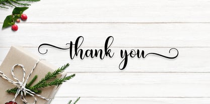 Bertilda Script come with 250+ glyphs. The alternative characters were divided into several OpenType features such as Swash, Stylistic Sets, Stylistic Alternates, Contextual Alternates. The OpenType features can be accessed by using OpenType savvy programs such as Adobe Illustrator, Adobe InDesign, Adobe Photoshop Corel Draw X version, And Microsoft Word. And this Font has given PUA unicode (specially coded fonts). so that all the alternate characters can easily be accessed in full by a craftsman or designer. Happy Designing Thanks
 - Darling Emily NF by Nick's Fonts,
$10.00The typeface Weiner Grotesk, designed by Rudolf Geyer for the H. Berthold AG foundry of Berlin in 1912, provides the pattern for this classic Jugendstil font. The design is very versatile: used as all caps, you can create elegant, compact headlines; and, as upper and lower, you can create subheads with decidedly dramatic contrast. Either way, this one is a "Weiner". All versions of this font include the Unicode 1250 Central European character set in addition to the standard Unicode 1252 Latin set. - Checkmark by Set Sail Studios,
$14.00 Make your mark with Checkmark; a slick, high energy signature-style script font guaranteed to make a big impression. Digitally hand-drawn, it's super-clean smooth flow and high-intensity pen strokes make an unmistakeable impact in logo/branding projects, large header text and product packaging. Checkmark is packed full of extra features to give you plenty of customization options. This includes; a full set of upper and lowercase alternate letters, 20 ligatures (double letters) to help the script lettering flow more naturally, 26 swashes and a full set of lowercase end forms to give your text that extra flair and finesse. Here's a run through everything in more detail; Checkmark • A smooth-edged signature style font containing upper & lowercase characters, numerals, and a large range of punctuation. Checkmark Alt • This is a second version of Checkmark, with a completely new set of both upper and lowercase characters. If you wanted to avoid letters looking the same each time to recreate a custom-made style, or try a different word shape, simply switch to this font for an additional layout option. Checkmark Swash • A third font containing 26 hand drawn swashes. Simply type any a-z or A-Z character in this font to generate a swash. Perfect for underlining your Checkmark text and adding a bit of extra flair! Ligatures • 20 ligatures (double-letters) are included to help your lettering flow more naturally. Many programs will automatically have this feature switched on for you, but if you need any help accessing them, please feel free to drop me a message. End forms • Are available for all lowercase characters when using the Checkmark font. Use these characters at the end of your word to add a stylistic 'end-swash'. These are accessible via software with opentype capability, by turning on 'Stylistic Alternates', or via a Glyphs panel. Language Support • Checkmark fonts support the following languages; English, French, Italian, Spanish, Portuguese, German, Swedish, Norwegian, Danish, Dutch, Finnish, Indonesian, Malay, Hungarian, Polish, Croatian, Turkish, Romanian, Czech, Latvian, Lithuanian, Slovak, Slovenian.
 - Bremoleaf by Alit Design,
$22.00 Introducing "Bremoleaf" - The Nature-Inspired Font 🌿 Embrace the beauty of nature with "Bremoleaf," a unique and versatile font that seamlessly blends the organic elegance of leaves with a harmonious mix of sans serif and script elements. This exquisite typeface is more than just a font; it's a work of art that brings the enchantment of nature to your creative projects. 🌱 The "Bremoleaf" font is a perfect choice for those who seek a harmonious fusion of two distinct typographic styles. It effortlessly combines the sleek and modern characteristics of sans serif letters with the flowing, graceful curves of an elegant script. This harmonious pairing creates a visually captivating and versatile typeface that suits a wide range of design needs. 🌿 With dynamic ligatures and an extensive selection of alternates, "Bremoleaf" offers endless possibilities to express your creativity. These ligatures and alternatives seamlessly flow, enhancing the readability and aesthetic appeal of your text. Whether you're designing a logo, a wedding invitation, a branding project, or any other creative endeavor, "Bremoleaf" has you covered. ✨ "Bremoleaf" boasts a wide range of characters and symbols, providing support for a staggering 708 characters. This inclusive font enables you to create content in various languages and styles with ease. Plus, it includes PUA (Private Use Area) Unicode, ensuring that you can access all its special characters and unique features effortlessly. 🌍 "Bremoleaf" is not bound by language or borders. It offers comprehensive multilingual support, making it the perfect choice for projects that target global audiences. From English to Spanish, French to Vietnamse, this font will help you convey your message beautifully and effectively. Experience the enchantment of "Bremoleaf" and elevate your design projects to new heights. This nature-inspired font brings the organic beauty of leaves to your creations, offering an irresistible combination of style and functionality. With "Bremoleaf," your designs will flourish like never before.
 - Aphrodite Slim by Typesenses,
$57.00 Aphrodite Slim Pro is not just a lighter version of its sister Aphrodite Pro. Aphrodite Slim Pro has duplicated the quantity of characters of its partner, and that means more than 500 new glyphs, reaching a total of more than 1000. More delicate and meticulous, Aphrodite Slim Pro is once more a new typography with deep calligraphic ideals: We immersed ourselves into the world of each calligraphy ductus and each calligraphy masters by studying from decoration to lettering books. This was the key for the logic of Aphrodite Slim’s behavior. The new concept of Aphrodite Slim Pro was to join diverse styles of calligraphy in one in order to achieve an autonomous expressiveness, in fact, this is what calligraphy aims to, and we agreed to bring those ideals to the world of typography: It is justifiable to be inspired in hundred-year-old calligraphies, but it is even better if the results you obtain have a plus. A personal plus. During the creation process we were wondering whether it was possible to mix certain strokes of such rigid styles as uncial, (Li·n’s favourite style), with strokes of the copperplate, (Sav’s favourite style), and also to take and mix cualities of cancelleresca cursiva, formata and moderna; finally giving our creation a roman-transition italic look. So Aphrodite Slim takes ideals and aspects from those formal styles, following its own logic though, and emphasizing the fact of being a decorative typography. Calligraphy masters of our past are who we are in debt with. They are the cause we have lovely letters now. They have been spontaneous at the moment of creation, what differs from the type-designers of nowadays, whose spontaneity is more limited. Digital faces that we are used to see these days are a result of long hours of optical adjustments, grids, macros and inspirations of other existing typography, but without personal contributions. Aphrodite Slim wants to refute this. Its mission is to rescue de spontaneity of the artesanal lettering in order to obtain unique words; those which only calligraphy masters of our past or lettering artists of our present could give us. We have worked hard to achieve this, making Aphrodite the most universal font we could: It was necessary to study the most common words, focalizing more in the ones referring to “sensitivity”, of four of the most spoken languages in the world. Aphrodite Slim has an enormous quantity of decorative characters and special ligatures for phrases and words in English, French, Spanish and German. (See English, Français, Español, Deutsch PDF in the gallery section). We promise there is no existing type that decorates/ligates glyphs and words like Aphrodite Slim does: It is the first time a font like this really considers its purpose. -The way glyphs are ligated is insane- : Aphrodite Slim rescues some ideals of persons like Jan van den Velde (Italian cancilleresca writing of XVI Century) who understands ascenders and descenders as possibilities to beautify the lines of writing with curved strokes that seem to be dancing above and below of the words. This master also creates ascenders and descenders even where they are not necessary, on letters that do not actually need them: Aphrodite Slim takes this ideal. The font counts with a wide range of glyphs that seem not to be satisfied with its more primitive form and prefer to extreme their parts to be decorative. It also existed masters of calligraphy like José de Casanova of XVII Century, who, with a magnificant skill and a really personal mark, had the particularity of ligating words that were actually separated with spaces. This is another innovative feature in Aphrodite Slim. An investigation of the most common beginnings and endings words of the English language was done. Having that feature activated (discretionary ligatures), common words will start to ligate or to be decorated even when they are separated by spaces. Impossible to forget Francesco Periccioli of XVII Century and our experience us designers to face with works of him: His letters, that today are included in the group of cancellerescas modernas, have been a direct inspiration to the oldstyle figures and historical forms variables in Aphrodite Slim. Giovanni Antonio Tagliente (XVI Century) and his particular way of making tails and diagonals longer than usual, qualities that our creation reflects too. Finally, our adventures in Biblioteca Nacional and Barrio San Telmo, Buenos Aires, were essential for us to make Aphrodite Slim more complete and interesting: Sav did an excellent work when studying how the decorative miscellanea and swirls of early XX century were. She also investigated what particularities made those roman titling characters look antique so she could rescue some ideals for the oldstyle figures and historical forms variables. This also leaded her to create the ornaments variable in Aphrodite Slim. We are really proud of presenting Aphrodite Slim Pro, a typography that was the result of days and nights of working hard, because we do love what we do; and we are glad we are living in a present that gives us the possibility to spread this kind of art, because that is the way we consider our job: Aphrodite Slim Pro is Art. Hope you can appreciate the enormous work this type has. Features. Aphrodite Slim Pro is the most complete variable. It includes more than 1000 glyphs. Thanks to the Open-Type programming, it counts with a easy way to change/alternate glyphs if the application in which the font is used supports this. The variables contained in Aphrodite Slim Pro are also offered separately. Aphrodite Slim Text: It is the variable for lines and paragraphs. Thus it is the least ornamental and the most accurate to achieve a satisfying legibility. It has the Standard Ligatures feature in order to improve the possible conflicts some glyphs could have by others. Aphrodite Slim Contextual: It is the one that makes emphasis in decorating. It has the particularity of ligating/decorating words of common use in English, French, Spanish and German. It also has the quality of ligating common beginnings and endings of the common words in English. Aphrodite Slim Stylistic: With similar features of Slim Contextual. It includes a set of decorative numbers for a display use. Aphrodite Slim Swash: This one has special beginnings and endings to decorate words. Aphrodite Slim Endings: It makes words look as a signature. Aphrodite Slim Historical: It adds an antique look to the written word. It also has the special historical ligature function. Aphrodite Slim Titling: This one is the most decorative. Its copperplate inspired ornaments give words a special color, in order to handle the quantity of decoration, it comes with the standard ligature feature, which has the most common ligatures plus others that make decorative swirls not to be conflictive. Aphrodite Slim Ornaments: A set of 52 ornaments. Aphrodite Slim Pro includes all this features plus the Stylistic Set 1; Stylistic Set 2 and the possibility of Slashed Zero. We recommend you to check out the gallery in order to see all these features in action.
 - Onamura by Balibilly Design,
$22.00 Initially, letterform was inspired by the gothic style of Romance decorative letters in transitional art in the Middle Ages. The conservative type in the Gothic era, especially in decorative romance, has led to the Victorian style being embedded in several forms as accents related but not forced to be combined. Rounded serif seems conventional combined with historically relevant letterform to create a harmonious blend. The art nouveau style also inspires this typeface. Approach to architectural ornamentation from 1880 to 1915, adopting the dynamic lines and curves typical of the civilization of the time. Continue time travel; we also present a more modern form influenced by the digitalization of art nouveau derivatives, familiarly called the psychedelic style. Paying homage to predecessors, we presented The Onamura font in a Japanese Ukiyo-e style that influenced the fine arts movement that broke old conservative art in Europe. We designed this font carefully with the information about the Middle Ages, Ukiyo-E, & Art Nouveau that greatly influenced art worldwide. In this font family, there are collaboration vibes. Both are the basis of the phenomenal blend of idealism between western and Japanese artists. Consisting of 10 fonts in 10 weights, it features an extended charset of over 850 glyphs, covering multilingual support, including Western European, Central European, and Southeastern European. Complete with advanced open type features like stylistic alternates, discretionary ligatures, ordinals, small caps, fractions, and case-sensitive forms. The elegant and refined details seen in this font provide a new aesthetic input, satisfy contemporary style, and give a range of choices for luxury typographic projects. This font is perfectly suited for high-impact headlines. Advance open-type features are stunning on logos, branding, magazines, website, etc. Supports languages: Afrikaans, Albanian, Asu, Basque, Bemba, Bena, Bosnian, Catalan, Cebuano, Chiga, Colognian, Cornish, Corsican, Croatian, Czech, Danish, Dutch, English, Estonian, Faroese, Filipino, Finnish, French, Friulian, Galician, Ganda, German, Gusii, Hungarian, Icelandic, Ido, Inari Sami, Indonesian, Interlingua, Irish, Italian, Javanese, Jju, Jola-Fonyi, Kabuverdianu, Kalaallisut, Kalenjin, Kinyarwanda, Kurdish, Latvian, Lithuanian, Lojban, Low German, Lower Sorbian, Luo, Luxembourgish, Luyia, Machame, Makhuwa-Meetto, Makonde, Malagasy, Malay, Maltese, Manx, Maori, Morisyen, North Ndebele, Northern Sami, Northern Sotho, Norwegian Bokmål, Norwegian Nynorsk, Nyanja, Nyankole, Occitan, Oromo, Polish, Portuguese, Romanian, Romansh, Rombo, Rundi, Rwa, Samburu, Sango, Sangu, Sardinian, Scottish Gaelic, Sena, Shambala, Shona, Slovak, Slovenian, Soga, Somali, South Ndebele, Southern Sotho, Spanish, Swahili, Swati, Swedish, Swiss German, Taita, Taroko, Teso, Tsonga, Tswana, Turkish, Turkmen, Upper Sorbian, Vunjo, Walloon, Welsh, Western Frisian, Wolof, Xhosa, Zulu
 - Girly Heart Script by Rotterlab Studio,
$10.00 Girly Heart Script: A sweet hand lettered font, casual and dynamic with a dancing baseline. Also available Platipus Sans & Ornaments to help you mix and match it to fit your creative work in harmony. All this to add an authentic touch to your designs. Girly Heart Script is perfect for Branding, Logos, Greeting Cards, Wedding Stationery, Quotes etc. It comes with a handy set of Opentype Stylistic Alternates, Ligatures and multiple language support. To enable the OpenType Stylistic alternates, you need a program that supports OpenType features such as Adobe Illustrator CS, Adobe Indesign & CorelDraw X6-X7, Microsoft Word 2010 or later versions. PUA Unicode. Mac users can use Font Book and Windows users can use Character Map to view and copy any of the extra characters to paste into your favorite text editor/app. Thanks so much for looking, I really hope you enjoy it and please don't hesitate to drop me a message if you have any issues or queries .
 - Arts And Crafts Ornaments BA by Bannigan Artworks,
$19.95 This is a picture font of Arts And Crafts style and Art Nouveau style ornaments.
 - AlphabetismHand - 100% free

- Bodidota - 100% free

- W.J. Pearce 213 - Unknown license

- Rare Bird Specimen VI by Rare Bird Font Foundry,
$200.00 Specimen VI is a refined hand by artist Aileen Fretz of Plume Calligraphy: thoroughly modern yet absolutely timeless. We have our sights set on this one becoming an instant classic. OBSERVATIONS Specimen VI takes its inspiration from the old world, while remaining thoroughly contemporary. It is unique while maintaining legibility. DEFINING CHARACTERISTICS At 2,580 characters, we dare say it is one of the most robust script fonts on the market today. The font includes extensive Opentype programming that authentically replicates Aileen’s unique handwriting pattern. As you type, watch the letters automatically adjust between connected and disconnected forms. Specimen VI also features formal titles, prepositions, social media wordart, and web navigation wordart, serif and sans serif Roman numerals, in and out-stroked letterforms at beginning and end of words, multiple alternate lowercase t cross-strokes, realistic double-letter ligatures, seamlessly connecting calligraphic letters, multiple styles of alternate capital letters, including swashes, and basic Latin encoding. Specimen VI is a typesetters’ dream. POTENTIAL SIGHTINGS In the pages of your favorite wedding tome; the signage, robe embroidery, and dinner menus of that coveted boutique hotel on the Italian Riviera, the labels of an artisanal hand-poured candle line, your new favorite Rosé, hand-crafted Belgium chocolate truffles, the indie cosmetic line fit for royalty, in any instance that you may be in need of a refined modern script.
 - LT Festive Medium - 100% free

- Farmhause Script by Struggle Studio,
$15.00 Farmhouse Together - DUO is a lovely, pretty handwritten font with lots of alternative, binding styles. Has two Styles (Sans & Script) in one Font.
 - Card Characters - Unknown license

- Fd Artheria Script by Fortunes Co,
$23.00 Artheria is a script font with a classic vintage style. The classic style of this font is suitable for retro/vintage-themed designs but can also be used for designs with other styles. This font is equipped with 130+ stylistic sets, Ligatures, and multi-language support.
 - Kadigan by Missy Meyer,
$12.00 Kadigan: (noun) A placeholder word. A kadigan can be used to substitute for any other noun: persons (John Doe, Acme Company), places (Anytown, 123 Main Street) or things (whatchamacallit, thingamajig). Just like kadigans can be used in nearly any situation, the members of the Kadigan font family can be used in nearly any design! These sans-serif beauties are clear and easy to use, but they also have a little bit of wiggle in their strokes and weights, for a fun hand-lettered look! The three members of the family: - Kadigan Light: An all-purpose lightweight stroke, with sharp corners. - Kadigan: A nice mid-weight stroke, with slightly rounded corners. - Kadigan Heavy: A thick, chonky stroke with pillowy rounded corners. And each member of the family is packed with features, including: - All of the basic stuff you expect from every font; - 340+ extended Latin characters; - Cyrillic character set; - Greek character set; - Those character sets? Support over 110 languages! - 52 double-letter ligatures for variety (That's right, EVERY letter. I'm looking at you, savvy revved trekkers!); - A full set of small caps (including Cyrillic & Greek); - And more! (Seriously, it was hard to stop.) So whether your work is in English, Español, български, ελληνικά, Türkçe, or over a hundred other languages, this cute and fun sans-serif may be just what you've been looking for!
 - DS ShowBill - Unknown license

- Corton by Greater Albion Typefounders,
$14.00 Corton was inspired by the traditional lettering on a gravestone in an English village. While that might sound a rather solemn beginning, Corton has wonderfully lively air, with distinctive lively serifs and beautifully swashed downstrokes. Eight faces are offered: regular and titular each in three weights plus regular condensed. Between them they are ideal signage and display faces, merging 'olde-worlde' charm and fun character, but remaining clear and legible.
 - Mezz by Adobe,
$29.00Clarinetist Milton ?Mezz? Mezzrow (1899-1972) was a remarkable jazz musician, as becomes evident upon reading his autobiography Really the Blues. His sharp tone and serpentine lines inspired English lettering artist and jazz lover Michael Harvey to create a condensed, oblique display typeface with the look of a chiseled alphabet in the musician's honor. Vertical formats such as book jackets and posters will be invigorated by Mezz as the display face. - Dance Number JNL by Jeff Levine,
$29.00 Vintage sheet music for the song "Just Once for All Time" (from the United Artists release "Congress Dances") provided the bold sans that served as the model for Dance Number JNL. This 1932 film was the English language version of the German comedy "Der Kongrefl tanzt" The movie's plot is based around the Congress of Vienna. There, an Austrian commoner is mistakenly thought to be the Tsar of Russia.
 - Thorowgood Wide by Wooden Type Fonts,
$20.00 One of the original Clarendon types, an English design, here derived from a specimen taken from an American foundry, no identifying marks. With a tall x-height, wide version, unlike more traditional Clarendons, not a square serif but bracketed. Unique to this Clarendon are the rounded openings at the points where the horizontal and vertical stems meet in the capital B, D, P and R, not common in other Clarendons.
 - VU Rock N Roll by VisualizeUnited Fonts,
$65.00 VU Rock nRoll is a block display typeface, that comes in English and Greek characters, numerals and a very basic set of marks. It was inspired by graffiti and custom made wooden type. Having a rough look, it feels appropriate for short messaging and titles since its design is dynamic. Posters, labels and tees would host beautiful designs, that can stand out! Choose your text and rock n roll!
 - Guadalajara JNL by Jeff Levine,
$29.00 Hand lettered, the title on the sheet music for a 1940s hit song "Ti-Pi-Tin" inspired Guadalajara JNL. The melody and original Spanish lyrics were written by Maria Grever, one of Mexico's first successful female composers, with English lyrics supplied by Raymond Leveen. This decorative and fun type face brings to mind fiestas South of the border, and emanates the charm of Mexico's music, dance and colorful costumes.
 - Steamfunk by MKGD,
$13.00 The font Steamfunk is based on Steampunk. A form of science fiction that couples Victorian era style with futuristic devices operated by early industrial age technology. Each Steamfunk letter is constructed in two symbolic parts. A thick stroke, for the machine’s outer shell, and a second, wire-like, stroke for that machine's delicate inner workings. The result is a look that is Steampunk in appearance, without it being exclusively so. Steamfunk has a glyph count of 398 and supports the following languages; Afrikaans, Albanian, Asu, Basque, Bemba, Bena, Bosnian, Catalan, Chiga, Colognian, Cornish, Croatian, Czech, Danish, Embu, English, Esperanto, Estonian, Faroese, Filipino, Finnish, French, Friulian, Galician, German, Gusii, Hungarian, Icelandic, Indonesian, Irish, Italian, Kabuverdianu, Kalaallisut, Kalenjin, Kamba, Kikuyu, Kinyarwanda, Latvian, Lithuanian, Low German, Lower Sorbian, Luo, Luxembourgish, Luyia, Machame, Makhuwa-Meetto, Makonde, Malagasy, Malay, Maltese, Manx, Meru, Morisyen, North Ndebele, Norwegian Bokmål, Norwegian Nynorsk, Nyankole, Oromo, Polish, Portuguese, Romanian, Romansh, Rombo, Rundi, Rwa, Samburu, Sango, Sangu, Scottish Gaelic, Sena, Shambala, Shona, Slovak, Slovenian, Soga, Somali, Spanish, Swahili, Swedish, Swiss German, Taita, Teso, Turkmen, Upper Sorbian, Vunjo, Walser, Zulu.
 - Sailec by Type Dynamic,
$37.00 Sailec is a very clean typeface inspired by type foundry of the International Typographic style. The low contrast makes it very interesting in display. The Sailec family includes 7 weights, from Hairline to Black, with their corresponding italics. Each font includes OpenType Features such as Stylistic Alternates, Proportional Figure, Tabular Figures, Numerator, Superscript, Denominators, Scientific Inferiors, Subscript, Ordinals, Ligatures and Fractions. It’s a totally neutral typeface. Sailec family supports Latin and Cyrillic, all these languages are covered: Latin language support: Afrikaans, Albanian, Asturian, Azeri, Basque, Bosnian, Breton, Bulgarian, Catalan, Cornish, Corsican, Croatian, Czech, Danish, Dutch, English, Esperanto, Estonian, Faroese, Filipino, Finnish, Flemish, French, Frisian, Friulian, Gaelic, Galician, German, Greenlandic, Hungarian, Icelandic, Indonesian, Irish, Italian, Kurdish, Latin, Latvian, Lithuanian, Luxembourgish, Malagasy, Malay, Maltese, Maori, Moldavian, Norwegian, Occitan, Polish, Portuguese, Provençal, Romanian, Romansch, Saami, Samoan, Scots, Scottish, Serbian, Slovak, Slovenian, Spanish, Swahili, Swedish, Tagalog, Turkish, Walloon, Welsh, Wolof Cyrillic language support: Adyghe, Avar, Belarusian, Bulgarian, Buryat, Chechen, Erzya, Ingush, Kabardian, Kalmyk, Karachay-Balkar, Karakalpak, Kazakh, Komi, Kyrgyz, Lak, Macedonian, Moldovan, Mongol, Permyak, Russian, Rusyn, Serbian, Tatar, Tofa, Tuvan, Ukrainian, Uzbek
 - Leboumar by IbraCreative,
$17.00 Leboumar – A Modern Signature Typeface Leboumar, a modern signature typeface, effortlessly merges contemporary aesthetics with the timeless elegance of handwritten script. With fluid strokes and a dynamic rhythm, Leboumar captures the essence of individuality and sophistication. Its sleek, yet expressive letterforms give a sense of personal touch, making it ideal for adding a touch of refinement to a variety of design projects. The smooth and deliberate curves of Leboumar create a harmonious balance between legibility and artistic flair, allowing it to adapt seamlessly to both digital and print mediums. Whether used in branding, invitations, or editorial design, Leboumar stands as a testament to the seamless blend of modernity and personal style in the world of typography. Leboumar is perfect for branding projects, logo, wedding designs, social media posts, advertisements, product packaging, product designs, label, photography, watermark, invitation, stationery, game, fashion and any projects. Fonts include multilingual support for; Afrikaans, Albanian, Czech, Danish, Dutch, English, Estonian, Finnish, French, German, Hungarian, Italian, Latvian, Lithuanian, Norwegian, Polish, Portuguese, Slovak, Slovenian, Spanish, Swedish.
 - Casca Riola by IbraCreative,
$17.00 Casca Riola – A Classic Display Serif Typeface Casca Riola is a timeless Classic Display Serif typeface that effortlessly combines elegance with readability. Its refined letterforms showcase a harmonious balance between traditional and contemporary design elements, making it suitable for a wide range of applications. The sturdy serifs and well-defined strokes lend a sense of authority and sophistication, while subtle details in the letter shapes add a touch of modernity. Casca Riola excels in conveying a sense of professionalism and grace, making it an ideal choice for editorial design, luxury branding, and any project that demands a touch of enduring style. Whether used for headlines, titles, or body text, Casca Riola captivates with its timeless aesthetic, making it a versatile and enduring addition to the typographic landscape. Casca Riola is perfect for branding projects, logo, wedding designs, social media posts, advertisements, product packaging, product designs, label, photography, watermark, invitation, stationery, game, fashion and any projects. Fonts include multilingual support for; Afrikaans, Albanian, Czech, Danish, Dutch, English, Estonian, Finnish, French, German, Hungarian, Italian, Latvian, Lithuanian, Norwegian, Polish, Portuguese, Slovak, Slovenian, Spanish, Swedish.
 - Westerland Grotesk by SG Type,
$21.90 Introducing Westerland Grotesk, a sans serif font family that seamlessly harmonizes classic simplicity with contemporary sophistication. Its slight contrast, which can be found throughout the weights, gives it a unique and warm character while maintaining the sleekness of a true grotesque. The family consist of eight weights in roman & italic, coming up to a total of 16 styles. This variety enables a range of uses, from elegant lightness with the thinner weights to loud expressiveness with the bolder ones. Language Support Afrikaans, Albanian, Asu, Basque, Bemba, Bena, Breton, Catalan, Chiga, Colognian, Cornish, Croatian, Danish, Dutch, Embu, English, Esperanto, Estonian, Faroese, Filipino, Finnish, French, Friulian, Galician, German, Gusii, Hungarian, Icelandic, Indonesian, Irish, Italian, Kabuverdianu, Kalenjin, Kamba, Kikuyu, Kinyarwanda, Lithuanian, Luo, Luxembourgish, Luyia, Machame, Makhuwa-Meetto, Makonde, Malagasy, Manx, Meru, Morisyen, North Ndebele, Norwegian, Bokmål Norwegian, Nynorsk, Nyankole, Oromo, Portuguese, Quechua, Romansh, Rombo, Rundi, Rwa, Samburu, Sango, Sangu, Scottish, Gaelic, Sena, Shambala, Shona, Soga, Somali, Spanish, Swahili, Swedish, Swiss, German, Taita, Teso, Turkish, Uzbek (Latin), Volapük, Vunjo, Walser, Welsh, Western, Frisian, Zulu Open Type Features Standard Ligatures, Alternates, Fractions, Superscript Figures
 - Caslon #540 by Linotype,
$29.99The Englishman William Caslon punchcut many roman, italic, and non-Latin typefaces from 1720 until his death in 1766. At that time most types were being imported to England from Dutch sources, so Caslon was influenced by the characteristics of Dutch types. He did, however, achieve a level of craft that enabled his recognition as the first great English punchcutter. The original Caslon specimen sheets and punches have long provided a fertile source for the range of types bearing his name. Identifying characteristics of most Caslons include a cap A with a scooped-out apex; a cap C with two full serifs; and in the italic, a swashed lowercase v and w. A few of the many interpretations from the early twentieth century were true to the source, as well as strong enough to last into the digital era. These include two from the American Type Founders company, Caslon 540 and the slightly heavier Caslon #3. Both fonts are relatively wide, and come complete with small caps, old style figures, and italics. - 1066 Hastings by GLC,
$38.00 In 1066, William, duke of Normandy, was invading England. He was demanding the crown for himself, against King Harold the Saxon. He killed Harold and reached the crown at Hastings, the well-known battlefield. A few years later, in Bayeux (Normandy, French)was displayed a large tapestry (almost 70 m long) who was telling the story of the conquest. Along the tapestry was written a comment in Latin, using Roman capitals influenced a little by English or Scandinavian style (as it is visible in the Eth character). We have created the font, inspired from this design, adapted for contemporary users, making difference between U and V, I and J, which has not any relevance for ancient Latin scribes, and naturally with Thorn, Oslash, Lslash... and usual accented characters did not exist at the time. We also have reconstructed the K, German double s and Z, always using patterns of the time. We have scrupulously respected the poetic irregular and distressed original forms with two or three alternate for each characters, including reconstructed numerals.


