10,000 search results
(0.027 seconds)
- Modica Pro by Monotype,
$30.00 Modica Pro is here to expand upon the success and versatility of the original Modica typeface (2019). Modica has been compressed, condensed, narrowed, widened, and extended to a mega-family of 108 fonts that now includes small caps as well as additional language coverage. Modica Pro is a nimble typeface that can handle a multitude of applications – everything from body copy to retail fashion to corporate identities... why not put Modica Pro to task today? There are 108 fonts in this family, ranging from Hairline to Ultra weights across six widths in both roman and italic. A single variable font (included with the full family) covers all weights, widths, and italic angle with every increment in between to suit whatever style you prefer. Modica Pro has a character set that covers all Latin European languages. Key features: 1 Variable Font 9 Weights in Roman and Italic 6 Widths Small Caps Full European character set (Latin only) 650+ glyphs per font.
 - Birthday Wish PB by Pink Broccoli,
$16.00 Birthday Wish is a totally off-kilter sans-serif font inspired by a late 70's birthday greeting card. Much like a typographic drunken stumble, this font wonderfully and awkwardly fumbles across designs, surprising with each letter typed. With a pseudo unicase character set, and offbeat letter weighting, Birthday Wish is fun to typeset with, with a cluster of ligature combinations that add to the quirky playfulness. You’ll find this Birthday Wish is a typesetting ride of a font. Try typing standard, all caps, or all lowercase for even more visual variety.
 - Doskyball by Keristyper Studio,
$14.00 Introducing a new retro pop script called Doskyball Inspired by '70s script letters. This font is good for logo design, Social media, Movie Titles, Books Titles, short text even long text letters, and good for your secondary text font with sans or serif. Featured: Standard Uppercase & Lowercase Numeral & Punctuation Multilingual : ä ö ü Ä Ö Ü ß ¿ ¡ Alternate & Ligature PUA encoded We recommend programs that support the OpenType feature and the Glyphs panel such as Adobe applications or Corel Draw. so you can use all the variations of the glyphs. Hope you enjoy our fonts!
 - Olive Village by Ivan Rosenberg,
$16.00 Olive Village is a stylish vintage font inspired by 70’s groovy vibe with a touch of modernity. It looks amazing at display sizes and is easily readable in text size. Olive Village comes with access to your OpenType features, large selection of alternate glyphs and ligatures. There are two versions of this font : REGULAR and ITALIC. Olive Village is a display font made mainly for headlines, titles, and other short texts and is well-suited for advertising, vintage mood board, branding, logotypes, packaging, titles, editorial design and modern and vintage design.
 - Rambors by Arterfak Project,
$17.00 Introducing Rambors, a multiline display font inspired by the 70s design which visualizes a futuristic touch and fun graphic. A very nostalgic typeface, perfect for your modern-futuristic design and contemporary style. Rambors is looks very catchy on headlines in your poster, flyer, motion graphic, and sticker. This font is an all-caps font with different uppercase and lowercase, it gives you a lot of possibilities to explore many alternatives of design. Also completed with alternates characters. If you have any questions, don't be hesitate to drop us a message. Thank you for visiting.
 - 1557 Civilité Granjon by GLC,
$42.00 Living from 1545 in Lyon, France, the famous punchcutter Robert Granjon created a typeface that looked like his own handwriting. The first book printed with this font, in 1557, was probably Dialogues de la vie et de la mort by Innocent Ringhier. We offer the complete typeface. It is a charming font with historical forms (long s, final s and others) and many ligatures, enriched with accented letters and other characters that did not exist in the original (thorn, eth, lslash and others), and a lot of alternates that permit rich and varying typography. Warning: all characters appear with the 1500s manual blackletter old style, especially letters “e” “r” or “h” alternate and some ending forms, and may be difficult to read at first, but it quickly becomes very easy. The font contains all characters for Baltic, Western European (Including Celtic), Eastern European, Northern European, and Turkish languages.
 - 1785 GLC Baskerville by GLC,
$42.00 This family was created/inspired from the well-known Baskerville Roman and Italic typefaces created by John Baskerville, the English font designer. We were inspired by the original family sent by Baskerville’s wife after his death. The full Baskerville collection was bought by the French editor and author Pierre-Augustin Caron de Beaumarchais who used it to print - in Switzerland - for the first time the complete works of Voltaire (known as the “Kehl edition” from the "Imprimerie de la société littéraire typographique"). We have used this edition, with copies from 1785, to reconstruct these two genuine historical styles. The font faces, kerning, and spacing are scrupulously identical to the original. This Pro font includes characters for Western, Eastern and Central European languages (including Celtic) and Turkish, with a complete set of small caps, standard and “long s” ligatures in each of the two styles.
 - Krul by Re-Type,
$99.00 ‘Krul’ is a typographic interpretation of the lettering style created by Dutch letter painter Jan Willem Joseph Visser at the end of the 1940s, which decorated the traditional brown bars of Amsterdam. In the beginning, these letters were strongly associated with the pubs connected to the Amstel brewery, given that Visser was the company’s official painter. As the years passed, the style became increasingly popular, and various business owners in Amsterdam and other Dutch and Belgian cities also commissioned its use. In the 1970s and 1980s, Leo Beukeboom, another talented letter painter, continued and expanded this lettering tradition while employed under the Heineken brand. Much of his work can still be found in the Jordaan and De Pijp neighborhoods in Amsterdam. The Amsterdamse Krulletter, or Amsterdam’s curly letter, is strongly inspired by the calligraphic works of the 17th century Dutch writing masters, of which Jan van den Velde was a central figure. However, distinct characteristics of this style, for example, its unusual and beautiful ‘g’, originate from a model that was published by Johannes Heuvelman in 1659, which J. W. J. Visser referenced. Typographic circles have somehow overlooked the Amsterdamse Krulletter and its heritage. The Dutch calligraphic hands preceded and influenced the formal English penmanship which has inspired numerous typefaces in the Copperplate style. In contrast, the models from van den Velde, Heuvelman, and Jean de la Chambre, among others, are a missing chapter in Dutch typographic history, and had never been turned into typefaces until now. Conscious of the cultural and identity issues that arise in reviving a unique style, and concerned about the speed with which the lettering style was disappearing, Ramiro Espinoza focused the project of designing ‘Krul’ on digitally recreating the calligraphic complexity of these beautiful letters. Created through several years of research, ‘Krul’ is not a direct digitization of the Amsterdamse Krulletter, but instead, an interpretation that incorporates numerous alternative characters absent in the original model, and improves upon details where necessary, resulting in an optimal performance on the printed page. The typeface is presented in Open Type format, with an abundance of intricate ligatures, fleurons, and swashes, which permit the creation of numerous calligraphic effects. The very high contrast and rhythm of the strokes in this typeface make it especially suited for media applications conveying a sense of elegance and sophistication. Designers of feminine magazines, advertisements, and corporate identities within the fragrance and fashion industries will find in this typeface to be an extremely useful and appropriate resource.The great Amsterdamse Krulletter is finally back, and we are proud to make it available to you.
 - Hoxton North by The Northern Block,
$32.00 Hoxton North came out of the concept to create something distinctly British, drawing on modernist influences such as Edward Johnston's typeface for the London Underground and Gill Sans. A humanistic san serif typeface with a British modern quality. Open forms with subtle contrast promote good readability across a wide range of media in both print and screen. The compact letterforms give it a strong lateral dynamic that is space efficient across design layouts. Details include 620 characters, seven weights with true italics, small caps, manually edited kerning and Opentype features.
 - Ponder by TypeUnion,
$20.00 This is Ponder. A modern sans carefully crafted to be a versatile typeface for the modern world. Featuring over 650 glyphs, Ponder includes stylistic alternates for the a, l, y and & characters to provide two uniquely styled design approaches. From contrasting strokes on the heavier weights to the angled bars on the P & R, Ponder has a unique feel that will give your brand or project that stand out quality. Ponder features extensive language support for Latin & Cyrillic as well as many opentype features such as stylistic alternates, ligatures and numbers (Tabular, Oldstyle & Circled).
 - Will - Unknown license

- Juliet - Unknown license

- Dance Number JNL by Jeff Levine,
$29.00 Vintage sheet music for the song "Just Once for All Time" (from the United Artists release "Congress Dances") provided the bold sans that served as the model for Dance Number JNL. This 1932 film was the English language version of the German comedy "Der Kongrefl tanzt" The movie's plot is based around the Congress of Vienna. There, an Austrian commoner is mistakenly thought to be the Tsar of Russia.
 - Neutral Sans by Brave Lion Fonts,
$28.00 Join us on a journey to explore the world of Neutral Sans, delving into its historical roots, evolutionary path, and contemporary applications. Whether you are a designer in search of the perfect typeface for your next project or someone with a keen interest in the subtleties of typographic design, our exploration of Neutral Sans promises to be an illuminating adventure into the heart of timeless and neutral typography.
 - La Portenia by Sudtipos,
$69.00 La Portenia pays homage to the spirit of early 20th-century show card writers and type designers. This face has two variations: La Portenia de Recoleta is slightly more formal and polite, while La Portenia de la Boca has longer, more extravagant flourishes and indulges in more interletter space. This showier variant is reminiscent of signs found in Buenos Aires. Both have been designed by Diego Giaccone and Angel Koziupa, and engineered and expanded by Alejandro Paul.
 - Atomic DooDads RJH by bobarama,
$21.00 Blast into the past with Atomic DooDads, a set of 1950’s and 60’s-era dingbats. Baby boomers to late bloomers will enjoy this set of playful glyphs. Go get yourself a cup-a-joe and design the heck out of something.
 - kaufhalle - 100% free

- Departe by TEKNIKE,
$45.00 Departe is a geometric monospace display font. The typeface is made from groups of single basic rectangular geometric units. Departe is inspired by structured and organic geometry. The name is derived from the Spanish departe, "de" (of) and "parte" (part). Departe is great for display work, logos, structures, architecture, technology, biology, sports, monograms, quotes, headings and posters.
 - Huruvida by Cercurius,
$19.95 A decorative font with descending tails on the capital letters. The design is based on a popular typeface from the 1880s, mainly used for personal names on title-pages, advertisements and stationery. Today, you can use it e.g. on book and album covers, invitation cards, restaurant menus and concert programs to give a fin-de-siècle impression.
 - KellyAnnGothic - Unknown license

- LaurenScript - Unknown license

- Miss - Unknown license

- PerryGothic - Unknown license

- Mostyle by Keristyper Studio,
$14.00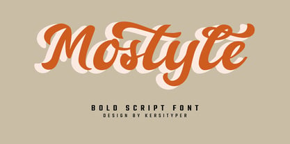 Introducing Mostyle font a Display Retro Script Font. Inspired by retro typography and lettering in the '70s and '80s combined with bold typography style. This Font is perfect for vintage and retro design, badges, logos, posters, branding, packaging, signage, and book cover. Multilingual support: Afrikaans, Albanian, Catalan, Danish, Dutch, English, Estonian, French, Finnish, German, Icelandic, Indonesian, Italian, Malay, Norwegian, Portuguese, Spanish, Swedish, Zulu, and many more. What’s Included : Standard & Multilingual glyphs Ligature Works on PC & Mac Simple installations Accessible in Adobe Illustrator, Adobe Photoshop, Adobe InDesign, and even work on Microsoft Word. Hope you enjoy our font!
 - Fd Forever Young by Fortunes Co,
$12.00 Forever Young is A disco 70s retro font is a typeface that captures the bold, flashy, and vibrant style of the disco era, which was popular in the 1970s. These fonts are characterized by their unique design elements that reflect the disco culture. with funky shapes Disco fonts often feature unconventional and geometric shapes, such as curves, swirls, and exaggerated serifs. Retro fonts are widely used in various design projects, branding, posters, and packaging to create a sense of nostalgia or capture the essence of a particular era. They are versatile and can be customized to fit a wide range of creative applications.
 - Constaline Script by Invasi Studio,
$17.00 Constaline is a super versatile pairing font monoline script and sans typeface with tons of alternate decorative characters. The Constaline font duo has a Rough Grunge texture and a clean style. Script Regular, Script Stamp, Sans Regular, and Sans Stamp are the four varieties available. They can be used for a wide variety of purposes. This font has been carefully hand-drawn to make sure its characters look consistent. Constaline font duo is suitable for logotype, badge, emblem, clothing design, signage, posters, packaging, and much more! Features: Uppercase & Lowercase Numerals & Punctuation Alternates and Ligatures Multilanguage Supports 60+ Latin based languages
 - Smooth Soul by Get Studio,
$15.00 SmoothSoul is a display sans-serif font with a smooth shape and a retro style characterized by its lack of decorative lines, which gives it a clean and modern-retro appearance. The smooth curves of this font create a sense of fluidity and ease, while the lack of serifs makes it feel relaxed and informal. The retro style of this font is evocative of the 1960s and 70s, with a nod to the playful and carefree design sensibilities of that era. Overall, this font is perfect for conveying a sense of fun and approachability, while still maintaining a sense of professionalism and modernity.
 - Beauchef by Latinotype,
$26.00 Beauchef is a sans serif typeface originally created to meet the needs of Centro de Modelamiento Matemático de la Universidad de Chile (University of Chile Center for Mathematical Modeling). Beauchef is a typeface with rough strokes that features subtle optical compensation and does not strictly follow the laws of perception. This typeface might not be too cheerful, but shows a very particular idiosyncrasy of form. Beauchef is as tough as advanced mathematics; however, it is as legible and exact as numbers themselves. This is an avant-garde typeface that resembles the development of mathematics, but at the same time it is as conservative, calm and respectful as clients who require its services. Beauchef is so astonishing as mathematical formulas that mathematicians work with, but at the same time it is as humble as resulting figures.
 - Beadly by ahweproject,
$9.00 Beadly. A retro bold script that will bring you back to the 70s feel. This typeface has the extrude version so you can create your retro effect font with ease. This font is perfectly made to be applied especially in logos, and other various formal forms such as invitations, labels, logos, magazines, books, greeting/wedding cards, packaging, fashion, make-up, stationery, novels, labels, or any type of advertising purpose. Beadly is PUA encoded which means you can access all glyphs and swashes with ease!
 - Alota by Burntilldead,
$14.00 Say hi to “Alota” retro typeface. Inspired by 70’s design styles, a good decade where we saw many calm colors with groovy, bold, 3D and round shape. This font is very easy to use with hundreds of stylistic alternate (ss01-ss12) & powered with opentype feature. The font really bring a good statement for your logo design and can be the image of a design. Alota is very unique and easy to apply to any media; t-shirts, posters, sign boards, and social media needs.
 - Roosk by DearType,
$39.00 Roosk is a round, reverse-contrast serif designed for display usages. It bears a 70s influence as well as a subtle western vibe, although it’s more rounded and chunky. The font is a single weight, Caps only and sports a set of 450+ glyphs and some cute symbols such as hearts and floral hearts. Roosk has Cyrillic and All European Languages Support and is best suited for posters, headlines, editorial, merchandise and packaging.
 - Moranga by Latinotype,
$29.00 Moranga is a contemporary, serif, retro-style typeface with a strong personality. Its design is a mixture between Café Brasil's flowing, organic shapes and elements from 70's popular fonts such as Cooper and Souvenir. Moranga, in 5 weights and matching italics, is the perfect choice for headlines, display use and high-impact or friendly designs. Moranga contains a set of more than 400 characters and supports over 200 Latin-based languages.
 - Diamond Jim JNL by Jeff Levine,
$29.00Diamond Jim JNL was inspired [in part] by an image of a 1970s Letraset® dry transfer typeface made entirely of small stars. By creating his own layout using tiny diamond shapes, Jeff Levine has produced a font that takes on multiple appearances. At 24 point it resembles dot matrix printing; at 48 point the diamonds are clearly visible; and overall, the design has a distinctive 70s retro feel. Limited character set. - Romela by Sealoung,
$20.00 Romela is a geometric sans serif font family. Contains 9 weights from Thin to Heavy with matching slopes. It is a blend of 70s geometric and modern style with a soft touch, minimalistic, elegant, warm, quirky, yet versatile, and easy to read. Romela was created for a satisfying reading experience, compatible with both text and display, and perfect for headers, titles, posters, websites, brands, apps, and a variety of other creative designs or projects.
 - ITC Ziggy by ITC,
$29.99ITC Ziggy was designed by Bob Alonso, who says it started out as phone doodles in the early 1970s." Alonso rediscovered the sketches years later, thought they revived the feel of the 70s, and decided to digitize the typeface. He liked the form of the letter Z best, so named the font Ziggy. ITC Ziggy reminds its designer of "elephant bellbottoms" and its style as a display face instantly evokes a nostalgia for the 1970s. - Bold Fashion by Mans Greback,
$59.00 Bold Fashion is a heavy slab-serif font of the disco era. Its funk-style design, coupled with soft, rounded serifs, embodies the soul of retro, bringing forth memories of neon lights, bell-bottoms, and roller discos. Each letter is profoundly heavy, yet they prance with a bouncy, comfy rhythm, akin to catchy 70s beats. The swashes adorning the uppercase letters add flair, reminiscent of iconic burger joint signs and groovy vinyl covers.
 - Asikue by Kereatype,
$14.00 Asikue is a soft serif font family inspired by the 70’s retro styles that bring chunky retro typography to the modern era. Asikue consists of 10 styles from Regular to Extra Bold with each matching Oblique. Asikue includes Asikue have Opentype features: Alternate, Ligature, Swashes, etc providing you with a variety of captivating custom text arrangements. Whether it's a fancy retro-inspired, logo, or engaging bold header text Asikue is able to deliver.
 - Angleface by ArtyType,
$29.00 With initial thoughts of creating something tubular, I had in the back of my mind the kind of contemporary chrome furniture that became ubiquitous throughout the 60s and that concept remained with me throughout the development process. The font-styling idea worked out very well in this case, resulting in plenty of optional character variations for my chosen theme, most of which are included in both styles of light and bold character sets.
 - Malistia by IM Studio,
$15.00 Give your typography designs a touch of retro style with Malistia! Introducing the trending font The Malistia, a bold retro script that will take you back to the 70s. comes with the Extrude version. So you don't need extra effort to create the extrude effect. Features include: Alternative Style, Swash, Collection of styles and multilingual support. You can choose alternative replacements with various Glyph variants. Very suitable for logos, t-shirts, posters, branding, etc.
 - Flicking by Ahmad Jamaludin,
$17.00 Introducing FLICKING, a font that's like a groovy time machine to the 60s. With its bold retro script and the added Shadow version, creating that perfect vintage look is a breeze. FLICKING offers two styles: Regular and Shadow, making it versatile for logos, invitations, labels, magazines, books, and even greeting cards. Features: Flicking Main File Has 2 Families: Regular and Shadow Instructions (Access special characters, even in Cricut Design) Simple Installations Thank you, Dharmas Studio


