10,000 search results
(0.03 seconds)
- Parochus by Kaer,
$24.00 Hello! Inspiration for this beautiful script font I found in “A Source of Solace in Illness” (Trost Bronn der Kranchhen) book, published in the middle of 17th century. There was an entire on the back of the top cover: Joannes Auanger Parochus Sinchingae 1808”. That's why I named my font family Parochus. In the Catholic Church, a parish is a community of the faithful within a particular church, whose pastoral care has been entrusted to a parish priest (Latin: parochus). There are original and regular style fonts. Also, I’ve added some modern symbols. With this set, you can precisely imitate medieval style text. I designed a full uppercase and lowercase set with Multilingual support and ligatures. You'll found ß, &, Š, ę and many other beautiful glyphs. Best, Roman.
 - The "PR Viking 01" font, created by Castles & Crypts, is a stylized typeface that draws significant inspiration from the historical and cultural elements of the Viking era. Designed to evoke the rugg...
- FF Kievit Slab by FontFont,
$65.99FF Kievit Slab is an industrial strength, do anything, go anywhere, kind of design. Its exceptional legibility and straightforward strength contrasts with a friendly humanistic underpinning. Michael Abbink and Paul van der Laan carefully revised character shapes and stroke contrast of FF Kievit, when they adapted them to FF Kievit Slab. The result is that the striking and powerful FF Kievit Slab easily complements the other members of the FF Kievit super family, that also includes FF Kievit and FF Kievit Serif, and stands on its own in as a multi-talented design. Though created from the sans, FF Kievit Slab is not FF Kievit with slabs serifs tacked on. The family is the fruit of a four-year collaboration between Abbink and Van der Laan, to make the perfect companion to the FF Kievit family. Each glyph was painstakingly adjusted and to achieve proper density, contrast, and balance, while remaining a perfect companion to its sans serif and oldstyle cousins. Its nine weights and italics also harmonize perfectly with the original FF Kievit design. Each of the FF Kievit styles is a typographical all-rounder that is equally at home in headlines as it is in text copy. Together, the three designs of the FF Kievit super family span a wide and deep typographic universe in which they support one another perfectly. These fonts will help you achieve your typographic goals, no matter how lofty. Featured in: Best Fonts for Websites - Baskerville by Linotype,
$40.99John Baskerville (1706-1775) was an accomplished writing master and printer from Birmingham, England. He was the designer of several types, punchcut by John Handy, which are the basis for the fonts that bear the name Baskerville today. The excellent quality of his printing influenced such famous printers as Didot in France and Bodoni in Italy. Though he was known internationally as an innovator of technique and style, his high standards for paper and ink quality made it difficult for him to compete with local commercial printers. However, his fellow Englishmen imitated his types, and in 1768, Isaac Moore punchcut a version of Baskerville's letterforms for the Fry Foundry. Baskerville produced a masterpiece folio Bible for Cambridge University, and today, his types are considered to be fine representations of eighteenth century rationalism and neoclassicism. Legible and eminently dignified, Baskerville makes an excellent text typeface; and its sharp, high-contrast forms make it suitable for elegant advertising pieces as well. The Linotype portfolio offers many versions of this design: ITC New Baskerville® was designed by John Quaranda in 1978. Baskerville Cyrillic was designed by the Linotype Design Studio. Baskerville Greek was designed by Matthew Carter in 1978. Baskerville™ Classico was designed by Franko Luin in 1995." - Baskerville Classico by Linotype,
$29.99John Baskerville (1706-1775) was an accomplished writing master and printer from Birmingham, England. He was the designer of several types, punchcut by John Handy, which are the basis for the fonts that bear the name Baskerville today. The excellent quality of his printing influenced such famous printers as Didot in France and Bodoni in Italy. Though he was known internationally as an innovator of technique and style, his high standards for paper and ink quality made it difficult for him to compete with local commercial printers. However, his fellow Englishmen imitated his types, and in 1768, Isaac Moore punchcut a version of Baskerville's letterforms for the Fry Foundry. Baskerville produced a masterpiece folio Bible for Cambridge University, and today, his types are considered to be fine representations of eighteenth century rationalism and neoclassicism. Legible and eminently dignified, Baskerville makes an excellent text typeface; and its sharp, high-contrast forms make it suitable for elegant advertising pieces as well. The Linotype portfolio offers many versions of this design: ITC New Baskerville® was designed by John Quaranda in 1978. Baskerville Cyrillic was designed by the Linotype Design Studio. Baskerville Greek was designed by Matthew Carter in 1978. Baskerville™ Classico was designed by Franko Luin in 1995." - Baskerville LT by Linotype,
$40.99 John Baskerville (1706-1775) was an accomplished writing master and printer from Birmingham, England. He was the designer of several types, punchcut by John Handy, which are the basis for the fonts that bear the name Baskerville today. The excellent quality of his printing influenced such famous printers as Didot in France and Bodoni in Italy. Though he was known internationally as an innovator of technique and style, his high standards for paper and ink quality made it difficult for him to compete with local commercial printers. However, his fellow Englishmen imitated his types, and in 1768, Isaac Moore punchcut a version of Baskerville's letterforms for the Fry Foundry. Baskerville produced a masterpiece folio Bible for Cambridge University, and today, his types are considered to be fine representations of eighteenth century rationalism and neoclassicism. Legible and eminently dignified, Baskerville makes an excellent text typeface; and its sharp, high-contrast forms make it suitable for elegant advertising pieces as well. The Linotype portfolio offers many versions of this design: ITC New Baskerville® was designed by John Quaranda in 1978. Baskerville Cyrillic was designed by the Linotype Design Studio. Baskerville Greek was designed by Matthew Carter in 1978. Baskerville™ Classico was designed by Franko Luin in 1995."
 - Monotype Baskerville by Monotype,
$29.99 John Baskerville (1706-1775) was an accomplished writing master and printer from Birmingham, England. He was the designer of several types, punchcut by John Handy, which are the basis for the fonts that bear the name Baskerville today. The excellent quality of his printing influenced such famous printers as Didot in France and Bodoni in Italy. Though he was known internationally as an innovator of technique and style, his high standards for paper and ink quality made it difficult for him to compete with local commercial printers. However, his fellow Englishmen imitated his types, and in 1768, Isaac Moore punchcut a version of Baskerville's letterforms for the Fry Foundry. Baskerville produced a masterpiece folio Bible for Cambridge University, and today, his types are considered to be fine representations of eighteenth century rationalism and neoclassicism. Legible and eminently dignified, Baskerville makes an excellent text typeface; and its sharp, high-contrast forms make it suitable for elegant advertising pieces as well. The Linotype portfolio offers many versions of this design: ITC New Baskerville® was designed by John Quaranda in 1978. Baskerville Cyrillic was designed by the Linotype Design Studio. Baskerville Greek was designed by Matthew Carter in 1978. Baskerville™ Classico was designed by Franko Luin in 1995."
 - Baskerville LT Cyrilic by Linotype,
$29.99John Baskerville (1706-1775) was an accomplished writing master and printer from Birmingham, England. He was the designer of several types, punchcut by John Handy, which are the basis for the fonts that bear the name Baskerville today. The excellent quality of his printing influenced such famous printers as Didot in France and Bodoni in Italy. Though he was known internationally as an innovator of technique and style, his high standards for paper and ink quality made it difficult for him to compete with local commercial printers. However, his fellow Englishmen imitated his types, and in 1768, Isaac Moore punchcut a version of Baskerville's letterforms for the Fry Foundry. Baskerville produced a masterpiece folio Bible for Cambridge University, and today, his types are considered to be fine representations of eighteenth century rationalism and neoclassicism. Legible and eminently dignified, Baskerville makes an excellent text typeface; and its sharp, high-contrast forms make it suitable for elegant advertising pieces as well. The Linotype portfolio offers many versions of this design: ITC New Baskerville® was designed by John Quaranda in 1978. Baskerville Cyrillic was designed by the Linotype Design Studio. Baskerville Greek was designed by Matthew Carter in 1978. Baskerville™ Classico was designed by Franko Luin in 1995." - Nostra 2003 J - Unknown license

- Kaku Dingbats One Piece Art One Piece Area - Personal use only

- Iloveyou - Unknown license

- DelitschAntiqua - Unknown license

- JustOldFashion-Condensed - Unknown license

- Mighty Rapids - Personal use only

- DirtyDeco - Unknown license

- Swifty - Unknown license

- Preciosa - Unknown license

- JoaoCond-Light - 100% free

- Nossible by Gassstype,
$25.00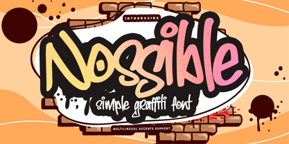 Introducing Nossible It's Simple Graffiti Font is a Natural Style and Authentic classy style, this font is great for your creative projects such as watermark on photography, and perfect for logos & branding, invitation,advertisements,product designs, stationery. It also features a wealth of special features including You can activate 11 Ligatures OpenType panel.
 - Borex by Twinletter,
$17.00 Introducing Borex, the ultimate font for all your sport racing needs. With its bold and dynamic letterforms, it captures the excitement and energy of the race track. And with four unique variations, including regular, slant, and taper styles, you can customize your designs to fit the tone and theme of your project. Not to mention, the font also comes equipped with alternate characters and unique ligatures to add an extra touch of creativity. So rev up your designs with Borex and get ready for the finish line! What’s Included : - File font - All glyphs Iso Latin 1 - Alternate, Ligature - Simple installations - We highly recommend using a program that supports OpenType features and Glyphs panels like many Adobe apps and Corel Draw so that you can see and access all Glyph variations. - PUA Encoded Characters – Fully accessible without additional design software. - Fonts include Multilingual support
 - DeLouisville - 100% free

- Minora by Alex Meier,
$40.00 Minora is a contemporary sans serif type family of three weights. Glyphs with open, plain and reduced forms are attributes of Minora. Several OpenType features allow different figure sets, fractions and more. Minora had its beginning in 2007 during Alex Meier’s Typedesign study (CAS Typedesign) at the ZHdK in Zurich (Switzerland). After graduation, Alex Meier continued working on this project in a shared studio with his former fellow student Dominique Kerber . He completed this fully developed font in April 2011.
 - BUNK by AdultHumanMale,
$20.00 BUNK is an 11 font system that can be layered in different ways to create various classic titling effects, think Old Timey signage 'COME IN WE'RE OPEN'. It's a display font that produces the different results by mixing and matching the various fonts together. Bunk's layer combos give you the control to create brilliant bevel, convex and 3-D styles. Each font contains the same metrics, so when your title is set, copy and paste-in-place to create layers of different weights/styles to build out your desired effect. Unlike other Layered Fonts out there, BUNK has upper case and lower case as well as currency symbols and lots of foreign characters too. Over 180 glyphs!. Five of the fonts (Shades 1,2,3,4,5) are clearly dependent on each other to create a complete font, so theses are only available in the Full family pack (11 fonts) or in the Layer Kit Family pack (7 fonts).
 - Independant - Unknown license

- Independant - Alternates - Unknown license

- Kachelofen by Proportional Lime,
$9.99 Konrad Kachelhofen was a printer in the city of Leipzig beginning around 1483. He printed many works by contemporary authors and also many of the classics. He acquired an unusually large amount of typefaces for his shop, a place that included a wine bar and book store. This particular face is based on the Typ.8:170G GfT101 Gesamtkatalog der Wiegendrucke. He probably died in 1529 after passing his business on to his son-in-law Melchior Lotter.
 - JerseyLetters - Unknown license

- SansThirteenBlack - 100% free

- BohrDonni - 100% free

- Wild Ride - 100% free

- DrunkenSailor - 100% free

- Gr-Memories - Unknown license

- ABC-LongLegs - Personal use only

- Jungle Juice - Unknown license

- CoolFatCat - Unknown license

- Gr-Memories - Unknown license

- PiggyBhank - Unknown license

- Felvetica - Unknown license

- Smoke - Unknown license

- OldBoot - Unknown license


