10,000 search results
(0.81 seconds)
- Protofo by Lafontype,
$19.00 Protofo is a modern-humanist sans-serif with characters that features various geometric shapes — from square, round and triangle. Protofo comes in 16 styles — upright and italic — from thin to black with each equipped with features such as localized, ligature, fraction, ordinal, superscript, numerator, nominator, subscript, proportional and tabular numerals. Protofo is also equipped with extended latin letters which can represent multi languages so making it perfect for any kind of project (display, editorial, web, interface, app, etc).
 - Lotus Grove by Fenotype,
$25.00 Utilize the elegance of Art Nouveau in modern form with Lotus Grove. Lotus Grove is a high-contrast serif typeface with deep roots in Art Nouveau aesthetics. In contrast to its archetypal models, Lotus Grove boasts a clean-cut and smooth design, perfectly suited for modern requirements. It is a fancy typeface that suits any kind of display use. Lotus Grove is equipped with Stylistic Alternates for letters G, E, K, R, S, T and ampersand.
 - XLeefMeAlone by Ingrimayne Type,
$14.95 XLeafMeAlone is a collection of leaf silhouettes from common Indiana trees based on actual leaves. Various leaves, selected for their good looks not their intelligence, were scanned and hand-traced. Some species, such as some oaks, are over-represented because they are more picturesque than others, such as apple or peach. LeafMeAlone was featured in the “Type Drawer” column of Personal Publishing (later renamed Business Publishing--I do not know if it still exists) in November of 1990.
 - Afterword JNL by Jeff Levine,
$29.00 At the end of the 1931 gangster film “The Public Enemy” a hand lettered card offers up an afterword on the demise of Tom Powers (James Cagney’s character in the film) and how a “public enemy” is neither a man nor a character but a problem society must deal with. The text is in an Art-Deco influenced sans serif, and has been digitally recreated as Afterword JNL, which is available in both regular and oblique versions.
 - Texturic by Zagach Letters,
$15.00 Texturic is a handwritten brush script with natural hand brushed strokes to give your design realistic and natural look. Texturic has a variety of coded features to create unique text designs. Stylistic alternates for all letters and numerals, contextual alternates and swashes, which makes your designs to look more natural. It is perfect for titles, headlines, greeting cards, stationery design, packaging, magazines, posters and more. Multilingual support. Extended Latin character base that covers most European languages.
 - Air Castles JNL by Jeff Levine,
$29.00 The cover of the 1919 sheet music for "While Others are Building Castles in the Air I'll Build A Cottage for Two" had its title hand lettered in a wonderfully eccentric Art Nouveau serif design that typified the era. Also typical of the time was the habit of various songwriters to come up with wordy titles. This particular one checks in at fourteen words. Nonetheless, the sheet music's title inspired Air Castles JNL and its oblique counterpart.
 - Supra Condensed by Wiescher Design,
$29.00 »Supra-condensed« – designed by Gert Wiescher in 2013 – is the condensed version to this new sans typeface family of eight weights with matching italics. The condensed version is designed for space-saving typography but with high legibility in mind. The light and normal weights and the dominant x-height with its high ascenders make for easy reading of long copy. The heavy and x-light weights are great for elegant headlines. Supra is an OpenType family.
 - Kuzanyan by ParaType,
$30.00 The hand composition typeface was created at Polygraphmash type design bureau in 1959 by a well-known Soviet book and type designer Pavel Kuzanyan (1901-1992). It was reproduced in the 1960s for slugcasting and machine display composition. Sharp contrast, strong weight, slightly condensed Modern Serif with calligraphic elements. The typeface is useful in text and display composition, in scientific, fiction and art books. The revised and completed digital version was designed at ParaType in 2002 by Lyubov Kuznetsova.
 - ITC Woodland by ITC,
$29.99ITC Woodland is the work of Japanese designer Akira Kobayashi. It is based on Kobayashi's hand lettering with a flat brush or square-edged pen. I wanted to design each weight to act its own part," says the designer. "The light version tends to look almost fading in small sizes, but the heavy weight is as black as Cooper Black." The cheerful ITC Woodland is ideal for graphics, greeting cards, correspondence, and other applications requiring a light touch. - ITC Stylus by ITC,
$29.99ITC Stylus is the work of American designer Dennis Pasternak, who based its forms on those of freehand architectural lettering from historical and contemporary sources. Pasternak points out that while the typeface emulates hand lettering, no pencil drawings or scanned art were used in its creation. The letters bounce slightly across the baseline, giving the typeface the look of true handwriting. ITC Stylus emanates warmth when used for extended text and a fresh quality in display sizes. - Hemingway's Shotgun by Burghal Design,
$29.00Once upon a time (a.ka. 1984), there was a Goth band who called themselves "Hemingway's Shotgun." As a symbol of his commitment to this band, the bass player acquired a tattoo of a shotgun on his forearm. Unfortunately, this tattoo wasn't very well drawn: the barrel was much too short, and was much thinner at one end than the other. The tattoo rather resembled a small, cordless, rechargeable hand-held vacuum cleaner. Thus, the band "Hemingway's Dustbuster" was born. - Argent CF by Connary Fagen,
$35.00 Argent is dashing and expressive, with a pronounced x-height and evocative, flowing letterforms. Featuring charming italics, a special superbold weight, and wide language support, Argent excels in display settings like headlines, titles, and logos. As an expressive and detailed typeface, Argent pairs nicely with clean typefaces that provide contrast, such as a sans serif like Greycliff CF, Artifex Hand CF, and Articulat CF. All typefaces from Connary Fagen include free updates, including new features, and free technical support.
 - Machete Pro by Sudtipos,
$39.00 Machete is the hulky, overfed distant cousin of Bayoneta. Enthusiastically in your face and full of humour, Machete is exactly the kind of big alphabet that takes a skinny actress camping at the top of a really tall building downtown. If you don't think this sort of date is interesting enough, try cramming these letters on your next tub of comfort food, road trip comedy, or assault rifle packaging and see. Machete don't text. Machete roars!
 - Badlands JNL by Jeff Levine,
$29.00 A vintage piece of sheet music for "Waitin' at the Gate for Katy" (from the 1934 movie "Bottoms Up") provided the hand-lettered, Western-influenced lettering which is now available as Badlands JNL. Some of the characters originally had overly-thick vertical strokes which stood out from the rest of the letters, so they were "standardized" in order to provide a more aesthetically pleasing overall design. Available in both regular and oblique versions to fit your design needs.
 - Reverb by Carmel Type Co.,
$15.00 Designed with the gig poster in mind, Reverb is a throwback to the Fillmore West golden age of psychedelic rock and summertime fun. With 5 distinct weights, this workhorse of a display face has you covered from light and airy to bold and curvy. Concave stems. short descenders with a tall x-height, and a generous helping of stroke contrast define this humanist sans face that's built to shine as a headliner or to spice up some secondary copy.
 - Ltt Recoleta by Latinotype,
$39.00 This new Recoleta is made up of 24 styles in total. We have added to its classical width two new variants with two different degrees of condensation: one very condensed and svelte, and the other at the midpoint between the standard width and the condensed. Each of the 3 widths has 8 weights, from thin to black. It also has numerous stylistic alternatives in both uppercase and lowercase. On the other hand, Recoleta also supports the Cyrillic alphabet.
 - Pulpo by Floodfonts,
$49.00 A friendly and comfortable typeface inspired by Century Schoolbook and Clarendon. Despite the strength and sturdiness of the design, each letter shape carries warmth and an echo of the human hand, concealing some nostalgia. The family is ideally suited for editorial, advertising and packaging as well as web and app design. A massive body combined with low stroke contrast, make it very suitable on screen and for small text sizes on newsprint paper. For more information visit the microsite.
 - Friends by W Type Foundry,
$25.00 Friends is a complete and contemporary language system for postmodern graphics. Inspired by the idea of making new art and graphic design keeping in mind new ways of visual language like emojis as a formal way of communication and contemporary graphic arts. Friends is perfect for web design, postmodern arts, book design, posters, editorial design, branding, advertising, headlines, and short texts. Friends includes 14 style typeface plus italics, icons, emojis, arrows, ligatures, fractions, special numbers, etc.
 - PGF Business by PeGGO Fonts,
$49.90 PGF Business inspired by script used on maps, spencerian aka "Business Script" and manual and confident signature strokes. Organized in 5 individual styles, for making it easier to use, and gathered all at one in a bigger unique file called "PGF Bussiness Full" where you will find way much more options, but requires a more advance editing skill to use. Accompained with a useful set of Dingbats and a set of complementary Ornaments to enhance more versatile typographic compositions.
 - Dual Line Deco JNL by Jeff Levine,
$29.00 Sheet music for the title song from the 1933 Jean Harlow-Clark Gable film "Hold Your Man" has the movie title hand lettered in a dual line sans serif with Art Deco influences. This is now available as Dual Line Deco, and is available in both regular and oblique versions. The song itself was written by Arthur Freed and Nacio Herb Brown, whose vast catalog of musical compositions was tapped for the 1952 musical classic "Singing in the Rain".
 - Tiara by Tanincreate,
$16.00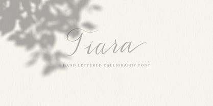 Tiara is a lovely modern calligraphy script typeface with contemporary accents. It is great for wedding invitations, branding, headline, logotype, apparel, packaging, advertising etc. Tiara script comes in uppercase, lowercase, punctuation, symbols & numerals, stylistic set alternate, ligatures, multilingual support . All lowercase letters include beginning and/or ending swashes which gives a realistic hand-lettered style. To use the swashes, a program that supports OpenType features is needed (Adobe Photoshop CS, Adobe Illustrator CC, Adobe Indesign, Corel Draw, ect.)
 - Stand High by Olivetype,
$18.00 Stand High is a handwritten typeface with an organic, hand-drawn feel. It's perfect for headlines, movie titles, and other creative applications. With its brush-like strokes and slightly rough texture, Stand High is sure to add an extra touch of personality to your designs. So what’s included : Standard Latin Numbers, symbols, and punctuations Ligatures and Swashes Multilingual Support. Accented Characters : ÀÁÂÃÄÅÆÇÈÉÊËÌÍÎÏÑÒÓÔÕÖØŒŠÙÚÛÜŸÝŽàáâãäåæçèéêëìíîïñòóôõöøœšùúûüýÿžß PUA Encoded and fully accessible without additional design software Simple Installations Works on PC & Mac Thank You!
 - Kanyon by Hurufatfont,
$19.00 Kanyon is a family of typefaces created from basic geometric forms based on the equal width system. Its clean and neutral structure and 3 different widths provide ease of use in different design channels. With its rich OpenType features, multi-language support and small capital characters, it has a wider usage area than its counterparts. Ideal for packaging, labels, routing designs, mobile applications, brand designs, logos, all kinds of presentation and editorial designs, indoor and outdoor printing works.
 - Snow Job JNL by Jeff Levine,
$29.00 Snow Job JNL was inspired by the hand lettered titles for the 1964 Rankin-Bass animated holiday classic "Rudolph the Red Nosed Reindeer". Because of the variable heights of the characters they float about the baseline in a free-form design. Available in both regular and oblique versions, the typeface gets its name from both the winter theme of the TV special along with the old term for deceiving someone with compliments while hiding one's true intent.
 - Big Caslon CC by Carter & Cone Type Inc.,
$35.00 The three largest sizes of type made by the Caslon foundry are strangely unlike the famously consistent text faces cut by William Caslon. Perhaps they were the work of other hands—or of the master in a funky mood. Caslon’s text types have often been revived, but the display sizes, forceful and a touch eccentric, had no digital version until Matthew Carter’s Big Caslon. With striking Italics and rich design features , this typeface shines at BIG sizes.
 - Geria by LetterMaker,
$21.00 Geria is a hand drawn sans serif in four weights. Despite being rough and organic, Geria retains the basic structure and shape of a readable sans serif. The result is a functional typographic tool with a lot of personality. The family comes in four carefully balanced weights that offer a lot of contrast from the delicate Light to the punchy Heavy weight. Geria is perfect for display use in branding, packaging, editorial design, posters and advertising.
 - Old Tijuana JNL by Jeff Levine,
$29.00 Old Tijuana JNL was modeled from the hand lettered title on the cover of the 1939 sheet music for "Class Will Tell" and is available in both regular and oblique versions. Casual, playful and reminiscent of the "serape" style of pseudo-Mexican lettering found on ad designs of the 1930s and 1940s, the type face isn't just for South of the Border themes. Use it for any festive occasion and the design will blend in well.
 - Bolero by Canada Type,
$24.95Named after Maurice Ravel's masterpiece, Bolero likes to find itself in places of classical elegance. Slightly inspired by the soft italics put forth by Giambattista Bodoni and the Didot family, Bolero adds a feminine touch to the traditional clarity of the modern masters. A must-have for anyone who designs wedding invitations, high-end menus, romance-related book covers and posters, cosmetics packaging, fashion branding, and much more. Comes with a large assortment of alternates and ligatures. - ITC Mithras by ITC,
$29.99ITC Mithras was designed by Bob Anderton and finds its foundation in the worn yet elegant letters carved into stones of a Mithraic temple in Scotland. The capitals are narrow and complemented by a wide, full bodied lowercase. The proportions of the curves vary slightly between characters and this subtle contrast gives the face a mellow appearance while still attracting attention. ITC Mithras is a very legible typeface and hence applicable to a wide range of display uses. - JT Alvito by JAM Type Design,
$15.00 The JT Alvito family includes 5 weights with matching italics. It is ideally used as a dipslay typeface but can also be used in body copy. You will find that it works particularly well in advertising, packaging, logo design and branding. JT Alvito provides advanced typographical support with features such as ligatures, fractions, and super- and subscript characters. It holds most glyphs which are required for Western European, Central European, South Eastern European and Vietnamese languages.
 - Mr Cyrk by Hipopotam Studio,
$18.00 Hand drawn typeface designed for one of our books. You can layer different styles over the background style to achieve lots of colorful effects. Use just one style to get a single color letter or set the fillOne and fillTwo over the background style to get a full, tree color mode. Mr Cyrk has only uppercase characters with alternate glyphs in place of lowercase letters. You can have one style for $18 or all of them for $30.
 - Resize by sizimon,
$15.00 Resize is a handmade typeface that is inspired from hand-drawn lettering. It is suitable for your awesome works such as product packaging, posters, social media posts, advertisements and product designs. It contains a full set of lower and uppercase letters, a large range of punctuation, numerals, and multilingual support, also has alternative characters. To enable the OpenType Stylistic alternates, you need a program that supports OpenType features such as Adobe Illustrator CS, Adobe Indesign & CorelDraw X6-X7.
 - Greenwich Village JNL by Jeff Levine,
$29.00 For decades, the Greenwich Village area of New York was a home for artists, poets, writers and free-thinkers of their time who were labeled "Bohemians" because of their non-conformist approach to life and the arts. Greenwich Village JNL is an Art Nouveau-influenced typeface with a Bohemian approach in its double crossbars on the A and H; all the while being a nice example of hand lettering found on a vintage piece of sheet music.
 - Garment Bag Stencil JNL by Jeff Levine,
$29.00 Searching the internet for interesting type ideas leads one to many unusual items for sale online. An antique, hand-cut metal stencil from France with the word “Bagagens” [luggage] provided a condensed Art Deco design in a semi-stencil format (some solid letters, others with traditional ‘breaks’ within the characters). The digital version of the type style has a more traditional stencil character set. Garment Bag Stencil JNL is available in both regular and oblique versions.
 - Simply Grotesk JNL by Jeff Levine,
$29.00 Up until the advent of vinyl plotters, computers and a myriad of other typesetting and printing changes the world has experienced over the past few decades, the art of hand lettering flourished. An early 1900s book on show card writing displayed a nice example of a Grotesk typeface (a popular style of sans serif of the time). This has been redrawn digitally as Simply Grotesk JNL and is available in four varieties - regular, oblique, condensed and condensed oblique.
 - WT Volkolak by Wraith Types,
$50.00 Volkolak is the ultimate serif-sans-grotesque tribrid, its numerous cuts will give you many options represent a typesetter's dream! Designed as one, it offers a serif, a contrasted sans serif and a grotesque style. The numerous typesetting options offered this way gives it a ton of usability and functionality in many different mediums, editorial design, books, magazines, posters, visual identity, web design... You won't find a project in which you can't use this true workhorse superfamily!
 - Last Tango JNL by Jeff Levine,
$29.00 The hand lettered title found on the 1924 sheet music for the tango “Sentimiento Gaucho” (“Sentimental Gaucho”) offered a different take on the thick-and-thin lettering that permeated the late 1920s through the Art Deco age. A ‘slash’ or ‘swipe’ is cut through the characters (similar to “Directa JNL” – another take on this type of design). Last Tango JNL is the digital recreation of this novelty lettering and is available in both regular and oblique versions.
 - La Vie Nouveau JNL by Jeff Levine,
$29.00 Early 1900s songwriters had a penchant for devising lengthy titles for their compositions. A perfect example from 1909, "It Is Hard to Kiss Your Sweetheart When the Last Kiss Means 'Good Bye'" is a whopping fourteen words long. The sheet music for this piece has a hand lettered, Art Nouveau sans serif design which became the working model for La Vie Nouveau JNL [which translates to "the new life"], and is available in both regular and oblique versions.
 - Screwball Comedy JNL by Jeff Levine,
$29.00 Cary Grant was one of Hollywood’s most versatile actors, playing romantic leads, dramatic parts and showing off his impeccable timing in screwball comedies. A perfect example of this is Frank Capra’s “Arsenic and Old Lace” from 1942. The movie trailer for the film had the title hand lettered in a playful and casual slab serif style, with varying character shapes and weights. This is now available as Screwball Comedy JNL in both regular and oblique versions.
 - Manifestor by Stawix,
$40.00 Manifestor is designed to be an urban culture typeface, it can effortlessly fit, blend and be in very situation at any time without taking up too much attention. It has a clean san-serif structure and proportion, kind to the eyes when set in texts while also look reliable when use in big scale. Manifestor has the simple - easy - comfortable feature, therefore it is a type appropriate for a very wide range of occasion. Manifestor also comes in Variable!