10,000 search results
(0.047 seconds)
- Trained Monkey by Hanoded,
$15.00 Trained Monkey is a happy serif cartoon font. Use it for your book cover designs, posters, product packaging (may I suggest peanut butter?) and whatever else you may fancy. This monkey was made by hand, so the glyph edges are a bit rough and uneven - giving it ‘ye olde handmade look’. The name? Well, I was watching a movie (can’t remember which one) in which two guys were having a discussion. One of them said to the other: ‘a trained monkey could have done this job!’ That’s all folks.
 - Latin CT by CastleType,
$59.00 The Latin family of typefaces, first popular in the last half of the nineteenth century, is characterized by its large, sharp, triangular serifs. With six widths (from Extra Condensed to Wide), Latin CT offers the most extensive collection of Latin fonts available, each with a large character set that includes support for all European languages including those that use the Cyrillic alphabet. From the sleek elegance of Latin CT Extra Condensed to the brash boldness of Latin CT Wide, you will find a width to fit your contemporary typographic needs.
 - Saki by Thinkdust,
$10.00 Saki is big and bold, presenting messages in an easy to understand, pleasant to read manner. Simple straight edges, shallow curves and sans-serif, Saki was created with legibility and minimalism in mind and its thick weight gives it great scalability. It is admirable for maintaining such close attention to form, each character fitting neatly into the space provided and slotting together smoothly for undistracted reading. For use in headlines and similar large text, Saki is the font you need to get your message across loud and clear, no ifs, ands or buts.
 - Concertina by Hanoded,
$15.00 A concertina is a kind of musical instrument, not unlike an accordeon. I just liked the name; I have to admit I’m not a particular fan of accordeon music… Concertina is a beautiful handmade script font. A little rough, but elegant as well. It was made with a small Japanese brush pen on coarse paper. Concertina comes with double letter ligatures and end-letter alternates. To access the end-letter alternates, type the letter you want + space (and make sure to tick the ‘ligatures’ box in your OT environment).
 - NorB Felt Tip by NorFonts,
$32.00 NorB Felt Tip was inspired from the lettering of my grand-brother Med Bahha who taught several kinds of letterings. It is a handwritten text font mimicking a felt pen and can be used with any word processing program for text and display use, print and web projects, apps and ePub, comic books, graphic identities, branding, editorial, advertising, scrapbooking, cards and invitations and any casual lettering purpose… or even just for fun! NorB Felt Tip comes with 6 weights each with their matching italics and in a Light, Normal, Bold and Heavy version.
 - My Love Olivia by Sulthan Studio,
$12.00 My Love Olivia is a modern, handwritten, modern calligraphy font. The shape is modern and unique and the writing style is very natural. My Love Olivia features a varied baseline, smooth lines, gorgeous glyphs, and stunning alternatives. Hand-drawn design elements allow you to create many beautiful typographic designs in an instant like branding, web design and editorial, prints, crafts, quotes,It's great for logotypes, wedding invitations, romantic cards, labels, packaging, spelling of names and others. Add to your most creative ideas and watch how they bring them to life!
 - Mellodate by Letterhend,
$19.00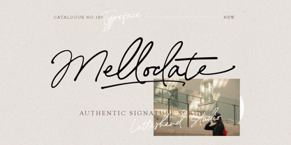 Introducing, Mellodate Script - an authentic hand writing with natural signature style. This type of font perfectly made to be applied especially in logo, and the other various formal forms such as invitations, labels, logos, magazines, books, greeting / wedding cards, packaging, fashion, make up, stationery, novels, labels or any type of advertising purpose. Features : uppercase & lowercase numbers and punctuation multilingual alternates and ligatures swashes PUA encoded We highly recommend using a program that supports OpenType features and Glyphs panels like many of Adobe apps and Corel Draw, so you can see and access all Glyph variations.
 - Spartwell by Ergibi Studio,
$20.00 Spartwell is a handwritten script with a brush effect that comes with a style that seems real. This font style is inspired by luxury goods and brands, making for many possibilities with your latest project. Spartwell is perfect for logos and branding, photography, invitations, watermarks, advertisements, product designs, stationery, wedding designs, labels, product packaging, special events or anything that requires handwritten content. Spartwell also contains some lowercase characters that have swash, as well as multi-lingual support. This can be accessed easily via opentype in Photoshop / Illustrator. Kind regards Ergibi Studio
 - Graves by madeDeduk,
$14.00 Introducing Graves is a display sans family with much special alternative glyphs and ligatures comes with 9 weight to get more stunning. Use this font family for any branding, product packaging, invitation, quotes, t-shirt, label, poster, logo etc. Feature 9 Weight Uppercase & Lowercase Number & Symbol International Glyphs Alternative & Ligatures Multilingual support Feel free to drop us a message any time and follow my shop for upcoming updates Shoot me on email at: dedukvic@gmail.com and find more previews on my Instagram here : https://www.instagram.com/acekelgondolayu/?hl=en Hope you enjoy it.
 - Mrs Summer by Hipopotam Studio,
$20.00 Mrs Summer is a hand drawn narrow typeface with a Western touch. It has only uppercase characters with alternate glyphs in place of lowercase letters and additional alternate glyph in a Stylistic Set. It has build in OpenType Contextual Alternates feature that will automatically set alternate glyphs depending on frequency of appearance of the same character (even in web font but only in HTML5 browsers). The script doesn’t just throw random glyphs. Additionally Mrs Summer is filled with ornaments, arrows, stars, horses, trees and a lot of other symbols.
 - Salda by Hurufatfont,
$19.00 Salda; It is a modern sans serif family that blends old and new generation sans serif fonts in the same body. It has a wide usage area with its light narrow structure, sharp and clean lines, humanist touches. It provides clean and smooth visuals in vertical screens, mobile applications and block texts. With two different x heights (xL-xS), the body offers richness in text and headings. It consists of a total of 40 styles. Ideal for all kinds of editorial design, packaging, corporate identity, brand, application, web and desktop.
 - Kinoble by Jehoo Creative,
$19.00 Kinoble is a font that combines the clean look of sans-serif with a touch of handwriting for a natural feel. It comes in different weights, from regular to black, and has an italic style for added variety. This makes it suitable for various design purposes, from subtle to bold. Whether you need it for titles, logos, or any kind of display text, "Kinoble" adds a modern twist while staying easy to read. It's like a versatile tool in your design toolbox, offering a unique blend of style and clarity.
 - Tritonal by Papermode Co,
$20.00 Tritonal, letters to connected each other to convey elegance and style. Thin and thickness, feminine and friendly. Tritonal will work perfectly for fashion, e-commerce brands, trend blogs, invitation, product packaging, hand-written quotes, greetings cards, labels, logos, magazines, books, greeting/wedding cards, packaging, stationery, novels, labels or any type of advertising purpose. Includes multilingual support and special ligatures If you do not have programs that support OpenType features like Adobe Illustrator and CorelDraw X Versions, you can access all alternative flying machines using Font Book (Mac) or Character Map (Windows).
 - Artificial Flavour by Kitchen Table Type Foundry,
$15.00 I do groceries a couple of times a week. When I am shopping for food, I always read the ingredients list; I don’t want too much sugar, nor palm oil, trans fats or a lot of E numbers. It used to be quite hard finding products that didn’t contain artificial flavours or colouring, but it is getting better. Artificial Flavour is an anti-ode to the time we couldn’t get enough of the stuff - it is a handmade, all caps font which comes with extensive language support and a sweet set of alternates.
 - Supaduper PB by Pink Broccoli,
$16.00 Supaduper PB is a font inspired by some wonderfully funky hand-lettered greeting cards from the 1980's. The delightfully awkward and animated playfulness of this lettering style was maintained throughout the fleshing out from the original specimens - and I think you're going to have a lot of fun typing with this. Even if you haven't seen these old greeting cards, the lettering style has a familiar visual to it. Bring back a little nostalgia, add a little wonkiness, or just have fun typing with Supaduper PB today!
 - Ansylia by Letterhend,
$19.00 Introducing, Ansylia Script - an authentic hand writing with natural signature style. This type of font perfectly made to be applied especially in logo, and the other various formal forms such as invitations, labels, logos, magazines, books, greeting / wedding cards, packaging, fashion, make up, stationery, novels, labels or any type of advertising purpose. Features : uppercase & lowercase numbers and punctuation multilingual alternates and ligatures swashes PUA encoded We highly recommend using a program that supports OpenType features and Glyphs panels like many of Adobe apps and Corel Draw, so you can see and access all Glyph variations.
 - Drama Quality by Papermode Co,
$10.00 Introducing Drama Quality, a monoline script typeface with extra features. Drama Quality comes in a handmade style and can perfectly be used as an elegant addition to any logo, invitation, or for product packaging, hand-written quote, greetings card, labels, logos, magazines, books, greeting/wedding cards, packaging, fashion, stationery, novels, labels or any type of advertising purpose. Includes multilingual support and special ligatures If you do not have programs that support OpenType features like Adobe Illustrator and CorelDraw X Versions, you can access all alternates using Font Book (Mac) or Character Map (Windows). Thank you!
 - Anjani Script by Letterhend,
$14.00 Anjani is a modern calligraphy script with a romantic feel. The natural hand writing script is suitable for you who needs a typeface for headline, logotype, apparel, invitation, branding, packaging, advertising etc. This typeface is comes in uppercase, lowercase, punctuations, symbols and numerals, stylistic set alternate, ligatures, etc also support multilingual and already PUA encoded. We hope you enjoy the font, please feel free to comment if you have any thoughts or feedback. Or simply send me a PM or email me at letterhend@gmail.com Thanks for purchasing and have fun!
 - Mongnai Script by Youngtype,
$14.00 Mongnai Script is a hand brush font made with brushes and ink. This typeface is ideal for use in thick watercolor designs or handwriting styles, such as blog titles, posters, wedding elements, t-shirts, clothing, book covers, business cards, greeting cards, branding, merchandise etc. Contains full set: - Uppercase - Lowercase - alternative - fastener - Punctuation - number - multilingual support. How to access all alternative characters, using Windows Character Map with Photoshop: - https://www.youtube.com/watch?v=Go9vacoYmBw How to access all alternative characters using Adobe Illustrator: - https://www.youtube.com/watch?v=XzwjMkbB-wQ Thank you!
 - Bittergrace Script by Letterhend,
$15.00 Introducing Bittergrace, a romantic modern script with a twist of fun! The natural hand writing script is suitable for you who needs a typeface for headline, logotype, apparel, invitation, branding, packaging, advertising and others. This typeface comes with uppercase, lowercase, punctuations, symbols and numerals, stylistic alternate set, ligatures, and mor and also has multilingual support. It also already PUA Encoded. We hope you enjoy the font, please feel free to comment if you have any thoughts or feedback. Or simply send me a PM or email at letterhend@gmail.com Thanks for purchasing and have fun!
 - Blusher Script by Youngtype,
$18.00 Blusher script is a hand brush font made with brushes and ink. This typeface is ideal for use in thick watercolor designs or handwriting styles, such as blog titles, posters, wedding elements, t-shirts, clothing, book covers, business cards, greeting cards, branding, merchandise etc. Contains full sets of: - Uppercase - Lowercase - Alternatives - Ligatures - Punctuation - Numbers - Multi-lingual support How to access all alternative characters, using Windows Character Map with Photoshop: https://www.youtube.com/watch?v=Go9vacoYmBw How to access all alternative characters using Adobe Illustrator: https://www.youtube.com/watch?v=XzwjMkbB-wQ Thank you!
 - Bon Apit by Papermode Co,
$16.00 Bon Apit is a monoline script typeface with extra features. Bon Apit comes in a handmade style and can perfectly be used for an elegant addition to any logo, invitation, product packaging, hand-written quote, greetings card, labels, logos, magazines, books, greeting/wedding cards, packaging, fashion, stationery, novels, labels or any type of advertising purpose. Includes multi-lingual support and special ligatures If you do not have programs that support OpenType features like Adobe Illustrator and CorelDraw X Versions, you can access all alternates using Font Book (Mac) or Character Map (Windows). Thank you!
 - Chellomego by Haksen,
$19.00 Chellomego is a stylish modern handwritten script font with casual chic flair. It is perfect for branding, signature, wedding invitation, promotion, product packaging, and other needs. You will get full set of lowercase and uppercase letters, numerals and punctuation, multilingual symbols, lowercase beginning and ending swashes, ligatures and extra swashes that giving realistic hand-lettered style. In order to use the beautiful swashes, you need a program that supports OpenType features such as Adobe Illustrator, Adobe Photoshop, Adobe Indesign and Corel Draw. Thanks and have a wonderful day, Haksen
 - Mumford by fragTYPE,
$16.00 Mumford began as a revival of the early designs for sans serif fonts of the late 19th and early 20th centuries, but along the way it morphed into a reinterpretation of this style and it adaptation to more contemporary shapes. It's strong contrast, signature of the design, works along it 9 weight variables each with their corresponding oblique. Each variable includes extended language support (+ Cyrillic), fractions, tabular figures, ligatures and opentype features. Mumford was design with strong graphic display design in mind, perfectly suited for poster, magazine headers, titles and editorial design.
 - Miss Moonling by Youngtype,
$18.00 Miss Moonling is a hand brush font made with brushes and ink. This typeface is ideal for use in thick watercolor designs or handwriting styles, such as blog titles, posters, wedding elements, t-shirts, clothing, book covers, business cards, greeting cards, branding, merchandise etc. Contains full set: - Uppercase - Lowercase - Alternative - Ligatures - Punctuation - Number - Multilingual support. How to access all alternative characters, using Windows Character Map with Photoshop: - https://www.youtube.com/watch?v=Go9vacoYmBw How to access all alternative characters using Adobe Illustrator: - https://www.youtube.com/watch?v=XzwjMkbB-wQ Thank you!
 - Rum Raisin Pro by Stiggy & Sands,
$29.00 Our Rum Raisin Pro was inspired by the lettering from a vintage Kellogg's Raisin Bran cereal box, yet is has expanded from what was originally a unicase design to include a lowercase character set. For those seeking to use the original unicase A, you can find it in the Delta character slot. Fun and festive, this font plays the comic clown to perfection. The SmallCaps and extensive figure sets offer a change up to a slightly more serious tone or alternate personality for a wider range of use.
 - Nori by Positype,
$49.00 First, the important information…Nori is a hand-lettered typeface that contains over 1100 glyphs, 250 ligatures, 487 alternate characters, 125+ swash and titling alternates, lining and old style numerals. To make sure it is perfectly clear—Nori is the result of brush and ink on paper. The textures produced in each glyph are real and the imperfections are intentional and add to the sincerity of the letters. I say this to be as blunt as possible in order to avoid confusion and to frame what this typeface represents—calligraphic, handwritten letters captured digitally for their warmth and poetic variation for print and screen. Like my handwritten, calligraphic or brush-driven faces before it (the Baka series and the TDC2 2010 winning typeface, Fugu), Nori is a product of my analog and digital hand. To view the words and sentences formed by this typeface is to look at how my hands, yes hands, make letters. The fluidity, as well as the irregularity, is human, honest and intentional—to do so lets the brush I am holding breathe life into each letter. Once digital, any number of points and repetitive processes can’t mask its influences—and I like that. The brush, a simple instrument, my tool, my friend designed to emulate traditional Japanese sumi-e brushes... the Pilot Japan Kanji Fude brush pen. Each letter, each variation was written over and over again until I found the right combination. From there, each was scanned, digitized and optimized. Points were removed in order to ‘clean’ the glyphs up some but I did not want to compromise the integrity of the actual brush stroke. Once this base set of characters (about 350) were completed, the thoughtful manipulation of the glyphs, their gestures and forms were further expanded to solidify the embellishments used within the ligatures, alternates, swashes and additional features. This process was admittedly self-indulgent to an extent. I wanted the words created with this typeface to have the flexibility of variation and cohesiveness of movement that someone fluidly producing these letters by hand might have. I hope you enjoy this typeface as much as I did during the six months working on it. A specimen and style guide is included with the purchased of Nori.
 - Lady Rene by Sudtipos,
$59.00 Looking back on my production to date, neither so little nor so large, it does not come as a surprise to find myself now introducing Lady René. A brief review of my career would read as follows: graphic designer graduated from Buenos Aires University, a 10-year professorship in Typography in the same institution, an illustrator in the making. For almost 15 years now my work has focused on the design of editorial pieces, predominantly books and CD sleeves. Typography proper has always been central to my research projects. All my obsessions eventually embodied as much the search for a perfect, spotless text as for a daring and provoking one. In my view, "how-to-say-something" ranks highest amongst a graphic designer’s responsibilities. It was in this vein that I called in the written word to illustrate, to draw, to narrate. Why not reverse the saying and proclaim that “a word is worth a thousand images”? If so, one single word could trigger endless meanings, associations, ideas, and memories in every reader’s mind. Language, we know, has a strong power and is a living expression of a culture. In my illustrations, letters and drawings reunite in one synergy said and unsaid, the finiteness of the message and the freedom of the free reading. And this is how and when, Lady René, my first born type font sees the light of day conceived out of a love of illustration and a reverence for the written word, recalling the whimsicality of the handmade drawing and reflecting its sensitive, warmth and spontaneity. Enabled by the characteristics of Open Type and the hard, outstanding work of designer Ale Paul, Lady René succeeds in composing texts in a simple, organic way by means of its contextual and stylistic alternates, swash characters, ligatures and connecting words. A bundle of decorative miscellanea completes the set of signs, enabling the user considerable freedom to create new typographic landscapes. Lady René is then prepared, very much like a character in a short story, to come to life in the reader’s mind. I expect you will enjoy her as much as I did creating her. Laura Varsky
 - Irongate by CozyFonts,
$25.00 The Irongate Font Family has a retro personality. The common denominators, in all the glyphs, is a blunt center serif. The main top & bottom of each Cap & lower case glyphs have 'fan serifs', yep serifs that fan out. This font's influence is based on a monogram I designed for my daughter's wedding where she described her image of the event being 'Classic with a Vintage Flair'. Irongate can be pictured on many things dated from 1918 - 2018. The font is available in 4 basic weights Light, Regular, Bold & Extra Bold. An additional pdf is included that gives the code for an additional 14 Dingbats, with each weight. Irongate works extremely well with Invites, Stationary, Signage, Embroidery, Letterpress, Ads, Logos and anything that feels Industrial or Hand-Crafted, eg. Coffee, Breweries, Antiques, Woodcuts, Western Styles, Sports Styles, etc.
 - Mr Orange by Hipopotam Studio,
$28.00 Mr Orange is a typeface based on our handwritten letters which we used in some of our books H.O.U.S.E, D.E.S.I.G.N and Who Eats Whom. It has up to three alternate glyphs for each character, even for every diacritic letter. We do use our fonts in our books so we know that switching alternate glyphs can be a pain in the ass. Thats why we’ve created a very cool Contextual Alternates feature. It automatically sets alternate glyphs depending on frequency of appearance of the same character. The script doesn’t throw random glyphs. It’s checks if lets say letter “A” appears more then once in a sequence of characters. For example in the word “ANAKONDA”, the third “A” and the second “N” would be changed to glyphs from first stylistic set, the second “A” would also be changed but to glyph from second stylistic set. We’ve designed different rules for basic characters and different for diacritics and punctation. It really works great but of course you can always fine tune it by hand. This option has one obvious advantage for web fonts. Browsers that support OpenType calt feature will be able to display alternate characters. And since you can’t put by hand alternate glyphs on your website this is the only way to use them.
 - MVB Sirenne by MVB,
$39.00A rare natural history book from the early 18th century served as inspiration for the MVB Sirenne typefaces. The artisan who engraved the book—likely a map engraver—had a distinctive style of lettering that was used on the descriptive captions for the many tropical fishes depicted in the book. The plates used to print the illustrations would have been copper, the letterforms hand-engraved. The designers at MVB Fonts found the distinctive quirks of the roman letterforms and the eccentric stress of the italic interesting enough to embark on developing digital fonts based on the engraved samples. As the captions were hand-lettered, there was a great degree of variation, making a direct “revival” impossible, so Alan Dague-Greene interpreted the characteristics of the letterforms into a workable typeface design. The challenge was to retain a rustic quirkiness to the forms, yet have a typeface that was useful for more than display. The solution was to make optical sizes. The “Six” faces are full of character, but strong and open for clarity at small sizes. The design of the “Text” faces is more subtle, so that they can be used for passages of text, but retain the feel of their model. MVB Sirenne “Eighteen” and “Seventy Two” are intended for display use. - Blackhaus by Canada Type,
$25.00Almost a half of a millennium after being mistaken for the original 4th century Gothic alphabet and falsely labeled "barbaric" by the European Renaissance, the blackletter alphabet was still flourishing exclusively in early 20th century Germany, not only as an ode to Gutenberg and the country's rich printing history, but also as a continuous evolution, taking on new shapes and textures influenced by almost every other form of alphabet available. Blackletter would continue to go strong in Germany until just before the second World War, when it died a political death at the height of its hybridization. For almost 50 years after the war, blackletter was very rarely used in a prominent manner, but it continued to be seen sparely in a variety of settings, almost as a subliminal reminder of western civilization's first printed letters; on certificates and official documents of all kinds, religious publications, holiday cards and posters, to name a few. In the early 21st century, blackletter type has been appearing sporadically on visible media, but as of late 2005, it is not known how long the renewed interest will last, or even whether or not it will catch on at all. The last few years before World War II were arguably the most fascinating and creative in modern blackletter design. During those years, and as demonstrated with the grid-based Leather font, the geometric sans serif was influencing the blackletter forms, taking them away from their previous Jugendstil (Art Nouveau) hybridizations. Blackhaus is a digitization and elaborate expansion of a typeface called Kursachsen Auszeichnung, designed in 1937 by Peterpaul Weiss for the Schriftguss foundry in Dresden. This is one of very few designs from that time attempting to infuse more Bauhaus than Jugendstil into the Blackletter forms. This is why we used a concatenation of the words blackletter and Bauhaus to name this face. The result of injecting Bauhaus elements into blackletter turned out to be a typeface that is very legible and usable in modern settings, while at the same time harking back to the historical forms of early printing. The original 1937 design was just one typeface of basic letters and numbers. After digitizing and expanding it, we developed a lighter version, then added a few alternates to both weights. The Rough style came as a mechanically-grunged afterthought, due to current user demand for such treatment. Having the flexibility of 2 weights and many alternates of a blackletter typeface is not a very common find in digital fonts. More specifically, having the flexibility of 2 weights and alternates of a 20th century blackletter typeface is almost unheard of in digital fonts. So the Blackhaus family can be quite useful and versatile in an imaginative designer's hands. - Jasmine Century by Timurtype,
$14.00 Introduced by Timurtype Studio! Jasmine Century is a Handbrushed Font This fonts are a beautiful and artistic type of font that mimics the look of letters created by hand using a brush or paint. Each character in a handbrushed font is carefully crafted with fluid brush strokes, resulting in a unique and natural handwritten appearance. These fonts add a touch of authenticity, creativity, and a sense of personalization to any design project. Whether used for logos, branding, invitations, or social media graphics, handbrushed fonts bring a charming and organic feel that can convey a wide range of styles, from casual and playful to elegant and sophisticated. With their versatility and ability to evoke emotions, handbrushed fonts have become a popular choice for designers looking to add a touch of artistic expression to their artwork. Jasmine Century Font also supports multilingualism. Enhance your designs with our original fonts, feel free to comment or provide feedback, Enjoy the fonts 😊 Thank You
 - Calligraphica by Monotype,
$49.00Calligraphica was designed because there are very few inline fonts, and even fewer inline calligraphic fonts. The original forms were written with a split pen in a single stroke. The minuscules have a rougher look and the capitals have a smoother shape to imitate hand written calligraphy with more formal, decorative initial caps. The Calligraphica family contains 6 fonts: Calligraphica Regular and Italic are the regular upright roman true italic version of the font. The ascenders on this font are a bit higher than the capital letters--this is standard for most fonts. Calligraphica LX Regular and Italic are similar to the first 2 fonts except their ascenders are longer and reach high above the capital letters--giving these fonts a taller appearance. Calligraphica SX Regular and Italic are similar to the first 2 fonts except their ascenders are shorter and are the same height as the capital letters--giving these fonts a shorter appearance. - Mr Palker by Letterhead Studio-YG,
$35.00 A slab serif Mr Palker and grotesque Mr Palkerson build one superfamily together. These are blank types. In a way even the display ones. Typefaces for newspapers, announcements, cheap advertising and police posters. Mr Palker and Mr Palkerson will turn every language into a fence. And due to six types of faces one can choose what material should the fence be made from — from Thin steel rods to the Black stone blocks. In their simplest appearance Mrs P&P are intended for the solid blank composition in victorian or industrial style. They are quite decent, a bit old-fashioned slab serif and grotesque with closed aperture. All my types have layers. Walker and Palkerson also do. Besides the standard set of symbols, they have 4 add-ons. 1. Alternate glyphs, including unicase ones. 2. Ligatures with A letter. 3. Extra tall small caps. 4. Two-storey ligatures. All this options are intended for the complex composition. The additional letters are rather eccentric as their main function here is to imitate the victorian oddities. Imitate, parody, just not repeat. There are lower-case As and Es in the set in height of small caps and uppercases. They can turn every writing into the unicase. The lower-case A (as well as uppercase and small caps version of it) has deliberately by my taste grown a ludicrous tail. To compensate it I’ve built all the possible ligatures - ад, ал, ая. There are 35 of this ligatures all together. Take a closer look at the Russian letters D, L, K, Ya from the main set as well as their alternates. The additional glyphs are one more comic than the other — on purpose to imitate (not to repeat!) the victorian set. This sets have lowercase numbers. And small caps numbers as well. What a modern typeface without them. They also have an У-letter with a generously curvy tail. As if before the WWI. The Latin of course has alternates as well. It has letters to make the perfect French sound more like the russian provincial version of it. The tails of Js and Ts can be made a little bit more open — or a little bit closed. My favorite feature here, an invention of a kind - extra tall small caps. It allows to compose logos with the small caped uppercases directly from the keyboard. The small caps of this typefaces are usually much taller than the customary ones. This is the kind of small caps that Palker and Palkerson have. More to that, the strokes’ weight and the letters width are corresponded to the uppercases. Just a ready set for making a logo a la 1913 style. With a unicase, one has to mind! One more trick with the tall small caps is a possibility to make them work like lower uppercases. Their height is just in between of lower- and uppercases. Isn’t it great to have an additional set of uppercase working ponies in stock for the case of emergency. And finally — the trademark of Palkers family, two-storey ligatures. They are made in the height of uppercases and turn every writing into an ornament or a puzzle of a kind, while at the same time making them much shorter. Each face has 90 of them. Mainly those are twins: CC, BB, DD and so on. ll this things are for the unhasty compositing, even for lettering. Which means that for the things which are not there you always should have Command+Option+O and some patience. Also — among the two storey ligatures one also can find some belvedere villas. All my types are glasses from the one kaleidoscope. The P&Ps family was preliminary part of the victorian set, which already has 1 Cents and Clarendorf - optionally one can add Costro, Gordoni, Handy, Guardy, Surplus, Red Ring, Red Square, Babaev to the list. And also Sklad, Odessa, Dreamland, Romb, Platinum - here, at Letterhead’s, every second one is victorian. All together our typefaces can allow one to set advertisement of any kind, even the trickiest one, and compose everything, from the coffee place’s menu to the antiquarian magazine.
 - Mr Palkerson by Letterhead Studio-YG,
$35.00 A grotesque Mr Palkerson and slab serif Mr Palker build one superfamily together. These are blank types. In a way even the display ones. Typefaces for newspapers, announcements, cheap advertising and police posters. Mr Palker and Mr Palkerson will turn every language into a fence. And due to six types of faces one can choose what material should the fence be made from — from Thin steel rods to the Black stone blocks. In their simplest appearance Mrs P&P are intended for the solid blank composition in victorian or industrial style. They are quite decent, a bit old-fashioned slab serif and grotesque with closed aperture. All my types have layers. Walker and Palkerson also do. Besides the standard set of symbols, they have 4 add-ons. 1. Alternate glyphs, including unicase ones. 2. Ligatures with A letter. 3. Extra tall small caps. 4. Two-storey ligatures. All this options are intended for the complex composition. The additional letters are rather eccentric as their main function here is to imitate the victorian oddities. Imitate, parody, just not repeat. There are lower-case As and Es in the set in height of small caps and uppercases. They can turn every writing into the unicase. The lower-case A (as well as uppercase and small caps version of it) has deliberately by my taste grown a ludicrous tail. To compensate it I’ve built all the possible ligatures - ад, ал, ая. There are 35 of this ligatures all together. Take a closer look at the Russian letters D, L, K, Ya from the main set as well as their alternates. The additional glyphs are one more comic than the other — on purpose to imitate (not to repeat!) the victorian set. This sets have lowercase numbers. And small caps numbers as well. What a modern typeface without them. They also have an У-letter with a generously curvy tail. As if before the WWI. The Latin of course has alternates as well. It has letters to make the perfect French sound more like the russian provincial version of it. The tails of Js and Ts can be made a little bit more open — or a little bit closed. My favorite feature here, an invention of a kind - extra tall small caps. It allows to compose logos with the small caped uppercases directly from the keyboard. The small caps of this typefaces are usually much taller than the customary ones. This is the kind of small caps that Palker and Palkerson have. More to that, the strokes’ weight and the letters width are corresponded to the uppercases. Just a ready set for making a logo a la 1913 style. With a unicase, one has to mind! One more trick with the tall small caps is a possibility to make them work like lower uppercases. Their height is just in between of lower- and uppercases. Isn’t it great to have an additional set of uppercase working ponies in stock for the case of emergency. And finally — the trademark of Palkerson family, two-storey ligatures. They are made in the height of uppercases and turn every writing into an ornament or a puzzle of a kind, while at the same time making them much shorter. Each face has 90 of them. Mainly those are twins: CC, BB, DD and so on. ll this things are for the unhasty compositing, even for lettering. Which means that for the things which are not there you always should have Command+Option+O and some patience. Also — among the two storey ligatures one also can find some belvedere villas. All my types are glasses from the one kaleidoscope. The P&Ps family was preliminary part of the victorian set, which already has 21 Cents and Clarendorf - optionally one can add Costro, Gordoni, Handy, Guardy, Surplus, Red Ring, Red Square, Babaev to the list. And also Sklad, Odessa, Dreamland, Romb, Platinum - here, at Letterhead’s, every second one is victorian. All together our typefaces can allow one to set advertisement of any kind, even the trickiest one, and compose everything, from the coffee place’s menu to the antiquarian magazine.
 - Stay Drips by Ditatype,
$29.00 Stay Drips is an interesting, unique font in capital letters with uneven edge lines and ink drop details to give lovely, dynamic visual effects. The letters have soft brush wipes, and the ink drop details on some letter parts show a unique nuance of organic and artistic touch. The font’s unique, flexible characteristics can carry on various design styles such as formal, creative, and experimental ones. Designs with this font will express strong, amazing, unique impressions. In addition, bright and contrast colors will outstand this dynamic font that is more applicable for big text sizes to be greatly legible. You can also enjoy the available features here. Features: Multilingual Supports PUA Encoded Numerals and Punctuations Stay Drips fits best for various design projects, such as brandings, quotes, printed products, merchandise, social media, etc. Find out more ways to use this font by taking a look at the font preview. Thanks for purchasing our fonts. Hopefully, you have a great time using our font. Feel free to contact us anytime for further information or when you have trouble with the font. Thanks a lot and happy designing.
 - Playful Garden by Yumna Type,
$25.00 Playful Garden is a display font inspired by garden plants, such as flowers, leaves, and other plants. The letters are round and organic portraying natural shapes of garden views. This font’s unique characteristic is that all of the letters are in capitals to show dramatic, prominent displays. Such big letter sizes help emphasize the messages delivered. Furthermore, such a garden-themed display font is able to create calm, quiet situations to apply for nature designs or organic and eco-friendly products. Overall, it is the right option for you to show unique, interesting displays. Moreover, Playful Garden provides a clipart in accordance with the font theme as a bonus and features you can enjoy. Features: Multilingual Supports PUA Encoded Numerals and Punctuations Playful Garden fits best for various design projects, such as brandings, headings, magazine covers, quotes, printed products, merchandise, social media, etc. Find out more ways to use this font by taking a look at the font preview. Thanks for purchasing our fonts. Hopefully, you have a great time using our font. Feel free to contact us anytime for further information or when you have trouble with the font. Thanks a lot and happy designing.
 - Vintage Stages by Ditatype,
$29.00 Vintage Stage is a gracefully designed script font that captures the essence of classic calligraphy with a modern twist. Crafted with a weight that is delicately balanced—not too thick nor too thin—this font offers a subtle elegance and a versatile appearance. The consistent sizing ensures that the font maintains a rhythmic flow, resembling traditional handwriting, but with the clarity and readability required in contemporary design. The relatively low contrast of the strokes further enhances the font’s legibility while maintaining a soft and approachable feel. One of the most captivating characteristics of Vintage Stage is the inclusion of swinging ends on select letters. In addition, enjoy the features here. Features: Ligatures Stylistic Sets Multilingual Supports PUA Encoded Numerals and Punctuations Vintage Stage fits in headlines, logos, posters, flyers, branding materials, greeting cards, print media, editorial layouts, and many more designs. Find out more ways to use this font by taking a look at the font preview. Thanks for purchasing our fonts. Hopefully, you have a great time using our font. Feel free to contact us anytime for further information or when you have trouble with the font. Thanks a lot and happy designing.
 - Monotalic by Kostic,
$30.00 Monotalic was created as a fun experiment, exploring better solutions for the monospaced type design. Most monospaced (fixed-width) typefaces have the same main design problem regarding the lowercase – filling the empty space around l, f, i, j and r. That usually brings the addition of slab serifs to those narrow characters, causing many monospaced fonts to look and feel alike. Monotalic solves that problem by adopting the handwritten (or cursive) form for those problematic characters, which allows them to be defined in more strokes, thus getting a better distribution of form in that fixed-width space. On the other hand, cursive writing usually lacks the legibility of a Roman (Regular upright) style, so Monotalic was created to be a hybrid, taking the best of both worlds. Monospaced fonts today are mostly used for coding. Modern code editors use colored text in order to differentiate between different kinds of code. So, in that environment there’s actually no need for traditional text styling by adding Italics, Bold or other styles, because the code lines are overstated as it is. That is why Monotalic focuses on one style only, in three widths and four weights. The weights allow users to choose the perfect contrast of text on screen, depending on their monitor resolution and background color in the editor. Movie scripts are almost exclusively set in 12pt Courier. It became the industry standard because when set in the specific “screenplay format" it helps with the breakdown of the schedule and budgeting process of the film production. Although it looks completely different, text set in Monotalic (Normal width) will take the same amount of space as Courier.