9,597 search results
(0.014 seconds)
- Foundry Monoline by The Foundry,
$90.00 Foundry Monoline is an elegant, modern typeface family eminently suited for use in identity, editorial, and advertising use. The deceptively simple design, and clean, linear appearance has been created using strong structural elements. Each character has its own subtleties and variations, with the monoline appearance achieved through careful optical adjustment. Since its first release, the family has been extended from 7 to 12 fonts. It now includes a comprehensive choice of 6 weights with accompanying italics - from ultra-light beautiful at large sizes, to extra bold great for headlines. It is also available in OpenType Levels 1, 2 and 3 providing a wide range of language access.
 - Morandi by Monotype,
$50.99 Morandi is the first commercial sans serif font created by Jovica Veljović – a much-awarded designer who's been creating typefaces for over thirty years. The product of years of crafting letterforms, Morandi is supremely graceful. Each detail has been carefully refined for legibility, with open counters and generous apertures, and the bottom of round strokes slightly flattened. Not just elegant in appearance, Morandi is an efficient design, versatile enough to work in print and digital environments, including on-screen applications. The family offers three weight ranges and includes a large multi-national character set – making it a practical choice, as well as an aesthetic one.
 - Smokum Pro by Stiggy & Sands,
$29.00 Our Smokum Pro is a western inspired slab-serif font with a little playful swagger to it. It's perfect for headlines and display uses that require a little loosened up country flair, but because of the contrast of thicks and thins, it will perform best as a WebFont at medium to large point sizes. The SmallCaps and extensive figure sets offer a little more serious tone and a wider range of design use. Opentype features include: - SmallCaps. - Full set of Inferiors and Superiors for limitless fractions. - Tabular, Proportional, and Oldstyle figure sets (along with SmallCaps versions of the figures). - Stylistic Alternates for Caps to SmallCaps conversion.
 - Vistr by Kobuzan,
$18.99 Vistr is a reverse-contrast display typeface inspired by western movies, infused with the tension of classic horror films. Powerful serifs, smooth curves, sharp details and an impressive contrast of strokes are unusually combined with each other. This creates a dramatic, eye-catching effect. Which is ideal for use in large sizes in titles and headlines to create a gloomy mood. This is an ALL-CAPS font. There is support for extended Latin, basic Cyrillic, and Greek. Features: – Total glyph set: 351 glyphs; – 1 style; – Support 210+ languages; – Latin Extended; – Cyrillic Basic + Bulgarian letters; – Greek; OpenType features: – Uppercase; – Proportional numerals; – Punctuations and symbols; – Arrows; – Stylistic alternates (ss01).
 - Atlantic Serif by URW Type Foundry,
$39.99 The original plan for Atlantic was to design a typeface in the Venetian syle of the Renaissance, with handwriting character and large ascenders. There is a wave-rolling unevenness in both the x- and cap-height caused by the strong ductus pointing to the upper right, together with heavily curved serifs, resulting in a very lively image of text on a page. Atlantic ? its name reflects the ocean, ships, carriers and loads, tourism and so on. These are the themes Atlantic is best suited for. The extended family includes a serif, a sans, and a special variant ? a SeaWashed. More? Atlantic was designed for the URW++ SelecType collection.
 - Distressed Telegraph by Stiggy & Sands,
$29.00 Our Distressed Telegraph brings the unique individuality of the Large Elite Type No. 44 vintage typewriter keyset to the digital age. Vintage typewriters evoke a warmth and comfort to them, primarily because of their unpredictable "grunge" results from force of keystrokes to ribbon and paper. The SmallCaps and extensive figure sets add a more serious note to the nature of the typeface. See the 5th graphic for a comprehensive character map preview. Opentype features include: - SmallCaps. - Full set of Inferiors and Superiors for limitless fractions. - Tabular, Proportional, and Oldstyle figure sets (along with SmallCaps versions of the figures). - Stylistic Alternates for Caps to SmallCaps conversion.
 - Lostgun by Qaratype,
$20.00 Lostgun is a Stunning, classy upper and lowercase typeface that looks incredible in both large and small settings. Best used as a display for headings and logos, Lostgun has clean lines and smooth curves that gives any project an extra touch of class. IMPORTANT NOTE: Lostgun includes a lot of Ligatures that may show by default. If you want to use an alternate character in the place of a ligature or to use the basic characters instead, you may need to disable the OpenType Feature on your software. Main Features: Uppercase & Lowercase letters Punctuation and special characters Multilingual support OTF Format Alternate and Ligatures
 - Bigola Display by Great Studio,
$20.00 Bigola Display is a modern vintage serif font packaged in a modern and classy style, complete with access to your OpenType features to access a large selection of alternates letters and ligatures, the choice of letters you like from variations of uppercase and lowercase letters to get a display luxurious and elegant. Unique, playful and versatile serif family with 14 ligatures and 170 alternates to beautify the design you like. This font is perfect for branding projects, Logo design, Clothing Branding, packaging, magazine headings, advertising, T-shirts, postcards and much more. What is included: Bigola Display Regular Features · All Uppercase and Lowercase · Number & Symbol · Supported Languages · Alternates and Ligatures · PUA Encoded
 - Termit by Ditatype,
$29.00 Termit is a striking display font designed with a game theme, featuring large letters with a fairly thick weight and a rectangular shape with sharp corners. This font shows large letters that demand attention and create a bold statement. The rectangular shape with sharp corners in Termit adds a sense of structure and stability to the font. The clean lines and defined angles create a visually bold and impactful appearance. This unique feature evokes a sense of strength and resilience, reflecting the competitive and strategic nature of the gaming world. Each character shares the same height and width, creating a cohesive and pleasing visual experience. With its low-contrast design, it offers a subtle and understated look. The minimal variation in stroke width adds a sense of uniformity and simplicity to the font, allowing the overall design to take center stage. This feature ensures that the focus remains on the content while still maintaining a strong visual impact. Enjoy the available features here. Features: Stylistic Sets Multilingual Supports PUA Encoded Numerals and Punctuations Termit fits in headlines, logos, posters, titles, branding materials, print media, editorial layouts, website headers, and any other game-themed projects. Find out more ways to use this font by taking a look at the font preview. Thanks for purchasing our fonts. Hopefully, you have a great time using our font. Feel free to contact us anytime for further information or when you have trouble with the font. Thanks a lot and happy designing.
 - Richie by Monotype,
$29.99 The Richie™ typeface grew out of a lettering experiment inspired by the work of Czech type designer Oldrich Menhart (1897-1962). Menhart’s typefaces were primarily text designs with a strong personal calligraphic influence. Monotype Studio designer, Jim Ford, wondered what a display typeface from Menhart might look like, and began drawing bold script characters with a broad-tipped chisel marker. “It was a familiar but laborious exercise,” explains Ford, “I tried to achieve an authentic – yet controlled – randomness that would serve as the foundation of a typeface.” Ford first drew a large suite of characters using the marker. All the drawings were then carefully adjusted, and scanned. Ford then pieced together a typeface from the best versions of letters, and refined those further. The result is a rugged, somewhat eccentric and playful script built on an obvious hand-drawn foundation. In a world of smooth scripts, the Richie design is heavy, chunky and rough. Its hand-made feel and vigorous rhythm put the power of raw brush lettering into the typographer’s hands. OpenType® fonts of Richie include standard, contextual and discretionary ligatures, in addition to contextual and stylistic alternates, old style, lining and superior figures, plus a large complement of swash characters. The name “Richie”? It grew out of Ford’s original premise for the design. “I wondered what it might it look like if ‘Old Richie’ had designed a heavy display face or script.”
 - Rigel by Supremat,
$15.99 Rigel was inspired by one poster by American artist and illustrator Katherine Milhous. It was a poster promoting the Ephrata Cloister in 1936. The letters from the Ephrata title on this poster are very concise and expressive, reminiscent of blackletter, but have a simplified look, which looks quite fresh even today. It was very inspiring to bring this font to life. In the process of redrawing and redesigning, the font has been slightly modified, but retained the character of those six letters from the reference poster. This is a header font consisting only of uppercase letters. It contains 6 styles from Light to ExtraBold. Despite the fact that the font has the character of blackletter, due to simplified forms, increased contrast and sharp lines, the font looks like a modern rethinking of Gothic script and it has found a new life. The name Rigel is taken for a reason. Rigel is a star, an blue supergiant in the constellation of Orion, and the Ancient Egyptians associated Rigel with the Sah - king of stars and patron of the dead. The human body after mummification was also seen as the embodiment of the soul. Of course, there is no direct connection between the font and Egyptian mythology, but indirectly in this way I wanted to emphasize even more the idea of incarnation, rebirth. Rigel is good for posters, large headlines, logos and any other large font compositions.
 - Elaina by Laura Worthington,
$39.99 Elaina Family Elaina Script is a tidy, precisely penned script face — perhaps closest of all of Laura’s faces to her own handwriting. In its standard form, with its sober x-height and restrained ascenders and descenders, it’s a pleasure to read at smaller display sizes and in short blocks of text. It is accompanied by an unconnected version of the lowercase characters, its stylistic alternates, and a companion font, Elaina Semi Serif, useful for body text and complementary contexts. Of course, like most of Laura’s typefaces, it includes hundreds of swashes, alternates, and ligatures, for attention-getting effects at large sizes and in brand identities. Elaina Script Elaina Script is a tidy, precisely penned script face — perhaps closest of all of Laura’s faces to her own handwriting. In its standard form, with its sober x-height and restrained ascenders and descenders, it’s a pleasure to read at smaller display sizes and in short blocks of text. It is accompanied by an unconnected version of the lowercase characters. Of course, like most of Laura’s typefaces, it includes hundreds of swashes, alternates, and ligatures, for attention-getting effects at large sizes and in brand identities. Elaina Semi-Serif Elaina Semi Serif was designed to complement Elaina Script. Both faces share calligraphic roots and typographic and allow them to mix harmoniously. Its modulated strokes and subtly flared terminals give it a humanist feel that adds warmth and positivity to any setting.
 - ATF Headline Gothic by ATF Collection,
$59.00 ATF Headline Gothic cries out to be used in headlines, and that is exactly how it was used after it was first created by American Type Founders in 1936 with newspapers in mind. It would be hard to imagine a better typeface for a shocking, front-page headline in a scene from an old black-and-white movie. With its all-caps character set, and its big, bold, condensed design, ATF Headline Gothic is the epitome of its name. “Extra! Extra!” The style of ATF Headline Gothic recalls the bold, condensed gothic display faces of the 19th century, but with more refinement in its details than many large types of the time (typically wood type). Its most recognizable trait is the restrained, high-waisted M, with short diagonal strokes that end with their point well above the baseline; this avoids the sometimes cramped look of a bold condensed M with a deep “V” in the middle, common in many similar headline faces. The digital ATF Headline Gothic comes in a single weight, all caps, like its predecessor, but offers two styles: one crisply drawn, and a “Round” version with softer corners, to suggest a more “printed” feel, reminiscent of wood type. Of course, in either style it includes a full modern character set, including symbols such as the Euro, Ruble, and Rupee, that didn’t exist in 1936.
 - Multiple by Latinotype,
$39.00 As its name suggests, Multiple is a family with multiple font styles. The idea that sums up the concept behind the typeface is “workhorse”. The challenge was to develop a useful font fit for any scenario and suitable for any design needs: editorial design, packaging, branding, screen use, etc. Multiple features soft, rounded shapes and large counterforms which make it well-suited for both text and display usage. The proportions are based on classic typefaces yet its design was specially created to provide a high degree of versatility. Multiple contains different stylistic sets whose variety of glyphs provides a wide range of choices for any design project. Partly humanist and partly grotesque, Multiple comes with a number of font variants that will help you choose the style that will best meet your needs. The font also includes a serif version with the same number of variants as its sans counterpart. The sans version includes 4 stylistic sets while its slab companion comes with 3 sets, both available as separate alt family packages (ideal for those seeking ready-to-use alternate glyph sets). These alternate characters are also available as OpenType features in the regular versions. Multiple comes in 5 weights—ranging from Extra Light to Bold - with matching italics, and contains a 395-character set that supports 207 different languages. Multiple: one font, multiple faces.
 - Ysadora by Autographis,
$39.50 Ysadora is a very elaborate script with high contrast and big swings.
 - Classi MF by Masterfont,
$59.00 High contrast serif font, so elegant, keeping the ethnic look and feel.
 - Big Chuck by Proportional Lime,
$1.99 Charlemagne, one of the great rulers of the Middle Ages, was instrumental in the reestablishment of formal education in the West. This font was inspired by the notion that he felt the need to protect his communications from people with the ability to read; a rare skill then. Did he really command such a script to exist? He did instigate the development Carolingian minuscule script. Here are two different systems that are both attributed to him. Does it provide any real security? No, but it is fun to think about how such a system might have been used.
 - Eckhardt Informal JNL by Jeff Levine,
$29.00 Eckhardt Informal JNL was found in a Dan Solo alphabets book under the name "Circus Wagon". This hand-lettered design with a playful inline is reminiscent of the show cards of the 1940s and 1950s. The Eckhardt series of typefaces is named in honor of the late Al Eckhardt, Jr. - a good friend of type designer Jeff Levine whose talents in hand-crafting attractive lettering was appreciated by many. His work, like the others before him is fast become a lost art in today's technology-driven world. Eckhardt Informal JNL is available in it's regular (inline) version and also as a solid version.
 - Hustle Actlife by Letterena Studios,
$10.00 Hi, Everyone! If you’re looking for a cute but elegant font to captivate your audiences or customers then we’ve got the font for you! Introducing Hustle Actlife - A Serif Font This typeface with elegant style looks very interesting for loads of different projects and promotions. It is perfect to be used on your website, for your social media branding, Pinterest banners, printed products, and more! This font is inspired by the classy style of women who are very luxury so it is perfect for a high-class business. Includes: Hustle Actlife (OTF) Features: Ligatures Alternates Multilingual Support PUA Encoded Numerals and Punctuation
 - Sean Phillips by Comicraft,
$39.00 England's own Sean Phillips wanted a lettering font to suit his distinctive work with Joe Casey on WILDCATS -- and we gave it to him! Of course, the tricky bit was working on Sean's Northern accent, and making sure that every time words like color, favorite and neighborhood popped up, the letter "u" was correctly inserted. Sean's font has now undergone months of Beta testing and is now ready for release to the public. Yes, Sean Phillips, your favourite British Master of Comic Book Art is coming to a neighbourhood near you soon -- now in Full Colour!
 - Future Bugler Upright by Breauhare,
$35.00 Future Bugler Upright is a non-slanted version of Future Bugler, a font based on the second logo created by Harry Warren in early 1975 for his sixth grade class newsletter, The Broadwater Bugler, at Broadwater Academy in Exmore, Virginia, on Virginia’s Eastern Shore. This font can convey several perspectives or moods. It can suggest a space-age vision of the future, or an art-deco perspective of the future as in the movie Sky Captain and the World of Tomorrow. It also communicates the idea of high performance, or extreme sports, without the grunge. Digitized by John Bomparte.
 - Linotype Syntax Serif by Linotype,
$29.00Linotype Syntax™ Serif is the serif typeface that complements Linotype Syntax™, both created by Swiss type designer Hans Eduard Meier in 2000. With this new design, Meier has at last given shape and structure to the invisible muse that inspired him in the 1950s when he conceived his monoline sans serif based on humanist or Oldstyle letterforms. The calm legibility of this workhorse text family is accented by Meier’s signature of subtle dynamic movement, making it ideal for longer texts in books and magazines. It combines harmoniously with the other Syntax typefaces, Linotype Syntax™ and Linotype Syntax™ Letter. - Scandinavia Brush by Mans Greback,
$69.00 Scandinavia Brush is a wild calligraphy font by Mans Greback, inspired by the untamed beauty of Nordic nature. It captures a rugged essence, with each stroke reflecting the raw energy and grace of natural environments. This brush-painted typeface is perfect for logos, handwritten designs, and tattoo art with its active and streetwise feel. Designed with a professional touch and high-quality craftsmanship, Scandinavia Brush comes in six versatile styles: Regular, Upright, Bold, Italic, and the combinations Bold Italic and Bold Upright. The range of styles allows you to create unique, expressive designs that capture the spirit of adventure, speed, and beauty. Use underscores _ anywhere in a word to make an underline swash. Example: Nord___ic Bru_sh Ideal for designer and art projects, or high-end handcrafted products, Scandinavia Brush brings a bold, authentic, and captivating touch to your creative endeavors. The font is built with advanced OpenType functionality and has a guaranteed top-notch quality, containing stylistic and contextual alternates, ligatures, and more features; all to give you full control and customizability. It has extensive lingual support, covering all Latin-based languages, from Northern Europe to South Africa, from America to South-East Asia. It contains all characters and symbols you'll ever need, including all punctuation and numbers. Mans Greback is a Swedish typeface designer with a passion for creating unique and versatile fonts. With an extensive background in design and typography, Mans has built a reputation for his meticulous attention to detail and prolific craftsmanship. His many fonts are widely used by designers around the world, making his work synonymous with creativity and innovation.
 - linkin park - Unknown license

- Parshanut MF by Masterfont,
$59.00 A modern touch to a Biblical oriented font. High legibility as text font.
 - Rahel MF by Masterfont,
$59.00 This bold and high contrast typeface is mainly used for extreme outstanding headlines.
 - Hand Writing OC by Okaycat,
$8.99 A pretty hand-written font that is very legible and high in style.
 - Corpo Sans by Borutta Group,
$19.00 Corpo Sans is REFRESHED version of my old font Korpo Sans. Corpo Sans is a sans type family with a friendly feel. This type contains 12 variants with 6 weights.The high contrast and high x height is perfect for headlines and display uses. Corpo Sans is great complement for Corpo Serif.
 - Fawazeernelly by MAKYN,
$20.00 FawazeerNelly is a Bilingual Display Typeface, the Arabic font is based on Kufi Maghribi script with high contrast strike thicknesses. And the Latin font is an italic high contrast font that compliments the Arabic. They work best for titles and Poster Designs. It is an Authentic Design with a modern flavor.
 - Hermes by ParaType,
$30.00 The typeface was designed at ParaType (ParaGraph) in 1993 by Tagir Safayev. Based on Placard typeface (Hermes Grotesk) of the Lange type foundry (St.-Petersburg), an adaptation of Hermes Grotesk, of the Woellmer type foundry (Berlin, middle of the 19th century). This sans serif with its old-fashion stability looks well in advertising and display typography.
 - KG First Time In Forever by Kimberly Geswein,
$5.00 This handwritten font was designed with Ashley Sanderson at Flying High In First Grade.
 - Richmond Hill by BA Graphics,
$45.00A great look for formal announcements, business, high-end ads and many other applications. - Mochary by Mans Greback,
$59.00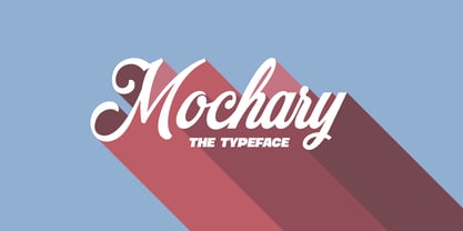 A beautiful and high-quality script font with contextual and stylistic alternates and ligatures.
 - Maxim MF by Masterfont,
$59.00 A special high contrast font with unique geometrical shapes for logos, titles, signage etc.
 - AleKoteret MF by Masterfont,
$59.00 This high readable font family is highly suitable for headlines as well as text.
 - SK Gunaydin by Salih Kizilkaya,
$9.99 SK Gunaydin is a display sans serif font family designed by Salih Kızılkaya in 2022. Thanks to its high contrast ratio, it offers high readability in all the media you need. It contains a total of 3120 glyphs, 624 glyphs in each font, and offers full support for languages using the Latin alphabet. This font family, which includes 3 different styles, classic, outline and shadow, and 5 different fonts, contains all the characters you will need in designs. You can visit the Behance prohe page for high resolution versions of the project images.
 - Solitas Contrast by insigne,
$39.00 This sleek, high contrast typeface means business, but it looks great on any project, no matter how big or small. Solitas Contrast was developed because existing high contrast sans options were neither modern nor crisp. This design challenge was solved through a series of typefaces: the original low-contrast Solitas, its serifed cousins, and now a high contrast sans—each carefully considered for an organic and free flowing look. It evokes a Dutch or european feel. Solitas Contrast is a modern, clean sans-serif with a distinctive style and impact.
 - Saphile by Craft Supply Co,
$20.00 Saphile – The Epitome of Elegant Sans Serif Elegance in Every Detail Saphile, an elegant sans serif font, stands out with its gracefully angled stem ends and terminals, coupled with high contrast, making it the perfect choice for luxurious designs. A Typeface of Luxury Saphile is more than just a font; it embodies luxury. Its sleek design and high contrast add an opulent touch to any project it graces. Tailored for Luxury Designs Designed with luxury in mind, Saphile elevates the visual appeal of high-end branding, premium packaging, and more.
 - Vernacular Sans by jpFonts,
$19.95 The Vernacular trilogy was designed by Swiss designer Hans-Jürg Hunziker, who had worked for Adrian Frutiger in Paris for many years. Based on the concept of a transitional Linear Antiqua, he has developed a colorful bouquet of typefaces that contain the entire spectrum of typefaces for book design and corporate identity. Thanks to his "Swiss school" and his outstanding skills, he has succeeded in giving the typefaces a particularly noble and sympathetic expression. In addition to the Sans family, there is a Serif family and a Clarendon family, each of which, including the separately drawn italics, is equipped with 12 font weights that are finely tuned to one another. Each of the 3 font styles develops its own character, but thanks to a concept that brings the different font styles closer together, they also work well together and complement each other perfectly. Sans and Clarendon have a vertical axis and similar endings in contrast to the Serif, which has a traditional diagonal axis and horizontal endings. The straight stems and the proportions are used as an element to stress the closeness of the typeface-trilogy. They thus share a comon feature. All fonts contain tabular and proportional figures as well as old style figures. Small caps and small cap figures are also available in all fonts. In addition, some fonts have alternative characters available via style set, such as «g», which can be used to further vary the typeface. Vernacular offers all the options for well-kept typesetting for print and web - for small and large orders.
 - Vernacular Serif by jpFonts,
$19.95 The Vernacular trilogy was designed by Swiss designer Hans-Jürg Hunziker, who had worked for Adrian Frutiger in Paris for many years. Based on the concept of a transitional Linear Antiqua, he has developed a colorful bouquet of typefaces that contain the entire spectrum of typefaces for book design and corporate identity. Thanks to his "Swiss school" and his outstanding skills, he has succeeded in giving the typefaces a particularly noble and sympathetic expression. In addition to the Sans family, there is a Serif family and a Clarendon family, each of which, including the separately drawn italics, is equipped with 12 font weights that are finely tuned to one another. Each of the 3 font styles develops its own character, but thanks to a concept that brings the different font styles closer together, they also work well together and complement each other perfectly. Sans and Clarendon have a vertical axis and similar endings in contrast to the Serif, which has a traditional diagonal axis and horizontal endings. The straight stems and the proportions are used as an element to stress the closeness of the typeface-trilogy. They thus share a comon feature. All fonts contain tabular and proportional figures as well as old style figures. Small caps and small cap figures are also available in all fonts. In addition, some fonts have alternative characters available via style set, such as «g», which can be used to further vary the typeface. Vernacular offers all the options for well-kept typesetting for print and web - for small and large orders.
