9,598 search results
(0.011 seconds)
- Heath Notted by YuliusParyadi,
$11.00 Heath Notted is suitable for display like poster, halloween, witch theme. We created it inpired by the night, because some times night is not always just dark, but sometimes it's beautiful. Heath Notted is includes: - full set uppercase and lowercase letter; - numerals; - large number of punctuations; - ligatures, and swash. Please add this font as your favorit, hit like button, or follow me. I'll very happy for that and aprreciated it. Thank you!
 - Firas by Linotype,
$155.99Firas, designed by Abbas Al-Baghdadi in 2005, is a traditional Kufi and a winner in Linotype’s first Arabic Typeface Design Competition. The design is very geometric and bold with very high level of contrast. This makes it suitable for large display sizes, especially in the area of advertising. The font includes a matching Latin design and support for Arabic, Persian, and Urdu. It also includes proportional and tabular numerals for the supported languages. - Senza by Blackmoon Foundry,
$40.00 Senza is a contemporary, neutral, all-purpose sans serif family designed by Elena Albertoni. It was specially designed for the use on screen. With open shapes and large x-heights Senza guarantees high legibility for body text in small sizes. Senza ’s character-set covers all European languages written in Latin alphabet including real small caps, ligatures, proportional and tabular figures. Senza comes in four weights from Light to Black with matching italics.
 - Dempster by Ascender,
$40.99 Dempster is a geometric sans serif design by Jim Ford. It is tall, bold and square with interesting details such as the angled terminals on the lowercase letters and friendly-looking punctuation. This typeface could feel at home with Art Deco and Modernism themes, as well as Sci-Fi and high-tech flavored graphics. Medium to large headline sizes work best when using Dempster. Dempster features include Extended Latin, Greek and Cyrillic support.
 - Praho Pro Stencil by Picador,
$29.00 Praho Pro is a part of Warsaw Types – a project based on Warsaw’s local typographic heritage. The project, presented at the Museum of Praga, is a collaboration of 12 young Polish typographers. Praho Pro Stencil is a multilingual family inspired by the unique, historical character of Praga district of Poland's capital - Warsaw. High contrast, thin serifs, sharp terminals and large x-height are key features for distinctive headlines. Now available as a stencil version!
 - NOh Carbone by OhType!,
$32.00 NOh CARBONE is a serif typeface with more than 250 glyphs, including Capitals, Small Letters, Numbers & Special glyphs and Punctuation. Appropriate for medium and large formats, its high contrast, strong features & aggressive and unconventional diagonal endow it with great elegance and give it distinction over other types of the same style. This typeface is adapted to different topics and applications, is easily modifiable and capable of generating a clear and direct message.
 - Nedo by Typogama,
$25.99 Nedo is a retro inspired, single weight display font based on a series of geometric lines. It features a large set of ligatures and some alternate characters that allow a range of possible combinations for text layouts and is best suited for use in large settings.
 - LGF Avadar by LGF Fonts,
$9.00 Avadar is a typeface with a fine serif of straight lines and an inner line that breaks the glyph in two. The type is indicated for use in large or very large sizes, especially for display graphics; the spacing between glyphs makes the readability of the text increase.
 - Anywhere - Unknown license

- Slinkster by Will Ryan,
$- Big. Bold. Beautiful. Slinkster is an intricately unique display face created by carefully overlapping equally-sized circles. The geometric patterns formed become increasingly mesmerizing the larger the type is set. Slinkster works best for display, headers, logotypes, and any other large-scale applications that allow the viewer to become hypnotized by its complexity. Due to how detailed Slinkster is, you may experience some lagging as it can take a while to render. Like this font? Consider donating to encourage further development and new fonts! Donations accepted through this Paypal address: willryan042@gmail.com
 - Quirk by Wooden Type Fonts,
$15.00A grunge font, drawn largely by hand. Characters are deliberately dissimilar. Very informal. - Philo Logic by TrueBlue,
$16.00 A new font with a large impact for words that shall be remember.
 - Equate by BA Graphics,
$45.00 An elegant Large and Smallcap design great for magazine and all sophisticated designs.
 - North West by William Johnston,
$29.99 Created to show movement of an object. Looks best at a large size.
 - Blatt by StudioJASO,
$56.00 Blatt is a retro-modern font which features downtoned strokes of writing brush, a writing instrument of Korean Serif font. The vertical/horizontal and high-contrast strokes as well as large graphemes complete the modern style of Blatt, with strokes finished off by the distinctive style of Latin Bracketed-Serif fonts. Blatt is a display font which looks ideal in big sizes (with details of each letter highlighted), while it remains legible in small sizes, too.
 - Bolero by Canada Type,
$24.95Named after Maurice Ravel's masterpiece, Bolero likes to find itself in places of classical elegance. Slightly inspired by the soft italics put forth by Giambattista Bodoni and the Didot family, Bolero adds a feminine touch to the traditional clarity of the modern masters. A must-have for anyone who designs wedding invitations, high-end menus, romance-related book covers and posters, cosmetics packaging, fashion branding, and much more. Comes with a large assortment of alternates and ligatures. - Scabbard by Elemeno,
$25.00A font within a font. Recommended at large sizes only for eye-catching effect. - Baskerville Display PT by ParaType,
$30.00 Baskerville Display PT is a type family intended for large and extra large point sizes. It was inspired by the faces of John Baskerville and designed for expressive display typography. Two weights of Baskerville Display with matching italics are much lighter than the existing text versions of Baskerville. Each of them is an ideal partner for ITC New Baskerville. A good addition to the family is Baskerville Poster which will look great in very large sizes. The font was designed by Arina Alaferdova under the supervision of Dmitry Kirsanov and released by ParaType in 2016.
 - Proza Display by Bureau Roffa,
$39.00 Proza Display is the eye-catching counterpart of Proza, consisting of 12 styles (6 weights + italics). Together, Proza and Proza Display form a large family of 24 styles, which are all equipped with plenty of language support and opentype features. Proza Display was made to function especially well at large sizes, drawing the reader's attention with its beautiful and slightly eccentric shapes. Its large character set (support for 200+ languages) and opentype features make sure that Proza Display doesn't let you down, while its classy design helps you to make a visual impact.
 - Old Man Eloquent by Three Islands Press,
$29.00 John Quincy Adams, sixth President of the United States, didn't hit his stride until he'd left that lofty office. It was during his many years in Congress that he assured his legacy, not least because of his long, masterful oratory opposing slavery. His speeches, in fact, won him the nickname "Old Man Eloquent." So when I decided to simulate Adams's penmanship in his legendary diary (which he kept for nearly 70 years), it seemed fitting to call the font by that name. I focused on his handwriting from about 1810, when he was Ambassador to Russia, but also consulted pages from later years. Old Man Eloquent has both regular and bold weights. The OpenType version has more than 450 glyphs, including alternate uppercase characters, old-style and lining figures, and numerous ligatures; all formats contain several common (English) words.
 - J. Scott Campbell Lower by Comicraft,
$39.00 Lower-case lettering is so-called because the characters that we know as lower-case were once kept in the bottom, shallow drawers of a type compositor's typecase. Not a lot of people know that, and we suspect superstar artist and FAIRYTALE FANTASIES Calendar creator, J Scott Campbell doesn't either because even though we looked high and low, in every single one of his drawers, we still could not find a single example of Scott EVER writing in lower case, but we begged him, we pleaded with him and, eventually we HYPNOTIZED him, and here's the font you'll find in J. SCOTT TIME CAPSULE from Image Comics! You're welcome. See the families related to J Scott Campbell Lower: J Scott Campbell & J Scott Campbell Sketchbook.
 - Aprilfuel by PizzaDude.dk,
$20.00Aprilfuel is a crunchy comic font; works very well in both small and large sizes. - Tara by Haiku Monkey,
$10.00Tara is a bold, fun handwriting font that scales really well to large point sizes. - Joe Hand by MatchaJoeJoe Fonts,
$10.00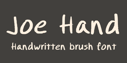 A handwritten brush font containing upper & lowercase characters, numerals and a large range of punctuation.
 - Ransahoff CT by CastleType,
$19.00 A very light, elegant, condensed typeface, which must be used very large (at least 100 points).
 - SiliusEngraved by Intellecta Design,
$30.90A decorative display font great for large header-like usage. Available design only with versals caps. - Atlantic Avenue by Fonts of Chaos,
$10.00 Atlantic Avenue is an experimental font made with paint brush on wood, large scan and vectorized.
 - LP Cervo by URW Type Foundry,
$35.99 LP Cervo is a typeface designed by German type designer Peter Langpeter. LP has been running his own design studio since 1995, working as a typeface and logo designer, as a calligrapher, cartographer and illustrator. During this time LP created a large number of excellent new typeface designs. With its styles Grotesk, Lapidar, Semiserif and Serif the LP Cervo is well suited for various design possibilities
 - LP Hand Eins by URW Type Foundry,
$19.99 LP Hand Eins is a typeface designed by German type designer Peter Langpeter. LP has been running his own design studio since 1995, working as a typeface and logo designer, as a calligrapher, cartographer and illustrator. During this time LP created a large number of excellent new typeface designs. LP Hand Eins is well-suited for plenty of applications, e.g. personal correspondence, invitations, greeting cards etc.
 - LP Horizont Caps by URW Type Foundry,
$19.99 LP Horizont Caps is another new font creation from German designer Peter Langpeter (lp-design.de). LP has been running his own design studio since 1995, working as a typeface and logo designer, as a calligrapher, cartographer and illustrator. During this time LP created a large number of excellent new typeface designs. LP Horizont Caps is a very futuristic looking, sharp and elegant sans serif.
 - Farm Bluster by Zeenesia Studio,
$14.00 Farm Bluster is a sweet and friendly handwritten font. Its natural and unique style makes it incredibly fitting to a large pool of designs. perfect for large design project like Tshirt, Advertising, bags, quotes, food , poster, fashion, custom sticker, magazine, and many others. It completed with numbers and punctuation. Multilingual support, and came with PUA encoded.
 - Gella Display by Slava Antipov,
$29.00 Gella Display is a new sans serif family with high internal contrast. It has 10 weights and 4 widths, for a total of 40 styles. This font family good for typing large amounts of text and for headlines, logos, posters, covers, spectacular presentations, and more. Gella Display would be great for branding, websites and other tasks. The typeface supports a huge number of Latin and Cyrillic languages. Gella Display has many OpenType features such as ligatures, alternate characters, fractional numbers, and more.
 - Sincerity Stencil by Océane Moutot,
$32.90 Sincerity Stencil is the new extension of the typeface Sincerity. It's a fierce and elegant typeface identified by its high contrast, sharp shapes and triangular. The stencil component of this new version will add originality to your designs. Its large variety of glyphs, including accents, old-style numbers and ligatures will give uniqueness to your designs. It's a great fit for branding, magazines, newspapers, and so on. Sincerity Stencil is available in 16 styles, from thin to black in roman and italic.
 - Breitkopf Fraktur by profonts,
$39.99Breitkopf Fraktur was designed by Johann Gottlob Immanuel Breitkopf (1719-1794), the well-known type designer and printer of Leipzig. Breitkopf's high reputation is based on a system of printing musical notes which was developed by him. 1793, in the final stage of his life, he designed this beautiful broken script named after himself.Breitkopf Fraktur is classified as broken", something created by the German renaissance. Broken, because all round parts of the lower case characters in such typefaces look broken.Ralph M. Unger redrew and digitized this font exclusively for profonts in 2003. His work is based on artwork taken from old font catalogues." - Number 514 by Wooden Type Fonts,
$20.00 An early serif font, largely for display, related to triangular Latin serifs styles, with unusual decorative elements.
 - Janda Stylish Monogram by Kimberly Geswein,
$5.00 Use lowercase letters to make the side initials and uppercase letters to create the large center initial.
 - Krank by Matt Grey Design,
$12.00 A minimalist, stackable and dynamic squared off typeface, perfect for posters and large print and screen material.
 - Bratterly by Typehand Studio,
$10.00 Bratterly is a beautiful handwritten font containing upper & lowercase characters, numerals and a large range of punctuation.
 - KG Modern Monogram by Kimberly Geswein,
$5.00 Use lowercase letters to make the side intials and uppercase letters to create the large center monogram.
 - Nautilus Text by Linotype,
$29.99Hellmut G. Bomm first released his Linotype Nautilus typeface in 1999. Ten years later, he updated and expanded the design. Now users have two additional families at their disposal: Nautilus Text and Nautilus Monoline. Nautilus Text bears more similarities to the original Linotype Nautilus. The letters shows a high degree of contrast in their stroke modulation. Bomm's intention was to create a clear, highly legible face. While the even strokes of most sans serif types eventually tire the eyes in long texts, the marked stroke contrast of Nautilus Text lends the face its legibility. The characters were drawn with a broad tipped pen. Like serif typefaces, the forms of Nautilus Text display a variety of elements. Its characters are narrow, with relatively large spaces between them. This helps create an overall open appearance, and allows a large quantity of text to fit into a small space. Nautilus Monoline's letters share the same overall proportions as Nautilus Text's. But as their name implies, they are monolinear. Their strokes do not have the calligraphic modulation that Nautilus Text features. This allows them to set another sort of headline, making Nautilus Monoline a refreshing display type choice to pair with body text set in Nautilus Text.
