6,657 search results
(0.033 seconds)
- Basil by Karandash,
$- A mix between tradition and innovation, Basil is a unique humanist slab serif well suitable for broad range of design projects - editorial, logotype, poster, etc. With its tall x-height and generous internal spaces, the type family was especially designed with legibility in mind and is well suitable for body text at small sizes. In the same time Basil is equally able as titling and headline font due to numerous distinctive visual features that shape its attractive appearance. A true workhorse, packed with lots of OpenType features and full multilingual support, the type family consisting of six weights, with Regular available for free! Basil type family received Special Mention in Cyrillic text Typeface category at 7th International Type Design Competition for non-Latin typefaces - Granshan 2014. It also was exhibited at New Bulgarian Typography exhibition part of Sofia Design week 2013 and then took part in several travelling exhibitions.
 - Corner D by CarnokyType,
$20.00 Corner D is a part of Corner type family. This subfamily is designed with inverse rounded shapes in the corners. The concept of the typeface Corner is based on variation of corner shapes in font characters, from what is also its name derived. The basis is a bitmap modular principle, to which by simple addition of “the missing pixels” in corners of the characters ( Corner A ) to the shape of diagonal ( Corner B ), curvature ( Corner C ), or inversion curvature (Corner D), three more font variations are created. The basic monolinear bitmap weight is supplemented by two more extreme thicknesses – hairline and fat weight. The character set supports the complete Latin, while the x-height of lowercase is drawn at the same height as in the uppercase characters. Corner is a strong display typeface, which allows you to easily experiment and to combine it with its mutual font variations.
 - Short Films by Dharma Type,
$19.99 Short Films is an all-new-styled family, which kind of looks like Art Deco Style. Wide opened counters and softly rounded bowls create a new feeling – Retro but futuristic, geometric but humanistic. Exquisite contrast between thin and bold parts of glyphs make mixed feeling – Pop and feminine, formal and casual, strong and soft. The most distinctive feature is a coexistence of decorativeness and Readability. This coexistence expands the range of font usage. You can use this font for not only titling but also body-text. Short Films consists of 6 weights and their matching Italics for a wide range of usages. Further, Short Films supports international Latin languages and basic Cyrillic languages including Basic Latin, Western Europe, Central and South-Eastern Europe. Also, Short Films covers Mac Roman, Windows1252, Adobe1 to 3. This wide range of international characters expands the capability of your works.
 - Celdum by The Northern Block,
$39.00 Celdum, a modern geometric type family, constructed from a rectangular grid. Smooth, precise curves meet horizontal and vertical lines to create a monoline design with no apparent contrast. Each letter shape has unique subtleties creating a purposeful type family suited to text and branding scenarios within mobile applications, video games and other interactive software. Details include six weights with italics, 460 characters, five variations of numerals, manually edited kerning and Opentype features.
 - Hleba Soli Ziamli Voli by Koval TF,
$39.99 Hleba Soli Ziamli Voli typeface is a graphic discovery on title type that combines traditional poster shapes with Humanist notes from Renaissance. Hleba Soli Ziamli Voli is named after Belarus poem by Yanka Kupala and inherits some original glyph designs from Renaissance printings by Francisk Skoryna. Hleba Soli Ziamli Voli due to wide variety of weights is great for titles and posters. Cyrillic and Latin support makes the type sutable for multilingual communications.
 - Swing Era JNL by Jeff Levine,
$29.00 Hand lettered Art Deco lettering for the title on the cover of the 1930s-era song "And I Still Do" provided the inspiration for Swing Era JNL. A bold, casual and friendly typeface, it features an intersecting inline through some of the characters. One could almost picture the hottest big band of the day promoted on a lobby card with this alphabet, beckoning all to come on in and "cut a rug".
 - Aribau Grotesk by Emtype Foundry,
$69.00 Born from the intersection of the geometric and grotesque typefaces. Aribau Grotesk combines low contrast and generous width proportions with typical traits of american gothics from the early 20th century, like the counters aperture and a double story ‘g’. Driven by the process, some details that come from the geometric style arose, like the clean-shaped figures and the circular dots that convey a more affable and contemporary look. Aribau Grotesk PDF.
 - Kessel 105 Remix by Talbot Type,
$19.50 A remixed variation, available in three weights, of the popular Talbot Type geometric sans Kessel 105 . The addition of occasional flourishes at the intersections of strokes, in both upper and lower case, adds character charm, making the font a perfect titling font to accompany Kessel 105, or a display font in its own right. Kessel 105 Remix features a comprehensive glyph set including a number of discretionary ligatures and accented characters for central European languages.
 - Scradl by Luxfont,
$35.00 Welcome to the world of Scradl - where fonts become the tool of the cutter and the artist at the same time. These letters, as if cut out of paper without preliminary drawings, are rough, angular and full of character. The main font is the canvas for your creativity. Additional variations add a stroke, shadow, or even a sticker effect, creating a harmonious visual interaction. Features: - Multilingual - Kerning - Ability to adapt letters to other languages
 - Infectious Halloween by Ardyanatypes,
$20.00 Infectious is a Halloween themed font with unique shapes that invite curiosity. Each letter is inspired by ancient magical symbols, with sharp strokes and curved lines that create a mysterious atmosphere. The font is not only visually appealing, but also interactive thanks to its advanced OpenType feature. Users can combine letters, slashes, and ligatures to create creative and unexpected looks. Features: A – Z Character Set a – z Characters set Numerals & Punctuations OpenType Multilingual
 - The font "3x3 dots Outline" by dustBUSt Fonts is an intriguing and distinctive typeface that captures the essence of both minimalism and creativity. True to its name, this font utilizes a unique comp...
- Sensation is a modern and highly versatile font family that captures the essence of simplicity and elegance in typographic design. It is not associated with a specific historical font but rather embo...
- The Blue Highway D Type font, created by the talented Canadian typeface designer Ray Larabie, stands as an iconic example of clarity and functionality blended with unique aesthetics. Its inception wa...
- Shady Lady NF by Nick's Fonts,
$10.00 The 1907 Barnhart Brothers & Spindler type specimen catalog called this unique typeface simply "Umbra". Since that name is already taken, it now has another. Due to the highly ornate nature of this face, the font has a limited character set (all accented characters, but no math operators or fractions). The Opentype version of this font supports Unicode 1250 (Central European) languages, as well as Unicode 1252 (Latin) languages.
 - Ratkeys by Quadrat,
$25.00Ratcaps and Ratkeys were designed as a set of highly-legible keycap fonts for use in software and systems documentation destined for in-house printing. They were specifically designed for clarity and legibility even on low-resolution (300 dpi) laser printers. Ratcaps consist of representations of the basic alpha-numeric keyboard keys. Ratkeys contains the special function and modifier keys. Both fonts also come in a 3D-effect version. - Dear Kimberly by Zamjump,
$15.00 Introducing the Dear Kimberly it our beautiful handcrafted fonts – original handwritten styles carefully digitized using simple but highly effective methods. This font offers authentic charm and is versatile for a variety of projects, including logos, book covers, wedding invitations, business materials, quotes, and more. Enhance your designs with the charming appeal of our uniquely crafted handwritten fonts, designed to bring a touch of authenticity and elegance to any creative endeavor.
 - Winland by Letterhend,
$19.00 Introducing, Winland. This font is carefully crafted by handwritten brush to get the feels of natural brush. you can use this font for branding, packaging, quotes, headline, etc Features : uppercase & lowercase (alternates) numbers and punctuation multilingual PUA encoded We highly recommend using a program that supports OpenType features and Glyphs panels like many of Adobe apps and Corel Draw, so you can see and access all Glyph variations. Thank You!
 - Lamphier by Juliawan90,
$15.00 Introducing our new product called Lamphier a Spooky Playful Serif Font, Lamphier inspired by Playful style with spooky style typography theme. This font is suitable for book covers, children's books, comics, posters, packaging, merchandise, logotypes and much more. We highly recommend using a program that supports OpenType features and Glyphs panels like many of Adobe apps and Corel Draw, so you can see and access all Glyph variations. Happy Designing!
 - Rayleigh by Allouse Studio,
$16.00 Rayleigh a Handwritten font. Rayleigh come along with Stylistic Alternate, Swash, Underline Style and Multi-Lingual Support which will give you many choices to play around. We highly recommend using a program that supports OpenType features and Glyphs panels like many of Adobe apps and Corel Draw, so you can see and access all Glyph variations. Enjoy the font, feel free to comment or feedback, send me PM or email.
 - We Love Nature Autumn Leaves by kapitza,
$69.00 We really enjoy going for long walks in the park in autumn, and the beautiful colours and shapes of the fallen leaves inspired us to create this font. We Love Nature Autumn Leaves is a picture font consisting of 52 highly detailed, hand drawn illustrations. The illustrations can be used on their own to create beautiful designs, or in combination with other illustrations in the We Love Nature font collection.
 - Ratcaps by Quadrat,
$25.00Ratcaps and Ratkeys were designed as a set of highly-legible keycap fonts for use in software and systems documentation destined for in-house printing. They were specifically designed for clarity and legibility even on low-resolution (300 dpi) laser printers. Ratcaps consist of representations of the basic alpha-numeric keyboard keys. Ratkeys contains the special function and modifier keys. Both fonts also come in a 3D-effect version. - Betterlett by Digitype Studio,
$20.00 Betterlett is a classy handwritten font, designed to make it easy to create professional signature logos, photologo, labels, packaging, fashion, or any type of advertising purpose for both personal and corporate use. It contains stylistic alternates, ligatures, swashes, and multilingual support. We highly recommend using a program that supports OpenType features and Glyphs panels like many of Adobe apps and Corel Draw, so you can see and access all Glyph variations.
 - Caramel Chestnut by Letterhend,
$19.00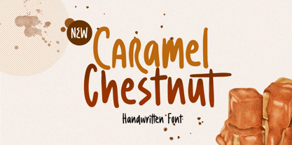 Introducing, Charamel chestnut! this font is a carefully crafted display font but still have an organic touch. this font is perfect for branding, packaging, headline, title, etc. Features : uppercase & lowercase numbers and punctuation multilingual alternates and ligatures PUA encoded We highly recommend using a program that supports OpenType features and Glyphs panels like many of Adobe apps and Corel Draw, so you can see and access all Glyph variations.
 - Smart Cookie by PizzaDude.dk,
$15.00 Smart Cookie is a happy and handmade font, ideal for packaging, posters or books (especially children's books!) It's highly legible and comes int 3 versions: Regular, Shine and Layer. Mix the Regular and Shine layer (using different colours) to make a cool shiny effect, or use the Shine version where the colours rely on the fore- and background colours...also a nice way of making your text stand out!
 - Spanish Signature by Scratch Design,
$9.00 Introducing Spanish! It's a modern script font with a signature style look. It's highly recommended for you who want to make some designs with a natural signature style. Just open your Opentype features while using the script font to use the ligatures and swashes. As you type, your text will look like a natural signature or handwriting. So, enjoy the Spanish modern script and make some cool stuff!
 - Stolzl by Inhouse Type,
$33.78 Stolzl is the text companion of the display family, Stolzl Display, which was optically tailored to perform as a functional addition to this concept steered font collection. Stolzl Text is a modernist interpretation of the first release, stripped of the primary stylised attributes, it is highly readable in print and on screen. Designed to perform at various sizes, Stolzl Text is a great addition to the type collection.
 - Splash by TypeSETit,
$24.00 Inspired by the splatters that come from a heavily inked architectural ruling pen gliding along the surface of a highly textured watercolor page—Splash. Just as droplets of water splash the ocean’s shore, little control can be predicted and no two splashes are exactly alike. The result is wonderfully organic and natural surprises. This display font touts flowing design potential. All glyphs are PUA encoded for ease of use.
 - Bergen Sans by Mindburger Studio,
$40.00 Bergen Sans is a contemporary sans serif font family of 6 fonts. Carrying clean and stylized Scandinavian geometry, partnered with explosive post Bauhaus type aesthetics, Bergen Sans is perfect companion in any designer's 'survival' kit. While being a small font family it has unlimited capabilities and plenty of Open Type features for highly professional use. Bergen Sans also includes Extended Latin, Cyrillic (including Bulgarian alternates) and Greek language support.
 - Romagna by AlienValley,
$5.00 Romagna is a modern and highly versatile sans-serif typeface designed for readability without sacrificing aesthetics. There are 8 included styles to pick from including regular + bold weights plus italics and 2 different uppercase styles so you can either go with a classic look or a modern futuristic theme. Features Modern design Easy to read characters Great for both headlines & large chunks of text Multilingual support Great versatility 8 Included styles
 - Visigoth by Linotype,
$29.00Visigoth font was created in 1988 by Arthur Baker for AlphaOmega Typography. He designed it specifically for setting the text of A Dante Bestiary published in 1989 for Ombondi Editions in New York. Highly expressive and unusual letter shapes make Visigoth unique among script faces: it has bold, pen written lines, a slight incline, and a distinct variation in stroke weights, making it ideal for advertising and other display work. - Roveron by Asenbayu,
$15.00 Roveron is a futuristic wide display font that has a unique geometric shape. Roveron is inspired by space explorers with a strong contemporary feel. The Roveron features a highly expanded alternative style as well as a discretionary ligature. You can use this font in a modern and sophisticated design. This font is perfect for various projects such as: logos and brand identity, headlines, posters, signs and many more.
 - BOXDON Titling by TYDTYP,
$15.00 BOXDON is an extra heavy expanded typeface which was especially designed for VERTICAL layout. Each shape looks like a box and has minimum graphical treatment to distinguish each character. It means that the counter space is not enough to use this typeface for small font sizes, however, for titles this typeface should give incredible effects. I highly recommend using it with software that is compatible with vertical layout. (e.g. Adobe illustrator)
 - PF Press by Parachute,
$45.00 Press combines aesthetic and functional attributes which make written text highly readable. It was originally designed for a newspaper with medium contrast to withstand harsh printing conditions. Its structure is quite narrow which makes this typeface ideal for body text and headlines where space is at premium. Supports Latin and Greek. This is a modern serif typeface which may be the right choice for newspapers, magazines and corporate communications.
 - Bergen Text by Mindburger Studio,
$40.00 Bergen Text is the younger twin and a lifetime companion of Bergen Sans with perfect legibility and adorable personality. It has been carefully crafted to improve readability experience particularly on small text sizes. Bergen Text is a family of of 6 fonts. While being a small font family it has plenty of Open Type features for highly professional use and Extended Latin, Cyrillic (including Bulgarian character set) and Greek language support.
 - Museo Sans by exljbris,
$- Museo Sans is based on the well-known Museo . It is a sturdy, low contrast, geometric, highly legible sans serif typeface very well suited for any display and text use. This OpenType font family offers also support for CE languages and even Esperanto. Besides ligatures, automatic fractions, proportional/tabular lining and old-style figures, numerators, denominators, superiors, and inferiors, Museo Sans also has a ‘case’ feature for case sensitive forms.
 - Delphium by Further Type,
$10.00 Inspired by a vision of the future that's been left in the past, Delphium is a continuation of the cutting edge design language of the 90s, most notably led by the typographic work of The Designers Republic. Designed to embody the pulsing rhythm of electronic music at the turn of the century, Delphium is a bold, highly legible display font that lends itself to impactful contemporary visual communications.
 - Mantika Sans Paneuropean by Linotype,
$67.99With its well-defined characters that are readily legible even in the small font sizes, Mantika Sans by Jürgen Weltin is ideal for typesetting. The elaborately designed and highly individual set of italics enhances the attractiveness of the font.Jürgen Weltin developed the Mantika™ Sans sans serif font using older designs for an serif font as his inspiration. Nothing more than the merest suggestion of the original serifs has survived. Bevelled line endings and the slight variation in thickness of verticals, in particular, provide Mantika Sans with a very dynamic character that evokes manuscript. Short ascenders and descenders give the font a compact appearance that is also underscored by its condensed proportions. Weltin has achieved his aim of producing a typeface with excellent legibility even in small sizes not just by means of the x-height, which is tall in comparison with the capital letters, but also by using clearly defined and well differentiated designs for critical letters, such as i", "I" and "l". Lower case "i", for example, has a serif while the "l" has a curved base.In addition to uppercase numerals, Mantika Sans also has lowercase or old style numerals that have been designed so that they can be used in both tabular and proportional settings. The uppercase numerals are slightly shorter than the uppercase letters, ensuring that the latter can be sympathetically incorporated within continuous text.The Mantika Sans italics are very unusual. They are inclined at only 4.5° (the usual angle for italics is 10 - 12°) and so appear to be almost upright. In addition, they also have quite distinctive forms. The overall effect calls attention to their curvilinear, manuscript character, enhances contrasts and further emphasizes the terminals. Weltin explains: "Within the variety of forms of the italics there are many contrasting terminal elements that create dynamism. The result is a diversity of interaction between the rounded and angular forms". Mantika Sans Italic thus has all the features of a display typeface, but can also be happily used on its own to set longer text passages. Mantika Sans is available in two weights; Regular and Bold, both of which have corresponding italics sets. Mantika Sans has been designed so that the widths of the four related cuts are identical, meaning that a change of font within a single layout will have no effect on justification. In addition, the members of the Mantika Informal font family, designed by Jürgen Weltin in 2010, also have the same thickness. Other font families having weights with equal thickness can be found in the "Linotype Office Alliance series".The Mantika Sans character sets are paneuropean. There are characters for setting texts in Eastern European languages, Greek and Cyrillic. There is also a range of special symbols, including right-angled brackets, subscript and superscript lower case letters, together with numerals, arrows and many different bullet points.As a vibrant and highly legible text font, Mantika Sans has a broad spectrum of potential applications. Its unusual italics are not just perfect for use in display text. The fact that it has only four cuts means that Mantika Sans is particularly suitable for office use or for the setting of business reports. Its excellent legibility even in the small font sizes also makes it ideal as a text for electronic reading devices; this also applies to Mantika Informal.At the 3rd International Eastern Type Design Competition Granshan 2010, Mantika Sans was awarded in the category Greek text typefaces." - Mantika Sans by Linotype,
$50.99 With its well-defined characters that are readily legible even in the small font sizes, Mantika Sans by Jürgen Weltin is ideal for typesetting. The elaborately designed and highly individual set of italics enhances the attractiveness of the font.Jürgen Weltin developed the Mantika™ Sans sans serif font using older designs for an serif font as his inspiration. Nothing more than the merest suggestion of the original serifs has survived. Bevelled line endings and the slight variation in thickness of verticals, in particular, provide Mantika Sans with a very dynamic character that evokes manuscript. Short ascenders and descenders give the font a compact appearance that is also underscored by its condensed proportions. Weltin has achieved his aim of producing a typeface with excellent legibility even in small sizes not just by means of the x-height, which is tall in comparison with the capital letters, but also by using clearly defined and well differentiated designs for critical letters, such as i", "I" and "l". Lower case "i", for example, has a serif while the "l" has a curved base.In addition to uppercase numerals, Mantika Sans also has lowercase or old style numerals that have been designed so that they can be used in both tabular and proportional settings. The uppercase numerals are slightly shorter than the uppercase letters, ensuring that the latter can be sympathetically incorporated within continuous text.The Mantika Sans italics are very unusual. They are inclined at only 4.5° (the usual angle for italics is 10 - 12°) and so appear to be almost upright. In addition, they also have quite distinctive forms. The overall effect calls attention to their curvilinear, manuscript character, enhances contrasts and further emphasizes the terminals. Weltin explains: "Within the variety of forms of the italics there are many contrasting terminal elements that create dynamism. The result is a diversity of interaction between the rounded and angular forms". Mantika Sans Italic thus has all the features of a display typeface, but can also be happily used on its own to set longer text passages. Mantika Sans is available in two weights; Regular and Bold, both of which have corresponding italics sets. Mantika Sans has been designed so that the widths of the four related cuts are identical, meaning that a change of font within a single layout will have no effect on justification. In addition, the members of the Mantika Informal font family, designed by Jürgen Weltin in 2010, also have the same thickness. Other font families having weights with equal thickness can be found in the "Linotype Office Alliance series".The Mantika Sans character sets are paneuropean. There are characters for setting texts in Eastern European languages, Greek and Cyrillic. There is also a range of special symbols, including right-angled brackets, subscript and superscript lower case letters, together with numerals, arrows and many different bullet points.As a vibrant and highly legible text font, Mantika Sans has a broad spectrum of potential applications. Its unusual italics are not just perfect for use in display text. The fact that it has only four cuts means that Mantika Sans is particularly suitable for office use or for the setting of business reports. Its excellent legibility even in the small font sizes also makes it ideal as a text for electronic reading devices; this also applies to Mantika Informal.At the 3rd International Eastern Type Design Competition Granshan 2010, Mantika Sans was awarded in the category Greek text typefaces."
 - Anger & Wrath by Omaikraf Studio,
$10.00 Introducing "Anger Style": Unleash the Power of Emotion Are you ready to harness the raw energy of emotions and bring them to life in your designs? Look no further than "Anger Style," an electrifying and dynamic font that will leave a lasting impact on your audience. Designed by our team of expert font designers, "Anger Style" is a captivating blend of intensity, power, and expressiveness. Possible Design Uses: "Anger Style" is a font that excels in making a bold statement. Its commanding presence and fiery nature make it perfect for various design applications, including: Headlines and Titles: Grab your audience's attention and make a lasting impression with powerful headlines that demand to be noticed. Logos and Branding: Infuse your brand identity with passion and intensity, creating a memorable and distinct visual presence. Posters and Flyers: Advertise events, concerts, or special promotions with eye-catching designs that embody rebelliousness and energy. Book Covers: Create striking covers that captivate readers and convey the emotional depth of your story or message. Apparel and Merchandise: Add an edgy touch to your clothing designs, making a statement that resonates with your target audience. Unique Qualities: What sets "Anger Style" apart from other fonts is its ability to evoke a wide range of emotions, not just anger. It transcends its name, allowing you to express passion, determination, and rebellion through your designs. Its versatility lies in its bold strokes and sharp edges, which convey a sense of intensity and power. By choosing "Anger Style," you gain access to a font that embodies the very essence of raw human emotion. Font Pairing: "Anger Style" pairs exceptionally well with other fonts that complement its intensity and create harmonious combinations. Consider combining it with: "Bold Sans Serifs": The clean lines and strong presence of a bold sans serif font can enhance the impact of "Anger Style," creating a balanced and eye-catching composition. "Elegant Script Fonts": To add a touch of contrast and sophistication, pairing "Anger Style" with an elegant script font can create a visually engaging and dynamic design. Functional Aspects: "Anger Style" offers a range of functional aspects designed to enhance your creative possibilities: Styles: "Anger Style" is available in bold and regular styles, allowing you to emphasize different levels of intensity within your designs. Character Sets: The font includes an extensive character set, covering uppercase and lowercase letters, numbers, punctuation marks, and special characters. This ensures versatility and legibility across various design projects. Special Features: "Anger Style" includes stylistic alternates and ligatures, providing you with additional design options and allowing you to create a truly customized and unique look.
 - As of my last update in April 2023, "Spat Crumb" is not a widely recognized or standard font within the graphic design or typography communities. Therefore, I will approach this description by embody...