10,000 search results
(0.017 seconds)
- The Doorman - Unknown license

- Doodolonomy Fred - Unknown license

- trop flou - Unknown license

- The Buns - Unknown license

- Teacher's Pet - Unknown license

- Tingle Institute - Unknown license

- Honey Bunches - Unknown license

- maran - Unknown license

- Gentle Redhead - Unknown license

- Socially Awkward - Unknown license

- Zupagargonizer T - Unknown license

- Hau Ruck - Unknown license

- Courtney Dorkling - Personal use only

- Turtle Club - Unknown license

- Lamoreli by AVP,
$19.00Lamoreli is a strong rounded face that provides high impact in a non-aggressive way. It is suitable for display, titling and headlines. It retains integrity even when considerably expanded or condensed. - Rocklidge Pro by Red Rooster Collection,
$60.00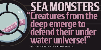 Steve Jackaman & Ashley Muir. This design was inspired by the 1965 VGC typeface, Jana by Richard D. Juenger. Rocklidge contains all the high-end features expected in a quality OpenType Pro font.
 - Charis Moderne by Sans And Sons,
$19.00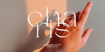 Charis Moderne is Modern Serif with Elegant and Luxury Style and each unique letters designed to create harmoniously, charming and lend themselves to high end branding, product packaging, logo designs & invitation designs.
 - Mango Dream by Sans And Sons,
$19.00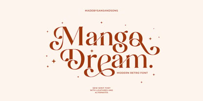 Mango Dream is Modern Retro Serif with Elegant and Retro Style. Each unique letters designed to create harmoniously, charming and lend themselves to high end branding, product packaging, logo designs & invitation designs.
 - Sensuous by Gerald Gallo,
$20.00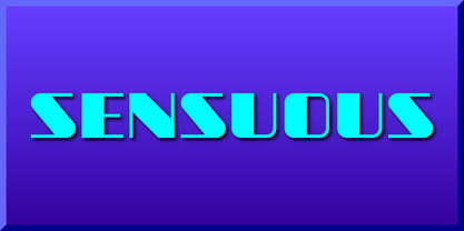 Sensuous is a bold sans serif font with characters that have a very high contrast between thick and thin elements. It is ideal for headlines, titles, branding and small blocks of text.
 - Ribjoint by Chank,
$39.95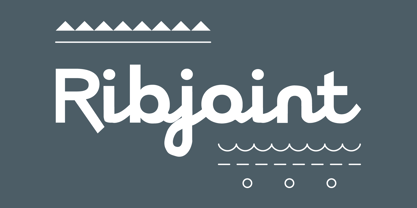 Created by Chank in 1992, Ribjoint was Chank’s first attempt at creating a Egyptian, cursive font on the computer. Writing cursive with a pencil sure is easy, but getting all the letters to link up correctly in computerized font format is a bit tricky. Not the most graceful script in the world, but it works good enough for a BBQ pit.
 - Qipao by TEKNIKE,
$39.00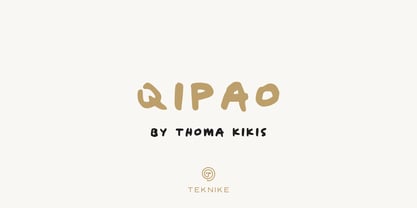 Qipao is a display monospace handwriting font. The typeface is a distinct hand drawn font using a felt marker. The Qipao name is derived from the traditional Chinese dress that Manchu women wore in China in the 17th century and became known as the qipao (旗袍), meaning “banner gown”. Qipao is great for display work, invitations, writing, architecture, posters, logos and headings.
 - Woodwork JNL by Jeff Levine,
$29.00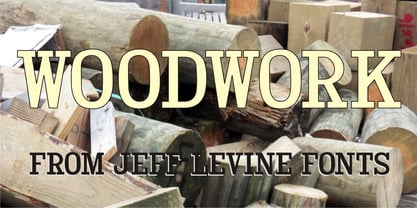 What sets wood type apart from the lettering designs created in the digital age is the simple premise that it is hand made. Woodwork JNL contains all of the slightly asymmetrical curves, unusual letter forms and incremental letter weight variations that add a "real world" touch to all print and web designs that seek the old-fashioned charm of another era.
 - Habana Vieja by Letters&Numbers,
$16.00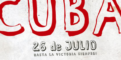 Habana Vieja is inspired by hand-painted signage in Havana’s old town. Letters are defined by their drop-shadow and worn outlines; suggestive of a sunny environment. This playful sans-serif, bold font, will work well used for headings and short paragraphs especially for posters or signage. Habana Vieja is extended, containing West European diacritics, making it suitable for multilingual environments and publications.
 - Ongunkan Tolkien English Runic by Runic World Tamgacı,
$50.00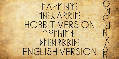 Cirth was invented by J.R.R. Tolkien for use in his novels. It is modelled on the Anglo-Saxon Runic alphabet, and is used to write the language of the Dwarves (Khuzdul) in The Hobbit and The Lord of the Rings in inscriptions in wood and stone. It is also used as a alternative alphabet for English. This font is english version.
 - Quinie SS by Sensatype Studio,
$15.00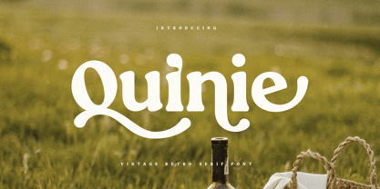 Quinie is Modern Retro Fancy Font is a well-balanced contemporary font with a fancy, unique, and versatile vintage serif, font that you can combine to get any variations and unique shapes easily just in seconds with choose alternates of them. It is a serif display font with moderate contrast that perfect for branding projects, logo, wedding designs, social media posts, advertisements, product packaging, product designs, label, photography, watermark, invitation, stationery, and any projects, it makes with a high level of legibility. What's Included: Character set A-Z Normal & Italic Style Numerals & Punctuation Accented Characters (West Europe) Stylistic alternates Works on PC & Mac Recommended using Adobe Illustrator or Adobe Photoshop. Wish you enjoy our font. :)
 - Carilliantine by Device,
$39.00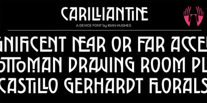 Carilliantine updates the organic curves of Art Nouveau typefaces typified by John F. Cumming's Desdemona, designed around 1886. A contemporary monoline sans reinterpretation rather than a more traditional serif, its high-waisted emphasis lends it an elegance and class. Carilliantine is replete with hundreds of two- and three-letter ligatures that bring a customised uniqueness to any headline. These are on by default, and can be toggled on or off in the Opentype palette of Adobe apps, or chosen individually according to taste from the Glyphs menu. Suitable for upmarket food packaging, wine labels, restaurants, folk bands, sword and sorcery trilogies, cosmetics and fashion brands that nod to the refinement of yesteryear, but are very much of today.
 - Conga Brava by Adobe,
$29.00Conga Brava is the work of type designer Michael Harvey, a combination of the high-minded, purist letterforms of revivalist, modern calligraphers with the mundane, even crude, lettering of warehouse stenciling. The resulting lyrical yet utilitarian forms have a visually exciting graphic effect, which Harvey has frequently used in his book jacket designs. Like his other typefaces, Ellington, Strayhorn, and Mezz, Harvey named his design after a jazz classic, Conga Brava", by Duke Ellington and his trombonist Juan Tizol. The rolling rhythm, polished swing, and stacatto brass treatment of the tune suits the look of this sassy roman design and even more so, its stencil mate. When you need a typeface that radiates sound and motion, think Conga Brava." - Vtg Stencil Germany No1 by astype,
$45.00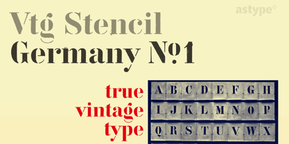 The Vtg Stencil series of fonts from astype are based on real world stencils. The Germany No.1 design was derived from authentic antique German stencil-plates. » pdf specimen « Surprisingly these stencil-plates offer a high contrast Didot design very similar to the French stencils produced and sold till today. The production time of these stencils is in the range of the German imperial period (1871‒1918). Of course the usage period was even longer. The font styles PAINT and SKETCH include 4 additional variations of base glyphs and figures. An extensive random function will mix the glyphs as you type - on proper OpenType-savvy apps like Adobe InDesign only. All styles offer an extended Latin character set.
 - Future Bugler by Breauhare,
$35.00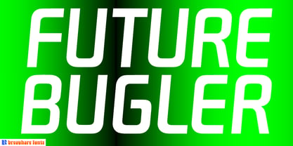 Future Bugler is a font based on the second logo created by Harry Warren in early 1975 for his sixth grade class newsletter, The Broadwater Bugler, at Broadwater Academy in Exmore, Virginia, on Virginia’s Eastern Shore. This font can convey several perspectives or moods. It can suggest a space-age vision of the future, or an art-deco perspective of the future as in the movie “Sky Captain and the World of Tomorrow”. It also communicates the idea of high performance, or extreme sports, without the grunge. Also be sure to check out the upright version of this font, Future Bugler Upright, available separately. Digitized by John Bomparte. Additional tags: NFL, NFL Network, NFLN
 - Footloose by BA Graphics,
$45.00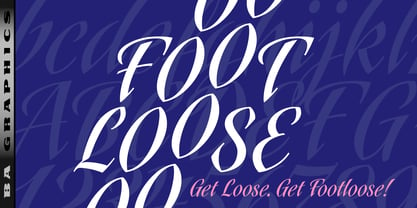 Footloose was a work in progress when its original designer, my friend and colleague Bob Alonso, passed away. Back then just 14 lowercase letters were designed so far. Several years have since gone by, but lately I took on the task of developing Bob’s design into a full-fledged font. The distinctive style of his supplied letterforms provided much inspiration. In blocks of short text there is a dynamic that communicates much verve and vigor, owing in part to gracefully curving lines and high contrast of stroke weight. I guess you could say that this project has been a sort of “passing on of the baton”; and I trust that Bob would have been pleased with the outcome.
 - Ganz Grobe Gotisch by URW Type Foundry,
$39.99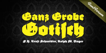 It is not only coarse but extremly black, and it is quite right to name it Black Letter in English. Ernst Schneidler, the designer, created the smallest possible counters. Still, this very coarse black letter is sensitive in detail and drawn with a high level of aesthetics. By the way, it was said in Schneidler's design class in Stuttgart that his number one student Walter Brudi had cut some of the characters with �silhoutte scissors� from black paper. Sharing his ideas and work with his students does not at all decrease or lower his copyright.Ganz Grobe Gotisch is not only a distinguised but also a very catchy design.(Albert Kapr in Fraktur -- �Form und Geschichte der gebrochenen Schrift�.)
 - Kamal Style by Sensatype Studio,
$15.00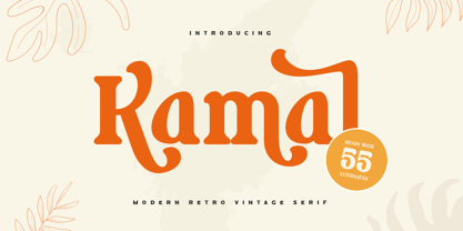 Kamal Vintage Retro Fancy Font is a well-balanced contemporary font with a fancy, unique, and versatile vintage serif, font that you can combine to get any variations and unique shapes easily just in seconds with choose alternates of them. It is a serif display font with moderate contrast that perfect for branding projects, logo, wedding designs, social media posts, advertisements, product packaging, product designs, label, photography, watermark, invitation, stationery, and any projects, it makes with a high level of legibility. What's Included: Character set A-Z Uppercase & Lowercase Numerals & Punctuation Accented Characters (West Europe) Stylistic alternates Works on PC & Mac Recommended using Adobe Illustrator or Adobe Photoshop. Wish you enjoy our font. :)
 - Meno Text by Lipton Letter Design,
$29.00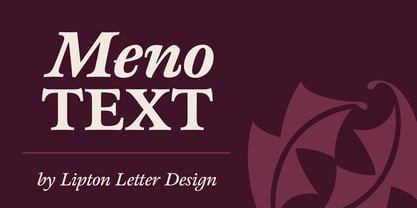 Richard Lipton designed Meno in 1994 as a modest yet elegant workhorse serif family in seven styles. In 2016, he expanded this spirited oldstyle into a 78–style superfamily. The romans gain their energy from French baroque forms cut late in the 16th century by Robert Granjon, the italics from Dirk Voskens’ work in 17th-century Amsterdam. Meno consists of three carefully drawn optical sizes—Text, Display, and Banner, with Condensed and Extra Condensed widths added to the latter two cuts. Steadfast in text settings, Meno is replete with alternate forms, swashes, and other enhancements that showcase Lipton’s masterful calligraphic hand. The series offers a complete solution for achieving high-end editorial typography.
 - Meno Display by Lipton Letter Design,
$29.00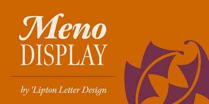 Richard Lipton designed Meno in 1994 as a modest yet elegant workhorse serif family in seven styles. In 2016, he expanded this spirited oldstyle into a 78–style superfamily. The romans gain their energy from French baroque forms cut late in the 16th century by Robert Granjon, the italics from Dirk Voskens’ work in 17th-century Amsterdam. Meno consists of three carefully drawn optical sizes—Text, Display, and Banner, with Condensed and Extra Condensed widths added to the latter two cuts. Steadfast in text settings, Meno is replete with alternate forms, swashes, and other enhancements that showcase Lipton’s masterful calligraphic hand. The series offers a complete solution for achieving high-end editorial typography.
 - Sabler Titling by insigne,
$-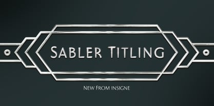 Make the right statement with the elegant Sabler Titling. This showstopping font features an inherent grace combined with the classic style of the Art Deco period. The subtle beauty of its letters is highlighted by the typeface’s stems, which taper towards the baseline highlight--a feature that adds clear distinction to your design. Originally inspired by a WPA poster, this typeface has been expanded to include three equally elegant proportions. Sabler Titling includes more than 60 free alternative forms, including support for most Latin-based languages. Add a hint of seduction to your work with Sabler’s high-contrast letterforms--ideal for magazines, advertisements and books on fashion, fine arts, and luxury goods of all kinds.
 - Angelik by Mysterylab,
$22.00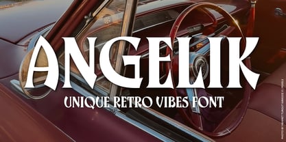 Graphic designers, meet Angelik: a stylish typeface that you can really put through its paces. This unique font can bring one of its multiple personalities to a wide variety of design challenges. It’s a louder and prouder version of a typical assertive editorial-style bold serif headline font. But it can also really shine as a great choice for logos and branding, spanning a variety of vibes and styles. Works superbly in a high-fashion context, as well as in lowbrow surf-skate-ski-snowboard gear branding, or perhaps as an understated – yet exotic – vacation travel poster font. With its finely-tuned contouring, extensive kerning, and a multilingual character set, Angelik will not let you down.
 - Brix Sans by HVD Fonts,
$40.00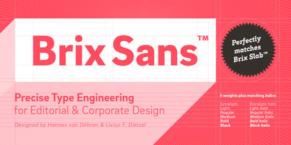 It took Hannes von Döhren and Livius Dietzel two years to develop and complete the Brix Sans family – the companion of the well-known Brix Slab . The approach was to design an independent type family following the rules of the “Sans-Serif” genre, harmonizing with its older sister Brix Slab from the “Slab-Serif” genre. The result is a family of 6 weights with matching italics, which works perfectly for corporate design & editorial design. Combined with Brix Slab, high and complex typographical challenges can be solved. The Brix Sans OpenType fonts feature small caps, five variations of numerals, arrows and an extended character set to support Central and Eastern European as well as Western European languages.
 - Tea Chest by Linotype,
$29.99The English typographer Robert Harling created Tea Chest in 1939 with the Stephenson Blake foundry. Today, this classic design is available in digital format from Linotype GmbH. Tea Chest is a bold stencil face. The font's narrow letters are all caps, and they sport small, slab serifs. Harling's design was most likely reminiscent of the old industrial lettering painted onto boxes and wooden crates that used to be shipped all over the world on the high seas. These letters had to be simple to reproduce, easy to read, and not take up too much space! Try out Tea Chest for large signage displays, on exotic product packaging, or in magazine or newsletter headlines. - Chandler Mountain by Mega Type,
$19.00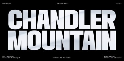 Chandler Mountain is a display font family that is simple but strong, defined by sharp edges with a modern touch. It is designed to exude a sense of strength and toughness as well as optimal readability. Chandler Mountain consists of 9 weights from Regular and Slanted: Chandler Mountain works well in branding, logos, headlines, high fashion, Magazines, Quotes and Posters. The different weights give you full range to explore a whole host of apps, from Television Shows, Youtube Podcasts, tech startups, local events to sporting events. Have fun using Chandler Mountain!!! I really hope you enjoy it! Feel free to follow, like and share. Thank you so much for checking out my shop!
 - Eagle Lake Pro by Stiggy & Sands,
$29.00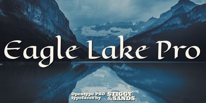 A Practical Calligraphic Hand. Eagle Lake Pro is based on the calligraphic lettering style known based on the practical Running Book Hand. It has shorter capitals that create a visually taller x-height lending to high legibility and fluidity. Classic, clean, and casual, Eagle Lake Pro fits a lot of design uses. The SmallCaps and extensive figure sets only work to further expand the usefulness of the typeface across a wider breadth of applications. See the 5th graphic for a comprehensive character map preview. Opentype features include: - SmallCaps. - Full set of Inferiors and Superiors for limitless fractions. - Tabular, Proportional, and Oldstyle figure sets (along with SmallCaps versions of the figures). - Stylistic Alternates for Caps to SmallCaps conversion.


