10,000 search results
(0.022 seconds)
- Catastrophist by Allouse Studio,
$16.00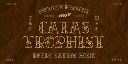 Catastrophist a Retro Tattoo Font that carefully crafted and will bring an cool impression to your project. Catastrophist is perfect for any titles, logo, product packaging, branding project, megazine, social media, wedding, or just used to express words above the background. Catastrophist also come with Multi-Lingual Support. Enjoy the font, feel free to comment or feedback, send me PM or email. Thank You!
 - Bread Forest by Timurtype,
$14.00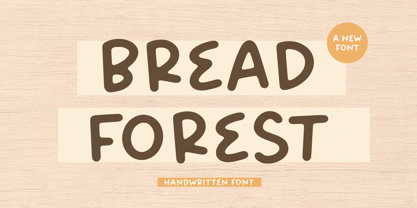 Introducing by Timur type Proudly Present, Bread Forest Bread Forest A Handwritten Script Font Bread Forest is perfect for product packaging, branding project, megazine, social media, wedding, or just used to express words above the background. This Bread Forest font includes: -Full Set of standard alphabet and punctuation & symbol -Extra set Alternate ending lowercase -multilingual support. Embelish your designs with our original fonts.Enjoy the font,Thank you!
 - Power Talks by Essqué Productions,
$35.00 Inspired by fonts used in financial and law arenas. Bold style reminiscent of 1920s deco era. Great font for play cash or Monopoly-themed party invitations. Vibes of Wall Street movers and shakers. Includes letters from Latin, Greek, Hebrew, and Cyrillic Alphabets - with some common diacritics. Also includes small caps and English feature words like "the", "of", "with", "and", etc. for marquee style accents.
 - NorB Croquis by NorFonts,
$28.00 NorB Croquis is a handwritten text font witch can be used with any word processing program for text and display use, print and web projects, apps and ePub, comic books, graphic identities, branding, editorial, advertising, scrapbooking, cards and invitations and any casual lettering purpose… or even just for fun! It comes with 12 weights: Normal, Medium, Bold and Cut Tip along with their Italic and Oblique versions.
 - Miya Mine by Arunatype,
$15.00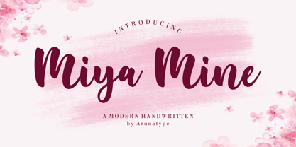 Miya Mine is a sleek and unique handwritten font, carefully crafted with a touch of creativity. Great for product packaging, branding projects, magazine covers, social media, weddings, or simply used to express words over a background. This font is made for those who need a beautiful and refreshing look. This font is PUA encoded, which means you can access all of the glyphs and swashes with ease!
 - Christoper Brothers by Timurtype,
$14.00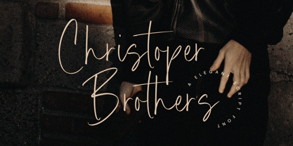 Introducing by Timur type Proudly Present, Christoper Brothers Christoper Brothers A Handwritten Font Christoper Brothers is perfect for product packaging, branding project, megazine, social media, wedding, or just used to express words above the background. This Smiley Hamster font includes: -Full Set of standard alphabet and punctuation & symbol -Extra set Alternate ending lowercase -multilingual support. Embelish your designs with our original fonts.Enjoy the font, Thank you!
 - Vermandois by Magpie Paper Works,
$68.00 Rough yet refined, kinetic and distinctive, the handdrawn Vermandois family mimics original calligraphy with exceptional accuracy. Perfect for correspondence, invitations, unique branding and display, Vermandois' connecting letters, caps and ink blots make a mark. Vermandois regular includes contextual ligatures and double-letter ligatures, alternate caps, preposition & title word glyphs, old style numerals, international support, currencies and fractions. VermandExtra includes 52 coordinating strokes, splashes and splatters.
 - Hogback by Allouse Studio,
$16.00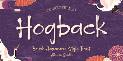 Proudly Presenting, Hogback a Brush Japanese Style Font that will bring an natural imression Asian Style for your need. Hogback is perfect for any tittles, logo, product packaging, branding project, megazine, social media, wedding, or just used to express words above the background. Hogback also come with Multi-Lingual Support. Enjoy the font, feel free to comment or feedback, send me PM or email. Thank You!
 - Moon Charming by Allouse Studio,
$16.00 Proudly Presenting, Moon Charming a Quirky Slab Typeface. Moon Charming is perfect for any titles product packaging, branding project, megazine, social media, wedding, or just used to express words above the background. Moon Charming come with two styles, regular and slab. Each style come with Multi-Lingual Support. Enjoy the font, feel free to comment or feedback, send me PM or email. Thank You!
 - Goldtext by Attractype,
$10.00 f you like being creative with bold serif fonts, then the BOLDTEXT font could be your choice. The thick and sharp shape will direct the eye to your special design. A legible letter style will form words that are easy to read. You can use this font to design logos, titles, magazines, comics, text effects, banners and more. Feel free to contact me about this font.
 - Film Crew JNL by Jeff Levine,
$29.00It's not a new idea, but it's always a fun one... a typeface comprised of 35mm film frames. Film Crew JNL is Jeff Levine's version, utilizing his Koehler Sans JNL as the lettering inside the frames. The lesser and greater keys have solid black frames for end caps or word spacing, and there's an alternate pair of frames with clear centers on the brace keys. - Widdershins by Hanoded,
$15.00 I like strange words. Widdershins is one of them: it means ‘to go counter clockwise’ and I picked it up from a book I am reading at the moment. Widdershins font was created using a broken bamboo satay skewer and Chinese ink. It is a little messy, uneven and maybe even unnerving, but I am sure you’ll find a way to put it to good use.
 - Redmarch by BaronWNM,
$12.00 Redmarch is a monoline script font that gives a natural-looking impression that is perfect for those of you who want to use a signature font. Redmarch is very suitable for branding, advertising, name cards, product labels, printing t-shirts, greeting cards, invitation cards, etc. Redmarch has several ligatures, begining and anding swashes to give a sweet touch at the beginning and end of words.
 - Party Doodles by Outside the Line,
$19.00 Party Doodles: the perfect font for that quickie party flyer. Six party words in script and hand printing as well as 24 party drawings of gifts, party hats and party crowns, a sundae, a cupcake, fancy cakes, drinks, party horn and noisemakers, candles and a gift tag. One font, many possible party flyers. It can also be found in the book "1000 Fonts" by Bob Gordon.
 - Reverie by District,
$15.00 Reverie is a cheerful band of letters that bounce across the page and get together to create words in three weights. Generous spacing and a modest x-height project an airy typeface that's open but not frail. Quirky without being too whimsical. Use the regular weight for surprisingly readable text or put the light and bold weights to use for decorative headlines and titles.
 - Retail Merchant JNL by Jeff Levine,
$29.00Retail Merchant JNL is strictly for making prices. The 0-9 keys have large numbers, the shift position of the same keys have smaller, centered numbers, and the alphabet keys have a variety of smaller numbers with underscores in single digits, pairs of numerals and even a few complete prices such as "$1.00". Thrown in for good measure are companion words... "at", "for, "each", "lb." and "dozen"... - Delight Paradise by Timurtype,
$14.00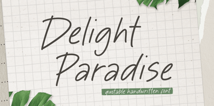 Introducing by Timur type Proudly Present, Delight Paradise Delight Paradise A Handwritten Font Delight Paradise is perfect for product packaging, branding project, megazine, social media, wedding, or just used to express words above the background. This Delight Paradise font includes: -Full Set of standard alphabet and punctuation & symbol -Extra set Alternate ending lowercase -multilingual support. Embelish your designs with our original fonts.Enjoy the font, Thank you!
 - Neug Asia by Allouse Studio,
$16.00 Proudly Presenting, Neug Asia. A font duo that will give you an a classy impression! Neug Asia can be display for any titles, logo, product packaging, branding project, megazine, social media, wedding, or just used to express words above the background. Neug Asia come with Multi-Lingual Support. Enjoy the font, feel free to comment or feedback, send me PM or email. Thank You!
 - Spicy Hour by PizzaDude.dk,
$17.00 Spicy Hour can be used for all your dishes and designs that needs that extra seasoning. Just mix, and you are ready to go! The ingredients includes contextual alternates, which in this case means that every letter has 5 different versions, which automatically cycles as you type. In other words, it spices up your text! Multilingual support is also a part of the dish!
 - Courtney Martines by Timurtype,
$14.00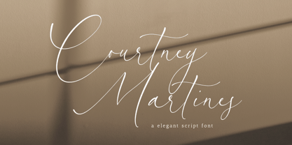 Introducing by Timur type Proudly Present, Courtney Martines Courtney Martines A Handwritten Font Courtney Martines is perfect for product packaging, branding project, megazine, social media, wedding, or just used to express words above the background. This Courtney Martines font includes: -Full Set of standard alphabet and punctuation & symbol -Extra set Alternate ending lowercase -multilingual support. Embelish your designs with our original fonts.Enjoy the font, Thank you!
 - Kimberly Paradise by Timurtype,
$14.00 Introducing by Timur type Proudly Present, White Butter Kimberly Paradise A Handwritten Font Kimberly Paradise is perfect for product packaging, branding project, megazine, social media, wedding, or just used to express words above the background. This Kimberly Paradise font includes: -Full Set of standard alphabet and punctuation & symbol -Extra set Alternate ending lowercase -multilingual support. Embelish your designs with our original fonts.Enjoy the font, Thank you!
 - Soul Doubt by Allouse Studio,
$16.00 Proudly Presenting, Soul Doubt a Graffiti Font with Two Syles. Soul Doubt is perfect for any tittles, logo, product packaging, branding project, megazine, social media, wedding, or just used to express words above the background. Both font come with underline styles and extras, also come with Multi-Lingual Support. Enjoy the font, feel free to comment or feedback, send me PM or email. Thank You!
 - ITC Weidemann by ITC,
$29.99 The Weidemann typeface's original name was Biblica, which was designed for the collaborative publication of a Bible by the German Catholic and Protestant Churches. The mass of text which the face was intended to set required that the design allow many characters to fit onto one line without rendering the words illegible. Thus, narrow spacing does not compromise the legibility or the elegance of Weidemann.
 - Fashion History by Timurtype,
$14.00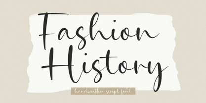 Introducing by Timur type Proudly Present, Fashion History Fashion History A Handwritten Script Font Fashion History is perfect for product packaging, branding project, megazine, social media, wedding, or just used to express words above the background. This Bread Forest font includes: -Full Set of standard alphabet and punctuation & symbol -Extra set Alternate ending lowercase -multilingual support. Embelish your designs with our original fonts.Enjoy the font,Thank you!
 - Breuckelen by Glyphobet,
$14.99 Breuckelen was inspired by the regular patterns of the New York City plan. The grid of any large modern city is immediately recognizable by the distinctive pattern of major roads curving or slanting through it. This face is intended to be recognizable in the same way. It is named after the Dutch town after which Brooklyn is named, a word which also roughly translates as "broken land".
 - Star Whisper by Allouse Studio,
$16.00 Star Whisper a Fun Handwritten Easter Font that will bring joy to your Easter Season. Star Whisper is perfect for any tittles, logo, product packaging, branding project, megazine, social media, wedding, or just used to express words above the background. Star Whisper also come with Multi-Lingual Support. Enjoy the font, feel free to comment or feedback, send me PM or email. Thank You!
 - Golden Monstera by Timurtype,
$14.00 Introducing by Timur type Proudly Present, Golden Monstera Golden Monstera A Handwritten Font Golden Monstera is perfect for product packaging, branding project, megazine, social media, wedding, or just used to express words above the background. This White Buttert font includes: -Full Set of standard alphabet and punctuation & symbol -Extra set Alternate ending lowercase -multilingual support. Embelish your designs with our original fonts.Enjoy the font, Thank you!
 - Quickbrush by Trial by Cupcakes,
$29.00 Like its cousin Quickpen, Quickbrush is an unfussy, confidently jotted script, with lots of rich texture to recreate the skips and jumps that appear in brush pen lettering. Contextual alternates for lowercase letters mimic starting and ending marks, to make each word look truly written by hand. It’s a typeface you’ll reach for again and again, for any project that needs a casual, handwritten touch.
 - Ed McGuinness by Comicraft,
$39.00 Fighting American and all around Superman Ed McGuinness joins our Masters of Comic Book Art with a font inspired by his gamma ray saturated handwriting! Ed is officially a friend of Comicraft and a big smile in Hulk form! Now a small slice of this Jolly Green Giant is available as an alphabet waiting for puny humans to arrange in words of no more than two syllables.
 - Esencia by CastleType,
$59.00 Esencia, a CastleType original, was inspired by a Spanish stock certificate from 1941 with 11 beautiful art deco style letters for the words "PERFUMES y ESENCIAS". Slender, elegant, with a Spanish flare. Uppercase only with numerals and punctuation. Supports all European languages that use the Latin alphabet, as well as modern Greek and most languages that use the Cyrillic alphabet. Includes alternate E, F, and S.
 - Deco Banner JNL by Jeff Levine,
$29.00 Deco Banner JNL is composed of reverse lettering on a black background with Art Deco end caps. To create a banner, first type the plus sign for the left end cap, then your text. To add a space between words, use the bar on the shift position of the backslash key then continue on. To add the right end cap, type the equal sign.
 - Bohemian Fashion by Timurtype,
$14.00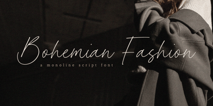 Introducing by Timur type Proudly Present, Bohemian Fashion Bohemian Fashion A Handwritten Font Bohemian Fashion is perfect for product packaging, branding project, megazine, social media, wedding, or just used to express words above the background. This Bohemian Fashion font includes: -Full Set of standard alphabet and punctuation & symbol -Extra set Alternate ending lowercase -multilingual support. Embelish your designs with our original fonts.Enjoy the font, Thank you!
 - Twist Jelly by Allouse Studio,
$16.00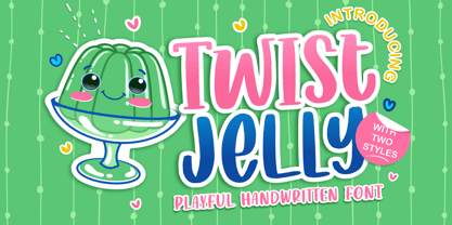 Proudly Presenting, Twist Jelly a Playful Handwritten Font with two styles, Basic and Slab Serif. Twist Jelly is perfect for any tittles, logo, product packaging, branding project, megazine, social media, wedding, or just used to express words above the background. Twist Jelly come with Multi-Lingual Support for each style. Enjoy the font, feel free to comment or feedback, send me PM or email. Thank You!
 - NorB Casual by NorFonts,
$28.00 NorB Casual is a handwritten text font which my daily casual writing, it can be used with any word processing program for text and display use, print and web projects, apps and Comic Books, graphic identities, branding, editorial, advertising, scrapbooking, cards, and invitations or even just for fun. This font comes with 16 styles, Light, Normal Bold and Heavy each with their Italic and Condensed version.
 - Grosser by Leo Colalillo,
$35.00 The design of Grosser* is inspired by the northern european modern architecture with it's rational shapes. The font was born for posters and to be used on large formats, the geometric shapes and the solid structure makes it a very good choice to do posters and graphics where you need an extra bold font with sharp lines. *Grosser (Größer) is a german word, which means "bigger/larger".
 - HGB Info SC by HGB fonts,
$10.00 It's nice when a font provides old style figures, small caps and alternate letters. But what if my typesetting program doesn't support Open Type features? The solution may be old-fashioned, but it's effective: the variants are placed in separate font families: Standard, Old Style Figures (OSF), and Small Caps (SC). Any word processor can handle it. HGB Info SC adds real Small Caps to HGB Info.
 - Ayesha by Rotterlab Studio,
$15.00 Ayesha is beautiful and lovely script font with many alternative styles, ligatures, swash and multilingual glyphs. Ayesha can be used for wide ranges of application, such as wedding design, logo, poster, name card, invitations, social media posts, and others. Files include: Ayesha Script.OTF + PUA-Encoded + Can be used in any software, like Adobe Photoshop, Illustrator, even Microsoft Word, PowerPoint and others + Multilingual glyphs. Thank You
 - Mega Drone by Sarid Ezra,
$17.00 Mega Drone is a black and fat display font with unique lowercase. You can use this font for many project that require strong and bold vibes. This font also including icons and catchwords that you can access just from ligature. Just mix the uppercase and lowercase in a word for better looks. This font also suitable for logo and more. Mega Drone also support multi language!
 - Komunidad Hebrew Script by Jonahfonts,
$42.00 Komunidad is the Hebrew version of ”Quintana Light”. Suitable for logos and packaging statements. Invoking the OpenType / CONTEXTUAL variant produces the word terminals for all lower-case letterforms as well as diacritic letters. Final Hebrew Glyphs are also added. This can be done individually for each letter as well. Komunidad also contain alternative Swashes and TabOldstyle numerals. (OpenType-Variants may only be accessible via OpenType-aware applications.)
 - Salsiccia by Bech Type,
$19.00 Inspired by bold and rounded typefaces on signs from the 1970s, Salsiccia can promote both your hot dog stand and your international toy store enterprise. Its boldness and roundness is combined with classical proportions, with wide letters — like the O — next to little nubby ones — like the T. This not only looks nice, but helps us even out the white spaces across words and sentences.