10,000 search results
(0.021 seconds)
- Ticketing by K-Type,
$20.00 Ticketing is a monospaced font loosely based on the pixel style lettering of electronic ticketing, designed for clarity when cheaply printed at small sizes. Ticketing, however, has a larger x-height than is often found on ticket type. The glyphs were drawn on a square grid 13 wide by 22 high, though some accented characters are taller or extend below the baseline. The Space is a full character width, but the Non-Breaking Space is set to half the width of the glyphs.
 - Incognia by Nasir Udin,
$29.00 Incognia is a sharp and high-contrast long-serif type family of 10 fonts inspired by classic roman typography. Ranging from light to bold with matching italics, Incognia offers many possibilities to be applied in many graphic or editorial projects. The lighter weights are suitable for short paragraph, and the heavier weights are perfect for display purpose such as titling or headlines, branding, editorial, book covers, and packaging. Incognia has extended latin character set that supports 200+ latin-based languages.
 - Binner Gothic by Monotype,
$29.99Binner Gothic is a very narrow sans serif thought to have been cut by the Bruce Typefoundry, in New York, around the turn of the century. The capitals are rather heavy with an elongated appearance, accentuated by the high-waisted treatment of characters such as B E F H M N P and R. The lowercase ascenders and descenders of the Binner Gothic font are cut at an angle. Binner Gothic is a display face particularly useful where space is at a premium. - Decour Soft by Latinotype,
$26.00 Decour Soft is the rounded-edged version of Decour. It is a slab serif humanist low contrast typeface. The overall design also features strong curves, making it a very friendly face. The font retains the original elegant features of Decour—based on Art Deco design—such as high contrast between upper and lower case characters. Decour Soft is a suitable font for logotypes and packaging. Its design also allows it to be used with certain elegance in book titles and magazines subheadings.
 - Stallone by Suza Studio,
$19.00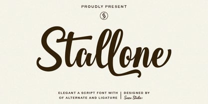 Stallone is a stunning Elegant Script font with a classic retro style, regular artistic swirls, coming together to create a distinctive, high-quality and exclusive typeface that will bring vintage charm to your designs. This font is created with advanced OpenType functionality and has the best quality guarantee, contains stylistic and contextual alternatives, ligatures and other features; all to give you complete control and customization capabilities. It contains all the characters and symbols you need, including all punctuation and numbers.
 - Billie James by Ardian Nuvianto,
$23.00 Billie James is a sophisticated and elegant script font that exudes timeless beauty and grace. With its fluid and graceful letterforms, this font brings a touch of refinement and luxury to any design project. Inspired by classic calligraphy, Billie James is perfect for wedding invitations, high-end branding, and any project that requires a touch of sophistication and charm. Its cursive strokes and gentle curves create a sense of movement and rhythm, adding a sense of elegance to your designs.
 - Absolute Beauty by My Creative Land,
$34.99 Absolute Beauty is a happy family of a smooth casual monoline signature script and a high contrast elegant didone serif. The signature script comes in three weights to cover as much design needs as possible - from websites to brand design, from magazines to billboards. It compliments from OpenType features such as ligatures, swashes, stylistic and contextual alternates, and is fully unicode mapped. Absolute Beauty serif is an ideal partner for the script: it features the same elegance and comes in two weights.
 - Ceramika by Santi Rey,
$25.99 Ceramika is a modern tribute to Old Style typefaces. This design is inspired by the letterforms of the serif faces found in history books from the beginning of the 20th-century. Its sturdiness and generous X-Height makes it bold and compact; while the high-contrast strokes and recognisable shapes makes it extremely readable. All this makes Ceramika a really versatile font, perfect for logos, headlines and even body copy. It comes in 6 different weights and 2 styles — Standard and Italic.
 - Slinces Heart by Nathatype,
$29.00 Slinces Heart is a captivating script font that captures the essence of handwriting with a touch of romance. Each letter in this font is meticulously crafted with fairly high line contrast, adding a dynamic and eye-catching quality to the font. The swinging endings in Slinces Heart add a flourish of creativity and uniqueness. With its smooth and flowing letterforms, this font offers a natural and seamless writing style. For the best legibility you can use this font in the bigger text sizes.
 - Micheliya by IM Studio,
$16.00 Micheliya has a font script that is provided with great tenderness to be presented with a variety of stunning character models. Micheliya combines a new design that features free, warm, modern features. taste. The diversity of weights provides a variety of choices that will help you find the best design colors for your project. Lighter weights are perfect for heavier body text ideal for high impact headers. Alternative styles available provide different characters that give your logo or business card a unique display.
 - Clarendon BT by Bitstream,
$50.99 The new Clarendon BT Pro typeface family features 450 glyphs in each font with expanded support for Central and Eastern European languages, and enhanced OpenType features including ligatures, diagonal fractions, superscript/subscripts and Case-Sensitive Forms. Clarendon BT is an updated revival of the square serif (also called Ionic or Egyptienne styles) with bracketed serifs, ball terminals and high xheights. These attributes give Clarendon BT a timeless appearance for a wide range of contemporary uses from websites, ads, publications and signage.
 - Zuume by Adam Ladd,
$25.00 Zuume is a high-impact, condensed, display font family. Its weight range gives a sharp, technical feel in the lighter weights, while the bolder weights are meant to be tightly spaced and stacked for visual punch. The strong and sturdy design makes it ideal for eye-catching headlines, branding, packaging, sports, logos, and more. The Cut family takes the dynamic nature of this design further by adding sliced out elements to flat, horizontal strokes, giving it more movement, aggression, and speed.
 - Boxley by Shinntype,
$45.00 The original superellipse typefaces coincided with the emergence of the CRT (cathode ray tube) TV screen, but there is more than this visual analogy of high-tech in play, as the pumped up angularity of the curved components of the genre also informs the quality of set text. In particular, due to the straightness of the round letters’ side stems, there is a neat modularity of vertical letter spacing, which denotes authority, with precision, complementing the tautness of the face’s curves.
 - Pixel Arcade by Comicraft,
$19.00 GAME OVER, MAN, GAME OVER! Time to grab your joystick, turn to channel 3 and level up, Player One, or you'll never beat the high score on your new game cartridge. Or bring a stack of quarters and a couple of friends to the mall, and we'll play some Rick Astley and Kajagoogoo over the PA while you scope out hotties near the food court. Either way, eight bit lettering has never looked more eighties than it does in our new PIXELARCADE font!
 - Rosiana by Arterfak Project,
$24.00 Rosiana is a modern decorative serif font. Inspired by the classic typography which visualizes a bright shade that feels good to apply to your design, such as magazines, cards, invitations, labels, logo, logotypes, books, packaging, and more! Designed with high contrast and soft-sharp serif that looks strong and confident as a display. Equipped with 200+ special characters and ligatures to beautify your typographic design. Font featured: Uppercase Lowercase Numbers Symbol Accented characters ÞþßÀÁÂÃÄÅÆÇÐĐÈÉÊËÌÍÎÏŁÑÒÓÔÕÖØŒŠÙÚÛÜŸÝŽàáâãäåæçđèéêëìíîïłñòóôõöøœšùúûüýÿž ĀāĆćĈĉČčĎďĒēĚěĜĝĤĥĨĩĪīĴĵŃńŇňŌōŔŕŘřŚśŜŝŞşŢţŤťŨũŪūŮůŴŵŶŷŹźẀẁẂẃẄẅĹ徼 Stylistic alternates Stylistic set 01-11 Ligatures
 - Cafgone by Wildan Type,
$14.00 Cafgone is a modern display sans serif with modern and elegant style. This fonts is designed to pair harmoniously, and lend themselves to high end branding, logo designs, product packaging & invitation designs. With two fonts style (Regular and Oblique), Cafgone clean lines and subtle contrast give any project a touch of luxury and class. There are also decorative alternates and ligature available for uppercase letters and lowercase, so you can mix and match to add extra character and interest to logos and wordmarks.
 - DT Skiart by Dragon Tongue Foundry,
$30.00 Looking for something between a Serif and Sans Serif font? Try the DT Skiart font. This high quality, versatile font has the professional feel of a Serif, but has the open readability of a Sans Serif. A smart crisp font with smooth simple lines. It has a medium to strong stroke contrast, with the vertical line being heavier than the horizontal line, and no serifs. The DT Skiart family is made up of 5 weights in both italic and normal.
 - Sincerity Stencil by Océane Moutot,
$32.90 Sincerity Stencil is the new extension of the typeface Sincerity. It's a fierce and elegant typeface identified by its high contrast, sharp shapes and triangular. The stencil component of this new version will add originality to your designs. Its large variety of glyphs, including accents, old-style numbers and ligatures will give uniqueness to your designs. It's a great fit for branding, magazines, newspapers, and so on. Sincerity Stencil is available in 16 styles, from thin to black in roman and italic.
 - Rondoy by High Peak,
$25.00 High Peak is proud to present Rondoy, a clean, readable yet distinctive sans-serif typeface. The Rondoy family comes in six weights and matching italics for a total of 12 styles to unleash maximum expression and creativity, ready to give you all you need to bring your project to the next level. Each glyph in this family is crafted with passion and care. Rondoy is designed to be used in any context where style, modernity and legibility is a requirement. Enjoy!
 - Clarize by Seventh Imperium,
$25.00 Clarize is an elegant high contrast serif fonts family, with the best features of the Didone style. Designed with consideration for more functionality with smooth details and a touch of modern and luxury, this font is perfect for designers who are developing in the field of books, fashion, magazine, blog, advertising, packaging, branding, etc. The family includes 10 styles: five weights from Light to Black Multilingual Languages. Clarize includes Ligature and discretionary "ct" and "st" that can be accessed via an access feature.
 - Apex Pro by Artyway,
$18.00 Unleash the Power of Motion and Speed with the ApexPro font – a dynamic, sporty font designed for those who crave action, speed, and innovation. This typeface is meticulously crafted to embody the essence of the automotive world, fitness, and cutting-edge technology. Key Features: Style: The ApexPro boasts a rounded and soft appearance with bold, italic, and slashed elements, giving it a sporty and energetic vibe. The letters are carefully crafted, providing a clean and sharp visual for maximum impact. Design Elements: Inspired by the sleek lines of high-speed vehicles, the font carries a rounded, beveled, and cutout aesthetic, adding a touch of modernity and innovation. The use of military and stencil elements infuses a sense of power and dynamism. Versatility: The ApexPro is not just a font; it's a statement. Perfect for automotive enthusiasts, gym-goers, and tech aficionados, it seamlessly blends into various contexts such as sports events, gaming interfaces, and futuristic designs. Target Audience: The ApexPro is tailored for individuals who appreciate the fusion of technology, speed, and style. The target audience includes: Age: 18-35, seeking dynamic and trendy design elements. Gender: Unisex, appealing to both males and females. Needs: Graphic designers, gamers, fitness brands, and automotive enthusiasts looking for a font that embodies speed and action. Why the ApexPro font? For Speed Enthusiasts: The ApexPro brings the thrill of high-speed action to your designs. For Fitness Brands: Reflect the energy and dynamism of your fitness brand with the ApexPro. For Gaming Interfaces: Elevate your gaming experience with a font that resonates with movement and power. File Inclusions: Languages Covered: Multilingual support for a global audience. Numbers, Symbols, and Punctuation: A comprehensive set for versatile use. Lowercase Letters: Lowercase letters for a balanced and cohesive look. Fuel your creativity with the ApexPro – the font that doesn't just communicate, but accelerates your message. Download now for an experience that goes beyond the ordinary.
 - Venice La Corla by Jolicia Type,
$19.00 Venice La Corla is a breathtaking serif font that embodies timeless elegance and sophistication. This typeface exudes a sense of refinement and grace that is perfect for projects where a touch of classic charm is required. Each character in Venice La Corla is meticulously crafted to provide a harmonious balance between its serifs and elegant lines, resulting in a truly remarkable font. Key Features: 1. Serene Elegance: Venice La Corla's primary hallmark is its serene elegance. The font's graceful serifs and curvaceous letterforms create an atmosphere of sophistication that is suitable for various design applications. 2. Timeless Appeal: Inspired by the romanticism of the Italian city of Venice, this font transports you to an era of classic beauty. Its timeless appeal is perfect for projects that require a touch of nostalgia and charm. 3. Versatile Usage: Venice La Corla is incredibly versatile and adapts effortlessly to different design scenarios. Whether it's a formal wedding invitation, a vintage-inspired poster, or a high-end fashion magazine, this font adds a touch of class to any project. 4. Exceptional Legibility: Despite its ornate elegance, Venice La Corla maintains excellent legibility, making it a practical choice for long passages of text as well as for branding and display purposes. 5. Captivating Details: The font's characters are adorned with captivating details, making it a true work of art. Each letter is thoughtfully designed to enhance the overall visual appeal of your design. Recommended Uses: Venice La Corla is ideal for a wide range of projects, including but not limited to: - Wedding invitations and stationery - Vintage and classic-themed designs - High-end fashion and luxury branding - Editorial design and magazine layouts - Product packaging and labels - Fine art prints - Wine labels and menus for upscale restaurants Incorporate Venice La Corla into your design projects, and you'll instantly elevate the aesthetics, adding a touch of timeless elegance that will captivate your audience.
 - Glance Sans by Identity Letters,
$29.00 Geometric, stylish, and not quite a stencil face: Glance Sans is the urban alter ego of Glance Slab—a strong-willed sans-serif with no frills but a few unique character traits. Glance Sans follows the design principle of nonjoining parts that made Glance Slab successful. Some strokes may not connect to their stems, creating visible gaps and thus, a dynamic impression of balance and movement. However, Glance Sans has a calmer appearance due to the lack of detached serifs. If Glance Slab’s home territory are large, crowded stadiums and massive sports events, Glance Sans prefers streetball courts, well-used skate parks, and underground clubs. It also adapts to urban work environments from finance to high-tech. Whenever a more toned-down look is called for while retaining the elegance of an athlete, Glance Sans is ready to roll. In the city environment, versatility is key. That’s why Glance Sans sports 7 weights as well as a complete set of italics. These are not just sloped romans but individually drawn letterforms, subtly referencing classic italic construction for more effective emphasis. Among the 600+ glyphs of Glance Sans, you’ll find goodies such as six sets of figures, circled numbers, circled arrows, and all kinds of currency symbols in two stylistic versions. Glance Sans is a great tool for industrial and high-tech branding, for wayfinding systems in contemporary or modernist architecture, for corporate identities in arts, crafts, medicine, culture, and education, and for all kinds of sports-themed design. Both members of the Glance superfamily are easily and effectively combinable; both are able to stand on their own feet. With its powerful italics, you might opt for Glance Sans as your text typeface and use Glance Slab for headlines. Or you set large, clean, display-sized lines in Glance Sans and spice them up with a bit of sportive Glance Slab. It’s up to you to decide how to bring out the best in both of them.
 - Conceal by Typodermic,
$11.95 Introducing the ultimate indulgence in typography—Conceal. This gorgeous display typeface is inspired by the world of high-end cosmetics and premium beauty brands. It encapsulates the essence of luxury and glamour, as lipstick-like lines and elegant letterforms come together to create a breathtakingly beautiful font that exudes opulent splendor. Each letter has been crafted with precision and care, just like the art of makeup application. Its smooth, flawless lines will elevate any message to a level of pure sophistication, making it perfect for the beauty industry, high-end fashion brands, and any company seeking to exude an air of elegance and refinement. Conceal will draw attention to your brand and leave a lasting impression. It’s the perfect choice for any project that requires a touch of glamour and refinement, from logo design to magazine covers, social media graphics, and beyond. Experience the ultimate in luxury typography with Conceal—the font that delivers your message in the most exquisite way possible. Unleash your inner beauty with this stunning display typeface and let your brand shine like never before. Most Latin-based European writing systems are supported, including the following languages. Afaan Oromo, Afar, Afrikaans, Albanian, Alsatian, Aromanian, Aymara, Bashkir (Latin), Basque, Belarusian (Latin), Bemba, Bikol, Bosnian, Breton, Cape Verdean, Creole, Catalan, Cebuano, Chamorro, Chavacano, Chichewa, Crimean Tatar (Latin), Croatian, Czech, Danish, Dawan, Dholuo, Dutch, English, Estonian, Faroese, Fijian, Filipino, Finnish, French, Frisian, Friulian, Gagauz (Latin), Galician, Ganda, Genoese, German, Greenlandic, Guadeloupean Creole, Haitian Creole, Hawaiian, Hiligaynon, Hungarian, Icelandic, Ilocano, Indonesian, Irish, Italian, Jamaican, Kaqchikel, Karakalpak (Latin), Kashubian, Kikongo, Kinyarwanda, Kirundi, Kurdish (Latin), Latvian, Lithuanian, Lombard, Low Saxon, Luxembourgish, Maasai, Makhuwa, Malay, Maltese, Māori, Moldovan, Montenegrin, Ndebele, Neapolitan, Norwegian, Novial, Occitan, Ossetian (Latin), Papiamento, Piedmontese, Polish, Portuguese, Quechua, Rarotongan, Romanian, Romansh, Sami, Sango, Saramaccan, Sardinian, Scottish Gaelic, Serbian (Latin), Shona, Sicilian, Silesian, Slovak, Slovenian, Somali, Sorbian, Sotho, Spanish, Swahili, Swazi, Swedish, Tagalog, Tahitian, Tetum, Tongan, Tshiluba, Tsonga, Tswana, Tumbuka, Turkish, Turkmen (Latin), Tuvaluan, Uzbek (Latin), Venetian, Vepsian, Võro, Walloon, Waray-Waray, Wayuu, Welsh, Wolof, Xhosa, Yapese, Zapotec Zulu and Zuni.
 - Neuropol Nova by Typodermic,
$11.95 Neuropol Nova is more than just a typeface, it’s a portal to a world of hard sci-fi design. Inspired by Neuropol X, this typeface transports us to a chilling and distant future, one where letterforms are stripped down to their most essential components. The stark, almost clinical aesthetic of Neuropol Nova is reminiscent of a high-tech laboratory or the sterile environment of a spaceship’s bridge. Neuropol Nova pushes the boundaries of letterform recognition to levels that are truly ultra-futuristic. The sparsely connected patterns that make up the letters evoke a sense of ancient cuneiform markings, or perhaps even the language of a highly advanced alien civilization from a distant, unknown future. The choice of three widths, three weights, and italics only adds to the versatility of this incredible typeface. With its strategic overtones, Neuropol Nova is ideal for any designer looking to create a design that screams of a dystopian future. Whether you’re working on a sci-fi novel cover or a video game interface, Neuropol Nova is the perfect typeface to transport your audience to a world of cutting-edge design. In conclusion, Neuropol Nova is more than just a typeface, it’s a masterful creation that seamlessly blends the past, present, and future of typography. So if you’re looking for a font that will truly set your design apart, look no further than Neuropol Nova. Most Latin-based European writing systems are supported, including the following languages. Afaan Oromo, Afar, Afrikaans, Albanian, Alsatian, Aromanian, Aymara, Bashkir (Latin), Basque, Belarusian (Latin), Bemba, Bikol, Bosnian, Breton, Cape Verdean, Creole, Catalan, Cebuano, Chamorro, Chavacano, Chichewa, Crimean Tatar (Latin), Croatian, Czech, Danish, Dawan, Dholuo, Dutch, English, Estonian, Faroese, Fijian, Filipino, Finnish, French, Frisian, Friulian, Gagauz (Latin), Galician, Ganda, Genoese, German, Greenlandic, Guadeloupean Creole, Haitian Creole, Hawaiian, Hiligaynon, Hungarian, Icelandic, Ilocano, Indonesian, Irish, Italian, Jamaican, Kaqchikel, Karakalpak (Latin), Kashubian, Kikongo, Kinyarwanda, Kirundi, Kurdish (Latin), Latvian, Lithuanian, Lombard, Low Saxon, Luxembourgish, Maasai, Makhuwa, Malay, Maltese, Māori, Moldovan, Montenegrin, Ndebele, Neapolitan, Norwegian, Novial, Occitan, Ossetian (Latin), Papiamento, Piedmontese, Polish, Portuguese, Quechua, Rarotongan, Romanian, Romansh, Sami, Sango, Saramaccan, Sardinian, Scottish Gaelic, Serbian (Latin), Shona, Sicilian, Silesian, Slovak, Slovenian, Somali, Sorbian, Sotho, Spanish, Swahili, Swazi, Swedish, Tagalog, Tahitian, Tetum, Tongan, Tshiluba, Tsonga, Tswana, Tumbuka, Turkish, Turkmen (Latin), Tuvaluan, Uzbek (Latin), Venetian, Vepsian, Võro, Walloon, Waray-Waray, Wayuu, Welsh, Wolof, Xhosa, Yapese, Zapotec Zulu and Zuni.
 - HWT Konop by Hamilton Wood Type Collection,
$24.95 HWT Konop is a monospaced (fixed-width) typeface that is also square! Designed by Mark Simonson (Proxima Nova) as square characters that can be arranged vertically or horizontally and in any orientation. To a traditional letterpress job printer, a font like this wouldn’t make much sense. But to a modern letterpress printer it is an unusual and creative design toolkit. The bold gothic style is reminiscent of gothic wood types but more geometric. Since the characters are meant to be used in any orientation, the usual optical adjustments, such as making verticals thicker than horizontals and making tops smaller than bottoms are set aside. This results in a quirky but charming design. To provide more design options, Simonson came up with a modular system consisting of three sizes: 12-line, 8-line, and 6-line. These three sizes can be used together like Lego® bricks, with endless arrangements possible. And the sidebearing match so that characters always align when different sizes are used together. The digital version of Konop replicates the wood type version as much as possible, including the three different size designs. It includes OpenType stylistic sets that allow most characters to be rotated in place, 90° left, 90° right, or 180°, just like the wood type version. Extra characters not available in the wood type version are included with the digital fonts. The set of 3 is priced just $5 more than one single font, so order via "Package Options" HWT Konop is named for Don Konop, a retired Hamilton Manufacturing employee, who worked from 1959 to 2003. In addition to serving on the Two Rivers Historical Society Board from 2004 to present-day, he was also instrumental as a volunteer in helping with the museum’s move to its current home in 2013.
 - Bronkey by Alit Design,
$15.00 BRONKEY Typeface is a sans serif font that has a bold, sporty feel to it. It comes in several styles, including regular, italic, outline, square, and rough, providing a versatile range of options for designers. The font has a high body, making it stand out when used in large sizes, such as for headlines or titles. It contains 700 glyphs, including ligatures and alternates, allowing for greater flexibility and creativity in designing. Additionally, it supports PUA codes and is multilingual, making it accessible to a broad range of users. Overall, BRONKEY Typeface is an excellent choice for those looking for a modern, bold font with a range of styles and features. Its sporty feel and high body make it a great choice for projects related to sports, fitness, or any project that requires a dynamic, attention-grabbing font. Language Support : Latin, Basic, Western European, Central European, South European,Vietnamese. In order to use the beautiful swashes, you need a program that supports OpenType features such as Adobe Illustrator CS, Adobe Photoshop CC, Adobe Indesign and Corel Draw. but if your software doesn't have Glyphs panel, you can install additional swashes font files.
 - Lipa Agate by TypeTogether,
$49.00 Lipa is the name of the Slovenian national tree 'Linden'. The typeface Lipa Agate by Croatian designer Ermin Međedović, is part of a bigger type collection, comprising various type groups into one coherent system which Ermin developed over the past 10 years. Lipa Agate is the first to be released; a sans serif designed and engineered to be used in the smallest text sizes, best under 10pt, and in very bad printing conditions. It is perfect for phone books, classified ads, directories or any other job requiring economy without jeopardising legibility. To achieve this, Lipa Agate employs a range of tools, such as deep ink-traps, narrow proportions and a tall x-height. Contemporary editorial design requires a high amount of flexibility to respond to various design situations in a consistent fashion. Lipa Agate — with its 3 levels of condensation, 4 weights and 2 sets of different x-heights, 'High' and 'Low', which share the same width — fulfils these requirements wonderfully. That's a total of 24 fonts! To make this clean and honest workhorse face complete, its large character set also includes small caps, arrows, info-numerals and much more.
 - Magedov Military by Mans Greback,
$69.00 The Magedov Military font is a strong and robust font that exudes power and authority. It has a sharp, geometric design with bold, hard edges that gives it a strict, army-inspired feel. In a blend of sans and slab serif styles, its unique and versatile look can be utilized for a wide range of projects. This font is perfect for university or college projects, as its straight and clear-cut design gives it an academic, high-school or college feel. It is also ideal for projects that require a strong and tough look, such as law enforcement, university or sports logos. Use the parenthesis symbols ( ) [ ] { } to make decorative elements. Example: United]States The Magedov Military family consists of four high-quality fonts: Regular, Italic, Bold and Bold Italic The font is built with advanced OpenType functionality and has a guaranteed top-notch quality, containing stylistic and contextual alternates, ligatures and more features; all to give you full control and customizability. It has extensive lingual support, covering all Latin-based languages, from Northern Europe to South Africa, from America to South-East Asia. It contains all characters and symbols you'll ever need, including all punctuation and numbers.
 - Ainslie Contrast by insigne,
$35.00 Ainslie Contrast is the newest in the Ainslie series, named for the famous mountain overlooking the Australian city of Canberra. The Ainslie series currently consists of four typefaces. The Ainslie design is very unique and originally began life as a semi-serif. Also available are a normalized sans serif and slab variants. This contemporary typeface’s high contrast catches the eye. The design flows with ease and sophistication. There are a mix of influences from Australia, which gives it a unique flavor. The original Ainslie was designed for the Canberra Australia Centennial Typeface Competition and named for the mountain that overlooks the beautiful capital city of Australia. Ainslie takes Canberra's distinct geometric design and blends it with the organic, flowing essence of aboriginal art and the smooth aerodynamic design of the boomerang. The typeface includes a multitude of alternates that can be accessed in any OpenType application. There are swashes and other details such as small caps, alternative titling caps and swash alternates. If you’re searching for a contemporary high contrast typeface with geometric simplicity and a hint of antipodean flair, Ainslie Contrast is fair dinkum.
 - Miss Mable by Cory Maylett Design,
$25.00 Miss Mable is a high-quality, well-proportioned contemporary typeface with variations in thick and thin strokes that contains a hint of previous decades. I wanted to create enough weights and widths to make the typeface suitable for a wide range of uses where a soft, stylish, and friendly look is appropriate. The Miss Mable type family consists of 44 fonts. The family encompasses seven weights across three widths in Roman and italics plus variable versions. Each font contains a complete set of characters for Western and Central European languages. In addition, OpenType features include dynamic fractions, alternate glyphs, ligatures, plus proportional, tabular, and old-style numerals. These high-quality fonts are fully compatible with Windows, Macintosh, and Linux. Also for sale are two Miss Mable variable fonts that include all Roman and italic glyphs of every width and weight plus everything in between. For example, if you need something slightly bolder than bold and a little wider than semi-condensed, the variable fonts make that possible without distortion. Variable technology is new, however. All modern web browsers support variable fonts, but support for most desktop software is still spotty.
 - Alfabetix - Unknown license

- Leopoldo Sans by Tiposureño,
$25.00 Leopoldo Sans is a modern sans serif typeface. He has a small family and its members are: light, regular and bold. Each weight includes small caps, ligatures, and tabular numbers. It could work perfectly in your design, web, editorial and corporate works.
 - Chamfer Serif JNL by Jeff Levine,
$29.00 A set of vintage wood type printing blocks yielded the alphabet which was to become Chamfer Serif JNL. With its heavy vertical serifs and interesting character shapes, the design is unique when compared to the more familiar wood type offerings of the past.
 - Clarenwood Stencil JNL by Jeff Levine,
$29.00 It's a wood type! It's a stencil font! It's BOTH! Clarenwood Stencil JNL was originally designed as a solid alphabet (Clarenwood JNL) modeled from vintage wood type. The stencil treatment was applied to add a fresh look to a classic lettering design.
 - Celtic Knots by Clanbadge,
$20.00 While it is obvious that this is an ornamental style font, it is more than that: it is a Celtic Knotwork design tool! Irish, Scottish, Welsh, even Norse and Viking cultures have used knotwork designs for millenia. These ancient traditional interwoven designs are experiencing a revival as Celtic culture gains exposure in the modern world. Intricate Celtic knots are featured everywhere from jewelry to tattoos. While many enjoy them simply for their beauty and fascinating twists, they can also be used to add an air of myth, magic and mystery to any project. The interlaced lines make them perfect for wedding invitations, borders, dividers and rules, web graphics, and logos. I began using Celtic knotwork designs in my own work as part of my knifemaking and jewelry making hobbies. I read all of the books I could find about Celtic knots and at first I drew them by hand with pencil and paper. Then as I realized how nice it would be to have "undos" I switched over to using Corel Draw. Draw proved to be a natural for this type of artwork with tools like contour and the trim function. But even with these great tools, it was still tedious to create these designs. I noticed that I was able to reuse a lot of parts in repetitive sections. I developed a small library of reusable bits and chunks of Celtic designs. I found them so useful and fun to work with that I began thinking about ways to market my Celtic design kit. I thought about CDR and EPS formats, but then I thought of creating this toolset as a True Type Font. That way anyone with ANY program that uses fonts could easily create Celtic knotwork designs. Word processors, embroidery programs, engraving programs, jewelry design programs, CAD/CAM programs...almost every program can use fonts. I was also interested in CNC work and thought that this font would work well for applications such as laser etching, vinyl signs, and machining. With that in mind, I designed each character of the font with extremes of accuracy. If one character from the font is used at one inch tall, every control point will be placed to an accuracy of better than 0.0001 inch. I wanted every piece to meet exactly with the next, with no possibility for misalignment. The different styles are all very carefully created to fit accurately with each other. So the Filled Style fits exactly into the Outline Style, and the Inverse Style fits precisely around the Outline Style so as to make up the background behind the knotwork. Combining the styles allows you to have complete creative control. By assembling the nearly 200 pieces it is quite easy to produce very complex designs. It is actually a bit like playing with a puzzle and many people really enjoy putting the pieces together to make designs. In fact, I have had many customers tell me of how they love playing with this font and making knots into the wee hours of morning. If you like puzzles then you will absolutely love this font! And creating the patterns is just the beginning of the fun! If you apply your favorite Photoshop tricks on them you can make anything from dazzling chrome knotwork to carved stone. Photoshop plug-ins like SuperBladePro are great for converting knotwork text into corroded bronze or rusted iron. Use your knotwork to add texture to a virtual landscape, or add them as surface embelishments on architecture and furniture. You can also make round knotwork by using this font with "WordArt" (WordArt is included with every copy of Microsoft Word. See http://clanbadge.com/round_knots.htm for a tutorial on how to make round knotwork). For Crafters there are limitless uses for this font. It has been used for embroidery, jewelry, leatherwork, stencils, stained glass, quilting, painting, pyrography, woodcarving and lots more. We have even sold copies to monks for use in decorating handmade books!
 - Italiano Fushion Color by RM&WD,
$35.00 Italiano Fushion is part of an expanding project on which we have been working for several years and is the colors ersion of ITALIANO FUSHION. Starts from the study of the great Futurist adventure of the early 1900s by great artists such as DEPERO and MARINETTI, who twisted the world of typography with shapes and colors. Italian Fushion is made up of almost 2,000 glyphs for each weight and in addition to hundreds of alternatives mainly, such as initials and endings of each word but also different alternatives for the letters I, J, Y. Thanks to the characteristics of Open Type, you can change them in automatic many of the alternatives, use it as a simple text font by changing only the I's and J's that have the typical capital dot, and giving the text a more fun breath to the composition. Italiano Fushion is suitable for large texts and to get the most out of it it is compulsory to transform the text into UPPERCASE text using the tabs of graphic applications such as Illustrator, or activate the Alternavive tabs and the various options of SS. You just need do a sandwitch between the 1 ( on the top ) and the 2 ( on the bottom ), choose the 2 different color and you hae finished. by transforming them into traces you can enrich the interaction between the two levels with nuances of pleasure. If you would like to be above layer 2, you can make the text parts transparent without swashes. Ideal for creating Logos, Head Lines, Web Titles, Posters, Epub Covers, Tatoo Projects, T-Shirts, Drink Labels ...
 - TE Nastaaliq by Tharwat Emara,
$59.00 TE Nastaaliq Font It is one of the Persian calligraphy or ta'liq line that appeared in Persia in the seventh century AH (thirteenth century AD), as it was extracted from the lines of naskh, patch and thuluth. It is a beautiful font whose letters are distinguished by precision and extension. It is also characterized by its ease, clarity and lack of complexity. It does not tolerate diacritics, despite its difference with the line of the patch, as it is one of the best fonts in the world and the best without a competitor and admires many Arab calligraphers, and no cultural or literary exhibition is devoid of a painting written in Persian script. It is one of the most beautiful lines that has a special character that distinguishes it from others, as it is characterized by gracefulness in its letters, so it appears as if it descends in one direction, and its beauty is increased by the soft and rounded lines in it, because it is more flexible in drawing and more flexible, especially if it is drawn with precision, elegance and good distribution, and the calligrapher may baptize In his use of decoration to reach strength in expression by taking advantage of arches and circles, in addition to the grace of painting, the artist may link the letters of one word and the two words to reach the composition of a frame or curved and wrapped lines in which he shows his genius in imagination and creativity.
 - Andalucia by Pista Mova,
$15.00 Andalucia is a calligraphic script font that comes with beautiful alternate characters. copper plate calligraphy mix with handlettering style. Designed to convey stylish elegance. Andalucia is attractive because it is subtle, clean, feminine, sensual, glamorous, simple and very easy to read. The classic style is very suitable to be applied in all types of formal work such as invitations, labels, menus, logos, fashion, make up, stationery, letterpress, romantic novels, magazines, books, greeting/wedding cards, packaging, labels. Andalucia features a glyph and alternate characters. including multiple language support. It features OpenType with styling, binding, and character strokes, allowing you to mix and match letter pairs to match your design. Files include: To enable the OpenType Stylistic alternative, you need a program that supports OpenType features such as Adobe Illustrator CS, Adobe Indesign & CorelDraw X6-X7, Microsoft Word 2010 or a later version. (Windows), Font Book (Mac) or a software program such as PopChar (for Windows and Mac). How to access all alternative characters using Adobe Illustrator: https://www.youtube.com/watch?v=XzwjMkbB-wQ How to use the font style set in Microsoft Word 2010 or later: https://www.youtube.com/watch?v=NVJlZQ3EZU0 There are additional ways to access the alternative/swash, using Character Maps (Windows), Nexus Fonts (Windows) Font Book (Mac) or a software program such as PopChar (for Windows and Mac). How to access all alternative characters, using the Windows Character Map with Photoshop: https://www.youtube.com/watch?v=Go9vacoYmBw If you need help or advice, please contact me. Thank you for your purchase!
 - Bringline Script by Hrz Studio,
$15.00 Bringline Script is a calligraphic script font that comes with beautiful alternate characters. copper plate calligraphy mix with hand lettering style. Designed to convey stylish elegance. Bringline Script is attractive because it is subtle, clean, feminine, sensual, glamorous, simple and very easy to read. The classic style is very suitable to be applied in all types of formal work such as invitations, labels, menus, logos, fashion, make up, stationery, letterpress, romantic novels, magazines, books, greeting/wedding cards, packaging, labels. Bringline Script features a glyph and alternate characters. including multiple language support. It features OpenType with styling, binding, and character strokes, allowing you to mix and match letter pairs to match your design. Files include: To enable the OpenType Stylistic alternative, you need a program that supports OpenType features such as Adobe Illustrator CS, Adobe Indesign & CorelDraw X6-X7, Microsoft Word 2010 or a later version. (Windows), Font Book (Mac) or a software program such as PopChar (for Windows and Mac). How to access all alternative characters using Adobe Illustrator: https://www.youtube.com/watch?v=XzwjMkbB-wQ How to use the font style set in Microsoft Word 2010 or later: https://www.youtube.com/watch?v=NVJlZQ3EZU0 There are additional ways to access the alternative/swash, using Character Maps (Windows), Nexus Fonts (Windows) Font Book (Mac) or a software program such as PopChar (for Windows and Mac). How to access all alternative characters, using the Windows Character Map with Photoshop: https://www.youtube.com/watch?v=Go9vacoYmBw If you need help or advice, please contact me. Thank you for your purchase!
