10,000 search results
(0.058 seconds)
- Siegra by Arterfak Project,
$22.00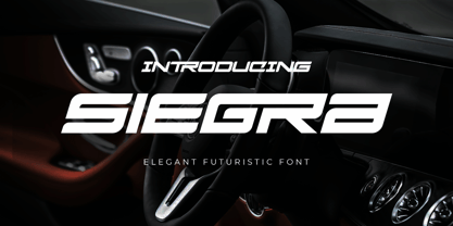 Siegra is a cool combination of powerful, sporty, automotive, elegant, and futuristic. One of kind techno font that versatile to apply in various design styles. Wide, sharp, and curvy of the letterforms that speed up your energy and get more confidently design. Siegra is suitable for posters, branding, campaign, logo, keychains, stickers, t-shirts, automotive, and many more! Completed with a lot of stylish ligatures to gives your design more power! Multilingual support and PUA encoded. Get yours! Thank you.
 - Verve by Altered Ego,
$65.00Called by some the "Archetype of the millennium", Verve is a seven-weight typeface family. It features a complete Adobe character set with kerning and fit to match. The alternate characters offer some variations on s,f,h,j,k,S,T,Y and others, plus this font has the Euro symbol. Verve is the fourth in an on-going series of condensed typefaces that I’ve been designing since 1989. My concept was to create an elegant condensed typeface that would be a "typeface for the millennium," in style and functionality. At the very core of all my designs is a typographic problem I wanted to solve, or a market niche that I think needs filled. Verve addresses both of those concerns, without copying or borrowing from its predecessors. There’s the challenge of creating a rich and interesting typeface with an austerity of line and elegance of form. I’m a minimalist by nature – but I wanted Verve to have a sensuous feel in certain respects – yet have that sensuality balanced by the uniformity of the uniform character widths. Gottfried Pott always stresses "theme and variation," and "point and counterpoint," and that’s what I’m doing in Verve. What one finds in musical composition is evident in Verve. Perfect for book covers, CD packaging, club flyers, retail packaging (especially bottles!), identity design and multimedia. The adventurous can try it in text, but it will give you a headache. The beauty of Verve is in thesize and weight variations which create a rich typographic texture in this font. - Guillermo by Homelessfonts,
$49.00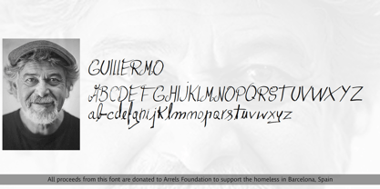 Homelessfonts is an initiative by the Arrels foundation to support, raise awareness and bring some dignity to the life of homeless people in Barcelona Spain. Each of the fonts was carefully digitized from the handwriting of different homeless people who agreed to participate in this initiative. Please Note: these fonts include only the latin alphabet; no accented characters, no numbers or punctuation. MyFonts is pleased to donate all revenue from the sales of Homelessfonts to the Arrels foundation in support of their mission to provide the homeless people in Barcelona with a path to independence with accommodations, food, social and health care. Guillermo was born in Argentina. And after crossing four continents and travelling in more than twenty countries, he still has his accent. His luck ran out on the streets of Barcelona. But despite his circumstances, he hasn’t lost a bit of his wit or articulacy. “The worst thing about the street is something that touches your heart, your brain. Not being able to have sex, not having any privacy until it leaves you empty.” On the street he follows his passion for art and writing as best he can, using old cardboard when he can’t find paper and listening to the music that comes to him. His way of thinking and expressing himself leaves people wide-eyed and open-mouthed, but even so he admits he’s a solitary man. “Solitude is an individual word. A solitary type like me can’t bring the word solitude to the whole world.”
 - Alethia Next by Pepper Type,
$40.00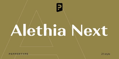 Alethia Next is a grotesque sans-serif typeface with high contrast in all weights. It has been designed to serve as a display typeface in various editorial projects, such as magazines or corporate brochures, as a sans-serif pair to serif types of modern style. Alethia Next comes in 7 weights + matching italics and upright italics, each supporting numerous Latin-based languages as well as major Cyrillic languages including Bulgarian local forms. It is packed with OpenType features like ligatures, small caps, and numerous alternatives.
 - Cardillac Text by Hoftype,
$49.00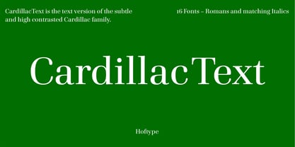 Cardillac Text is the down to earth version of the subtle and high contrasted Cardillac family. More suitable for longer text and for strong headline applications. The Cardillac Text Family consists of 16 styles, provides many features which allow its application for ambitious typography. It comes in OpenType format with extended language support. All weights contain small caps, ligatures, superior characters, proportional lining figures, tabular lining figures, proportional old style figures, lining old style figures, matching currency symbols, fraction- and scientific numerals, matching arrows and alternate characters.
 - Godfrey Sykes Initials by Celebrity Fontz,
$24.99This illustrative alphabet was inspired by the decorations of Godfrey Sykes, whose work was greatly influenced by that of Raphael and Michelangelo. This tile alphabet follows a Venetian 16th-century tradition of letters decorated with figures symbolizing each initial, a High Renaissance style. Includes one set of A-Z ornamental initials conveniently assigned to both the upper and lower case alphabet characters. Perfect for artistic publications, storybooks, fairy tales, and texts conveying the feel of the apogee of the visual arts in the Italian Renaissance. - Nazari by RodrigoTypo,
$25.00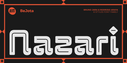 Nazari is a typeface for titles with personality, character and multiple alternatives to design. Nazarí is inspired by Arabic lettering and calligraphy, but updates its shapes through games of high contrast, geometric design and rounded terminals. The family has 4 styles: Regular, Regular Inline, Sans and Sans Inline. In turn, Nazari is divided into a basic set and an extended set. The basic set supplies all the essential characters to design any graphic piece. The extended set also contains different contextual alternatives, ligatures and swashes.
 - Brandon Printed by HVD Fonts,
$25.00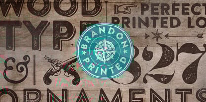 Brandon Printed is based on the famous Brandon Grotesque typeface. It has an eroded, printed look with variations of every letter by using different styles. With several different styles like a shadowed version, an inline version and a double printed version you can create a lot of lovely combinations. The Brandon Printed package also contains a set with 95 Extras like arrows, catchwords, stars, emblems numbers & lines. Brandon Printed has a high level of detail, so it may process more slowly in some applications.
 - Gazpacho by Monotype,
$29.00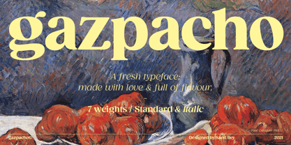 Gazpacho is inspired by the serif typefaces used in editorial media in the 70s and 80s. The morphology of the letterforms makes this typeface ideal for display purposes like logos and big, bold headlines. Also, thanks to its large x-height it works perfectly on headlines with tight leading. On the other hand, its high contrast and very simple and recognisable shapes makes it highly readable, so it works on small, long texts as well. It comes in 7 different weights and 2 styles (Standard & Italic).
 - Sommet Rounded by insigne,
$24.99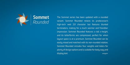 The Sommet series has been updated with a rounded variant. Sommet rounded retains its predecessor's high-tech web 2.0 character but features blunted terminators, making for a much warmer and friendlier impression. Sommet Rounded features a tall x-height, and its letterforms are compressed, perfect for when layout space is at a premium Sommet Rounded can be easily mixed and matched with its non-rounded relative. Sommet Rounded includes four weights and italics for plenty of design options and is suitable for body copy and display text.
 - Hecate by Océane Moutot,
$32.90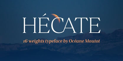 Hécate is a contemporary serif typeface designed with sharp serifs, smooth and dynamic lines and high contrast. Inspired by the Garalde style with its tilted axis, Hécate brings uniqueness and modernity to this more traditional style. Its large variety of glyphs, including accents, old-style numbers and ligatures will give you freedom for all of your projects. It offers a large choice of uses such as magazine, branding, edition and so on. Hécate is available in 16 styles from thin to black, in roman and italic.
 - Delivery Matrix AOE by Astigmatic,
$19.95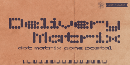 The Delivery Matrix typestyle is inspired by the high bleed stamp printing on some shipped packages I've received over the years. An extended techno dot matrix style, good for so many uses at a wide variety of sizes, even with the tight "e" and "s" characters. Do you send out packages to friends...? Do you make techno style art/flyers...? Here is a typestyle for you. Put the power of the Digital and Postal systems in your computer and at your fingertips, get Delivery Matrix today!
 - Primus by Artegra,
$19.00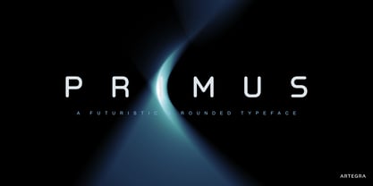 Primus has been designed to express the feelings of future, science and innovativeness while being simple and clean. It’s a geometric typeface with rounded edges, carefully designed and kerned to achieve a high visual quality that would make it a perfect typeface for any kind of use. While providing a clean and enjoyable reading when it’s used for text purposes, Primus is primarily effective as a display typeface that can be used for logotypes, brand identities, advertisements and so on, to fully reflect our era and beyond.
 - K&T Martine by K and T,
$70.00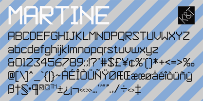 This is an angular typeface inspired by axonometric construction diagrams (for flat-pack furniture), particularly the way their lines impart a sense of 3-D space. The horizontal, vertical, and diagonal constraints of stroke direction produce interesting results in characters such as the 'R', 'S', and 'V' and contribute the mechanical appearance of this typeface. There is a high degree of repetition amongst different characters (upper and lower case) for instance the ’M’ and ‘W’ are similar and so are the ’m’ and ‘w’.
 - Upscale JNL by Jeff Levine,
$29.00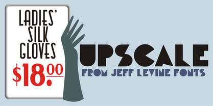 A page from an "ideas booklet" that was copyrighted in 1939 by the Sanford Ink Company displayed a hand lettered variation on the counter-less [or solid] alphabet that so typified the Art Deco style of the times. Bold, brash and beautiful, Upscale JNL evokes high-end department stores, fine millinery shops, cafeterias, night clubs and other business establishments from the Streamline era. This type of lettering style was a workhorse, and could (and still can) tackle any message with strength, clean lines and class.
 - Nursery Rhyme Initials by Celebrity Fontz,
$24.99High-quality ornamental initials superimposed on nursery rhyme backgrounds such as Humpty Dumpty, Ride a Cock Horse, Baa Baa Black Sheep, Tom Tom the Piper's Son, Rub-A-Dub-Dub, the Queen of Hearts, Old King Cole, and many others. Includes one set of A-Z ornamental initials conveniently assigned to both the upper and lower case alphabet characters. Ornate and accurate renderings that can be used for the beginning of paragraphs in any children's publication or texts relating to nursery rhymes and fairy tales. - Maine by Fenotype,
$25.00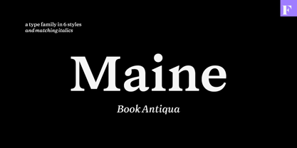 Maine is a modernized book antiqua consisting of six styles and matching italics. Maine's cuts are from Light to Extrabold, of which Regular and Slightly Bolder Book are especially suitable for longer texts. Thanks to its clear features and high x-height, Maine creates a beautiful and legible body text. Maine gives a professional, no-nonsense impression and it’s best used in editorial, books, magazines and everywhere where you can use many different styles and sizes of the same typeface. Go dignified with Maine.
 - Kwersity by Ingrimayne Type,
$12.95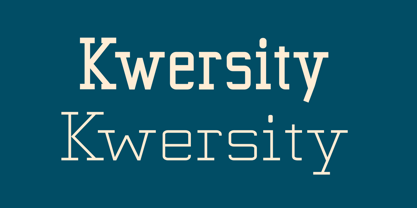 Kwersity is a boxy, geometric, slab-serifed typeface with strokes of uniform weight. Its circular elements are almost rectangular. The narrower style has a high x-height. Both the narrower and wider variants come in three weights, regular, semi-bold, and bold. (In its original, pre-2020 form, what is now semi-bold was bold. What is now bold is new as of 2020.) There is also a shadow version; Kwersity-semibold can be layered on top of it to color the interior of the letters.
 - Sierra by Linotype,
$29.99Sierra is an antiqua with a high x-height and generous, open counters. Many curves of the letters are almost right angles, which was particularly suited to the Digiset machines from Dr. Ing. Rudolf Hell, Kiel. The forms of Sierra with their flowing stroke contrast and half serifs have a calligraphic touch, which is especially highlighted in the italic weights. This is a graceful text type and its bold weights look almost like woodcuts. Sierra is an excellent choice for both texts and headlines. - Hinnual by Jipatype,
$27.00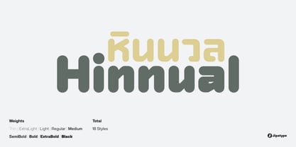 Hinnual เป็นฟอนต์ที่ผสมผสานระหว่างรูปทรงสี่เหลี่ยมและทรงกลมเพื่อสร้างสไตล์ที่ไม่เหมือนใคร ชื่อมาจากคำไทย 2 คำ คือ Hin แปลว่า หิน และ Nual แปลว่า อ่อน ผสมผสานองค์ประกอบที่แข็งและอ่อนนี้สะท้อนให้เห็นในแบบอักษร ซึ่งมีเส้นที่สะอาดตาและเส้นคมซึ่งถูกทำให้อ่อนลงด้วยมุมโค้งมน ฟอนต์มีให้เลือกถึง 18 แบบ มีตัวเลือกหลากหลายให้คุณได้เลือกใช้ Hinnual เหมาะอย่างยิ่งสำหรับใช้ในพาดหัวและพาดหัวย่อย ซึ่งลักษณะที่โดดเด่นสามารถช่วยดึงดูดความสนใจของผู้อ่านได้ เส้นสายที่สะอาดตาและสไตล์ที่เป็นเอกลักษณ์ยังทำให้เป็นตัวเลือกที่ยอดเยี่ยมสำหรับแบรนด์ โลโก้ และงานออกแบบอื่นๆ ที่ต้องการภาพลักษณ์ที่น่าจดจำ โดยรวมแล้ว Hinnual เป็นฟอนต์อเนกประสงค์และสะดุดตาที่ผสมผสานองค์ประกอบทั้งความแข็งแกร่งและความนุ่มนวล การออกแบบที่เป็นเอกลักษณ์ทำให้เป็นตัวเลือกที่ยอดเยี่ยมสำหรับนักออกแบบที่ต้องการสร้างผลงานที่น่าจดจำ Hinnual is a font that combines the square and rounded shapes to create a unique visual style. Its name comes from two Thai words - Hin, which means stone, and Nual, which means soft. This juxtaposition of hard and soft elements is reflected in the font's design, which features clean, sharp lines softened by rounded corners. The font comes in 18 styles, providing a range of options for designers to choose from. Hinnual is particularly well-suited for use in headlines and sub-headlines, where its bold and distinctive appearance can help to grab the reader's attention. Its clean lines and unique style also make it a great choice for branding projects, logos, and other design elements that require a memorable. Overall, Hinnual is a versatile and eye-catching font that combines elements of both strength and softness. Its unique design make it an excellent choice for designers looking to create impactful visual content.
 - Porkshop by Chank,
$99.00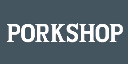 Porkshop is a font of retro vintage flavor with a hefty dose of immigrant-influenced naive typography. It's fundamentally inspired by an old-but-still-prominent "Pork Shop" sign in Manhattan. I like to think that this font was made by a signmaker's apprentice who didn't yet have a grasp on the subtleties of elegant letterforms, but put his gusto into perfectly sharp serifs. While pointy little serifs are cool, the real shine of this font comes from the imaginative combination of uppercase and lowercase shapes. This unique mixture in the lowercase reminds me of an indeterminate European accent in the big city. Big and strong and easy to understand. Best rendered in 3-foot tall metal type, Porkshop works well in print and on screens, too. The Bolds and Italics are brand new in 2011.
 - Bona Nova by Borutta Group,
$-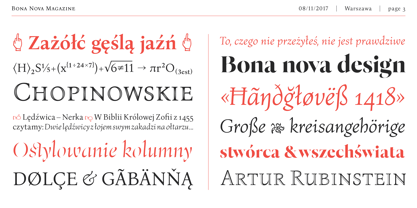 ☞ Bona Nova is a collective revival project of Bona typeface designed in 1971 by the author of polish banknotes Andrzej Heidrich. Besides giving the project a digital font form the aim was to expand the base character set: preparation of small caps, designing the alternative glyphs and multiple opentype features. Working together with the author we designed two new text versions: regular and bold – to give the family a form of a classic script triad. ☞ It is accompanied by three title versions and three contour styles under the name of Bona Sforza. All styles contains over 1200 glyphs. ☞ Bona Nova is an unprecedented typographic adventure for our team. We hope that our work will allow the cultural heritage of Bona and the work of Andrzeja Heidricha to gain new followers and fans. This project connected three generations of graphic designers who graduated the same school – the Academy of Fine Arts in Warsaw. ☞ Bona Nova isn’t only a typeface. We have also prepared a book about the project (including an interview with Andrzej Heidrich, my text about the digitalisation and a font specimen). The Bona Nova release party was a big exhibition (over 1000 guests). I’ve invited 26 graphic designers to prepare their own initials of Bona Nova – they were presented as posters on exhibition too. LINKS Bona Nova WEB Bona Nova FP Bona-Nova-(FREE-FONT) Bona Nova Book BONA NOVA IN THE MEDIA Typeroom Typography Guru Slanted Designalley Stgu Typografie Info Wikipedia Bona Nova is a non-profit project, all founds that we raise we reinvest to develop the Bona Nova project (new styles, Cyrillic & Greek, extend character set).
 - Sagor by Cihangir Öziş,
$15.00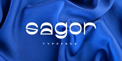 Sagor, designed by Cihangir Öziş in 2019, is a modern font that adds a different flavour to your works with its cool look and unique details. Sagor is suitable for fashion, branding, packaging and editorial uses. It is an excellent choice for short sentences, big hero titles, unique logo fonts, in particular. It can also be used to add a new look to historic design structures. Sagor is particularly elegant and assertive, especially in lowercase letters. Features: Latin Basic Latin Western European South Eastern European Uppercase Lowercase Numbers - Decimal Digits Standart Punctuation Standart Ligatures Alternate for "a" Letter Symbols - Currency, Basic Math, Arrows
 - Easy Headline by Dumadi,
$25.00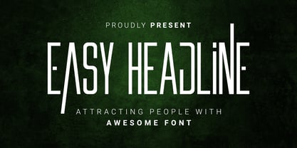 Hello Designers! Are you ready to make your Designs rock the world? If so, we know the right solution. Now comes the Easy Headline font ready to use for your best projects. Easy Headline is equipped with Uppercase Letters, Lowercase Letters made with unique and cool shapes, Numbers, and Multilingual Support. This font is made for any professional branding project, Great for creating titles, Movie titles, Event titles, Social media titles, Book cover titles, Poster titles, branding, posters, Each letter has a unique and beautiful touch. You can see the sample preview above for comparison, stay the center of attention and classy!
 - Italix by Punch,
$45.00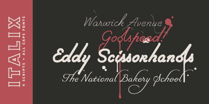 Italix is an easygoing font family with mainly 4 script styles (Fineliner, Brushpen, Marker & Fatstick) and 7 supportive AllCaps fonts. Each script has its own unique personality, and come with optional ink splatters. These are attached to several ligatures, so don’t forget to activate the “OpenType Features” and the “World Ready Composer” in the application settings. The cool thing about Italix is that you can have a lot of creative fun with it, and its multiple features. Brushpen has a more classic look, Fineliner is a bit quirky, Marker is the chill one, and Fatstick is a total badass!
 - Spitting Image by preussTYPE,
$25.00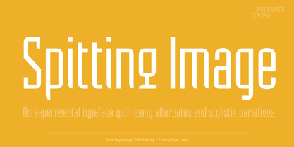 SpittingImage is a font which speaks of mechanical exactness, cool and reserved. The SpittingImage font family is formed by two different weights (regular and bold), each one with uppercase and lowercase letters, numbers, punctuation marks and diacritic characters in regular and italic. The outline version included as a part of OpenType-Feature. There are in all styles numerous ligatures, alternate characters, small caps, and different sets of numbers that you can put both headlines and short texts without any problems. OpenType features: contains over 1.000 Glyhps Central European Glyhps Standard Ligatures Small Capitals Stylistic Alternates Discretionary Ligatures OldStyle Figures Ordinals Slashed Zero Feature
 - Hapsary by Allouse Studio,
$16.00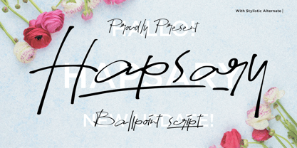 Proudly Presenting, Hapsary a Ballpoint Script Font. Hapsary come along with Ligatures, Underline Styles, and Multilingual-Support which will fulfill your need and give cool impression for you. We highly recommend using a program that supports OpenType features and Glyphs panels like many of Adobe apps and Corel Draw, so you can see and access all Glyph variations. Hapsary is perfect for any tittle, product packaging, branding project, megazine, social media, wedding, or just used to express words above the background. Enjoy the font, feel free to comment or feedback, send me PM or email. Thank You!
 - Line Art Eclectrice Aligned by DJ THINK,
$95.00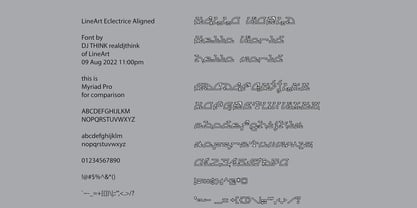 Thanks for checking out LineArt ECLECTRICE (pronounced EHCK-LEHCK-TREES) Light Aligned font by Rene Toussaint (otherwise known as DJ THINK) of LineArt Foundry and Brand. This font is designed in the vein of graffiti art with stylings of hip-hop and hieroglyphic appearance. Try it in a preview window and check out if it will meet your needs for something cool and hip for your next flyer design or other type of graphic art image. Keep in mind that this is a light design and may require extra thickening in your vector program of choice with outline thickness options.
 - My Darling by Type Innovations,
$39.00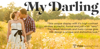 ‘My Darling’ is a stunning new typeface by Alex Kaczun. Inspired by the Didone shapes, ‘My Darling’ incorporates some Didot, a little Caslon, a splash of Scotch and a pinch of old Times. This unique display, with its high-contrast strokes is playful, formal and just a bit ‘sexy’. The swash capital terminals and lively curves, give this design a unique and distinctive look. It works well as a headline font, and because it was designed with generous counters, proportions and spacing—works equally well over a large range of text point sizes. My Darlings' character set supports most Central European and many Eastern European languages. Alex hopes to add many style variations, along with alternate glyph sets and weights to further enhance this offering. Stay tuned!
 - Garvo by BeJota,
$25.00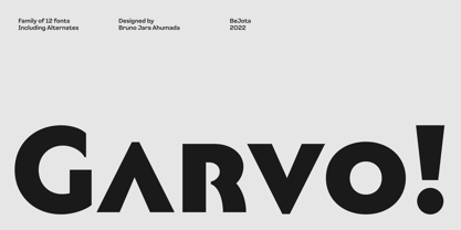 Garvo is based on old Hollywood movie posters, vintage film credit designs and pays homage to Herb Lubalin's Serif Gothic font & lettering. This is why Garvo is named after the acclaimed international actress Greta Garbo. The Garvo family comes in 6 weights (from Thin to Black) and includes 2 different subfamilies: Garvo and Garvo Poster. Garvo is perfect for short readable texts, such as advertising and packaging designs, while Garvo Poster brings a wide range of contextual alternatives which makes it perfect for high impact pieces. Both styles increase the overall family flavor with discretionary ligatures, small caps figures. The 12 styles of Garvo are perfectly well suited for branding projects, album covers, audiovisual related designs, magazines and layouts, among other uses.
 - Welland by Factory738,
$15.00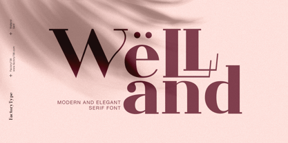 Welland is a modern and elegant serif font family. The combination of modern and vintage elements renders an elegant design. The variety of weights provide a range of choices that will help you find the best typographic colour for your project. Lighter weights are well-suited for body text while heavier ones are ideal for high impact headlines. The available stylistic Ligature and Alternate offer a number of different characters that give your project design or logo a unique look. 5 Weights (Light, Regular, Semibold, Bold, Black) Basic Latin A-Z and a-z Numerals & Punctuation Stylistic Alternates & Ligatures Multilingual Support for ä ö ü Ä Ö Ü ... OTF file format Free updates and feature additions Thanks for looking, and I hope you enjoy it.
 - Bisco Condensed by Galapagos,
$39.00Bisco Condensed is a small capital design inspired by hand lettered memorial wall art from the Harlem section of New York City. As a memorial, this design is dedicated to a type design colleague who lost his long battle with cancer. This font is a tribute to his strength and his liveliness. The original idea for Bisco Condensed was to capture the energy of those unique "streetforms" in a text/display design and encapsulate them into a lively & fluid type design with a high level of readability at all point sizes. Bisco Condensed is an excellent type for expressive display layouts. It works well as an independent design or a long with contemporary sans serifs that complement Bisco's irregular contours, weighting and bounce. - Restgold by Great Studio,
$25.00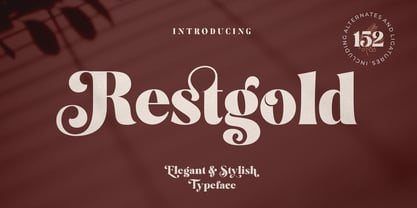 Restgold is modern retro display typeface, featuring a high-contrast design to create elegant, original and expressive characters. It is useful for many purposes, from branding projects, logo, wedding designs, advertisements, product packaging, product designs, labels, photography, posters, invitations, stationery, and much more. Restgold is a serif typeface that is suitable for classy branding and editorial designs. Alternative versions include swash and more than 350+ glyphs and 16 ligatures, allowing for more stylized designs. What's Included: • Character set A-Z • Uppercase & Lowercase • Numerals & Punctuation • 136 Stylistic alternates & 16 Ligatures • Accented Characters (West Europe) • Recommended to use in Adobe Photoshop or Adobe Illustrator. I hope you enjoy this font. If you have questions, don't hesitate to give me a message :) Cheers! Great Studio
 - Beach Holiday by Gian Studio,
$12.00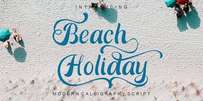 Beace Holiday is an elegant calligraphy luxury font that comes with a very beautiful character change, a kind of classic decorative script with a modern touch, designed with high detail to present an elegant style. Beace Holiday is attractive because the typeface is pleasing to the eye, clean, feminine, sensual, glamorous, simple and very easy to read, thanks to its many extravagant letter relationships. I also offer a decent number of stylistic alternatives for some of the letters. Classic style is very suitable to be applied in various formal forms such as invitations, labels, restaurant menus, logos, fashion, make up, stationery, novels, magazines, books, greeting/wedding cards, packaging, labels or all kinds of advertising purposes. and much more. .. Thanks & Happy Designing!
 - Renata by Laura Worthington,
$25.00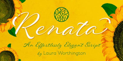 Both casual and upscale, Renata features inviting. languorous letterforms, stroked by the hand of an experienced calligrapher with a small brush-tipped pen. Renata is quite readable thanks to its high x-height and spacious connecting strokes. It also looks exceptionally natural – every lowercase letter includes an alternate of each letter and a beginning, ending, and an “isolated” form (useful for settings like “mar y sol,” “o sole mio”; lettered lists; and creative uses like wordmarks). Renata features 119 swashes for a custom look and feel. See what’s included! http://bit.ly/2fQYX6B This font has been specially coded for access of all the swashes, alternates and ornaments without the need for professional design software! Info and instructions here: http://lauraworthingtontype.com/faqs/
 - Leonard by Fenotype,
$25.00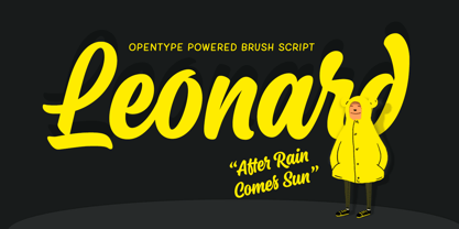 Leonard is a bold brush script with strong character. Leonard has low contrast, smooth letterforms and high x-height. It’s great for single words or longer text passages; use it in logos or headlines, in packaging, posters, illustrations or product design. Leonard is packed with OpenType features. It has Contextual Alternates and Standard Ligatures that help to maintain the flow and keep the letters from colliding. These features are automatically on. In addition it has Discretionary Ligatures, Swash, Stylistic and Titling Alternates that you can access from OpenType controls for more custom look, and you can check the Glyphs palette for even more alternates from the total 534 glyphs. All characters shown in the posters can be found inside the font.
 - Kolligio by Khaiuns,
$18.00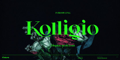 Proud to Introduce you a Kolligio — classic serif full of modern mood, with ligatures, special alternative glyphs and old style. The high contrast between thick and thin strokes gives Kolligio so stylish look and is ideal for headlines, headers, logos, labels, packaging, postcards, presentations, magazines, invitations, etc _______________________________________________________________________________________ Kolligio has more than 60 upper and lower case ligatures, and for alternative letters (K, L, b, d, o, p and q) simply add plus after the letter. _______________________________________________________________________________________ Please message me if you want your language included or If there are any features or glyph requests, feel free to send me a message, I would like to update it. _______________________________________________________________________________________ I hope you have a blast using Kolligio. _______________________________________________________________________________________ Thanks for use this font ~ Khaiuns
 - Elephantmen by Comicraft,
$19.00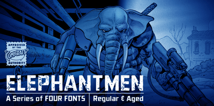 Worn and torn, dry and cracked, resistant to wind and rain... the skin of the elephant is a thing of dry beauty and ancient wisdom... During the gold rush, the phrase “Seeing the elephant” became synonymous with the high cost of each prospector’s dreams and hopes --- not only the prospect of wealth beyond the dreams of avarice in California but also the possibilities of encountering misfortune on the journey. Like the circus elephant, gold was an exotic sight, and seeking it was an unequalled experience, the adventure of a lifetime. Now we've created a font much like the skin of an Elephant and Adventure, Excitement and Really Wild Things are available in the pages of the comic book of the same name, Elephantmen.
 - King Sans by Factory738,
$15.00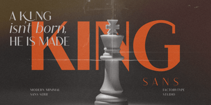 King Sans is a stylish sans serif font family. The mix of modern and vintage elements results in an elegant design. The different weights offer a variety of options to help you find the best typographic color for your project. Lighter weights are ideal for body text, while heavier weights are best for high-impact headlines. The available stylistic Ligature provide a variety of different characters that give your project design or logo an unique shape. 5 Weights (Light, Regular, Semibold, Bold, Black) 2 Styles (Regular and Italic) Basic Latin A-Z and a-z Numerals & Punctuation Stylistic Ligatures Multilingual Support for ä ö ü Ä Ö Ü ... Free updates and feature additions Thanks for looking, and I hope you enjoy it.
 - Silian Calligraphy by Mans Greback,
$49.00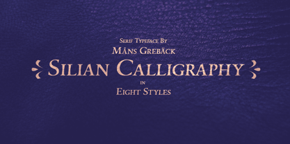 Silian Calligraphy is a sharp serif typeface. With classy letterforms and an organic appearance, this calligraphic lettering has a proper look, yet a vivid personality. Use [ ] { } for decorative elements. Example: [Silian Calligraphy] The Silian Calligraphy typeface family consists of eight high-quality styles: Light, Regular, Bold and Black, and each style as Italic. The font is built with advanced OpenType functionality and has a guaranteed top-notch quality, containing stylistic and contextual alternates, ligatures and more features; all to give you full control and customizability. It has extensive lingual support, covering all Latin-based languages, from North Europe to South Africa, from America to South-East Asia. It contains all characters and symbols you'll ever need, including all punctuation and numbers.