10,000 search results
(0.041 seconds)
- Nutshell by Gassstype,
$25.00 Hello Everyone, introduce our new product font Nutshell is a Natural Handwritten Brush Font with a natural style and dramatic movement. Crafted manually with love and passion, This font is great for your next creative project such as logos, printed quotes, invitations, cards, product packaging, headers, Logotype, Letterhead, Poster, Label, and etc. Every glyphs are made with Procreate. Then trace down into a vector format, and carefully crafted into a typeface. That is why Nutshell has textured,cool, authentic and strong characteristic more natural look.
 - Craw Modern by GroupType,
$19.00 Craw Modern was designed by Freeman Craw in 1958 and first released by The American Typefounders Company, (ATF). In typography, 'Modern' is a style of typeface (classification) developed in the late 18th century that continued through much of the 19th century. Characterized by high contrast between thick and thin strokes and flat serifs. Bodoni is among the most popular of the Moderns. Moderns are also known as Didone and New Antiqua.
 - Delvona by Great Studio,
$19.00 Delvona is a contemporary serif typeface, retro styled with a strong personality and a soft look. And also its high contrast and very simple and easily recognizable shape make it very easy to read. Delvona was inspired by the serif typography used in editorial headlines in the 80s. Delvona excels in display settings such as headlines, titles, branding projects, Logo design, packaging, magazine titles, advertisements, short or long text.
 - ALS Bingley by Art. Lebedev Studio,
$63.00 Bingley is a beautifully old-fashioned, proper, and full of class body typeface. The British feel of this face comes from its inspirational source—a tombstone script from Oxford. The characters are squat and nearly square in proportions, even cursive comes with a pronounced breadth. Generous counters and pleasant stroke weight contrast ensure high legibility of any text set in Bingley. Pronounced serifs and drop-shaped terminals further enrich the experience.
 - Valibuk by Juraj Chrastina,
$39.00 Valibuk is a compact clean typeface for headlines and short text. No details are small and it’s a bunch of details that make Valibuk as it is. It’s a heavy, condensed face with a high x-height and tight spacing and that’s why Valibuk can write loud. The quality of the spacing and kerning is ensured by Igino Marini. Lomidrevo is a grunge stencil family derived from Valibuk.
 - Neckar by BeJota,
$26.00 Neckar takes its name from the German river. Its rounded corners and classic geometric proportions ensure that your graphic piece will stand out. The Neckar family is available in 6 weights ranging from Thin to Black, and includes 2 different subfamilies: Neckar and Neckar Poster. In addition, thanks to the "inline" version, Neckar is ideal for designing high-impact graphic pieces. Neckar includes small caps figures (symbols, letters and numbers).
 - Triz by Typeóca,
$30.00 Triz is a high-contrast monospaced sans-serif, bringing together a typewriter rhythm and a fashion magazine look. With 5 different weights and 3 different contrast variations, Triz shines on both footnotes and headlines. With more than 1.000 glyphs, the Triz has an extensive language support and a lot of features, like its distinctive 'thin' alternates for diacritics, symbols and punctuation, small caps, arrows, manicules and much more.
 - TCF Plana by TypeCult Foundry,
$22.00 Very thin fluid strokes and high speed letters form this casual script entitled TCF Plana. TCF Plana is elegant and functional, expressive yet harmonious, with more bounce and irregularity of rhythm than usual formal script typefaces. TCF Plana was executed with a ball-point pen and then digitised so it would convincingly mimic handwriting by using a plethora of contextual alternates which makes the words look much more natural and beautiful.
 - Silk Serif by SilkType,
$47.50 Silk Serif is a high-contrast typeface with thin, pointy, heavily bracketed serifs, and ball terminals in the appropriate places, as well as bracketed junctions in various letterforms. The main feature of the typeface is the disconnection between the bowls and the stems. However, the bowl is very close to the stem, creating the illusion of connection. Silk is delicate and legible — but above all, it is sophisticated.
 - Fields by Adam Ladd,
$25.00 Fields is a versatile, soft serif family blending casual, retro tones with modern vibes. Details like rounded serifs, teardrop terminals, and subtle tails make this typeface friendly and approachable. Drawing inspiration from familiar classics such as Cooper and Souvenir, Fields is a contemporary expression of this style. Fields exudes pleasant, plumper characters with its medium contrast, while the high contrast in the Fields Display family presents something more fashionable and sophisticated.
 - Torah by Masterfont,
$59.00 Based on ancient scribal texts, useful for Jewish education. Useful at text sizes and large scale applications. Bold, high contrast typeface. Pro version- Excellent support for Niqqud (Vowels). All marks are programmed to fit each letter's shape and width. Best used with apps that support right to left Hebrew text, like Adobe InDesign CC or MS Word. Please check these advanced features in this link: https://tinyurl.com/ybgdsxme
 - Acosta by Zane Studio,
$18.00 Acosta is a serif typeface with high contrast and a refreshing look. From sheer to black with italics, Acosta offers many possibilities for application in many graphic or editorial projects. The lighter weight is suitable for short paragraphs, and the heavier weight is suitable for headlines, perfect for display purposes such as branding, book covers, and web titles. Acosta is also available latin character set which supports latin based languages.
 - Scootchy by Typogama,
$19.00 Scootchy is a high contrast, narrow typeface destined for use in both large and small point sizes. Blending an industrial and humanist approach, this typeface includes four weights ranging from a slender, regular style to a dark and contrasted Black weight. With an Extended Latin character set and a wide range of Opentype features, Scootchy aims to provide a versatile solution that can be applied to a wide range of layouts.
 - Quiche Flare by Adam Ladd,
$25.00 Quiche Flare is a high-contrast, flared serif typeface featuring foxtail ball terminals, swash capitals, and geometric proportions. With weights ranging from Thin to Black with matching italics, it’s useful for a variety of display applications across products, packaging, labels, invitations, stationery, fashion, etc. The design exhibits both elegance and a touch of whimsy with the foxtail terminals and the flared serifs add more interest, beauty, and movement to the characters.
 - Taku by Thinkdust,
$10.00 Taku comes in two styles, Taku regular and Taku Solid. As one of the most creative faces to date, this is a beautiful piece aimed at a whole range of markets for print and digital work. Super creative, extremely eye catching, and almost obsessively accurate. Taku is a typographers dream, over 300 hours of work on aesthetics and technical details, so you can expect the most high quality typeface around.
 - Fluidum by Monotype,
$29.99 Aldo Novarese designed the Fluidum typeface in 1951. As its name implies, the design is very fluid. This high contrast script face curls and twists across the line. It is sort of a cross between Giambattista Bodoni's cursive letters, and Aldo Novarese's later, heavier designs, like Microgramma, Eurostile, and Sprint. Fludium should be set in very large pint sizes. It is perfect for invitations, greeting cards, and fine logos.
 - Blauth by Latinotype,
$29.00 Blauth—a versatile and contemporary sans serif typeface—comes in 8 weights, ranging from Thin to Black, with matching italics and contains a set of alternate characters. Its small x-height gives it an elegant feel that reminds us of classic typefaces. Blauth is well-suited to continuous text and its uppercase set is ideal for high-impact headlines while its softened corners give your designs a warm and contemporary look.
 - Angro by Linotype,
$29.99 The sans serif Angro was designed in the weights light and bold by Erwin Koch. The figures are based on the form of a rectangle which along with the high xheight and short ascenders and descenders gives the forms a static character. Lines of text in Angro are very compact and close set. Due to the reserved ascenders and descenders Angro can be set with very close line spacing.
 - Quiche Sans by Adam Ladd,
$25.00 Quiche Sans is a high-contrast, sans serif with monoline stroke endings, angled stems, and geometric proportions. A sibling to the Quiche family, with the ball terminal endings removed. The design is influenced by the serif didone genre, characterized by its elegance and extreme thick/thins, but it removes the serifs for a unique and modern expression and tapers out the stroke endings for a sophisticated monoline appearance.
 - Bilcase by Ilham Herry,
$20.00 The Bilcase font family is a layered condensed font family that comes from vintage logos, labels, packages, and signage. This collection of styles has 5 type layers and vintage scrolls, panels, and ornaments. Combine these to create label designs, headlines, logotypes, signage, posters, greeting cards, letterheads, T-shirts... the applications are endless. This font family is available in 2 styles. Bilcase has font layers with contextual, stylistic alternates and ligatures. You will get special capital letters when you activate the contextual alternate feature. Bilcase Extras is the expanded version of the main font with panels, ribbons, and ornaments. You can access the ornaments by activating the ligature feature. Type the letter “p” for the panel, “r” for ribbon and “o” for ornament and add numbers to each code, e.g. “p1, p2, p11, r2, o2”. Complete information is in the pdf file. http://bit.ly/2OClGjY. You can also try it in the font tester below.
 - Baskerville by Linotype,
$40.99John Baskerville (1706-1775) was an accomplished writing master and printer from Birmingham, England. He was the designer of several types, punchcut by John Handy, which are the basis for the fonts that bear the name Baskerville today. The excellent quality of his printing influenced such famous printers as Didot in France and Bodoni in Italy. Though he was known internationally as an innovator of technique and style, his high standards for paper and ink quality made it difficult for him to compete with local commercial printers. However, his fellow Englishmen imitated his types, and in 1768, Isaac Moore punchcut a version of Baskerville's letterforms for the Fry Foundry. Baskerville produced a masterpiece folio Bible for Cambridge University, and today, his types are considered to be fine representations of eighteenth century rationalism and neoclassicism. Legible and eminently dignified, Baskerville makes an excellent text typeface; and its sharp, high-contrast forms make it suitable for elegant advertising pieces as well. The Linotype portfolio offers many versions of this design: ITC New Baskerville® was designed by John Quaranda in 1978. Baskerville Cyrillic was designed by the Linotype Design Studio. Baskerville Greek was designed by Matthew Carter in 1978. Baskerville™ Classico was designed by Franko Luin in 1995." - Hex Braille by Echopraxium,
$5.62 The purpose of this monospace font is to display braille in an original although rather steganographic way. Its glyphs are built from a flat hexagon which can be read as 3 rows of 2 vertices (i.e. regular braille glyph grid). The initial design is illustrated by glyphs 'ç' (no dot) and 'û' (6 dots) as shown by poster 5. Glyphs are connected to each other, thus 6 connections for each hexagon (2 on left/right and 4 on top/bottom). In the final design many diagonal segments of the hexagon were removed for esthetical reason. Text is displayed not as a honeycomb but as a lattice instead which mixes hexagons, squares and "irregular convex octagons" (mostly unclosed), the design favored squares over octagons. The whole slightly resembling a PCB. Text can be framed with 3 sets of Frame glyphs (as shown in Poster 4): Octagonal: { €, °, £, µ, §, ¥, ~, ¢ } which can be mixed with Rectangular High Rectangular Low: { è, é, ê, ï, î, à, â, ä } Rectangular High: { Â, ù, Ä, Ê, Ë, ô, õ, ë } which can be mixed with Octagonal NB: When using Frame glyphs, it is advised to show Pilcrow (¶) and Non Breaking Space, which are replaced by empty shapes (e.g. in Microsoft Word, use CTRL+8 or use [¶] button in the ribbon).
 - Baskerville Classico by Linotype,
$29.99John Baskerville (1706-1775) was an accomplished writing master and printer from Birmingham, England. He was the designer of several types, punchcut by John Handy, which are the basis for the fonts that bear the name Baskerville today. The excellent quality of his printing influenced such famous printers as Didot in France and Bodoni in Italy. Though he was known internationally as an innovator of technique and style, his high standards for paper and ink quality made it difficult for him to compete with local commercial printers. However, his fellow Englishmen imitated his types, and in 1768, Isaac Moore punchcut a version of Baskerville's letterforms for the Fry Foundry. Baskerville produced a masterpiece folio Bible for Cambridge University, and today, his types are considered to be fine representations of eighteenth century rationalism and neoclassicism. Legible and eminently dignified, Baskerville makes an excellent text typeface; and its sharp, high-contrast forms make it suitable for elegant advertising pieces as well. The Linotype portfolio offers many versions of this design: ITC New Baskerville® was designed by John Quaranda in 1978. Baskerville Cyrillic was designed by the Linotype Design Studio. Baskerville Greek was designed by Matthew Carter in 1978. Baskerville™ Classico was designed by Franko Luin in 1995." - Baskerville LT by Linotype,
$40.99 John Baskerville (1706-1775) was an accomplished writing master and printer from Birmingham, England. He was the designer of several types, punchcut by John Handy, which are the basis for the fonts that bear the name Baskerville today. The excellent quality of his printing influenced such famous printers as Didot in France and Bodoni in Italy. Though he was known internationally as an innovator of technique and style, his high standards for paper and ink quality made it difficult for him to compete with local commercial printers. However, his fellow Englishmen imitated his types, and in 1768, Isaac Moore punchcut a version of Baskerville's letterforms for the Fry Foundry. Baskerville produced a masterpiece folio Bible for Cambridge University, and today, his types are considered to be fine representations of eighteenth century rationalism and neoclassicism. Legible and eminently dignified, Baskerville makes an excellent text typeface; and its sharp, high-contrast forms make it suitable for elegant advertising pieces as well. The Linotype portfolio offers many versions of this design: ITC New Baskerville® was designed by John Quaranda in 1978. Baskerville Cyrillic was designed by the Linotype Design Studio. Baskerville Greek was designed by Matthew Carter in 1978. Baskerville™ Classico was designed by Franko Luin in 1995."
 - Monotype Baskerville by Monotype,
$29.99 John Baskerville (1706-1775) was an accomplished writing master and printer from Birmingham, England. He was the designer of several types, punchcut by John Handy, which are the basis for the fonts that bear the name Baskerville today. The excellent quality of his printing influenced such famous printers as Didot in France and Bodoni in Italy. Though he was known internationally as an innovator of technique and style, his high standards for paper and ink quality made it difficult for him to compete with local commercial printers. However, his fellow Englishmen imitated his types, and in 1768, Isaac Moore punchcut a version of Baskerville's letterforms for the Fry Foundry. Baskerville produced a masterpiece folio Bible for Cambridge University, and today, his types are considered to be fine representations of eighteenth century rationalism and neoclassicism. Legible and eminently dignified, Baskerville makes an excellent text typeface; and its sharp, high-contrast forms make it suitable for elegant advertising pieces as well. The Linotype portfolio offers many versions of this design: ITC New Baskerville® was designed by John Quaranda in 1978. Baskerville Cyrillic was designed by the Linotype Design Studio. Baskerville Greek was designed by Matthew Carter in 1978. Baskerville™ Classico was designed by Franko Luin in 1995."
 - Baskerville LT Cyrilic by Linotype,
$29.99John Baskerville (1706-1775) was an accomplished writing master and printer from Birmingham, England. He was the designer of several types, punchcut by John Handy, which are the basis for the fonts that bear the name Baskerville today. The excellent quality of his printing influenced such famous printers as Didot in France and Bodoni in Italy. Though he was known internationally as an innovator of technique and style, his high standards for paper and ink quality made it difficult for him to compete with local commercial printers. However, his fellow Englishmen imitated his types, and in 1768, Isaac Moore punchcut a version of Baskerville's letterforms for the Fry Foundry. Baskerville produced a masterpiece folio Bible for Cambridge University, and today, his types are considered to be fine representations of eighteenth century rationalism and neoclassicism. Legible and eminently dignified, Baskerville makes an excellent text typeface; and its sharp, high-contrast forms make it suitable for elegant advertising pieces as well. The Linotype portfolio offers many versions of this design: ITC New Baskerville® was designed by John Quaranda in 1978. Baskerville Cyrillic was designed by the Linotype Design Studio. Baskerville Greek was designed by Matthew Carter in 1978. Baskerville™ Classico was designed by Franko Luin in 1995." - VLNL Bonen by VetteLetters,
$30.00 While sketching for a music project logo, Donald DBXL Beekman looked at several wood type alphabets as a starting poing. One of these was No.120, patented in 1880 by William Hamilton Page. With its distinct diagonally cut serifs and round shapes cut off at top and bottom, it bore just the right feel for the project. DBXL digitized the alphabet, adding all characters needed for a full set. During this process all shapes were widened, tweaked and streamlined to enhance consistency and rhythm along the whole font. VLNL Bonen is an all-caps display font with a very specific western cowboy or circus look. For instance burger or barbecue grill restaurants would do well with this one. We can easily see it shine on a festival flyer or poster as well, and not just country & western festivals. VLNL Bonen is suitable for any ‘big’ use that needs to stand out of the crowd. Bonen is the Dutch word for beans, a world wide source of nutrition and proteins it comes in a multitude of shapes, colours and sizes. Beans are also the most eaten foods in a cowboy’s diet along the trail. Available in abundance and easily preserved and transported, many recipes on the cattle drives in the American Wild West used beans. Think of chili, mashed beans with biscuits and bean soups. “Keep them doggies movin’, cowboy!”
 - Octin Stencil by Typodermic,
$11.95 In the world of graphic design, the selection of a typeface can often make or break a design. A font can evoke a range of emotions and set the tone for the entire piece. The Octin Stencil typeface is no exception. This font boasts a brawny and robust design, making it the perfect choice for designs that demand strength and resilience. With 7 weights to choose from, including light, book, regular, semi-bold, heavy, and black, the Octin Stencil typeface provides designers with an impressive range of options. Whether your design needs to convey a sense of authority or exude a no-nonsense attitude, Octin Stencil has you covered. This typeface is particularly well-suited for designs that require a tough, no-frills approach. Police, sports, prison, construction, school, or military themes can all benefit from the bold and commanding presence of Octin Stencil. Its stencil style and sturdy construction give the letters a sense of fortitude that is sure to grab attention and command respect. In summary, if you are looking for a typeface that exudes power and strength, Octin Stencil is the clear choice. Its burly and powerful design will make your message stand out and leave a lasting impression on your audience. Check out the rest of the Octin families: Octin Sports, Octin College, Octin Prison, Octin Vintage & Octin Spraypaint. Most Latin-based European writing systems are supported, including the following languages. Afaan Oromo, Afar, Afrikaans, Albanian, Alsatian, Aromanian, Aymara, Bashkir (Latin), Basque, Belarusian (Latin), Bemba, Bikol, Bosnian, Breton, Cape Verdean, Creole, Catalan, Cebuano, Chamorro, Chavacano, Chichewa, Crimean Tatar (Latin), Croatian, Czech, Danish, Dawan, Dholuo, Dutch, English, Estonian, Faroese, Fijian, Filipino, Finnish, French, Frisian, Friulian, Gagauz (Latin), Galician, Ganda, Genoese, German, Greenlandic, Guadeloupean Creole, Haitian Creole, Hawaiian, Hiligaynon, Hungarian, Icelandic, Ilocano, Indonesian, Irish, Italian, Jamaican, Kaqchikel, Karakalpak (Latin), Kashubian, Kikongo, Kinyarwanda, Kirundi, Kurdish (Latin), Latvian, Lithuanian, Lombard, Low Saxon, Luxembourgish, Maasai, Makhuwa, Malay, Maltese, Māori, Moldovan, Montenegrin, Ndebele, Neapolitan, Norwegian, Novial, Occitan, Ossetian (Latin), Papiamento, Piedmontese, Polish, Portuguese, Quechua, Rarotongan, Romanian, Romansh, Sami, Sango, Saramaccan, Sardinian, Scottish Gaelic, Serbian (Latin), Shona, Sicilian, Silesian, Slovak, Slovenian, Somali, Sorbian, Sotho, Spanish, Swahili, Swazi, Swedish, Tagalog, Tahitian, Tetum, Tongan, Tshiluba, Tsonga, Tswana, Tumbuka, Turkish, Turkmen (Latin), Tuvaluan, Uzbek (Latin), Venetian, Vepsian, Võro, Walloon, Waray-Waray, Wayuu, Welsh, Wolof, Xhosa, Yapese, Zapotec Zulu and Zuni.
 - Summer Glasses by Arendxstudio,
$15.00 Summer Glasses - Cool Handwritten with sharp and beautiful letters that create fonts that are modern, trendy and elegant. Came with opentype features such stylistic alternates, stylistic sets & ligatures good for logotype, poster, badge, book cover, tshirt design, packaging and any more. Features : • Character Set A-Z • Numerals & Punctuations (OpenType Standard) • Accents (Multilingual characters) • Ligature • Alternate There it is! I really hope you enjoy it
 - Toot Sweet Bistro NF by Nick's Fonts,
$10.00A 1928 poster for a café by German artist Karl Bauer informed the creation of this charming and expansive typeface. This font hops, bops, flip-flops and never stops, and is named after a fictitious café which offers cool jazz and fast service. Both versions contain the complete Unicode 1252 (Latin) and Unicode 1250 (Central European) character sets, with localization for Romanian and Moldovan. - Fiesta De Los Muertos by Mvmet,
$10.00 Fiesta De Los Muertos is a fun and festive display font! Not only can be used for Halloween theme needs, you can use it too for other things for daily needs. Use it on t-shirts and clothing, book designs, greeting cards, stickers, posters, banners, or anything that needs a fun touch. Try it to create fabulous designs and feel the fun and cool vibes with it!
 - Kramps by Mvmet,
$16.00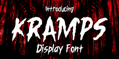 Kramps is a very cool horror display font. It will be perfect for your horror and Halloween-themed needs! You can use it for anything ranging from t-shirts and clothing, to your scary book designs, Halloween party needs, greeting cards, stickers, posters, banners, or anything that needs a horror touch. Try it to create fabulous designs and feel the horror and Halloween vibes with it!
 - Battlexoid by PizzaDude.dk,
$20.00Get ready for a battle - a battle of punk and grunge! This surely is a messy font...it looks like it has been run over by a VERY bad copy machine! Comes with a bunch of cool features such as: - Different lower/caps letters - Unique accented charaters - Ligatures for double letters/numbers - Alternative letters You will need to use OpenType supporting applications to use the autoligatures - Gangstown GT by Gartype Studio,
$13.00 Inspired by quick handwritten graffiti tagging around city, we are make this graffiti typeface called Gangstown. This font comes with contextual and stylistic alternates that way easy to use, multilingual glyphs, and swashes too. Create your uniquely mix combination with swashes and alternates. Your project will look cool while using this for project like tagging, product package, ads, title, headlines, logo, stickers, apparel, etc.
 - Artistic Venture by Storictype,
$19.00 Artistic Venture Typeface, Inspirated those bold wide letters you see on. computer screen, movie futureistic with combine classic , Well, some of them have these strong or hooks on the ends of the letters. But, there's also this new style of font that's super cool and futuristic. It's called a Artistic Venture Typeface. There Include : All Caps Opentype Feature Alternate Character Ligature Multilanguage Thank You
 - Rabbet by Atlantic Fonts,
$26.00 Rabbet is based on the handwriting of Maine furniture designer and maker, Aaron Fedarko. It's friendly, bold, condensed, and slants left. Rabbet's special feature, besides loads of boyish charm, is a load of handwritten fractions as discretionary ligatures. Whether you're curious about woodworking (a rabbet is a type of joint), or you just want a cool, maybe slightly rebellious font, Rabbet is ready to do the work.
 - Haboro by insigne,
$- Haboro is a powerful workhorse. It’s a neoclassical font developed for numerous uses, ranging from editorial and corporate to web pages and apps. This new face from insigne Design takes a modern twist on the high-contrast typeface genre known as the Didone. Recognized for their ability to convey clarity, the geometric simplification of the Didone genre adds a level-headed rationality to whichever work it’s applied. Didones are used to lend style and sophistication to a wide number of applications—everything from style or cosmetic labels to annual reports. With its unique take on this classic genre, Haboro—with its slight wedge-shaped serifs and unique terminals—is still defined by elegance, tradition and timelessness. Even more to its versatility, this multi-purpose text face features whimsical terminals, which liven up even the most serious texts. If you desire, you can also opt for the more usual ball terminals by activating OpenType alternates. The Haboro family consists of seven weights from a Thin to a Black along with matching italics. The contrast from the letters’ thick strokes and thin strokes draws the eye to your design, making Haboro a powerful visual tool for communicating your message. The typeface also contains numerous ligatures and alternates. Choose between serif variants such as ball terminals or standard serifs by utilizing OpenType alternates. We recommend using the default contextual alternates and discretionary ligatures in order to benefit from all members of this fantastic font family. In addition, Haboro has a sizable set of option glyphs and numerous other OpenType variables to give your text the unique touches it needs. Haboro has all of the attributes you need to undertake your next project. Use its modified elegance to shape and mold your next design, whether a web site, app, branding package, or magazine. You’ll find there’s no job Haboro can’t take on.
 - PGF Caprina Pro by PeGGO Fonts,
$24.00 "PGF Caprina Pro" is an audacious and rough geometric sans-serif font inspired by the wild and untamed personality of mountain goats (the word "caprina"‘ in Spanish is related to or resembling ‘goats’)—amazing animals which can skilfully climb up slopes and withstand very cold temperatures. Was originally developed under the Latinotype team supervision and is now upgraded to this Pro version that comes in 20 font styles, with 739 glyphs each, supports now more than 200 Latin-based languages and includes a wider OpenType features range like: Stylistic Alternates ‘set 01’ for b, d, g, p, q, i, j, t, y, &, I, G, M Stylistic Alternates ‘set 02’ for d, g, j 4 Stylistic Alternate from ‘set 01’ to ‘set 04’ for Enclosed Numbers (circles and squares) Stylistic Alternate ‘set 05’ for curved 3 and ‘Zero with dot inside’ Contextual alternates automatically turns ‘zero’ into a ‘slashed zero’ in alphanumeric contexts Contextual alternates automatically turns “Il” into a serif for improve its legibility Case Sensitive when "All Caps" is activated for ß, ¡, ¿, () [] {}, ‹› «», •(bullet), *(asterisk), -(hyphen) Standard Ligatures for fi, fj, fl Discretionary Ligatures for tt, tr, www, LL, TT Lining Numbers Old Style Numbers Tabular Lining Tabular Old Style Numbers Slashed zero on every number figures Numerators and Denominators from 0 to 9 for any Fraction expression Superiors and Inferiors from 0 to 9 for any scientific notation Ordinal forms for ‘a’ and ‘o’ Localized language customization for German, Dutch, Polish, Catalan, Romanian, Moldavian, Turkish, etc. Every OpenType option is also accessible via Character Map allowing users and designers to choose an alternate design for a particular character. “PGF Caprina Pro” is well-suited for high-impact action publishing and advertising as well related with adrenalynic and extreme sport design stuff.
 - Modelista by Krismagraph,
$19.00 The New Modelista Serif Family is a modern ligature serif font that includes 16 fonts, regular and italic, from Thin weight to Extra Bold. Modelista is a multipurpose font perfect for any project, with high-contrast glyphs, giving it an elegant, feminine and masculine, modern, and easy-to-read quality. It is equipped with a unique ligature to give your designs a new color. Excellent in layout design for quotes or body copy, best used as a display for headings, logos, branding, magazines, product packaging, invitations, quotes, blogs, and more. This font is easy to use and has OpenType features. What do you get: Modelista Font Family 8 serif weights 16 Fonts from Thin - Extra Bold, Regular & Italic Complete the Alphabet with Uppercase and Lowercase Letters Numbers, fractions Punctuation and symbols Alternative Ligature Multilingual support Feel free to follow, like, and share. Thank you and I hope you enjoy it!
 - Axiforma by Kastelov,
$55.00 Axiforma was designed with the single idea of creating a font that starts with the letter A, because let's face it, this is the best letter. For those of you who didn't see it coming, Axiforma is a /drum roll/ geometric sans in 20 weights. If you are thinking "Oh boy, another geometric sans", you clearly know your stuff. Yet, Axiforma is different in at least three crucial ways: 1) It's made by me 2) It's not free 3) It's polite and humble Additionally, Axiforma is packed with Opentype such as oldstyle numbers, fractions, case sensitive alternates, localized forms, stylistic sets, cyrillic alphabets (Bulgarian & Russian) and many more. Basically it's quite extensive and kinda great. Upon using Axiforma, clients will start to behave differently around you and may even start paying you. Your spouse will start working out again just to gain your attention and your kid will become instantly popular at school. After all you are using Axiforma and rumors do spread quickly. That's what we are talking about - raw font power. With Axiforma regular typed text is suddently transformed into first class design. That includes branding, posters, headlines, display, presentation materials, websites, logotypes, etc. The world will now be your playground. To sum it up, Axiforma is badass, thus you should have it and use it everywhere.