10,000 search results
(0.093 seconds)
- Quatsity by Ingrimayne Type,
$5.00 Quatsity is a squarish or boxy serifed font with rounded corners. Quatsity is is suitable for titles or signage and legible enough for small blocks of text. Quatsity-Light was constructed in 1995 by blending two very different faces, a typeface very similar to Kwersity (with low contrast) and one similar to Qwatick (with high contrast). The other seven styles were added in 2020.
 - Vianova Serif Pro by Elsner+Flake,
$59.00 The font superfamily Vianova contains each 12 weights of Sans and Slab and 8 weights of the Serif style. The design from Jürgen Adolph dates back into the 1990s, when he studied Communication Design with Werner Schneider as a professor at the Fachhochschule Stuttgart. Adolph started his carrier 1995 at Michael Conrad & Leo Burnett. He was responsible for trade marks as Adidas, BMW, Germanwings and Merz. He has been honored as a member of the Art Directors Club (ADC) with more than 100 awards. On February 26, 2014, Jürgen Adolph wrote the following: “I was already interested in typography, even when I could not yet read. Letterforms, for instance, above storefronts downtown, had an irresistible appeal for me. Therefore, it is probably not a coincidence that, after finishing high school, I began an apprenticeship with a provider of signage and neon-advertising in Saarbrücken, and – in the late 1980s – I placed highest in my field in my state. When I continued my studies in communications design in Wiesbaden, I was introduced to the highest standards in calligraphy and type design. “Typography begins with writing” my revered teacher, Professor Werner Schneider, taught me. Indefatigably, he supported me during the development of my typeface “Vianova” – which began as part of a studies program – and accompanied me on my journey even when its more austere letterforms did not necessarily conform to his own aesthetic ideals. The completely analogue development of the types – designed entirely with ink and opaque white on cardboard – covered several academic semesters. In order to find its appropriate form, writing with a flat nib was used. Once, when I showed some intermediate designs to Günter Gerhard Lange, who occasionally honored our school with a visit, he commented in his own inimitable manner: “Not bad what you are doing there. But if you want to make a living with this, you might as well order your coffin now.” At that time, I was concentrating mainly on the serif version. But things reached a different level of complexity when, during a meeting with Günther Flake which had been arranged by Professor Schneider, he suggested that I enlarge the offering with a sans and slab version of the typeface. So – a few more months went by, but at the same time, Elsner+Flake already began with the digitilization process. In order to avoid the fate predicted by Günter Gerhard Lange, I went into “servitude” in the advertising industry (Michael Conrad & Leo Burnett) and design field (Rempen& Partner, SchömanCorporate, Claus Koch) and worked for several years as the Creative Director at KW43 in Düsseldorf concerned with corporate design development and expansion (among others for A. Lange & Söhne, Deichmann, Germanwings, Langenscheidt, Montblanc.”
 - Vianova Slab Pro by Elsner+Flake,
$59.00 The font superfamily Vianova contains each 12 weights of Sans and Slab and 8 weights of the Serif style. The design from Jürgen Adolph dates back into the 1990s, when he studied Communication Design with Werner Schneider as a professor at the Fachhochschule Stuttgart. Adolph started his carrier 1995 at Michael Conrad & Leo Burnett. He was responsible for trade marks as Adidas, BMW, Germanwings and Merz. He has been honored as a member of the Art Directors Club (ADC) with more than 100 awards. On February 26, 2014, Jürgen Adolph wrote the following: “I was already interested in typography, even when I could not yet read. Letterforms, for instance, above storefronts downtown, had an irresistible appeal for me. Therefore, it is probably not a coincidence that, after finishing high school, I began an apprenticeship with a provider of signage and neon-advertising in Saarbrücken, and – in the late 1980s – I placed highest in my field in my state. When I continued my studies in communications design in Wiesbaden, I was introduced to the highest standards in calligraphy and type design. “Typography begins with writing” my revered teacher, Professor Werner Schneider, taught me. Indefatigably, he supported me during the development of my typeface “Vianova” – which began as part of a studies program – and accompanied me on my journey even when its more austere letterforms did not necessarily conform to his own aesthetic ideals. The completely analogue development of the types – designed entirely with ink and opaque white on cardboard – covered several academic semesters. In order to find its appropriate form, writing with a flat nib was used. Once, when I showed some intermediate designs to Günter Gerhard Lange, who occasionally honored our school with a visit, he commented in his own inimitable manner: “Not bad what you are doing there. But if you want to make a living with this, you might as well order your coffin now.” At that time, I was concentrating mainly on the serif version. But things reached a different level of complexity when, during a meeting with Günther Flake which had been arranged by Professor Schneider, he suggested that I enlarge the offering with a sans and slab version of the typeface. So – a few more months went by, but at the same time, Elsner+Flake already began with the digitilization process. In order to avoid the fate predicted by Günter Gerhard Lange, I went into “servitude” in the advertising industry (Michael Conrad & Leo Burnett) and design field (Rempen& Partner, SchömanCorporate, Claus Koch) and worked for several years as the Creative Director at KW43 in Düsseldorf concerned with corporate design development and expansion (among others for A. Lange & Söhne, Deichmann, Germanwings, Langenscheidt, Montblanc.”
 - Vianova Sans Pro by Elsner+Flake,
$59.00 The font superfamily Vianova contains each 12 weights of Sans and Slab and 8 weights of the Serif style. The design from Jürgen Adolph dates back into the 90th, when he studied Communication Design with Werner Schneider as a professor at the Fachhochschule Stuttgart. Adolph started his carrier 1995 at Michael Conrad & Leo Burnett. He was responsible for trade marks as Adidas, BMW, Germanwings and Merz. He has been honoured as a member of the Art Director Club (ADC) with more than 100 awards. On February 26, 2014, Jürgen Adolph wrote the following: “I was already interested in typography, even when I could not yet read. Letterforms, for instance, above storefronts downtown, had an irresistible appeal for me. Therefore, it is probably not a coincidence that, after finishing high school, I began an apprenticeship with a provider of signage and neon-advertising in Saarbrücken, and – in the late 1980s – I placed highest in my field in my state. When I continued my studies in communications design in Wiesbaden, I was introduced to the highest standards in calligraphy and type design. “Typography begins with writing” my revered teacher, Professor Werner Schneider, taught me. Indefatigably, he supported me during the development of my typeface “Vianova” – which began as part of a studies program – and accompanied me on my journey even when its more austere letterforms did not necessarily conform to his own aesthetic ideals. The completely analogue development of the types – designed entirely with ink and opaque white on cardboard – covered several academic semesters. In order to find its appropriate form, writing with a flat nib was used. Once, when I showed some intermediate designs to Günter Gerhard Lange, who occasionally honored our school with a visit, he commented in his own inimitable manner: “Not bad what you are doing there. But if you want to make a living with this, you might as well order your coffin now.” At that time, I was concentrating mainly on the serif version. But things reached a different level of complexity when, during a meeting with Günther Flake which had been arranged by Professor Schneider, he suggested that I enlarge the offering with a sans and slab version of the typeface. So – a few more months went by, but at the same time, Elsner+Flake already began with the digitilization process. In order to avoid the fate predicted by Günter Gerhard Lange, I went into “servitude” in the advertising industry (Michael Conrad & Leo Burnett) and design field (Rempen& Partner, SchömanCorporate, Claus Koch) and worked for several years as the Creative Director at KW43 in Düsseldorf concerned with corporate design development and expansion (among others for A. Lange & Söhne, Deichmann, Germanwings, Langenscheidt, Montblanc.”
 - Miss Mable by Cory Maylett Design,
$25.00 Miss Mable is a high-quality, well-proportioned contemporary typeface with variations in thick and thin strokes that contains a hint of previous decades. I wanted to create enough weights and widths to make the typeface suitable for a wide range of uses where a soft, stylish, and friendly look is appropriate. The Miss Mable type family consists of 44 fonts. The family encompasses seven weights across three widths in Roman and italics plus variable versions. Each font contains a complete set of characters for Western and Central European languages. In addition, OpenType features include dynamic fractions, alternate glyphs, ligatures, plus proportional, tabular, and old-style numerals. These high-quality fonts are fully compatible with Windows, Macintosh, and Linux. Also for sale are two Miss Mable variable fonts that include all Roman and italic glyphs of every width and weight plus everything in between. For example, if you need something slightly bolder than bold and a little wider than semi-condensed, the variable fonts make that possible without distortion. Variable technology is new, however. All modern web browsers support variable fonts, but support for most desktop software is still spotty.
 - Ginthamy by Krakenbox Studio,
$16.00 Ginthamy is a cute and playful display font. Use this font to add that special cool touch to any design idea you can think of! It is perfect for any branding project such as logos, t-shirt printing, creative products, and more.
 - Spooky Ghost by Sakha Design,
$12.00 Spooky Ghost is a cool, fun, and quirky decorative font. This font is PUA encoded which means you can access all glyphs and swashes with ease! Add it confidently to your favorite Halloween designs and let yourself be amazed by the outcome generated.
 - Creepy Ghost by AEN Creative Studio,
$15.00 Creepy Ghost is a cool and spooky display font. This font is PUA encoded which means you can access all of the glyphs and swashes with ease! Add it confidently to your favorite creations and let yourself be amazed by the outcome generated.
 - Hello Miracle by Letterafandi Studio,
$16.00 Hello Miracle is a cool and interestingly designed display font. It will elevate a wide range of crafting ideas, from cards, to branding, labels and much more. This font is PUA encoded which means you can access all of the glyphs with ease!
 - Antik by Sulthan Studio,
$10.00 A fun font that is truly extraordinary, handwritten as it is, a combination of lowercase and uppercase letters, really cool, has a playful impression but is very amazing, very suitable for all jobs because this font has its own free style and courage.
 - Love Princes by Sulthan Studio,
$10.00 Love Princes is a handwritten script font that was written using a marker on paper and then I made it into a charming and very natural font, with two very cool writing characters if paired or used in one of your works
 - Nijikon Japan by Letterara,
$14.00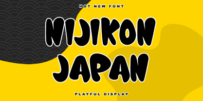 Nijikon Japan is a cool and friendly display font, inspired by Japanese cartoons. Get inspired by its childlike charm and use it to create fun designs. This font is PUA encoded which means you can access all of the cute glyphs with ease!
 - LD Dear Diary by Illustration Ink,
$3.00If you've got a secret to tell, or just crave a unique font for cool scrapbook journaling, "Dear Diary" will fit the bill. This true type font looks handwritten with tall uppercase letters, and small, narrower lowercase script. Have some fun with it! - Kralken by ahweproject,
$9.00 Kralken is a cool, modern and detailed serif font. It will add a luxury spark to any design project that you wish to create! This font is PUA encoded which means you can access all of the amazing glyphs and ligatures with ease!
 - Bat Boo by AEN Creative Studio,
$15.00 Bat Boo is a cool and spooky display font. This font is PUA encoded which means you can access all of the glyphs and swashes with ease! Add it confidently to your favorite creations and let yourself be amazed by the outcome generated.
 - Cute Molly by MJB Letters,
$9.00 Cute Molly is a very cute handwritten font created with great attention to produce beautiful, funny and stunning works. Your project will definitely look very cool with this font which has 3 weights: regular, thin and bold. Grab it fast and happy designing!
 - Hallo Witch by Sakha Design,
$12.00 Hallo Witch is a cool and spooky decorative font. Add it to each of your Halloween related designs and notice how easily they stand out. This font is PUA encoded which means you can access all of the glyphs and swashes with ease!
 - Absolute Kiddos by Krakenbox Studio,
$15.00 Absolute Kiddos is a cute and playful display font. Use this font to add that special cool touch to any design idea you can think of! It is perfect for any branding project such as logos, t-shirt printing, creative products, and more
 - Bathella by Arunatype,
$15.00 Bathella script is the perfect font choice for businesses that want to convey an image of elegance, luxury, and style. The font's smooth and fluid lines create a sophisticated and refined appearance, making it ideal for high-end branding and marketing materials. Bathella script's exquisite details and graceful curves make it a favorite among designers who seek to create an impression of exclusivity and class. Whether used in logos, invitations, or advertisements, Bathella script is sure to leave a lasting impression of quality and luxury.
 - The "MATILDAS GRADE SCHOOL HAND_DEMO_script" font, designed by Fontsandfashion, encapsulates the charm and whimsy of youthful handwriting. This font meticulously reflects the idiosyncratic nature of ...
- Milky Matcha Personal Use - Personal use only

- Bahoda by 160 Std,
$3.00 Bahoda is a sans serif font that comes in 4 styles. Bahoda font has bold and high contrast. This font looks very modern when paired with contrasting design colors. This font is impressive and features a clean and elegant font, professionally shaped, and as a result, it will easily match a variety of creations that require a different touch. Add it with confidence to your projects, and you’ll love the results. This typeface is perfect for powerful logos, branding, promotions, book covers, magazine layouts, or simply as a stylish text overlay onto any background image.
 - Kimbiso by Yukita Creative,
$14.00 Kimbiso is one of the most advanced fonts on the market. Its clean lines and ultra-modern style make it perfect for high fashion branding, cinematic videos, social media posts, and more. Best of all, it's easy to read and looks sophisticated and stylish. What do you get when you get this font? - Modern Sans is one font you need - Affordable and versatile - Multilingual support and complete characters set - Designed by a Typeface Designer - Get one font for any occasion - Multilingual support in this modern sans serif font - Well known for its exceptional readability
 - Bant by Kufic Studio,
$15.00 Bant - A modern comic font that compliments any sort of graphic and web design. A doodly doodle font, this font is perfect for comics, doodle, whiteboard animation, branding, wedding invitations, magazines, business cards, quotes, posters, and websites. The complete font set includes; Bant will bring a unique and comic look to your overall design, as any typeface is a major part of the design. Kufic Studio is a platform that provides professional and high-quality designs & fonts to fill the gap that has been missing in the market.
 - Lakony by Khoir,
$9.00 Lakony Regular, italic and display serif lacony are combined into one into a modern serif, lacony pays attention to high readability and a soft font model so that readers feel comfortable. lakony font also has unique alternates, making it easier for you to design as unique a text as possible. However, this does not leave behind the function of the font itself, namely readability, so this font is suitable for titles, posters, branding, invitation cards and much more. Lakony Regular Lakony Italic Lakony Display Uppercase Lowercase 75+ Language Alternates Font
 - Royale Milano by Krismagraph,
$15.00 Royale Milano is an elegant and modern serif font family. It's serif in 8 weights from Thin to ExtraBold, with regular and italic versions. 16 fonts in total, Font Royale Milano is the perfect multipurpose font for any project, with high contrast glyphs, giving it a feminine and masculine quality, modern, and easy to read. Great in layout design for quotes or body copy, best used as a display for headings, logos, branding, magazines, product packaging, invitations, and more. This font is easy to use and has OpenType features.
 - Beardsons by Arterfak Project,
$20.00 Introducing our new exploration Beardsons, another vintage-inspired font with the additional effect: Normal - Inline - Shadow, packed as the layered font. Collected from many references such as vintage signage, logo, badges, and old fashioned graphics. Beardsons is An all-caps font, carefully crafted with a high ornamental taste. Beardsons is perfect for many display purposes. You can use this font for poster, label, logo, signboard, t-shirt, book cover, decoration, merchandise, and more! Multilingual support with extra ornaments included! Fonts featured: Uppercase Smallcaps Numbers & symbols Stylistic alternates Accented characters: ����������������������������ތ������������������������������������ Thank you for watching!
 - Acarau Display by Tipogra Fio,
$30.00 Acarau is a 6 fonts display typeface with high reverse contrast—since from Roman capitals and calligraphy, usually Latin alphabet letters have thiner horizontal steams and thicker verticals, these features being optical or visual—quite adequate for logos, headlines and posters. Moreover, the style of the typeface is inspired by Italics form factor: lowercase letters having less strokes to make their shapes; A has one story; E has one stroke shape, such as K, G, Y and Z; F has a descent. To give it more calligraphic feeling, there is contrast for uppercases as well, this is very perceived by the diagonal letters like A, K, M, N, V, W, X, Y and Z. J also has a descent. Q and R have natural swashes, but they have alternates in case the costumer want to go for more usual forms—including accent marked letters. Acarau is a 12 months project, the contrast for uppercases were increasing as the process was made. In the middle it is found suitable blend the letter shapes with the history of Brazilian music from the 70’s and 80’s, since the font has a tropical, warm, spicy and nostalgic feeling. Songs from bands and singers that emerged on Rio de Janeiro like Paralamas do Sucesso, Cazuza, Lulu Santos and Kid Abelha bring the beach accent and rhythm that this font has. OpenType features complement the set, which has Multi-Lingual support for a comprehensive Latin set, including Vietnamese—meaning more than 640 glyphs: Case-Sensitive forms, so symbols can properly align to uppercase letters; Ligatures, to better reading for z_y and L_I, and style for s_s, w_w_w; also for ease arrows and punctuation typing; Stylistic Set 1: two story a—including accent marked letters; Stylistic Set 2: two story g—including accent marked letters; Stylistic Set 3: diagonal (usual) z—including accent marked letters; Stylistic Set 4: flower i and j dots; Contextual alternates; Terminal forms, for R and Q; Ordinals.
 - Razzle by Ayca Atalay,
$18.00 Razzle Sans | A Whimsical Sans Serif Razzle Sans is a clean sans serif typeface with a whimsical attitude. Playful yet legible letterforms that have a high x-height makes Razzle Sans an excellent choice as a display typeface.
 - Arial Nova by Monotype,
$45.99The Arial® Nova family takes Arial back to its roots. Character spacing has been adjusted and a number of subtle modifications were made to the design to return the shapes and proportions to those of the original 1982 design created for IBM's then new high-speed laser printers. Although these first Arial fonts, called "Sonora Sans" by IBM, were low-resolution bitmaps, it was apparent that the design could also be an important high-resolution digital typeface, and Arial was redrawn for Monotype's imagesetters in the late 1980s. In the process Arial evolved from its original design loosing some of its earlier personality. The restored Arial Nova family is made up of three weights of roman design of standard proportions and three weights of condensed - all with complementary italic designs. The Arial Nova family is also compatible with the fonts that Microsoft® provides in the Windows® 10 operating system. - Mondia by Nasir Udin,
$19.00 Mondia is a modern serif font family with 18 fonts inspired by transitional and contemporary typefaces. Mondia has been designed with high-contrast character ratio to give an elegant touch, and high x-height to give sentences more legibility. Ranging from thin to fat with its matching italics, Mondia offers many possibilities to be applied in many graphic or editorial projects. Also thanks to the extended latin character set so that Mondia supports 200+ latin-based languages. Mondia also has a complete set of true small caps that integrate beautifully with lowercase letters to give more emphasis to the highlighted texts. Mondia has OpenType features built in, such as stylistic alternates, standard ligatures, special ligatures, oldstyle figures, localized letters, automatic fractions, sub/superscripts, and ordinals. Mondia also has a complete set of proportional and tabular numbers. With those features, Mondia is a great choice for headline, branding, titles, but can also perfectly be used in small articles. For full presentation please visit me Behance post.
 - Bagerich by Zealab Fonts Division,
$10.00 Bagerich is font designed by Reza Rasenda & Riska Candra Dewi, with design choices inspired by the Art Nouveau era. Bagerich comes with stylistic, alternates, ligatures and supports multilingual languages. Create unique & beautiful logotype, use it as an elegant solution for your next magazine layout, or choose Bagerich for any graphics that require a sleek look with a elegant flair.
 - Budhayanti by madeDeduk,
$14.00 Budhayanti is a duo with both a script and sans-serif. This font perfect for poster design, book covers, merchandise, fashion campaigns, newsletters, branding, advertising, magazines, greeting cards, album covers, and quote designs and more. If you need anything else just shoot me an email at: dedukvic@gmail.com Find more previews on my Instagram here : https://www.instagram.com/acekelgondolayu/
 - Raque by madeDeduk,
$15.00 Introducing Raque is a Capital Modern Serif, use this font for any branding, product packaging, invitation, quotes, t-shirt, label, poster, logo etc. Feature Uppercase & Lowercase Number & Symbol International Glyphs Multilingual support Alternative Ligature Shoot me on email at: dedukvic@gmail.com and find more previews on my Instagram here : https://www.instagram.com/acekelgondolayu/?hl=en Hope you enjoy it.
 - Amerta by Eotype,
$9.00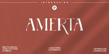 Amerta is a versatile, modern and unique serif font. Designed by Eotype Studio, It has a unique style with stylistic, alternates, ligatures and supports multilingual languages. Create unique & beautiful logotype, use it as an elegant solution for your next magazine layout, or choose Amerta for any graphics that require a bold look with a elegant flair.
 - Woliu Maners by madeDeduk,
$16.00 Woliu Maners is a Modern Sans, use this font for any branding, product packaging, invitation, fashion, label, poster, logo etc. Feature Uppercase & Lowercase Number & Symbol International Glyphs Multilingual support Alternative Ligature Feel free to drop us a message any time and follow my shop for upcoming updates Shoot me on email at: dedukvic@gmail.com Hope you enjoy it.
 - Le Kick by Resistenza,
$46.00 Introducing LeKick. Inspired by Fraktur script with a contemporary flare, LeKick is a blackletter display face. This font has been designed with a flat brush and ink, choose between two styles; Brush, which demonstrates the strokes and construction of each letterform, or Regular. The perfect typeface for typographic creations such as book covers, headlines, and banners.
 - Crosseur by Eotype,
$9.00 Crosseur is a versatile, modern and unique condensed san serif font. Designed by Eotype Studio, It has a unique style with stylistic, alternates, ligatures and supports multilingual languages. Create unique & beautiful logotype, use it as an elegant solution for your next magazine layout, or choose Crosseur for any graphics that require a bold look with a unique.
 - Organic Space by Melissa Lapadula,
$19.95Organic Space is about preserving what natural goodness there is left in the world, with its use of curves and space usage. It represents the selection of consumers, which choose organic products instead of the alternative genetically modified version. This typeface aims to be organic and unique. This font can function as headings, subheadings and body text. - Brumers by Trustha,
$17.00 Brumers is a fun sans serif font. Inspired by the curves of a bear. The basic concept is actually hand-drawn. Then, I developed and improved it in the next process. It comes in six styles, which makes it easy to choose according to the project you are working on. Brumers is perfect for headlines, branding, and many more.
