10,000 search results
(0.017 seconds)
- Gang of Three - Unknown license

- Got heroin? - Unknown license

- Graced Script by Mans Greback,
$59.00 Graced Script is a calligraphic brush font in high quality, with a full alternate alphabet. Turn on contextual alternates to get natural letter variations.
 - Moonlight In Tokyo by Epiclinez,
$18.00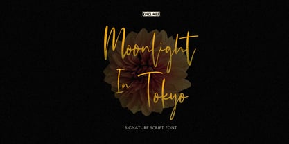 Moonlight In Tokyo is an authentic signature script font. This handwritten beauty is suitable from high-end sophisticated branding to simple memorable Instagram quotes.
 - Bunny Story by Haksen,
$7.00 A hand lettered font with quirky style Specifics: Cute style with average high of uppercase Numerical, Punctuation, Multi language included Hope You enjoy it.
 - Shenzhen Industrial by Device,
$29.00 With its contours roughened by ink spread on porous cardboard, Shenzhen Industrial evokes packing crates, stamped documents and urban grit with high-impact urgency.
 - Locutorio by Kickingbird,
$24.00 Very big on talk, Locutorio supports Latin, Cyrillic, Greek and over 100 additional languages. Also included is a bonus set of global communication icons.
 - Napolitanka by Tour De Force,
$25.00 Napolitanka is an elegant high contrasted font family. Contains a set of ligatures and swashes in each weight and borders as separate OTF file.
 - Monema by ArimaType,
$18.00 Monema is a modern serif font with a unique, high-contrast binding style. The letterform morphology makes this typeface ideal for display purposes such as large bold logos and titles. Also, thanks to its large x-height, it works flawlessly in headlines with tight prefixes. On the other hand, its high contrast and very simple and easily recognizable form makes it very easy to read, so it also works with small and long text.
 - Nada Fraktur by Johan Elmehag,
$19.00 Nada Fraktur is a modern geometrical blackletter made to serve your hip intentions. Think hip-hop album sleeves, your local t-shirt print shop, and Tumblr-boy action. The goal with this typeface is to blend medieval aesthetic with sharp modern cuts. You could say that the font is sort of monospaced, but it is not. The typeface includes an extended character set to support Central and Eastern European as well as Western European Languages.
 - Moisette by Nasir Udin,
$32.00 Moisette is a serif typeface inspired by the classic and the modern. Developed in 7 weights with its complementary italics, Moisette offers many possibilities to be applied in many graphic, editorial, or branding projects, for short paragraph or display purposes. Moisette has high-contrast stem ratio to give it an elegant touch and luxurious appeal, and its high x-height makes sentences more legibility. It supports Latin and Cyrillic character set (incld. Bulgarian & Serbian Cyrillic).
 - Castagna by Eurotypo,
$48.00 Castagna is a contemporary calligraphic font with classical roots. It is carefully designed, with a special emphasis on the connection of the letters, with high ascenders to give rise to the ornaments of the different letters. There is a special search for high readability. Castagna includes a wide selection of stylistic sets, contextual and stylistic alternates, initial forms, swashes, and ligatures to preserve the qualities of handwriting, in order to accommodate various design aesthetics.
 - Wolves Gothic by Chank,
$39.00 Make a little extra impact with this strong athletic font with big geometric muscles, clean lines and sharp teeth, too. Originally created for a local pro basketball team in Minnesota, this sporty and big-shoulder poster font is now available directly to you for the first time ever to add some punch to your printed or web designs. Crisp and clear and ready for action a concise variety of weights and styles!
 - Couturier Poster by Latinotype,
$29.00 Elegance flows through Couturier Poster soul. The new cousin of early launched Couturier, brings higher contrast and an extended family, perfect for big sizes. Inspired by the didones from the 18th century, its design its heavily influenced by contemporary ideas makes it suitable to use for almost anything you can think of. Equipped with swashes, ligatures, small caps and alternates, this typography is very versatile and allows you to set a big range of compositions with discretion or personality. Couturier Poster comes in six weights and matching true italics, from thin to black. It's a good choice to pair with Couturier for smaller sizes and Couturier Poster for the big titles. It has a set of 1248 characters that cover more than 200 languages derived from latin.
 - Levato by Linotype,
$29.99 Levato, the first font designed by Felix Bonge, is an Antiqua that is full of character and is refined but by no means sterile. This typeface provides for a wide range of options for creating individual designs. It was not really Felix Bonge's intention to create a whole font family when, as a second year student, he began several exercises in contrast and proportion as part of the typeface design course of Professor Veljovi? at Hamburg University of Applied Sciences. However, these initial studies developed into a project that Bonge persisted with over the following years while working towards his degree. He continually had new insights and ideas that he was able to exploit for his font. Of particular importance, he claims, was a calligraphy seminar, which prompted him to completely rework his concept. It took him several years before his extensive font Levato™ was ready. Although the forms of Levato are ultimately derived from Renaissance Antiqua, Bonge has slightly increased the relative contrast in his version. This gives the font a graceful appearance that is further emphasized by the reduced x-height and the associated prominence of the ascenders. And, in addition, the relatively fine serifs, which are almost linear at their ends, infuse Levato with a hint of classical Antiqua á la Bodoni. At the same time, Bonge cleverly compensates for the sterilising tendency of this font form. Soft and rounded serif attachments and rounded line apexes offset the severe nature of the font and provide it with an aura of vivacity. This effect is promoted by the calligraphic-like foot of the lowercase h, n and m and the not quite horizontal bars of the uppercase E and F. Overall, Bonge has succeeded in creating a refined and yet very dynamic typeface. Levato is available in five weights; Light, Regular, Medium, Bold and Black, in each case with the corresponding italic versions. Bonge treats Levato Italic as a genuine cursive typeface. Its letters are thus slightly narrower than the analogous upright letters and their forms are considerably more curvilinear. All the versions of Levato boast an enormous range of characters to meet all possible requirements. In addition to four sets of minuscule and majuscule numerals for tabular and proportional typesetting, there are also small caps, numerous ligatures, ornamental characters and even swash variants of letters. With their generous, sweeping curves, the swash variants (available as OpenType versions) can be used for striking titling effects or as initials.
 - beachsunshine - Personal use only

- Holitter Circle - 100% free

- Osaka-Sans Serif - Unknown license

- Holitter Hollow - 100% free

- Even Badder Mofo - Unknown license

- 2006 Team - Unknown license

- Endorfinia by PizzaDude.dk,
$20.00Endorfinia is a clean and geometric sans serif with a very high x-height. Smooth looking for both small amounts of text, or headlines/logos - The Good Stuff by Epiclinez,
$18.00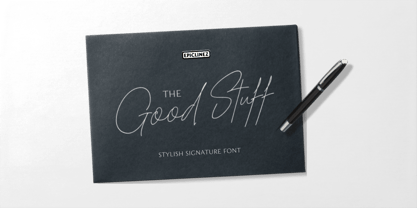 The Good Stuff is a handwritten signature script with a natural flow. This stylish font is a good choice for high-end, sophisticated Branding design.
 - OK Moral by Tour De Force,
$25.00 Glyphfight at the OK Moral – single weight Western style typeface. High inverted contrast, generous width, decorative serifs, extended Latin support. It is our 103rd release.
 - Eiffel Shine by Haksen,
$13.00 A cute serif quirky font style Specifics: Cute style with average high of uppercase Ligatures of the lowercase Numerical, Punctuation, Multi language included Happy Designing!
 - Sport Shaded JNL by Jeff Levine,
$29.00Sport Shaded JNL is a classic block font with a cast shadow, perfect for any project for sports teams, college life or high school activities. - Henri Modeste by JBFoundry,
$16.00 Henri Modeste is a mix of capital and lowercase forms. It has an high contrast and many ligatures to give your documents an eccentric look.
 - Distinction by Great Lakes Lettering,
$12.00 Distinction Is a brand new font from Great Lakes Lettering. A high contrast brush script with a ton of usefulness. Make you mark with Distinction.
 - Hundo - Personal use only

- Glance Sans by Identity Letters,
$29.00 Geometric, stylish, and not quite a stencil face: Glance Sans is the urban alter ego of Glance Slab—a strong-willed sans-serif with no frills but a few unique character traits. Glance Sans follows the design principle of nonjoining parts that made Glance Slab successful. Some strokes may not connect to their stems, creating visible gaps and thus, a dynamic impression of balance and movement. However, Glance Sans has a calmer appearance due to the lack of detached serifs. If Glance Slab’s home territory are large, crowded stadiums and massive sports events, Glance Sans prefers streetball courts, well-used skate parks, and underground clubs. It also adapts to urban work environments from finance to high-tech. Whenever a more toned-down look is called for while retaining the elegance of an athlete, Glance Sans is ready to roll. In the city environment, versatility is key. That’s why Glance Sans sports 7 weights as well as a complete set of italics. These are not just sloped romans but individually drawn letterforms, subtly referencing classic italic construction for more effective emphasis. Among the 600+ glyphs of Glance Sans, you’ll find goodies such as six sets of figures, circled numbers, circled arrows, and all kinds of currency symbols in two stylistic versions. Glance Sans is a great tool for industrial and high-tech branding, for wayfinding systems in contemporary or modernist architecture, for corporate identities in arts, crafts, medicine, culture, and education, and for all kinds of sports-themed design. Both members of the Glance superfamily are easily and effectively combinable; both are able to stand on their own feet. With its powerful italics, you might opt for Glance Sans as your text typeface and use Glance Slab for headlines. Or you set large, clean, display-sized lines in Glance Sans and spice them up with a bit of sportive Glance Slab. It’s up to you to decide how to bring out the best in both of them.
 - Juvenis by Storm Type Foundry,
$32.00Designs of characters that are almost forty years old can be already restored like a historical alphabet – by transferring them exactly into the computer with all their details. But, of course, it would not be Josef Tyfa, if he did not redesign the entire alphabet, and to such an extent that all that has remained from the original was practically the name. Tyfa published a sans-serif alphabet under the title Juvenis already in the second half of the past century. The type face had a large x-height of lower-case letters, a rather economizing design and one-sided serifs which were very daring for their time. In 1979 Tyfa returned to the idea of Juvenis, modified the letter “g” into a one-storey form, narrowed the design of the characters even further and added a bold and an inclined variant. This type face also shows the influence of Jaroslav Benda, evident in the open forms of the crotches of the diagonal strokes. Towards the end of 2001 the author presented a pile of tracing paper with dozens of variants of letter forms, but mainly with a new, more contemporary approach: the design is more open, the details softer, the figures and non-alphabetical characters in the entire set are more integral. The original intention to create a type face for printing children’s books thus became even more emphasized. Nevertheless, Juvenis with its new proportions far exceeds its original purpose. In the summer of 2002 we inserted all of this “into the machine” and designed new italics. The final computer form was completed in November 2002. All the twelve designs are divided into six variants of differing boldness with the corresponding italics. The darkness of the individual sizes does not increase linearly, but follows a curve which rises more steeply towards the boldest extreme. The human eye, on the contrary, perceives the darkening as a more fluent process, and the neighbouring designs are better graded. The x-height of lower-case letters is extraordinarily large, so that the printed type face in the size of nine points is perceived rather as “ten points” and at the same time the line spacing is not too dense. A further ingenious optical trick of Josef Tyfa is the figures, which are designed as moderately non-aligning ones. Thus an imaginary third horizontal is created in the proportional scheme of the entire type face family, which supports legibility and suitably supplements the original intention to create a children’s type face with elements of playfulness. The same applies to the overall soft expression of the alphabet. The serifs are varied; their balancing, however, is well-considered: the ascender of the lower-case “d” has no serif and the letter appears poor, while, for example, the letter “y”, or “x”, looks complicated. The only serif to be found in upper-case letters is in “J”, where it is used exclusively for the purpose of balancing the rounded descender. These anomalies, however, fit perfectly into the structure of any smoothly running text and shift Juvenis towards an original, contemporary expression. Tyfa also offers three alternative lower-case letters *. In the case of the letter “g” the designer follows the one-storey form he had contemplated in the eighties, while in “k” he returns to the Benda inspiration and in “u” adds a lower serif as a reminder of the calligraphic principle. It is above all the italics that are faithful to the tradition of handwritten lettering. The fairly complicated “k” is probably the strongest characteristic feature of Juvenis; all the diagonals in “z”, “v”, “w”, “y” are slightly flamboyant, and this also applies to the upper-case letters A, V, W, Y. Juvenis blends excellently with drawn illustrations, for it itself is modelled in a very creative way. Due to its unmistakable optical effect, however, it will find application not only in children’s literature, but also in orientation systems, on posters, in magazines and long short-stories. - Eleckatrical Banana JNL by Jeff Levine,
$29.00 From the same page of a vintage German lettering textbook entitled “50 Alphabete fur Technikur und Fachschulen” (loosely translated to “50 Alphabets for Technicians and Specialized Schools”) that inspired Trippy Hippy JNL comes Eleckatrical Banana JNL. It’s another novelty, free form Art Nouveau hand lettered alphabet that works well in recreating 1920s period pieces or for designing a retro-inspired rock and roll concert poster reminiscent of the 1960s. The name of the typeface is from a line in the 1966 pop hit “Mellow Yellow by Donovan (Leitch), and his extended pronunciation of ‘electrical’: “…E-lec-a-tric-cal’ banana is going to be the very next craze…” Caps only Fonts. Eleckatrical Banana JNL is available in both regular and oblique versions.
 - Raleigh Gothic Condensed by GroupType,
$29.00 In 1932, the great American type designer, Morris Fuller Benton was busy directing the creative departments of ATF and designing type. Big on his plate during that period was the development of the Bank Gothic® family among other typefaces like Raleigh Gothic. Bank Gothic and Raleigh Gothic share some very similar design traits. The most obvious difference being the ultra condensed style of Raleigh Gothic. Although the Bank Gothic family was released with a condensed, Raleigh Gothic could have originally been planned as an ultra condensed Bank Gothic but for reasons we can only speculate, the Ultra Condensed Bank became its own design. So, If you like Bank Gothic, you may also like Raleigh Gothic. Separated at birth? Fun to speculate.
 - Anno by Linotype,
$29.99The impulse behind André Maaßen’s design of the Anno typeface was the design of a New Year’s card for the year 2000 (Anno 2000). His desire to create the perfect printed image developed into a family with four styles: Anno 1, Anno 1 Italic, Anno 2, and Anno 2 Italic. Anno 1 and its Italic are semi-classicist typefaces, with a high degree of stroke contrast, while Anno 2 and its Italic are semi-grotesks, with less stroke contrast. Both Anno 1 and Anno 2 are sans serifs typefaces, but they each offer a new interpretation of the genre. The Anno typeface may be used in a number of applications and sizes. And it is naturally suitable for New Year’s greetings and other cards, of course! - Jubileum by Hanoded,
$15.00 Some time ago, I found myself in a clinic with my wife: at the time she was 20 weeks pregnant and had to do an ultrasound. To pass the time, I leafed through some (ladies') magazines which were lying around. Most of them tackled big issues like which shoes to wear and what type of foundation to plaster on, but one glossy featured a photo shoot. The photographer had found an old building with a beautiful art deco tile mural and had placed his skinny model in front of it. Fortunately for me, the mural featured a lot of text in a beautiful frilly style. I re-created the font I saw and it became "Jubileum" - which just means Jubilee in Dutch.
 - Kerp by aRc,
$10.00 Kerp introduces the new trend in handwriting practice for kids in preK-Kindergarten. It's fun, unique and visually stimulating that will encourage any young "alphabet tracers" to find joy while learning their ABCs. This TrueType font is great for creating personalized tracing worksheets, flashcards and even home-made greeting cards. For best results, big fonts are highly recommended to see the fine details of each character. Kerp was conceptualized in 2007 to inspire a 4 year-old boy to stop from his hectic schedule of playing. It started from hand-drawn apples forming the letter A to non-stop digital editing until 2008. The images selected are things that are associated to a preschooler's life varying from food to school supplies.
 - Slash Roller by Colllab Studio,
$19.00 "Hi there, thank you for passing by. Colllab Studio is here. We crafted best collection of typefaces in a variety of styles to keep you covered for any project that comes your way! Introducing, Slash Roller, it marks a new era in graffiti font. The slashing zig zag tape gives it an authentic DIY feel. The slashed tape is prominent but not overdone, adding an interesting layer to the blocky rough letters. Slash Roller is an attempt to create a lettering style that seems like it was made with a spray can and a brush, but keeps the appearance of a slightly imperfect and distorted typeface. It looks like the work of a vandal, but the slashed typography is actually intentional. A Million Thanks Colllab Studio www.colllabstudio.com
 - Bakery Script by Sudtipos,
$49.00 Bakery Script is the Argentine duo's nod to the high spirits of the 1970s. Angel Koziupa used his ever popular wild brush to draw the outline version, and Alejandro Paul refined it, expanded it, then extrapolated the solid version. While the outline version makes the letters seem like they're growing out of each other's shadows, the solid version presents a wilder version of the casual dancing letters Koziupa's brush has entertained us with during recent years. Sharp in places, perfectly curved in others, and with many letter alternates and ligatures included within the fonts, Bakery Script would be at home in packaging design, outdoors and adventure literature, and everywhere a display design needs that sharp but friendly touch to reach its goal.
 - Volatile Serif by Mans Greback,
$59.00 Volatile Serif, designed by Mans Greback, is a luxurious and romantic typeface that exudes an air of softness and delicate beauty. Its flowing, liquified forms, and delicate swirls evoke feelings of empathy, creating a sense of connection and warmth. This font is perfect for high-end projects that demand a touch of fine elegance. Inspired by the gentle movements of water, the designer sought to capture the essence of fluidity in Volatile Serif. The result is a typeface that feels alive, as if its character is organically creating the word, making it a perfect choice for luxury brands, romantic designs, and storytelling. The font is built with advanced OpenType functionality and has a guaranteed top-notch quality, containing stylistic and contextual alternates, ligatures, and more features; all to give you full control and customizability. It has extensive lingual support, covering all Latin-based languages, from Northern Europe to South Africa, from America to South-East Asia. It contains all characters and symbols you'll ever need, including all punctuation and numbers. Mans Greback is a Swedish typeface designer with a passion for creating unique and versatile fonts. With an extensive background in design and typography, Mans has built a reputation for his meticulous attention to detail and prolific craftsmanship. His many fonts are widely used by designers around the world, making his work synonymous with creativity and innovation.
 - tobminx - Personal use only


