10,000 search results
(0.016 seconds)
- Merilee by SummitType,
$25.00 Fonts with handwritten characteristics are always an attractive option when creating projects that call for a personal touch. Merilee helps deliver a natural pattern to computer generated text, helping readers feel a more personal attachment to the words in front of them. Merilee includes a full character set (UPPER and lower case), all punctuation, all special characters, Euro symbol, and all Latin Extended-A characters, making this font a perfect match for a variety of creative projects including holiday and kids projects, signs, logo designs, banners and advertisements.
 - Klamp 105 by Talbot Type,
$19.50 Talbot Type Klamp 105 is an elegant and streamlined, geometric sans-serif. A legible text font, its narrow proportions mean it’s economical with space; while at larger sizes it makes a confident, modern display face. Klamp 105 is available in a comprehensive family of seven weights, featuring an extended character set to include old style numerals, as well as accented characters for Central European languages. It is also available with some character variations as Klamp 205, most notably featuring a traditional, double-storey lower case a and g.
 - Bhoory by Twinletter,
$15.00 Bhoory Halloween Font is a bold font that will help you create powerful text or logos and designs for your Halloween-themed projects. Use it to create invitations, flyers, and posters, or use the font as a headline or just a decoration. You can use this font to depict Halloween in an artistic or spooky way while showing your creative talents. Of course with this font your various design projects will be perfect and amazing, get a beautiful title and start using our font for your special project.
 - Revx Neue Rounded by OneSevenPointFive,
$9.00 Revx Neue Rounded is a modern rounded sans serif typeface. It contains 14 styles - 7 uprights and corresponding italics. The typeface supports the OpenType Latin Pro character set of 455 characters. It is packed with powerful OpenType features, alternative glyphs, kerning pairs, guided typing experience, and more which makes the typeface well featured. The typeface is suitable for all platforms (web, display, print, etc.). Revx Neue Rounded blends beautifully in your designs. Revx Neue (Non-Rounded corners): https://www.myfonts.com/fonts/one-seven-point-five/revx-neue/ Feedback: https://forms.gle/iY8Zswmsg689m95M8
 - Snowflake Drop Caps by Celebrity Fontz,
$15.99The Snowflake Drop Caps font is a set of highly ornate block letters with rich embedded snowflake designs, perfect for winter and holiday themes and publications or any text where you want to add some texture, pizzazz, and depth to make your message stand out. This one-of-a-kind font has the feel of a homemade embroidered or quilted design and comes with both upper and lower case letters to give you more design flexibility. (Numbers, special characters, and punctuation are a neutral sans serif typeface and are included for convenience only.) - Gulp by Flavortype,
$18.00 GULP font is a playful and fun font inspired by pop art, hippie and comic book styles. It's groovy, funky and retro with an ultra-bold and fat appearance, making it perfect for eye-catching headers and short word texts. This font exudes modernity and fanciness, making it ideal for any purpose that requires a dominant and powerful impact. The italic style adds a touch of uniqueness, giving it a playful edge. However, GULP is not recommended for long text as it can be overpowering and may detract from the overall readability of your content.
 - Vegetability by Hanoded,
$15.00 Vegetability: “The quality or state of being vegetable”. Yes, I know: it’s kinda weird, but I quite like the name of this font! I am trying to become a vegetarian (I am a ‘flexitarian’ right now) and I was trying to find a good veggie recipe for dinner, when this name crossed my mind. Vegetability is a handwritten font with a dash of roughness, a splash of attitude and a pinch of class. Comes with a whole bunch of diacritics and double letter ligatures for the lower case letters.
 - Susan Sans by ParaType,
$30.00 An original text and display type family was designed for ParaType in 2008 by Manvel Shmavonyan to be used together with Susan and Susan Classic, earlier released type families by the same author. This is a low-contrast sans serif font with open letterforms. Its shape is distinguished by rounded upper parts of lower case. Susan, Susan Classic and Susan Sans forms a super family coordinated on weight, style and proportions. Susan Sans is well suited for short and middle range text composing as well as for use in advertising and display typography.
 - Bellisia by sizimon,
$18.00 Bellisia is a modern calligraphy font and perfect for logotype, website headers, fashion design, wedding card designs and more. It contains a full set of lower & uppercase letters, a large range of punctuation, numerals, and multi-lingual support. Multilingual support : Danish, Finnish,English, Spanish, Dutch, German, Icelandic, Italian, Norwegian, Portuguese, Indonesian, Swedish, Basque, Bosnian, Catalan Cornish, Croatian, Czech, Embu, Esperanto, Estonian, Faroese, Filipino, French, Galician, Hungarian, Irish, Malay, Maltese, Manx, Maori, Meru, Morisyen, North Ndebele, Bokmål, Norwegian Nynorsk, Nyankole, Oromo, Polish, Romansh, Serbian (Latin), Slovak, Slovenian, Swiss German
 - Klamp 205 by Talbot Type,
$19.50 Talbot Type Klamp 205 is an elegant and streamlined, geometric sans-serif. A legible text font, its narrow proportions mean it’s economical with space; while at larger sizes it makes a confident, modern display face. Klamp 205 is available in a comprehensive family of seven weights, featuring an extended character set to include old style numerals, as well as accented characters for Central European languages. It is also available with some character variations as Klamp 105, most notably featuring a more modern, single-storey lower case a and g.
 - 36 Dope by Power Type,
$- 36Dope is a display typeface with an experimental serif design. It draws from the event ’36DaysOfType’ held in 2023. Created as part of the ’36DaysOfPower’ theme, this font showcases unique and unconventional serifs, reflecting the creative and powerful spirit of the event. With its bold and experimental look, 36dope is well-suited for attention-grabbing headlines, titles, or graphic design projects that aim to convey a sense of strength and artistic innovation. This font is intended for eye-catching headlines, titles, or other graphic design projects that require a bold and experimental look.
 - Linotype Pide Nashi by Linotype,
$29.99Linotype Pide Nashi is part of the Take Type Library, chosen from the entries of the Linotype-sponsored International Digital Type Design Contests of 1994 and 1997. German artist Verena Gerlach created a typeface which looks almost like Arabic at the first glance, only with the second do the familiar forms become clear. Rounded lower case letters, generous, sweeping capitals and diamond-shaped ornaments give the font its Arabic feel. The exotic Linotype Pide Nashi is best suited for short and middle length texts and headlines and especially for ornamental texts. - Delaguerra by Scriptorium,
$18.00Delaguerra is based on a lettering style originating in the California Arts & Crafts period commonly associated with 'Mission Style'. It is still in common usage in signage at historical sites in California. This version is a sort of idealized hybrid of several different variations on the style from samples we were sent by a customer who wanted to use the font in a set of invitations. It features a basic character set on the lower case and then relief initial versions of the same characters for the upper case. - Monkton by Club Type,
$36.99 The inspiration for this typeface family came from my childhood experiences at West Monkton, amidst an historic part of the South West of England. Studies of the original incised capitals of the Trajan column in Rome were analysed and polished for this modern version. The lower case letterforms and numerals were then created in sympathy, taking their proportions from the incised letters of local gravestones. Its name honours not only the area where the original alphabet was conceived and drawn, but also the people responsible for fostering my initial interest in letters.
 - Smashing by PintassilgoPrints,
$26.00 Smashing is a stout typeface, with a twist. It’s a massive all-caps font with bouncing glyphs, positively bold yet quite good-humored. Its upper and lower case slots stores different lettershapes, providing handy options to choose from. When working with OpenType savvy applications you can turn on the contextual alternates feature to instantly get alternating glyphs, which add spontaneity to your artwork and prevent neighbor double letters from using the same glyph. Also try the discretionary ligatures feature to get some cool interlocking pairs. A smashing font for truly smashing designs!
 - pf.animals - Unknown license

- Edo - Unknown license

- Pokopen - Unknown license

- Adrenaline : Zero - Unknown license

- Xerography - Unknown license

- Acryle Script by Mans Greback,
$59.00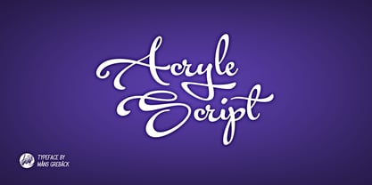 Clean high quality script font with multiple ligatures and alternate glyphs. Gives your project a creative touch.
 - Semantica MF by Masterfont,
$59.00 Formal, yet with very high legibility even in small point sizes. Many weights gives you design alternatives
 - Sonata by Adobe,
$29.00The Sonata font contains 170 music notation symbols and is used for setting high quality sheet music. - Mea Culpa by TypeSETit,
$24.95 One of the most elegant script styles found. This beautifully formal font is perfect for high society.
 - Tzoba MF by Masterfont,
$59.00 Inspired by old manuscript serif font, this low contrast font makes it high legible for long texts.
 - Clique by Device,
$29.00 A clean elegant subtly flared serif in three weights suitable for high-fashion and luxury brand use.
 - Allioideae by URW Type Foundry,
$49.99 This fine lined display type face was named Allioideae because of the ascenders of the lower cases. They are rising upright with a single stroke and are ending - depending on the font style - into a spherical blossom. The name was chosen concerned to the plant allium, that forms an umbel at the top of a leafless stalk, when it is blooming. Allioideae is the name of a subfamily of monocot flowering plants in the family Amaryllidaceae. The name is derived from the generic name of the type genus, Allium. The wide and round capital letters are showing a nice contrast to the lower cases and giving the font a kind of female feeling. That provides a functional and lovely use in headlines for all beauty and cosmetics issues.The typeface appears in 4 different styles. a plain style – Allioideae, a stencil style - Allioideae Stencil, a (dotted) style for both - Allioideae Dot and Allioideae Stencil Dot. It supports multi language as it covers all the latin diacritics and a cyrillic character set. Lots of numbers as monospaced, lining figuers, old styles, sub- and superscript and many fractions in two different styles are giving a nice finish to that font. Also some matching ornaments are included.
 - Grand Atlantic by Fenotype,
$35.00 Grand Atlantic is a powerful display package by Fenotype. It’s a genuine Brush script packed with features and Swoosh extras and it’s a striking condensed flared serif in two weights, designed with the same sharp edges on the flares as the Brush. Together they make stunning logotypes, posters or headlines. On top of that there’s a “Printed” version of each. Printed versions are the same but with rugged outlines and a print texture. Grand Atlantic is great for creating powerful identities for artisanal coffee brands, craft beer, organic juice or a sports teams. Grand Atlantic Brush is equipped with Standard Ligatures and Contextual alternates that help keeping the connections between letters smooth. They’re automatically on as you should normally keep them. On top of that Grand Atlantic Brush has Stylistic, Titling and Swash Alternates for standard characters if you need more ornamental letters and if you want to break up the rectangular word shapes. There’s even more alternates in the glyph palette, making it total more than 600 glyphs. Grand Atlantic Swoosh contains 52 shapes designed to go with the Brush. There’s many “terminal swashes” that you can put in the end of a word and it will connect to the last letter, and swirl under the word from there.
 - Sihmittree by Ingrimayne Type,
$9.00 Sihmitree is a gimmick typeface in which all glyphs have reflective (mirror) or rotational symmetry (or both). Sihmitree has two weights and is caps only, with most of the lower-case letters identical to the upper-case letters. It includes only those accented characters that are symmetrical. The letters of the alphabet are often used to explain symmetry. BCDEK are given as examples of shapes that can easily be formed with symmetry over a horizontal line. AMQTUVWY can easily be formed so that they mirror over a vertical line. Letters HIOX can be formed so they mirror over both horizontal and vertical lines, and as a result they will also have rotational symmetry. Letters NSZ can be formed so that they reproduce themselves with a rotation of 180º. That leaves letters FGJLPR, which are usually considered examples of asymmetry. However, there are script versions of J, L, and R that can be formed with symmetry, and variants of lower-case f and g can be made that are symmetrical. P looks a lot like the thorn character. Some of the numbers also present challenges when trying to form them symmetrically. The symmetrical alphabet is not stylistically harmonious and has limited use other than as an exploration of symmetry.
 - Bambusa Pro by Fontforecast,
$29.00 Bambusa Pro is a sturdy expressive modern calligraphy family of 4 fonts: Regular, Bold, Basic and Ornaments. It owes its name to the bamboo pen that was used to draw all of the characters and swashes. The typical ink-strokes of the bamboo pen give Bambusa Pro a distinctively different appearance than dip pen calligraphy fonts like Salt & Spices Pro. Similarities between the two are a wide variety of long swashes that connect to the first and last letter of a sentence or name. But with Bambusa Pro this even goes for accented characters, and all upper and lower case letters. Together with five different connecting spaces you can create phrases that look as if the pen was never lifted from the paper. Like Stylist Pro all characters of Bambusa Pro connect to each other, both lower case and upper case letters and vice versa. Bambusa Pro Basic also is hand-lettered with a bamboo pen, but is a lot more straight forward. It combines beautifully with the connected styles Regular and Bold. On top of that Bambusa Pro Ornaments offers 100+ glyphs for additional designs possibilities. Enjoy! You will need an opentype savvy application to get the most out of Bambusa Pro.
 - Siamese Katsong Pro by CheapProFonts,
$10.00 A faux Thai font - but not over the top, just stylishly hinting at the foreign script. I have introduced lots of alternate glyphs, so it now has both lower- and uppercase letterfoms. Perfect for that travel brochure, ad or restaurant menu - in many languages. Vic Fieger simply says: "A font based on a boldface sign in Thai". ALL fonts from CheapProFonts have very extensive language support: They contain some unusual diacritic letters (some of which are contained in the Latin Extended-B Unicode block) supporting: Cornish, Filipino (Tagalog), Guarani, Luxembourgian, Malagasy, Romanian, Ulithian and Welsh. They also contain all glyphs in the Latin Extended-A Unicode block (which among others cover the Central European and Baltic areas) supporting: Afrikaans, Belarusian (Lacinka), Bosnian, Catalan, Chichewa, Croatian, Czech, Dutch, Esperanto, Greenlandic, Hungarian, Kashubian, Kurdish (Kurmanji), Latvian, Lithuanian, Maltese, Maori, Polish, Saami (Inari), Saami (North), Serbian (latin), Slovak(ian), Slovene, Sorbian (Lower), Sorbian (Upper), Turkish and Turkmen. And they of course contain all the usual "western" glyphs supporting: Albanian, Basque, Breton, Chamorro, Danish, Estonian, Faroese, Finnish, French, Frisian, Galican, German, Icelandic, Indonesian, Irish (Gaelic), Italian, Northern Sotho, Norwegian, Occitan, Portuguese, Rhaeto-Romance, Sami (Lule), Sami (South), Scots (Gaelic), Spanish, Swedish, Tswana, Walloon and Yapese.
 - Phiz by Shinntype,
$29.00 Phiz is a diverse suite of 28 decorative fonts based on Figgins Sans Extra Bold. Classic (10 fonts), Rounded (7 fonts), Rough (4 fonts) and Particles (7 fonts). The Rough and Particles styles emerge as a unique niche—neither imitating distressed printing (e.g. the “rusty” look), nor casual, hand-drawn styles. These type designs are conceived and executed as complex algorithmically-generated graphic procedures, in which repetitive elements have been artfully applied to the Sans capitals, and manually nuanced. As such they also differ substantially from textured glyph shapes that have been cut out from larger pattern fields, for the constituent particles are disposed in relation to the specific shape of each character they define. The caps-with-small-caps format was chosen for two reasons. Firstly, titling display usage is predominantly capitals, and secondly, rather like optical scaling, having the same resolution of texture available in two different “sizes” (upper and lower case) should prove useful in the hierarchy of page layout—not primarily for setting upper and lower case text as caps-with-small-capitals, although this is of course an option. All figures and major symbols (punctuation and currency) are provided in both cap and small cap height.
 - Sofia Pro Condensed by Mostardesign,
$25.00 A geometric sans for space saving typography Sofia Pro Condensed is the condensed version of the popular Sofia Pro font family. This typeface was completely drawn with the look of the original normal-width version. Sofia Pro Condensed contains 16 styles from Ultra Light to Black (Ultra Light, Extra Light, Light, Regular, Medium, Semi Bold, Bold and Black) with an alternative glyph set to improve its use in different graphic contexts. This typeface will be suitable for many projects such as titles, subtitles, long editorials, brand building, mobile applications, ebooks, websites or company signage. Its contemporary aspect and its condensed style will also be suitable for editorial projects who needs to save space. Sofia Pro Condensed also has many powerful OpenType features such as case sensitivite forms, old style and tabular figures, ligatures, capital spacing, fractions and alternative characters to give personality to graphic design projects. Designed also for complex editorial content, this typeface has a powerful home kerning system called “Pro Kerning”. With more than 1500 pairs of glyphs in many languages, Pro Kerning optimizes headlines, subtitles, texts as well as long paragraphs in real time. In addition to all the features of its kind, Sofia Pro Condensed is part of a very complete “type system” with style variants such as the normal-width-version (Sofia Pro), the soft version (Sofia Soft) or the rough version (Sofia Rough). With all these typefaces, you have more than 40 styles to make your own vibrant and professional graphics or web creations while maintaining consistency in your creations. The OpenType features of Sofia Pro Condensed have an extended character set to support Central and Eastern European as well as Western European languages, Cyrillic and Greek. For more info about the powerful opentype features and the complete character map of Sofia Pro Condensed, download the PDF specimen to get a detailed view of all features.
 - World Pressure by Haksen,
$14.00 Introducing: World Pressure A rustic, dapper handwritten font with a personal charm. With quick dry strokes and a signature style, World Pressure is perfect for branding projects, homeware designs, product packaging - or simply as a stylish text overlay to any background image. World Pressure includes 4 font styles and additional swashes: World Pressure Regular handwritten script font containing upper & lowercase characters, numerals and a large range of punctuation. World Pressure Alternate This is a second version of World Pressure, with a completely new set of both lower and uppercase characters. If you wanted to avoid letters looking the same each time to recreate a custom-made style, or try a different word shape, simply switch to this font for an additional layout option. World Pressure Slant This is a third version of World Pressure, with a completely new set of both lower and uppercase characters in slant version. If you wanted to avoid letters looking the same each time to recreate a custom-made style, or try a different word shape, simply switch to this font for an additional layout option. World Pressure Alternate This is a forth version of World Pressure, with a completely new set of both lower and uppercase characters in slant version. If you wanted to avoid letters looking the same each time to recreate a custom-made style, or try a different word shape, simply switch to this font for an additional layout option. World Pressure Swashes A set of 26 hand-drawn swashes, the perfect finishing touch to underline your Northwell text. Simply install this as a separate font, select it from your font menu and type any A-Z Uppercase and Lowercase also Number 0-9 character to create a swash. Fonts are provided in OTF formats. Fonts include multilingual support. Ligatures are also available for several lowercase characters (double-letters which flow more naturally). These are only accessible via software with opentype capability or a glyphs panel, e.g. Photoshop/Illustrator.
 - Onick by Wordshape,
$- While researching the history of Onitsuka Tiger's branding and graphic design, I came across an odd, yet highly appealing piece of custom lettering on the company's ONICK ski boots from the 1970s. Reminiscent of aspects of the typeface Black-Out by Eli Carrico (released by my type foundry Wordshape), yet vertically compressed with razor-sliced counters and odd stencil element that makes up one of the legs of the "K", the ONICK lettering is a potential source for an intriguing modular font. I immediately thought of Ryoichi Tsunekawa as a potential collaborator to bring this piece of lettering to full-fledged life in the contemporary context. Based in Nagoya, Tsunekawa runs an independent type foundry called Dharma Type, including three specialized foundry sub-labels: Flat-It, devoted to display lettering; Prop-A-Ganda, a series of fonts inspired by and based on retro propaganda posters, movie posters, retail sign lettering & advertisements in the early 20th century; and Holiday Type, a series of decorative and retro scripts for holiday use. The past year has seen a flurry of notice of his work abroad, having been featured in both MyFonts' "Creative Characters" and YouWorkForThem's newsletter. As the work of most Japanese type designers is almost wholly unnoticed abroad, for Tsunekawa to be interviewed by two of the most popular type distribution companies in the world is definitely something beyond the norm. Perhaps it is because he works independently, or perhaps it is due to the charm and friendliness with which his typefaces are infused. Either way, this attention is both welcome and appreciated. Beyond mere charm, Tsunekawa's work is nuanced, detailed, and accessible due to its high level of finish. His fonts stand apart from his contemporaries in Latin typeface design in Japan due to his fascination with pop, vernacular and historical lettering from "non-pure" sources- whereas type designers like Kunihiko Okano and Akira Kobayashi have spent years analyzing the essence of Western letterform construction and unlocking the essence of Latin forms, Tsunekawa views surface and the awkward nature of his sources as being of value, as well. His irreverence for the formal doctrines of history imbue his typeface designs with a rugged inventiveness that would be missed by most- glyphs without source designs are guessed at and approximated, often in a manner wildly divergent from what Western eyes would assume. It is in these moments that I find sheer delight in Tsunekawa’s work and what make me most pleased to invite him aboard Neojaponisme and Onitsuka Tiger’s type development project. His assorted typefaces show an eclecticism in finish and as holistic systems- Tsunekawa's return email to me about the proposed type project showed a digital sketch of how a completed typeface family from the source lettering might look, rendered with an effortlessness and dedication to detail that belies a skilled craftsperson. Further development showed Tsunekawa’s rigor- the typeface in development rapidly featured glyphs ignored by many: a full set of fractions, Eastern European diacritics and accents, superior and inferior numerals, alternate characters, and custom ligatures - all designed with regulated, detailed spacing. ONICK is a typeface Tsunekawa should be proud of- an homage to a moment in history rendered in the absolute best fashion. We are proud to present it to the world! --Ian Lynam
 - NT Gagarin by Novo Typo,
$26.00 Anna Gagarin is the loving matriarch of the Gagarin Family. Her life was full of love and passion. She had several affairs with Futurist and Contstructivist artist in the beginning of the 20th century. She was in love with the Russian poet Vladimir Majakovski (born on July 19th, 1893 and died in Moscow on the April 14th, 1930). She gave birth to his son Boris. She called him 'a cloud with trousers'. After this love story, Anna Gagarin met the designer and artist Gustav Klucis in Italy. His radical and political ideas were much too childish for her. After a period of love and passion Anna gave birth to his son. At that time they were in Italy, which explains his italic forms. After her return to Moscow in the beginning of the 1920's Anna was introduced by Alexander Rodchenko. They were heavenly in love but Ilja Stepanova was very jealous on her husband. Anna once said that 'Alexander fills mine construction with love...' That phrase can be an explanation for the term Constructuvism as an art movement. Alexander was the great love of Anna. She gave birth to their love-baby Dimitri Gagarin. That night Alexander designed his most famous poster. A decade before that Anna told it was 'a time for a change'. In a local bar in Sint Petersburg she met Gregory Rasputin. At that time Rasputin was a well known person and a respected member of the Sint Petersburg upper class.His diabolic character influenced Anna and after several months she gave birth to their son Kurt. He inherited the main characteristics of his father. The Gagarin Family wants to give love and wants be loved...
 - Trump Mediaeval Office by Linotype,
$50.99The Trump Mediaeval Office family is designed after the model of the original serif family produced by Georg Trump in 1954. Trump released this typeface through the C.E. Weber type foundry in Stuttgart, and Linotype quickly cut the face for mechanical composition. Thereafter it became popular around the world. One of the most prolific German type designers of the 20th century, Trump created numerous typefaces in several different styles, but Trump Mediaeval is often regarded as his best work. Trump Mediaeval is an old style serif typeface, with new inherent quality that could only have come about after centuries of variation on this theme. It bears some resemblance to the classic Garamond typefaces, yet its characteristic letters set it apart in a positive way. Akira Kobayashi, Linotype’s Type Director, released his own revived design, Trump Mediaeval Office, in 2006. Trump Mediaeval Office has two weights, each with an italic companion. Unlike the original design, Kobayashi has harmonized the varying letterforms across the two weights, allowing Regular and Bold text to stand side by side harmoniously. Trump Mediaeval’s numbers now match across weights as well, optimizing their legibility in sizes large and small. Decades ago, Trump Mediaeval was a popular choice for setting book texts, because of its robust serifs. These are exactly what make the face a good choice for office application today; on lower-resolution printers, these serifs will still remain a strong feature on the letterform, increasing legibility along the line of text. - Corporate - Unknown license

- elektrogothik - Unknown license

- FT Mammoth by Fenotype,
$19.95 FT Mammoth is a heavy and tough all-caps font. Mammoth is an ideal font for big words!


