10,000 search results
(0.135 seconds)
- Fabuleuse Slab by Nuno Dias,
$18.00 Fabuleuse Slab is a one-style font that features a thin, condensed and high cap height and x-height. This gives the font a distinct retro look & bohemian feeling that is great for logos & branding, packaging, titles, magazines, posters, signs, shirts, scrap-booking, … This display font comes in Capital letters as well as Lowercase. It also comes equipped with Ligatures, Numbers, Punctuation Marks, Diacritic Marks and a well stocked supply of special characters.
 - Villarys by Maulana Creative,
$16.00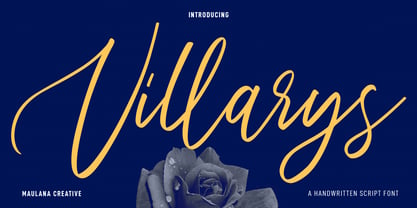 Villarys is an beautiful Script font. With high contrast stroke, fun character with a bit of ligatures. To give you an extra creative work. Villarys font support multilingual more than 100+ language. This font is good for logo design, Social media, Movie Titles, Books Titles, a short text even a long text letter and good for your secondary text font with sans or serif. Make a stunning work with Villarys font. Cheers, Maulana Creative
 - NOh Carbone by OhType!,
$32.00 NOh CARBONE is a serif typeface with more than 250 glyphs, including Capitals, Small Letters, Numbers & Special glyphs and Punctuation. Appropriate for medium and large formats, its high contrast, strong features & aggressive and unconventional diagonal endow it with great elegance and give it distinction over other types of the same style. This typeface is adapted to different topics and applications, is easily modifiable and capable of generating a clear and direct message.
 - Joss Rilex by Rotterlab Studio,
$15.00 Introducing a new beautiful calligraphy font, Joos Rilex! Joos Rilex is perfect for elegant logos, high-end packaging, wedding stationery, websites and other projects that require a handwritten and luxurious touch. A wide variety of doodles and alternatives are included so you can give your logo or name a hand-drawn calligraphic look. Features: Joss Rilex (OTF) Thank you for visiting my shop, and feel free to contact if you have any questions!
 - Sabu by Larin Type Co,
$16.00 Sabu is multitasking, modern sans-serif font family, and a great solution for anyone your project. It includes upright and Italic style, each of them has weight weights from thin to extra bold. This is a multi-purpose one that is perfect for big and small text, it is constructed modern and easy to read. With it, you can create logos, banners, use in advertising, packaging, books covers and magazines, headings, descriptions and much more.
 - Attica by Resistenza,
$39.00 Attica is a slab typeface with inverted contrast that was inspired by Caslon’s Italian type and by Aldo Novarese’s Estro, published by the turinese foundry Nebiolo. We wanted to develop a wood type typeface and we designed the complete alphabet with a flat long brush and slowly we did the whole character set. Attica contains a big set of icons and dingbats. Enjoy it. More About Opentype Features: https://bit.ly/opentype-rsz
 - Modula by Emigre,
$39.00 Modula was the first high resolution headline face that Zuzana Licko designed with the Macintosh computer. In 1985, the computer was very crude as far as being able to produce subtle curves, but it was outstanding at producing perfect geometric elements. As a guide, she used the proportions of her earlier Emperor Fifteen bitmap design and applied the precision of the computer's geometric elements. See also Modula Round and Ribbed. Greek version by Dimitris Arvanitis.
 - RNS Pictografica Cocina by RNS Fonts,
$9.00 RNS Pictografica Cocina (Kitchen, culinary arts and food related font) it is comprised of 230 glyphs, it's based on a modular structure of a minimal thickness on lines and round corners, making a clean visually drawing, give importance to the surround white for improve contrast. The font is better used on a big white canvas for achieve visual focus. And in great sizes for more impact, however the font is legible even at small sizes.
 - Masky by Graphicxell,
$19.00 Masky is a unique and very elegant font for branding and logo designs Elegant serif typeface combined with a classy and modern style. This type of font is very suitable for your various needs such as branding projects, logos, wedding designs, social media posts, advertisements, product packaging, product designs, labels, photography, watermarks, invitations, stationery, and any project, created with high level of readability. you will not be disappointed if you buy this font!!
 - Linotype Down Town by Linotype,
$29.99Linotype Down Town is part of the Take Type Library, chosen from the contestants of Linotype’s International Digital Type Design Contests of 1994 and 1997. The cheerful character of this fun font from German designer Critzler is perfect for comics or posters. The figures dance across the base line, swinging between thick and thin, big and small. Linotype Down Town is intended exclusively for headlines and short texts in at least 18 point. - Mango Display by Masa Type,
$17.00 Mango Display is a stylish blend of classic serif fonts with modern serifs with bold curves giving it a traditional groovy vibe, luxury and versatility. Mango Display is made with a high level of legibility and is perfect for nostalgic moodboard projects, vintage logos, wedding designs, social media posts, advertisements, product packaging, product designs, labels, photography, watermarks, invitations, stationery and any project. Mango Display Features: Multilanguange PUA Encoded OpenType features Stylistic alternates, ligatures
 - Vexillum by Melothias,
$17.50 Vexillum is a new and modern look at a classical serif font and inspired by a flag-like object used as a military standard by units in the Ancient Roman army and typography arabic-persian. The shapes of the letters and perfectly balanced high-contrast makes each sign look elegant, sophisticated and eye-catching. Vexillum also can be used in logos and blog posts or independently in combination with text for initials or headlines.
 - Patrol Car Stencil JNL by Jeff Levine,
$29.00 Comic books based on popular characters have been around pretty much since the advent of comic books themselves. An edition of the "Car 54 Where Are You?" series published by Dell (and based on the hit TV show created by Nat Hiken) displayed "Car 54" in a bold hand lettered stencil design on the cover. These few characters became the inspiration for Patrol Car Stencil JNL, which is available in both regular and oblique versions.
 - Britania Vintage by Max.co Studio,
$15.00 Britania Vintage is a mix of retro and modern serif font styles, with these tight curves giving traditional groovy, luxury and versatility. Britania Vintage is made with a high degree of legibility and is perfect for nostalgic projects, vintage logos, wedding designs, social media posts, advertisements, product packaging, product designs, labels, photography, watermarks, invitations, stationery and more. Features · All Uppercase and Lowercase · Number & Symbol · Supported Languages · Alternates and Ligatures · PUA Encoded Thank you, Max.co Studio
 - Mollafest by Maulana Creative,
$14.00 Mollafest is a modern script font. With high contrast stroke, fun character with a bit of ligatures. To give you an extra creative work. Mollafest font support multilingual more than 100+ language. This font is good for logo design, Social media, Movie Titles, Books Titles, a short text even a long text letter and good for your secondary text font with sans or serif. Make a stunning work with Mollafest font. Cheers, Maulana Creative
 - Permanent Park by Wing's Art Studio,
$16.00 Permanent Park - 1990s Graffiti Inspired Marker Pen Font A hand-drawn marker pen font inspired by graffiti tags and 1990s Hip Hop. Permanent Park is a marker pen font with a graffiti tag aesthetic inspired by the golden-age of Hip Hop and 1990s TV shows. It’s 100% hand-drawn and comes packed with alternative characters for creating truly natural looking type treatments. No repeated oo’s, ee’s and ll’s that are a dead give-away of lazy lettering! Permanent Park is a highly customisable all-caps design featuring a complete set of uppercase and lowercase characters, along with numerals, punctuation and language support. It also features a complete set of alternatives with additional lowercase characters (for mixing things up even more), and a selection of underlines and symbols for an illustrative flourish. It’s a uniquely fun, urban looking font, typical of 90s music videos and TV shows, and equally suited to sports, travel and food themes. Check out my visuals for ideas on how you might use it on posters, movie titles, product packaging, broadcast and advertising.
 - Fester by Fontfabric,
$150.00 Get inspired with Fester Behance presentation After several years of iterations, our brand new sans family of 16 styles is ready to take over with vector excellence! Fester is a semi-condensed Grotesque developed to beam big messages across the galaxy with a clear, bold voice. Emerging as if from the future, this low-contrast sans warps slick lines and sharp terminals into unexpected geometric shapes for extra flair. Ranging from Thin to Heavy, the typeface is loaded with 8 weights + italics, one variable style, over 760 glyphs, and Extended Latin + Cyrillic for flawless work at hyper-speed. Fester syncs with designs that feature big type, sharp layouts, interfaces, outlines, and raster images to help decipher any cutting-edge idea and make a memorable first contact. Family overview: 8 weights (from Thin to Heavy) + italics Extended Latin Cyrillic 760 glyphs Variable Font 1 free font - Fester-ExraLight 130+ languages OpenType Features: Localized Forms Subscript and scientific inferiors Superscript (Superiors) Numerators and Denominators Fractions Lining Figures Tabular Figures Oldstyle Figures Case-Sensitive Forms Standard and Discretionary Ligatures Stylistic Alternates Contextual Alternates Slashed Zero
 - Recta by Canada Type,
$24.95 Recta was one of Aldo Novarese’s earliest contributions to the massive surge of the European sans serif genre that was booming in the middle of the 20th century. Initially published just one year after Neue Haas Grotesk came out of Switzerland and Univers out of France, and at a time when Akzidenz Grotesk and DIN were riding high in Germany and Gill Sans was making waves in Great Britain, it was intended to compete with all of those foundry faces, and later came to be known as the “Italian Helvetica”. It maintains traditional simplicity as its high point of functionality, while showing minimal infusion of humanistic traits. It shows that the construct of the grotesk does not have to be rigid, and can indeed have a touch of Italian flair. While the original Recta family lacked a proper suite of weights and widths, this digital version comes in five weights, corresponding italics, four condensed fonts, and small caps in four weights. It also includes a wide-ranging character set for extended Latin language support.
 - Silk Script by Canada Type,
$29.95Silk Script is a revival and elaborate expansion of a 1956 Helmut Matheis script called Primadonna, which strangely remained a metal face and never made the leap into the film age. Silk Script has the unmistakable high contrast and elegance of formal scripts, yet both its majuscules and minuscules show much more complex and visually appealing art than traditional copperplate or Spencerian calligraphy. When set properly, it adds just the needed extra touch of artistic flair to designs that are not visually satisfying with the usual high-contrast elegant scripts. Silk Script comes in two styles, with the Alt font containing form variations on almost every letter, allowing for flexibility and precision in choice typesetting. Plenty of more alternates are available throughout the character sets of both fonts. Both styles also boast expanded character sets that include support for Central and Eastern European languages, as well as Baltic, Celtic, Esperanto, Maltese and Turkish. Silk Script Pro unifies both styles in one font, for 550 characters of sheer elegance and handy OpenType features including stylistic alternates, discretionary ligatures and class-based kerning. - Instance by preussTYPE,
$55.00 German type designer Ingo Preuss created this family between 2014 and 2016. Instance is a new classic built on the foundation of over two centuries of history. Fresh and contemporary, while feeling familiar. This typeface is a high contrast sans serif typeface family and was designed for contemporary typography, especially for use in headlines and on posters, but also for reading purposes. A flexible, medium to high contrast, sans serif less about designing a stylish decorative design and more about applying contrast onto a neo-grotesk skeleton. Instance is more than just chopping off the serifs. The classical proportions of the capitals and x-heights were maintained, but the letterforms were rebalanced for use without serifs. Contemporary modifications were made to some widths, as well as an all new Light weight was created. Please note: Instance STD Office Packages is only as TrueType (* .ttf) and Standard-Version. Also, the character set has been reduced to Standard (without OpenType-Features, SmallCaps, old style figures, etc.). Ideal for testing and for Microsoft Office applications.
 - EraMax Radial by Our House Graphics,
$16.00 EraMax Radial is a geometric sans serif meant to be set BIG, for big statements. It's the perfect face for signage, packaging posters, branding and so on and on, where a strong voice is needed. It has a modern look that will work in a retro setting. Or, should that be a vintage look that will work in a modern setting. This is the first of what is to be a series to typefaces inspired by the original hand painted signage found in the TH&B train station in Hamilton Ontario. This classic Art Deco, Or, more precisely, Art Moderne building designed by the New York architectural firm of Fellheimer and Wagner and completed in 1933. The original lettering included about 75% of the uppercase letters only, so the balance of the uppercase and the lowercase plus all the other glyphs were extrapolated from the look and feel of the existing uppercase letters. Figures are based on the numerals on the station clock, with adjustments made to harmonised with the letters.
 - Ravensara Antiqua Stencil by NaumType,
$19.00 Ravensara Stencil - elegant high contrast classic serif. Ravensara family was born from the idea of taking the Didone concept to weight extremes. In light and medium weights Ravensara transmits a very elegant and high fashion style attitude, but stays readable in small sizes and can even be used as a text font. That makes it an ideal solution for projects, that needs an injection of contemporary sophistication. Heavy weights perfectly complement light and medium ones and also works great by their own in large sizes. It is a part of the Ravensara superfamily, united by the same anatomy, which currently also includes Ravensara Sans and Ravensara Serif. Ravensara Stencil is available in 9 weights, including Thin, Light, Regular, Medium, SemiBold, Bold, ExtraBold, Black and ExtaBlack. Ravensara font family, combining its classic origins and contemporary elegance, is a perfect choice for bold headlines, oversize typography, fashion logos, branding, identity, website design, album art, posters, advertising, etc. Ravensara Stencil extends multilingual support to Basic Latin, Western European, Euro, Catalan, Baltic, Turkish, Central European, Pan African Latin and Afrikaans.
 - Pandilla by Typozon,
$39.00 Pandilla was inspired from personal sketches and letters developed by the past of the years making graffiti art. the forms of this typeface are related with the graffiti and street scenes of the different cities around the world and takes traits and elements of the Handstyle, Classic graffiti, Brazilian Pichação and different urban letters. This font has a variety of objectives, the first is to create a legible version of the graffiti inscriptions and use this typography for different print pieces, the second objective is to give back the essence of the meaning of the word "Pandilla", this word has been transformed for the past of the decades and now is associated with negative things. The original meaning of this word is a group of people who feel a close relationship, which usually have a friend or close interaction with ideals or common philosophy among members. Pandilla is to be used in different print purposes and graphic pieces like: Posters, Brochures, Magazines, Business cards and different stuff that uses big type sizes and big display formats.
 - Bebas Neue Pro by Dharma Type,
$14.99 Thank you for waiting. Finally, Bebas Neue has got lowercases! Bebas Neue is a world wide, the most popular font family with all caps released in 2010. Bebas Neue has been used from by big companies to by startup designers for many projects. In spite of the fact that Bebas Neue has only Uppercases, it became very popular font for these 10 years. At the same time, we received many requests for adding lowercases. To be honest, we had been developing whole new Bebas Neue with lowercases secretly for long time. Thinner Uppercase from thin to regular weights were redesigned for Pro. New lowercases were designed to match the Uppercases very carefully. You can access Tabular figures by using OpenType tnum features. Almost all European languages are supported by Pro. One more big thing is... Bebas Neue Pro has Italics! Please don't use sloped Bebas Neue. Pro has proper Italics! Bebas Neue “Pro” can extend your possibilities. Be the first to use this professional and premium Bebas Neue!
 - Smooth Miracles by Nathatype,
$29.00 Are you ready to make your branding stand out? Do you dream of creating headings that stand out and inspire creativity, imagination, modernity, and endless fun? Looking for an elegant and stylish font? We've got what you want. Smooth Miracles-A Script Font Smooth Miracles is a font of choice for writing things that go beyond words. This font type is designed with high detail to deliver stylish elegance. So, it can be said, the character of the change is very beautiful, a kind of classical decorative copper script. Smooth Miracles presents alternative variants of most letters, binders, and many calligraphy tips, ideal for elegant labels, high-end packaging, stationery, and compositions for certain brands, beautiful titling, verses, letters and short texts, which are intended to be read only with the eyes or intended to whisper into someone's ear. Our font always includes various language support to make your branding reach a global audience. Features: Ligatures Stylistic Sets Swashes PUA Encoded Numerals and Punctuation Thank you for downloading premium fonts from Natha Studio
 - Hinnual by Jipatype,
$27.00 Hinnual เป็นฟอนต์ที่ผสมผสานระหว่างรูปทรงสี่เหลี่ยมและทรงกลมเพื่อสร้างสไตล์ที่ไม่เหมือนใคร ชื่อมาจากคำไทย 2 คำ คือ Hin แปลว่า หิน และ Nual แปลว่า อ่อน ผสมผสานองค์ประกอบที่แข็งและอ่อนนี้สะท้อนให้เห็นในแบบอักษร ซึ่งมีเส้นที่สะอาดตาและเส้นคมซึ่งถูกทำให้อ่อนลงด้วยมุมโค้งมน ฟอนต์มีให้เลือกถึง 18 แบบ มีตัวเลือกหลากหลายให้คุณได้เลือกใช้ Hinnual เหมาะอย่างยิ่งสำหรับใช้ในพาดหัวและพาดหัวย่อย ซึ่งลักษณะที่โดดเด่นสามารถช่วยดึงดูดความสนใจของผู้อ่านได้ เส้นสายที่สะอาดตาและสไตล์ที่เป็นเอกลักษณ์ยังทำให้เป็นตัวเลือกที่ยอดเยี่ยมสำหรับแบรนด์ โลโก้ และงานออกแบบอื่นๆ ที่ต้องการภาพลักษณ์ที่น่าจดจำ โดยรวมแล้ว Hinnual เป็นฟอนต์อเนกประสงค์และสะดุดตาที่ผสมผสานองค์ประกอบทั้งความแข็งแกร่งและความนุ่มนวล การออกแบบที่เป็นเอกลักษณ์ทำให้เป็นตัวเลือกที่ยอดเยี่ยมสำหรับนักออกแบบที่ต้องการสร้างผลงานที่น่าจดจำ Hinnual is a font that combines the square and rounded shapes to create a unique visual style. Its name comes from two Thai words - Hin, which means stone, and Nual, which means soft. This juxtaposition of hard and soft elements is reflected in the font's design, which features clean, sharp lines softened by rounded corners. The font comes in 18 styles, providing a range of options for designers to choose from. Hinnual is particularly well-suited for use in headlines and sub-headlines, where its bold and distinctive appearance can help to grab the reader's attention. Its clean lines and unique style also make it a great choice for branding projects, logos, and other design elements that require a memorable. Overall, Hinnual is a versatile and eye-catching font that combines elements of both strength and softness. Its unique design make it an excellent choice for designers looking to create impactful visual content.
 - Compendium by Sudtipos,
$99.00 Compendium is a sequel to my Burgues font from 2007. Actually it is more like a prequel to Burgues. Before Louis Madarasz awed the American Southeast with his disciplined corners and wild hairlines, Platt Rogers Spencer, up in Ohio, had laid down a style all his own, a style that would eventually become the groundwork for the veering calligraphic method that was later defined and developed by Madarasz. After I wrote the above paragraph, I was so surprised by it, particularly by the first two sentences, that I stopped and had to think about it for a week. Why a sequel/prequel? Am I subconsciously joining the ranks of typeface-as-brand designers? Are the tools I build finally taking control of me? Am I having to resort to “milking it” now? Not exactly. Even though the current trend of extending older popular typefaces can play tricks with a type designer’s mind, and maybe even send him into strange directions of planning, my purpose is not the extension of something popular. My purpose is presenting a more comprehensive picture as I keep coming to terms with my obsession with 19th century American penmanship. Those who already know my work probably have an idea about how obsessive I can be about presenting a complete and detailed image of the past through today’s eyes. So it is not hard to understand my need to expand on the Burgues concept in order to reach a fuller picture of how American calligraphy evolved in the 19th century. Burgues was really all about Madarasz, so much so that it bypasses the genius of those who came before him. Compendium seeks to put Madarasz’s work in a better chronological perspective, to show the rounds that led to the sharps, so to speak. And it is nearly criminal to ignore Spencer’s work, simply because it had a much wider influence on the scope of calligraphy in general. While Madarasz’s work managed to survive only through a handful of his students, Spencer’s work was disseminated throughout America by his children after he died in 1867. The Spencer sons were taught by their father and were great calligraphers themselves. They would pass the elegant Spencerian method on to thousands of American penmen and sign painters. Though Compendium has a naturally more normalized, Spencerian flow, its elegance, expressiveness, movement and precision are no less adventurous than Burgues. Nearing 700 glyphs, its character set contains plenty of variation in each letter, and many ornaments for letter beginnings, endings, and some that can even serve to envelope entire words with swashy calligraphic wonder. Those who love to explore typefaces in detail will be rewarded, thanks to OpenType. I am so in love with the technology now that it’s becoming harder for me to let go of a typeface and call it finished. You probably have noticed by now that my fascination with old calligraphy has not excluded my being influenced by modern design trends. This booklet is an example of this fusion of influences. I am living 150 years after the Spencers, so different contextualization and usage perspectives are inevitable. Here the photography of Gonzalo Aguilar join the digital branchings of Compendium to form visuals that dance and wave like the arms of humanity have been doing since time eternal. I hope you like Compendium and find it useful. I'm all Spencered out for now, but at one point, for history’s sake, I will make this a trilogy. When the hairline-and-swash bug visits me again, you will be the first to know. The PDF specimen was designed with the wonderful photography of Gonzalo Aguilar from Mexico. Please download it here http://new.myfonts.com/artwork?id=47049&subdir=original
 - C-Nation by URW Type Foundry,
$39.99 Marit Otto about C-Nation: The building typeface. Although the 70ties were very liberating and progressive, still girls played mainly with dolls and sweet things and boys with all kinds of challenging stuff. They did all sorts of basic scientific experiments in mini labs and of course built cool things with Meccano building sets. As a girl I was perfectly happy with the toys I had access to. But at the same time I was very curious about all the adventure toys and discoveries my brother did. It also made me wonder why the grown up people thought that our world could be separated so easily by separating our toys in pink and blue sections. At this day of age Meccano is probably hopelessly old fashioned and far to manual. Children of today are fed by fast images and cool animations on screen, they learn, play, communicate and relax in the same space, the digital space. The special feature of Meccano was that even though it was very basic there was the promise you could create anything. It might even contribute to a logical mind. The typeface I designed refers to the Meccano feel. It is a creative typeface. A bit masculine and bold looking perhaps but after the first impression a subtle and refined female touch is revealed. It has links to architecture and associations with metal constructions like ‘The Eiffel Tower’ and (old railway) bridges. I am convinced that we all think of that as very charming man-made objects.
 - Haunted House by HiH,
$8.00 Halloween lends itself to graphic images: witches, ghosts, bats, jack-o'lanterns and haunted houses. When we think of a haunted house, we generally think of a large, abandoned, derelict Victorian wood-frame house. The style is usually Second Empire or Queen Anne. There tends to be a lot of decoration. There is usually a porch or two with decorative spindle work. There is probably a tower, either square with a mansard roof such as one might see in Paris or round with a conical roof borrowed from a Loire Valley chateau. These houses were generally built in the United States between 1860 and 1900, products of the exuberance of a time before income tax. It took at least three servants to maintain such a house and was very expensive. Few can afford them today. That is why so many were converted to professional offices, multi-family dwellings or simply abandoned. HAUNTED HOUSE is our typographical contribution to Halloween. Based on our font PETRARKA ML, it features decorative capitol letters that utilize the silhouette of a Second Empire style house complete with a dead tree and a full moon. The font includes 8 ornaments suitable for flyers and party invitations. Revision 2.000 eliminates dual encoding, harmonizes metrics, adds new glyphs, and adds open type features. The zip package includes two versions of the font at no extra charge. There is an OTF version which is in Open PS (Post Script Type 1) format and a TTF version which is in Open TT (True Type)format. Use whichever works best for your applications.
 - Dancin' by ITC,
$29.00Dancin' is yet another unusual typeface from American designer David Sagorski. Based on his own style of handwriting, Dancin' is an inventive, carefree typeface ornamented with dots and unusual strokes. - Aitos by Monotype,
$29.99Kevin Simpson was five years old when the stylized "E" of the Electrolux vacuum cleaner logo caught his eye. This is his earliest recollection of an interest that ultimately became an obsession. Type remains his major preoccupation, and he admits to attempting to work a good typeface design into any project where he can get away with it. Aitos was inspired by a metal sculpture Simpson saw while driving through the French countryside. "The statue was very strong. It was heavily weathered and had obviously been there for some time, yet it also seemed very delicate and light." Aitos, like the statue, is a rugged design. At first glance, it is chunky and bold, perhaps a little jarring. If you look again, however, you'll see it has refined qualities. Aitos commands attention - yet is still affable. - Genre by Storm Type Foundry,
$26.00The official terseness and grey of Neo-Classical type faces will stand out when we narrow them. The consistently vertical shading of the letters suppresses one's desire for eccentricity, just like tea with bromine. It would, however, be wrong to consider Bodoni as the originator of this - vertically shaded - trend in type face production. In his Manual we can also find type faces with a slanted axis of shade, picturesque italics and a number of normal, more human type faces. It remains a mystery why his name is connected only with one of his many works. Genre's basic design is fairly light in colour, which is why it looks good in illustrated magazines and short texts and directly calls for graphically striking, contrasting headings. It shows off beautifully next to photographs, on diplomas and on printed materials connected with a person's death. - Konrad Kachelofen by Proportional Lime,
$9.99 Konrad Kachelofen was a printer in the city of Leipzig beginning around 1483. He printed many works by contemporary authors and also many of the classics. He acquired an unusually large amount of typefaces for his shop, a place that included a wine bar and book store. This type face is based on Typ.11:340G GfT510 Gesamtkatalog der Wiegendrucke and is similar to Proportional Lime’s “Kachelofen'' font. The major differences are that the whole miniscule set is slimmer and the majuscule set has different style glyphs and this face was used solely for titles and section headings because of its sharper and clearer appearance at large point values. Konrad probably died in 1529 after passing his business on to his son-in-law Melchior Lotter, who also went on to fame as an industrious and illustrious printer.
 - Architype Stedelijk by The Foundry,
$99.00 Architype Crouwel is a collection of typefaces created in collaboration with Wim Crouwel, following his agreement with The Foundry, to recreate his experimental alphabets as digital fonts. Crouwel's most recognized work was for the Van Abbe and Stedelijk museums (1954 –72) where he established his reputation for radical, grid-based design. Stedelijk first appeared in the seminal Vormgevers poster, commissioned by the Stedelijk Museum, Amsterdam in 1968. Crouwel created a rigid grid system across the poster of 57 vertical by 41 horizontal lines, also forming the basis for the construction of the letterforms. Although all hand drawn, the resulting typeface had a machine-made appearance. This striking black and white poster with its visible grid became one of Crouwel's most iconic designs. Architype Stedelijk now re-creates these letterforms as a single alphabet typeface in a digital font.
 - Ongunkan Enochian Script by Runic World Tamgacı,
$60.00 I drew this font staying true to the original design. The letter table in the relevant book was taken as reference. Enochian (/ɪˈnoʊkiən/ ə-NOH-kee-ən) is an occult constructed language[3] — said by its originators to have been received from angels — recorded in the private journals of John Dee and his colleague Edward Kelley in late 16th-century England.[4] Kelley was a scryer who worked with Dee in his magical investigations. The language is integral to the practice of Enochian magic.
 - Tourist Postcard JNL by Jeff Levine,
$29.00 Alf Becker graced many issues of “Signs of the Times” (a trade magazine for the sign industry) with his innovative hand lettered alphabets for others to use as design inspirations. His 134th submission was titled “Post Card Type”, a condensed thick-and-thin stylized Art Deco design. This served as the inspiration for Tourist Postcard JNL, which is available in both regular and oblique versions. Thanks to Tod Swormstedt of S.T. Media Group and the American Sign Museum for providing the work image for this type revival.
 - Shinemoon by Scratch Design,
$14.00 Introducing, Shinemoon, a futuristic font by Scratch Design Shinemoon is a sans-based font with futuristic hi-tech lowercase & uppercase that will make your design look futuristic and modern. This font will be suitable for science-fiction movie posters, advertising, or projects that match with hi-tech, robots, space, future, planet or race. You can mix and match the uppercase and lowercase to make your design more stunning and stand out. This font is also included with ligatures, alternates and multi-language. Enjoy this futuristic font!
 - Bayview JNL by Jeff Levine,
$29.00Around the turn of the 20th Century, the Inland Type Foundry produced a display face named Studley. It was a variation on a design by another foundry called Florentine. A condensed face with a bold, clean look, the design resembled the warmth and feel of a classic wood type. Best applied to headlines and titles, the font reads amazingly well at even 18 point renderings. Jeff Levine had added his own personal touch to his digital version of this old favorite and renamed it Bayview JNL. - P22 FLW Terracotta by P22 Type Foundry,
$29.95The lettering and 100 extras for this font set, the third in P22’s Frank Lloyd Wright series, are derived from letterforms and decorative embellishments found in Wright’s early work (1893–1910) and in his book, The House Beautiful (1896–97). Wright based his delicate graphic designs on stylized natural plant forms. Users go this font can adorn their graphics with these beautiful motifs. Terracotta Regular and Terracotta Alt have been remastered and now contain almost 400 characters including support for Western and Central European languages. - Acorde by Willerstorfer,
$95.00 Please note: Acorde webfonts are exclusively available at willerstorfer.com Acorde is a reliable workhorse for large, demanding design projects. It was designed to be perfectly suited to all different sizes, from small continuous text to large headlines and big signage. The typeface’s name is derived from ‘a’ ‘cor’porate ‘de’sign typeface, however Acorde is not only suitable for corporate design programmes but for information design and editorial design purposes as well. Acorde’s inception was in early 2005 as Stefan Willerstorfer’s final project in the Type and Media course at the Royal Academy of Art in The Hague (NL). It is a humanist sans serif with noticeable diagonal contrast and shows clear influences of the broad nib pen, especially in the Italics. Acorde’s characterful details give it a distinctive appearance in large sizes and contribute to its high legibility in small sizes. It comes in 14 styles – seven weights in Roman and Italic each. While the proportions of the Regular style were chosen to guarantee optimal legibility without being too space consuming, the heavier the weight gets the more suitable it is for headline purposes. The heavy weights are relatively narrower than the lighter ones, which gives them a strong appearance. The huge character set contains 925 glyphs per font and covers a vast range of latin-based languages. Various accented letters, small caps, eleven figure-sets, superscript and subscript are all included. OpenType features allow for a comfortable use of the large set. Acorde was honored with the 2010 Joseph Binder Bronze award for type design by DesignAustria.