10,000 search results
(0.018 seconds)
- Sasa by NJ Studio,
$19.00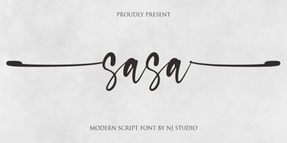 Hi...Thank for your visit :) Sasa a modern script font with beginning and ending swash. It features ligatures characters that will take your projects to the next level! This font is PUA code which means you can easily access all the glyphs and swash that are full of authentic! It also features many special features including glyphs. font designs that are made for various vector designs, printing such as digital wedding blogs, online shops, social media, while printing can be used in the field of product clothing, accessories, bags, pins, logos, business cards, watermarks and many others ... so it can make your product look authentic and attractive, and also Multilingual support!!! Happy design ...
 - Sweet Song by NJ Studio,
$19.00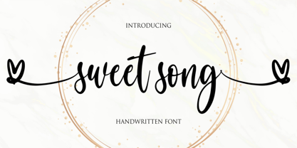 Hi...Thank for your visit :) Sweet song a handwritten script font. It features beginning swash and ending swash characters that will take your projects to the next level! This font is PUA code which means you can easily access all the glyphs and swashes that are full of swash! It also features many special features including glyphs. font designs that are made for various vector designs, printing such as digital wedding blogs, online shops, social media, while printing can be used in the field of product clothing, accessories, bags, pins, logos, business cards, watermarks and many others ... so it can make your product look cute and attractive, and also Multilingual support!!! Happy design ...
 - Valienta Script by Colllab Studio,
$19.00 "Hi there, thank you for passing by. Colllab Studio is here. We crafted best collection of typefaces in a variety of styles to keep you covered for any project that comes your way! Fonts never fit your designs ? They’re just not flexible enough, not modern enough or too old-fashioned? And you’re too busy to keep looking for a font that fits the bill, right? The market is flooded with all kinds of fonts, but none of them is simple and elegant. Valienta Script is what you’re looking for. It’s an elegant typeface created to make your designs stand out from the crowd, and to add a touch of luxury. A Million Thanks www.colllabstudio.com
 - Lampard Signature by NJ Studio,
$19.00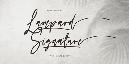 Hi...Thank for your visit :) Lampard Signature a stylish signature font 9 swash and ending swash. It features ligatures characters that will take your projects to the next level! This font is PUA code which means you can easily access all the glyphs that are full of swash! It also features many special features including glyphs. font designs that are made for various vector designs, printing such as digital wedding blogs, online shops, social media, while printing can be used in the field of product clothing, accessories, bags, pins, logos, business cards, watermarks and many others ... so it can make your product look swash and attractive, and also Multilingual support!!! Happy design ...
 - Dairy day by NJ Studio,
$19.00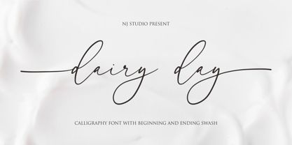 Hi...Thank for your visit :) dairy day a modern calligraphy font with beginning and ending swash. It features ligatures characters that will take your projects to the next level! This font is PUA code which means you can easily access all the glyphs that are full of natural! It also features many special features including glyphs. font designs that are made for various vector designs, printing such as digital wedding blogs, online shops, social media, while printing can be used in the field of product clothing, accessories, bags, pins, logos, business cards, watermarks and many others ... so it can make your product look natural and attractive, and also Multilingual support!!! Happy design ...
 - Make Cake by NJ Studio,
$19.00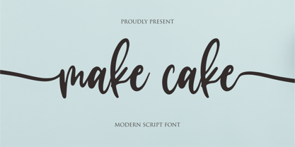 Hi...Thank for your visit :) Make cake a script font. It features beginning swash and ending swash characters that will take your projects to the next level! This font is PUA code which means you can easily access all the glyphs and swashes that are full of swash! It also features many special features including glyphs. font designs that are made for various vector designs, printing such as digital wedding blogs, online shops, social media, while printing can be used in the field of product clothing, accessories, bags, pins, logos, business cards, watermarks and many others ... so it can make your product look cute and attractive, and also Multilingual support!!! Happy design ...
 - Hertical by Edignwn Type,
$12.00 Hi everyone, how are you today? We hope you are good. And don’t forget to stay safe. Today we release a crafted display font again, it's called Hertical. Hope you are enjoy the design of font. Hertical come with two typefaces, serif and sans serif. Every typeface contains four styles (regular, smooth, rough and texture). This matches applies in some designs such as the logotype, poster, label, badge, packaging, branding, quotes and more custom design. Hertical includes : 2 typefaces (serif and sans serif) 4 style typefaces (regular, smooth, rough and texture) All-caps, numeral, symbol and punctuation 2 sets alternates on serif font Multilingual PUA Encoded Thank you for your support and choosing us.
 - Get Married by NJ Studio,
$19.00 Hi...Thank for your visit :) Get Married a modern calligraphy font with 192 alternate, swash and ligature. It features ligatures characters that will take your projects to the next level! This font is PUA code which means you can easily access all the glyphs that are full of natural! It also features many special features including glyphs. font designs that are made for various vector designs, printing such as digital wedding blogs, online shops, social media, while printing can be used in the field of product clothing, accessories, bags, pins, logos, business cards, watermarks and many others ... so it can make your product look natural and attractive, and also Multilingual support!!! Happy design ...
 - Rich and Famous by NJ Studio,
$19.00 Hi...Thank for your visit :) Rich and Famous a modern script font with beginning and ending swash. It features ligatures characters that will take your projects to the next level! This font is PUA code which means you can easily access all the glyphs and swash that are full of authentic! It also features many special features including glyphs. font designs that are made for various vector designs, printing such as digital wedding blogs, online shops, social media, while printing can be used in the field of product clothing, accessories, bags, pins, logos, business cards, watermarks and many others ... so it can make your product look authentic and attractive, and also Multilingual support!!! Happy design ...
 - Vernacular Sans by jpFonts,
$19.95 The Vernacular trilogy was designed by Swiss designer Hans-Jürg Hunziker, who had worked for Adrian Frutiger in Paris for many years. Based on the concept of a transitional Linear Antiqua, he has developed a colorful bouquet of typefaces that contain the entire spectrum of typefaces for book design and corporate identity. Thanks to his "Swiss school" and his outstanding skills, he has succeeded in giving the typefaces a particularly noble and sympathetic expression. In addition to the Sans family, there is a Serif family and a Clarendon family, each of which, including the separately drawn italics, is equipped with 12 font weights that are finely tuned to one another. Each of the 3 font styles develops its own character, but thanks to a concept that brings the different font styles closer together, they also work well together and complement each other perfectly. Sans and Clarendon have a vertical axis and similar endings in contrast to the Serif, which has a traditional diagonal axis and horizontal endings. The straight stems and the proportions are used as an element to stress the closeness of the typeface-trilogy. They thus share a comon feature. All fonts contain tabular and proportional figures as well as old style figures. Small caps and small cap figures are also available in all fonts. In addition, some fonts have alternative characters available via style set, such as «g», which can be used to further vary the typeface. Vernacular offers all the options for well-kept typesetting for print and web - for small and large orders.
 - Vernacular Serif by jpFonts,
$19.95 The Vernacular trilogy was designed by Swiss designer Hans-Jürg Hunziker, who had worked for Adrian Frutiger in Paris for many years. Based on the concept of a transitional Linear Antiqua, he has developed a colorful bouquet of typefaces that contain the entire spectrum of typefaces for book design and corporate identity. Thanks to his "Swiss school" and his outstanding skills, he has succeeded in giving the typefaces a particularly noble and sympathetic expression. In addition to the Sans family, there is a Serif family and a Clarendon family, each of which, including the separately drawn italics, is equipped with 12 font weights that are finely tuned to one another. Each of the 3 font styles develops its own character, but thanks to a concept that brings the different font styles closer together, they also work well together and complement each other perfectly. Sans and Clarendon have a vertical axis and similar endings in contrast to the Serif, which has a traditional diagonal axis and horizontal endings. The straight stems and the proportions are used as an element to stress the closeness of the typeface-trilogy. They thus share a comon feature. All fonts contain tabular and proportional figures as well as old style figures. Small caps and small cap figures are also available in all fonts. In addition, some fonts have alternative characters available via style set, such as «g», which can be used to further vary the typeface. Vernacular offers all the options for well-kept typesetting for print and web - for small and large orders.
 - Vernacular Clarendon by jpFonts,
$19.95 The Vernacular trilogy was designed by Swiss designer Hans-Jürg Hunziker, who had worked for Adrian Frutiger in Paris for many years. Based on the concept of a transitional Linear Antiqua, he has developed a colorful bouquet of typefaces that contain the entire spectrum of typefaces for book design and corporate identity. Thanks to his "Swiss school" and his outstanding skills, he has succeeded in giving the typefaces a particularly noble and sympathetic expression. In addition to the Sans family, there is a Serif family and a Clarendon family, each of which, including the separately drawn italics, is equipped with 12 font weights that are finely tuned to one another. Each of the 3 font styles develops its own character, but thanks to a concept that brings the different font styles closer together, they also work well together and complement each other perfectly. Sans and Clarendon have a vertical axis and similar endings in contrast to the Serif, which has a traditional diagonal axis and horizontal endings. The straight stems and the proportions are used as an element to stress the closeness of the typeface-trilogy. They thus share a comon feature. All fonts contain tabular and proportional figures as well as old style figures. Small caps and small cap figures are also available in all fonts. In addition, some fonts have alternative characters available via style set, such as «g», which can be used to further vary the typeface. Vernacular offers all the options for well-kept typesetting for print and web - for small and large orders.
 - Retiro Std by Typofonderie,
$59.00 Full of life Hispanic Didot in 2 optical sizes Retiro is a daring interpretation of Spanish typography. Severe, austere and yet, full of life, Retiro is a vernacular version of Castilian and Andalusian in a typical Didot. Named after a lovely park in Madrid, Retiro started life as a a bespoke typeface designed to give a unique voice to the magazine Madriz. In 2006, the founder of Madriz was looking for a Didot for his new magazine. The Didot is the archetypal typeface used in high-end magazines. Retiro is a synthesis of these high contrast styles mixed with an Hispanic mind. Result is then, after 2-3 years of work, a typeface with countless variations to establish typographic shades adapted to different sections and pages of the Madriz. In 2014, it was necessary to further revise the typeface before its launch at Typofonderie. In order to keep its originality, the unique weight was retained, but complemented with optical size variants to set highly contrasted headlines into various sizes, visually balanced. How to use Retiro optical sizes? Each font provided in Retiro family is named according to the scale of body size: 24 pt and 64 pt. Of course, these names are referring to the body sizes used in typographic design. In the “glorious old days,” the letterpress period, it was customary to cut punches directly to the size at which typefaces would be used. The punchcutter had to visually adapt his design to the engraving size. The aim was to optimize the best contrast and general weight, but also to respect both design’s and reader’s needs. In Retiro’s case, intended for large titling sizes, it’s an adaptation of this ancient practice for our contemporary uses. Although each font is named by a typographic point size, do not feel obliged to use this font at this precise size, but why not, in larger or smaller. It’s rather the concept of gradients that must be preserved in layouts, rather than strictly size numbers. It’s up to the designer to select the right font size for his own designs. Granshan Awards 2012 Creative Review Type Annual 2011 Designpreis 2011 Club des directeurs artistiques, 41e palmarès Type Directors Club 2010 Certificate of Type design Excellence
 - DEADman by Volcano Type,
$29.00The font family "DEADman" is mostly inspired by the weird style of the British illustrator Ralph Steadman. He had a long partnership with the American journalist Hunter S. Thompson, drawing pictures for several of his articles and books e.g. "Fear and Loathing in Las Vegas." Like Steadman's artwork all the letters are painted with ink. The best ones were selected out of hundreds of variations to get the whole character set complete and look uniform. By combining the regular weight with one (or both) of the additional weights "Blotting" and "Squirting" you can achieve a more freaky and psychadelic look. - Maat by Wordshape,
$20.00 Maat is a modular geometric stencil display font that includes a number of modular pattern characters, and can be used to create designs that echo early Modernism by merely applying letters, patterns and color. Maat is a loose interpretation of a hand lettered alphabet by the late Dutch designer Jurrian Schrofer called Sans Serious which was included in Wim Crouwel's publication Letters of Maat. It is inflected with a bit of influence from British designer Ken Garland's similar lettering form the cover of his textbook, The Graphics Handbook. Maat derives its name from the title of Couwel's booklet.
 - American Scribe by Three Islands Press,
$39.00 The Declaration of Independence was authored by Thomas Jefferson, but his is not the classic handwriting on the engrossed copies familiar to most Americans. That belonged to Timothy Matlack, an early patriot who fought in the Revolution, sat as prosecutor at Benedict Arnold’s court martial, and also penned copies of a number of documents for then-General George Washington. Matlack’s script was compact but legible, perfect for the first and most famous of American documents. Now you, too, can write that way. Please note: The font does not include any of the signatures from the Declaration of Independence.
 - Big Chuck by Proportional Lime,
$1.99 Charlemagne, one of the great rulers of the Middle Ages, was instrumental in the reestablishment of formal education in the West. This font was inspired by the notion that he felt the need to protect his communications from people with the ability to read; a rare skill then. Did he really command such a script to exist? He did instigate the development Carolingian minuscule script. Here are two different systems that are both attributed to him. Does it provide any real security? No, but it is fun to think about how such a system might have been used.
 - Ambient by IHOF,
$24.95 “When you push the stage props of the life aside, there will remain the truth ...” Ambient is a deconstructed sans-serif font, which captures the essence of basic Roman letterforms... with a few twists. Gabor Kothay was born July 19th, 1962. He works as a graphic designer and teaches second-form art students. Typeface design was a hobby for many years but it has become an everyday routine with Fontmunkasok and Fontana Type Foundry. He lives with his wife and two daughters in a suburb of Szeged, a sunny southern Hungary town that lies on the banks of the Tisza river.
 - ITC Quorum by ITC,
$29.99Australian typographer Harry Pears continues to explore ancient type forms while maintaining his consultancy business Typeface Research Pty. Ltd., of Lake Cathie, Australia. Born in Quirindi, Australia, Harry has had a long career in printing and graphic arts and has been the guiding force behind the creation of the Lindisfarne Nova family. Lindisfarne Nova Incised and Lindisfarne Runes are wonderful illustrative companions to the Lindisfarne Nova text fonts. In a unique partnership, Harry develops the concepts, and calligrapher Margaret Layson brings the designs to life. They both then work on the digital incarnation in a true collaboration. - Newsprint JNL by Jeff Levine,
$29.00 Newsprint JNL has its origins in an online auction image of wood type. Only the lower case a-z were shown and the type design included an extra-wide 'g' and 's'. Expanding on this idea but narrowing the 's' a bit, Jeff Levine created a capitals set and all of the necessary additional characters - even adding a generous selection of accented characters not usually found in his display fonts. Regular, oblique, narrow, narrow oblique, wide and wide oblique versions are available. All styles offer crisp, clean lettering for headlines, window signage and other display text applications.
 - Bosento by Gatype,
$12.00 Hi everyone, come back from us The Bosento font is perfect for Your projects today are branding, poster design, t-shirts, invitations, designs for children, and editorial design. You will find a lot of glyphs, including ligatures, to look elegant in this bold serif. OpenType features include style sets, character variants, starting and ending forms, and multilingual support. Important information: To access the alternatives, you must have access to an older version of Photoshop to copy/paste the glyphs from the included PSD, OR the Glyphs Panel, which can be found in Photoshop CC or any Version of Adobe Illustrator. Cheer!
 - Tough Talk by Comicraft,
$29.00 What's that, bub? Looking for a whole train full of whupass? A six pack of adamantium shred? Listen, are you talking to me or chewing a brick? Either way you're gonna get all your teeth broken. And if you think that's all just Tough Talk, make your move, bub. (Our new font, ToughTalk, put the words in Wolverine's mouth in the pages of Steve Skroce's WOLVERINE: BLOOD DEBT, but don't tell the short Canadian over there, he's likely to get upset at the mere suggestion that people put words in his --) What? No, I didn't, uh, say you were -- ulp -- short...
 - Femi SRF by Stella Roberts Fonts,
$25.00 People often come into your life and make a significant impression that lasts a lifetime. Be they friend, family member or relationship partner, such people are rare and endearing. Sadly, we lose many of these individuals before their time. Femi SRF is dedicated to one such person who was in Stella's life and whose memory will live on long past the duration of his mortal existence. Like Femi himself, this typeface offers a touch of bold elegance and discipline. The net profits from my font sales help defer medical expenses for my siblings, who both suffer with Cystic Fibrosis and diabetes. Thank you.
 - Sign Maker JNL by Jeff Levine,
$29.00In 1948, Joseph Struhl pioneered an innovative do-it-yourself sign kit for retail merchants. Die-cut letters and numbers made from flexible sheets of vinyl with the ability to adhere to smooth surfaces by static electricity; his "Magic Master Interchangeable Sign Kits" became a great success. Jeff Levine has paid tribute to this innovative method of in-store advertising with Sign Maker JNL. Because of their die-cut shapes, the design style of the static cling letters have unique characteristics. Companion fonts (based on other Struhl sign kits) are Cling Vinyl JNL and Cling Vinyl Clear JNL. - Take The Money by Kitchen Table Type Foundry,
$15.00 Take The Money is a wonky all caps font, made with a Sharpie pen. The name was inspired by something I read in the newspaper: apparently a Danish artist received €72.000 from a museum to create two works of art. The works of art should depict the average income of someone from Austria and someone from Denmark - in real money. The museum then loaned him the €72.000 and told him he'd receive €3.300 for his work. The artist decided that €3.300 would merely cover the costs, so he delivered two empty canvases and called the work: Take The Money And Run.
 - Calamity Wayne by explogos,
$24.99 Calamity Wayne is a reverse-contrast slab serif, inspired by the ‘wild west’ French Clarendons (aka Italians or Egyptians) of the late-1800s. Despite the idiosyncrasies that make it ideal for display and headline uses, it is also surprisingly legible in text settings. Calamity Wayne supports Latin, Cyrillic and Greek, and is available in OTF and TTF formats. Acknowledgement: I am very grateful to David Jonathan Ross (https://djr.com) for his support and encouragement.
 - Sirenia by Floodfonts,
$49.00 Sirenia is designed by nature! A friendly display typeface with organic letterforms and flowing transitions, as if naturally grown. This authentic natural look is ideally suited for lifestyle products, the food & beverage sector and for sustainable design. Sirenia’s 1270 characters contain many decorative letters and swash variations for initial, medial and final letters. This allows the designer to create lively logotypes according to her/his own ideas, matching the respective letter combination.
 - DF Dudok by Dutchfonts,
$33.00 The DF Dudok is a minimal bitmap typeface which works very well in small sizes both on your screen and on paper. I am connected in a culinary way with the architects’ name W.M. Dudok. It was the first restaurant where I cooked under the critical eye of my chef Gerhard Braun. (Now La Stanza in Rotterdam) Well, it is incidently getting into my typeface work, the cook, the architect, his wife and...who knows
 - Sageyl by Sealoung,
$25.00 Proudly present Sageyl Typeface created by Sealoung, A serif modern and classic typeface that his own unique style & modern look. It loops and swoops in a delicate dance that is never boring. Use this dainty serif as a memorable logotype or header and pair it with something contrasting and clean. This typeface is perfect for an elegant & luxury logo, book or movie title design, fashion brand, magazine, clothes, lettering, quotes, and so much more.
 - Journal Republica by Wildan Type,
$15.00 Journal Republica is a serif typeface inspired by the beauty of classic serif and calligraphic style, fused with modern appeal to blend with modern needs. His family is Regular, Italic, and Bold. Journal Republica offers many possibilities to be applied in many graphic or editorial projects. The Regular weights are suitable for short paragraph, and Bold weight are perfect for headlines, perfectly suitable for display purpose such as branding, editorial, book covers, and packaging.
 - Country Fang by Baseline Fonts,
$39.00Brian Miller is a graphic designer who loves hillbilly culture, which is what inspired his popular phrase, 'country fangs!'--used to describe anyone with teeth that - well - just don't quite line up right. Git Cletus an' Jimmy Ray an' we'll hold down a piggy an' make 'er SQUEAL!!!!!--be sure t' put yer teeths in, too! Country Fang includes multiple grit patterns and appropriate "teeth" icons to spiff up any layout on the fly. - ITC Eastwood by ITC,
$29.99 ITC Eastwood is the work of British designer Martin Archer and is named for Clint Eastwood. Archer was looking for a plain oldstyle typeface with open lower case forms and used Stempel Garamond as his starting point, although the result ended up well beyond its origins. In small point sizes the typeface looks interestingly rough while at display sizes it looks like a 16th century French typeface and its unique details come forward.
 - Sandwich Shop JNL by Jeff Levine,
$29.00 A 1930s WPA (Works Progress Administration) poster promoting national parks depicts Native Americans overlooking the land with the tag line "his hunting ground of yesterday". The hand lettering of that text is reminiscent of Futura Black and similar Art Deco stencil-influenced type designs, but is rendered in an oblique lower case with no capitals. Re-drawn as Sandwich Shop JNL, the typeface is now available in both regular (vertical) and oblique versions.
 - PiS LIETZ Berlham by PiS,
$38.00 Need a perfect typeface for your post-apocalyptic shooting game? A documentary about suffragettes? Your vintage themed coffeeshop? PiS Lietz Berlham! Boom! Just as his straighter brother LIETZ Lindham, Lietz Berlham evokes the spirit of the 1920s and 30s. Hand-drawn and rough, it is perfect for large scale use in all things retro, but legibility is given also in smaller sizes. It features over 370 glyphs, ligatures and special characters. Have fun!
 - ITC Mona Lisa by ITC,
$29.99ITC Mona Lisa was designed by Pat Hickson, a stark and elegant typeface originally drawn in the 1930s by Albert Auspurg. The original drawings were long gone and the surviving metal type was already severely worn when Hickson studied Auspurg's design for his recreation. The result is a typeface which melds the flavor of the 1930s with current design standards. ITC Mona Lisa displays all the suave sophistication of Fred Astaire and Greta Garbo. - Austin Pen by Three Islands Press,
$29.00 Empresario Stephen F. Austin (1793-1836) is considered by many the “Father of Texas” for leading the first Anglo-American colony into the then-Mexican territory back in the 1820s. A few years later, while on a diplomatic mission to Mexico City, Austin was arrested on suspicion of plotting Texas independence and imprisoned for virtually all of 1834. During this time he kept a secret diary of his thoughts and musings—much of it written in Spanish. Austin Pen is my interpretation of Austin’s scribblings in this miniature prison journal (now in the collection of the wonderful Dolph Briscoe Center for American History, in the Texas city that bears his name). The little leather-bound book is filled with notes in ink and pencil—some of the faded penciled pages traced in ink years later by Austin’s nephew Moses Bryan. A genuine replication of 19th century cursive, Austin Pen has two styles: a fine regular weight, along with a bold style that replicates passages written with an over-inked pen. Each is legible and evocative of commonplace American penmanship of two centuries ago.
 - Cartier Book by Monotype,
$29.99 Cartier was Canada’s first roman text typeface, created in 1967 to celebrate Canada’s centennial. Its designer, Carl Dair, was one of the country’s most celebrated graphic design pioneers, and a fine designer indeed — but he was not a trained type designer. He had spent a year at the Enschedé type foundry and printing works in the Netherlands, but that probably wasn’t enough to fully grasp all that was required to make an effective text face. It is also possible that Dair simply compromised his own design by not allowing any of the much needed alterations to be made to his working drawings when they were handed over to Linotype for production. Cartier, though a strikingly original oldstyle, never became the influential allround text face it might have been. A display typeface derived from it, Raleigh, was more successful. Realizing that Dair’s design was sound in concept, if not in execution, Rod McDonald began working on a new digital version in 1997. The final family is convincing proof that Cartier could have been the functional text face that Dair originally wanted.
 - Labyrindo by URW Type Foundry,
$39.99 Labyrindo is inspired on the classic Labyrinth. The oldest known labyrinth is 3200 years old and is to be found in Greece. The mythological king Minos held the monstrous son of his wife ‘Minotaurus’ prison in a labyrinth. Much later the labyrinth made his appearance in the medieval churches, this time as a pattern on the church floor. During the Italian renaissance the multiple gate labyrinth came in fashion. Paths led trough green hedges in beautiful palace gardens. These hedges where perfectly cut in rectangular shapes. Mainly meant as an aesthetic statement. Besides the origin of the physic labyrinth, it has always been a great source of story-telling and myths. I mention a few personal favourites (film) like, Pan’s Labyrinth (a journey to the underworld), Labyrinth (with David Bowie) and the Shining with Jack Nicholson (where a horrific scene takes place in a labyrinth). Not the most cheerful stories but fascinating and intriguing. A Labyrinth is mind boggling and mysterious but wonderful. I made graphic translation in this typeface.
 - ITC Merss by ITC,
$29.99ITC Merss proves that sometimes accidents work out just fine. Late one evening Eduardo Manso, an Argentinean graphic and type designer, spilled coffee on his desk. When he began to wipe up the mess, he noticed that one of the splashes looked like a roman letter 'l' - complete with serifs. This triggered his imagination. “What if a complete alphabet was created with this same irregular flow to the character designs?” ITC Merss was the result of Manso's experiments with “fluid” letter shapes. The oddly handsome design looks aged and spontaneous at the same time. Its irregular texture is striking-the result of careful modeling of character shapes. While Manso wanted to maintain the free-form character of spilled liquid, he also knew the individual letters had to work together with an underlying harmony. When not experimenting with typefaces - or spilled coffee - Manso creates award-winning graphic and publication designs. A contributor to the design magazine el Huevo (the Egg), he also writes articles on type and typography and is part of the publication's design team. - Halis Grotesque by Ahmet Altun,
$19.00 The Halis Grotesque font family comes in eight weights of Normal and Italic. In addition, all weights contain small caps in both italic and normal. The name of the font means “pure, clean.” The Halis Grotesque Font Family has the new Turkish Lira Sign as well as an alternative ampersand created by Prof. Halis Biçer, renowned in Turkey for his expertise in typography, calligraphy, and graphic design. That’s why this font’s name is inscribed with a dedication to the venerable Halis Biçer. The spaces between characters are wide enough to be legible even at very small sizes. With the HALIS GROTESQUE FONT FAMILY, you can create beautiful works for the web, including logos, banners, body copy, and presentations. Halis Grotesque also works nicely in print formats such as posters, T-shirts, magazines, and affiches. Because of its eye-pleasing style, this font is both effective and versatile.