3,314 search results
(0.018 seconds)
- Heisei Kaku Gothic N by Adobe,
$79.00 - Iwata Maru Gothic Std by IWATA,
$149.00 書き文字のような柔らかみのある丸ゴシック体です。字面が大きくラインが揃うデザインです。あたたかさや優しさ、親しみやすさを表現しやすい書体です。
 - Iwata G Gothic Pro by IWATA,
$199.00
- FF Letter Gothic Slang by FontFont,
$41.99 American type designer Susanna Dulkinys created this display and sans FontFont in 1999. The family has 6 weights, ranging from Light to Bold and is ideally suited for festive occasions and music and nightlife. FF Letter Gothic Slang provides advanced typographical support with features such as ligatures, alternate characters, case-sensitive forms, and stylistic alternates. It comes with a complete range of figure set options – oldstyle and lining figures, each in tabular and proportional widths. This FontFont is a member of the FF Letter Gothic super family, which also includes FF Letter Gothic Mono and FF Letter Gothic Text.
 - Sign Gothic Bold Condensed by BA Graphics,
$45.00Strong Bold Condensed Gothic great for poster and display work. - News Gothic SB Vietnam by Scangraphic Digital Type Collection,
$26.00 This version of News Gothic contains the Vietnamese character set. Since the release of these fonts most typefaces in the Scangraphic Type Collection appear in two versions. One is designed specifically for headline typesetting (SH: Scangraphic Headline Types) and one specifically for text typesetting (SB Scangraphic Body Types). The most obvious differentiation can be found in the spacing. That of the Body Types is adjusted for readability. That of the Headline Types is decidedly more narrow in order to do justice to the requirements of headline typesetting. The kerning tables, as well, have been individualized for each of these type varieties. In addition to the adjustment of spacing, there are also adjustments in the design. For the Body Types, fine spaces were created which prevented the smear effect on acute angles in small type sizes. For a number of Body Types, hairlines and serifs were thickened or the whole typeface was adjusted to meet the optical requirements for setting type in small sizes. For the German lower-case diacritical marks, all Headline Types complements contain alternative integrated accents which allow the compact setting of lower-case headlines.
 - el&font gohtic! - Unknown license

- Hel Grotesk Gothiq - Personal use only

- Gothiks Round Compressed by Blackletra,
$50.00 Gothiks Round Compressed is the rounded version of Gothiks Compressed. It is a 6-weight display sans-serif influenced by Texturas. The rhythm and verticality of Texturas can be easily identified on the letters with diagonal strokes like A N M K k V v W w X x Y y Z z: here they are all vertical. This kind of morphology was chosen because it accepts condensation in a very natural way, giving to this sans-serif a very unique personality. It has an extensive character set—with extensive language support—and many OpenType features like fractions, small capitals and different figure sets. Default figures align with lowercase. The typeface’s name refers to the plural of the word Gothic, which in turn can refer to both sans-serifs or Blackletter, depending on geographic location. Use it BIG!
 - Gothiks Round Condensed by Blackletra,
$50.00 Gothiks Round Condensed is the rounded version of Gothiks Condensed. It is a 6-weight display sanserif influenced by Texturas. The rhythm and verticality of Texturas can be easily identified on the letters with diagonal strokes like A N M K k V v W w X x Y y Z z: here they are all vertical. This kind of morphology was chosen because it accepts condensation in a very natural way, giving to this sans-serif a very unique personality. It has an extensive character set—with extensive language support—and many OpenType features like fractions, small capitals and different figure sets. Default figures align with lowercase. The typeface’s name refers to the plural of the word Gothic, which in turn can refer to both san-serifs or Blackletter, depending on geographic location. Use it BIG!
 - HG Soei Kakupoptai by RICOH,
$199.00 HG創英角ポップ体は、水本恵子氏がデザインした「創英ポップ体1」を字母とする書体です。店頭広告用文字のスタイルを模して作られた書体で、楽しく、軽快な書体です。極太角ゴシックのイメージをベースに作られていますが、それをやや崩し、柔らかさも取り入れ、フリーハンドで書いたイメージを残しています。見やすくするため、ふところは可能な限り大きくなっています。店頭のPOP、チラシ、看板などに最適の書体です。 HG Soei Kakupoptai is a typeface with a "fresh pop" designed by Mr. Mizumoto Keiko. It is a typeface made by mimicing the style of letters for party-style, fun and light typefaces. It is made on the basis of the image of thickSoei Kakugothic, but it breaks it open, and incorporates softness, leaving the font looking freehand. To make it easy to see, the boldness has become as thick as possible. It is a typeface best suited for store-front fun, leaflets, signboards and so on.
 - HG Marugothic PRO by RICOH,
$199.00 HG丸ゴシックは、リョービの書体「シリウス」を字母とする丸ゴシック体です。L、M、Bと、3つの太さがあります。線はやわらかで、全体的に明るく、あたたかさがあります。ふところは大きくとられていて、かつ、仮名も大きめに作られていて、判別もしやすくなっています。また、それらの特徴から、カジュアルな印象を強く与えますが、ややコントラストがあるため、すっきりとしていて、優しい印象も与えます。
 - HG Soei Kakugothic by RICOH,
$199.00 HG創英角ゴシックLは、極細のゴシック体で、創英企画によるデザインです。シンプルな線で構成された現代的なゴシック体で、仮名が大きめに作られていて、全体的な印象はとても明るくカジュアルです。HG創英角ゴシックUBは、極太のゴシック体で、水本恵子氏のデザインです。仮名はHG創英角ゴシックLと比較すると小さめに設計されていて、現代的でありながらも、フォーマルさも合わせもっています。
 - HG Heisei Minchotai by RICOH,
$199.00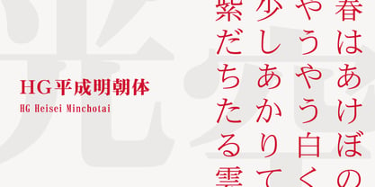 平成明朝体は、ワープロやDTPの普及にともなうフォント需要の高まりに対して供給が遅れていたため、文字フォント開発・普及センターの指揮のもと、製作された、本文用の明朝体です。デザインは、リョービイマジクスが担当。横組み適性を考慮し、視覚的重心が低めになっています。可読性のため、ふところは広めに、また、低解像度出力機での使用を考慮し、直線を多用したシンプルなデザインになっています。
 - HG Soei Presence by RICOH,
$199.00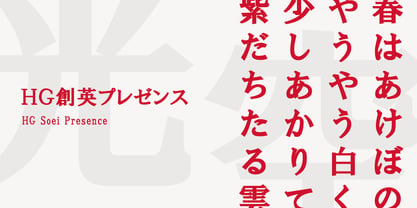 HG創英プレゼンスのデザインは、創英企画。横画が太い明朝体系の書体です。データ量を少なくするため、微妙な傾きや太さの変化を避け、始筆部や終筆部の飾りや、はらいの先端部、ゲタやはね、うろこなどの形状は、できる限り、直線化したり、単純化するなどの処理を行っています。そのため、シンプルですっきりとしたデザインの書体になっています。大きなサイズで使用したほうがよいでしょう。
 - HG Seikaishotai PRO by RICOH,
$199.00
- GP Casual Script by Intellecta Design,
$17.90a handwrite naive font - HG Mincho PRO by RICOH,
$199.00 HG明朝は、リョービの「本明朝」を字母とする明朝体です。現代的なイメージにするため、仮名文字の一部は変更されています。クラシックでシャープな書体ですが、ふところは大きく、読みやすい書体です。縦、横線の始筆部のふくらみをカットすることで、初期のPCディスプレイでの表示品位向上を実現しています。また、線幅補正ヒンティングのため、線幅の種類を抑制しています。HG明朝Lは、MS明朝と同じデザインです。
 - M XiangHe Hei SC Pro Variable by Monotype,
$1,049.99The M XiangHe Hei Simplified Chinese typeface merges traditional brush strokes with modern letterforms to carefully balance traditional calligraphy with humanist design. Named for the smooth movements of a flying crane, the M XiangHe Hei typeface is designed to glide across the page, and features strokes that are partly derived from the Kaishu calligraphic style – an everyday script which dates back hundreds of years. Seol Sans features Neue Frutiger for its Latin glyphs, and works harmoniously with Neue Frutiger World and Monotype’s CJK typefaces Tazugane Info (Japanese) and Seol Sans (Korean). M XiangHe Hei is a great choice for global brands using sans serif Latin typefaces looking to maintain their visual identity, and communicate with a consistent tone of voice with Simplified Chinese. - M XiangHe Hei SC Std Variable by Monotype,
$1,049.99The M XiangHe Hei Simplified Chinese typeface merges traditional brush strokes with modern letterforms to carefully balance traditional calligraphy with humanist design. Named for the smooth movements of a flying crane, the M XiangHe Hei typeface is designed to glide across the page, and features strokes that are partly derived from the Kaishu calligraphic style – an everyday script which dates back hundreds of years. Seol Sans features Neue Frutiger for its Latin glyphs, and works harmoniously with Neue Frutiger World and Monotype’s CJK typefaces Tazugane Info (Japanese) and Seol Sans (Korean). M XiangHe Hei is a great choice for global brands using sans serif Latin typefaces looking to maintain their visual identity, and communicate with a consistent tone of voice with Simplified Chinese. - Kingthings Gothique - 100% free

- Dr.Po GothicRu - Unknown license

- Gotham Nights - Unknown license

- SF Gothican - Unknown license

- Mythical Christmas by Allouse Studio,
$16.00 Mythical Christmas Script bring you the joyfull feel with bouncy calligraphy styles with Beginning and Ending swash to play around, these also come with Multi-Lingual Support. Mythical Quirky give you an a handwriting serif styles and just including Uppercase Lowercase Number and Multi-Lingual Support. Enjoy these Lovely Couple Font! We highly recommend using a program that supports OpenType features and Glyphs panels like many of Adobe apps and Corel Draw, so you can see and access all Glyph variations. Mythical Christmas is perfect for any tittle, logo, invitation, product packaging, branding project, megazine, social media, wedding, or just used to express words above the background. Enjoy the font, feel free to comment or feedback, send me PM or email. Thankyou!
 - Mythical Prince by Sign Studio,
$15.00 Mythical Prince is a beautiful and smooth sans serif font created by a romantic and lovely look. It is perfect for greeting cards, wedding invitations, posters, logotypes, product branding, and much more.
 - Gotica Lumina by Omine Type,
$24.00Gotica Lumina is a an attempt to make blackletter more legible to the 21st century's eye. It is available in two styles: soft (for text) and sharp (for display). Both of them have an alternate font, which contains stylistic alternate forms for several characters, for a more “traditional” look. Opentype features: four styles of figures and currencies, ligatures (f-ligatures and c-ligatures), historical forms (long-s). - PG Gothique by Paulo Goode,
$30.00 This is my addition to a long line of traditional gothic typefaces. As you can probably tell, PG Gothique is inspired by classics such as Trade Gothic, News Gothic, Franklin Gothic, Alternate Gothic, and Gothic Gothic. Well, maybe not the last one... But Paulo, we have all those already, why would we want to add PG Gothique to our collection? This typeface has many subtle design nuances that differentiates itself from its historical influences. Also, this is possibly the most comprehensive Latin gothic font family released to date. It has 99 fonts that cover pretty much every style you could ever need, and if you do require more, this family is available as a single variable font that covers all the weights and widths in between. PG Gothique is designed to handle a multitude of applications, from branding projects, to titles, body text, user interfaces, and film poster credits. This type family has a style that will suit the purpose. There are 99 fonts in this family, ranging from Thin to Ultra weights across six widths in both roman and italic*. Activate Stylistic Set 1 and you will get the alternate slab serif-style capital “I” that offers improved legibility when placed adjacent to a lowercase “l”. PG Gothique has an extensive character set that covers every Latin European language. If you would prefer PG Gothique as a single variable font, please choose PG Gothique Variable. Test drive PG Gothique today – both the Regular and Italic fonts are offered as a free download. See full details and hi-res examples at https://paulogoode.com/pg-gothique Key features: 9 Weights 6 Widths 99 Fonts Small Caps Old Style Figures European Language Support (Latin) 600+ Glyphs per font *Compressed weights do not include italics.
 - Gotica Moderna by Intellecta Design,
$25.90a modern blackletter - Banque Gothique by Red Rooster Collection,
$45.00Based on the earliest ATF/M.F. Benton versions of the Bank Gothic typefaces. ‘Fleshed-out’ into a full family. - Helena Gothy MF by Masterfont,
$59.00 - Iwata UD Maru Gothic Pro by IWATA,
$199.00 ???????????UD????????????????? ??????????????????????????????????????????
 - OL Raleigh Gothic A Display by Dennis Ortiz-Lopez,
$40.00 - ITC Avant Garde Gothic Paneuropean by ITC,
$49.00ITC Avant Garde Gothic¿ was designed by Herb Lubalin and Tom Carnase in 1970. They based it on Lubalin¿s logo for Avant Garde Magazine - an exciting construction of overlapping and tightly-set geometric capitals. ITC Avant Garde is a geometric sans serif; meaning the basic shapes are constructed from circles and straight lines, much like the work from the 1920s German Bauhaus movement. The early versions of ITC Avant Garde became well-known for their many unique alternates and ligatures that still conjure up the typographic aura of the 1970s. These fonts contain the basic alphabets (without the old unusual ligatures). Still strong and modern looking, ITC Avant Garde has become a solid staple in the repertoire of today's graphic designer. The large, open counters and tall x-heights seem friendly, and help to make this family work well for short texts and headlines. The condensed weights were drawn by Ed Benguiat in 1974, and the obliques were designed by Andr¿ G¿rtler, Erich Gschwind and Christian Mengelt in 1977. ITC Avant Garde¿ Mono is a monospaced version done by Ned Bunnel in 1983. - OL Raleigh Gothic B Display by Dennis Ortiz-Lopez,
$40.00 - Iwata News Gothic NK Pro by IWATA,
$309.00 数多くの新聞社で使われてきた伝統ある「岩田新聞呉竹体」を再現した「イワタ新聞ゴシック体」と、かなを現代風にアレンジした「イワタ新聞ゴシック体新がな」があります。
 - Iwata News Gothic NK Std by IWATA,
$199.00 数多くの新聞社で使われてきた伝統ある「岩田新聞呉竹体」を再現した「イワタ新聞ゴシック体」と、かなを現代風にアレンジした「イワタ新聞ゴシック体新がな」があります。
 - Franklin Gothic Raw Semi Serif by Wiescher Design,
$19.50 When drawing a new font, there is a time when the final form is found – almost – but the curves are not slick and clean yet, that's what I call the "raw" form. Raw – no sweeteners added! In this family I redefined this moment in type development for the eternally beautiful "Franklin Gothic". I call the design "Franklin Gothic Raw". This packet is the semi-serif addition. There never was a Franklin-Gothic with serifs but actually the font lends itself perfectly to a slab-serif. I started with adding a half serif and eventually add a full slab-serif later on.
 - Trade Gothic Next Soft Rounded by Linotype,
$53.99 In 1948, Mergenthaler Linotype released the first weights of Trade Gothic, designed by Jackson Burke. Over the next 12 years, Burke, who was the company’s Director of Typographic Development from 1948 through 1963, continued to expand the family. Trade Gothic Next is the 2008 revision of Jackson Burke’s design. Developed over a prolonged period of time, the original Trade Gothic showed many inconsistencies. Under the direction of Linotype’s Type Director Akira Kobayashi, American type designer Tom Grace, a graduate of the MA Typeface Design in Reading, has redesigned, revised and expanded the Trade Gothic family. Many details were improved, such as the terminals and stroke endings, symbols, and the spacing and kerning. Moreover, there are newly added compressed widths and heavy weights perfect for setting even more powerful headlines. Trade Gothic Next brings more features and better quality for today’s demanding typographers. Trade Gothic Next Soft Rounded introduces a new friendliness and warmth to the family.
 - YD Gothic 100 for ZEISS by Yoon Design,
$400.00


