1,169 search results
(0.016 seconds)
- Archive Grotesque Shaded by Archive Type,
$19.95Grotesque shaded display typeface. - Intellecta Grotesca Compacta by Intellecta Design,
$25.00a bold and grotesque sans serif typeface - HG Soei Kakupoptai by RICOH,
$199.00 HG創英角ポップ体は、水本恵子氏がデザインした「創英ポップ体1」を字母とする書体です。店頭広告用文字のスタイルを模して作られた書体で、楽しく、軽快な書体です。極太角ゴシックのイメージをベースに作られていますが、それをやや崩し、柔らかさも取り入れ、フリーハンドで書いたイメージを残しています。見やすくするため、ふところは可能な限り大きくなっています。店頭のPOP、チラシ、看板などに最適の書体です。 HG Soei Kakupoptai is a typeface with a "fresh pop" designed by Mr. Mizumoto Keiko. It is a typeface made by mimicing the style of letters for party-style, fun and light typefaces. It is made on the basis of the image of thickSoei Kakugothic, but it breaks it open, and incorporates softness, leaving the font looking freehand. To make it easy to see, the boldness has become as thick as possible. It is a typeface best suited for store-front fun, leaflets, signboards and so on.
 - HG Marugothic PRO by RICOH,
$199.00 HG丸ゴシックは、リョービの書体「シリウス」を字母とする丸ゴシック体です。L、M、Bと、3つの太さがあります。線はやわらかで、全体的に明るく、あたたかさがあります。ふところは大きくとられていて、かつ、仮名も大きめに作られていて、判別もしやすくなっています。また、それらの特徴から、カジュアルな印象を強く与えますが、ややコントラストがあるため、すっきりとしていて、優しい印象も与えます。
 - HG Soei Kakugothic by RICOH,
$199.00 HG創英角ゴシックLは、極細のゴシック体で、創英企画によるデザインです。シンプルな線で構成された現代的なゴシック体で、仮名が大きめに作られていて、全体的な印象はとても明るくカジュアルです。HG創英角ゴシックUBは、極太のゴシック体で、水本恵子氏のデザインです。仮名はHG創英角ゴシックLと比較すると小さめに設計されていて、現代的でありながらも、フォーマルさも合わせもっています。
 - HG Heisei Minchotai by RICOH,
$199.00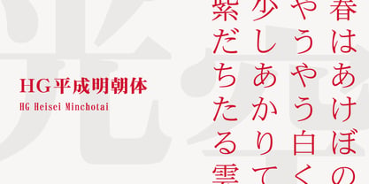 平成明朝体は、ワープロやDTPの普及にともなうフォント需要の高まりに対して供給が遅れていたため、文字フォント開発・普及センターの指揮のもと、製作された、本文用の明朝体です。デザインは、リョービイマジクスが担当。横組み適性を考慮し、視覚的重心が低めになっています。可読性のため、ふところは広めに、また、低解像度出力機での使用を考慮し、直線を多用したシンプルなデザインになっています。
 - HG Soei Presence by RICOH,
$199.00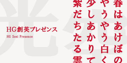 HG創英プレゼンスのデザインは、創英企画。横画が太い明朝体系の書体です。データ量を少なくするため、微妙な傾きや太さの変化を避け、始筆部や終筆部の飾りや、はらいの先端部、ゲタやはね、うろこなどの形状は、できる限り、直線化したり、単純化するなどの処理を行っています。そのため、シンプルですっきりとしたデザインの書体になっています。大きなサイズで使用したほうがよいでしょう。
 - HG Seikaishotai PRO by RICOH,
$199.00
- Hiragino Sans GB by SCREEN Graphic Solutions,
$200.00 Based on the Hiragino Sans (Kaku Gothic) design, this is the first Chinese-language font from a Japanese font manufacturer to be certified compliant with China’s GB 18030-2000 standard. Unique features are a contemporary typeface design that sets it apart from existing Chinese typefaces and a dedication to high quality down to the slightest detail. Multi-language composition using both Japanese and Chinese Hiragino fonts offer a sense of unity With demand growing rapidly in China, Hiragino Sans Simplified Chinese is the optimal font for uses in those fields that need both readability and contemporary vibe such as product packaging, catalogues, books, magazines, websites, and sign and displays.
 - HG Mincho PRO by RICOH,
$199.00 HG明朝は、リョービの「本明朝」を字母とする明朝体です。現代的なイメージにするため、仮名文字の一部は変更されています。クラシックでシャープな書体ですが、ふところは大きく、読みやすい書体です。縦、横線の始筆部のふくらみをカットすることで、初期のPCディスプレイでの表示品位向上を実現しています。また、線幅補正ヒンティングのため、線幅の種類を抑制しています。HG明朝Lは、MS明朝と同じデザインです。
 - HG Gothic PRO by RICOH,
$199.00 HGゴシックは、リョービの書体「ゴシック」を字母として作られたフォントです。クラシックなデザインがほどこされた正統派のゴシック体ですが、仮名は大きめに作られていて、読みやすいです。Bウェイトは、MSゴシックと同じデザインになっています。M、Bは、本文用途に向いていますが、見出しにも合います。M、Bよりも太いEは、よく目立つので、大きく使うことで魅力が発揮できるスタイルです。
 - Web Hosting Hub Glyphs Essentials by BanzaiTokyo,
$- Icon font for web and offline.
 - Grotesque No. 9 SB by Scangraphic Digital Type Collection,
$26.00Since the release of these fonts most typefaces in the Scangraphic Type Collection appear in two versions. One is designed specifically for headline typesetting (SH: Scangraphic Headline Types) and one specifically for text typesetting (SB Scangraphic Bodytypes). The most obvious differentiation can be found in the spacing. That of the Bodytypes is adjusted for readability. That of the Headline Types is decidedly more narrow in order to do justice to the requirements of headline typesetting. The kerning tables, as well, have been individualized for each of these type varieties. In addition to the adjustment of spacing, there are also adjustments in the design. For the Bodytypes, fine spaces were created which prevented the smear effect on acute angles in small typesizes. For a number of Bodytypes, hairlines and serifs were thickened or the whole typeface was adjusted to meet the optical requirements for setting type in small sizes. For the German lower-case diacritical marks, all Headline Types complements contain alternative integrated accents which allow the compact setting of lower-case headlines. - TG Aqsa Grotesque Pro by Tegami Type,
$30.00 TG Aqsa Grotesque Pro is the latest version of the font that was previously released in 2017, TG Aqsa Grotesque. In this latest version there are several optical fixes on each glyphs. In this latest version also added 2 new weights namely black and ultra black so that TG Aqsa Grotesque Pro has 6 fonts of different weights. Still maintaining the sans serif grotesque style coupled with the improvement of the letter form make TG Aqsa Grotesque Pro have a good level of readability when applied as a body text. And this version also has extended latin which will support more than 90+ different languages.
 - Grotesque No. 9 SH by Scangraphic Digital Type Collection,
$26.00Since the release of these fonts most typefaces in the Scangraphic Type Collection appear in two versions. One is designed specifically for headline typesetting (SH: Scangraphic Headline Types) and one specifically for text typesetting (SB Scangraphic Bodytypes). The most obvious differentiation can be found in the spacing. That of the Bodytypes is adjusted for readability. That of the Headline Types is decidedly more narrow in order to do justice to the requirements of headline typesetting. The kerning tables, as well, have been individualized for each of these type varieties. In addition to the adjustment of spacing, there are also adjustments in the design. For the Bodytypes, fine spaces were created which prevented the smear effect on acute angles in small typesizes. For a number of Bodytypes, hairlines and serifs were thickened or the whole typeface was adjusted to meet the optical requirements for setting type in small sizes. For the German lower-case diacritical marks, all Headline Types complements contain alternative integrated accents which allow the compact setting of lower-case headlines. - Legal by Linotype,
$29.99The Legal typeface family grew out a sans serif project that Hellmut G. Bomm began in the 1970s (his HGB Grotesk). This refined, industrial type family is well suited for short amounts of text, headlines, corporate identity and logo design. In small sizes, the typeface works like many other sans serifs, but with better differentiation between characters. The Legal family includes oldstyle figures and true italics. - Wood Bonnet Grotesque No.4 by astype,
$46.00 After release of Wood Bonnet Antique No.7 some of my clients asked for a sans serif version. So I printed my second batch of old wood type. I transferred these wood type into a digital font and tried to preserve the warm vintage look. » pdf specimen « The font offers up to four glyph variations of all the Latin base letters, figures and some additional letters - It has an build in letter randomizer. Please check you have turned on contextual alternates in your application. If you prefer a more common look and need more weights or to use the font in smaller text sizes I have done clean and sharp font family called Bonnet Grotesque Nr. It’s the preferred version for all the usages on websites, apps or ebooks. Have fun!
 - M HG Hagoromo T HK by Monotype HK,
$523.99HK series fonts are in Unicode encoding and consists of BIG 5 character set and HKSCS characters. The character glyphs are based on the regular Traditional Chinese writing form and style. It is generally used in Taiwan ROC, Hong Kong and Macau. - M HG Kyokashotai T HK by Monotype HK,
$523.99HK series fonts are in Unicode encoding and consists of BIG 5 character set and HKSCS characters. The character glyphs are based on the regular Traditional Chinese writing form and style. It is generally used in Taiwan ROC, Hong Kong and Macau. - M HG Reithic T HK by Monotype HK,
$523.99HK series fonts are in Unicode encoding and consists of BIG 5 character set and HKSCS characters. The character glyphs are based on the regular Traditional Chinese writing form and style. It is generally used in Taiwan ROC, Hong Kong and Macau. - Oxona - Personal use only

- Typesetter JNL by Jeff Levine,
$29.00 Typesetter JNL is based on an old-style 'grotesk' (or 'grotesque') text face popular with printers and rubber stamp makers since the 1800s. The nonconformist character shapes and line widths are reminiscent of hand-cut type of the era.
 - Editorial Comment JNL by Jeff Levine,
$29.00Editorial Comment JNL is another wood type in the Grotesk (also spelled Grotesque) style of sans serif faces. Popular in newspaper headlines as well as posters, the slightly irregular stroke widths add an old-fashioned charm to any print project. - CHE LIVES! - Unknown license

- FS Koopman by Fontsmith,
$80.00 FS Koopman is a hard-working typeface. A crossbred workhorse that draws on inspiration from Swiss grotesks, American gothics and early British grotesques. It refuses to fit neatly into any of these categories, it’s neither one nor the other, but all of the above. It’s kinda Swiss meets American… (but with a slight Yorkshire twang).
 - Strongbox JNL by Jeff Levine,
$29.00Strongbox JNL is based in part on an incomplete sample of an old wood type alphabet seen on an image sharing site. Commonly known as a grotesk (or grotesque) face, this style of sans serif lettering is well-suited for headlines, display work, price cards or anything where a bold, condensed typeface is needed. - Oxona Caps - Personal use only

- PSZ Alpha by Patrick Siegfried Zimmer,
$45.00 PSZ Alpha was designed by Patrick Siegfried Zimmer in 2023. It is a modern typeface designed in a sans serif-grotesque structure and it has been created by taking inspiration from the leading Grotesk fonts that have been designed at the beginning of the 20th century. PSZ Alpha is designed to give results in both screens and editorial designs.
 - Gramatika by Tokotype,
$50.00 Gramatika is a typeface family of sans serif from the neo-Grotesque styles. There are four different weights available, ranging from light to bold. Each weight is equipped with an italic style that is a bit like an oblique style and lifted by some unique characters, with an alternative to the single story ‘a’ for example. Inspired by the famous grotesk typefaces such as Akzidenz Grotesk and Bauersche Giesserei’s Venus Grotesk, Gramatika shapes and styles are consistently adjusted for each character to meet the classic contemporary style, treated with some ciruclar-based characters in descender g, y. By balancing balance and flexibility, Gramatika was established to create alternative communication for current trends. The latest version of this fonts comes with Latin plus script coverage, and supported by the basic characters of Cyrillic and Greek.
 - Xtra Sans by Typolar,
$58.00 In its characteristics Xtra Sans is a combination of modern grotesks/grotesques and traditional calligraphy. Its upright and compact letterforms generate a sturdy effect as in the early 20th century grotesks Nobel, Kabel or Erbar. On the contrary, dynamic inside forms (counters) give the characters a fluent appearance. As a result, Xtra Sans stands out in large size, while remaining highly legible in small and long text. In 2007 Xtra Sans received a Certificate of Excellence in Type Design from Type Directors Club, New York. In 2002, still unpublished, it was awarded a bronze prize at the Morisawa Awards, Tokyo.
 - KT Mogli by Kotivoro Lab,
$18.00 KT Mogli is a Grotesque print design typeface inspired from automotive poster. KT Mogli is single style font for Headline & body copy. Stylistically it sits between the dynamic humanist sans and more rigid grotesk. The clear letterforms have broad proportions and are generously spaced. This font suitable with your projects such as poster, user interface, magazine, logo, apparel design, etc.
 - SchilderGrotesk - 100% free

- Molecula by Northeast Type Foundry,
$22.99 Molecula is grotesque sans serif of slightly condensed proportions and humanist-grotesk features. The family features 9 weights from Thin to Black, each of which has an italic. The character set is robust, covering extended latin. All completely equipped with opentype features, alternative glyphs, fractions, lining numbers, small caps, subscript and superscript. Molecula has been designed for advertising, branding, packaging or anywhere a clean and contemporary voice is needed.
 - Sturkopf Grotesk, designed by Uwe Borchert, is an intriguing addition to the vast world of typefaces. Its design distinguishes itself by threading the fine line between stoic traditionalism and bold ...
- Motrhead - Unknown license

- Bruney by Sensatype Studio,
$15.00 Bruney is a Classy and Unique font for brand and logo design. Based on our experience as a graphic designer who works for a lot of companies, we often are requested to design a logo in a unique style but with an elegant shape. So, we try to brainstorming and create this font to make the idea is going out. This is perfect for BRANDING and LOGO DESIGN. You will get classy, elegant, and certainly unique logos with this font. To make it look more classy and unique, here we prepared some ligatures: KA KI KU KE KO LA LI LU LE LO RA RI RU RE RO EB EH EP ER EK HB HP HK HR TB TD TE TF TP TR TT UB UD UF UK UM UN UP UR VA WA AB AD AR AV AW CK OO OC CA CY EA EB ED ES GB GH GK GB GR HB HP HR HK KB KD KS EY FY LS ME MU MB MD MF MH MK MP MR NN SO RS SB SD SE SF SP SY SR ST SS LL UN CS Bruney is also included full set of: uppercase letters multilingual symbols numerals punctuation Wish you enjoy our font. :)
 - Metro Sans by Studio Few,
$12.00 The result of a study into the Paris Metro system; Metro Sans is a Grotesk typeface with personality. It bridges the gap between the stern terminals of a Swiss Neo-Grotesk, and the smooth curves of a modern day Geo-Grotesk. The two combine to give a versatile typeface that works well in both body and display weights.
 - Kristall Now Pro by Elsner+Flake,
$49.00 The design of Kristall Grotesk Now is based on a cut by Wagner & Schmidt, Leipzig, from the 30s of the last century as well as the digital version Kristall Grotesk MdK, created for the Stiftung Werkstattmuseum für Druckkunst. The implementation of the Kristall Grotesk MdK, a headline font, was deliberately created as a replica to create a faithful reproduction of the original. The design of the complete family Kristall Grotesk Now is based on the one cut Kristall Grotesk Buchschrift by Johannes Wagner GmbH, 1937, with its function as a text family. Designer: in parts Johannes Wagner GmbH, Redesign Elsner+Flake, Hamburg Designdate: 1937, 2009 Publisher: Elsner+Flake Design Owner: Elsner+Flake Original Foundry: in parts Johannes Wagner GmbH
 - Album Cover JNL by Jeff Levine,
$29.00An older typeface belonging to a family of sans serif fonts known as Grotesque (or Grotesk in the classic spelling) has been re-drawn by Jeff Levine and released as Album Cover JNL. The font's name is derived from the fact that this typeface was found on many long-playing record jackets during the 1950s and 1960s. To add a look closer to that of hand-set type, there are minute variants in some of the heights of the characters. - Central by AVP,
$10.00 Central was developed specifically as a titling font for a theatre-hub website. The pure geometric forms and elegant simplicity provide a pleasing contrast to small screen text sizes.


