10,000 search results
(0.027 seconds)
- Meteora by Andinistas,
$19.95 Meteora is a font designed for headlines by Carlos Fabian Camargo Guerrero. Its purpose is to be useful tool for solving decorative problems in graphic design which require broken letters without ascending and descending strokes. Due to its vertical and horizontal proportions these letters are compact, appealing and special to compose headlines and featured with worn look in covers, magazines, posters and advertising material. The first Meteora sketches were made by hand, photocopying and deforming letters of an old Letraset catalog, specifically from slab serif typefaces from the Nineteenth Century. Hence, uppers cases and lower cases were merged in the same height x, obtaining a narrow width, endings with some serifs and stencil cuts here and there. The amount of low contrast between thick and thin strokes brings strength and consistency with the contours apparently brokens. Thus, developed features slab serif and sans-serif proposing empty and full shapes connoting decomposition and noise; and from a rigorous process of scanning letters I set up damaged letters, but drawn with the greatest possible thoroughness and high definition in 438 glyphs per font. Finally, in regular and bold variables I included opentype features with some discretionary ligatures and a few titling alternates. In Meteora bold all glyphs are framed simulating the effect of letters cut out of paper.
 - Hopeless Romantic Society by PeachCreme,
$23.00 An imperfectly charming handwritten font, "Hopeless Romantic Society", is here to liven up your design works. This carefree ligature-filled handwritten typeface was influenced by writings that were sloppily produced by hand. With these 55 ligatures, your designs will have that extra layer of authenticity. Whether you're looking to create a playful logo or send a handwritten letter, this typeface is the way to go.
 - Parochus by Kaer,
$24.00 Hello! Inspiration for this beautiful script font I found in “A Source of Solace in Illness” (Trost Bronn der Kranchhen) book, published in the middle of 17th century. There was an entire on the back of the top cover: Joannes Auanger Parochus Sinchingae 1808”. That's why I named my font family Parochus. In the Catholic Church, a parish is a community of the faithful within a particular church, whose pastoral care has been entrusted to a parish priest (Latin: parochus). There are original and regular style fonts. Also, I’ve added some modern symbols. With this set, you can precisely imitate medieval style text. I designed a full uppercase and lowercase set with Multilingual support and ligatures. You'll found ß, &, Š, ę and many other beautiful glyphs. Best, Roman.
 - Breakdance Reborn by Trustha,
$15.00 Breakdance is inspired by dance moves, the first font created with this concept is sans serif with a curved shape in one direction. Curves are made not too extreme, so that they maintain the shape balance. And now Breakdance comes in several styles and is divided into three typesface, namely script, sans and serif. Each typeface has several different styles and the total is 18 fonts.
 - Cuizy by Twinletter,
$13.00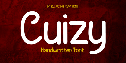 Introducing "Cuizy Font" - Where Handwriting Meets Distinctive Design. Cuizy Font is your key to adding a touch of personal charm and uniqueness to your projects. Crafted with precision, it effortlessly blends the warmth of handwritten text with contemporary style. What’s Included : File font All glyphs Iso Latin 1 Alternate, Ligature Simple installations PUA Encoded Characters – Fully accessible without additional design software. Fonts include Multilingual support
 - Meyling by URW Type Foundry,
$35.99 Three carefully crafted script styles by the Brazilian type designer João Henrique Lopes. Another type project by Joao in which each style can be written by itself but combined they have an unique vitality and develop their full potential. An excellent readability make Meyling the perfect partner for a variety of projects, from stylish invitations to magazine ads, from poetry books to restaurant logos.
 - M Zhi Ngai HK by Monotype HK,
$523.99 Zhi series is inspired from vertical shop banners/signages from Japan, where each banners is attached to a slim simple structured skeleton. M Zhi Ngai™ takes reference from M Zhi Hei’s straightforwardness and masculinity but inserted plenty of ornaments and gentleness. Featuring a strong thick–thin contrast in the strokes, the typeface looks bright, smart and contemporary, suitable for promotional materials and more other media.
 - M Zhi Ngai PRC by Monotype HK,
$523.99 Zhi series is inspired from vertical shop banners/signages from Japan, where each banners is attached to a slim simple structured skeleton. M Zhi Ngai™ takes reference from M Zhi Hei’s straightforwardness and masculinity but inserted plenty of ornaments and gentleness. Featuring a strong thick–thin contrast in the strokes, the typeface looks bright, smart and contemporary, suitable for promotional materials and more other media.
 - Tory by Matteson Typographics,
$19.95 Frederic Goudy designed Tory in the spirit of the ‘lettres batarde’ found Geoffry Tory’s Champ Fleury. He was looking to create a romantic type for which to typeset the book Auccasin et Nicolette. It was one of Goudy’s favorite typefaces of his own creation and it is digitized by Steve Matteson to preserve that legacy.
 - Strom by Lasse Strøm,
$35.00 STROM is а modern sans serif font with minimalistic and geometric characters. The rounded corners give the typeface a friendly look, yet it retains a professional quality. The attention to detail paid during its development means that this typeface offers a vast range of design possibilities – and helps users create eye-catching designs. The different font styles are built on the same foundation, so they can be mixed and matched while maintaining a harmonious look. The simple, clean lines make it noticeable and ideally suited in display settings, advertising, packaging, logo, branding, poster, billboards, film, television, web, screen and print design.
 - Nerine by Studioways,
$33.00 Nerine is a modern brush lettering and handwritten font duo designed by hand lettering artist Eliza Gwendalyn. Both scripts were drawn completely by hand and digitally perfected to bring you these unique script fonts. Nerine is a bold, connecting brush script, with lots of swashes and loops, while Nerine Deux is a lighter, straight stroke semi-connecting script, with a little less flair. Both scripts are ideal for use in a wide range of projects, from branding & advertising to wedding stationery & birth announcements! They also pair well with sans serif and serif typefaces! Each font is packed with ligatures and some alternate letterforms that help text runs appear more natural. The OpenType ligature feature will automatically insert ligatures when certain glyph combinations are typed, and the swash feature in Nerine will replace some beginning and ending letters with nice gentle swash alternatives. Nerinet also boasts five Style Sets that let you swap out groups of letters with interesting alternatives. Both fonts support the extended European character set so language support is extensive. Pick up Nerine or Nerine Deux, or the Nerine Duo Family today, and watch your creativity blossom!
 - Fruitypops by Set Sail Studios,
$16.00 Introducing Fruitypops! A friendly, versatile script font ready for any project. Hand drawn with a real marker pen on paper, Fruitypops is bold and standout yet maintains large counter spaces with its large loops and carefully crafted letterforms. With 56 ligatures, a full set of unconnected lowercase alternates, and a bold version included, it’s designed to be a go-to script font for any design brief in need of a personal touch. The Fruitypops family includes; 1. Fruitypops Regular • A handwritten script font containing upper & lowercase characters, numerals and a large range of punctuation. 2. Fruitypops Bold • A bold version of Fruitypops with thicker letterforms, great for use at smaller sizes. Lowercase Alternates • A full set of a-z lowercase alternates are included with unconnected strokes. These can be accessed by turning on ‘Stylistic Alternates’, via a Glyphs panel, or pasted via Font Book/Windows Character Map. 56 Ligatures • 56 ligatures are included for lowercase letters (see image). These are uniquely designed double and triple letter combinations designed to create realistic handwriting and fix tricky character pairings. These can be accessed by turning on ‘Standard Ligatures’, via a Glyphs panel, or pasted via Font Book/Windows Character Map. Language Support • English, French, Italian, Spanish, Portuguese, German, Swedish, Norwegian, Danish, Dutch, Finnish, Indonesian, Malay, Hungarian, Polish, Croatian, Turkish, Romanian, Czech, Latvian, Lithuanian, Slovak, Slovenian.
 - Sunday Thinker by Hanoded,
$16.00 No, no fantastic story about how I came up with the name for this font. It was a Sunday when I thought up Sunday Thinker. It seemed like the right name and it wasn’t taken yet, so there you have it! Sunday Thinker is a thoughtful font, made with creativity in mind. Personally I think it’d look great on product packaging or book covers, but the font will adapt itself to whatever you think of! Just think happy thoughts!
 - Hatmaker by ITC,
$29.99Jean Evans' interest in type design dates back to her third-grade fascination with fancy script writing. Years later, work at a sign-painting school she found in the Yellow Pages® cemented her relationship with letterforms. Evans went on to study with master calligraphers and type designers, including the likes of Donald Jackson, Hermann Zapf and Matthew Carter. Evans' designs have been exhibited and collected around the globe, and her distinctive calligraphic style has been lauded by leading trade organizations, annuals and publications. Hatmaker, one of Evans' more popular typefaces, was originally developed for the Boston-based broadcast design firm of the same name. Inspiration for the design came from Ben Shahn's famous hand-constructed alphabet. Shahn's alphabet, however, was limited to capital letters. Daunted by the idea of designing a lowercase that would measure up to Shahn's capitals, I developed a second set of caps-simple, quirky, yet almost classic-to work as 'lowercase' with the Shahn-like caps," explains Evans. Mixing the two in Hatmaker, creates a lively interplay of light and dark." - Haboro Slab Soft by insigne,
$32.99 Haboro Slab Soft is a scion of the Haboro hyperfamily. This concept powers through with its well built, accommodating nature. Haboro Slab Soft’s serifs are rounded, giving it a softer look. The Haboro hyperfamily is a comprehensive design suite that provides solutions for many projects. The iconic angled wedge makes this family ideal for apparel, packaging, apps, corporate identities and advertising campaigns. Subfamilies in the hyperfamily include the original Haboro, a Didone face, Haboro Sans, Serif, Soft, and Slab. The Haboro hyperfamily is known for its ability to make your copy appear clear and simple. The Haboro typeface is built on a common underlying model. It has the same cap height, the same x-height, and the same basic character shape. This unification of shape and proportion results in a complementary set of typefaces. Haboro Slab Soft’s wide variety of ligatures and OpenType alternatives give your message the clarity it deserves. The Haboro Slab Soft family includes seven weights, from Thin to ExBold, three widths, and matching italics. There are over 550 glyphs per style and support for over 70 Latin-based languages. Haboro Slab Soft includes features such as small caps, ligatures, fractions, and alternatives. Haboro Slab Soft is there when you need to present information in a clear and friendly fashion.
 - Joschmi by Adobe,
$29.00Joost Schmidt?s (1893?1948) name is undoubtedly connected with monolinear condensed letters of geometric appearance ? his unfinished draft of a stencil alphabet, constructed on grid paper in 1930, is much lesser known. These modular shapes simply consist of half circles, quarter circles and square strokes with half-round terminals. From just six original letterforms (a, b, c, d, e, g), Flavia Zimbardi completed Schmidt?s draft and extended it to a full character set for contemporary use, adding upper case letters and different figure sets including old-style. Joschmi overcomes legibility issues usually associated with this stencil style, with special attention to the design of white space. Zimbardi lends the face even more character by carefully adding round terminals in subtle spots of the alphabet, accessible through stylistic sets. - SP Reka by Remote Inc,
$39.00It was an unlikely union. Reka was a Maori maiden who made her home on the shores of Piha. I was a struggling actor who had spent the last six months in Bangkok, working as a cross-eyed prostitute. - Wiblz Serif by The Ampersand Forest,
$19.00 Meet Wiblz (say “Vibbles!”). Wiblz is a Modern/Didone text family in the great tradition of squarish text families like Walbaum, Ibis, and Georgia. He has a high x-height and a great balance of legibility and readability. Plus, he supports the Latin alphabet, basic Cyrillic, Monotonic and Polytonic Greek, and the International Phonetic Alphabet. That makes him superlative in his usefulness and versatility! When searching for a didone typeface, it's often a struggle between blackness/legibility and stylishness/contrast. this is especially true of squarish didones, which number less than their round counterparts. Wiblz is an excellent balance between the two — clean and striking, good for uses from text to heading, and at home in print and on screen. Give him a try! He's a smart, adaptable, useful guy!
 - Meridien by Linotype,
$29.99 Frutiger based the design for his Meridien on the 16th century characters of Jenson, saying: As I designed Meridien, I wanted to avoid stiffness in the forms - I thought they should have a more natural line and flow. My main consideration was in creating a font which was both extremely legible and aesthetically pleasing. Meridien is proof of Frutiger’s success in his endeavor.
 - Type Warmers JNL by Jeff Levine,
$29.00 The name Type Warmers JNL traces its lineage to small catalog booklets issued by Indianapolis' Cobb Shinn for his line of letterpress cuts; of which a few can be found included within this typeface. Presumably type could "warm up to" these stock illustrations and work hand-in-hand to deliver the message, hence the "Type Warmers" sobriquet. Originally known for illustrating many attractive and comical postcards of the early 1900s, Shinn moved into the field of purchasing stock art and redistributing them as electrotypes or "cuts", the predecessor to today's digital clip art. A number of the cartoons he sold can be found in the Shinn Kickers JNL font.
 - HGBGalaxo Line by HGB fonts,
$23.00 HGB Galaxo is a tribute to Othmar Motter (1927–2010), the Vorarlberg graphic artist and typeface designer, who designed very individual and perfectly crafted typefaces in the 1970's and later. (Motter Ombra, Motter Tectura ...)From a Motter sketch of 5 letters for a logogram, I derived a simplified letterform and developed all the necessary characters. Working on these glyphs and delving deeper into Motter's letterforms, the respect for the accuracy with which he drew his letters (in ink) grew more and more. The spiral resembles the shape of a galaxy, hence the name Galaxo. The font is suitable for retro, poster and logo design.
 - Dancin' by ITC,
$29.00Dancin' is yet another unusual typeface from American designer David Sagorski. Based on his own style of handwriting, Dancin' is an inventive, carefree typeface ornamented with dots and unusual strokes. - NorB Architect CF by NorFonts,
$32.00 NorB Architect Condensed fonts are the condensed and the extra-condensed version of my NorB Architect font. It comes with 12 weights from Light to Condensed to Extra Condensed along with their Bold and Felt version. These Architectural fonts will add a beautiful architectural hand-lettering style to all your CAD project drawings. Architects have always wanted their CAD drawings to look more like they were drawn by hand, rather than by a CAD program. These AutoCAD fonts are the first step in bringing back that “artistic hand-drawn” feel to your CAD drawings or any graphic design project that can use true type fonts. They also can be used with any word processing program for text and display use, print and web projects, apps and ePub, Comics, graphic identities, branding, editorial, advertising, scrapbooking, cards and invitations … or even just for fun! NOTE: For more variations of 'NorB Architect CF' font please visit click on this link.
 - Evangelos by TEKNIKE,
$39.00 My inspiration for this font was my father. He was a puzzle toy inventor and as a child he showed me how to write in capitals and this font is an homage to his handwriting style.
 - Totally Terrific by Set Sail Studios,
$12.00 I love Tea. Do you love Tea? Good. Because there's a whole load of T's in the Totally Terrific Typeface! Bursting with fun and bouncy brush-strokes, this typeface will undoubtedly add a dash of cheeky playfulness to your text - ideal for greeting cards, branding, merchandise, invitations & hand-made quotes. The awesome thing about this typeface is that it's so easy to mix up the various font styles and create totally unique, hand-made looking words each time. The lowercase characters can be connected (Totally Terrific Regular) or un-connected (Totally Terrific Two), and will work in any combination of these two versions. Not only does it also look great in all-caps, but the uppercase letters will fit in with the lowercase at any location - I'm serious! Just throw one in the middle of a word, I dare you ;). Your download will contain 2 font files: Totally Terrific Regular • Contains a full set of connected lowercase letters, uppercase letters, a large range of punctuation, numerals, and multilingual support. Totally Terrific Two • A second version of the Totally Terrific Typeface, with a completely new set of un-connected lowercase characters. These are designed to work in perfect harmony with the connected set from the other font file. Just keep switching between the two fonts to create unique word layouts!
 - Archemy by Sonic Savior,
$90.00Archemy is a restricted and obscure branch of Alchemy that deals specifically with the life, generation and transmutation of Metals. The Archemy font is primarily a magical and alchemical alphabet. It was created on initiative of Senior Zadith, in order to properly quote older alchemical manuscripts, without the need to insert handwritten symbols. The font combines a unique and elegant Roman alphabet with a set of the most frequently used planetary and alchemical symbols that are common in the Western Mystery Tradition, and as used by those involved in the Royal Art. The Archemy font contains a selection of symbols that are still used by practitioners of the Art today, and for the sake of completeness, a selection of less used and more arcane symbols that can be found in older alchemical texts. In addition a Hebrew Alphabet is included, which will supply practitioners of the Art with the glyphs related to Cabalistic studies. The Hebrew Alphabet in this font does not include vowel points, since they have no place in ancient Hebrew, nor in the Western Mystery Tradition. A selection of the most distinct glyphs as used in the Antediluvian font family - the Alphabet of the Ancients - is included for those that wish to include the archetypal and arcane quality of these glyphs from the dawn of history. By our knowledge there exists at this time no font that includes a selection of Alchemical symbols, let alone combines all of the above mentioned archetypal symbols of occult language in a single package. In that respect Archemy can be considered to be an “Arch” font. - Roadway by PintassilgoPrints,
$24.90 Roadway is an original typeface with an antique accent, inspired by Clarendon woodtypes from late 19th century. It comes in three matching varieties, with extended character sets and a lot of personality.
 - Catalog JNL by Jeff Levine,
$29.00 Catalog JNL is based on a set of vintage wood type. Its uniform, block-style appearance is perfect for projects where bold, readable titling will apply. Available in regular and oblique styles.
 - Sandwich sans by 4RM Font,
$12.00 Is a unique font, Sanwich sans is made with a messy character arrangement and an expanded width to get a silly and playful impression, suitable for use in casual themed graphic designs.
 - Varese Gradient by Tarallo Design,
$18.99 Varese Gradient is a color font for display, headlines, or large body text. Use it for bold graphic statements or a vintage mood. Its geometric style is inspired by Art Deco and early 1900s European travel posters. This typeface will set a friendly and light tone while giving messages a unique and memorable feeling. The gradients transition vertically and come in these sets; color with white, color with black, two colors, chromatic grays, grayscales, and concepts like summer or cappuccino. The font name will indicate its color. The full family includes one regular font. Here is a list of all the fonts in color. The lowercase letterforms are similar to the uppercase, but the lowercase have counterforms. It comes with OpenType features such as alternate glyphs, half-height letters, standard ligatures, and stylistic sets. The fonts are OpenType SVG format and fully scalable. Contact Tarallo Design if you need custom colors. Varese Gradient has siblings, Varese Soft (rounded) and Varese Outlined (color/shadow/outline).
 - Danube Pro by CheapProFonts,
$10.00 This cool techno font is easily recognizable with its quite unique stroke endings. I have increased the ascenders and descenders slightly (so they would work better with the new diacritic letters) and introduced a few alternate letterforms in addition to generally expanding the character set. A totally enjoyable reworking of an original design. Now also with a Bold and a brand new Light variant! Please note that these variants are made by adding/removing from the regular shape, so the letters no longer sits on the baseline. ALL fonts from CheapProFonts have very extensive language support: They contain some unusual diacritic letters (some of which are contained in the Latin Extended-B Unicode block) supporting: Cornish, Filipino (Tagalog), Guarani, Luxembourgian, Malagasy, Romanian, Ulithian and Welsh. They also contain all glyphs in the Latin Extended-A Unicode block (which among others cover the Central European and Baltic areas) supporting: Afrikaans, Belarusian (Lacinka), Bosnian, Catalan, Chichewa, Croatian, Czech, Dutch, Esperanto, Greenlandic, Hungarian, Kashubian, Kurdish (Kurmanji), Latvian, Lithuanian, Maltese, Maori, Polish, Saami (Inari), Saami (North), Serbian (latin), Slovak(ian), Slovene, Sorbian (Lower), Sorbian (Upper), Turkish and Turkmen. And they of course contain all the usual "western" glyphs supporting: Albanian, Basque, Breton, Chamorro, Danish, Estonian, Faroese, Finnish, French, Frisian, Galican, German, Icelandic, Indonesian, Irish (Gaelic), Italian, Northern Sotho, Norwegian, Occitan, Portuguese, Rhaeto-Romance, Sami (Lule), Sami (South), Scots (Gaelic), Spanish, Swedish, Tswana, Walloon and Yapese.
 - Kate Greenaway's Alphabet by Wiescher Design,
$49.50 Some time ago I bought my smallest book ever: Kate Greenaway’s Alphabet* 57 x 72 mm. I thought it was the sweetest little book I had ever seen. Not knowing about the fame of the designer Kate Greenaway (1846-1901), I put it in some dark drawer and looked at it from time to time. Kate’s books were all outstanding successes in English publishing history; she was an icon of the Victorian era. Some of those books are still being reprinted today. This little gem I had accidentally acquired has become very rare and I have not found any reprints yet. So I thought maybe I could adapt her drawings for use on today’s computers. I ventured to redraw her delicate illustrations, blowing them up 300 percent, being forced to simplify them without losing her touch. It took quite some time! While redrawing them, I discovered that she most certainly drew them in at least three different sessions as well. Then I scanned my drawings and put them in a font. To make the font more usable, I added the ten numerals in Kate’s style; the original does not have those. I hope she would have liked my adaptations. Yours in a very preserving mood, Gert Wiescher. * Kate Greenaway’s Alphabet, edited by George Rutledge & Sons, London and New York, ca. 1885.
 - Cooper Screamers by Wordshape,
$- In 1925, at the request of Barnhart Brothers & Spindler, the foundry he worked for, Oswald Bruce Cooper designed a wide selection of "screamers", oversized exclamation points used to grab attention in display advertising. The foundry rushed the screamers into production, much to Cooper's dismay. Cooper was disappointed with the final form of the screamers– they were designed in assorted weights to match the assorted Cooper series of typefaces, as well as in a variety of other formal solutions- squaredoff, incised, wavy, Tuscan, and rounded. Cooper's working design methodology was to re-draw his projects a number of times in order to refine the formal results. However the screamer project was hastily cut by the head of BB&S's matrix engraving room in fourteen sizes from the initial sketches, causing Cooper to fire off a fiery missive stating, "Everything I draw is bum the first half-dozen times I draw it; the trouble with these is that I drew them only once!" This typeface is the result of researching Cooper's original drawings and series of engraved proofs for the screamers, as well as the original Screamer type specimen. Cooper Screamers have never been available before in digital format.
 - Shameless by Positype,
$79.00 I will spare you the long-winded description this time and all of the motivations and witty innuendoes. Quite frankly, I forgot about creating this typeface and it sat on my hard drive for almost a year. Luckily, my daughter Isobel saw the initial drawings one day and ask me about those pretty letters and I remembered… yep, that happened. That said, time made this a better typeface… with fresh eyes and time, much was redrawn, retooled and expanded to something I truly enjoy playing with. Shameless makes extensive use of Contextual alternates to create a proper ebb and flow from letter to letter. Interestingly, there are only a handful of ligatures… instead many special combinations are accounted for solely by relying on Contextual Alts. Mix in Stylistic Alts, Swashes, responsive Titling Alts, numerous Style Sets, etc and you can have a lot of fun. I created 2 versions. A ‘Standard’ version that has 2200+ characters and a ‘Deluxe’ version that has 2400+ characters and an interesting caveat… I plan on expanding the Deluxe version any time I have an idea to add to the typeface… and as such, buyers will receive all of those updates at no charge (with updates going directly to the distributors). You get what you pay for… no insane discounts. Oh, and if you are wondering… Shameless is based on my handwriting using Kuretake Zig CocoIro pens. I love these pens.
 - Bleak by Andinistas,
$34.00 @andinistas presents Bleak , an experimental font designed by #carlosfabiancg. Bleak is based on the imaginative use of contrast applied in the empty space and on the dramatic distributions of the wide and compressed horizontal of more than 400 textured symmetric capitals inspired by compositions of the Lissitzky, Theo van Doesburg, among others. In the Europe of the 20s, scarce resources prevailed, which gave these great artists the firm determination and dedication to create a visual vocabulary, characteristic of the composition with movable types of wood and metal. As they did not readily dispose of the forms of the letters they required, they did not hesitate to construct them with metal rulers, ornaments and other improvised pieces and remains and obtained in the forgotten corners of the typographic composition workshop.
 - Satimah by Attype Studio,
$13.00 Satimah is a stunning Arabic style typeface that brings an elegant and professional look to any design. With its simple yet refined design, this font is perfect for a wide range of projects, from branding to editorial and beyond. The font also comes with stylistic set 1 and 2, as well as stylistic alternates for some characters, giving you even more creative options. Satimah is particularly well-suited for Islamic design and Islamic theme events, thanks to its beautiful calligraphic flourishes and timeless elegance. With both regular and italic versions, this font is versatile enough to be used in a wide range of design applications. And with multilingual support, you can be sure that your message will be communicated clearly and effectively no matter where your audience is located. Features : - Satimah Family Font - Stylistic Alternates - Stylistic Set - Multilingual, US Roman, Latin 1 Support --- This Font Support Language: Afrikaans, Albanian,Asu, Basque, Bemba, Bena, Breton, Catalan, Chiga, Cornish, Danish, Dutch, English, Estonian, Faroese, Filipino, Finnish, French, Friulian, Galician, German, Gusii, Indonesian, Irish, Italian, Kabuverdianu, Kalenjin, Kinyarwanda, Luo, Luxembourgish, Luyia, Machame, Makhuwa-Meetto, Makonde, Malagasy, ManxMorisyen, North Ndebele, Norwegian Bokmål, Norwegian Nynorsk, Nyankole, Oromo, Portuguese, Quechua, Romansh, Rombo, Rundi, Rwa, Samburu, Sango, Sangu, Scottish Gaelic, Sena, Shambala, Shona, Soga, Somali, Spanish, Swahili, Swedish, Swiss German, Taita, Teso, Uzbek (Latin), Volapük, Vunjo, Zulu, Hope you enjoy with our font! Attype Studio
 - Metropolis SG by Spiece Graphics,
$39.00 The revival of this 1932 classic design by W. Schwerdtner for the Stempel Foundry in Germany brings back the fashion and culture of those bygone days. Wedge-shaped vertical strokes are thicker at the top than at the bottom while serifs are somewhat elongated, thin, and pointy. Here is an excellent choice for large display settings where capturing the spirit of the 1920s and 30s is important. Metropolis SG is also available in the OpenType Std format. Some new characters have been added to this OpenType version. Advanced features currently work in Adobe Creative Suite InDesign, Creative Suite Illustrator, and Quark XPress 7. Check for OpenType advanced feature support in other applications as it gradually becomes available with upgrades.
 - Yana by Laura Worthington,
$49.00 Yana is classy and confident. Its classical proportions convey worldly sophistication and experience. Designed as a versatile font for everything from text use to headlines and titling, you’ll find yourself using Yana in project after project. Yana is available in regular, bold, and italic variants, and includes two sets of swash capitals, each available in standard sizes, small caps, and mid-sized petite caps, ideal for adding beautiful, properly scaled flourishes to the middle or end of wordmarks. See what’s included! http://bit.ly/2bOpVXA These fonts have been specially coded for access of all the swashes, alternates and ornaments without the need for professional design software! Info and instructions here: http://lauraworthingtontype.com/faqs/
 - Hummingbird by Laura Worthington,
$39.00 Hummingbird is reminiscent of old-fashioned cursive penmanship found in treasured letters bundled together by silken ribbons or in worn leather-bound ledgers. Hummingbird is graced with an impressive number of contextual alternates (214!) that bring a flowing randomness to the typeface, creating a more natural handwritten appearance. The font also has 266 swashes including an entire set of decorated uppercase letters that add personality, emphasis, and beauty. See what’s included! http://bit.ly/2cdVw4d *NOTE* Basic versions DO NOT include swashes, alternates or ornaments These fonts have been specially coded for access of all the swashes, alternates and ornaments without the need for professional design software! Info and instructions here: http://lauraworthingtontype.com/faqs/
 - Westside by Linotype,
$29.99 Westside was designed by Adrian Frutiger in 1989 and is a kind of wood type. It is reminiscent of dusty streets, Wild West heroes and swinging saloon doors. The origins of this kind of typeface can be found in the early 19th century. Called Italian or Italienne, these typefaces quickly became very popular. They are distinguished by square serifs whose width is larger than the stroke width of the characters. When the letters are set together, the heavy serifs build dark horizontal bands. Westside is a particularly decorative typeface which will have a marked effect when used expertly. It is perfect for headlines in larger point sizes, which will highlight its special character.