10,000 search results
(0.139 seconds)
- Arpa by Özhan Yurtseven,
$20.00 Arpa is a display sans and condensed font family. The source of inspiration of this typeface is “wheat-barley”. This typeface has three styles. Extensive Latin language support and features multiple weights.
 - MBF Canno by Moonbandit,
$12.00 A geometric modern with rounded corner sans serif font. This sleek and clean typeface is perfect for futuristic, scifi, technology theme projects. Use canno for poster, headlines, titling, logo and many more.
 - Honey Christmas by Letterafandi Studio,
$12.00 Honey Christmas consists of two fonts (display and script) designed to complement each other perfectly. Together or apart, these fonts are ideal for adding a chic and cheery touch to your crafts.
 - Mechanical Stencil JNL by Jeff Levine,
$29.00 For well over a century, stencil machines allowed manufacturers, shippers and even the military to quickly mark and identify objects. Mechanical Stencil JNL was created from examples from one of these machines.
 - Agressiva by 4RM Font,
$20.00 Made in a soft style with inktrap variations, Agressiva font combines authenticity with uniqueness so that it looks different from others. suitable for use in casual themed graphic designs such as logos.
 - Yanson by Younestype,
$99.00 This Arabic typeface family was created by Younes Alaboudi. Yanson proudly incorporates a timeless geometric style with humanistic nuances. Featuring three weights from Light to Bold, Yanson supports OpenType features for Arabic.
 - Brushmark JNL by Jeff Levine,
$29.00 A 1940s edition of the Speedball® Lettering Pen instruction book yielded the design that Brushmark JNL is based on. This lettering also lends itself to projects with tropical or jungle themes.
 - Ridie by Dealita Studio,
$16.00 Ridie is an elegant display of modern serif with beautiful contrast. Specially designed for fashion-themed projects, perfectly suitable for creating elegant, chic, lifestyle designs such as logos, titles, magazines, and more.
 - Intense Horror by Seemly Fonts,
$14.00 Intense Horror is a cute and casual display font with a Halloween theme. Add this beautiful display font to each of your creative ideas and notice how it makes them stand out!
 - Design District JNL by Jeff Levine,
$29.00Decorative elements with a decidedly Art Deco flair make up the twenty-six images found in Design District JNL by Jeff Levine. Use these images as embellishments to your next design project. - Renelemon by URW Type Foundry,
$39.99 RenéLemon is a design where the basic design idea is part of its name – Lemon. Every glyph is derived from the form of a lemon, splashing and dashing – a typographic vitamin pill!
 - Cattle Drive JNL by Jeff Levine,
$29.00 Cattle Drive JNL is based on some examples of a classic condensed wood type. Lettering of this period lends itself well to themes of Western life, carnivals, circuses or classic broadside posters.
 - Shining Monday by Subectype,
$16.00 Shining Monday is a fun and whimsical paint brushed display font. This font is perfect for children themed designs, especially when combined with bright colors. What's Include: Hello Angel Thank You, Subectype
 - Baby Boss by Nirmalagraphics,
$14.00 Baby Boss was inspired by the writing style of my brother who focused on learning to write and read. This font works well for children themed uses and has multi-lingual support.
 - Bluebottle by Greater Albion Typefounders,
$14.50 Bluebottle is a lively fun family of typefaces, a boisterous fun design, BLuebottle brings a distinctive cheerful character where ever it's used. Use Bluebottle to bring life and fun wherever you will.
 - Pompeian Cursive by Wordshape,
$30.00 Pompeian Cursive is a calligraphically-inspired display typeface featuring a limited number of alternate characters and a handful of graceful ligatures. A lively set of non-lining numerals accompanies, as well as a few calligraphically-inspired flourishes for ornament. The history of this typeface: Oswald Cooper’s relationship with the Barnhart Brothers & Spindler foundry was one instigated under the auspices of creating new styles of type in lieu of following stylistic trends. In 1927, BB&S requested that Cooper create a script-like cursive typeface design in step with Lucien Bernhard’s Schoenschrift and ATF’s similarly-styled Liberty typeface. In response to BB&S’s desire to emulate instead of innovate, Cooper wrote to Mcarthur, “I am desolated to see Barnhart’s hoist the black flag. Your own efforts through the years to boost the foundry into a place in the sun as an originator seem wasted.” Still, Cooper took up the task at hand, creating a delicate, sophisticated type design which he named Pompeian Cursive. The typeface featured a limited number of alternate characters and a handful of graceful ligatures. A lively set of non-lining numerals accompanied, as well as a few calligraphically-inspired flourishes for ornamenting the end of lines of type accompanied the typeface, as well. By reviewing the few remaining original drawings for the type, as well as copious samples of Pompeian Cursive from both Cooper & BB&S' proofing process and period-specific type specimens, Wordshape presents the first digital version of this classic hybrid script/sans typeface, complete with all original alternate characters and ornaments. Pompeian Cursive has been intensively spaced and kerned for the finest setting for weddings, announcements, and general display work. - What was the inspiration for designing the font? While researching a biographic essay for Japan’s IDEA Magazine, I came across the original proofs and drawings for Pompeian Cursive. While a number of foundries have released interpretations of Cooper’s assorted typefaces, they stray from the original rather dramatically in parts. Cooper is without a doubt my favorite type and lettering designer, and to bring a refined return to his original intentions is an immense gift. - What are its main characteristics and features? Pompeian Cursive is a typeface which functions as both a display face and a limited text face. It features classy, thoughtful, and delicate swash capitals and rugged lowercase characters with a low x-height and gracefully long ascenders and descenders. - Usage recommendations: Display type or text-setting. Perfect for newspaper work, editorial design, materials intended to invoke an "old-timey" flavor, or just about anything in need of personality.
 - Novelty Script by HiH,
$10.00 Novelty Script is a bold dynamic script, sharply delineated, yet fluid. Most of the lower case letters and many of the upper case letters have joins. The typeface was designed by Nicholas J. Werner and Gustave F. Schroeder and patented in March 1893. The original release was by the Central Type Foundry of St. Louis, Missouri. Although a part of ATF from 1892, the Central Type Foundry continued to operate under its own name until 1895. Novelty Script uses our new encoding, as noted in the All_customer_readme.txt. The Euro symbol has been moved to position 128 and the Zcaron/zcaron have been added at positions 142/158 respectively. Otherwise, Novelty Script has our usual idiosyncratic glyph selection, with the German ch/ck instead of braces, Western European accented letters, lower case “o” and “u” with Hungarian umlaut and our usual Hand-in-Hand symbol. But that is not all. With the takeover of the Central Type Foundry by ATF, a group of special characters appeared. All are included in this font, except the “&Co” and the "'s", for a total of nine in all. The “Ch” and “nd” ligatures are especially interesting because of the impact they have on the color and overall appearance of the page. Download the PDF Type Specimen for locations. This is a fun font to use. Its strength is print, where it gives a page a refreshing look. The joins sometimes have difficulty on the screen, in spite of extensive hinting. Playing around with small changes on the point size can pay dividends. Not for the faint-of-heart. Are you up to the challenge?
 - Civane by insigne,
$- High atop the mountain of fonts, a new structure has been raised--one solid and strong against the challenges of time. Civane is a victorious conqueror among fonts, standing above the clutter and the mundane. Its firm structure joins effortlessly with graceful calligraphy in a new flowing, inscriptional typeface. Civane is inspired by monuments of great civilizations, whose lofty inscriptions remain chiseled into the very stones and columns of their structures. The font’s medium contrast with its flared stroke ends lead the reader to feel the solemn presence found in these great obelisks and shrines. Even Civane’s thinnest weight holds a quiet power over its audience. Still, its classic lines provide a beautiful flow between the strong letters, allowing the reader’s eye to move easily across the page. Civane supports OpenType features and comes with upright italics, alternates, ligatures, old-fashioned figures, titling and small caps. Preview all these features in the interactive PDF manual. The font family has 48 fonts, with three widths and eight weights. The font family also includes glyphs for 72 languages; over 550 glyphs per font stand ready for you to command throughout your design. Civane is built for advertising and display typesetting as well as title and small text, making it an excellent choice for websites as well as flyers and packaging. Use it for defining your brand or for creating designs that evoke academia, militaria, monuments, automobiles, signs, and so on. Its 48 well-designed fonts are well-equipped to help you leave your mark on history. Production assistance from Lucas Azevedo and ikern.
 - Garnet Euro Typewriter by Coniglio Type,
$19.95Garnet is a rare TT typewriter face, made digital from analog samples gathered with great care by Coniglio Type. A time and place; type and life. Garnet Euro Typewriter is the first new release by designer Joseph V Coniglio in over 5 years. It is contemporary designer type, made from the struck steel hammers of an art deco san serif face transferred from a mechanical 1926 Royal Portable typewriter. It has an obsessively complete commercial roman character set ––for the pre-opentype environment of the late 1990's. Yes, it has that great “Monopoly Game” question mark -- and all on a period-piece typewriter! You should have no trouble grafting that sorely needed Euro symbol.” –And he very well did! - Buffet Script by Sudtipos,
$99.00 Buffet Script is based on fantastic calligraphy by Alf Becker, arguably the greatest American sign lettering artist of all time. The Alf Becker series of nameless alphabets published by Sign of the Times magazine in 1941 has attracted letter digitizers for a few years now, so it’s really a wonder that a few of those alphabets are still in the non-digital realm. It is understandable, though, that the basis for Buffet Script was not digitally attempted until now. The page presenting this alphabet shows a jungle of letters running into each others and swashes intertwining. The massive amount of work involved in digitizing such lettering, where scanning is nowhere near being an option, is quite obvious at a mere glance. If anyone was going to commit this particular alphabet to a digital form, it would have to be redrawn stroke by stroke and curve by curve on the computer. And don't we love a challenge! But seriously, the challenge was not the main attraction. In a way, the Becker approach to lettering is so far from digital that the imagination is almost forced to work out possibilities and letter combinations to solve problems presented by the scant showings in that magazine. After a few imaginative visualizations, the digital potential becomes clear in the mind, and the eye and hand follow. The result with Whomp (another Alf Becker-inspired work) was an enormous font with a lot of alternates and ligatures. With Buffet Script the imaginative process was no different, but the result particularly shines here, because this is some of the most fascinating flowing calligraphy ever seen. Calligraphy is where the accountability of all the little extra touches, such as alternates and swashes and ligatures, is raised to a higher level than in most other type categories. Buffet Script’s OpenType programming contains discretionary ligatures, stylistic and contextual alternates, interacting with each other to allow the composition of just the right word or sentence. This font is best used where lush elegance is one of the design’s requirements.
 - TA Regresso PRO by Tural Alisoy,
$39.00 TA Regresso PRO graphic presentation at Behance TA Regresso PRO font is inspired by Didon and Bodoni fonts. A combination of a little Bodoni and a little Didon elements and a unique style and Text, Display, Subhead and about 80 styles, it is a font that gives the user a choice. TA Regresso font supports Greek, Hebrew, Cyrillic and Latin alphabets. After starting work on the font since February of last year, the font is ready today with constant revisions. Being open to learning, I sought help from experienced designers. I must mention that Yulia Gonina, the founder of Schrifteria Foundry, also helped me a lot to make Regresso good. With her knowledge and advice, the flaws in the font were eliminated. By the way, Viktor Baltus also helped me with his valuable advices. I did some research about the alphabets of the supported languages so that Regresso is good. I paid a lot of attention to the correct design of the letters. I will fix the problems I missed in the next updates of the font. I would be happy if you send me your work when you use my font. I'm very interested in where you use my font. TA Regresso PRO contains 200+ Latin and Cyrillic, Greek, Hebrew languages. TAFT produce retail typefaces, create custom fonts and even do Greek, Hebrew and Cyrillization. Our mission is to create and distribute only carefully drawn, thoroughly tested, and perfectly optimized typefaces which are available to a wide range of customers. If you're looking for a type or logo → t@taft.work
 - Ordinary Boys by Putracetol,
$26.00 Ordinary Boys - Elegant Font Duo is a delightful and versatile font combination that consists of a modern sans-serif font and a playful handwriting font. With a perfect blend of modern elegance and fun, this font duo offers creative possibilities for various design themes. The sans-serif font exudes sophistication and is ideal for modern and elegant projects, while the handwriting font adds a playful and enjoyable touch, perfect for fun and lighthearted designs. Whether you're creating logos, headlines, titles, invitations, greeting cards, printing materials, or designs for children, Ordinary Boys will bring charm and character to your projects. The modern and playful style of Ordinary Boys is what sets it apart. The sans-serif font showcases clean lines and a sleek design, conveying a sense of elegance and professionalism. On the other hand, the handwriting font injects a fun and whimsical vibe, adding a touch of enjoyment and personality to your text. The versatility of this font duo allows you to seamlessly switch between elegant and playful designs, making it suitable for a wide range of projects. Ordinary Boys - Elegant Font Duo brings the best of both worlds to your design projects. Its unique combination of modern elegance and playful fun allows you to create a diverse range of designs, catering to different themes and styles. Whether you're designing for sophisticated brands or playful children's themes, Ordinary Boys will elevate your designs with its charming and delightful touch, making your projects truly stand out with its versatility and character.
 - Geo Deco by Tipo Pèpel,
$28.00 Geodeco font family brings to you the recovery of the typographic forms from the beginning of the 20th century, with a strong ArtDecó flavour but from a new point of view: modernity and geometry. Modernity in the visual contrast between lowercase and capital letters, where rounded shapes are opposed to the breaks and graphic tensions of the strokes of the capital letters. which gives it an enormous originality. Generous doses of internal whites, assure a powerful legibility even with the spite of its short ascending and descending strokes. What we get is a coherent and martial look where fluidity and homogeneity is the main note. Soft and rounded minuscule, with large internal whites for super legibility, bombproof, especially on screens, where Geodeco lives with an astonishing naturalness. The capital letters, used alone as display, or as companions of the minuscule characters, give the family a touch of originality and exotic flavor. Like the spices in the food; a brief but intense note. Breaking the rectangular shapes so that the appearance of the letter comes out benefits from enlarging the internal whites and making them consistent with the white of the lower case. GeoDeco works very well in plain text with the obvious limitation that it is not a type for small bodies, but exceptionality weldon for plain text and signage. Maximum visibility, total beauty on screens. A family of this new century with the flavour of that epoch of experimentation that were the years 20. Extensive multilanguage support and almost all Opentype functionalities. Try it and it will convince you - for sure!
 - Stubble by Aah Yes,
$12.00Stubble is a distressed grunge font with many useful variations that make things easy. It comes in both a Regular and Bold version, and a Smudged version as if the print block has slipped a little bit just at the vital moment. Also there’s 2 jumbled versions with the letters and numbers, and some punctuation, at odd angles and slightly off-whack; there’s 2 versions with little bits of overprint on most of the main characters (as if the corners of the block or stamp have just caught the paper); a couple of Caps Only versions; plus condensed and expanded versions of the main faces. The Bold version is not an exact expanded version of the Regular version, please note, the characters are different (i.e. the misprinting is different) in the two weights. Western and Central European accented characters are included, and there’s a set of replacements for double-letter combinations such as bb, dd and OO, TT, so that 2 different letters will appear - which avoids having exactly the same grunge letter appearing twice in succession (20 or more pairings for each case, all the pairings that reasonably exist) which work as ligature replacements. The whole family constitutes a comprehensive package that offers a great variety of ways of presenting a grunge typeface for display, headlines and posters, while maintaining the thread of the same sans-serif style. The zip package contains both the TTF and OTF versions of the font. Install only one version on the same machine, installing both versions may produce all sorts of erratic behavior. - Endast by Cercurius,
$19.95 Sans-serif reversed capitals in outlined circles, resembling old-fashioned typewriter keys. Intended for logos and signs, and for enhancement in lists and maps.
 - Sarabella by ArFF,
$24.95I've 2 grand children, the youngest is just 3 years old. Her name is Sarah and see is Bella. And so we have Sarabella..... - KG Feeling 22 by Kimberly Geswein,
$5.00 The handwriting of a college student - complete with the whimsical nature of a student jotting down notes to friends or doodling in her journal.
 - Droog by Device,
$39.00 Droog is an unusual rounded font pierced with circular holes, some of which are used in lieu of counters. Used to best effect in shorter settings and at larger sizes. Suitable for science fiction posters, sweet wrappers, hipster bars, noodle joints, pet shops and native Nadsat speakers.
 - Bulgari by Slex Studio,
$15.00 Bulgari is an organic handwritten font suitable for branding, wedding invitations, promotions, product packaging and other necessities. This font is modern, simple, but still authentic. You'll get a full set of lowercase and uppercase letters, numbers and punctuation, multilingual symbols, lowercase start and end swashes, and ligatures.
 - Herbaceous Border by Lauren Ashpole,
$15.00 Herbaceous Border features blocky letters made up of an intricate pattern of leaves and vines. It should definitely be used for headlines to get the most out of the details. All of the letters are capitals but the lowercase characters provide an alternative set of leafy designs.
 - Donatellia by Garisman Studio,
$20.00 Donatellia is perfect for logos, wedding invitations, posters, business cards, logos, headlines, Instagram stories, youtube stories, book cover, poster promotion and many more! Includes OTF files with many ligatures and opentype features, also Stylistic Sets with end & start love swashes. Get the best love with Donatellia.
 - ViabellaT H Pro by Elsner+Flake,
$40.00 The script version of the typeface Viabella introduces us to the calligraphic side of the Berlin type designer and typographer Karl-Heinz Lange. The sketches for this script typeface, which resulted from the close cooperation with Veronika Elsner and Günther Flake, found their roots in sketch drawings which Karl-Heinz Lange had already drawn in the 1980’s. For the Viabella design, Karl-Heinz Lange drew the basic letterforms of the Black and Regular cuts with a brush. He then re-worked the drawings and transferred them on to tracing paper. The design studio Elsner+Flake in Hamburg cut these typeface extensions and later digitized them manually with the help of the IKARUS Sustem. With the Regular cut as a basis, Elsner+Flake extended the family with the Light version and interpolated and re-worked the Medium weight. The completion of the family was taken over by the type designer Björn Gogalla who had done the same kind of work on Rotola, a design which Karl-Heinz Lange had also created for Elsner+Flake. While Viabella was originally conceived as a headline typeface, its lighter weights can certainly be used for shorter text applications. The Black version creates powerful headlines with highly effective accents. With the help of swashes, which are available for all weights, the user can lighten up longer texts and add special character to titles. In contrast to pure headline fonts, Viabella has been enriched by an extensive complement of special characters. In addition to the Europa-Plus character set which allows setting type in over 70 latin-based languages, the user will find multiple versions of numerals as well as oldstyle figures, tabular and proportional lining figures, diagonal fractions, and a complete set of superior and inferior figures and fractions (60%). With such a rich character set, Viabella is not only ideal for many different uses in the areas of newspaper, magazine and advertising but it will surely be chosen for the design of greeting cards, invitations and other design projects within the privat sphere.
 - FF Kaytek Rounded by FontFont,
$50.99 Kaytek™ Rounded completes the Kaytek typeface family with seven carefully rounded weights. Every style of the typeface takes up exactly the same amount of space, thanks to the careful creation by Radek Łukasiewicz. This means designers can switch between styles without the text being reflowed, making it particularly useful in magazines, where space might be limited, and also on the internet, where hover links appear in a different style. Kaytek Rounded comes in seven weights, from Thin to Black. It pairs also with Kaytek Sans, Kaytek Slab, and Kaytek Headline.
 - Fosho by Chank,
$49.00 For more than 70 years the 10-foot tall letters displaying the word FOSHAY have illuminated the Foshay Tower in the Minneapolis skyline. However, the typestyle has never been made into a font before. This new modern font family, dubbed Fosho Book, is optimized for book print usage as well as functioning as big bold display type on screen. The Fosho fonts are available in three styles: Outlines, Dotted Bulb Inlines and Composite with both. You can use the three styles in overlapping colors for dramatic chromatic effects.
 - Vingo by Poole,
$32.00Vingo is an understated, elegant, sans serif face. This font is among the first in a series of alphabets I am creating that are dignified and sophisticated. I wish these fonts had been available when I was designing wine labels. These fonts are rooted in "old world" tradition, but are more utilitarian. Some of the funky aspects are downplayed, some are enhanced and updated. Any job that requires understated sophistication is perfect for this face. The name comes from the French for wine, "Vin", and "Go" from gothic-wine gothic or Vingo. - JWX Zebra by Janworx,
$15.00 Zebra, designed by Janet Valdez of Janworx, is a bold sans serif typeface, heavy on one side, and sporting a realistic zebra animal theme. Both upper and lower case are all caps. Incorporating the stripes into the font eliminates the need to power-clip or edit an existing font to reflect the animal theme. Creating artwork for spirit wear of a team with a zebra mascot has never been easier. This typeface is suitable for use at a large size, and would work well for screen printing, vinyl work and posters.
 - My Hero Father by Putracetol,
$18.00 My Hero Father is a quirky playful font with father's day theme. This font has 7 variations of fonts, each variation has a different decoration. The decorations are items that a father often wears, such as: cigarettes, glasses, hats, mustaches, ribbons and crowns. I made this font specifically for the Father's Day theme, but other than that this font can also be used for other projects. This font is suitable for logos, crafting, greeting cards, invitation cards, social media, products, stickers, headings, quotes and more. This font is also support multi language.
 - Gutheng by Letterlite Studio,
$10.00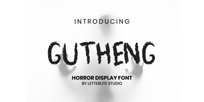 Gutheng - is a horror-themed font that is very mysterious and spooky. This font is very suitable to be used for book covers, titles, quotes, and others that require a font with a horror theme. What's Included : - Standard & Multilingual glyphs - Works on PC & Mac - Simple installations - Accessible in the Adobe Illustrator, Adobe Photoshop, Adobe InDesign, even work on Microsoft Word. - PUA Encoded Characters - Fully accessible without additional design software. - Fonts include multilingual support for; Afrikaans, Danish, Dutch, French, German, Indonesian, Irish, Italian, Norwegian, Portuguese, Scottish, Spanish, Swedish, Swiss. Hope you enjoy with our font!
 - Decalcomania JNL by Jeff Levine,
$29.00 Decalcomania JNL is based on examples of gold and black water-applied initial decals made by the Transfer Monogram Company of Chicago circa the 1940s. It is presumed the patterns for the letters were hand cut, possibly explaining the variations in line widths and character shapes. These eccentricities were left intact and followed through to the other characters in order to represent a more "authentic" digital version of these vintage decals. Decalcomania JNL is available in both the regular (outline) version, and a solid black version, as well as obliques of both styles.
 - Bromwich by Greater Albion Typefounders,
$14.95 Bromwich is a piece of brand new Edwardian fun. In the spirit of railway travel posters and illustrated news journals, it's a wonderful font for poster design, or for book covers and other work with a period theme. Need something for a menu or placecards for a period themed function? Designing a book cover for a period novel? Bromwich is the face for you. It's offered in regular and alternate forms, with additional true small capital forms of both. Bring a bit of period flare to everything you do!