10,000 search results
(0.065 seconds)
- Lehavot MF by Masterfont,
$59.00 Here is you next choice of the desired romantic greeting font you were looking for.
 - FG Swan by YOFF,
$13.95 Here is FG Swan who is a more artistic and egocentric young woman or male.
 - Achshelo MF by Masterfont,
$59.00 Rude, rough, wild, energetic - it is all here, waiting for your next headline to emerge.
 - Factual JNL by Jeff Levine,
$29.00Nothing too fancy here, just your everyday workhorse sans in both regular and oblique versions. - Goondocks PB by Pink Broccoli,
$14.00 HEY YOU GUYS! Goondocks PB is a faithful recreation of the titling font from 1985 film, "The Goonies". This was a lot of fun to recreate and flesh out, and it has that purposefully awkward appeal that a lot of Pink Broccoli fonts are imbued with. With a pseudo unicase styling, wonky blockish style lettering, and that visceral tieback to the 80's, Goondocks brings back fond memories, perfect for those unorthodox creative designs.
 - Visum by Hanoded,
$15.00 Visum means Visa in Dutch. The name was inspired by Dutch soccer club Vitesse's rather sad decision to leave Israeli player Dan Mori behind, after he was refused a UAE visa because of his nationality. Visum font is a tall and proud all caps typeface. It comes with alternates for the lower case letters, some ligatures and an impressive language support. Of course, upper and lower case glyphs can be freely interchanged.
 - Beatnik by Type Innovations,
$39.00 I was working at Bozell Worldwide, an advertising agency, on their yearly promotional pitch. An art director was looking for a condensed informal headline treatment to be used on one of the new ad campaigns. I took several different font designs and started to condense and scale the proportions in the hopes of finding several good solutions. They finally settled on a version of Times Roman, scaled horizontally to about 50 percent proportions. I liked the look so much that I later went back to the drawing board and refined the concept by adding slanted serifs and a varying alignment on all the letter forms giving the typeface a very casual and informal appearance. At about that time, I was reading a book by Jack Kerouac, and was so inspired by his writings on the ‘beat generation’ that I decided to name the font ‘Beatnik’. Afterwards, I added a set of true small capitals and old style figures. I'm currently working on additional weights and variations to expand this ‘hip’ new font series. Groovin' baby.
 - Absalon by Michael Nordstrom Kjaer,
$39.00 Absalon has square letter shapes. It has some characteristics semi-sharp and semi-rounded corners and it has a relatively tall x-height for legible text. To create the perfect typesetting the spaces between individual letter forms has been precisely adjusted. The Absalon font family is perfect for the web as well as for print, for display as well as longer text, for motion graphics, on the side of a van, t-shirts, logotypes and so on. The font family consist of 5 weights or 10 styles and it has 410 glyphs. A total of more than 4000 glyphs. The styles are: Light, Light Italic, Regular, Italic, Medium, Medium Italic, Bold, Bold Italic, Extra Bold & Extra Bold Italic. It has OpenType features such as automatic fractions, subscript, superscript, numerators, denomerators, ordinals and the “f” ligature set. Absalon has extended language support (most Latin-based scripts are supported). The name of the font family is Absalon and it is a reference to a Danish bishop in the middle ages. He was a key figure in the founding of Copenhagen, the Capital of Denmark.
 - Ysans Std by Typofonderie,
$59.00 Fashion style meets typography in 9 styles The Ysans designed by Jean François Porchez is a sanserif influenced by Cassandre lettering pieces and the geometric sanserif style from the inter-war period. Since Chanel logo, the geometric sanserif style is the favorite typographic thing in fashion. Ysans asserts this reference. Not only Haute-Couture houses use these categories of typefaces for their visual identity, but fashion magazines usually strength their layout with these geometric sanserif when a Didot isn’t used. Details of Ysans drawings Nevertheless, Ysans takes its sources in certain details imagined by the graphic designer Adolphe Mouron Cassandre for the monogram then logotype Yves Saint Laurent (1961 …). One thing keeps coming in again and again in Cassandre’s post-war graphic work: the pointed finish and endings, the references to the Roman capitals engraved and unique features such as the open R or other details influenced by Antiqua and calligraphic forms or ductus (you should have in mind that an earlier typeface by Cassandre is the Peignot, a modern uncial based on researches of the palaeographer Jean Mallon.) Certain letters from the Ysans are directly an homage to the Yves Saint Laurent logo, the R, the narrow U, the apex of the N, and all the details of such pointed endings on the f and t lowercases. The Ysans, a typeface between diversity and synthesis There are several ways to approach the design of a new geometric sanserif. The first approach is to follow the Bauhaus philosophy by designing in the most rational way, typographic forms based on simple geometric elements: square, round, triangle. Another approach is to start a revival based on an historical geometric typeface and optimize the original ideas, in order to adapt certain details to the contemporary needs. For Ysans, the approach is somewhat different because this project started in 2011 at ZeCraft as a typeface designed specifically for Yves Saint Laurent Beauty, still in use by the brand under its original name Singulier. The Singulier-Ysans has been conceptualized by ZeCraft, both drawing its sources from Cassandre and various historical geometric typefaces. Some will spot specific traits as in Futura, others in Metro or Kabel. By closely observing the Ysans, the result can also recall the way Eric Gill draw the curves and endings of his typefaces, of which Jean François Porchez is a fervent admirer. In the end, Ysans is like fashion as envisioned by Yves Saint Laurent who constantly revealed multiple references in his new collections, without being recognisable any other than with his unique style. “Fashions pass, style is eternal. Fashion is futile, not style.” Cherry on the cake: Ysans Mondrian Ysans Mondrian, named in reference to the Mondrian dress created by Yves Saint Laurent, is the multi-layer version of the family. Ysans, fashion style meets typography Club des directeurs artistiques, 49e palmarès
 - Hello Freeday by Nathatype,
$29.00 Hello Freeday is a striking display font that combines a bold and clean font weight with playful swinging endings. With its uniform letter proportions and unique character details, this typeface effortlessly balances sophistication and a touch of whimsy. The bold and clean font weight of this font commands attention and adds a sense of strength and impact to your designs. Each letter is meticulously designed with precise geometric forms, resulting in a polished and professional appearance. The consistent proportions of the letters contribute to the font's overall coherence, ensuring a harmonious and balanced visual experience. What sets this display apart is the charming swinging endings found in select letters. These decorative details add a hint of playfulness and movement to the font, injecting a touch of personality and delight into your designs. The swinging endings give the letters a sense of rhythm and flow, making Hello Freeday an excellent choice for projects that require a dynamic and captivating visual presence. The font's bold and clean aesthetic ensures legibility and readability, even at smaller sizes. Enjoy the available features here. Features: Stylistic Sets Ligatures Multilingual Supports PUA Encoded Numerals and Punctuations Hello Freeday fits in headlines, logos, attention-grabbing titles, product packaging, greeting cards, branding materials, editorial layouts and website headers. Find out more ways to use this font by taking a look at the font preview. Thanks for purchasing our fonts. Hopefully, you have a great time using our font. Feel free to contact us anytime for further information or when you have trouble with the font. Thanks a lot and happy designing.
 - Corpid by LucasFonts,
$49.00 The name Corpid derives from “Corporate Identity” — which is what this family of low-contrast sans-serifs was made for. Corpid was originally commissioned by Studio Dumbar in the Netherlands as a corporate typeface for the Dutch Ministry of Agriculture, Nature Management and Fishing. The font was designed to replace the existing standard typeface (a well-known business-like sans-serif) to provide the organization with a unique and strong identity. Although it was designed to fit strict technical requirements, Corpid has a personality all of its own. This was in part a result of what Luc(as) calls “creating tension” between the inner and outer curves of each character. “I tend to put a little more diagonal contrast into fonts than is the case in most neutral sans serif fonts. This brings a certain humanistic touch to the typeface. Much more subtle here than in Thesis – but although it is almost invisible, it is still palpable.” Corpid was gradually expanded into a five-weight, three-width family. The new Corpid SemiCondensed has double functionality. It is a no-frills, compact headline font that offers optimum legibility in sizes from small to huge. It is also a great space-saving text typeface for magazines, newsletters or annual reports: economic, versatile, and provided with several different numeral sets. In this OpenType type version, all weights come with Small Caps. With its wealth of numeral styles and complete character sets (including Central European) the Corpid family is now well equipped to tackle the most complex of typographic tasks.
 - Tex Writer by Designova,
$15.00 Tex Writer is a custom handmade / handwritten Serif typeface with a simple and casual personality making it perfect for text typography, logotypes, marketing graphics, branding, package and advertisement design and anything in between. Extended Character Sets Along with the basic Latin character set, we have added Western European, Central European, South Eastern European character sets for your convenience. What You Get This typeface comes with 14 fonts having 7 weights + 7 italics (Light / Regular / Medium / SemiBold / Bold / ExtraBold / Heavy).
 - ITC Roswell by ITC,
$40.99Roswell was designed by Jim Parkinson, who acknowledges the 'spacey' ancestry of its name. Yes, Roswell, New Mexico. There was a big anniversary of 'the incident' in the news while I was designing in Roswell. "The incident" is of course the alleged UFO crash in Roswell. "I thought the name was acceptable as a serious font name, while, on another level, having a strangely humorous edge," says Parkinson. Roswell looks great in large sizes on a poster or in a magazine layout. It started out as "a variation on American gothic forms like Railroad Gothic", says the designer, but Roswell is an original design with eccentricities of its own." - HayStackMF - Unknown license

- Veggie Fruit by Gerald Gallo,
$20.00 VeggieFruit is an assortment of 47 vegetables and fruits all located under the character keys.
 - Donna Julia by Autographis,
$39.50 Donna Julia is the embellished version of DonJulio. They are designed to be used together.
 - Redpine by Taznix Creative,
$15.00 Redpine is an unique and simple sans serif font. Use it to add that special retro touch to any design idea you can think of! There are 2 types of fonts in Redpine, namely clean and textured. If you need a clean and aesthetic design, you can use the regular redpine or you want to use as a rough design or some scratch effect, you can use textured Redpine. Redpine is perfect for branding projects, logo, social media posts, advertisements, product packaging, product designs, label, photography, watermark, invitation, stationery and any projects that need retro taste. What's Included : Standard glyphs Ligature Works on PC & Mac Simple installations Accessible in the Adobe Illustrator, Adobe Photoshop, Adobe InDesign, even work on Microsoft Word. PUA Encoded Characters - Fully accessible without additional design software. Fonts include multilingual support for; ä ö ü Ä Ö Ü ß ¿ ¡ Image used : All photographs/pictures/vector used in the preview are not included, they are intended for illustration purpose only. Hope you enjoy with our font! Taznix
 - Hillstone by 38-lineart,
$14.00 Hillstone is a handwritten font with a rough texture, the process of making letters with scratched with strong and fast stroke on paper to make the rough texture that characterizes of Hillstone, so this is a font with a rough and dry brush style. We repaired the letters computerically and if they didn't unite well and we made several alternate glyph. There is no problem for long or short text, so this font can be used in various designs widely. you can use this font for instagram, quotes and other long text, this font is also unique for one word text or short typing, that you can use for product brands, company logos, books and magazine covers, everytype will look very typical. use ligatures and alternatives to your taste.38. Anything made with this font will definitely be wrapped in a very contemporary style and elegance. We make several priview images as a guide for designing directions, please check them all Best regard and thank you very much.. 38.lineart studio
 - Stud by Typodermic,
$11.95 Listen up, partner! If you want to give your message some real grit, you need to saddle up with Stud. This ain’t no wimpy, delicate typeface that’ll have you tip-toeing around your message like a city slicker. No way, pal. Stud is a cowboy typeface with brawny serifs that’ll have you shouting your message from the rooftops. With wide characters and robust letterforms, Stud is the epitome of solid confidence. It’s the kind of typeface that’ll have your audience sitting up straight, paying attention, and hanging on your every word. And let me tell you, there ain’t no other typeface out there that can do that. But that’s not all, folks. Stud comes equipped with some serious firepower. Some character combinations are automatically swapped for custom pairs in OpenType-aware apps. That means your message is going to be more powerful than a bull at a rodeo. So if you want to make a real impact, make sure to turn off your application’s “standard ligatures” function to disable the effect. It’s time to get tough with Stud. Saddle up and let your message ride into the sunset with confidence, power, and a powerful style that’ll leave your competition eatin’ dust. Most Latin-based European writing systems are supported, including the following languages. Afaan Oromo, Afar, Afrikaans, Albanian, Alsatian, Aromanian, Aymara, Bashkir (Latin), Basque, Belarusian (Latin), Bemba, Bikol, Bosnian, Breton, Cape Verdean, Creole, Catalan, Cebuano, Chamorro, Chavacano, Chichewa, Crimean Tatar (Latin), Croatian, Czech, Danish, Dawan, Dholuo, Dutch, English, Estonian, Faroese, Fijian, Filipino, Finnish, French, Frisian, Friulian, Gagauz (Latin), Galician, Ganda, Genoese, German, Greenlandic, Guadeloupean Creole, Haitian Creole, Hawaiian, Hiligaynon, Hungarian, Icelandic, Ilocano, Indonesian, Irish, Italian, Jamaican, Kaqchikel, Karakalpak (Latin), Kashubian, Kikongo, Kinyarwanda, Kirundi, Kurdish (Latin), Latvian, Lithuanian, Lombard, Low Saxon, Luxembourgish, Maasai, Makhuwa, Malay, Maltese, Māori, Moldovan, Montenegrin, Ndebele, Neapolitan, Norwegian, Novial, Occitan, Ossetian (Latin), Papiamento, Piedmontese, Polish, Portuguese, Quechua, Rarotongan, Romanian, Romansh, Sami, Sango, Saramaccan, Sardinian, Scottish Gaelic, Serbian (Latin), Shona, Sicilian, Silesian, Slovak, Slovenian, Somali, Sorbian, Sotho, Spanish, Swahili, Swazi, Swedish, Tagalog, Tahitian, Tetum, Tongan, Tshiluba, Tsonga, Tswana, Tumbuka, Turkish, Turkmen (Latin), Tuvaluan, Uzbek (Latin), Venetian, Vepsian, Võro, Walloon, Waray-Waray, Wayuu, Welsh, Wolof, Xhosa, Yapese, Zapotec Zulu and Zuni.
 - Vintagedeck by Ditatype,
$29.00 Vintagedeck is a charming script font that gracefully combines vintage elegance with contemporary style. Each character in Vintagedeck is crafted with care. Designed with a fairly thick weight and a shape that gently nods to rounded forms, Vintagedeck is a versatile font that brings a touch of welcoming feel. The overall looks create a warm, approachable aesthetic reminiscent of classic handwriting, yet perfectly suited for the demands of current design trends. To truly appreciate the beauty and clarity of this font, it is recommended to use it in a larger font size. This not only improves readability but also allows its unique characteristics to shine. In addition, enjoy the features here. Features: Ligatures Stylistic Sets Multilingual Supports PUA Encoded Numerals and Punctuations Vintagedeck fits in headlines, logos, posters, flyers, branding materials, greeting cards, print media, editorial layouts, and many more designs. Find out more ways to use this font by taking a look at the font preview. Thanks for purchasing our fonts. Hopefully, you have a great time using our font. Feel free to contact us anytime for further information or when you have trouble with the font. Thanks a lot and happy designing.
 - Tailpen by Yumna Type,
$25.00 It is a tough task to create a visual identity without using a characteristic, multipurpose font to represent your brand in order to look different, yet unexaggerating. For that reason, let us welcome Tailpen, the perfect balance of simplicity, charm, and boldness to live up your brand identity. Tailpen is a display font in simple, inclined square letter shapes to show charming, real, attractive nuances. It is greatly legible due to the simple shapes in high contrasts with which you can apply this font for various text sizes. It also gives you a clipart as a bonus and you can make use of the available features here as well. Features: Multilingual Supports PUA Encoded Numerals and Punctuations Tailpen fits best for various design projects, such as brandings, posters, banners, headings, magazine covers, quotes, printed products, merchandise, social media, etc. Find out more ways to use this font by taking a look at the font preview. Thanks for purchasing our fonts. Hopefully, you have a great time using our font. Feel free to contact us anytime for further information or when you have trouble with the font. Thanks a lot and happy designing.
 - Black Butter by Ditatype,
$29.00 Arranging fonts is a difficult, time-consuming process, especially the handwriting arrangement which needs careful considerations and precisions for a natural-looking font. Because you deserve a unique, real essence-catching font, let us introduce you to the Black Letter, an attention-catching script font. This capitalized font designs with brush details have curvy, infirm lines to make the designs look more artistic and unique. The letters’ proportions are similar, yet it has high contrast to add some visual attractions to the font. However, a brush font lacks legibility in lengthy texts. As a result, it is more suitable to apply for short texts or titles only. You can also enjoy the available features here. Features: Multilingual Supports PUA Encoded Numerals and Punctuations Black Letter fits best for various design projects, such as brandings, posters, banners, headings, magazine covers, quotes, printed products, merchandise, social media, etc. Find out more ways to use this font by taking a look at the font preview. Thanks for purchasing our fonts. Hopefully, you have a great time using our font. Feel free to contact us anytime for further information or when you have trouble with the font. Thanks a lot and happy designing.
 - Long Vacation by Din Studio,
$27.00 Do you want something prominent yet legible? This is Long Vacation, our new handwritten font, ideal for all of your design needs. Long Vacation is a visually interesting handwritten font showing a unique handwriting style giving the natural, lovely nuances on your designs. The flowing letters are interconnected and the scratches that connect the letters make the font look more natural. Details on each letter and curves on the edges show high contrasts. Due to its great legibility, you can apply this font to both big and small text sizes. Additionally, enjoy the features available here. Features: Stylistic Sets Multilingual Supports PUA Encoded Numerals and Punctuations Long Vacation fits best for various design projects, such as brandings, posters, banners, invitations, greeting cards, magazine covers, quotes, printed products, merchandise, logos, social media, etc. Find out more ways to use this font by taking a look at the font preview. Thanks for purchasing our fonts. Hopefully, you have a great time using our font. Feel free to contact us anytime for further information or when you have trouble with the font. Thanks a lot and happy designing.
 - Winslow Title by Kimmy Design,
$25.00 Winslow Title is a high contrast modern type family comes in two styles and a monolinear script family. The traditional proportions of Winslow Title are historical in nature and follow the design and style of Winslow Book as a high contrast variant. The Winslow Title Mod family is a contemporary take on the style, with tapering terminals and less pronounced finials. Each family includes both styles, to be accessed through the opentype panel as a stylistic alternate. If preferable, you can purchase the entire family collection to have easier access to both styles, but it's not necessary. The typeface family comprises of roman and italic styles in six weights from Thin to Black and two widths in the roman style: Regular and Narrow. The accompanying script family has a single weight but offers five tracking widths, from Narrow to Wide. The bundle is an elegant combination of styles perfect for titling and display design. The serif typeface is packed with features that make ideal titling styles. Not only do they include the Stylistic Alternates, but also Titling Alternates, Discretionary Ligatures, Small Capitals, Swashes and Contextual Ligatures. As noted previously, the typeface comes in two styles, Traditional and Modern. Each can be accessed either by the Stylistic Alternates or Stylistic Sets. Titling Alternates are alternates that expand the ball terminals to K, R, V, W, and Y (see Titling Alternates slide). Contextual Ligatures are for capital combinations with A that tighten the gap created by the extended serifs. It connects characters with a pairing serif (the lower right serif of the M with the lower right serif of the A) and bridges them together. This combination works for single and multiple A combinations. It is turned on automatically in the Opentype panel and shouldn’t need to be accessed individually. Alternatively, the Discretionary Ligatures feature combines diagonal or baseline stems with lifted small capitals, creating a unique combination of characters. Swashes is an extensive feature that offers up to five swash options per many of each character. These can be selected via the Glyphs panel or as character alternates in Adobe programs. The Script family has a feature set of it’s own, with initial and final swashes on lowercase letters, middle swashes for select characters, and a titling feature that joins words together by replacing the space with a line. Stylistic alternates create a bouncing baseline on connecting strokes. *Note: there is no great need to purchase both families as all styles can be accessed via Opentype features, but if customers prefer to purchase both styles, it can be done by selecting the Complete Typeface Family collection.
 - Fairplex by Emigre,
$49.00 Zuzana Licko's goal for Fairplex was to create a text face which would achieve legibility by avoiding contrast, especially in the Book weight. As a result of its low contrast, the Fairplex Book weight is somewhat reminiscent of a sans serif, yet the slight serifs preserve the recognition of serif letterforms. When creating the accompanying weights, the challenge was to balance the contrast and stem weight with the serifs. To provide a comprehensive family, Licko wanted the boldest weight to be quite heavy. This meant that the "Black" weight would need more contrast than the Book weight in order to avoid clogging up. But harmonizing the serifs proved difficult. The initial serif treatments she tried didn't stand up to the robust character of the Black weight. Several months passed without much progress, and then one evening she attended a talk by Alastair Johnston on his book "Alphabets to Order," a survey of nineteenth century type specimens. Johnston pointed out that slab serifs (also known as "Egyptians") are really more of a variation on sans serifs than on serif designs. In other words, slab serif type is more akin to sans-serif type with serifs added on than it is to a version of serif type. This sparked the idea that the solution to her serif problem for Fairplex Black might be a slab serif treatment. After all, the Book weight already shared features of sans-serif types. Shortly after this came the idea to angle the serifs. This was suggested by her husband, and was probably conjured up from his years of subconscious assimilation of the S. F. Giants logo while watching baseball, and reinforced by a similar serif treatment in John Downer's recent Council typeface design. The angled serifs added visual interest to the otherwise austere slab serifs. The intermediate weights were then derived by interpolating the Book and Black, with the exception of several characters, such as the "n," which required specially designed features to avoid collisions of serifs, and to yield a pleasing weight balance. A range of weights was interpolated before deciding on the Medium and Bold weights.
 - Suorva by Sign Studio,
$15.00 Suorva from the sans serif family is made for display needs. Each side of his body is well-measured and consistent. Has a Stylistic Alternate Set ( S, Y, a, e, g, k, y) and also Discretionary Ligatures (uppercase). All Glyphs have PUA Encoded which will make it easier to use in general editor software.
 - Cluster by PintassilgoPrints,
$24.00A hand-drawn shadowed and textured display sans. Strong and stylish, definitely. Two glyphs per letter for a nice natural feel. And let's not forget to remark the hi-versatile solo versions. These fit many design applications, with the amazing ability of looking slightly serious or slightly fun. But always genuine, you bet! - Caterina by Calligraphics,
$30.00Caterina, was selected personally by Francis Ford Coppola for the film he produced called The Legend of Suriyothai. It's not the credits, but text placed in the center of the screen to introduce information about the setting, the characters, and so on. Something like chapter headings in a book, or the text in silent movies. - Florens LP by LetterPerfect,
$39.00 Florens is a flourished, semi-formal script that designer Garrett Boge modeled after his own italic calligraphy, which is a contemporary version of the chancery script of the Italian Renaissance. In addition to the standard character set, a Flourished font provides old-style figures, special dingbats, and swash variants for all upper and lowercase characters.
 - Graphit by HVD Fonts,
$40.00 Graphit is a typeface designed by Lit Design Studio & curated by HvD Fonts. It combines clear, geometric shapes with edgy yet finely-crafted details. Graphit features uncompromising characters such as G, Q, f, k and 1. It works well both for impactful headlines and for reading sizes. The type family consists of six weights plus matching italics. In early 2018, Livius Dietzel & Tom Hoßfeld started developing the typeface’s essential character and released a free font named after the studio, Lit. Just a few months later, Hannes von Döhren had a look at the typeface and suggested expanding it into a family – then publishing it with HvD Fonts. They drew every single letter from scratch, and also decided to give the font a new name — Graphit. The family features six low-contrast weights, ranging from Black to Thin. Every character has been crafted to give it a distinctive and individual feel. Medium, Regular and Light are optimized for usage in copy text. For smaller font sizes & longer body copy, the alternate character set features a double-story a and a simplified Q, f, r and t for improved legibility. All fonts are manually hinted for optimal performance on digital devices.
 - ChromosomeLight - Unknown license

- ChromosomeHeavy - Unknown license

- Happy-Go-Lucky by Jelloween,
$-The purpose of Happy-Go-Lucky is to bring joy to the world. These cheerful little dingbats will brighten your day right up! - Outside by PintassilgoPrints,
$24.00 Alternates, ornaments, ligatures and two casual stylish faces. This is Outside. Where we'd absolutely rather be. * Released during the inside times of 2020 *
 - Carols Night by Maulana Creative,
$12.00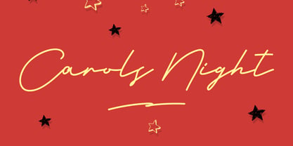 Give your designs an authentic handcrafted feel. �Carols Night Christmas Theme Font� is perfectly suited to stationery, logos and much more. Many Thanks!
 - LD Absurd by Illustration Ink,
$3.00This downloadable font has silly written all over it. Its versatile style makes it useful for all sorts of absurd or comical themes. - Social Gathering JNL by Jeff Levine,
$29.00 Social Gathering JNL is modeled from the Art Deco hand-lettered title of a vintage piece of sheet music entitled "Three of Us".
 - Printers Pictures JNL by Jeff Levine,
$29.00 Printers Pictures JNL is another volume of vintage letterpress stock cuts, cartoons, embellishments and what-nots for those who enjoy these charming illustrations.
 - Azote by Thomas Jockin,
$30.00 One line, two lines, three lines. Inspired by the 1968 Mexican Olympics, Azote is a multiline typeface family that adds lines for weight.
 - Valimo by Fenotype,
$19.00 Valimo RMX is a destroyed hard-to-read typeface. It's suitable for creating text "textures" where you don't necessarily need any actual content.


