10,000 search results
(0.032 seconds)
- Bambus by URW Type Foundry,
$49.99 LP Bambus is another new handwriting script written with bamboo from German designer Peter Langpeter (lp-design.de). LP has been running his own design studio since 1995, working as a typeface and logo designer, as a calligrapher, cartographer and illustrator. During this time LP created a large number of excellent new typeface designs. Now, we are extremely happy that LP has chosen to let URW digitally produce and market his designs.
 - Belly Laugh by Comicraft,
$19.00 When we asked Dave Gibbons to name the typestyle he created for the sound effects in GIVE ME LIBERTY, he must've thought we were kidding. So we humored him, and now you can get in on the joke when you order BELLY LAUGH and Dave's signature font for just $99. It's a rib-tickler alright, and it's also available separately for those of you who like to laugh alone.
 - Keystoned by TypeArt Foundry,
$45.00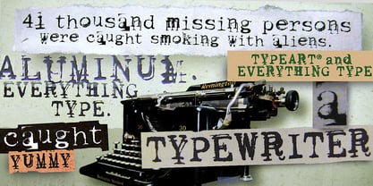 Typewriter with problem keys.
 - Koni by Anastasia Kuznetsova,
$17.00 Get to know the beautiful natural and neat font "Koni"! This beautiful neat retro sans-serif font with imperfect ink edges and a little sloppy shading is inspired by nature. This is a textured font in vintage style with capital letters. The letters here are clearly distinguishable, and interesting touches give it uniqueness. Eco-friendly fashion takes into account the health of consumers, the health of the planet. The font "Koni" is perfectly combined with any stylized graphics, watercolors, and also looks great on its own as part of a minimalist design. Play with letters to get different effects. Great for branding, invitation design, packaging design, quotes, label design and more. Font features: - A-Z; character set a-z; - 1 language (English); - numbers and punctuation marks, symbols. Fonts can be opened and used in any software that can read standard fonts, even in MS Word. No special software is required, and to get started. It is recommended to use it in Adobe Illustrator or Adobe Photoshop Made with love and magic ♡ Thank you for checking this out and feel free to write me a message if you have any questions! ~ Anastasia
 - Marintas by insigne,
$22.00 Marintas is a sleek upright italic that offers you a modern look and feel. This elegant sans serif comes across as lively, yet comfortable. Some semi slab characteristics of the font give it a face-forward momentum. These semi slabs, even with their geometric construction, are fluid shapes with a soft hint of brushstroke. The soft curves of Marintas paired with its playful but geometric semi slabs or ending strokes give the face its spirited--though friendly--eye-catching appearance. The Marintas family is comprised of 8 variants, ranging from Thin to Ultra. Its incredible versatility ranges from the delicate hairline to the extreme ultra weight. The heavier weights show some similarity to Antique Olive, and the face has an exuberant South American or Latin feel. This type of family is well-suited for advertising, retail, food and beverage products as well as for use in magazines, logotypes, and books. The fonts lend themselves to display settings, but are still very usable for longer copy. Because of its large x-height, the typeface is legible at very small sizes and as a webfont. Marintas has support for extended Latin character set. A wide range of Western languages are also supported, including Central, Eastern and Western European languages. In all, Marintas supports over 40 languages that use the extended Latin script, making Marintas a great choice for multi-lingual publications and packaging. All insigne fonts are fully loaded with OpenType features. Marintas is also equipped for complex professional typography and includes ligatures, alternate characters and fractions. The face includes a number of numeral sets, including old-style and lining figures with superiors and inferiors. OpenType-savvy applications such as Quark or the Adobe Creative Suite can take full advantage of the automatically replacing ligatures and alternates. This family also includes the glyphs to support a wide range of languages. Check out the informative .pdf brochure to see these features in action.
 - Roloi by Mayfield Type Foundry,
$15.00 Originally inspired by the numerals on a vintage clock face, Roloi is a layered numbers font in the deco lettering style, and includes a full set of automatic clock symbols. Its geometric forms are typical of the deco style, but stop well-short of pure geometry. The irregular stroke and character widths work together to give the forms a warm and energetic, yet cohesive, feel. Roloi offers two layering styles—the personable Fill and the more dynamic Inline. Designed to be layered over the background Regular style, they both lend the forms an added level of interest. Roloi also includes a clock symbol for any and every time of day, rounded to the nearest five-minutes. The regular weight provides the circular clock background, while the Fill and Inline styles produce the clock hands. If ligatures are activated in your text-editing program, type out any time—such as 9:32, 12:05, etc.—and the proper clock symbol will be automatically substituted. Go ahead, type any time out below! To stop the automatic clock symbol substitution, simply deactivate ligatures. Because the clock symbols are standard ligatures, every major modern browser will support their use on the web. With some programing they could even be used to make a lightweight, text-only clock. In addition to the clock symbols and basic numerals, Roloi’s glyph range covers numeric superiors and inferiors, standard and arbitrary fractions, currency symbols, all of the punctuation and symbols commonly associated with currency, unicode clock Face symbols, the A M P / a m p letters, and alternates of the 1, 2, and 4, accessible by selecting Stylistic Set 1.
 - Minnak by Esintype,
$18.00 Minnak, as a whole geometric display type is our take on Square Kufic (Makili) style Latin script fonts, comes in eleven weights with linear progression. It is an Uniwidth typeface at the core. From Hairline to Black, all multiplexed weights take up the same space in width and can be used interchangeably. Supports wide range of Open Type features, with many stylistic alternates in 12 context. Minnak is also have a close relation with pixel fonts, because in spite of its based on Makili forms, it all started as a pixel font in the drawing stage before further steps came into play. The key difference between Minnak and Makili style is that the latter must have the exact square counters with no diagonal strokes, and any other components of a letterform must conform to be proportional. Such style-specific requirements determine the overall dimensions of the glyphs and therefore, there can be only minor differences between the typefaces. In Minnak, counters are rectangular because of its narrow and condensed proportions, but the Makili form influence is still manifest. This impression is best confirmed with Medium weight where negative spaces and stem thickness are equal. Contrast and virtually no optical correction were presented, as characteristic of its genre had to have equal horizontal and vertical line thicknesses. As per the minimal and authentic look of the type, all glyphs are drawn as straight or only as 45-degree diagonal strokes. The representation of the ‘diagonalless’ approach is preserved by stylistic alternatives, making its similarity in visual aesthetics clearly visible. Marks and punctuation is another feature that doesn’t follow the strict rules of the origin style. Although not a pixel font, all building parts of the glyphs in Minnak share the same unit precision as they are designed with pixel equivalents in mind. Even space characters are designed to match glyph widths, meeting the demands of certain typesetting or multi-line lettering compositions. With its Pseudo Ancient and Runic alternates, extention parts and ornaments included in all weights, Minnak is suitable for branding, logo and monogram designs, the screen titles and headlines, packaging, posters, book covers and more, where it shines at big sizes. Its pixel font-like appearance makes it a significant choice for the modern compositions. Thanks to mostly uniform width design, it is possible to use Minnak also as a system for lettering. This feature can be used as vertical fitting of the letters between the lines. As a casual expression in Turkish, “Minnak” is one of the seven typeface designs in Esintype's ancient scripts of Anatolia project, Tituli Anatolian series — representing Seljuk period in the medieval Anatolia and their tradition of architectural stone ornamentation.
 - Kalyna by 2D Typo,
$36.00 The Kalyna font is interesting with its stylistic implementation through asymmetrical serif. Such design is characteristic for the Ukrainian style. The drawing of the font is based on the sketches of a famous Ukrainian graphic artist of early 20th century Heorhiy Narbut. His work set the whole school in the Ukrainian graphic art and is still very influential nowadays. The font is capital and also includes a set of ornaments in addition the standard set of symbols.
 - Constant by Underscore,
$32.00 Constant is a meticulously constructed slab serif display typeface of a sturdy lineage. The strong horizontal and vertical rhythm and calculated angles dominate its appearance, yet sweeping broad shapes infuse the design with an overall warm undertone. Constant is best suited for setting short headlines, word marks, posters and other visual communication ephemera. Particular when set in all uppercase the typeface’s squarish and resolute nature commands attention and projects authority. Despite the prominent slab serifs and their angular corner details, these fonts work well also for shorter text passages, especially in the lighter to medium weights. When typesetting Constant in paragraphs spanning several lines the face requires a fair amount of leading to not appear vertically compressed. As customary for Underscore’s catalog the fonts have very extensive support for languages in the Latin script, reaching from Afrikaans to Vietnamese and Zulu. The fonts are carefully spaced, kerned and hinted, and include a variety of typographic glyphs and OpenType features like various ligatures, number features and case alternatives. Constant has been developed and released in 2018 as the proud forth release from the Underscore label. This design by Johannes Neumeier is available from the Underscore webshop as well as selected retailers.
 - Pistacho by Estudio Calderon,
$20.00 Are you looking for an appropriate typeface for coffee shops concept? We want to introduce Pistacho, the new type family of Estudio Calderon that contains 18 fonts to design great illustrations and to be applied, especially, in coffee shops, bakeries, ice-cream shops, candy stores, pastry shops, fruit shops and all those places where food is the center. Pistacho was designed by hand using pencils and markers that let us get a handcrafted and rough texture. Below, a brief description of each style: Display: A fresh and modern type, perfect to be used in coffee shops outdoor signs. The logotype of “Central Perk”, the coffee shop of the tv show “Friends” was our inspiration to develop this beautiful font that contains 317 characters and three variables: Display 1, Display 2 and Display 3, each one has specific characteristics that will be an excellent resource for your designs. Sans: Style that contains 7 fonts that can be mixed to get interesting finishes in your designs, each variable has 363 characters with standard ligatures and stylistic alternatives. You can find this styles as: Sans 1, Sans 2, Sans 3, Sans 4, Sans 5, Sans 6 and Sans 7. Good news, you can get Sans 5 DEMO for free. Script: Script 1 and Script 2, two monolineal fonts with a generous spacing that provides contrast and movement, being a suitable complement for the rest of the types of Pistacho family. Serif: Font with a lot of style and personality, inspired in the interlock alphabets shown in «Photo-Lettering´s One Line Manual of Style». Serif 1, Serif 2, Serif 3 and Serif 4 contain a great number of ligatures that generate nice compositions by combining them. One of the characteristics of this style is the combination of upper case and lower case giving as a result a different touch in each design. Soft: Humanist type with a rustic texture and geometric forms ideal for long texts and small sizes. Dingbats: We have designed a package of 244 graphics, illustrations and ornaments that are the perfect complement to combine with each font of this family. Get Pistacho type family, enjoy using it… and do not forget your cup of coffee.
 - Abecedarian by The Type Fetish,
$10.00 Chank claims to have the fastest type design, we think we have the youngest. Samuel was merely four years old when he wrote out his first face. We are expecting many more brilliant typefaces from this upcoming designer. Please note that this font has no numbers or punctuation symbols; Samuel just did letters at that time.
 - Ambriel by Type Innovations,
$39.00 Ambriel is a fancy neoclassic delight—typographic "eye candy" for the senses. Alex Kaczun embelished one of his earlier typefaces, Kaczun Oldstyle Italic, and infused it with many decorative elements including extravagant ball terminals along with many additional whimsical touches throughout. And, what he created is a truly unique display font reminiscent of the ornately decorated Victorian era.
 - Kamaboko by Fype Co,
$14.00 Hey guys! Today I want to present to you with Kamaboko decorative display font, this fun font is a perfect choice if you want to give your design a playful and childish look. This is a cute font that would be perfect for the cutest cards, posters, flyers, calendar, packaging, T-shirts, invitations and so much more!
 - Kalligraphia by Linotype,
$40.99Otto Weisert was a German type founder who ran his own foundry in Stuttgart during the early years of the 20th Century. In 1902, he created Kalligraphia, a cursive Art Nouveau display script face. Kalligraphia has a unique stroke contrast model; the tops and bottoms of its letterforms are thicker than the verticals on its sides. - Mouse Paw by Alexander Sharkov,
$5.00 My home mouse, Hector, drew this wonderful font for kids. He tried very hard and hopes that you will like the result of his work! This font is perfect for advertising various children's brands, decorating children's books, and generally any children's projects! Hector and I believe that the font Mouse Paw will help you in any business.
 - FS Albert by Fontsmith,
$80.00 The x factor How do you make a font like FS Albert unique, distinctive? “When designing a font I try to question every letter,” says Jason Smith, “but all you need is a few that have an x factor. With FS Albert, they’re the lowercase ‘a’ and ‘g’ and the uppercase ‘I’ and ‘J’. “I remember a friend saying, ‘Why on earth have you designed the ‘a’ like that? Isn’t it too friendly for this kind of font?’ And, in a way, that’s what I wanted – honesty and warmth, because a lot of big brands at the time really needed to show a more human side.” Range of weights and styles FS Albert is a charismatic type: a warm, friendly sans serif face with a big personality. Open, strong and amenable, and available in a wide range of weights and styles, FS Albert suits almost every task you put it to. Fontsmith has crafted five finely-tuned upright Roman weights and four italic weights, as well as a special Narrow version to provide the best coverage and give headlines and text an easy-going character. The chunky kid “FS Albert was inspired by – and named after – my son, who was a bit of a chunky kid,” says Jason Smith. “I designed an extra bold weight because I always felt that the really big font heavy weights had the most personality. “I recently told Albert this story. He laughed, and forgave me for thinking he was a fat baby. He liked the big personality bit, though.” 1000s of glyphs Not content with a character set that covered Europe and the whole of the Western world, the studio decided to go further afield. There are now FS Albert character sets that cover western and eastern European languages, including those of Russia, as well as Cyrillic, Arabic and Greek scripts. In fact, the font now covers more than 100 languages, making it ideal for bringing a consistent typographic style to the communications of global brands.
 - FS Albert Paneuropean by Fontsmith,
$90.00The x factor How do you make a font like FS Albert unique, distinctive? “When designing a font I try to question every letter,” says Jason Smith, “but all you need is a few that have an x factor. With FS Albert, they’re the lowercase ‘a’ and ‘g’ and the uppercase ‘I’ and ‘J’. “I remember a friend saying, ‘Why on earth have you designed the ‘a’ like that? Isn’t it too friendly for this kind of font?’ And, in a way, that’s what I wanted – honesty and warmth, because a lot of big brands at the time really needed to show a more human side.” Range of weights and styles FS Albert is a charismatic type: a warm, friendly sans serif face with a big personality. Open, strong and amenable, and available in a wide range of weights and styles, FS Albert suits almost every task you put it to. Fontsmith has crafted five finely-tuned upright Roman weights and four italic weights, as well as a special Narrow version to provide the best coverage and give headlines and text an easy-going character. The chunky kid “FS Albert was inspired by – and named after – my son, who was a bit of a chunky kid,” says Jason Smith. “I designed an extra bold weight because I always felt that the really big font heavy weights had the most personality. “I recently told Albert this story. He laughed, and forgave me for thinking he was a fat baby. He liked the big personality bit, though.” 1000s of glyphs Not content with a character set that covered Europe and the whole of the Western world, the studio decided to go further afield. There are now FS Albert character sets that cover western and eastern European languages, including those of Russia, as well as Cyrillic, Arabic and Greek scripts. In fact, the font now covers more than 100 languages, making it ideal for bringing a consistent typographic style to the communications of global brands. - Nothing by Dharma Type,
$19.99 The real handwriting script. Very powerful impression because of its heavy, wide and speedy shape. Award Winning No. 1 font 2007 at MyFonts and Rising Star. There is one more script designed by in the same concept. -Banana -Nothing
 - Bardi by URW Type Foundry,
$39.99 Tilp Barde is a striking, moderately dynamic design suitable for many different typographic tasks. Its individual ductus is inspired by handwriting, however without calligraphic embellishment. There are no serifs but tiny endings which lead to think of wood-carving.
 - Pansy Bo by Dharma Type,
$19.99 Based on some script in the 19th century. Inky texture gives realistic handwriting appearance. Smooth writing feeling creates antiqued and nostalgic atmosphere. There are two other script designed by in the same concept. -Daisy Lau -Lily Wang -Pansy Bo
 - Gallard by Type-Ø-Tones,
$40.00 Gallard is a two weights family that contains the display type of the great cartoonist and illustrator Miguel Gallardo. In addition, as we usually do for this kind of author fonts, there is a collection of drawings called Victims.
 - Write by Aah Yes,
$12.00Write is a handwriting font, more like neat print than a flowing cursive script, which renders it highly readable and almost like a formal font, but still retaining the informality of handwriting. Also there are some "special effects" varieties. - RM New Albion by Ray Meadows,
$19.00 A classic blackletter Which looks best at 16pt and above. Due to the modular nature of this design there may be a slight lack of smoothness to the curves at very large point sizes (around 100 pt and above).
 - Titanium Motors by Monotype,
$29.99 There is almost no other font that conveys a sense of speed better than the bold but dynamic letters of Titanium Motors™ by Steve Matteson. Use this headline font to create exciting software titles, logos and user interfaces.
 - Roemisch by Linotype,
$29.99The Roemisch type family is a historic hot metal face with left slanted weights that is used for the german cartographic map production. There are also special typefaces required like the Venus type family and Topografische Zahlentafel type family." - Rajomon by Etewut,
$20.00 Introducing Rajomon the hand drawn script made with dry brush. All European languages are in. More of all there are initial, final and alternative letters for making your lettering on a high level as a peak of the rock!
 - Lust Stencil by Positype,
$39.00 When you hear that name, you likely ask yourself, ‘why?!’ I did too, but the number of requests could not be ignored. Once I finally decided to move forward with it, the only way to solve the offering would be to adhere to the same theme of indulgence, I planned for the same number of optical weights AND Italics. Yeah, italic stencils… ok, why not? It’s not a new concept. One thing to note and a creative liberty I assumed during the design. Lust Stencil would not be just a redaction or removal of stress to produce a quick stencil. To do that, would just be a cheap solution. Strokes had to resolve themselves correctly and/or uniquely to the concept of the stencil format. And, it had to be heftier. For it it to look correctly, it needed about 8% additional mass to the strokes for it to retain the effervescent flow of the curves and the resolute scalloped lachrymals. The Lust Collection is the culmination of 5 years of exploration and development, and I am very excited to share it with everyone. When the original Lust was first conceived in 2010 and released a year and half later, I had planned for a Script and a Sans to accompany it. The Script was released about a year later, but I paused the Sans. The primary reason was the amount of feedback and requests I was receiving for alternate versions, expansions, and ‘hey, have you considered making?’ and so on. I listen to my customers and what they are needing… and besides, I was stalling with the Sans. Like Optima and other earlier high-contrast sans, they are difficult to deliver responsibly without suffering from ill-conceived excess or timidity. The new Lust Collection aggregates all of that past customer feedback and distills it into 6 separate families, each adhering to the original Lust precept of exercises in indulgence and each based in large part on the original 2010 exemplars produced for Lust. I just hate that it took so long to deliver, but better right, than rushed, I imagine. It would have taken even longer if not for font engineer and designer, Potch Auacherdkul. Thanks Potch.
 - Hanah Hebrew by Jonahfonts,
$42.00 Hanah Hebrew without cantillation marks, very much used in everyday modern Hebrew. I have added Alternate Stylistics with just some additional cantillation marks which in some cases may be necessary. Use the Character Map (Windows) or Character Viewer (Mac) to access these characters. Unlimited Fractions can be obtained. You may be interested in these Hebrew fonts as well, NEWMARK HEBREW, HEBRON HEBREW,YOM TOV HEBREW, KOMUNIDAD HEBREW SCRIPT and PAGEANTRY HEBREW. Check them out! These fonts require OpenType-aware software.
 - Syncopate Pro by Stiggy & Sands,
$29.00 The Syncopate Pro Family is a unicase design where the traditional lowercase x-height has been abandoned and a single uppercase height rules the design of all of the alpha and numeric glyphs. Some uppercase glyphs are copied to their lowercase slots, where other lowercase glyphs such as the a, e, and r, are scaled up to uppercase heights. This motif allows for a vast array of typesetting possibilities. A modern and stylish sans inspired by the many trendy sans serif typefaces that are prevalent today, the Syncopate Pro Family, primarily intended for display and headline use, also works well for limited text runs. The thin and regular weights and wide body impart a certain level of elegance, while the unicase approach keeps the look lively and fresh. The bold weight imparts a powerful substantiality, lending a strong corporate presence to any design. Opentype features include: - Stylistic Alternates for a collection of alternate Small Caps - Full set of Inferiors and Superiors for limitless fractions - Lining and Proportional figure sets
 - Stella Ann by Jukebox Collection,
$32.99 Stella Ann is another great addition to the script fonts of the Jukebox collection. Named after the designer's maternal grandmother, Stella Ann is a beautiful flowing calligraphic style font. It is both bold and strong, yet warm and graceful, just like its namesake. Perfect for wedding invitations, business cards, scrapbooking and much more! Jukebox fonts are available in OpenType format and downloadable packages contain both .otf and .ttf versions of the font. They are compatible on both Mac and Windows. All fonts contain basic OpenType features as well as support for Latin-based and most Eastern European languages.
 - Bernhard Brushscript SG by Spiece Graphics,
$39.00 This extremely heavy informal script was created in the early 1920s by Lucian Bernhard. Like so many of his designs, this typeface has its roots in his earlier poster work. Bernhard Brushscript invokes a rather warm, pleasant feeling despite a number of quirky characters. Originally created for the Bauer Foundry of Frankfurt, Germany, the face looks as though it’s been drawn with a brush and contains looping ascenders and descenders. Perfect for situations where a quaint and casual lettering effect is desired. The Bernhard Brushscript is also available in the OpenType Std format. Some new characters have been added to this OpenType version. Advanced features currently work in Adobe Creative Suite InDesign, Creative Suite Illustrator, and Quark XPress 7. Check for OpenType advanced feature support in other applications as it gradually becomes available with upgrades.
 - Funboo by ZetDesign,
$14.00 Funboo is a horror-themed font, the shape of the letter resembles a ghost image but still funny. This font is suitable for Halloween decoration and design with a horror theme and can be applied to various media according to your wishes. stay cute and boo!!! ..... Thanks ....
 - Dr. Bones by Sipanji21,
$18.00 Dr Bones is one of those halloween themed fonts, it looks like a series of bones. Dr. Bones is good for some Halloween themed graphic designs, such as logos, banners, t-shirts, posters, products, advertising, or other designs. make your design more attractive with Dr. Bones Font.
 - Sunmore by Viaction Type.Co,
$17.00 Sunmore is a sans serif font with elegant characters. Sunmore is perfect for your elegant-themed work, suitable also for elegant vintage. This font is available in six font style variants, making it easy to do work on various design themes. Sunmore is equipped with multilingual accents.
 - Bungire Retro by Product Type,
$17.00 Introducing Bungire Retro, the ideal answer for your projects with a retro, vintage, or classic modernist theme! Bungire Retro is the perfect font for bringing a sense of nostalgia and charm to your creations because of its distinctive and eye-catching design. With its extensive selection of alternates, Bungire Retro lets you personalize and produce genuinely distinctive typographic designs. When creating logos, posters, invitations, or other creative endeavors, Bungire Retro’s distinct retro vibes will enthrall your audience. Additionally, because of its linguistic support, it may be used for projects everywhere. With Bungire Retro, you can take your ideas to the next level and let your creativity shine. Get Bungire Retro right away to take your audience back to the heyday of classical modernism! What’s Included : - File font - All glyphs Iso Latin 1 - We highly recommend using a program that supports OpenType features and Glyphs panels like many Adobe apps and Corel Draw, so you can see and access all Glyph variations. - PUA Encoded Characters – Fully accessible without additional design software. - Fonts include Multilingual support. Thank you for your purchase!
 - Castle Rocks by Java Pep,
$17.00 Introducing ligature serif font called CASTLE ROCKS duo fonts, these fonts have more than 50 ligatures include full set in uppercase and lowercase. This package consists of CASTLE ROCKS is the ligature font and CASTLE ROCKS DUO is the regular font so you can combine it to mix and match with switch on ligature font (CASTLE ROCKS) or regular font (Castle Rock). CASTLE ROCKS duo fonts are pretty and elegant fonts that perfect for title, headline, logotype, personal branding, branding invitations, quote, magazine, text font, etc. The package including CASTLE ROCKS (Ligature Font), this full set ligature font in uppercase and lowercase and have 4 weight style regular, italic, bold, and bold italic. CASTLE ROCKS DUO (Regular Font), this regular font without ligature feature so you can mix and match with CASTLE ROCKS or use to text font, this has 4 weight style regular, italic, bold, and bold italic. Multilingual, support more than 30 languages PUA Encoded If you have any questions, please let me know. Thanks and have a wonderful day.
 - Sacharon by Konstantine Studio,
$19.00 Are you tired of the same old fonts that everyone's using? Add a touch of nostalgia and personality to your designs with Sacharon, a retro pop font! Whether you're working on a vintage-themed project, designing a catchy poster, or simply want to stand out from the crowd, our fonts will give your work the groovy vibe it deserves. Sacharon takes inspiration from the bold and vibrant styles of the '60s and '70s, bringing back the essence of the good old days. From funky disco fonts to psychedelic lettering, we've got the perfect typefaces to transport your audience to an era of fun and excitement. Perfectly fit for logo, branding, advertising, poster, food and beverages, restaurant, book cover, album artwork, decoration, sign painting, and many more. Don't settle for ordinary typography—take a trip down memory lane with Sacharon! Browse our collection now and transform your designs into eye-catching works of art. Get ready to embrace the vibrant, nostalgic spirit of the past in a modern and trendy way. Get it now and let the grooviness begin!
 - Mayonez by Sardiez,
$29.00 Mayonez is a typeface with rational structure and axis but softened with rounded contours and cupped serifs, getting as result a balance between seriousness and friendliness. The shapes have a soft appearance but without lacking definition. A more fluid structure influenced by calligraphy is proposed for the italic variants, in this case the uppercase letters adopted a simplified semiserif structure that works better with the lowercase letters. Also the figures are very different from the roman version and follow more faithfully the italic style. In an attempt to give Cyrillic lowercase romans a fresh look, symmetrical serifs inherited from the versal tendency are mostly avoided thus getting simpler structures closer to the latin forms. This type is good for commercial and editorial uses like advertising, packaging and pages with showy headlines where a warm touch wants to be given. The character set includes a group of figures and currency symbols with standard height and another suited to match better with lowercase letters. Mayonez was selected to be part of the Communication Arts Typography annual in 2015.
 - Filiya by Anastasia Kuznetsova,
$19.00 Say hello to 'Filiya'! This is a funky hand-drawn handwritten font, perfect for all your holiday designs!! Add some retro fun using the 'Filiya' font inspired by the 70s font! This font is perfect for all your retro designs, procreate designs, social media, shirts, stickers, branding, logos, prints, Cricut designs, svg designs and more! This font includes a basic set of retro letters from A to Z, as well as some fun festive Christmas themed letters. Create, enjoy and create your own unique image! 'Filiya' is available in five versions! The kit includes - regular, contour, shadow, luminous and doodle!! Font Features: - A-Z; a-z character set; - 1 language (English); - numbers and punctuation marks, symbols. Fonts can be opened and used in any software that can read standard fonts, even in MS Word. No special software is required to get started. It is recommended to use it in Adobe Illustrator or Adobe Photoshop. Made with love and magic ♡ Thank you for reading it, and do not hesitate to send me a message if you have any questions! ~ Anastasia
 - Gemsea by Product Type,
$17.00 With Gemsea Fonts, you open the door to a world of limitless creativity. A display theme that celebrates the power of the ocean, bringing a strong, bold, and fun touch to any of your projects. Gemsea is the perfect solution for projects that require a unique theme. From epic films to stunning games and unforgettable streaming events, this font offers durability and appeal in various languages. Stunning Features: Five different family styles: Regular, Blur, Engrave, Outline, and 3D. This gives you the flexibility to create a variety of nuances in your designs. It supports multilingual so that you can connect with a global audience without restrictions. Gemsea creates not just projects, but unforgettable works of art. Get the Gemsea Font now and bring the magic of the ocean into your designs!