10,000 search results
(0.136 seconds)
- Sport Numbers by Gerald Gallo,
$20.00 Sport Numbers contains classic sport number designs, similar to those that appear on sport uniforms and competition vehicles, in the proportions of 6 x 10, 8 x 10, 10 x 10, and 12 x 10, both vertical and oblique. The vertical numbers are located under the character set and the oblique numbers are located under the respective keys of the shift + character set.
 - Derailer by Aerotype,
$29.00 Derailer’s eclectic character set is comprised mainly of disparate sans serif characters that claim to play well together. OpenType users also benefit from 52 ligature features that automatically substitute a unique pairing of letters when any upper or lower case character is keyed twice in a row. Derailer Pro extends the character set to support Eastern European Latin, Baltic, Greek and Turkish.
 - Savigny by insigne,
$22.00 Savigny began as an offshoot of Le Havre. Le Havre met my design objective of a geometric sans serif with a strong art deco touch. Le Havre’s primary inspiration came from the art deco titling of the 1930’s, and the lower case was just icing. The art of the 1930’s is of particular interest to me, and I love the art deco era and its art, and the simplicity of geometric shapes. I am mostly interested in designing display typefaces. In many ways Le Havre was the exact opposite of another popular insigne offering, Aviano Sans. Le Havre has very high ascenders, a lower case and is very condensed. Aviano Sans has no lowercase and extremely extended capitals. With the rise of webfonts I began to see Le Havre being used frequently online. It’s short x-height and very tall ascenders made it difficult to read in on screen text settings as it was intended as display type. With this observation, I felt that there is more room for a geometric sans in the insigne catalog. So I set about to design a new geometric sans using the successful skeleton of the Le Havre family. Although I planned to extend the Le Havre line, the new family is so drastically different I decided on a new name: Savigny. The face evolved and began to take on a few humanist touches. Designed from the very beginning as a webfont, the design is open and pleasing to the eye, with a tall x-height. To optimize it for onscreen settings, the spacing is generous. In addition, it includes extended and condensed members, making it insigne’s first superfamily. The family includes over 100 OpenType alternate characters. These include several style sets. Some are stemless, others are purely geometric, and in a nod to Savigny’s origins, Art Deco titling alternates. Please see the informative .pdf brochure to see these features in action. OpenType capable applications such as Quark or the Adobe suite can take full advantage of the automatically replacing ligatures and alternates. This family also includes the glyphs to support a wide range of languages. Savigny is a great choice for a professional designer who wants a well rounded typeface family that is ready for the web.
 - Refinery by Kimmy Design,
$10.00 Refinery is the newest font in the Evanston Collection of square typefaces. With a similar capital structure to Tavern and Alehouse, Refinery includes both lowercase and small caps, making it an ideal typeface for paragraph text settings. It also comes in a wide array of weights and widths, with 85 font files in total. DESIGN Refinery has it’s roots in early 20th century signage and saloon typography, but has been modernized - even future-ized - to fit the 21st century digital landscape. The design was aimed at providing a type family that could work in many modern design fields, from sports, tech and military to gaming, HUD, virtual reality and augmented reality. ENGINEERING Essentially. Refinery is a simple mono-linear square design has been expertly refined into an easy-reading sans serif typeface. It was designed to be used in both display and text settings. From hairline to black in ultra-narrow or extended, the wide array of weight and width options makes it easy to find the right font for each text need. SPECS Refinery not only includes 85 font files, but each one include a wide array of Opentype Extras that allow even further customization. • Stylistic Alternatives: Letters A W Y have a styling variation that rounds the pointed apex into a square curve. The S and 2 variation straightens the spine, making all curves in the alphabet read as 90º angles. • Small Capitals: A shortened version of the capitals for alternate header settings. • Titling Alternatives: In this typeface, this feature turns on lifted small caps. Take the small capitals, raise them to level with capitals and underline at the baseline. When multiple lowercase or small capital letters are typed in a row, the underlines connect, creating unique ligatures. • Figures: There are different figure styles for different text needs. Options include, proportional lining, tabular lining (for math), old style and small capitals. • Discretionary Ligatures: A little funk to this otherwise serious typeface. Letters with a long baseline or cap height stem - F, L, T - get elongated to hug a small capital vowel. Other ligatures include Co. and No. • Catchwords: These are common words that bring emphasis to a design. In English these words include ‘and’ ‘as’ ‘by’ ‘in’ ‘of’ ‘the’ ‘to’ ‘when’, among others. Refinery also includes multilingual catchwords of ‘el’ ‘la’ ‘oder’ ‘go’ ‘para’ ‘pour’ ‘und’ ‘y’, among others. For the full list, please check out the specimen images. EXTRAS To round the typeface off, a set of over 150 ornaments, icons, arrows, patterns and line breaks is included to provide complimentary graphics. These can be found in the Ornaments labelled font, it is recommended to use the Glyphs panel to select which text glyph is needed.
 - Normandia by Canada Type,
$30.00 Designed over three years after the second World War, and published in 1949 by the Nebiolo foundry, Normandia was Alessandro Butti’s take on the fat face. As it usually was with Butti’s designs, this face effectively injected a catchy yet expertly calculated calligraphic spin into its source of inspiration — which was the essentially geometric/deco, thicker model of Bodoni’s very popular aesthetic. The metal Normandia saw some widespread use for a handful of years after its publication, not least because of the multitude of sizes in which it was available. It stepped out of the limelight by the mid-1950s, due to a combination of the popularity of cold type and Nebiolo’s refusal to retool its faces for new technologies. It was copied by a few small film typesetting outfits on both sides of the Atlantic, but never really found its way back to the mainstream. By the time computer type became the norm, Normandia was pretty much relegated to a type historian’s collection of anecdotes. This digital update of the classic series revives and refines the three original metal designs (Tonda/Regular, Corsiva/Italic, and Contornata/Outline) and expands the character set to more than 600 glyphs per font, including small caps, six types of figures, fractions and nut fractions, a full set of f-ligatures, some stylistic alternates, and other fine typography niceties.
 - Stockholm LP by LetterPerfect,
$39.00 Stockholm is a contemporary roman typeface designed by Paul Shaw in collaboration with Garrett Boge in 1998. Its strong yet refined roman character shapes were inspired by twentieth century Swedish lettering. The face is appropriate for both text and display settings. Stockholm is part of the LetterPerfect Swedish Set
 - Goteborg LP by LetterPerfect,
$39.00 Goteborg is a an original italic typeface designed by Paul Shaw in collaboration with Garrett Boge in 1998. Its graceful yet sturdy character shapes were inspired by twentieth century Swedish lettering. The face is appropriate for both text and display settings. Goteborg is part of the LetterPerfect Swedish Set
 - Cholla by Emigre,
$49.00 The Cholla typeface family was designed by Sibylle Hagmann in 1998-99 and named after a species of cactus she encountered in the Mojave Desert. Cholla was originally developed for the Art Center College of Design in Pasadena, California. There, art director Denise Gonzales Crisp and associate designer, Carla Figueroa, collaborated with Hagmann to create a series of fonts that would offer a great deal of variation. The variety was needed to echo the school's nine different departments, yet together the fonts had to exude a unified feel. It was first used in the radically designed 1999/2000 Art Center catalog which won a honorable mention in I.D. magazine and was featured in Eye No. 31. Originally Hagmann set out to design a typeface that, as she recalls, "I could feel comfortable making, first of all, and one that would serve a purpose and had a clear idea behind it, and something that I would want to use myself." Stylistically Hagmann set out to create "12 cuts with slightly different personalities, with different ideas applied. For example the bold weight isn't simply the Regular with weight gain, but has bold letterforms with their own peculiar details. What all weights share and what is the necessary unifying detail is the tapered curve - marked out, for example, in the lowercase b's left top and bottom of the bowl." Gonzales adds: "The forms seemed classical as well. This combination could have a long life, and be timely. I also saw - at least in the beginnings of Cholla - forms that connoted hybrid, of inter-connection, of human and machine growing together. These notions seem appropriate for a school that teaches design and art." Greek version by Panos Haratzopoulos.
 - Marguerite by Great Lakes Lettering,
$40.00 Designed by fine artist and calligrapher Alissa Mazzenga, Marguerite is is a calligraphy style font inspired by fine artistry and risk taking. She has a way of surprising her viewer, with a look that is authentic, yet chic, relaxed, but also elegant. Marguerite’s trademarks are strong angles, bold uppercase forms, elegant hairlines and perfectly placed swashes. She comes along with many ligature variations and a contextual alternates features.
 - Calder by Inhouse Type,
$27.26 Calder is a display typeface collection. It incorporates 10 styles and offers two distinctive voices: a playful semi-connected script and a selection of subtle yet authentic sans serifs. Designed to complement each other, they offer a unique and engaging visual tool. Inspired by the pursuit of the outdoors, Calder began as a personal experience and endeavor to express and share the spirit of adventure connected with this renewed, growing movement.
 - Huginn And Muninn by Hanoded,
$15.00 Huginn And Muninn are a pair of ravens that fly all over the world Midgard. They keep the god Odin up to date on the wheelings and dealings of everyone living under the sun. Huginn means 'thought' and Muninn means 'memory' or 'mind' in old Norse. The font is a handwritten notebook-style typeface, messy yet legible. It is ideal to give your designs a lively, personal touch.
 - Table Shake by PizzaDude.dk,
$16.00 Table Shake is somewhat like sunshine after a cloudy day: It puts a smile on your face and makes your trouble seem easier to overcome. Table Shake handmade, yet digitally re-organized, but leaving the organic handmade details. Maybe it is that particular font that makes your designs blow into space with happiness! I've added 3 different versions of each lowercase letter, and they automatically cycle as you type.
 - Poster Project JNL by Jeff Levine,
$29.00 An online image of a grid page [circa 1930s] showing teachers how they and their students could create cut-out letters and numbers inspired Poster Project JNL. The typeface is available in both regular and oblique versions. A crude, yet charming simplicity to the lettering can help replicate old time school bulletin boards and posters, or simply provide a less formal typographic approach when that is needed for a project.
 - Grotters by Ergibi Studio,
$21.00 Grotters is a supercharged, urban styled font, with extra attention to quick strokes and sharp details, Grotters contains uppercase, lowercase and ligature. Grotters is ideal for logos, apparel, t-shirts, hoodies, quotes, product packaging, or anything that needs a typographic turbo-boost and you’ll get a unique swash to accompany the font. What's Included: Grotters Regular - The standard version of the font. Perfect for titles and logos. Grotters Swash - cool underline under your text or a splash of paint? This font set has you covered. Type any letter a-z using this font, and you'll get a unique swash to accompany the font and extra brush Language Support - We've added in a great deal of extra characters to support many different languages. Commercial/Extended License - This is in your design arsenal for life! Use on end products for sale is permitted with the standard license. If there is a problem, question, or anything about my fonts, don't hesitate to ask! Big Thanks Ergibi Studio
 - Ginza Narrow by Positype,
$22.00 Here's what I said about the original Ginza: Sometimes you get an idea stuck in your head and the only way to get rid of that demon is to put something down on paper. A year later the doodles became a skeleton, and then the skeleton had a body, then the body had a name, then the name got a personality. What was left was a clean set of fonts that encompass a very simple skeleton with a lot of visual appeal. And now with Ginza Narrow: Once Ginza was released, I immediately wanted to commit the time to create a narrower version—if for nothing else but to add additional versatility to the skeleton, but my schedule just would not allow it until a client recently asked me to. There was no need to ask twice as I had already started and then shelved the initial builds. I also had the opportunity to expand the localization of the fonts by adding Cyrillic.
 - Modern Times by Tural Alisoy,
$20.00 Modern Times font has been updated. To use the new version, go here. Modern Times font. 996 glyph, 100+ Languages Set. Multilingual support: Latin basic, Latin Extended, Cyrillic, Greek, Georgian, Central Europe, Turkish, Baltic, Romanian, Euro, West European diacritics Please test your alphabet
 - PictiFont Symbols - On The Beach by PictiFont,
$12.00 PictiFont’s newest symbol set, intended to be used within any of the PictiFont™ typefaces, features a sampling of the seashore. From seashells to sailboats, surfboards to sunshine, here are the symbols you need to make all things summer a breeze! Sunscreen anyone?
 - Willgets Calligraphy by Soft Creative,
$20.00 Willgets Calligraphy is a classic calligraphy font. This is a classic thin font with an italic style. Here you will get a beautiful classic font. This font is available in several modern swirls that can make your work look elegant, sweet and perfect.
 - Brasserie by Wilton Foundry,
$29.00Brasserie, the font, is a tribute to all brasseries since they are wonderful places to relax and enjoy food, wine and friends. It is also a salute to Parisian neon sign makers who continue in their difficult quest to adapt type, including script, into fragile, gas-filled, electric glass tubes. I tried to capture the spirit of these neon signs and combined it with the loosely styled handwritten menus written on blackboards that are usually placed outside Brasseries. You will find Brasserie to be very useful in many situations where you need clarity with style in a reasonably compact width. It is also creates an unusually even texture in sentences. Brasserie is a fairly upright script with a large x-height, which helps to save on overall width. Like a brasserie, the font is a relaxed and informal script, useful for logo, packaging, menus, editorial, advertising, invitations, etc and is available for Mac and PC in Opentype, Truetype and Postscript versions. In France, a brasserie is a café doubling as a restaurant with a relaxed setting, which serves single dishes and other meals. It can be expected to have professional service and printed menus (unlike a bistro which may have neither), but has more informal eating hours than a full-fledged restaurant. Typically, a brasserie is open every day of the week and the same menu is served all day. The word 'brasserie' is also French for brewery and, by extension, "the brewing business". - Vegas by ITC,
$29.99Vegas is the work of British designer David Quay, an excellent choice where a bright, glitzy effect is desired. Like most scripts, the capitals work as initials in conjunction with the lowercase. The lowercase letters should be set very closely or touching to create a true script effect. - Rotham Industria by Greater Albion Typefounders,
$18.00 Rotham Industrial. Stylised lettering for industrial flavoured projects. Imagine, if you will letters shaped from metal tube, or perhaps from a solid rod, or perhaps made from brass handrails? You get the idea. A stylised and fun typeface for those occasions where you want to suggest an engineering influence.
 - Christmas Energy by Rashatype,
$10.00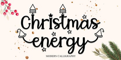 Christmas Energy is a whimsical script font with a relaxed theme, featuring a lovely style. This font is PUA encoded which means you can access all of the glyphs and swashes with ease! Add it confidently to your favorite creations and let yourself be amazed by the outcome generated.
 - P22 Vienna by P22 Type Foundry,
$24.95 The Vienna Workshop (Wiener Werkstätte) produced a tremendous variety of art from the turn of the century until the beginning of World War II. This set, which includes three typefaces and a collection of graphic extras, draws on both the Art Nouveau and Expressionist traditions of the Workshop.
 - Japoneh by Okaycat,
$29.50 Japoneh is a dynamic font set in all bold heavy brushed characters. It practically jumps off the page with the action of these fluid strokes! Take your design to the next level with Japoneh. Japoneh is extended, containing West European diacritics & ligatures, making it suitable for multilingual environments & publications.
 - Bingo Player JNL by Jeff Levine,
$29.00Bingo Player JNL is a thorough reworking of Jeff Levine's old freeware font - cleanly redrawn with fresh glyphs and a set of "alphabet balls" for creating short headlines. To match the fonts in these dingbats for other text applications, use Shopkeeper JNL, Trade Journal Wide JNL and Market JNL. - Kegger by Chank,
$59.00Show you school spirit with this sporty, collegiate font. These big chunky serifs let the world know you speak with authority, and they'll read your message clear as a bell. It's like a traditional college font, but it's got a chanky flair. Good for hockey jerseys and house parties. - Nazanin by Linotype,
$187.99Nazanin, originally named Haghighi, is a modern Arabic text face first produced by Linotype in 1978. Its popular design was converted into OpenType format in 2005, taking full advantage of digital technology to allow accurate positioning of diacriticals and kerning refinements. The counters and inter-character proportions of Nazanin are characteristic of Persian display lettering and typography. This is particularly true of Nazanin bold, which gives a strong image when used for display purposes. Nazanin possesses fuller, deeper characters than is normally exhibited in Arabic typography: its angled counters contributing to fluid, well-balanced, yet vibrant, letterforms. Originally designed for Farsi typesetting, Nazanin has now become popular for Arabic typesetting as well. Nazanin is available in two OpenType weights: Nazanin Light and Nazanin Bold. Both of the fonts include Latin glyphs (from Palatino Roman and Palatino Bold, respectively) inside the font files, allowing a single font to set text in both most Western European and Arabic languages. Nazanin incorporate the Basic Latin character set and the Arabic character set, which supports Arabic, Persian, and Urdu. They include tabular and proportional Arabic, Persian, and Urdu numerals, as well as a set of tabular European (Latin) numerals. - Mesotone BT by Bitstream,
$50.99Matt Desmond (MADType, Pufficlaude BT) would like you to meet Mesotone BT. This computer typeface design is monoweight and somewhat monowidth. The squarish unicase glyph forms feature eased corners and rounded terminal ends, which takes some of the edge off its techi look. Yet Mesotone still inspires one to explore the outer limits of the design universe. So, don’t tone it down; Mess with the fringes. Get Mesotone. Available in PostScript OpenType format, Mesotone’s extended glyph set covers the Western and Central European, Baltic and Turkish languages. - Chankbats by Chank,
$39.00Chankbats are the original hand-drawn illustrations of artist Chank Diesel. Insert these nifty little doodles into your layouts when you feel an illustrator's touch would add personality to your designs. Or when you want a nice little horsie picture to break up the grayness of a long text passage. Or get yourself a tattoo. We trust you'll come up with a clever use for these whimsical, folk art drawings. The fonts in this family come in 4 varieties in cross-platform OpenType format for both Mac & Windows. - Kareny by Craft Supply Co,
$20.00 Introducing Kareny – Brush Script Font A Vibrant Beginning Firstly, let’s dive into the world of Kareny – a delightful brush script font. Bursting with charm, Kareny initiates a journey where each letter dances with playful creativity. Right from the start, its enchanting style captivates the eye, setting a tone of warmth and friendliness. Effortlessly Versatile Moving forward, Kareny’s versatility becomes unmistakably evident. Seamlessly transitioning from one application to another, it proves to be the ideal companion for a multitude of display needs. Consequently, it crafts a space where readability coexists with a distinctive visual appeal.
 - Chicago Shift by Letterhend,
$17.00 Chicago Shift is a font specialized made for sport theme. Very suitable for for headline, logotype, apparel, invitation, branding, packaging, advertising etc with old school / vintage as well as modern theme. It comes in uppercase, lowercase, punctuations, symbols & numerals, stylistic set alternate, ligatures, etc also support multilingual and already PUA encoded. Features : numbers and punctuation multilingual alternates and ligatures PUA encoded We highly recommend using a program that supports OpenType features and Glyphs panels like many of Adobe apps and Corel Draw, so you can see and access all Glyph variations.
 - Pandorum by design-tourist,
$29.00 The Pandorum font was especially designed by Alejandro Lecuna and Henning Brehm for film sets in the science fiction movie “Pandorum” starring Ben Foster, Antje Traue and Denis Quaid. It was used for all signage, logos, posters and monitors in the spaceship “Elysium”.
 - Jeyran by Michael Browers,
$25.00Jeyran is a handwriting font co-developed by Elnara Browers and Michael Browers. Based on Elnara Browers' handwriting, Jeyran is her first font design. Elnara's fluency in multiple languages facilitated the development of an extended character set that includes both Latin and Cyrillic. - Dogjaw by Aerotype,
$29.00Dogjaw uses the OpenType ligature feature to automatically substitute a unique pair of distressed characters when any upper or lower case letter is keyed twice in a row. Dogjaw Pro extends the character set to support Eastern European Latin, Baltic, Greek and Turkish. - Farmer by SparkyType,
$19.00The OpenType version of Farmer contains two sets of slightly different upper-case letters. The alternate version is accessible as Titling Caps in OpenType feature enabled software. Mixed and matched they create a strong and persuasive headline, logo or For Sale notice. - Woodhaven Initials JNL by Jeff Levine,
$29.00 Woodhaven Initials JNL were designed using an outline cast shadow wood type set against a rectangle with horizontal "engraving" lines to add background texture to the initials. An ampersand is on the corresponding keystroke, and a blank rectangle is on the period key.
 - Coldsmith by Aerotype,
$49.00 Coldsmith uses the OpenType ligature feature to substitute a unique pair of distressed characters when any upper or lower case letter is keyed twice in a row. Coldsmith Pro extends the character set to support Eastern European Latin, Baltic, Greek and Turkish.
 - Brahma by Tall Chai,
$15.00 Brahma V2 is here. The new version has been three years in the making. It has multiple new updates and improvements based on user feedback. The focus for this version has been improved readability while maintaining the unique, modern identity of Brahma type family that has received so much love since V1 was launched in Dec 2020. Brahma is a modern geometric sans-serif font family with weights ranging from Thin (100) to Black (900). Features: Available in 9 weights Over 550 glyphs supporting extended Latin Ideal for display texts: Titles, Logos and Headlines etc. Perfect for branding and rebranding Supports OpenTypes features like Ligatures and Stylistic Alternates Tabular Numerals included Symbols for 10 major currencies including Bitcoin provided in all weights Description: The name comes from Brahmā who is known as the god of creation. And manifesting the same spirit, the Brahma font family focuses on modern creativity. Every character effortlessly integrates with current design standards and interfaces. The fonts are professional yet have a hint of informal personality in them. This makes Brahma perfect for use in modern apps and websites. Brahma is built for the designing and marketing squads. It has a trendy geometric characteristic which is ideal for any branding and rebranding. Brahma has lot of OpenType features (like ligatures and tabular numerals) and the Extended Latin character set supports over a hundred languages. Start Creating!
 - John Handy by ITC,
$29.99John Handy is the work of British designer Timothy Donaldson and based on his own handwriting. Part of the ongoing trend for casual letterforms in display typography, John Handy is an excellent choice for letters, greeting cards, menus, wherever an elegant yet personal look is desired. - DT Skiart Serif Mini by Dragon Tongue Foundry,
$9.00 ‘Skiart Serif Mini’ is now available online. Originally inspired by the san serif font ‘Skia’ by Mathew Carter for Apple. ‘Skiart’ was designed to feel more like a serifed font, but without any serifs. It took a step between sans serif and serif fonts. Next on the path towards a serif font comes Skiart Serif Mini, with tiny serifs added. This is a true serif font, all be it on the small side. It remains fully readable and feels as clean and normal as any of the best body copy serifs, and yet still has the strong solid bones of all the other Skiart font familys. If compared to one of the more commonly used serifs like ‘Times New Roman’, the ‘Skiart Serif Mini’ lowercase is more open with a taller x-height, increasing its readability and friendliness. The serifs are smaller and less distracting. They are not pretending to be ligatures. Where ‘Times’ makes its p q b d forms out of a barely touching oval and stem, the ‘Serif Mini’ forms are much more firmly attached, appearing clearly as single letters. The standard setting for the g’s are round single storied, (the italic a’s are also), feeling warmer and more inviting in the ‘Serif Mini’ font. Much more friendly than the stuffy double storied versions in fonts such as ‘Times’ etc.