10,000 search results
(0.04 seconds)
- Excelsius by Comicraft,
$19.00 Once upon a midnight dreary, this Comicraftsman pondered, weak and weary, For a name synonymous with Mighty and Marvelous comics lore. Solid, Outline, Inline was the nameless font I'd crafted, I nodded, nearly napping o'er the work I'd grafted When suddenly came a tapping, As of someone gently rapping, rapping at my cubicle door. "'Tis some visitor," I muttered, "tapping at my cubicle door-- Calling out "EXCELSIOR!" Then an Amazing Vision beguiled my sad fancy into smilin', By the Spectacular decorum of the countenance it wore, "Though thy crest be shorn and shaven," he said, "thou art sure no craven, And thy font should not remain nameless here forevermore!" Eagerly I wished the morrow; vainly I had sought to borrow From comic books surcease of sorrow, letters that called out "EXCELSIOR!" Then, upon the velvet sinking, I betook myself to linking Fancy unto fancy, thinking of the nominative neuter singular thing Like Some Silvered Surfer wandering from the Nightly shore-- The Vision shrieked, upstarting--"Tell me what thy lordly name is thus!" Quoth the Craftsman: "EXCELSIUS!"
 - England Script by Max.co Studio,
$12.00 England Script is a romantic typeface, which is elegant, fun and vintage. It can be used for various purposes such as logos, wedding invitation, t-shirt, letterhead, signage, news, posters, badges etc. England Script features 500+ glyphs and extruded font, alternate characters, ligatures, swash and multiple language support: ŠÀÁÂÃÄÅÆÇÈÉÊËÌÍÎÏŸŽÐÑÒÓÔÕÖØÙÚÛÜÝßàáâãäåæçèéêëìíîïñòóôõöøùúûêýÿŒœšž To enable the OpenType Stylistic alternates, you need a program that supports OpenType features such as Adobe Illustrator CS, Adobe Indesign & CorelDraw X6-X7. How to get access alternate glyphs from open type fonts: http://youtu.be/iptSFA7feQ0 There are additional ways to access alternates/swashes, using Character Map (Windows), Nexus Font (Windows), Font Book (Mac) or a software program such as PopChar (for Windows and Mac). How to access all alternative characters, using Windows Character Map with Photoshop: https://www.youtube.com/watch?v=Go9vacoYmBw Need help? If you need help or advice, please contact me. Thank you!
 - KK3045 Pro by HS Fonts,
$39.00 The font family KK30/45 is available in 3 weights: Light, Regular, and Bold. Type Designer: Kuncho Kunev The name of family - KK30/45 is from the first letters of the designer's name (K)uncho (K)unev and from the main angles of the slanted stems - 30° and 45°. Release date: December, 2001 HermesSOFT Ltd. The design of КК30/45 incorporates a geometric variety of shapes, and have been originally designed in such a way that all slanted stems are 30° and 45°, The very high x-height and low bottom parts allow typesetting with almost 100% leading. КК30/45 is a display face suited best to sizes 16-18 point and above. There are included also all Cyrillic vowels with accents that are really necessary for the professional typesetting in Cyrillic languages. Supported Languages: Western Europe (Greek not included), Central/Eastern Europe, Baltic, Turkish, Romanian, Cyrillic. Supported Code Pages: Macintosh and Windows, any for above languages. Opentype features includes kern, fractions, ordinals, superscripts.
 - Thurbrooke by Greater Albion Typefounders,
$18.50 Thurbrooke is an early 20th century inspired display family, offering two sizes of Roman capitals. Five typefaces are offered in the Thurbrooke family. The Regular face is shaded in horizontally engraved lines and suggests something of vintage advertising captions. A reversed 'Reverso' face, transposing black and white space is offered, as is a 'Black' face with solid letterforms. The remaining two faces are a bit more specialised. Thurbrooke 'Banner' is the latest in our popular line of masthead or cartouche faces-very impressive for banner headings. Thurbrooke Initials is a set of initial capitals, which blend in perfectly with Thurbrooke Reverso, or which also make splendid drop capitals. Why not explore some (or all) of the elements of the Thurbrooke family today, and introduce some early 20th century inspired colour to your work?
 - Sprout by The Northern Block,
$25.99 Sprout is a low-contrast sans serif, slightly condensed for economy of space, and complete with 6 weights in Roman and Italic. It has open apertures and a generous x-height for clarity of reading. It also comes with a weight balanced italic, which can be used for differentiation or as a standalone typeface in itself. The defining feature of the family is the taut curve, where the inner counter pushes out toward the outer contour, creating a feeling of tension in the curve. In the italic this shape language is pushed further, with a playful looped g and cursive form of the f. Sprout also comes with Old Style figures. Its range of weights makes for a versatile family suitable for branding, on-screen publishing and long-form reading.
 - Core Mellow by S-Core,
$20.00 Core Mellow is a condensed geometric sans-serif typeface family that can be used in various applications especially for short texts. The letterforms in roman style are mild, minimal, simple, and clean in appearance. The Core Mellow Family consists of 3 widths (Compressed, Condensed, Normal), 7 weights (Thin, Extra Light, Light, Regular, Medium, Bold, Extra Bold) and Italic for each format. The Core Mellow provides a wide range of character sets to support Cyrillic, Central and Eastern European characters and advanced typographical support with features such as proportional Figures, tabular Figures, numerators, denominators, superscript, scientific Inferiors, subscript, fractions, standard ligatures, discretionary ligatures and stylistic alternates. Core Mellow looks smooth in any layout with its sleek rounded lines, use it for your magazines, brochures, web pages, screens, and so on.
 - Stevie Sans by Typefolio,
$29.00 Some years ago I had my first contact with a grotesque typeface, when handling a sample catalog of typographic specimens from the age of phototypesetting. The style eventually settled in my memory waiting for the work of time. Behind its apparent neutrality, there is a complex balance game, that almost leads to the basic principles of design which deliver such power to the grotesque style. Stevie Sans is the answer to the action of time. A bridge that allows the designer to go into the past, while being in the present and looking towards the future. It is what it’s expected from a grotesque designed in the 21st century. With 7 roman styles ranging from thin to black, support to many languages and essential opentype features, Stevie Sans is the ideal choice for your project.
 - Brutman by Sardiez,
$36.00 The purpose of Brutman was to create a typeface that reimagined the incise style for the 21st century. Its roots emerge from the humanistic style, adopting the structures of the roman capitals for the upright version and some features of the chancery style for the italics. On the other side, its contours are forged by the frankness of the brutalist style, which can be seen in the asymmetrical flared terminations, the sharp shoulders and the diagonal cuts that emulate the stress of the broad nib pen. The result is a typeface that combines a sleek character with a historical flair. It conveys a feeling of modernity and sophistication when it comes to shine in big sizes, but on the functional size has sharp shapes that make it perform very well on small ones.
 - Bronzetti by Greater Albion Typefounders,
$10.00 A typographic revolution-Bronzetti has been a long term project for Greater Albion Typefounders, aimed at filling a large gap in the range of typefaces available today. The Bronzetti family of 22 text typefaces combines modern requirements for legibility and readability with the charm of traditional Roman faces in the spirit of those carefully constructed by small scale quality foundries such as the Kelmscott and Vale presses. In short, Bronzetti is traditional letterpress meets modern publishing, offering a real opportunity to make your material stand out from today’s ‘run of the mill’ crowd. The range of typefaces on offer includes five widths of type, as well as small capitals and italic forms and regular and bold weights. Try out Bronzetti today, make your work stand out from the crowd and join the revolution!
 - Marathon by Linotype,
$29.99Marathon was originally designed by Rudolf Koch in 1931 for Schriftgiesserei Klingspor. It is a roman with short ascenders and descenders. The serifs are small, but longer at the ends of the arms of E, F and L, M is rather splayed and is without top serifs, like M in other typefeaces designed by Rudolf Koch. The lowercase g has no link and an open tail, again like the g in other Koch types. U has the lower-case design. In the W the middle strokes cross, the lower case w has no middle serif. The figures are short-ranging. Ute Harder from the Fachhochschule Hamburg had redesigned Marathon with the help and supervision of Professor Jovica Veljovic. She has added a book weight to offer more flexibility with this beautiful typeface. - Neftali Pro by TipoType,
$25.00 2015 First Prize TipoType award. Neftali is a type family designed for continuous reading in long texts & editorial design, created as an interpretation of Pablo Neruda’s “Poema 20”. This work delivers a subtle experimentation of Baroque and Roman styles, rescuing features from some of the most successful chilean typefaces such as “Australis”, “Berenjena” and “Biblioteca”, along with its particular calligraphic details, medium weights, accentuated strokes, and wide curves that seek to project Pablo Neruda’s particular way of reciting. This typeface contains uppercase, lowercase, small caps, oldstyle, and tabular numbers; in addition to a true italic for every weight; and calligraphic details designed to compose his poems. A typography to talk about everything, except love… (Special thanks to: Francisco Gálvez & Patricio Truenos; without the help of the latter, this project wouldn’t have had an ending)
 - City Boys by Dharma Type,
$19.99 City Boys is a fashionable contrasted sans-serif that can be used in almost any situation. City Boys has basic, natural and neutral letterforms and skeletons for a wide range of usage. The glyphs are somewhat humanist yet they have vertical stress for modern and sophisticated impression. The ratio of the contrast was carefully designed for modern usage –websites, digital, printings and merchandises–. City Boys consists of 7 weights and their matching Italics for a wide range of usages. Farther, City Boys is supporting international Latin languages and basic Cyrillic languages including Basic Latin, Western Europe, Central and South-Eastern Europe. Also CSS covers Mac Roman, Windows1252, Adobe1 to 3. This wide range of international characters expands the capability of your works. City Boys Soft is a softly rounded version of this City Boys.
 - Longa Iberica by Paweł Burgiel,
$38.00 Longa Iberica is a serif typeface inspired by ancient scripts (Visisigothic, Proto-Gothic, Gothic). It has a long ascender and descender, small x-height and low-profile lining figures. Include automatic ligature creation, stylistic alternates and historical letterforms, lining and oldstyle numerals, fractions, Roman numerals adjusted to figure height (lining and oldstyle) and ordinal letters. Character set contains the complete Unicode Latin 1252 (Western European; ANSI), 1250 Latin 2 (Central European), 1254 Turkish, 1257 Baltic. Supported OpenType features: Acces All Alternates, Alternative Fractions, Capital Spacing, Case-Sensitive Forms, Contextual Alternates, Contextual Swash, Fractions, Historical Forms, Kerning, Lining Figures, Localized Forms, Oldstyle Figures, Ordinals, Proportional Figures, Slashed Zero, Stylistic Alternates, Stylistic Set (1-20), Superscript, Swash, Tabular Figures. Kerning is prepared as single ('flat') table for maximum possible compatibility with older software.
 - Monotype Engravers Old English by Monotype,
$29.99 The rather wide, caps-only Monotype Engravers family imitates scripts that evolved from copperplate and steel plate engravers hands of the nineteenth century, which were a quite expressive medium! Monotype Engravers' letters show a strong contrast between thick and thin strokes and have sharply cut serifs. In 1899, Robert Wiebking (who worked for a number of foundries in his time) designed an all-caps typeface named Engravers Roman."" Shortly thereafter, American Type Founders, Inc. (ATF) released another successful ancestor of this design in 1902, ""Engravers Bold,"" designed by Morris Fuller Benton. Engravers Bold was also released by the Barnhart Brothes & Spinder foundry. Also made available by Lanston Monotype at the beginning of the twentieth century, the Engravers faces soon became a popular choice for letter heads, advertising and stationery.
 - Haggis by The Ampersand Forest,
$19.00 Meet Haggis! Inspired by the Insular Half-Uncial and Uncial typefaces that have long been associated with Scotland, Ireland, and their Celtic cousins, Haggis is an unusual creature. Unlike traditional Uncials, he's monoline, rounded, sausagey, and distinctly lighthearted! Use him for posters, signage (especially pub signs!), kids' stuff, and packaging — anyplace a little quasi-Celtic flavor is desired, but with a fun twist. Must we say it? He's a Funcial! Tongue-in-cheek though he may be, Haggis has some great features. He comes in Lean and Overstuffed forms, and has full true small caps, standard(ish) Roman alternates for the more out-there characters, lots of ampersand forms (including a true[ish] "Et" and a Tironian and), fun quasi-Celtic bullets, and lots of ligatures. Try him out today — with some tatties and neeps!
 - Monotype Engravers by Monotype,
$40.99 The rather wide, caps-only Monotype Engravers family imitates scripts that evolved from copperplate and steel plate engravers hands of the nineteenth century, which were a quite expressive medium! Monotype Engravers' letters show a strong contrast between thick and thin strokes and have sharply cut serifs. In 1899, Robert Wiebking (who worked for a number of foundries in his time) designed an all-caps typeface named Engravers Roman."" Shortly thereafter, American Type Founders, Inc. (ATF) released another successful ancestor of this design in 1902, ""Engravers Bold,"" designed by Morris Fuller Benton. Engravers Bold was also released by the Barnhart Brothes & Spinder foundry. Also made available by Lanston Monotype at the beginning of the twentieth century, the Engravers faces soon became a popular choice for letter heads, advertising and stationery.
 - City Boys Soft by Dharma Type,
$19.99 City Boys Soft is a fashionable contrasted sans-serif that can be used in almost any situation. City Boys has basic, natural and neutral letterforms and skeletons for a wide range of usage. The glyphs are somewhat humanist yet they have vertical stress for modern and sophisticated impression. The ratio of the contrast was carefully designed for modern usage –websites, digital, printings and merchandises–. City Boys consists of 7 weights and their matching Italics for a wide range of usages. Farther, City Boys is supporting international Latin languages and basic Cyrillic languages including Basic Latin, Western Europe, Central and South-Eastern Europe. Also CSS covers Mac Roman, Windows1252, Adobe1 to 3. This wide range of international characters expands the capability of your works. City Boys is a normal corner version of this City Boys Soft.
 - Therhoernen by Proportional Lime,
$9.99 Arnold Therhoernen. (Arnoldus ther Hornen, Drucker des Dictys , Arnold ter Hoernen, Arnold ther Hoernen, Arnoldus TherHornen.) Who was this guy? He was a printer active in the city of Cologne, having graduating from the university there. He learned his craft under Ulrich Zell. He printed books from 1470 to 1482 when the plague carried him off. Was he just another printer of the era? No, he brought out the first edition of the "Fasciculus temporum'' (The most popular work by a living author at that time.) And he was the first to use both a title page and page numbers. His page numbers, an idea probably suggested to him by Werner Rolevinck, were interesting in that they were centered half way down the page on the outer margin and were set in Roman Numerals.
 - Storica by Arkitype,
$15.00 Storica is a display typeface with roman style serifs that create a sense of history and culture. The Storica family has 7 weights as well as a Heavy Rough and Heavy Hand version that give you an option for a more rustic or hand style approach to you projects. The character set is expansive and has a wide range of language support. Storica has a great selection of Stylistic alternates, ligatures, small-caps, old-style numbers and more packed into the opentype features. This typeface is an excellent choice for branding, particularly in the beverage industry, it is also perfect for typographic layouts for magazines, poster, books etc. Storica has been designed to make it easy for a designer to create beautiful typography with creative flair quickly and easily.
 - Vallentino by Bal Studio,
$12.00 Vallentino is a stylish and elegant handwritten font, which looks like a signature, this font is deliberately made with unique ligatures and alternatives. Vallentino is perfect for signatures, branding, logos, business cards, posters, invitations, greeting cards, news, product packaging, blog posters, all including personal charms etc. This font is also equipped with unique and interesting ligatures, by using these ligatures you can give a real handlettered style: ab ah ak al am an ar at ch ck cr eb el em en er es et ff ht il im in it ll mm ng nn nt of oh oi ol on or oo od ou ow oy sh ss st th tt ut wh Th ft Multiple Language Support: ŠÀÁÂÃÄÅÆÇÈÉÊËÌÍÎÏŸŽÐÑÒÓÔÕÖØÙÚÛÜÝßàáâãäåæçèéêëìíîïñòóôõöøùúûüýÿŒœš Thank you for your purchase!
 - The Kells SD font, designed by Steve Deffeyes, is a unique and intriguing typeface that finds its inspiration in the historical and ornate scripts of the past. Drawing from the rich heritage of the B...
- ITC Silvermoon by ITC,
$29.99 ITC Silvermoon was designed by Akira Kobayashi in the style of the advertisements of the 1920s. Art Deco was the artistic movement which marked the years between the two world wars, combining elements of Jugenstil, futurism and east Asian influences. This font carries on in that tradition. The small, high reaching figures with their elegant forms and reserved but distinguishing loops give Silvermoon its unmistakable look. Kobayashi designed this font in two weights, regular and bold. To retain the elegance of the bold weight, the consistent stroke width of the regular weight was exchanged for contrasting strokes. This gives the weight more weight without detracting from its grace. The nostalgic, romantic ITC Silvermoon is best used for headlines and short texts in point sizes of 12 and larger.
 - Umbrellia by Matra Creative,
$14.00 Umbrellia Script is a calligraphy script font that comes with beautiful alternative characters. mixture of handleting copper calligraphy. Designed to bring elegance to style. Umbrellia comes with uppercase letters, lowercase letters, numbers, punctuation, and so many variations on each character including OpenType alternatives, and general binders to allow you to adjust the design. Classic styles are very suitable to be applied in various formal forms such as invitations, labels, menu, logo, fashion, make up, stationery, letterpress, romantic novels, magazines, books, greeting / wedding cards, packaging, labels. Umbrellia Script has 582 glyphs. including various language support. With the OpenType feature with alternative styles, binders and characters, it allows you to mix and match pairs of letters that match your design, as well as a touch of ornament to make this font look elegant.
 - Migura Sans by Andrey Sharonov,
$15.00 Migura Sans Serif Family Migura is a high contrast Sans Serif family inspired by fashion and beauty world. Geometrically clean letterforms give elegant and luxury look when creating designs. There is different font styles from Light to Bold (+Italic version) what give enable wide use. In addition, Migura has several alternative characters, ligatures and more decorative Titling Alternates. You can see many examples how this font can be used. Migura is very good looking in Big Tittles, Magazine design, Branding, Logotypes, Posters, Wedding invitations, Romantic cards and others. Multilingual Support Migura support Western European characters and works with following languages: English, Danish, Dutch, Estonian, Faroese, Filipino, Finnish, French, German, Hungarian, Icelandic, Irish, Italian, Norwegian, Polish, Portuguese, Spanish, Swedish, Turkish. Opentype features doesn't work in Microsoft Word. Recommended to use in Adobe Illustratior or Photoshop.
 - Yella Delisa by Aqeela Studio,
$25.00 With the help of the distinctive decorative typeface Yella Delisa, you may create the appearance of handmade lettering. Greek (of course), a Latin character set, and diacritics are all included in the multilingual lettering font Yella Delisa. Your modern graphic design requirements are best served by this distinctive style. If you want to add some flair to long text, choose this font because it has a really good flow. It can be applied to packaging, branding, and social media content. Additionally, Yella Delisa is the best typeface for branding and packaging organic products. Additionally, you can design invitations for weddings and baby showers using this typeface's romantic emotions. This typeface is perfect for you, especially if you're seeking one for Instagram quote posts or any other social media content!
 - Loving Ambros by Say Studio,
$15.00 Introducing Loving Ambros - Luxury Typeface Loving Ambros typeface is a Luxury beautiful typeface and inspiring mix of classic calligraphy with 50 unique alternates and 69 unique ligatures. come with 2 versions regular & italic. Loving Ambros is made mainly for headlines, titles, and other short texts and is well-suited for advertising, vintage mood board, branding, logotypes, packaging, titles, editorial design, modern logos, websites, social media quotes, wedding branding, modern and vintage design. These a fonts are perfect for designs with the concept of elegant, luxury, romance, fashion and so on. What you get: Accessible in the Adobe Illustrator, Adobe Photoshop, Coreldraw, even work on Microsoft Word. PUA Encoded Characters – Fully accessible Fonts include multilingual support. If you need a custom license or have questions, please email to: romandpio3793@gmail.com
 - Renny Hybrid - 100% free

- Anachrony by Cerulean Stimuli,
$24.00 Reminiscent of circuitry and wrought iron, Anachrony constructs the forms of an Old English Blackletter with the strokes of a Modern Geometric Sans, and lands in the vicinity of Art Deco. For such an unusual chimera, the Anachrony family is legible and versatile. Its glyphs cover pan-European Latin, Greek, and a wealth of symbols including arrows, zodiac, planets, chess, suits, and circled numbers. It is also packed with Opentype features: Small Capitals: Of similar proportions to the default numerals, tall enough to be a suitable choice in place of regular capitals. All Caps Forms: In addition to the four usual types of numerals, there are numerals and currency symbols that match the capitals. Swash: A leading curly swash on capitals, and fancy looped ascenders in the lowercase that are handled by over a hundred standard ligatures where they would collide. Style Set 01: Romanized forms. Especially recommended for all caps. Plainer A/M/T/V/W/Y, J/Q reined in to the baseline, and alternate g. Style Set 02: Masthead forms. Old-fashioned capitals with descenders and that lower left dealy. Also f/x/z/ß in a more traditional fraktur mode. Style Set 03: Mild embellishments. Tall bifurcated ascenders and descenders. Style Set 04: Extravagant swash descenders. Style Set 05: Final swashes for the end of a word. Style Set 06: Converts capital letters into the corresponding connected Roman numerals. Seemed like it could be useful sometime. Easy swooshes: Standard ligatures allow you to type two to seven commas in a row to append an assortment of sweeping or ending swashes. Catchwords: In Anachrony Royale, turn on Discretionary Ligatures for a variety of decorative articles and prepositions.
 - Abril Titling by TypeTogether,
$35.00 Abril is an extension of the Abril typographic system that was engineered as a response to a very specific requirement from the editorial design community: a low contrast typeface for head- lines. Given its broad range of styles though, Abril deserves to be considered a separate font family on its own. Based on the original text styles of Abril, the letter shapes are sturdy, very legible, and deliver a newsy and trustworthy feel. The accented editorial style of the Scotch Roman finds continuity in this new type family, but some of the details have been ironed out for improved performance in headline, both in print and on screen. The family is conceived as four series of different widths, with four weights in each series plus matching italics, a total of 32 fonts. This wide range of styles allows for setting titles at almost any size. The wider series are aimed for smaller point sizes while the con- densed weights can deliver a striking and cohesive appearance as front cover headlines. Abril was designed as a versatile tool for those graphic and web designers looking for a workhorse with high impact. It is also an excellent companion for the rest of the Abril type family: Abril Titling and Abril Narrow.
 - Loxley by Canada Type,
$24.95 Drawn shortly before Jim Rimmer's passing in 2010, Loxley was designed to be used in a fine press edition of the folklore story of Robin Hood. It was named after the cited birthplace of the story's classic hero. Loxley's shapes were inspired the same early Roman faces (such as Subiaco from the late 1400s) that influenced Frederick Goudy's Aries, Franciscan and Goudry Thirty types. It exhibits the preculiarities of Jim's left-handed calligraphy, as well as his outside-the-box thinking with exit strokes and serif variations. Loxley was remastered for the latest technologies in 2013. Now it comes with a character set of over 450 glyphs, including plenty of stylistic alternates, a full compliment of f-ligatures, a Th-ligature, basic fractions, ordinals, a long s for historic setting, comprehensive class-based kerning, and extended Latin language support. 20% of this font's revenues will be donated to the Canada Type Scholarship Fund, supporting higher typography education in Canada.
 - The Chastha Script by madjack.font,
$20.00 Chasta. script Chastha Script is a romantic typography. sans, an elegant & fun vintage script font. Can be used for various purposes such as logos, wedding invitations, t-shirts, letterhead, signage, news, posters, badges etc. Chastha Script features 521+ glyphs and extruded fonts, alternate characters, ligatures, strokes, and multiple language support. See all the glyphs here: http://s28.postimg.org/7osts7ezx/All_Glyphs.jpg To enable the OpenType Stylistic alternative, you need a program that supports OpenType features such as Adobe Illustrator CS, Adobe Indesign & CorelDraw X6-X7. How to get alternate glyph access from open type fonts: http://youtu.be/iptSFA7feQ0 There are additional ways to access alternatives/swashes, using the Character Map (Windows), Nexus Font (Windows), Font Book (Mac) or a software program such as PopChar (for Windows and Mac). How to access all alternative characters, using the Windows Character Map with Photoshop: https://www.youtube.com/watch?v=Go9vacoYmBw Need help? If you need help or advice, please contact me by email. Thank You!
 - Baby Boy by Ws Studio,
$15.00 Baby boy - Elegant calligraphy font is a sweet, romantic calligraphy typeface with interesting characters along basic lines. It has a casual yet elegant touch. It can be used for various purposes such as logos, wedding invitations, titles, t-shirts, letterheads, name boards, labels, news, posters, badges etc. The font includes OpenType features with alternative styles, ligatures, and multiple language support. To activate the alternative OpenType Stylistic, you need a program that supports OpenType features such as Adobe Illustrator CS, Adobe Indesign & CorelDraw X6-X7, Microsoft Word 2010 or a later version. There are additional ways to swap / swap, using Character Map (Windows), Nexus Fonts (Windows), Font Book (Mac) or a software program such as PopChar (for Windows and Mac). How to access all alternative characters, using Windows Character Map with Photoshop. How to access all alternative characters using Adobe Illustrator. How to use a stylized font set in Microsoft Word 2010 or a later version.
 - Marcel Merlina by Pixesia Studio,
$16.00 Introducing Marcel Merlina - A Lovely Chic Script Font Marcel and Marlina is now released as beautiful as romance is. This font-type gives you the vibe of an elegant and the classic-yet-so fresh kind of feeling. The curves and the flexibility of the fonts provide you the warm and familiar sense—as if you are reading letters from your beloved ones. Marcel and Marlina is meant to be endearing—portray the warmth of love. This font is designed to be used in such occasions which require high involvement of delightful emotion. This font would be best to be used in wedding invitations, love letters, and sincere greeting cards for someone so dear to you. FEATURES - Stylistic Alternates - Ligatures - PUA Encoded - Uppercase and Lowercase letters - Numbering and Punctuations - Multilingual Support - Works on PC or Mac - Simple Installation - Support Adobe Illustrator, Adobe Photoshop, Adobe InDesign, also works on Microsoft Word Hope you Like it. Thanks.
 - September Rain Script by Letterday Studio,
$19.00 September Rain Script elegant Calligraphy font is a sweet and romantic calligraphy typeface with characters dancing along the baseline. It has a casual yet elegant touch. Can be used for various purposes such as logos, wedding invitations, titles, t-shirts, letterheads, signage, labels, news, posters, badges etc. This font includes OpenType features with alternative styles, ligatures, and multiple language support. To enable alternative OpenType Stylistic, you need a program that supports OpenType features such as Adobe Illustrator CS, Adobe Indesign & CorelDraw X6-X7, Microsoft Word 2010 or a later version. There are additional ways to swap/swap, using Character Map (Windows), Nexus Fonts (Windows), Font Book (Mac) or software programs like PopChar (for Windows and Mac). How to access all alternative characters, using Windows Character Map with Photoshop: https://www.youtube.com/watch?v=Go9vacoYmBw How to access all alternative characters using Adobe Illustrator: http://youtu.be/iptSFA7feQ0 How to use a stylish font set in Microsoft Word 2010 or later versions: https://youtu.be/x1A_ilsBsGs
 - Baby Honey by Rhd Studio,
$18.00 Baby honey - lovely script font is a sweet, romantic calligraphy typeface with characters dancing along baseline. It has a casual yet elegant touch. It can be used for various purposes such as logos, wedding invitations, titles, t-shirts, letterheads, name boards, labels, news, posters, badges etc. The font includes OpenType features with alternative styles, ligatures, and multiple language support. To enable OpenType Stylistic alternates, you need a program that supports OpenType features such as Adobe Illustrator CS, Adobe Indesign & CorelDraw X6-X7, Microsoft Word 2010 or a later version. There are additional ways to alternate / swash, using the Character Map (Windows), Nexus Font (Windows), Font Book (Mac) or a software program like PopChar (for Windows and Mac). How to access all alternative characters, using Windows Character Map with Photoshop: https://www.youtube.com/watch?v=Go9vacoYmBw How to access all alternative characters using Adobe Illustrator: http://youtu.be/iptSFA7feQ0 How to use a style font set in Microsoft Word 2010 or later versions: https://youtu.be/x1A_ilsBsGs
 - Billy Betty by Romie Creative,
$13.00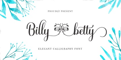 B illy betty - elegant Calligraphy font is a romantic and sweet calligraphy typeface with characters that dance along the baseline. It has a casual and yet elegant touch. It can be used for various purposes such as logos, wedding invitations, headings, t-shirts, letterhead, signage, lables, news, posters, badges etc. The fonts include OpenType features with stylistic alternates, ligatures and multiple language support. To enable the OpenType Stylistic alternates, you need a program that supports OpenType features such as Adobe Illustrator CS, Adobe Indesign & CorelDraw X6-X7, Microsoft Word 2010 or later versions. There are additional ways to access alternates/swashes, using Character Map (Windows), Nexus Font (Windows), Font Book (Mac) or a software program such as PopChar (for Windows and Mac). How to access all alternative characters, using Windows Character Map with Photoshop: https://www.youtube.com/watch?v=Go9vacoYmBw How to access all alternative characters using Adobe Illustrator: http://youtu.be/iptSFA7feQ0 How to use stylistic sets font in Microsoft Word 2010 or later versions: https://youtu.be/x1A_ilsBsGs
 - Olimpico by MAC Rhino Fonts,
$59.00 The name of this typeface is a hymn to the Stadio Olimpico in Rome. The home arena to the World's most beautiful football club – AS ROMA. A club with many great players through the years. The biggest of them all, is already a living legend… Francesco Totti. The design is a 2-weight family perfect for elegant display work. The regular weight is more even in blackness while the bold weight carry more contrast.
 - Grafical by Halbfett,
$30.00 Grafical is a contemporary take on 19th-century sans serifs. In this family, the amount of geometry inherent within the letterforms has been amped up. Many shapes have received further streamlining, too. All the geometric forms you see have been optically corrected, ensuring their delivery of better legibility. Grafical ships in two different formats: depending on your preference, you can install the typeface as two Variable Fonts or use the family’s 16 static OpenType font files instead. The static fonts offer eight weights, running from Extralight through Black. Each weight has an upright and an italic font available. While the static-format fonts offer a good intermediary-step selection, users who install the Variable Fonts have vastly greater control over their text’s stroke width. The Grafical Variable and Grafical Variable Italic font’s weight axes allow users to differentiate between almost 1,000 possible font weights. That enables you to fine-tune your text’s exact appearance on-screen or in print. Grafical is the perfect tool for a range of design uses, including text on the web, text in print, and text in motion graphics. Its fonts are typographic workhorses – not just from their legibility perspective but also because of the amount of OpenType features they include. There are ligatures, for instance, as well as proportional and tabular lining and oldstyle figures, fractions, numbers placed inside circles, and even Roman numerals. Users can also substitute alternate versions of the “a”, “g”, “i”, “j”, “y”, “G”, and “Q” into their work.
 - Anselm Sans by Storm Type Foundry,
$63.00One of the good practices of today’s type foundries is that they release their type families as systems including both serif and sans serif type. Usually, the sources of inspiration need to be well tried with time and practice, since production of a type family is such a laborious and complex process. From the beginning, it needs to be clear that the result will be suited for universal use. Such systems, complete with the broad, multi-lingual variations permitted by the OpenType format, have become the elementary, default instrument of visual communication. Non-Latin scripts are useful for a wide scope of academic publications, for packaging and corporate systems alike. And what about outdoor advertisement designated for markets in developing countries? Cyrillics and Greek have become an integral part of our OpenType font systems. Maybe you noticed that the sans serif cuts have richer variety of the light – black scale. This is due to the fact that sans serif families tend to be less susceptible to deformities in form, and thus they are able to retain their original character throughout the full range of weights. On the other hand, the nature of serifed, contrasted cuts does not permit such extremes without sacrificing their characteristic features. Both weights were drawn by hand, only the Medium cut has been interpolated. Anselm Ten is a unique family of four cuts, slightly strengthened and adjusted for the setting in sizes around 10 pt and smaller, as its name indicates. The ancestry of Anselm goes back to Jannon, a slightly modified Old Style Roman. I drew Serapion back in 1997, so its spirit is youthful, a bit frisky, and it is charmed by romantic, playful details. Anselm succeeds it after ten years of evolution, it is a sober, reliable laborer, immune to all eccentricities. The most significant difference between Sebastian/Serapion and Anselm is the raised x-height of lowercase, which makes it ideal for applications in extensive texts. Our goal was to create an all-round type family, equally suitable for poetry, magazines, books, posters, and information systems. - Anselm Serif by Storm Type Foundry,
$63.00 One of the good practices of today’s type foundries is that they release their type families as systems including both serif and sans serif type. Usually, the sources of inspiration need to be well tried with time and practice, since production of a type family is such a laborious and complex process. From the beginning, it needs to be clear that the result will be suited for universal use. Such systems, complete with the broad, multi-lingual variations permitted by the OpenType format, have become the elementary, default instrument of visual communication. Non-Latin scripts are useful for a wide scope of academic publications, for packaging and corporate systems alike. And what about outdoor advertisement designated for markets in developing countries? Cyrillics and Greek have become an integral part of our OpenType font systems. Maybe you noticed that the sans serif cuts have richer variety of the light – black scale. This is due to the fact that sans serif families tend to be less susceptible to deformities in form, and thus they are able to retain their original character throughout the full range of weights. On the other hand, the nature of serifed, contrasted cuts does not permit such extremes without sacrificing their characteristic features. Both weights were drawn by hand, only the Medium cut has been interpolated. Anselm Ten is a unique family of four cuts, slightly strengthened and adjusted for the setting in sizes around 10 pt and smaller, as its name indicates. The ancestry of Anselm goes back to Jannon , a slightly modified Old Style Roman. I drew Serapion back in 1997, so its spirit is youthful, a bit frisky, and it is charmed by romantic, playful details. Anselm succeeds it after ten years of evolution, it is a sober, reliable laborer, immune to all eccentricities. The most significant difference between Sebastian/Serapion and Anselm is the raised x-height of lowercase, which makes it ideal for applications in extensive texts. Our goal was to create an all-round type family, equally suitable for poetry, magazines, books, posters, and information systems.
