10,000 search results
(0.032 seconds)
- Konstantin Forte by Wiescher Design,
$39.50My son Konstantin needs a bold face for his bold recipes. So I made Konstantin Forte for him — and the rest of the world. Your bold family designer, Gert Wiescher. - Fort Mayhem by Letterhend,
$17.00 Fort Mayhem is a display marker font with hand drawn feel. The strokes make this font outstanding and looks great for title. This type of font perfectly made to be applied especially in logo, headline, signage and the other various formal forms such as invitations, labels, logos, magazines, books, greeting / wedding cards, packaging, fashion, make up, stationery, novels, labels or any type of advertising purpose. Features : 3 Styles-Regular, Extrude, & Online numbers and punctuation multilingual alternates / swashes and ligatures PUA encoded We highly recommend using a program that supports OpenType features and Glyphs panels like many of Adobe apps and Corel Draw, so you can see and access all Glyph variations.
 - Front Lines by Gassstype,
$27.00 Hello Everyone, introduce our new product Font Frontlines This Is All Caps Sporty Font.This is a Textured Natural Style and classy style with a clear style and dramatic movement. This font Frontlines is great for your next creative project such as logos, printed quotes, invitations, cards, product .
 - Face Front by Comicraft,
$49.00 FACE FRONT, True Believers, This is The Issue You’ve Been Waiting For! In response to requests from our Hawkeyed customers, we’re making this Super Team of fonts -- which our fontmeister Assembled for the pages of THE AVENGERS -- available for the first time! A handsome collection of characters that would put a Norse God to shame, FACE FRONT is composed of Earth’s Mightiest regular, italic, bold and bold italic faces -- in UPPER and lower case. And now, these Living Legends can now be yours! Rick Jones not included! Remastered Face Front includes improved spacing and kerning, an upright Bold weight, Central European & Cyrillic characters,Crossbar I Technology™ to place it in exactly the right spots, plus hearts, stars & music notes for Manga lettering.
 - Monte Falco by RagamKata,
$16.00 Monte Falco is a classic serif font with an elegant and sophisticated style. It is inspired by 16th-century Italian serif fonts and features characteristic features such as slender and delicate serifs and proportional letterforms.
 - Front Desk by Aah Yes,
$12.00Front Desk is designed to be easily readable, its increased legibility coming from the slightly enlarged lower case letters (a greater x-height) which make it easy on the eye. Also it is slightly slanted (but a lot less than a normal italic angle) to give it a more informal and modern look than a perfectly upright font would be, which is also intended to contribute extra dynamism while reading. Five available weights give adequate variation, and there are some Condensed and Expanded varieties in the complete set. A primary feature of this font is that the serif bases and tops are not indented or concave, which gives clear straight edges to the serifs, and the removal of this complexity adds to the clean lines and crispness of the font. The package contains both OTF and TTF versions - install either OTF or TTF, not both versions of a font on the same machine. - Fort Yukon by Larin Type Co,
$15.00 Inspired by wildlife, Fort Yukon is a bold and authentic vintage family font. This will inspire any design project that needs a vintage style. This font family is composed of 14 styles which perfectly complement each other. You can use them to create a logo or use for your business, branding, t-shirts, book covers, stationery, marketing, blogs, magazines and more.
 - Scriptissimo Forte by Wiescher Design,
$39.50 Scriptissimo-Forte is the bold version of Scriptissimo. When using the normal cut of Scriptissimo I sometimes had the feeling that I could well use a bolder cut to make a bigger impression, so I simply made that cut for myself. I think you can use it too; try it out. Yours very bold scriptissimo, Gert Wiescher
 - Via Roma Display by Font&Co.,
$19.00 A font inspired by regime propaganda inscriptions found in Italian institutional and civic architecture of the 20’s and 30’s. Bold, severe lettering, suggestive of pre-war Italian Art Deco and American Depression Modern aesthetics.
 - Times New Roman PS Cyrillic by Monotype,
$67.99In 1931, The Times of London commissioned a new text type design from Stanley Morison and the Monotype Corporation, after Morison had written an article criticizing The Times for being badly printed and typographically behind the times. The new design was supervised by Stanley Morison and drawn by Victor Lardent, an artist from the advertising department of The Times. Morison used an older typeface, Plantin, as the basis for his design, but made revisions for legibility and economy of space (always important concerns for newspapers). As the old type used by the newspaper had been called Times Old Roman," Morison's revision became "Times New Roman." The Times of London debuted the new typeface in October 1932, and after one year the design was released for commercial sale. The Linotype version, called simply "Times," was optimized for line-casting technology, though the differences in the basic design are subtle. The typeface was very successful for the Times of London, which used a higher grade of newsprint than most newspapers. The better, whiter paper enhanced the new typeface's high degree of contrast and sharp serifs, and created a sparkling, modern look. In 1972, Walter Tracy designed Times Europa for The Times of London. This was a sturdier version, and it was needed to hold up to the newest demands of newspaper printing: faster presses and cheaper paper. In the United States, the Times font family has enjoyed popularity as a magazine and book type since the 1940s. Times continues to be very popular around the world because of its versatility and readability. And because it is a standard font on most computers and digital printers, it has become universally familiar as the office workhorse. Times?, Times? Europa, and Times New Roman? are sure bets for proposals, annual reports, office correspondence, magazines, and newspapers. Linotype offers many versions of this font: Times? is the universal version of Times, used formerly as the matrices for the Linotype hot metal line-casting machines. The basic four weights of roman, italic, bold and bold italic are standard fonts on most printers. There are also small caps, Old style Figures, phonetic characters, and Central European characters. Times? Ten is the version specially designed for smaller text (12 point and below); its characters are wider and the hairlines are a little stronger. Times Ten has many weights for Latin typography, as well as several weights for Central European, Cyrillic, and Greek typesetting. Times? Eighteen is the headline version, ideal for point sizes of 18 and larger. The characters are subtly condensed and the hairlines are finer." - Times New Roman Small Text by Monotype,
$67.99In 1931, The Times of London commissioned a new text type design from Stanley Morison and the Monotype Corporation, after Morison had written an article criticizing The Times for being badly printed and typographically behind the times. The new design was supervised by Stanley Morison and drawn by Victor Lardent, an artist from the advertising department of The Times. Morison used an older typeface, Plantin, as the basis for his design, but made revisions for legibility and economy of space (always important concerns for newspapers). As the old type used by the newspaper had been called Times Old Roman," Morison's revision became "Times New Roman." The Times of London debuted the new typeface in October 1932, and after one year the design was released for commercial sale. The Linotype version, called simply "Times," was optimized for line-casting technology, though the differences in the basic design are subtle. The typeface was very successful for the Times of London, which used a higher grade of newsprint than most newspapers. The better, whiter paper enhanced the new typeface's high degree of contrast and sharp serifs, and created a sparkling, modern look. In 1972, Walter Tracy designed Times Europa for The Times of London. This was a sturdier version, and it was needed to hold up to the newest demands of newspaper printing: faster presses and cheaper paper. In the United States, the Times font family has enjoyed popularity as a magazine and book type since the 1940s. Times continues to be very popular around the world because of its versatility and readability. And because it is a standard font on most computers and digital printers, it has become universally familiar as the office workhorse. Times?, Times? Europa, and Times New Roman? are sure bets for proposals, annual reports, office correspondence, magazines, and newspapers. Linotype offers many versions of this font: Times? is the universal version of Times, used formerly as the matrices for the Linotype hot metal line-casting machines. The basic four weights of roman, italic, bold and bold italic are standard fonts on most printers. There are also small caps, Old style Figures, phonetic characters, and Central European characters. Times? Ten is the version specially designed for smaller text (12 point and below); its characters are wider and the hairlines are a little stronger. Times Ten has many weights for Latin typography, as well as several weights for Central European, Cyrillic, and Greek typesetting. Times? Eighteen is the headline version, ideal for point sizes of 18 and larger. The characters are subtly condensed and the hairlines are finer." - Times New Roman Windows compatible by Monotype,In 1931, The Times of London commissioned a new text type design from Stanley Morison and the Monotype Corporation, after Morison had written an article criticizing The Times for being badly printed and typographically behind the times. The new design was supervised by Stanley Morison and drawn by Victor Lardent, an artist from the advertising department of The Times. Morison used an older typeface, Plantin, as the basis for his design, but made revisions for legibility and economy of space (always important concerns for newspapers). As the old type used by the newspaper had been called Times Old Roman," Morison's revision became "Times New Roman." The Times of London debuted the new typeface in October 1932, and after one year the design was released for commercial sale. The Times New Roman World Version is an extension of the original Times New Roman with several other scripts like with the Helvetica World fonts. It is part of the Windows Vista system. The following code pages are supported:1250 Latin 2: Eastern European 1251 Cyrillic 1253 Greek 1254 Turkish 1255 Hebrew 1256 Arabic Note: The Roman and Bold versions include the arabic scripts but they are not part in the corresponding italic versions. 1257 Windows Baltic 1258 Windows Vietnamese
- Nimbus Roman No. 9 L by URW Type Foundry,
$89.99 - Times New Roman PS Greek by Monotype,
$67.99In 1931, The Times of London commissioned a new text type design from Stanley Morison and the Monotype Corporation, after Morison had written an article criticizing The Times for being badly printed and typographically behind the times. The new design was supervised by Stanley Morison and drawn by Victor Lardent, an artist from the advertising department of The Times. Morison used an older typeface, Plantin, as the basis for his design, but made revisions for legibility and economy of space (always important concerns for newspapers). As the old type used by the newspaper had been called Times Old Roman," Morison's revision became "Times New Roman." The Times of London debuted the new typeface in October 1932, and after one year the design was released for commercial sale. The Linotype version, called simply "Times," was optimized for line-casting technology, though the differences in the basic design are subtle. The typeface was very successful for the Times of London, which used a higher grade of newsprint than most newspapers. The better, whiter paper enhanced the new typeface's high degree of contrast and sharp serifs, and created a sparkling, modern look. In 1972, Walter Tracy designed Times Europa for The Times of London. This was a sturdier version, and it was needed to hold up to the newest demands of newspaper printing: faster presses and cheaper paper. In the United States, the Times font family has enjoyed popularity as a magazine and book type since the 1940s. Times continues to be very popular around the world because of its versatility and readability. And because it is a standard font on most computers and digital printers, it has become universally familiar as the office workhorse. Times?, Times? Europa, and Times New Roman? are sure bets for proposals, annual reports, office correspondence, magazines, and newspapers. Linotype offers many versions of this font: Times? is the universal version of Times, used formerly as the matrices for the Linotype hot metal line-casting machines. The basic four weights of roman, italic, bold and bold italic are standard fonts on most printers. There are also small caps, Old style Figures, phonetic characters, and Central European characters. Times? Ten is the version specially designed for smaller text (12 point and below); its characters are wider and the hairlines are a little stronger. Times Ten has many weights for Latin typography, as well as several weights for Central European, Cyrillic, and Greek typesetting. Times? Eighteen is the headline version, ideal for point sizes of 18 and larger. The characters are subtly condensed and the hairlines are finer." - Odds n Sods - Unknown license

- STP Display Cyrillic by Sete Std,
$30.00 Its inspiration comes from the types without serifs, with features ranging from architecture to modernist design products. With generous shapes and counterforms, the type becomes showy wherever it is, masterfully fulfilling the purpose for which it was designed. Initially designed for a signaling project in the Brazilian city of Jaraguá do Sul, Santa Catarina, the STP Display was expanded to include the largest number of characters in the Cyrillic anda Latin alphabet. This helps to find solutions in cases where a large number of languages to communicate something is needed, such as to inform a specific place for a tourist or also a direction to follow for an employee in a company. The STP Display is a modular feature, developed with rounded corners and a design based on geometric elements, ideal for use in large sizes. Forms and counterforms, its main characteristics, bring prominence to any signaling project. The STP Display Cyrillic also has another version, the STP Stencil Cyrillic, and in addition to wayfinding projects, both can be used in architectural projects, advertising, packaging, posters, and others. With a complete Latin alphabet, STP Display Cyrillic covers over 90% of the supported languages, covering the whole American continent, East and West Europe and most of the countries of Africa, Asia and Oceania.
 - STP Stencil Cyrillic by Sete Std,
$30.00 Developed from the STP Display Cyrillic, the STP Stencil Cyrillic Typeface follows the same characteristic premise as its sister, in addition to composing the same number of Cyrillic and Latin characters. What distinguishes them it’s that the STP Stencil Cyrillic can be applied more easily anytime, anywhere, increasing the possibility of being used in a more craft and artistic way. Since it has characteristics of a stencil font, it brings a more urban and contemporary look, which makes ideal to use it in public spaces with large circulation of people. In addition, wayfinding, architectural, advertising, packaging, posters, among others projects, are a good request for STP Stencil Cyrillic show its vigor and all its beauty. The STP Stencil Cyrillic is a modular feature source, perfect to use it in major event signaling projects or similar. It can also be useful in any demands that requires improvisation and quick solutions. The STP Stencil has very expressive forms and counterforms, but still counts with the practicality of a stencil source and its infinite possibilities of use.
 - Studded Leather Jackets by SynFonts,
$39.00 - American Spirit STF by Altered Ego,
$30.00American Spirit STF is a glorious collection of contemporary patriotic symbols: US Flags (traditional and contemporary), a variety of stars, eagles, torches, and combinations of them all. Designed for print and web, this collection is useful for embellishing your designs with a subtle (or not-so-subtle) patriotic touch. The flags have been designed for easy ungrouping in a drawing program, in order to colorize the union and stripes. And as a special feature, American Spirit™ splits the flags into two characters (the union and the stripes) that can be separately colored and will kern together based on the character chosen. Suggestions for doing this are included in every package. This versatile collection also contains a special contemporary version of the US Flag, with rounded corners on the union and stripes, and a five-pointed asterisk-like shape as the stars. (This allows the stars to appear as stars at smaller sizes.) Show your American Spirit! Sign up today for this contemporary collection of patriotic symbols! - Blade Runner Movie Font - Unknown license

- National First Font Dotted - Unknown license

- A Charming Font Expanded - Personal use only

- the King & Queen font - Unknown license

- A Charming Font Leftleaning - Personal use only

- A Charming Font Italic - Personal use only

- A Charming Font Superexpanded - Personal use only

- A Charming Font Outline - Unknown license

- 4 Star Face Font - Unknown license

- My type of font - Unknown license

- Trace Font for Kids - Unknown license

- Gregor Miller's Friends Font - Unknown license

- KR Font Fishin 2 - Unknown license

- LA Gang Font Set01 by Rawtoons,
$11.00 This unique font is influenced by the graffiti writing on the walls of Los Angeles. Raw and Uncut. This font can be used on web pages, banners, hats, shirts, advertising. Perfect for all streetwear brands, music groups, and whoever else looking for that raw Los Angeles street style.
 - Fat Font Grotesk Streamline by Intellecta Design,
$21.90a stout font with the streamline art deco visual - Delvey Modern Serif Font by BeckMcCormick,
$16.00 Delvey is best for: – logos + branding, especially cosmetics, fashion, & clothing brands – website design + website accents – think travel blogs, fashion blogs, & more – clean print design, like magazines + flyers – header elements that need a clean, modern look – quote graphics for social media – chic graphic tees
 - Amoure Brides Couple Font by Panatype Studio,
$7.00 Amoure Brides Couple Font is a pairing font between sans serif and handwritten script, These two couple lovely fonts would be perfect to combine in your design. This combination creates an elegant and romantic impression. Suitable for digital invitation, wedding design, fashion design, logo, business cards, branding materials, quotes, etc.
 - British Green Font Duo by Attract Studio,
$17.00 British Green is a font duo consisting of a script font and a serif font that stylizes attractively when placed side by side. Which comes with upper and lower case characters in each individual font. British Green is a versatile set of fonts that can be used & suited across a variety of design projects. Includes: Serif, Oblique, Script. Multilingual Support PUA Encoded Characters.
 - Sweety Klaus Script Font by Maulana Creative,
$13.00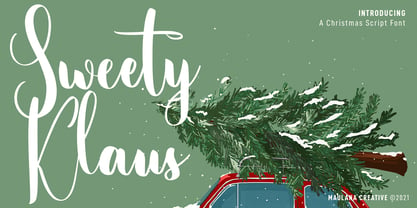 Sweety Klaus is a casual stylish script font. With regular contrast stroke, fun character with a bit of ligatures. To give you an extra creative work. Sweety Klaus font support multilingual more than 100+ language. This font is good for logo design, Social media, Movie Titles, Books Titles, a short text even a long text letter and good for your secondary text font with sans or serif. Make a stunning work with Sweety Klaus font. Cheers, Maulana Creative
 - Demogen Sans Condensed Font by Azzam Ridhamalik,
$19.00 Sans Condensed Font Demogen, A bold and strong condensed font that’s here to make a statement. Drawing inspiration from the sleek modern designs of the 2000s, Demogen brings back that iconic vibe with a fresh twist. This font is your go-to choice for creating stunning posters, captivating website headlines, and sleek interface designs. Demogen typeface has a strong presence and is perfect for display sizes, making it an excellent candidate for impressive logo design with its contemporary sans serif design. It has OpenType features and an Extended Latin character set boasting over 370+ glyphs covering more than 88 languages. Sans Condensed Font Demogen will ensure your design communicates effortlessly to a global audience. Features: Uppercase, Lowercase, Numbers, Punctuation Ligatures Opentype Feature PUA Encoded Characters Extended Latin Multilanguage
 - Bergenia Script Font Duo by Zane Studio,
$15.00 Bergenia Script FONT DUO is a new modern script font with irregular base lines. Trendy and feminine style. Bergenia Script looks beautiful in wedding invitations, thank-you cards, quotes, greeting cards, logos, business cards, and more. Perfect for use in ink or watercolors. Includes initial letters and terminals, alternatives and support for many languages. Include file: Bergenia Script.OTF Bergenia Script.TTF Bergenia SANS.OTF Bergenia SANS.TTF Bergenia Slant.OTF Bergenia Slant.TTF To activate the OpenType Stylistic alternative, you need a program that supports OpenType features such as Adobe Illustrator CS, Adobe Design & CorelDraw X6-X7, Microsoft Word 2010 or newer versions. There are additional ways to access alternatives / swash, using Character Map (Windows), Nexus Fonts (Windows), Font Books (Mac) or software programs such as PopChar (for Windows and Mac). How to access all alternative characters: https: //www.youtube.com/watch? v = Go9vacoYmBwhttps: //www.youtube.com/watch? v = XzwjMkbB-wQhttps: //www.yo ... need help or have questions, let me know. I am happy to help :) Thank you & Congratulations on the Design!


