10,000 search results
(0.036 seconds)
- Badehaus by Hanoded,
$15.00 In the German city of Bad Neuenahr you can visit a spa called Thermal Badehaus. This beautiful art deco building has an even more beautiful art deco lettering covering its facade. I had to work with only a couple of glyphs ('Thermal Badehaus' to be exact) and tried to capture their beauty in the remaining glyphs. The result is a font called Badehaus (Bath House in German). It is a bold, all caps typeface, with some unique glyphs.
 - Big Caslon CC by Carter & Cone Type Inc.,
$35.00 The three largest sizes of type made by the Caslon foundry are strangely unlike the famously consistent text faces cut by William Caslon. Perhaps they were the work of other hands—or of the master in a funky mood. Caslon’s text types have often been revived, but the display sizes, forceful and a touch eccentric, had no digital version until Matthew Carter’s Big Caslon. With striking Italics and rich design features , this typeface shines at BIG sizes.
 - Blackminster by Hanoded,
$10.00 Blackminster is a Gothic font, inspired by a handwritten set of letters (designed by Harry Lawrence Gage) I found in a 1916 book about lettering. I only had the ABC/abc to work with, so I designed the remaining glyphs myself. Use Blackminster for your Metal album covers, skateboards and downhill mountain bikes, or just anything that requires a bit of a Gothic look! Comes with a serious amount of diacritics and an alternate, swashy, g and y.
 - Brooklyner by Hanoded,
$15.00 Brooklyner font is based on the typeface used for The Brooklynite, a magazine which saw its heyday in the 1920's. The typeface before you is an all caps affair, making it a perfect choice for headlines, posters and ads. Since I had to work with just a handful of glyphs (11 to be precise), it took me a while to design the rest. Brooklyner font is loose, cartoonesque and very legible - and it comes with extensive language support.
 - Weekday Mornings by Bogstav,
$17.00 "Weekday Mornings" are the 2 first words from the song "Nancy" by Prefab Sprout. Just like the song, the font has a romantic theme and could be considered as "easy listening". Well, I've added 7 slightly different versions of each letter, enough to make the font look like the real handwriting which was the base of the font. Fun fact: I had this song on repeat when finishing the font. I still do love that song! :)
 - Safety by Pelavin Fonts,
$25.00 Safety is influenced by works from the Machine Age which had its greatest period between the two world wars and celebrated the triumphs of the late Industrial Age including mass production, skyscrapers, radio & phonographs, hydroelectric power and streamlined styling in industrial design. It is based on an Art Deco display style lettering known most popularly as Broadway or Manhattan but, having existed in a multitude of incarnations from showcard lettering to neon signs for a century.
 - Cowboy Lament JNL by Jeff Levine,
$29.00 A lament is a sad song, and the music of the cowboys of the Old West had their fair share of them. However, a vintage piece of sheet music from the early part of the 20th century with the title "The Dying Cowboy" brought at least one positive trait to its mournful song. The title lettering was drawn in a fashion that emulated lettering made with quick strokes of a paintbrush, and became the inspiration for Cowboy Lament JNL.
 - Crowd Funded by Hanoded,
$15.00 Crowd Funded fonts wasn’t really crowd funded… In fact, all of the funding came from me, as I had to buy paper and a new pen to get this font going! Crowd Funded is an all caps display font, which I based on a recent font of mine called Longreach. Crowd Funded is narrower and rounder than Longreach and, in a way, more delicate. It comes with a generous amount of diacritics and basic Cyrillic as well!
 - Big George NF by Nick's Fonts,
$10.00Here’s another gem by Ross F. George from the Speedball Text Book. It was originally entitled simply Bold Display (Modern Alphabets on Parade) and had a graduated spatter pattern. This version omits the pattern, but keeps the bold, brassy lines. Use it whenever you need an unusual and dynamic headline with a strong retro vibe. Both versions include the complete Unicode Latin 1252, Central European 1250 and Turkish 1254 character sets, with localization for Moldovan and Romanian. - Fiebiger Eins by Hanoded,
$15.00 Franz Fiebiger (1880 - 1932) was an Austrian painter and designer who was associated with the Vienna Secession. In 1908 he created a beautiful poster for the Kaiserjubiläums Möbel Ausstellung - a furniture exhibition during the Kaiser's Jubilee. Fiebiger Eins (meaning Fiebiger One) is based on one of the hand made typefaces gracing this poster. As I had to work with only a few glyphs, I designed the missing ones myself. Fiebiger Eins comes with language support befitting a Kaiser...
 - Cumbre by Antipixel,
$22.00 Cumbre is a slanted display type with unorthodox anatomy, a dynamic rhythmic structure, movement expression, and intense visual language. An eccentric rebel with ribbon-like moves, a balanced extrovert that makes meticulous use of ink traps. Both the name and design got inspiration from mountain peaks. "Cumbre" in Spanish means summit, and that's the motive for the spiked design and the angular serrated structure. Cumbre is built by balancing sharp angles and venturous curves. The stems are spiky, and they vary in width. Cumbre is slanted and unicase. It has condensed proportions, moderate weight contrast, spacious counters, pointy terminals, and square ink traps. Cumbre is meant for large display settings to make the most out of the precise outlines and the clean intersections. The font styles: 'Sharp' has straight paths and precise intersections. 'Round' has the same outlines but with round corners. 'Stamp' has irregular wavy contours and heavy swelling at intersections.
 - P22 Stickley Pro by IHOF,
$39.95 Stickley Optical Family is an expansion of P22 Stickley Text, a humanist, Oldstyle-rooted design with a contemporary execution and full OpenType abilities. The font contains ten distinct cuts across four optical masters—in addition to Text for page content, the optical family includes Display for titling; Headline for emphasis; and Caption for footnotes and small sizes. Typefaces were originally designed for the physical size at which they were to be printed, with subtle variations in proportion, detail, contrast, and visual weight to ensure they were as clear at 6 pt. as they were elegant at 68 pt. This created a unified design as the various sizes were set together on a page. Text is the foundation of this typeface family and is built for use in extended reading. Its proportions are carefully balanced for visual clarity while retaining its character; designed for use at 9 to 13 pt. Caption is a sturdy, simplified interpretation of the Text letterforms, with ink traps, generous letters and spacing, and hefty proportions to give balance to the smallest content on a page; designed for use at 5 to 8pt. Headline is a complement to the Text master size. It is a gently modified version with larger small caps to add visual strength and has a greater delicacy; designed for use at 14 to 26 pt. Display is an elegant refinement with stylized details. It harmonizes with the smaller optical masters as a more intricate manifestation of the typeface. Designed for use at 34 pt. and above. Opentype features include ligatures, oldstyle and lining figures, alternates, Central European characters and diacritics, and Swash Caps for the Italics. Stickley Optical Family is a feature-rich workhorse with international functionality.
 - Foobar Pro - 100% free

- Octin Stencil by Typodermic,
$11.95 In the world of graphic design, the selection of a typeface can often make or break a design. A font can evoke a range of emotions and set the tone for the entire piece. The Octin Stencil typeface is no exception. This font boasts a brawny and robust design, making it the perfect choice for designs that demand strength and resilience. With 7 weights to choose from, including light, book, regular, semi-bold, heavy, and black, the Octin Stencil typeface provides designers with an impressive range of options. Whether your design needs to convey a sense of authority or exude a no-nonsense attitude, Octin Stencil has you covered. This typeface is particularly well-suited for designs that require a tough, no-frills approach. Police, sports, prison, construction, school, or military themes can all benefit from the bold and commanding presence of Octin Stencil. Its stencil style and sturdy construction give the letters a sense of fortitude that is sure to grab attention and command respect. In summary, if you are looking for a typeface that exudes power and strength, Octin Stencil is the clear choice. Its burly and powerful design will make your message stand out and leave a lasting impression on your audience. Check out the rest of the Octin families: Octin Sports, Octin College, Octin Prison, Octin Vintage & Octin Spraypaint. Most Latin-based European writing systems are supported, including the following languages. Afaan Oromo, Afar, Afrikaans, Albanian, Alsatian, Aromanian, Aymara, Bashkir (Latin), Basque, Belarusian (Latin), Bemba, Bikol, Bosnian, Breton, Cape Verdean, Creole, Catalan, Cebuano, Chamorro, Chavacano, Chichewa, Crimean Tatar (Latin), Croatian, Czech, Danish, Dawan, Dholuo, Dutch, English, Estonian, Faroese, Fijian, Filipino, Finnish, French, Frisian, Friulian, Gagauz (Latin), Galician, Ganda, Genoese, German, Greenlandic, Guadeloupean Creole, Haitian Creole, Hawaiian, Hiligaynon, Hungarian, Icelandic, Ilocano, Indonesian, Irish, Italian, Jamaican, Kaqchikel, Karakalpak (Latin), Kashubian, Kikongo, Kinyarwanda, Kirundi, Kurdish (Latin), Latvian, Lithuanian, Lombard, Low Saxon, Luxembourgish, Maasai, Makhuwa, Malay, Maltese, Māori, Moldovan, Montenegrin, Ndebele, Neapolitan, Norwegian, Novial, Occitan, Ossetian (Latin), Papiamento, Piedmontese, Polish, Portuguese, Quechua, Rarotongan, Romanian, Romansh, Sami, Sango, Saramaccan, Sardinian, Scottish Gaelic, Serbian (Latin), Shona, Sicilian, Silesian, Slovak, Slovenian, Somali, Sorbian, Sotho, Spanish, Swahili, Swazi, Swedish, Tagalog, Tahitian, Tetum, Tongan, Tshiluba, Tsonga, Tswana, Tumbuka, Turkish, Turkmen (Latin), Tuvaluan, Uzbek (Latin), Venetian, Vepsian, Võro, Walloon, Waray-Waray, Wayuu, Welsh, Wolof, Xhosa, Yapese, Zapotec Zulu and Zuni.
 - The Arggh @$*# Lite font, crafted by GemFonts and the talented Graham Meade, stands out distinctly in the realm of typography for its imaginative and playful design. This font encapsulates the essenc...
- Gallicide by MuSan,
$12.00 Gallicide is a Handmade Modern Vintage Textured Display Typefaces. This fonts is combining the style of modern handwritten style and classic vintage looks. It comes with 3 Styles (Rough, Reglar and Outline). This font will look good on any retro design like poster, t-shirt, label, logo etc.
 - Lyonade by LetterStock,
$23.00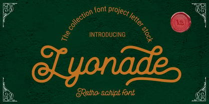 **Lyonade Font** This pair was inspired by Retro motorbike poster design that I saw on some coffee shop, It was crafted by hand specially to add natural handmade feeling in its brand identity than i make it clean with pentool. **Opentype features** Lyonade font has 226 character set included Allysondust Font is very good looking in logo, labels, product packaging, invitations, advertising and others. This fonts works with folowing languages: Afrikaans, Albanian, Asu, Basque, Bemba, Bena, Chiga, Cornish, Danish, English, Estonian, Filipino, Finnish, French, Friulian, Galician, German, Gusii, Indonesian, Irish, Italian, Kabuverdianu, Kalenjin, Kinyarwanda, Low German, Luo, Luxembourgish, Luyia, Machame, Makhuwa-Meetto, Makonde, Malagasy, Malay, Manx, Morisyen, North Ndebele, Norwegian Bokmål, Norwegian Nynorsk, Nyankole, Oromo, Portuguese, Romansh, Rombo, Rundi, Rwa, Samburu, Sango, Sangu, Scottish Gaelic, Sena, Shambala, Shona, Soga, Somali, Spanish, Swahili, Swedish, Swiss German, Taita, Teso, Vunjo, Zulu Thank you for using this font. LS
 - Afrile Script by Masinong Studio,
$15.00 Afrile Script is a modern calligraphy font with the current handwriting style. This font is perfect for branding, wedding invites, magazines, mugs, business cards, quotes, posters, and more. Afrile Script is equipped with 462 glyphs. and by having many of these glyphs there will be able to choose the letters according to your likes, lots of variations and options for each letter, so you can customize on your design choices. To access the variety of OpenType features you can use applications such as Adobe Photoshop Cs / Adobe Photoshop CC, Adobe Illustrator CS / Adobe Illustrator CC, Adobe Indesign and Corel Draw. If you do not have a program that supports OpenType, you can access all the alternate glyphs using Font Book (Mac) or Character Map (Windows) If you have any question, do not hesitate to contact me by email masinong.studio@gmail.com Thanks and happy designing :-)
 - Fondue by Latinotype,
$29.00 Fondue: an eclectic-flavoured contemporary typeface. Designed by Jorge Alberto Martínez and Latinotype Team. Fondue is a type family of eclectic shapes, inspired by Art Deco designs, in particular, the lettering used by the Mexican cartoonist Ernesto “El Chango” Cabral on almost the entire publication Revista de Revistas ("Magazine of Magazines"). Far from being a copy, Fondue expects to be an adaptation of the thinking of that time to be used in contemporary context. Fondue has a cursive ductus, wide horizontal proportion and large x-height. Its friendly consistent rhythm makes it ideal for medium-sized text, headlines, branding, and so on. The family comes in 6 weights, from Thin, which reminds of the cartoonist’s loose strokes, to Ultra Bold, the version with powerful and unique voice. Fondue has a set of 496 characters that support 207 different languages.. OpenType features include standard and discretionary ligatures as well as stylistic alternates.
 - Gymkhana by Typodermic,
$11.95 Introducing Gymkhana, a clean and simple sans-serif typeface that brings a touch of architectural elegance to your design. Inspired by twentieth-century American lettering, Gymkhana is the perfect typeface for your next project. Gymkhana’s clarity is immediately evident in its design. The typeface’s large x-height and generous width make it incredibly easy to read, even at small sizes. With its clear lines and easy-to-read characters, Gymkhana adds a feeling of solemn clarity and friendly professionalism to any message. But Gymkhana isn’t just easy to read; it’s also versatile. With old-style numerals, tabular (monospaced) numerals, and old-style tabular numerals in OpenType-capable applications, you can customize the typeface to suit your needs. Gymkhana comes in six weights and italics, so you can choose the perfect style for your project. Whether you’re designing a logo, a website, or a printed document, Gymkhana has you covered. So why wait? Try Gymkhana today and experience the power of clear, clean typography in your design. Most Latin-based European, Vietnamese, Greek, and most Cyrillic-based writing systems are supported, including the following languages. Afaan Oromo, Afar, Afrikaans, Albanian, Alsatian, Aromanian, Aymara, Azerbaijani, Bashkir, Bashkir (Latin), Basque, Belarusian, Belarusian (Latin), Bemba, Bikol, Bosnian, Breton, Bulgarian, Buryat, Cape Verdean, Creole, Catalan, Cebuano, Chamorro, Chavacano, Chichewa, Crimean Tatar (Latin), Croatian, Czech, Danish, Dawan, Dholuo, Dungan, Dutch, English, Estonian, Faroese, Fijian, Filipino, Finnish, French, Frisian, Friulian, Gagauz (Latin), Galician, Ganda, Genoese, German, Gikuyu, Greenlandic, Guadeloupean Creole, Haitian Creole, Hawaiian, Hiligaynon, Hungarian, Icelandic, Igbo, Ilocano, Indonesian, Irish, Italian, Jamaican, Kaingang, Khalkha, Kalmyk, Kanuri, Kaqchikel, Karakalpak (Latin), Kashubian, Kazakh, Kikongo, Kinyarwanda, Kirundi, Komi-Permyak, Kurdish, Kurdish (Latin), Kyrgyz, Latvian, Lithuanian, Lombard, Low Saxon, Luxembourgish, Maasai, Macedonian, Makhuwa, Malay, Maltese, Māori, Moldovan, Montenegrin, Nahuatl, Ndebele, Neapolitan, Norwegian, Novial, Occitan, Ossetian, Ossetian (Latin), Papiamento, Piedmontese, Polish, Portuguese, Quechua, Rarotongan, Romanian, Romansh, Russian, Rusyn, Sami, Sango, Saramaccan, Sardinian, Scottish Gaelic, Serbian, Serbian (Latin), Shona, Sicilian, Silesian, Slovak, Slovenian, Somali, Sorbian, Sotho, Spanish, Swahili, Swazi, Swedish, Tagalog, Tahitian, Tajik, Tatar, Tetum, Tongan, Tshiluba, Tsonga, Tswana, Tumbuka, Turkish, Turkmen (Latin), Tuvaluan, Ukrainian, Uzbek, Uzbek (Latin), Venda, Venetian, Vepsian, Vietnamese, Võro, Walloon, Waray-Waray, Wayuu, Welsh, Wolof, Xavante, Xhosa, Yapese, Zapotec, Zarma, Zazaki, Zulu and Zuni.
 - Nasser by Eyad Al-Samman,
$3.00 “Nasser” is a Kufic modern Arabic typeface. It is suitable for books' covers, advertisement light boards, and titles in magazines and newspapers. It is very distinctive when used in black and white printout. It decorates colored pages and makes artworks more attractive. This font comes in three different weights. My father’s name is “Nasser”. Consequently, “Nasser” Typeface was designed for eternizing the memory of my late father. He was the person who taught me how to like arts, literature, and languages. Besides, my first cute child is named also “Nasser.” The main characteristic of “Nasser” Typeface is in its modern non-descender style for some of its Arabic characters such as “Sad”, “Seen”, “Sheen”, “Qaf” and others. The shape of the characters' “dot”, “dots”, and “point” is innovative; a triangle with a semi-circle shape. “Nasser” Typeface is suitable for books' covers, advertisement light boards, and titles in magazines and newspapers. Its characters' modern Kufic styles give the typeface more distinction when it is used also in posters, greeting cards, covers, exhibitions' signboards and external or internal walls of malls or metro’s exits and entrances. It can also be used in titles for Arabic news and advertisements appeared in different Arabic and foreign satellite channels.
 - Modern Love by Resistenza,
$39.00 Breaking from our catalog of typefaces to create a new handwritten font family, Modern Love was born out of our desire to see what would happen if we took a step back from the norm. We weren’t looking for the perfection of the many calligraphy techniques, but more of a natural way of writing with the same tools. Our escapist experiment into casual lettering culminated into 4 fonts: Modern Love Regular, Grunge, Rough and Caps. Modern Love Regular is a hand-painted script, each glyph individually designed with a pointed brush and walnut ink. The aim was to create an effortless hand-drawn feel while keeping the contrast high density. Playful, yet polished, this font works very well when accentuated with the family’s two distinctive styles: Modern Love Grunge, simulating a washed-out effect, perfect to add a vintage look to your projects; and Modern Love Rough, with its crunchy borders, makes letters visibly rough-around-the edges and gives large letters an unmistakeable pop. All three fonts include a hand-painted set of ornaments, swashes and alternates to limitlessly customize and decorate your texts, accessible through Opentype features. Modern Love Caps is the fourth font, a handwritten Sans Serif that ties the family together with its simplicity and readability. Designed with a pointed nib and Indian ink, this font boasts a different style that perfectly complements Modern Love Regular, Grunge and Rough. The result is a fresh font family perfect to create headlines, posters, DIY hand-lettered artwork, books, holiday cards, wrapping paper, invitations, T-shirts, labels, packaging for cosmetics, fashion supplies, food products, artisanal goods, and an endless array of options for your projects. Modern Love…when brush meets passion. Check out also ‘Modern Love Slanted’ Turquoise Nautica
 - Ddt by Typodermic,
$11.95 Introducing DDT, the epitome of modern typography that exudes professionalism and authority in every stroke. With its unique superelliptical shape, DDT strikes the perfect balance between clarity and seriousness, drawing inspiration from the time-tested classics like Univers and Eurostile. Not one to compromise on functionality, DDT offers a wide range of numeric styles, including monospaced lining numerals, proportional lining numerals, and proportional old-style numerals. And that’s not all—DDT is equipped with OpenType fractions and numeric ordinals, making it an ideal choice for all your design needs. DDT is available in both condensed and regular widths, each boasting seven different weights and italics. So whether you’re looking to create an impactful heading or a sleek body text, DDT has got you covered. Elevate your design game with DDT—the ultimate neutral-sans typeface that blends form and function seamlessly, leaving a lasting impression on your audience. Most Latin-based European, Vietnamese, Greek, and most Cyrillic-based writing systems are supported, including the following languages. Afaan Oromo, Afar, Afrikaans, Albanian, Alsatian, Aromanian, Aymara, Azerbaijani, Bashkir, Bashkir (Latin), Basque, Belarusian, Belarusian (Latin), Bemba, Bikol, Bosnian, Breton, Bulgarian, Buryat, Cape Verdean, Creole, Catalan, Cebuano, Chamorro, Chavacano, Chichewa, Crimean Tatar (Latin), Croatian, Czech, Danish, Dawan, Dholuo, Dungan, Dutch, English, Estonian, Faroese, Fijian, Filipino, Finnish, French, Frisian, Friulian, Gagauz (Latin), Galician, Ganda, Genoese, German, Gikuyu, Greenlandic, Guadeloupean Creole, Haitian Creole, Hawaiian, Hiligaynon, Hungarian, Icelandic, Igbo, Ilocano, Indonesian, Irish, Italian, Jamaican, Kaingang, Khalkha, Kalmyk, Kanuri, Kaqchikel, Karakalpak (Latin), Kashubian, Kazakh, Kikongo, Kinyarwanda, Kirundi, Komi-Permyak, Kurdish, Kurdish (Latin), Kyrgyz, Latvian, Lithuanian, Lombard, Low Saxon, Luxembourgish, Maasai, Macedonian, Makhuwa, Malay, Maltese, Māori, Moldovan, Montenegrin, Nahuatl, Ndebele, Neapolitan, Norwegian, Novial, Occitan, Ossetian, Ossetian (Latin), Papiamento, Piedmontese, Polish, Portuguese, Quechua, Rarotongan, Romanian, Romansh, Russian, Rusyn, Sami, Sango, Saramaccan, Sardinian, Scottish Gaelic, Serbian, Serbian (Latin), Shona, Sicilian, Silesian, Slovak, Slovenian, Somali, Sorbian, Sotho, Spanish, Swahili, Swazi, Swedish, Tagalog, Tahitian, Tajik, Tatar, Tetum, Tongan, Tshiluba, Tsonga, Tswana, Tumbuka, Turkish, Turkmen (Latin), Tuvaluan, Ukrainian, Uzbek, Uzbek (Latin), Venda, Venetian, Vepsian, Vietnamese, Võro, Walloon, Waray-Waray, Wayuu, Welsh, Wolof, Xavante, Xhosa, Yapese, Zapotec, Zarma, Zazaki, Zulu and Zuni.
 - TT Bells by TypeType,
$29.00 TT Bells useful links: Specimen PDF | Graphic presentation | Customization options About TT Bells: TT Bells combines the elegant softness of antiqua with a complex and daring temper reflected in straight stroke terminals and arrowheaded serifs. The family is based on broad nib, which was typically used for old style fonts and creates these hallmark terminals and serifs. We've taken the best from old style fonts created before the digital age and added sharp and contemporary geometric shapes to the traditional style. That’s how TT Bells refers the spectators and font enthusiasts to the origins and, at the same time, reminds us that we live in the digital era when geometry and screens rule the world. TT Bells is suited for different types of text–from the shortest headings to large text arrays. When the font size is decreased, the boldness and sharpness of the font soften, it becomes more classic. The font family is created according to the traditional TypeType formula (Thin, Light, Regular, Bold, Black & Italics). FOLLOW US: Instagram | Facebook | Website TT Bells OpenType features: tnum, onum, pnum, numr, dnom, frac, case, ordn, subs, sups. TT Bells language support: Acehnese, Afar, Albanian, Alsatian, Aragonese, Arumanian, Asu, Aymara, Banjar, Basque, Belarusian (cyr), Bemba, Bena, Betawi, Bislama, Boholano, Bosnian (cyr), Bosnian (lat), Breton, Bulgarian (cyr), Cebuano, Chamorro, Chiga, Colognian, Cornish, Corsican, Cree, Croatian, Czech, Danish, Embu, English, Erzya, Estonian, Faroese, Fijian, Filipino, Finnish, French, Friulian, Gaelic, Gagauz (lat), Galician, German, Gusii, Haitian Creole, Hawaiian, Hiri Motu, Hungarian, Icelandic, Ilocano, Indonesian, Innu-aimun, Interlingua, Irish, Italian, Javanese, Judaeo-Spanish, Judaeo-Spanish, Kalenjin, Karachay-Balkar (lat), Karaim (lat), Karakalpak (lat), Kashubian, Khasi, Khvarshi, Kinyarwanda, Kirundi, Kongo, Kumyk, Kurdish (lat), Ladin, Latvian, Laz, Leonese, Lithuanian, Luganda, Luo, Luxembourgish, Luyia, Macedonian, Machame, Makhuwa-Meetto, Makonde, Malay, Manx, Maori, Mauritian Creole, Minangkabau, Montenegrin (lat), Mordvin-moksha, Morisyen, Nahuatl, Nauruan, Ndebele, Nias, Nogai, Norwegian, Nyankole, Occitan, Oromo, Palauan, Polish, Portuguese, Quechua, Rheto-Romance, Rohingya, Romansh, Rombo, Rundi, Russian, Rusyn, Rwa, Salar, Samburu, Samoan, Sango, Sangu, Scots, Sena, Serbian (cyr), Serbian (lat), Seychellois Creole, Shambala, Shona, Slovak, Slovenian, Soga, Somali, Sorbian, Sotho, Spanish, Sundanese, Swahili, Swazi, Swedish, Swiss German, Swiss German, Tagalog, Tahitian, Taita, Tatar, Tetum, Tok Pisin, Tongan, Tsonga, Tswana, Turkish, Turkmen (lat), Ukrainian, Uyghur, Vepsian, Volapük, Võro, Vunjo, Xhosa, Zaza, Zulu.
 - Cocogoose Pro by Zetafonts,
$39.00 Discover Cocogoose Pro Narrow Weights! Designed by Cosimo Lorenzo Pancini in 2013, Cocogoose was first expanded in 2015 with the help of Francesco Canovaro who co-designed the decorative display weights and Andrea Tartarelli who developed the condensed widths. In 2020 a full redesign of the typeface has been published: Cocogoose Pro now includes new widths, weights, open type features and characters, thanks to the help of Mario De Libero. Influenced by vernacular sign-painting and modernist ideals, Cocogoose is drawn on a classic geometric sans skeleton, softened by rounded corners and slight visual corrections. Its very low contrast, dark color and tall x-height make it a solid choice for all designers looking for a powerful display typeface for logos, headings and vintage-inspired branding. The tall x-height makes texts set in Cocogoose very readable even at small sizes, while the bold regular weight allows for maximum impact when used as a branding, signage or decorative typeface. Cocogoose Pro was designed as a highly reliable tool for design problem solving, and given all the features a graphic designer needs, starting from its wide range of widths and weights. Its 2000+ latin, cyrillic and greek characters make sure it covers over 200 languages worldwide, while its comprehensive set of open type features allows faultless typesetting thanks to small capitals, positional numbers & case sensitive forms. A wide range of alternate letterforms, developed along nine different stylistic sets, gives you an extra level of design fine-tuning. The layerable and color-ready display variants include inline, outline, shadow and a letterpress version that can simulate the effect of old print, also thanks to programmed randomization of its letters. Cocogoose Pro has been completely re-engineered in 2020 to include extra features and technologies. A variable font version allows you to fine tune precisely the appearance of the text while minimizing download size on the web. A darkmode weight range has been added to the whole family, to keep consistency of effect when the typeface is used in reverse on the web and in dark mode interfaces. Also, a new text subfamily has been developed for body text usage, to keep the look and feel of Cocogoose while maximizing readability on screen and on the printed page.
 - TT Rationalist by TypeType,
$39.00 Please note! If you need OTF versions of the fonts, just email us at commercial@typetype.org TT Rationalist useful links: Specimen | Graphic presentation | Customization options We thought, "What if we provide the user with a collection of matching fonts, each of which would still be unique?"—and so we started developing TT Rationalist. For those familiar with the bestsellers TT Norms® Pro and TT Commons Pro, the new font will be intuitive to use. It has similar proportions, characteristics and functionality, but yet it is an independent and original font family. Unlike the geometric sans serifs TT Norms® Pro and TT Commons Pro, TT Rationalist is a slab serif typeface. It is functional and original. Slabs are characterized by massive rectangular serifs, but in TT Rationalist they are trapezoidal and refined, which makes them look modern. Speaking of modernity, when creating the typeface, we wanted to avoid the excessive historicism that can be seen in many slab serif fonts. We have been particularly careful working on the Black style, which in the first sketches had something in common with the Wild West posters. When we balanced out the excessive contrast caused by visual compensation, the font stopped evoking retro associations. Now TT Rationalist Black is perfect for headlines, especially on posters and posters, and works great with Light styles in TT Norms® Pro and TT Commons Pro. The new typeface works well for both headings and text arrays. It looks especially aesthetically pleasing in printed production (books, magazines, brochures). The TT Rationalist typeface consists of 22 two styles: 10 upright, 10 real Italics and two variable fonts, each with over 950 glyphs. It supports over 200 languages and contains 27 OpenType features. In addition to the standard ones, there are Small Capitals for Latin and Cyrillic languages, alternative versions of the ampersand and the letter g. The italics have two stylistic sets allowing to switch the design of style-forming characters (k, v, w, y, z) between italic and classical forms. TT Rationalist font field guide including best practices, font pairings and alternatives. FOLLOW US: Instagram | Facebook | Website
 - ATF Garamond by ATF Collection,
$59.00 The Garamond family tree has many branches. There are probably more different typefaces bearing the name Garamond than the name of any other type designer. Not only did the punchcutter Claude Garamond set a standard for elegance and excellence in type founding in 16th-century Paris, but a successor, Jean Jannon, some eighty years later, cut typefaces inspired by Garamond that later came to bear Garamond’s name. Revivals of both designs have been popular and various over the course of the last 100 years. When ATF Garamond was designed in 1917, it was one of the first revivals of a truly classic typeface. Based on Jannon’s types, which had been preserved in the French Imprimerie Nationale as the “caractères de l’Université,” ATF Garamond brought distinctive elegance and liveliness to text type for books and display type for advertising. It was both the inspiration and the model for many of the later “Garamond” revivals, notably Linotype’s very popular Garamond No. 3. ATF Garamond was released ca. 1918, first in Roman and Italic, drawn by Morris Fuller Benton, the head of the American Type Founders design department. In 1922, Thomas M. Cleland designed a set of swash italics and ornaments for the typeface. The Bold and Bold Italic were released in 1920 and 1923, respectively. The new digital ATF Garamond expands upon this legacy, while bringing back some of the robustness of metal type and letterpress printing that is sometimes lost in digital adaptations. The graceful, almost lacy form of some of the letters is complemented by a solid, sturdy outline that holds up in text even at small sizes. The 18 fonts comprise three optical sizes (Subhead, Text, Micro) and three weights, including a new Medium weight that did not exist in metal. ATF Garamond also includes unusual alternates and swash characters from the original metal typeface. The character of ATF Garamond is lively, reflecting the spirit of the French Renaissance as interpreted in the 1920s. Its Roman has more verve than later old-style faces like Caslon, and its Italic is outright sprightly, yet remarkably readable.
 - South Route by Nicky Laatz,
$15.00 Introducing South Route Font Duo and Extras - a handsome new font duo with tons of versatility.South Route consists of two fonts , A textured casual script and a bold & hearty sans-script titling font.To make your designs more authentic, South Route Script font has a set of lowercase alternate letters and ligatures included.South Route also has a handy set of 26 extra dry marker swashes and grit dingbats . Fantastically versatile, South Route lends itself to both retro hipster style designs and fresh bold modern designs.
 - Patisserie by Thinkdust,
$10.00 Patisserie is exactly the font you might expect to see on chalkboards outside Parisian cafés; tall, elegant and enticing. The lithe, thin and graceful characters of this font compliment the hand-drawn style to create a typeface that is both casual and professional. Excellent for display work and larger sizes, to really show off the slightly rough edges, Patisserie supports over 26 languages with full punctuation and character sets. Step on in for a traditional, hand-made, French fontant, or whatever else you fancy.
 - Ash by Fenotype,
$19.00 Ash is a script font hand drawn with dry brush. Ash is packed with automatic contextual alternates that keep the text vivid. Ash also has swash alternates for lowercase letters that add extra flavour. In titling alternates there’s 26 swooshes and strokes placed in a-z that can be used as underlines or just decorations. Ash is great display font for a swift hand drawn look. Ash has wide language support and it is PUA encoded so you can access extra glyphs in most graphic design softwares.
 - The Doggon font by GemFonts | Graham Meade is a distinctive and playful typeface that embodies a sense of whimsy and creativity. Crafted by Graham Meade, a designer known for his diverse and often qu...
- Luxe Atelier by PeachCreme,
$19.00 Hey guys! Meet our new font "Luxe Atelier" which is inspired by a bit quirky but still lovely handwriting. When we launched our font "Lolita" in 2019 many liked the way we replaced some uppercase letters with lowercase ones. The response was overwhelmingly positive. The feedback we received inspired us to refine the idea of the lowercase signature style and we created "Luxe Atelier" with a lot more lowercase letters that give an uppercase look. However, some uppercase letters simply cannot be written as lowercase due to their nature: they would just lose their primary sound. For example, when we tried writing lowercase 'e' in the uppercase style it more resembled lowercase 'l' and affected the legibility of the font. Therefore some letters in this font remained as is. When it comes to other letters, we tried maximally to keep the lowercase style. This playful, non-standard signature font with slightly rough edges includes 37 ligatures which will definitely add realistic handwritten character to your designs. It is perfect for branding, signatures, weddings and so much more.
 - Reina Neue by Lián Types,
$29.00 Hey! See Reina Neue in action here! INTRODUCTION When I designed the first Reina¹ circa 2010, I was at the dawn of my career as a type designer. The S{o}TA, short for the Society of Typographic Aficionados, described it as complex display typeface incorporating hairline flourishes to a nicely heavy romantic letterform². And it was like that; that’s what I was pursuing at that time since I was very passionate about ornaments and accolades of Calligraphy. Why? I felt that Typography, in general, needed more of them. These subtle flourishes could breathe life into letters. Maybe, I thought it was the only way I could propose something new into the field of type. However, after some years, I came across a very interesting quote: –Beautiful things don’t ask for attention– Wow! What did this mean? How could something be attractive if it’s not actually showing it. Could this be applied to my work? Sure. I think every type-designer goes through this process (aka crisis) regarding his or her career. At the beginning we love everything. We are kind of blind, we only see the big picture of a project. And that’s not because we are lazy. We actually can’t see the small mistakes nor the subtleties that make something simpler beautiful. We are not able. But, the small subtleties… They are actually everything: With experience, one puts more attention into the details and learns that every single decision in type has to be first meticulously planned. Here I am now, introducing a new Reina, because I felt there was a lot of it that could be improved, also the novelty of Variable Fonts caught my attention and I had to take that to my type library. THE FONT A thing of beauty is a joy forever Now, a decade later, I’m presenting Reina Neue. This font is not just an update of its predecessor: –A thing of beauty is a joy forever– is the first line of the poem ‘Endymion’ by John Keats, and despite the meaning of “beauty” may vary from person to person, and even from time to time (as read in the last paragraph), with Reina I always wanted to bring joy to the eye. In 2010, and now, in 2020. I believe the font is today much better in every aspect. It was entirely re-designed: Its shapes and morphology in general are much more clean and pure. The range of uses for it is now wider: While the old Reina consisted in just one weight, Reina Neue was converted into a big family of many weights, even with italics, smallcaps and layered styles. The idea behind the font, this kind of enveloping atmosphere made out of flourishes, is still here in the new Reina. This time easier to get amazing results due to the big amount of available alternates per glyph and also more loyal from a systemic point of view. However, and as read in the introduction -Beautiful things don’t ask for attention-, if none of the flourishes are activated the font will look very attractive anyway. Reina Neue is ready to be used in book covers, magazines, wedding cards, dazzling posters, storefronts, clothing, perfumes, wine labels and logos of all kind. Like it happened with the previous Reina, I hope this new font satisfies every design project around the world if used, and can be a joy forever. SOME INSTRUCTIONS Before choosing the right style for your project, hear my advice: -Reina Neue Display was meant to be used at big sizes. If you plan to print the font smaller than 72pt, I suggest using Reina Neue, not Display. Otherwise, if the font will be BIG or used on a digital platform, Reina Neue Display should be your choice. For even smaller sizes, use Reina Neue Small. This style was tested and printed in 12pt with nice results. (Note for variable fonts: Print them in outlines) -Reina Italic is not a slanted version of the roman, and this means some flourishes are different between each other. The Italic version has other kind of swirls. More conservative, in general. -All the styles of Reina Capitals have Small Capitals inside. -Reina Capitals Shine should be used/paired ONLY with Reina Capitals Black. The engraved feeling can be achieved if Reina Capitals Black and Reina Capitals Shine are used as layers, with the same word. Variable fonts instructions: -For more playful versions, choose Reina Neue VF, Reina Neue Italic VF or Reina Neue Capitals VF: With them you can adjust between 3 axes: Weight (will change the weight of the font) – Optic Size (will thicken/lighten the thin strokes and open/close the tracking) – Accolades (will modify the weight of the active flourishes). SOME VIDEOS OF REINA NEUE VF https://youtu.be/8cImmT5bpQM https://youtu.be/1icWfPmKAkg https://youtu.be/YC9GkJDL1a8 NOTES 1. The original Reina, from a decade ago: https://www.myfonts.com/fonts/argentina-lian-types/reina/ 2. In 2011, Reina received an honourable mention by S{o}TA. “Great skill is shown in the detailing, and an excellent feel for the correct flow of curves and displacement of stroke weight.” https://www.typesociety.org/catalyst/2011/ Reina was featured in the “Most Popular Fonts of the year” in MyFonts in 2011 https://www.myfonts.com/newsletters/sp/201201.html In 2012, the font was also selected in Tipos Latinos, the most prestigious competition of type in Latinoamerica. https://www.tiposlatinos.com/bienales/quinta-bienal-tl2012/resultados Also, chose as a “Favorite font of the year” in Typographica. https://typographica.org/typeface-reviews/reina/
 - Soul Lotion by TypoGraphicDesign,
$19.00 CONCEPT/CHARACTERISTICS The typeface “Soul Lotion” is a sans serif font for display sizes. Constructed, clear and simply with monoline character. The round and unadorned look is modern & simple. APPLICATION AREA The modern, clear and simply sans serif font “Soul lotion” would be happy as a display typeface in headline size on the following areas and there simply feel good: Logos/Wordmarks, party flyer, album covers, CD covers, Poster design, video game design, and much more as display typeface for print and digital magazines, books and websites. TECHNICAL SPECIFICATIONS Headline Font | Display Font | Sans Serif Font “Soul Lotion” OpenType Font (Mac + Win) with 6 styles (regular, bold, light + 3x italic) & 354 glyphs. Incl. accents, alternative letters, ligatures & €. Desktop Font (.otf) + Web Font (.svg, .eot, .woff) KONZEPT/BESONDERHEITEN Die Schrift »Soul Lotion« ist ein serifenloser Font für Headlinegrößen. Konstruiert, klar und einfach mit gleichbleibender Strichstärke. Die runden und schnörkellosen Formen wirken modern & schlicht. EINSATZGEBIETE Die moderne, klare und einfache Sans Serif Schrift »Soul Lotion«, würde sich als Auszeichnungsschrift in Headlinegröße über folgende Einsatzgebiete sehr freuen und sich dort schlicht wohlfühlen: Logos/Wortmarken, Flyer für fast jede Party, PlattenCover, CD-Cover, PlakatDesign, Videospiel Design, als Headlineschrift für print und digitale Magazine, Bücher und Webseiten u.v.m. TECHNISCHE INFORMATIONEN Headline Font | Display Font | Sans Serif Font »Soul Lotion« OpenType Font (Mac + Win) mit 6 Schriftschnitten (regular, bold, light + 3x italic) & 354 Glyphen. Inkl. diakritisches Zeichen, alternative Buchstaben, Ligaturen & €. Desktop Font (.otf) + Web Font (.svg, .eot, .woff)
 - Mirielle by Typadelic,
$19.00Mirielle is curvy yet angular at the same time. Whimsical yet orderly. As with all Typadelic fonts, this script typeface is unique and original, with a playful twist. - Barranom by PojolType,
$12.00 This Barranom font is great for logos, branding, apparel and headlines. This typeface encapsulates a wide variety of nuances, apparently, opposing elements like technology with friendly angular shapes.
 - Monoline Deco JNL by Jeff Levine,
$29.00 Monoline Deco JNL is a thin, elegant typeface that is reminiscent of the Art Deco Streamline influence of the 1930s and 1940s, complete with angular and truncated characters.
 - Qasiru by Phoenix Group,
$13.00 Qasiru is a messy handwriting font with a theme of fun and love, it has bold and irregular lines, but fits perfectly in the whole lettering. Thank you
 - Daitengu by Hanoded,
$15.00 I have always been fascinated by Tengu - a mythical creature from Japan. Tengu are usually depicted with a red face, a very long nose, white moustaches and a funny hat. They used to be regarded as harbingers of war, but over the centuries, their image softened and they became the protective spirits of mountains and forests. Daitengu means ‘greater tengu’ and stems from the Genpei Jōsuiki - an extended version of the ‘The Tale of the Heike’ - an epic account of the struggle between the Taira and Minamoto clans for control of Japan. So, now you know about tengu, end of the history lesson! Daitengu is an epic brush font. I made it with a soft brush and China ink (like most of my brush fonts), but instead of forming the glyphs I saw in my head, I let the brush do the work. A more ‘zen’ approach to brushwork if you will! The result is a messy, organic brush font with a lot of spirit. Comes with diacritics and double letter ligatures.
 - Metrisch by Gumpita Rahayu,
$18.00 Metrisch is new sans serif typefamily of seven weights plus seven italics uprights in each weights. The typefaces designed based on traditional geometric construction that have been built with letter size wider, the x-heights taller and short descender that almost proportioned with the basic letter shape. With little details added like clean vertical cuts on the terminals and optimized sharp corners that makes this fonts smooth and refined looks. It was represents the flavor of the most common humanist typefaces style and grotesk feels. The weights comes from extra light to extra bold suitable to make display appearance, and the book and medium weights also works well as small/medium text sizes to accompany your design, such as editorial fashion magazine, solid headline, websites heading, poster, advertising, logo, signage, etc Also, Metrisch type-family fully loaded with OpenType features such as some stylistic alternates, case-sensitive forms, fractions, small capitals,and another most common numerals features such as super & subscript, tabular & oldstyle figures, numerator-denominator, and has more extended latin diacritics characters.
