10,000 search results
(0.033 seconds)
- Exter by Variable Type Foundry,
$22.99 Exter is a geometric Sans-Serif font inspired by the work of Russian artist Alexandra Exter that combines geometric and angled forms. Exter has been designed for advertising, posters, web, branding, packaging or any place where you need a clean and forceful voice. This personal character of its forms is due to the variety of weights it has (Black, Ultra Bold, Bold, Semi Bold, Regular, Light, Ultra Light, Extra Light and Thin). All are fully The character set is robust, covering extended Latin.
 - MC Camcode by Maulana Creative,
$12.00 Camcode is a semi Bitmap style with round edges Display sans font. Regular stroke, fun character with a bit of ligatures and alternates. To give you an extra creative work. Camcode font support multilingual more than 100+ language. This font is good for logo design, Social media, Movie Titles, Books Titles, a short text even a long text letter and good for your secondary text font with script or serif. Make a stunning work with Camcode font. Cheers, Maulana Creative
 - Road Picture JNL by Jeff Levine,
$29.00 Road Picture JNL was modeled after the hand lettered title and credits for the 1940 Bob Hope-Bing Crosby semi-musical comedy “Road to Singapore”, and is available in both regular and oblique versions. Although the lettering design doesn’t resemble anything that was probably used in Singapore at the time, its faux “exotic” look still makes for an interesting revival. Bob Hope and Bing Crosby made a total of seven “road” pictures, hence the homage in the name of this type font.
 - Hyperon by ParaType,
$30.00 Hyperon is a text typeface, which is especially useful for math and physics literature. Its nature is defined by austere and humanist features that show the most in italic. The typeface includes weights from Regular to Black and widths from Condensed to Semi Expanded. What stands out for Hyperon is the extended character set, with added Greek and lots of mathematical signs. Some styles have small caps. The typeface was designed by Natalia Vasilyeva and released by Paratype in 2020.
 - Ciribiribin JNL by Jeff Levine,
$29.00 Ciribiribin is an Italian ballad composed by Alberto Pestalozza in 1898. Many versions with different sets of lyrics have been recorded over the years. The hand lettering on the sheet music for one such popular version of the song was comprised of bold characters with a "semi-serif" treatment; that is, characters with partial or no serifs on certain strokes of the letters. Ciribiribin JNL extends this unique design into a complete digital typeface. Available in both regular and oblique versions.
 - Falena by Typoforge Studio,
$19.00 Falena is a type family designed by Gianluca Boffito. This simple, easy-to-read, geometric-style sans serif family is published by Typoforge Studio and consists of 18 weights (together with italics). It has more than 300 glyphs per style (including special characters). Falena works equally well in long form type settings and for titles, headings, posters. It comes with two sets of original dingbats (set 1 contains 52 ornaments, set 2 contains 52 truly distinctive and stylish icons).
 - Agistra by Krismagraph,
$19.00 Agistra is an elegant and modern Ligature san serif font . Comes with 83 unique ligatures . Agistra font is a multipurpose font that is perfect for any project, with high contrast glyphs, giving it a feminine and masculine quality, modern, and easy to read. Great in layout design for quotes or body copy, best used as a display for headings, logos, branding, magazines, product packaging, invitations, and others. This font is easy to use and has OpenType features.
 - Niko by Ludwig Type,
$50.00 Niko is a contemporary, humanist sans with a friendly yet clear and distinct personality. It is designed for excellent legibility, particularly for long continuous reading. The wedge-shaped stem heads add liveliness and variety to the carefully crafted letterforms. Niko, a highly versatile type family consisting of 54 styles that are designed to work equally well on paper and on screen. The family includes condensed, as well as extra-condensed variations, for situations where space-saving typography is required.
 - Stepford by Joanne Marie,
$10.00 A typographic playground Stepford is a versatile semi-serif boasting 6 styles - regular and italic, sketch and italic and outline and italic. It includes 231 glyphs, ligatures and multilingual support. These six styles make it the perfect display typeface for any kind of project. Absolutely sweet for editorial design - mainly headers and sub-headers but can also be used for body text too. This typographic trio is based on the vintage 50’s and 60’s style scripts and modernised for the present day. It’s another powerful typeface to add to your arsenal of design assets that command attention. That’s what design is all about! For regular updates and freebies follow me on Instagram at joannemarie_cm
 - ED Muskrat by Emyself Design,
$9.00 ED Muskrat is a display font family that looks elegant classic and modern, this font is designed from a combination of serif and semi blackletter fonts that add a unique feel to the font. ED Muskrat has 9 styles: Thin, ExtraLight, Light, Regular, Medium, SemiBold, Bold, ExtraBold, and Black. ED Muskrat is equipped with ligatures, alternative characters, and supports multiple languages. and also this font is perfect for your design needs such as branding, poster design, books, fashion, social media design, logos, etc. Features: Stylistic alternates ( C, E, F, I, J, N, Q, S, Z ) Ligatures ( fi , fj , tt ) 9 Styles ( Thin, ExtraLight, Light, Regular, Medium, SemiBold, Bold, ExtraBold, and Black ) Multi Language Support 373 Glyphs
 - Hintdake by Edignwn Type,
$21.00 Hintdake is more than just a font; it's your ticket to a tattoo font collection. Featuring three styles (regular, rough, and stamp) and 26 bonus tattoo illustrations. Hintdake is your secret weapon for standout logos, branding, and apparel designs. Dive into the world of blackletter fonts and make your creative mark with this exceptional collection. Hintdake font features : - 3 style typefaces (regular, rough and stamp) - Uppercase, lowercase, numeral, symbol, punctuation and ligature in blackletter font - All-caps, numeral, symbol and punctuation in sans serif font - Multilingual - PUA Encoded Hintdake includes : - 8 fonts (blackletter, sans serif and dingbat) - 26 tattoo illustrations in dingbat
 - SF Article by Sultan Fonts,
$40.00 About Sf Article font family: Sf Article is An Arabic and Latin typeface for desktop applications ,for websites, and for digital ads. The main types of Sf Article font family weight are regular and bold. The regular weight is perfect for reading, it is helpful during long reads, Bold Sf Article styles are designed to draw attention to short phrases. The Sf Article font family is characterized by short heights and dynamic stretching of letters through the paragraph, where the space In the line is automatically filled. In Sf Article font family, we have developed two italic fonts: regular and bold, to help with the diversity of stylistic expression in the Article, document and research work. Sf Article typeface comes with many OpenType features including stylistic sets. Designer: Sultan Maqtari Design date: 2021 Publisher: Sultan Fonts
 - Valley by Illushvara,
$10.00 Valley is a lovely script font featuring charming, playful characters that seem to dance along the baseline. Add this font to your most creative ideas, and notice how it makes them stand out! Have a Regular & Italic style can be used various purposes such as magazine, logos, wedding invitations, headings, and so much more. If you have any question, don’t hesitate to contact me. Happy Designing !!! Thank You, Bayu Suwirya
 - Birdy by Omotu,
$22.00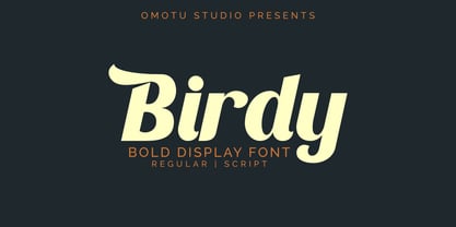 Birdy is bold display font. Comes with 2 styles, regular and script. Great for heading, logotype, branding, packaging design, poster design, website/display, editorial, headline, advertising, and more. Whats Include? Opentype support Multilingual support PUA encoded Features: Uppercase, lowercase, numerals, punctuations, alternates, ligatures, and swashes. Thanks for looking, and I hope you enjoy it! Please don't hesitate to drop me a message if you have any issues or queries.
 - Skulebuk by WCM,
$20.00Skulebuk is a decorative typeface ideally created for use on edgy/street/urban or sports related design projects. Reminiscent of the early 90s scribblings in the back of my old school books (we all remember right!) instead of doing real work! The two weights available Regular and Heavy will help balance designs that want to over use the typeface i.e Heading and body text. 80s-90s is very now! - Allen Keys by Letters&Numbers,
$18.00 Rummaging through the toolbox recently, I was surprised by how many allen keys I had from years of assembling flat-pack furniture. After some experimenting with the keys to make up individual letters I was struck by their graphic quality. The typeface is defined by the slim, right-angled shape of the allen key; creating a geometrical, yet playful font. The typeface is suitable for logos and feature headings.
 - Kticha by Typink,
$11.00 Excellent futuristic font with pretty rounded angles will fit any title or heading. It supports more than 20 European languages. This font is unique for it's elegant and thin letters. Font's idea came to the designer in the late autumn when tender yellow leaves fell to his hands. The combination of straight lines and bows had sparked a thought about the font, that could be used as awesome decoration.
 - Publio by Tour De Force,
$25.00 Publio is small unusual and unique font family, characterized with sharp, triangular semi-serifs.
 - Scribonius GTSLB by Intellecta Design,
$30.00 Blackletter typefaces, also known as Gothic, Fraktur, or Old English, have been used in the headings and initial chapters of books. This style of typeface is recognizable by its dramatic thin and thick strokes, and in some fonts, the elaborate swirls on the serifs. Blackletter typefaces are based on early manuscript lettering and evolved in Western Europe from the mid twelfth century. They are best used for headings, logos, posters, and signs, as they are not easy to read in body texts. Blackletter was type that emulated the most common handwritten scripts of the era and was used for books of hours and initial chapters of books Brazilian type designer Paulo W created this font ideally suited for advertising and packaging, festive occasions, editorial and publishing, logo, branding and creative industries as well as poster and billboards. An elegant and clean typeface, with two harmonic blackletters styles, the bold lowercases with beaufitul ornamented initials. A classic decorative design around an antique theme: The headings of gothic texts, this font works great in display purposes. ENJOY
 - Monkton Book Condensed by Club Type,
$36.99 Packing more copy in a narrow space is the main reason for using a condensed type. Characters with a more ovular shape tend to be less wide than their circular counterparts and will allow for more letters per line. In narrow columns for example, this typeface can provide up to 25% more copy than the regular typeface in the same space. Another reason is when a larger type size is called for — used sparingly it is useful for headings or headlines. For emphasis, narrower letters can provide a stark contrast in the flow of reading, creating impact while retaining typographic character. Condensed types can specially useful in tables and charts because typically both use few words in each block. If space now allows, you may think about the luxury of a larger point size. This optimizes space while keeping your typography more easily legible.
 - Sea of Japan JNL by Jeff Levine,
$29.00 A 1922 piece of sheet music entitled “Japanese Sailor” had its title hand lettered in a Far Eastern motif. This design is now available as Sea of Japan JNL, in both regular and oblique versions.
 - Merriment JNL by Jeff Levine,
$29.00 Within the pages of the 10th edition of the Speedball Lettering Book (1927) is an alphabet called “Vanitie”. This had been redrawn digitally as Merriment JNL, and is available in both regular and oblique versions.
 - Silent Comedy JNL by Jeff Levine,
$29.00 A poster for the 1917 Charlie Chaplin comedy “Easy Street” had Chaplin’s name hand lettered in thick, round cornered block characters. This inspired Silent Comedy JNL, which is available in both regular and oblique versions.
 - FF QType by FontFont,
$62.99 German type designer Achaz Reuss created this display and sans FontFont in 2004. The family has 26 weights, ranging from Extra Light to Black in Compressed, Condensed, Normal, Semi Extended, and Extended and is ideally suited for advertising and packaging, logo, branding and creative industries, poster and billboards as well as sports. FF QType provides advanced typographical support with features such as ligatures, alternate characters, case-sensitive forms, fractions, super- and subscript characters, and stylistic alternates. It comes with tabular lining and proportional lining figures.
 - Geometris Round by NicolassFonts,
$25.00 Geometris Round Semi-Condensed is a modern versatile sans-serif typeface. What differentiates Geometris Round Semi-Condensed from the other fonts is an exceptionally distinctive design. It is brilliantly suited for graphic design and display use and perfect for logotypes, t-shirts, packaging, brand identity, books, magazines, newspapers, posters, billboards, and advertising.
 - F2F Metamorfosi by Linotype,
$29.99The techno sound of the 1990s, a personal computer, font creation software, and some inspiration all came together to inspire the F2F (Face2Face) font series. Alessio Leonardi and his friends had the demand to create new unusual typefaces, which would be used in the leading German techno magazine of the day, Frontpage. Even typeset as small as 6-points, in nearly undecipherable layouts, it was a pleasure for the kids to read and try to decrypt the messages. Letterforms in F2F Metamorfosi are parts of other characters that have been rotated to take on new meaning. For instance, an upside down V has become an A, a German ß has become the B, and a left parenthesis has become the C, etc. - Vaccine by ParaType,
$30.00 Vaccine is a slab serif font family with a mixture of the usual and one-sided serifs. We call it ‘semi semi slab serif’. Serifs and terminals have soft rounded shapes, but stem junctions on the contrary use hard constructions. Such combination of basic design features makes the font distinct and strong in a setting and delicate and soft in appearance. This design peculiarity, together with low contrast and strong serifs, produces the qualities needed for using the font in small sizes, in low quality print, and in bad reading conditions. Vaccine got modern stylish design and has a prominent place in the set of popular faces. The family consists of 10 members - five weights with the corresponding italics. It can be used in a wide range of applications - magazines, advertising, corporate identity, urban navigation, packaging, children books, etc. Design by Manvel Shmavonyan with the help of Gayane Bagdasaryan as a consultant. Released by ParaType in 2013.
 - Vtks Relaxing Blaze - 100% free

- Futurex Roughly Sliced - Unknown license

- Futurex Arthur - Unknown license

- Radiac by Stereo Type Haus,
$25.00 Radiac is a semi-monospaced unicase design inspired by lettering constructed from pieces of tile.
 - Store Clerk JNL by Jeff Levine,
$29.00 The cover of the 1929 sheet music from the First National/Vitaphone picture “The Girl from Woolworth’s” had its title (“Someone”) hand lettered. This single word title was the model for Store Clerk JNL, which is available in both regular and oblique versions as well as solid and solid oblique versions (without an inline). A bold, casual sans serif with rounded ends and an inline, Store Clerk JNL is perfectly suited for projects where a strong, yet playful title is necessary to grab the reader’s attention. For those old enough to remember, Woolworth’s was a leading “Five and Dime” store chain, especially in the days when a nickel or a dime actually could purchase something.
 - DT Enigmystic by Dragon Tongue Foundry,
$9.00 When reading text, the most informative parts of the written word for a human brain to identify, are the top and bottom edges of each word, and to a lesser degree, the leading and trailing edges. The overall shape has more useful info than the inner workings of each word. DT Enigmystic, is a display font family that gives you just that. The outer edge. At first glance, these letters don't look like standard letters, and yet, they are perfectly readable. And it is a 'somewhat' smart text, in that it will automatically complete the trailing edge of every word, whenever it sees a comma, period or space. Similarly, it will automatically complete the leading edge of every word following a space. When used as display test or as a heading, the first letter will need to be preceeded by a space, to achieve a full enclosed word outline. As with most of my fonts, do use Contextual Ligatures. This allows the letters to come alive. When generated here on this webpage, contextual ligatures are not turned on, and so the words do not appear completely closed at their beginnings and ends. But as can be seen in the poster images, these outlined words do automatically complete themselves when contextual ligatures are active.
 - De Fonte Plus by Ingo,
$39.00 A variation of ”Helvetica according to the blur principle.“ The underlying typeface is ”Helvetica“, the only true ”run-of-the-mill“ typeface of the twentieth century. The distortion principle used simulates the photographic effect of halation and/or overexposure. The light weight, »DeFonte Léger«, nearly breaks on the thin points, whereas on those points where the lines meet or cross, dark spots remain. The characters are ”nibbled at“ from the inner and outer brightness. On the normal and semibold typestyles, »DeFonte Normale« and »DeFonte Demi Gras«, the effect is limited almost exclusively to the end strokes and corners, which appears to be strongly rounded off. The bold version »DeFonte Gros« is especially attractive. As a result of ”overexposure“, counters (internal spaces) are closed in, while characters become blurred and turn into spots; new characteristic forms are created which are astoundingly legible. The fat version »DeFonte Gros« is particularly appealing. “Overexposure” leads to drifted counters, letters blur into spots; new characteristic forms emerge, which are surprisingly easy to read.
 - Marcher by Horizon Type,
$30.00 Marcher is a modern display type family in 10 weights plus matching true italics. Designed for an impactful and stylish visual impression especially on logos and posters. Marcher has semi-humanist and semi-geometric details and extensive language support. Marcher has OpenType features like fractions, numerators, denominators, tabular numbers, stylistic alternates and 12 stylistic sets.
 - Khonsong Rounded by Jipatype,
$27.00 Introducing "Khonsong Rounded" a rounded semi-condensed sans serif font that embodies a harmonious blend of modernity, futurism and softness. With its sleek and contemporary appearance, Its semi-condensed proportions strike a perfect balance between space-saving efficiency and legibility, making it an ideal choice for various applications, from online media to print media.
 - Maracatu by Bruno de Aviz,
$5.00 The family of Tipografia Maracatu was born in 2020 when we could not leave the house because of the coronavirus epidemic. I had no idea how it would turn out. I just wanted to draw letters. When I finished the regular version, I thought it looked a lot like the art and music from the Northeast of Brazil, and that is why I came up with the name Maracatu. Maracatu is a musical-style original from the Northeast of Brazil. After I had the font style and the Regular version, I thought it would be nice to have Bold and Light.
 - Bartholeme by Galapagos,
$39.00The four weight semi-condensed Bartholemé family came into existence as a family expansion based on the designer's earlier concept, Bartholemé Open. This hybrid family was inspired by and loosely based on a number of contemporary mid-twentieth century type concepts having Old Face or Modern influence. Those inspirational type designs were primarily designed for various proprietary photolettering technologies of the time. The award-winning* Bartholemé Open and its companion design Bartholemé small capital open were inspired by various Shaded, Inline and Handtooled type models from the nineteenth and twentieth centuries. Most of those inspirational type designs were designed as titling fonts with all capital sets only. To set it apart from the earlier models, Bartholemé Open is semi-condensed intentionally designed with a lowercase. Design qualities include a large x- height, tightly curved ample counters, crisp serifs and tight bracketing. The overall plan of the family was originally intended for display usage in titling and short passages of text. At higher output resolutions all fonts read well at smaller point sizes. The Bartholemé family works well on its own, but also is compatible with type styles possessing qualities that complement or enhance its own. The Bartholemé family consists of a Regular weight complementing a Bold weight, along with Medium complementing an Extra Bold weight. The companion true-drawn italics are based on the Bartholemé roman design. * Award for Design Excellence bukva: raz! Type Design Competition of the Association Typographique Internationale, 2001 - Bestowens by Letterara,
$12.00 Bestowens is the perfect handwritten font: Elegant, Sweet, innocent, light and charming, this one-of-a-kind typeface will add a unique charm to any design project! Bestowens was created to look as close to a natural handwritten script as possible by including 44 ligatures. With built in OpenType features, this script comes to life as if you are writing it yourself. You can see it in the pictures shown. A wide range of swashes (a-z) and alternates (A-Z, a-z) are included so that you can give your logo or name a custom, hand-calligraphy look. This font is available in 10 Styles in 1 typefaces: Thin, Light, Regular, Semi Bold, Bold, Thin Italic, Light Italic, Italic, Semi Bold Italic, Bold Italic and most importantly, Bestowens is perfect for you! don't wait anymore, put it in your shopping basket :) and follow me, because there will be many promos!
 - Widy by Pasternak,
$12.00 Wide font family is a geometric sans serif font, which features 9 styles. It’s based on the Futura developed by Paul Renner and neo sans-serif fonts. At the same time, it has significant stylistic differences. Massive lengthy letters are among the unique features of this font. They will help you come up with the perfect composition. The letters have optical compensation, while a circle is the main figure of the fonts. Due to wide fonts, your project will have modern and fresh design. The composition will keep its contrast regardless of a background you’ve chosen. The Widy family includes 9 styles: Thin, Extra Light, Light, Semi Light, Regular, Medium, Semi Bold, Bold and Extra Bold. Each of them also has Italic variation. The fonts are perfect for both graphic design projects (posters, brand identities, logotypes) and simple interface design, which needs the necessary style.


