10,000 search results
(0.04 seconds)
- Queulat Condensed by Latinotype,
$- This font is the condensed version of Queulat, but keeping the same features as the original typeface. Queulat Cnd is a hybrid typeface that combines different styles, reflecting charm, freshness and, especially, a strong personality.. Since it is a condensed font, it is well-suited for publishing and subheadings. The font is inspired by Modern and Grotesk styles. The former is shown in some characteristic features such as teardrop terminals, which give the typeface an attractive unique look, making it an ideal choice for logotypes and labelling. The latter, with its rationality, makes Queulat Cnd a stable and strong face for headings and subheadings. The combination of styles can be clearly seen by comparing the Regular with the Alt version. The Regular version is more simple than the Alt one. Differently, the alternative version possesses more features of the Modern style, like teardrop terminals in ‘k’ and ‘v’.
 - Prelo Condensed by DSType,
$55.00Prelo was designed to be a neutral, highly readable typeface, for identity, editorial and information design. With nine weights and nine true italics, from Hairline to Black, Prelo is a workhorse typeface, full of OpenType features such as Small Caps, Tabular Figures, Central Europe characters and Historical Figures, among others. Like other DSType fonts, most of the diacritics were designed to fit the gap between the x-height and the caps height, avoiding some common problems with the accented characters. The curves are soft and smooth, providing legibility, even in very poor conditions and the neutrality allows this typeface to be used with any serif companion. - Blitz Condensed by Wiescher Design,
$20.00 A very glitzy Blitz! Blitz-Condensed is an addition to my normal Blitz family. Both are topheavy fonts and are meant to be used together. The font gets a special shine because of this effect. And it stays readable despite its special design. Your designer of surprising typefaces, Gert Wiescher
 - Candide Condensed by Hoftype,
$49.00 Candide Condensed is the complement for Candide and widens greatly the possible applications of the Candide family. Through Its moderately condensed proportions, it also works superbly as a discrete space saving text face. Candide Condensed comes with the same character layout and features as Candide. Candide Condensed consists of 16 styles. It comes in OpenType format and provides an extended language support. All weights contain standard and discretionary ligatures, proportional lining figures, tabular lining figures, proportional old style figures, lining old style figures, matching currency symbols, fraction- and scientific numerals, matching arrows and alternative characters.
 - Breuer Condensed by TypeTrust,
$30.00 Breuer Condensed is a mechanical sans ideal for captions and headline settings, and may also be suitable for moderate lengths of body copy with its comprehensive offering of OpenType features. The italics are optically adjusted obliques with a selection of augmented lowercase glyphs to provide a warmer read. The overall design ensures a distinct aura of technical precision in a personable tone. This family of eight fonts is designed to accompany the Breuer Text and Breuer Headline sets released in 2007. Breuer Condensed offers a 76% narrower footprint compared to Breuer Text and is fine-tuned to render typographic color equivalent to each sibling Text weight.
 - Nirma by madeDeduk,
$15.00 Introducing Nirma Display Typeface, use this font for any branding, product packaging, invitation, quotes, t-shirt, label, poster, logo etc. Feature Uppercase & Lowercase Number & Symbol International Glyphs Multilingual support Feel free to drop us a message any time and follow my shop for upcoming updates Shoot me on email at: dedukvic@gmail.com and find more previews on my Instagram here : https://www.instagram.com/acekelgondolayu/?hl=en Hope you enjoy it.
 - Nomadic by Heyfonts,
$15.00 Nomadic Blackletter font, also known as Gothic or Old English font, is characterized by its bold, ornate and decorative style with thick vertical and thin horizontal strokes. They are highly ornamental and are distinguished by their black, high-contrasting nature. Features of Nomadic Font: Ornate and Decorative: Nomadic fonts are highly ornamental, artistic and decorative, making them ideal for titles, headlines, logos, and other design applications where a touch of sophistication, elegance, and class is required. Strong and Bold: Due to its bold strokes, Nomadic fonts exude strength and power, making them the perfect choice for logos and branding, especially in fields such as music, fashion and sporting industries. High Contrast: Nomadic font creates a high contrast between the thick and thin strokes, creating a unique visual appeal that is not found in other fonts. Gothic Style: Nomadic font originates from the Gothic period where it was commonly used in manuscripts and inscriptions. This style has persisted through the centuries and is still popular today. Use of Capitals: Nomadic fonts make use of stylized capital letters with exaggerated loops and curves, adding to the uniqueness of the font. In summary, They are excellent for logos and headlines, providing a touch of elegance and sophistication. However, their complexity limits their use in large amounts of text.
 - Coral by Scholtz Fonts,
$17.00Coral had its origins in the font Leah. I had requests from users that I create a cursive version of Leah. (In a cursive font the letters are joined together as in handwriting). In the process of development it changed sufficiently that I decided to release it under its own name. Hence "Coral". Coral is relaxed but very readable. It is, perhaps, a tad more formal and regular than Leah but not sufficiently so as to detract from its relaxed quality. The font is fully professional: carefully letterspaced and kerned. It contains over 235 characters - (upper and lower case characters, punctuation, numerals, symbols and accented characters are present). (It has all the accented characters used in the major European languages). - Normies by Gassstype,
$25.00 Introducing NORMIES It's Sans Display Typeface is a Textured Natural Style and Authentic Classy Style, this font is great for your creative projects such as watermark on photography, You can activate 9 Alternate glyphs OpenType panel.
 - Noman by Arendxstudio,
$15.00 Noman - Bold Display Fontl, retro looking display font. Whether you use it for cartoon related designs, children games or just any creation that requires a lovely touch, this font will be an amazing choice. Features : • Character Set A-Z • Numerals & Punctuations (OpenType Standard) • Accents (Multilingual characters) Ligature
 - Norca by Holis.Mjd,
$10.00 Norca is a typeface available in 4 types of styles, regular/clean, round, rough and textured. Available in all caps mode, suitable for designs with classic, vintage, and retro styles.
 - Morality by Sensatype Studio,
$15.00 Morality is a Modern Elegant Sans Serif Font that perfect for branding, logotyp, poster design, etc A new San Serif Font that we created special for Headline, Title and more stand out typography needs. It's so perfect to add your style and headline overview. And specially for Headline font, we crafted for unique style and modern feels so enjoy to create any project that will show your main idea out. Morality Modern Elegant Sans Serif Font ready with: Any options to get creative variations Preview as a inspirations that you can do with Morality font Ready with All characters Wish you enjoy our font. :)
 - Nxrma by NXRMALIST,
$20.00 Nxrma is a font designed by Nxrmalist. This font has a design that combines calligraphy, modern, and geometry. This font is designed to make it easier for designers to create custom typefaces, logos, or for decoration. The neat design makes it easy for designers to create cool works.
 - Nomad by Coniglio Type,
$20.02 NOMAD —Regular is a stand alone font. Nomad -Regular is a clean, interesting revival font. It is a Display font. Nomad, now exclusively in OpenType .oft by Joseph V Coniglio of Coniglio Type. It is a narrow boldfaced font. Its analog source was comprised of an extremely limited die cut, truly generic, craft, peel-and-stick vinyl set of capital letters of ascenders and numbers. It was purchased at a five & dime stores, hardware department from the 1970's. My father owned an original set of characters: Nomad-Regular is nicely expanded to meet the needs of OpenType. The original adhesive labels adhered to the bows of that small boats so fisherman wouldn't get turned away at the Canadian border for not having their vessels tagged and listed with the appropriate license name and numbers, recorded by customs. It was a required serialization of letters and numbers marked on the side of their vessels. On the other hand, most beer and whisky drinking fishers, card players and bait casters would rather not deal with it, but the boat could not cross over the border without them. (Once part of Market LTD from the 1990's, a collection of limited faces, mostly alpha-numeric and some just plain numeric, used primarily in retail and display situations and titling.) Designer: Joseph V Coniglio Author: Coniglio Type
 - Comalle by Latinotype,
$49.00 Comalle is an organic typeface that rescues some elements of handwritten script, but its stroke does not necessarily answer to a literal calligraphy structure. So Comalle could produce a powerful impact on the page, it was designed with thicker strokes than its counter forms. The objective is that the black of the letter fills the page and causes a fastest visual impact than typographies that balance blacks and whites. One of the most important tasks of the Comalle design was to think of how to handle the unequal percentages of blacks and whites in the typeface. The peculiar thing, is that the precision work of the letter does not make the blacks, but the whites; this is the reason why in one first instance it was very valid to start off designing in a very gross way, nevertheless, the majority energies are put in the details of the design of counter space. From the drained filling concept of forms Comalle was born, a typeface that pretends to enchant with its delicate counter space design and to impact with the heavy outlines which compose its form.
 - Contender by Viaction Type.Co,
$17.00 Font Contender with a stamp effect gives a vintage feel and is suitable for adding a vintage feel to your design. There are 2 regular and oblique styles, complete with multilingual characters and stalistic alternatives. It is suitable for quotes, clothing designs, vintage logos, labels, posters, packaging designs and other designs. File Include (Font Family) : - Contender - Contender Slant Features : - Uppercase. - Lowercase. - Multilingual. - Punctuation & Symbol. - Stylistic Set. Thank you for buying. I hope you enjoy and thank you.
 - Consent by Sarid Ezra,
$15.00 Consent is an editorial serif font with unique lowercase. With special features, Consent will make your project more stand out and elegant. This font suitable for brand or title of the magazine. You also can use this font for logo, branding, and also versatile for any project! No need a complicated step for using the features. Just type in lowercase, uppercase, or both! You can also access the additional features from opentype ligatures. Just type equal + number (1-4) for the magic. Example =3. Try it in the type sample below!
 - Contenu by Hackberry Font Foundry,
$24.95 Because Contenu is designed for text use, it is spaced for body copy in the 9-12 point range. That is far too much spacing for heads, subheads, and the like. So I made the display version of Contenu Book to use for headers. In the process of tightening the spacing at the very large sizes, I also made some minor modifications to the glyph shapes to make this version a little more elegant. Contenu Opentype has two Opentype families for print design. Contenu Book has five fonts: Regular, Italic, Bold, Bold Italic, and Display. Contenu has Medium, Medium Italic, Black, and Black Italic. The name is French for content and this is what the family is designed for: text, body copy, and book layout. If it has a style, it is a modern take on oldstyle serif font using Jenson as a mask. There are no plans for display versions of the bolder weights or the italics. If you want them, use Contenu Medium, Book Bold, Contenu Black, or any of the four italics and tighten the tracking.
 - Condemned by Grype,
$16.00 Condemned is a light destructive sans typeface created from an old damaged ATF Specimen Book from 1912, and looks reminiscent of poorly transferred rub off type. It contains a complete alternate core character set for a subtly randomized look. Here's what's included with Condemned: 684 glyphs - including Capitals, Lowercase , Numerals, Punctuation and an extensive character set that covers multilingual support of latin based languages. (see the 5th graphic for a preview of the characters included) Contextual Alternates that auto-switches between Capitals & Alternate Capitals, Lowercase and Alternate Lowercase, as well as Numerals and Alternate Numerals for visual randomness. To access the Contextual Alternates feature, you will need to be using software with Opentype compatibility otherwise you can access the alternate glyphs via a Glyphs panel. Stylistic Alternates feature that swaps all standard Capitals, Lowercase, and Numerals with their Alternates Alternate Capitals and Lowercase are complete with all international accented characters Font is provided in TTF & OTF formats. The TTF format is the standard go to for most users, although the OTF and TTF function exactly the same. Here's why Condemned is for you: You're into legible but distressed typestyle that imitates a random distress to it You love condensed gothics, and want to pair them with a distressed condensed gothic You're a fan of old Letraset/Transfertype rub off lettering You're recreating weathered military ephemera and want a typeface with some tooth to it You just like to collect quality fonts to add to your design arsenal
 - Conversion by Wildan Type,
$10.00 Conversion is a cute handwritten font with quirky letters! This font is perfect for shirts, mugs, signs, children's designs, headings, blogs, logos, brandings, invitations, and more!
 - Caldense by Tiago Cândido,
$20.00 The typeface was baptized as "Caldense" in order to honor the city of Caldas da Rainha, a small city in Portugal, the typography's birth place. It has three weights, Regular, Demi Bold and Bold and it is a sans serif and grotesque. Each character was based on a grid and was built in modules, having round edges and straight finishes. The font can be used in titles and normal text while being easy to read.
 - Congenial by Laura Worthington,
$19.00 I wanted to design my own sans-serif typeface for my web site to complement the rest of my type library; I designed Congenial as an understated, highly legible complement to my more decorative display faces. Of course, I’m never far from my calligraphic roots, so Congenial retains some hand-drawn elements, visible particularly in the heavier weights of this generous 10-face family. As befits its name, Congenial is a friendly and inviting face with a generous x-height and highly differentiated characters. See what’s included! http://bit.ly/1Agnkio These fonts have been specially coded for access of all the swashes, alternates and ornaments without the need for professional design software! Info and instructions here: http://lauraworthingtontype.com/faqs/
 - Gondess by Omotu,
$16.00 Gondess, a handwritten script font with 4 lowercase alternate variations. Gondess is perfect for branding, logotypes, apparel, T-shirts, Hoodie, product packaging, quotes, flyers, posters, and more. Whats does Gondess offer? 1. Uppercase and lowercase characters 2. Supports international languages 3. Numerals, punctuations, stylistic alternates. 4. Accessible in the Adobe Illustrator Glyphs panel, or under Stylistic Alternates in the Adobe Photoshop OpenType menu, Adobe InDesign, Corel Draw, even work on Microsoft Word. 5. Multilingual support. Please message me if you're unsure of any language support. Thanks for looking, and I hope you enjoy it. Please don't hesitate to drop me a message if you have any issues or queries.
 - Pep O Mint Normal - Unknown license

- Gothic Special Normal Italic by Wooden Type Fonts,
$15.00 A revival of one of the popular wooden type fonts of the 19th century, suitable for text or display, short descenders, tall ascenders, the narrow, italic version, completing the Gothic Special family of 5 fonts in total, sans serif.
 - Formal Notice JNL by Jeff Levine,
$29.00 Samuel Welo’s “Studio Handbook for Artists and Advertisers” was a popular book of inspiration for sign painters, graphic artists and designers from the 1920s through the 1960s. Many digital revivals of Welo’s hand lettered typography have been made available. Formal Notice JNL is one such revival, and is available in both regular and oblique versions.
 - Cross Stitch Formal by Gerald Gallo,
$20.00 Cross Stitch Formal is based on upper case characters 20 stitches tall and contains upper case characters A-Z. All characters are linked by at least one stitch.
 - Nouveau Formal JNL by Jeff Levine,
$29.00 Lettering found on the cover of 1915 textbook pamphlets from the Woman’s Institute of Domestic Arts and Sciences, Inc. [of Scranton, PA] inspired the creation of Nouveau Formal JNL. This attractive serif typeface is available in both regular and oblique versions.
 - Formal Dance JNL by Jeff Levine,
$29.00 A vintage Canadian-published music book circa the 1940s had the title "Strauss Waltzes" hand lettered in a bold Art Deco sans serif that featured block style letters with rounded corners. This was the working model for Formal Dance JNL, which is available in both regular and oblique versions.
 - Formal Invite JNL by Jeff Levine,
$29.00 The thin, condensed serif lettering found in a 1937 magazine ad for Chris Craft boats inspired Formal Invite JNL, which is available in both regular and oblique versions.
 - David Hadash Formal by Monotype,
$50.99Monotype Imaging is pleased to present David Hadash (New" David), the full family of typefaces by Ismar David, in its intended authentic form. The Estate of Ismar David has sought to revive this jewel of Twentieth-Century design by granting an exclusive license to Monotype Imaging to implement it in industry-standard format. Never before has the typeface in its full set of sub-styles been made available to the design community. David Hadash consists of three style families, Formal, Script, and Sans. Each of these appears in three weigths: regular, medium, and bold. Originally devised as a companion to the upright Formal style, the Script style has a beauty and grace all its own that allows it to be used for full-page settings also. While it is forward-leaning and dynamic, it does not match any of the existing cursive styles of Hebrew script. Ismar David created an eminently readable hybrid style which is like no other by inclining the forms of the upright while blending in some features of Rashi style softened with gentle curves. One can say that the Script style is the first truly italic, not just oblique, typeface for Hebrew script. Although the proportions of the Sans style are very similar to those of the Formal style, its visual impression is stunningly different. If the Formal style is believably written with a broad-point pen, the Sans is chiseled in stone. Rounded angles turn angular and stark. The end result is an informal style that evokes both ancient and contemporary impressions. David Hadash (Modern) supports the writing conventions of Modern Hebrew (including fully vocalized text) in addition to Yiddish and Ladino. David Hadash Biblical is a version of the Formal style that supports all the complexities of Biblical Hebrew, including vocalization and cantillation marks. " - Formal Event JNL by Jeff Levine,
$29.00 The hand lettered actors’ credits on a title card from the 1937 film “Shall We Dance” served as the model for Formal Event JNL – an Art Deco sans serif font available in both regular and oblique versions.
 - Vital Formations - Unknown license

- Normalise Din by Mecanorma Collection,
$45.00 - Mortal Coil by Hanoded,
$15.00 I was playing around with an old brush I found in our kitchen: it had fallen under the stove and it had probably been hiding there for quite some time! I dusted it off, got my Chinese ink and set to work. The result is a scary-ish font. Mortal Coil comes with discretionary ligatures for double lower case letter combinations.
 - Zornale Title by Eurotypo,
$20.00 Zornale TITLE is a family of four fonts that can be combined with the rest of Zornale family (text and caption). These fonts have been designed with precise kerning and full OpenType features: Old-style figures, swashes, stylistic alternates, ligatures and case-sensitive forms.
 - Lost Format by T-26,
$19.00 - Mortal Claws by Krakenbox Studio,
$27.00 Corogh Gorge is a Blackletter Font. It has gothic, mysterious, brave, classic. It’s a great font for fashion, apparel projects, signature, album cover, logo, branding, magazine, social media, & advertisements, but also works great for other projects.
 - Pic Format by Device,
$29.00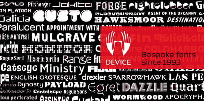
- OK Corral by FontMesa,
$20.00 OK Corral is a revival of a very old Italian font that you may have seen in the past under the original name of Italian Print. The Lined version of this font has never been known to have a lower case set of letters until now.

