6,587 search results
(0.02 seconds)
- Progelud by Beary,
$13.00 Hello guys Proudly presents our font Progelud. Progelud is mazing sans-serif look attractive and natural! Every single letters have been carefully crafted to make your text looks beautiful. It has beautiful and well-balanced characters and as a result, it matches a wide pool of designs. Progelud is PUA encoded, which means you can access all of the glyphs!
 - Saddle Tramp JNL by Jeff Levine,
$29.00 The designers of wood type in the 1880s did not lack for inspiration or imagination. From extremely ornate designs to ultra compressed or condensed alphabets, there was no shortage of variety. Saddle Tramp JNL is one such compressed font. Its wide, bold design coupled with its squat appearance allows for multiple words in a headline without overuse of page space.
 - Becka Script by ITC,
$29.00Becka Script was designed by David Harris in 1985 and is a wide running typeface with varying stroke contrasts. This font looks as though written with a broad tipped pen and its slight slant to the right makes clear its similarity to callipgraphy fonts. Becka Script is reminiscent of the 1950s and its strong strokes make it best for headlines or shorter texts. - Sandy Pillow by Nathatype,
$29.00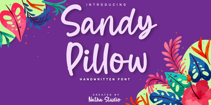 Sandy Pillow is a beautiful handwritten font. It brings an attractive typeface. Made for any professional projects. The font is suitable for any project like logo, t-shirt printing, wedding invitations, and greeting cards to social media quotes, branding, and more! Outstanding in a wide range of contexts. Featured : - Standard Ligatures - Stylistic Sets - Multilingual Support - PUA Encoded - Numerals and Punctuation
 - Battleslab by Kostic,
$40.00 Battleslab is a slab serif made for setting few words in large sizes. Two heavily contrasted weights work well when combined, with its mono-line wide light and heavy black it is perfect for making that "one-two punch" in headlines or logotypes. Display oriented Battleslab derived from Battlefin Family (which is much more comprehensive with its ligatures, italics and SC).
 - Dalton Marine by Sign Studio,
$15.00 Dalton Marine is an absolutely elegant serif font and designed for display. This typeface includes stylistic alternates set that allow you to change multiple characters in one click. It will elevate a wide range of crafting ideas, from cards to branding, labels, and more. This font is PUA encoded, which means you can access all of the glyphs and swashes with ease.
 - Bucanera Soft by Corradine Fonts,
$24.95 Bucanera Soft is a clean modern blackletter designed especially considering its readability. Due to its soft edges, Bucanera Soft leaves the traditional look of aggressive and hard blackletters and allows to find a more friendly appearance in a wide range of applications. Bucanera Soft was selected as a winner in the 3rd Communication Arts Magazine Typography Contest in Typeface Design category, 2013 issue.
 - BD Supper by Typedifferent,
$45.00 "BD Supper" is a friendly and humorous geometric-organic sans serif typeface great for use on food packaging and in gastronomy-related topics. It features a wide selection of alternate characters to choose from. Use them as you like. With two weights regular and bold, «BD Supper» fits the needs to structure a body text with a headline and to create logotypes.
 - Howdy by Ben Buysse,
$45.00 Howdy is a modern French Clarendon revival typeface inspired by late 19th-century woodblock type and sign painting. Its ties to the American West evoke a distinctive western and retro flair. It was designed with flexibility in mind. Intended for use as a display type, its reverse contrast forms make an impact from tall or wide headlines and anything in between.
 - Makeevka by NREY,
$19.00 Makeevka typeface is sans-serif semi-condenced font family. It has wide multilingual support with cyrillic also. This font was crafted with the intention to present clean, legible, multipurpose characters that are easy to read wether it's on screen or print. Fit for all purposes; text, display, headline, print, corporate identity, logo, branding, product, infographic, photography and other applications and medium.
 - Telka by BumbumType,
$39.00 Ideas are diverse and modern applications are complex. Telka is the typeface to answer this contemporary needs, following our studios approach in creating multi-dimensional tools. Characteristic for this typeface is the character-width variation. From the standard, neutral width collection to the wide collection, with its quirky details and strong personality. Telka is in our shop as variable font available.
 - Pictographs by Monotype,
$29.99The Pictographs MT font was contains over 700 emoji icons (emoticons). These symbols, pictures and images cover a range of expressions and uses. Emoji were very popularized in Japan and have become widely adopted and integrated into the Unicode specification. The Pictographs MT font was created to support messaging applications, and to give designers and developers a robust set of emoticons. - Umba Slab by TypeThis!Studio,
$29.00 The best thing about Umba Slab is its surprise! UMBA Slab is a clean but eye-catching typeface designed by Anita Jürgeleit. It adds an amazing touch to your corporate design and titling by developing a more dynamic shape from thin to bold. It’s especially designed for a wide range of variety and to create a highly recognizable branding and titling. Twenty styles from thin to bold and matching italics help you to create design with a strong essence. Separate styles for alternate and small caps will show up in your font menu, making sure that you always stay aware of the wide range of possibilities of your new favourite font. Finally, for all those who love caps, there are extra caps-only fonts added to the collections. Would you like to see more of how UMBA can improve your design? Let’s get in touch! INSTAGRAM @anitajuergeleit +++ FACEBOOK AnitaJuergeleitTypefaces
 - Tanger Serif by Typolar,
$72.00 Inspired by New Transitional and Egyptian fonts, Tanger Serif has elements of a sturdy work-horse text face and finely detailed headline font. A wide variety of widths and weights support many text sizes. Typically Narrow is used in headlines, Medium in body and Wide in smaller print. Nothing is predefined, though. By combining the right widths with the right weights this traditional approach can easily be challenged. Let’s take an oversized (over 10 pt) body copy for instance. In conjunction with using a bigger size to enhance readability, a narrow and slightly lighter weight will save space and brighten text color. Tanger Serif Narrow is a slim normal rather than a condensed face. As an Open Type “Pro” font each weight includes an expanded character set, small caps, old style figures, tabular figures, ligatures, fractions etc. All these are easily accessible through OpenType features.
 - Neuron Angled by Corradine Fonts,
$29.95 Neuron Angled is based in the idea of Neuron, the original font designed in 2012 by Corradine Fonts' team, keeping from its predecessor the proportions and slight narrowness. In this version the rounded edges are replaced by sharp contours and flat endings. A broader typographic system is proposed in Neuron Angled to obtain a versatile and modern typeface without missing its original distinctive style. The neutral aspect of the family allows its application in a wide range of projects specially in those related with branding, signage and editorial design. The Neuron Angled family consists of four styles with eight weights each one, for a total of thirty two fonts. The different fonts of the family are not just complementary to each other, but can be used to complement the original version of Neuron. Its wide character map provides coverage for Western European, Eastern European and Cyrillic scripts.
 - Debs by Scholtz Fonts,
$9.95 Debs was inspired by a thank you note sent from one of my friends to another. The recipient liked the handwriting so much that he passed the note on to me after having asked permission from Debs, the writer. I enjoyed the vigor and looseness of the handwriting, as well as admiring its legibility and style. Debs has all the characteristics of modern handwriting: It appears loose, unstructured, and free, while maintaining good form and great legibility. Its baseline is varied, creating an impression of notes written by busy people, while its characters remain well formed and readable. Debs comes in five styles, regular, lite, black, wide and wide-black. Use Debs for advertising, for casual greeting cards, for a casual, handwritten look on music or fashion media. Debs has all the features usually included in a fully professional font. Language support includes all European character sets.
 - Tabac Glam by Suitcase Type Foundry,
$75.00 A special category of typefaces, combining together principles of both serif and sans-serif, is sometimes described as Linear-Antiqua by German typographers. This concept catches the eye wherever it appears and this is also the case of Tabac Glam — a highly contrasting display typeface, expanding the wide expressive spectrum of our Tabac super-family through a new characteristic hue. Tabac Glam is naturally a great complement to the serif Tabac. It’s however only in conjunction with other styles of the superfamily — Sans, Slab and Mono, that you’ll be able to unleash the enormous potential of the wide range of combinations, and the family’s 112 styles will certainly satisfy all needs of both elegant and technical typesetting. Tabac Glam will best stand out in huge grades, on the covers of thick magazines under glossy layers of UV coating, or on snow-white surfaces of displays.
 - Petunia by Great Lakes Lettering,
$40.00 Petunia is a calligraphy style font designed by New York based calligrapher Eliza Gwendalyn . Her modern copperplate script has been a style she has been developing throughout her career. Her angelic flourishes and bouncy style are widely influenced by Eliza’s favorite childhood character Alice in Wonderland falling down the rabbit hole. She pairs her elegant script with a traditional sans serif and serif which is based on Eliza’s everyday handwriting. The name ‘Petunia' acquired from her childhood nickname her parents called her which was only fitting to choose as the name of her font that was derived from her childhood fantasies. Widely known in the wedding industry, she curated this font family for industry professionals with a versatile array of styles: a script, a bold script, sans serif, sans serif italic, serif, serif italic, and specially calligraphy words & ornaments making this a total package for all types of designers.
 - Sebale by Craft Supply Co,
$20.00 Introducing Sebale – Handwritten Script A Playful Handwritten Script Sebale, a font brimming with delightful whimsy, injects a playful touch into your designs. Charming Whimsy Sebale’s design is not only handwritten but also exudes charming whimsy, making it an ideal choice for a variety of creative projects. Versatile for Creative Endeavors Moving beyond its charm, Sebale’s versatility shines through, allowing it to seamlessly enhance a wide range of design projects. From greeting cards to branding, it offers a wide array of possibilities. Engaging and Memorable Sebale ensures that your content is not only engaging but also incredibly memorable, leaving a lasting and delightful impression. In Conclusion To sum it up, Sebale – Handwritten Script is the font that effortlessly infuses a delightful playfulness into your designs. Its versatility makes it suitable for a broad range of creative endeavors, ensuring accessibility to a diverse readership. With Sebale, your projects will undoubtedly stand out.
 - Stapel by ParaType,
$30.00 Stapel is a contemporary closed sans serif with sci-fi looking forms and eloquent, thin stroke joints. The superfamily consists of three subfamilies of different width: Normal, Narrow and Condensed. Each subfamily contains seven weights with corresponding true italics. Additionally, there are several extra wide bold styles. All these styles work perfectly in headings and short display texts. Another important subfamily is Stapel Text which includes upright and italic styles of lower contrast and more generous spacing. Text styles are great for body text in small and medium point sizes. Most styles include alternate characters, proportional and lining figures, math symbols, fractions, currency signs and case-dependent punctuation. A wide range of styles and typographic features makes Stapel ideal for use in brand identity, infographics and all kinds of designs related to technology, science, finance, politics or sports. Stapel was designed by Alexander Lubovenko and released by Paratype in 2020.
 - Shelley Script Cyrillic by Linotype,
$67.99Matthew Carter designed the Shelley family 1972 for Mergenthaler Linotype to be used as a new script face for the photo typesetting machines. The basic idea was to create one script face that would offer dfferent elegant letterforms. Matthew designed Shelley in three different versions, Allegro which is in the style of Kuenstler Schreibschrift, Andante where the caps are less flowrish and wide and Volante where the letters have its most expressive and wide forms and the lowercase z in this font is in the french anglian double stacked form. All three versions can be easily mixed to give the text a more individual calligraphic look Besides Shelley Linotype Zapfino from Hermann Zapf shows similar basics, but in a totally different letterform. In Linotype Zapfino the individual lowercase letters from the four different versions have different letterforms which gives the text an even more individual touch. - Servus Slab by Dada Studio,
$29.00 This family is very special to me. I started working on it right after my first son was born. I decided to name the typeface "Servus" which means "Hello" in my country. The whole idea of the family symbolizes a child’s growth. It starts with Thin and Narrow weights - just like a newborn baby - then it slowly grows to Black and Wide. As You can guess, my son is quite chubby now! And I can assure You that I put all my love into details. Servus consists of 9 weights which gives us 18 fonts with matching italics. Lights and Bolds, due to their strong personality, are perfect for display uses. At the same time, Regulars create a harmonious structure that provides good legibility in long texts. Servus covers all latin languages. It contains a wide set of numerals, small capitals, fractions, ligatures and other OpenType goodies.
 - Bergurau by Zealab Fonts Division,
$14.00 BERGURAU is a versatile and unique serif typeface, a result of half side curved serif and half side straight serif experiment. BERGURAU has a unique style with stylistic, alternates, ligatures and supports multilingual languages. Create unique & beautiful logotype, use it as an elegant solution for your next magazine layout, or choose BERGURAU for any graphics that require a sleek look with a elegant flair.
 - Velvet Hammer by Great Lakes Lettering,
$40.00 The Velvet Hammer is a true hand calligraphy font that offers the viewer a sense of strong elegance. This font can be used for all things such as cards, posters, signage, wedding invitations, catalogs, book covers and so much more! The Velvet Hammer’s simple unique style can stand strong on its own or sit comfortably side by side with any display or text font!
 - Number5 Reg by Wooden Type Fonts,
$15.00 A William Page font, a variation of the William Page 500 font, with wider lower case, more clearly worked upper case.
 - Chiq by Ingo,
$36.00 The name suggests it: the Chiq is based on a well-known system font from Apple's classic Mac OS operating system. By revamping and expanding good old “Chicago“, I want to make that 90s tech charm available for the future. The model consisted of just a single style and inspired me to create “Chiq Bold,” which later became the starting point for the entire font family. The shapes of the Chiq are constructed according to a very simple principle. The contrast of stems and hairlines becomes more pronounced towards the bolder cuts. A few basic shapes form the framework for all characters. The shapes are very regular and sometimes form somewhat unusual figures, which has a negative effect on readability and makes the font rather unsuitable for long passages of text, but results in a very even typeface. This is particularly true for the extra-wide “UltraExpanded,” which is so wide that you can no longer recognize word images but literally have to spell them out. In this way, words are turned into letter bands with a great decorative effect. With variants from “Light” to “Black”, from “Normal” to “Ultra Expanded” and the italics, Chiq reaches beyond its archetype. This opens up a wide range of uses. It is even clearer, even more sober, and to a certain extent speaks an even more modern formal language. Chiq is also a variable font!
 - Madurai by insigne,
$24.75 The rounded forms found in Chennai have proven to be one of insigne's more popular designs for web-based company logotypes. Now, insigne's new superfamily Madurai takes its popular predecessor to a new level, offering a wide range of complementary fonts. Madurai removes Chennai's rounded stems and then adjusts the character width to account for its reduction in geometry, resulting in a balanced sans-serif face with humanist touches that works well for extended text. The Madurai family has a full range of six weights from thin to black and includes Condensed and extended options for a total of 36 fonts. All members of the Madurai series include a wide variety of OpenType alternates. Madurai is equipped for complex professional typography, including alternates, small caps and plenty of alts, including "normalized" capitals and lowercase letters that include stems. The face also has a number of numeral sets, including fractions, old-style and lining figures with superiors and inferiors. OpenType-capable applications such as Quark or the Adobe suite can take full advantage of automatically replacing ligatures and alternates. You can find these features demonstrated in the .pdf brochure. Madurai also includes the glyphs to support a wide range of languages, including Central, Eastern and Western European languages. In all, Madurai supports over 40 languages that use the extended Latin script, making the new addition a great choice for multi-lingual publications and packaging. For your next project, explore the fantastic potential of Madurai.
 - Parisine Std by Typofonderie,
$59.00 Ultra legible forceful sanserif in 32 fonts Parisine was born as official parisian métro signage typeface. This family of typefaces has become over years one of the symbols of Paris the Johnston for the London Underground or the Helvetica for the New York Subway. The Parisine was created to accompany travelers in their daily use: ultra-readable, friendly, human while the context is a priori hostile. Meanwhile, Parisine is now a workhorse and economical sanserif font family, highly legible, who can be considered as a more human alternative to the industrial-mechanical Din typeface family. More human, but not fancy: No strange “swashy” f, or cursive v, w etc. on the italics, to keep certain expected regularity, important for information design, signages, and any subjects where legibility, sobriety came first. Born as signage typeface family, the various widths and weights permit a wider range of applications. In editorial projects, the Compress version will enhances your headlines, banners, allowing ultra large settings on pages. The Narrow version will be useful as direct compagnon mixed to standard width version when the space is limited. The various Parisine typeface subfamilies Parisine is organised in various widths and subsets, from the original family Parisine, Parisine Gris featuring lighter versions of the usual weights and italics, Parisine Clair featuring extra light styles, to Parisine Sombre with his darker and extremly black weights as we can seen in Frutiger Black or Antique Olive Nord. Many years of adjustments were necessary to refine this complex family. Initially, Parisine was designed by Jean François Porchez in 1996 for Ratp to solely fulfil the unique needs of signage legibility. Parisine remain the official corporate typeface of the public transport in Paris, the worldwide capital for tourism, and now integral part of the French touch. Directly related, Parisine Office was initially created for Ratp’s internal and external communication, Parisine Office is available at Typofonderie too. Not connected with Ratp and public transports, Parisine Plus was created as an informal version of Parisine. Parisine: Introducing narrow and compressed families About Parisine Parisine helps Parisians catch the right bus Observateur du design star of 2007
 - CP Company by FSD,
$23.37 C.P. Company is a group of types including 4 different forms and it is a complementary sign of communication for the C.P. Company clothes maker. C.P. Company communication makes use of media such as the press and the web and that’s the reason why we have always felt the need for a font that would not show incongruities through the monitor. Therefore we have decided to change the structure of glyphs like a, e, g, s… in the most contrasted versions to prevent the serifs from touching the internal parts of the letters and in this manner we have made a really unusual stylistic choice for a group of types. The difference between the height of caps and smalls is very low (about 20%) so that the smalls are easy to read even when their dimensions are on a very small scale. Moreover this stylistic solution gives the possibility to avoid using the small capitals in case of charts and catalogue codes (i.e. Tricot M5) and provides more vertical compactness between the lines. Even a sentence written in capital letters next to another one written in smalls does not look so much contrasted from a typographical point of view and then it is not unpleasant. The limits due to different constructive principles have been overcome by means of a grid based on the automatic division of EM square of 9-point type and in this manner the letters have a wider face. The font is even more unusual owing to the style chosen that belongs to the classical tradition of hair-lined types for glyphs like e and also thanks to ligatures like ? in the characters set. CP Company is a geometrical font whose alphabet makes use of the style of types that preceded the Helvetica, matched with more experimental and updated solutions. Numbering is monospaced. The bending of number 2, the slight raising of the oblique serif of number 4 and the presence of a hair-line in number 7 are the solutions adopted to make the types match in a more balanced manner.
 - Typnic by Corradine Fonts,
$19.95 Everybody likes to have a picnic: some fresh fruits, cheese, ham, wine and so on. Like a “typographic picnic,” Typnic font system gathers many fonts with different flavors too, and you can enjoy them mixed or on their own. Typnic was drawn and calligraphed by hand and is made with eighteen typefaces, including three totally compatible yet different styles. It also has enhancement sets containing labels, dingbats, patterns and ornaments. The Headline style has six layered fonts that can be mixed in a wide variety of combinations to obtain powerful mastheads and headlines. It can be used to construct very nice advertising pieces. If you need to write informal texts, then use Typnic Script, which also comes in six variants and additionally has a complementary font with tails, double letters and ornamented ascenders. Finally, use Typnic Roman to add some secondary texts without losing the general appearance of your work. Typnic has a cool and natural feeling and could be used in all sorts of projects. Typnic is a very ambitious project and we will be working on it to further expand the whole system. Please check out our Typnic Headline Slab.
 - Extenda by Zetafonts,
$39.00 Extenda is a variable width sans serif type family designed by Francesco Canovaro with Andrea Tartarelli and Cosimo Lorenzo Pancini.It been created to provide designers with a powerful but flexible tool to create strong headlines, logos, and display text with tight spacing and maximum space coverage. Rather than providing a family of weights, it gives you a fine-grained range of widths to choose from, allowing maximum control in display editorial uses, and proportional size variation in logo design, keeping consistent appearance and readability. From the vertical, ultra-condensed and thin Pica, Nano and Micro weights to the wide and ultra-bold Peta, Exa and Yotta weights, all Extenda fonts include an extended character set covering Latin languages as well as ones using Cyrillic and Greek for a coverage of 200+ languages. Full Open Type features are included, from small caps to stylistic alternates, positional number forms and discretionary & standard ligatures. The 11-weights family is complemented by the Extendable special weight, that uses Open Type scripts to create a dynamically scaling typeface where each letter becomes automatically tighter or wider than the previous one.
 - Hortensia by Canada Type,
$24.95 Hortensia, designed around 1900 by Emil Gursch for his own Berlin foundry, is a typeface most expressive of the post-Victorian aesthetic that was all the rage in both Europe and America during the second half of the 19th century and up until the Great War. It is a reduced aesthetic of sharp points and natural curves that almost want to apologize for their own elegance, but clearly embody the simple excitement about the blossoming of industry and crafts during the period. This deco script trend would get a re-run for about a decade on either side of the second World War — especially in the entertainment and financial industries — before giving way to art nouveau and big brush faces. Hortensia was Gursch's most popular typeface, used extensively and prominently in many beautiful type catalogs, and a commonly seen design element in Germany for quite a while after its release. This digital version brings plenty of fixes and additions to the original metal Hortensia design, including many alternates sprinkled throughout the character set, and support for a wide range of Latin-based languages (including Central European, Baltic, Turkish and Welsh).
 - Garbata by Zetafonts,
$39.00 Garbata was designed in 2020 by Francesco Canovaro, looking for an approach to sans serif design that ignored the over-exploited grotesque and modernist models. It takes its skeleton from old style typefaces like Windsor or Cooper, keeping the quirky sloped shapes of some letters and adding to the historical smooth shapes a flat brush calligraphic sensibility. The result of these different historical influences is a humble yet distinctive sans serif typeface, developed in a wide range of weights, with finely-tuned differences between the medium, text-oriented cuts (with wider tracking and more regular design) and the more extreme, display-oriented weights. This play on subtlety allows Garbata to be surprising in all uses: humble and readable when set in body text, it shows all its elegant, whimsical qualities in logo design and display use. Equipped with all advanced OpenType features you expect from a production typeface, Garbata comes with an extended character set covering over two hundred languages with latin and Cyrillic glyphs. Designed with an Italian sensibility mixing craftsmanship and artistry, Garbata is ready to help you make your designs timeless, elegant and unusual.
 - Miss Mable by Cory Maylett Design,
$25.00 Miss Mable is a high-quality, well-proportioned contemporary typeface with variations in thick and thin strokes that contains a hint of previous decades. I wanted to create enough weights and widths to make the typeface suitable for a wide range of uses where a soft, stylish, and friendly look is appropriate. The Miss Mable type family consists of 44 fonts. The family encompasses seven weights across three widths in Roman and italics plus variable versions. Each font contains a complete set of characters for Western and Central European languages. In addition, OpenType features include dynamic fractions, alternate glyphs, ligatures, plus proportional, tabular, and old-style numerals. These high-quality fonts are fully compatible with Windows, Macintosh, and Linux. Also for sale are two Miss Mable variable fonts that include all Roman and italic glyphs of every width and weight plus everything in between. For example, if you need something slightly bolder than bold and a little wider than semi-condensed, the variable fonts make that possible without distortion. Variable technology is new, however. All modern web browsers support variable fonts, but support for most desktop software is still spotty.
 - Movida by ROHH,
$39.00 Movida™ is a 101-font mega family - modern, spurless, with geometric flat-sided nature. Its versatile character and huge choice of styles let it serve as a charismatic display typeface as well as clean contemporary tool for setting paragraph text. Its dynamic personality fits perfectly to such industries as sports, gaming, technology, streetwear, automotive. Movida works great for logo design & branding, magazine editorial use, web design, user interfaces and mobile applications. Movida features a super-flexible 3-axis variable font allowing fluent adjustments to width, weight and italic angle. This single font contains all the styles and features of the whole mega family. Main features: 5 widths (Narrow, Condensed, Normal, Expanded, Wide) 10 weights for each width (from Hairline to Black) + 10 corresponding italic styles 1 variable font (3 axes: weight, width, italic angle) modern, slick & sharp spurless design large x-height improving legibility in small sizes flattened oval shapes, adding vertical rhythm and elegance to narrow styles extended latin language support OpenType features (case sensitive forms, standard and discretionary ligatures, stylistic sets, contextual alternates, lining, oldstyle and tabular figures, slashed zero, fractions, superscript and subscript, ordinals, currencies and symbols)
 - Callisto by Groteskly Yours,
$8.00 Callisto is a classic serif stencil fonts that is a stencil font like no others. Elegant curves are paired with great legibility and wide range of available glyphs. While stencil fonts are generally thought of as too masculine and rough, Callisto is very feminine and soft, which makes it perfect as a logo font for those who seek to further emphasise their brand's identity. Despite being a display font, Callisto looks great at smaller sizes, so short headlines and headers will look natural and email legible even in smaller sizes. Callisto comes in two styles —Regular and Half —which can easily be combined within the same body of text. Regular is a more minimal style, with wider and more open apertures, while Half is a hybrid between a serif and stencil font that still has longer strokes and stems. Each style consists of 415 glyphs, ranging from fractions to diacritics. There are a number of glyphs with cool stylistic alternatives (which is awesome for branding), lots of punctuation and OpenType features. Callisto is a great font for designers and artists who need a feminine font with a really strong character.
 - Wah Wah Narrow by Font&Co.,
$29.00 Wah Wah Narrow is a compact, eye-catching, flat-sided display font that will tightly pack the empty space in your layout!
 - Pier Arcade by Studio K,
$45.00 This font is inspired by all those end-of-the-pier amusement arcades and fairground rides. It’s also a bit of a nod to comic book graphics of the Marvel era and the superheroes who deliver knockout punches in a spew of drop shadow typography. With Pier Arcade you can now create your own fairground ride or comic book adventure. Enjoy! See also my other fun fonts Bebopalula, Barrowboy and Calypso.
 - Orange Cat by Atlantic Fonts,
$26.00 Like the cat that swallowed the canary, this font can't hide its mischievous nature. Orange Cat is moody, athletic, and likes to play.
 - Zar Casual by SzarDesign,
$19.95 ZarCasaul has a soft side with a bouncy attitude. Informal font works for taglines to logos, inspired by my background in showcard lettering.