3,874 search results
(0.037 seconds)
- Cumbre by Antipixel,
$22.00 Cumbre is a slanted display type with unorthodox anatomy, a dynamic rhythmic structure, movement expression, and intense visual language. An eccentric rebel with ribbon-like moves, a balanced extrovert that makes meticulous use of ink traps. Both the name and design got inspiration from mountain peaks. "Cumbre" in Spanish means summit, and that's the motive for the spiked design and the angular serrated structure. Cumbre is built by balancing sharp angles and venturous curves. The stems are spiky, and they vary in width. Cumbre is slanted and unicase. It has condensed proportions, moderate weight contrast, spacious counters, pointy terminals, and square ink traps. Cumbre is meant for large display settings to make the most out of the precise outlines and the clean intersections. The font styles: 'Sharp' has straight paths and precise intersections. 'Round' has the same outlines but with round corners. 'Stamp' has irregular wavy contours and heavy swelling at intersections.
 - Muller by Fontfabric,
$47.00 Muller Specimen: http://bit.ly/mullers Muller Narrow Specimen: http://bit.ly/mullerns The very first sketches of Muller were made about four years ago. In the process they changed to the point where they had nothing in common with the original idea. As it is with most work we do, when we seek perfection, changes are inevitable. It was specifically designed with a wider structure for better appearance in small sizes and the extra attention to the detail was needed for the big sizes. We managed to find the right balance for the perfect universal font family. The family consists of 20 weights, ranging from Thin to Heavy with matching Italics. This font family is suited for everything, ranging from advertising, packaging, editorial and branding, to web and screen projects. Muller comes with a complete range of figure options, including proportional and old style figures, each in its tabular version. It also includes advanced typographic features such as ligatures, fractions, alternate characters, case-sensitive forms, superscripts and subscripts.
 - Goodland by Swell Type,
$25.00 Built tall and strong, the Goodland font family is ready to do the heavy lifting in your next design project! Inspired by painted signs on industrial buildings in the town of Goleta, California, Goodland combines a mid-20th century aesthetic with modern features. Three widths: Normal, Condensed and Compressed Eight weights from ExtraLight to UltraBold Matching italics for all 584 glyphs support 223 languages, including Vietnamese & Cyrillics Two sets of Stylistic Alternates Variable font to select any amount of width, weight or slant The Goodland font family is a versatile branding solution. Extreme Light and Bold weights stand out in headlines and display type, while the mid-range Regular and Medium make for easily readable body text on light or dark backgrounds. Dial in the exact look you need with Stylistic Alternates and Variable Font features. Explore the many features of the Goodland font with wonderful things that have come out of the Goodland!
 - ITC Adderville by ITC,
$29.99On a cold winter's night, George Ryan, of Galápagos Design Group, began musing on the possibilities for a “truly original” sans serif typeface. What came out of his musing, and his always-present sketchpad, was ITC Adderville, a typeface whose visual impact is immediate and strong. Ryan explains how he did it: “The rounded ends of its strokes and their skewed baseline contact create an illusion of dancing feet. The tops of lowercase stems emit serif buds, suggesting transition into or out of the serifed form. The spear-like lowercase stroke terminators, along with other distinctive elements such as the stylized reticulation of the lowercase 'g' segments, the salute of that same character's spur, and the bold, non-self-conscious 'i' and 'j' dots, all contribute to the playful and unique nature of this design.” The result is a friendly, lively type family whose graduated weights -- book, medium, and heavy -- lend themselves especially well to use at small display sizes and in short blocks of text. - Univa Nova by Designova,
$15.00 Univa Nova is a beautiful minimalist typeface with masterclass design and outstanding usability features. The typeface is inspired by some of the original Swiss design-based branding projects. Univa Nova is a perfect choice for graphic design, text presentation, web design, print and display use. The typeface can be an amazing option for beautiful branding, logo / logotype design projects, marketing graphics, banners, posters, signage, corporate identities as well as editorial design. Adding extra letter-spacing for the Caps will make this font perfect for minimal headlines and logotypes as shown in promo images here. The typeface is specially handmade with great OpenType features in mind, each weight includes extended language support including Western European & Central European sets. A total of 306 glyphs are included. Univa Nova typeface comes with a total of 16 fonts having 8 weights (Hairline / Thin / Light / Regular / Medium / SemiBold / Bold / Heavy as well as Italic versions of each weights.
 - Wastern by Say Studio,
$12.00 About the Product Introducing "Wastern" - A brand new bold display typeface with both modern and vintage curves. Modern or Vintage. If you are going Vintage Retro : Access your OpenType features to access the large selection of alternate letters and ligatures, select the letters you like from the large variety to get the vintage look you are after. Vary between a light and heavy vintage look based on how many letters you alter. Due to alternates , Wastern is a very versatile font, covering a wide range project types, from bold magazine imagery , to wedding invitations, to branding, poster design and so much more. What's you get? Wastern Italic Unique letterforms Works on PC & Mac Simple Installations Accessible in the Adobe Illustrator, Adobe Photoshop, Microsoft Word even work on Canva! PUA Encoded Characters Fully accessible without additional design software. Language Support : Danish, English, Finnish, French, German, Italian, Luxembourgish, Norwegian Portuguese, Spanish, Swedish, Swiss German. Let me know if you any question:) Have a wonderful Day Say Studio
 - Nazare Exuberant by Ndiscover,
$39.00 Nazare Exuberant is the Poster version of Nazare. This version makes the vintage design more elegant and luxurious. It has super high contrast and the semi-serifs were turned into opulent serifs. Some shapes were redesigned by adding a slight calligraphic feel, making it even more vibrant. This way this design got more organic, more human, more serious, more trustworthy and more luxurious. This is the design for your posters, headlines and actually anything where the letters have a big point size. If you need a more text suitable version you can always use the original Nazare. Another feature is the insertion of some Opentype features: Ligatures were added as well as old style numbers. With its six weights you will have plenty of room for many variations. From the Regular that focus more on elegance to the Heavy that focus more on the lavishness. Regardless of which style you choose Nazare Exuberant is so unique that your designs will not remain unnoticed.
 - Secca by astype,
$42.00 Secca is a fresh and versatile typeface series. With its workhorse qualities, Secca is perfectly suited for a wide range of applications - especially where legibility and economy are important factors. Secca is rooted in the tradition of early German Grotesk typefaces, but is tailored for the needs of today, with a wide language support and many typographic features and extras. » pdf specimen « The core family comes in nine weights from Thin to Ultra Black plus another three Hairline weights - each with italics, small caps and italic small caps. While the weights from Light to Bold perform well in text sizes, the more extreme styles give extra freedom for Headlines & Signage. For setting tables and charts, Secca offers tabular figures, fractions, currency signs and mathematic operators which share the same fixed width throughout the entire range of weights. This special feature is called “weight duplexing” and is a time saver for designers of annual reports and other figure-heavy texts.
 - Belligan by Orenari,
$16.00 Belligan is rounded sans serif which looks calm, feminine yet elegant. Belligan is perfect for your next project, if your project is decided to be simple, modern, clean, and professional touch. Belligan Features: - All Character A-Z, a-z, numeral & punctuation. - Ligatures (BB, CC, DD, EE, FF, GG, LL, MM, NN, OO, PP, RR, SS, TT, Th, ZZ, bb, cc, dd, ee, ff, fi, gg, ll, mm, nn, oo, pp, rr, ss, tt, ti, zz) - Multilingual Support. Oh, and please don't hesitate to drop me a message if you have any questions or you wanna share some jokes! :) Thank You, Ari
 - ÉconoSans Pro by Ingo,
$41.00 The most space-saving sans serif This font saves more space than any of its kind! Slim proportions, but not “condensed” Characters which nearly touch Sparse ascenders and descenders Distinct forms How close to each other can the characters of a font get? Theoretically, as close as you want. But obviously, the words should still be legible. And as any designer knows, body clearance of characters also depends on other parameters such as point size and line spacing. In practice, there are always situations in which as much information as possible has to be positioned in as little space as possible. The ingoFont ÉconoSans is made for exactly this purpose. Even the name of the font implies its function: French for the infinitive “to save” is “économiser.” Now if that doesn’t sound good… The shapes of the upper and lower case letters are completely matter-of-fact, the way a modern font has got to be. The letters c e, and s are wide open to their neighbors. An especially distinguished trait of this font is the design of the “triangular” characters v w y x k z and A V W Y Z K X M N. And the open form of B R and P is also not typical in a sans serif. The distance between letters is kept tight and often the characters nearly touch, but only nearly. With ÉconoSans you gain approximately 20% more text in a line than with »Tahoma«, and even still more than 10% compared to »Helvetica«. ÉconoSans also includes tabular figures as well as ligatures. Among the ligatures, the double mm is especially unusual and is hardly familiar, but can contribute greatly to saving space without catching the reader’s eye.
 - Forever Black - Unknown license

- Coconut Milk by Susan Brand Design,
$10.00 Coconut Milk Script is a fun new handwritten font with lots of personality. It contains multi-lingual support with accented characters for international Western European users, as well as a special double "tt" ligature and stylistic alternative.
 - Novera by René Bieder,
$29.00 The Novera family is a sharp geometric sans in ten weights plus matching italics, available in two versions – Modern and Classic. It has a contemporary, approachable and multifunctional yet characteristic design, that comes with an extensive glyphs set of 1000+ glyphs per font, meeting all typographic demands. The Design Vertical terminals, circular shapes and angular apexes – Novera truely breathes geometry! But the concept goes beyond the application of rational geometry. The intension was to create a highly legible family suitable for every day usage inspired by the work of Paul Renner, Eric Gill or Jakob Erbar, combining the geometric with the human and the functional with the unconventional. Although Novera is inspired by the past, its appearance is unmistakingly modern. Modern vs Classic Novera is available in two versions - Modern and Classic - born from the same source file but with different characters set as default. This creates subtle but effective distinctions such as the double-storey a (Novera Modern) which is optimized for legibility in longer text paragraphs, as opposed to the single-storey a (Novera Classic) which allows a purely geometric appearance. Another distinguishing feature are the ascenders on Novera Mondern, which extend above the cap height for an elegant presence, compared to the ascenders on Novera Classic, ending at the cap height, for a compact and helvetica-flavored look. Novera Modern was intended for usage in body copy, whereas Novera Classic was planned for headlines, short paragraphs or logos, but both versions can be used vice versa too, of course. Alternate Characters To maintain neutrality and a modern appearance, the standard character set largely dispenses with idiosyncratic forms. This is in contrast to the alternative forms with the gill-like lowercase letters g and t as well as a traditional shape of S and the German ligature t/z, which traces back to old German spellings. Also inspired by German poster designs from the early 20th century are the elongated i-dots and dieresis-dots that can create eye-catchers in headlines or logos. By the way, both versions, Novera Modern and Classic, can be created via stylistic set 1, 17 and 18. Opentype Features and Symbols The family comes with many opentype features to support modern typesetting. This includes ligatures, different number sets or alternative shapes for texts set in all caps. If you like arrows and other shapes, you will love Novera! The family has a built-in extensive symbols-set including 48 different arrows and various geometric shapes or icons. Weights With its 40 styles and 1000+ glyphs per font, the Novera family covers all thinkable design scenarios from branding to web, app or editorial usage. It blends in perfectly in text heavy paragraphs with its mid-weights like Light, Regular, Medium or Bold or stands out like a monument in headlines and posters with its extreme weights like Thin, ExtraLight, Black or Ultra. Testfonts If you like to test the fonts before buying the full version, please follow the link below. Please note, all test fonts are available for evaluation purposes only and contain a limited character set! A commercial license for the full version must be purchased separately. Please send a mail to contact@renebieder.com for more information. Download the test fonts here: https://www.renebieder.com/test-fonts
 - America by Peliken,
$14.00 America otf color font. Letters and numbers in national flag design, stripes of red and blue, white stars ornament for festive decoration.You can use this font for design logos, quotes prints on t-shirts, Presidential election posters and other. OpenType-SVG Font was designed with Fontself Maker in Illustrator CC. WARNING Color fonts are pretty new technology - they currently show up in Photoshop CC 2017+, Illustrator CC 2018 and some Mac apps. Learn more about color font support on third-party apps here: https://www.colorfonts.wtf/
 - Aleut by Peliken,
$14.00 Tribal Aleut OTF color font. Native Historic font, traditional ethnic characters in style of customs and traditions of national culture. You can use this font for design logos, quotes prints on t-shirts and other. OpenType-SVG Font was designed with Fontself Maker in Illustrator CC. Contains only uppercase letters and digits. WARNING Color fonts are pretty new technology - they currently show up in Photoshop CC 2017+, Illustrator CC 2018 and some Mac apps. Learn more about color font support on third-party apps here: https://www.colorfonts.wtf/
 - Brighty by SSI.Scraps,
$15.00 Brighty is a fun and friendly sans serif font with a beautiful alternates. Fall in love with its timeless elegance. it is suitable for heading and outline. you will love it. Support multilingual. it is consist of Basic Multilingual Plane, Basic Latin, Latin-1 Supplement, Latin Extended-A & B, general punctuation, super and subscripts, currency symbols, letterlike symbols and Alternate characters on PUA. The file includes OTF, plus bonus editable SVG Papercut and template can be downloaded here: https://www.dropbox.com/s/xen5i6h2o3f6oz6/Brighty%20MF.zip?dl=0
 - Square Diamond Monogram by MonogramBros,
$15.00 Square Diamond Monogram is a perfect rectangular rhombus shaped monogram font consisting of 78 letters and 1 frame. With just a single font file and detailed printable key guide instructions, you will be able to create beautiful monograms in just a matter of minutes after the purchase! Square Diamond Monogram Font comes with font files in OTF format. It features all the modern advanced font features such as Contextual Alternates, effectively eliminating the need to use multiple separate font files for left, center and right letters.
 - Dead Face by Eotype,
$12.00 Dead Face is an experimental black letter font that has a strong, abstract and segmentive appearance. Dead Face is a black letter font with unique fractures, where each fracture tends to be soft in synergy with thin strokes. Each glyph is crafted originally, so it can stand alone which can be used for logos or clothing designs. This font is also suitable for banners and posters. This font has alternate features and ligatures that are packaged in otf format. Have fun being creative using this font!
 - PRONK Clean by wearecolt,
$9.00 Introducing PRONK. By Wearecolt. This is a tall, bold and round display font designed for retro-modern designs. This font is perfect for your next logo design or magazine titles. Taking inspiration from many tall fonts and American number plates i created a display font that would be my 'go to' for a neat tall, bold font. I also wanted something which would be able to take a good amount of treatment like stamp effects and grunge. The PRONK pack includes: .otf and standard webfont file types
 - Street North by Jehansyah,
$12.00 Street North this is a modern serif font, which is very elegant, and also looks very luxurious, make this the choice of your large project, it is suitable for all titles, or large writing, there are several alternates that you can use and combine, and supported by PUA encode , meaning you can easily access all the letters with a glyph, perfect for e-mail, magazines, book titles, movies, notes, brands, logos, and much more include : Street North otf punctuation numeric alternate Thank you very much
 - Zero To Hero by Olivetype,
$18.00 Zero To Hero is a bold handwritten font, carefully handcrafted to become a true favorite. Its casual charm makes it appear wonderfully down-to-earth, readable, and ultimately, incredibly versatile. Zero To Hero will look outstanding in any context, whether it’s being used on busy backgrounds or as a standalone headline! This font is supporting Multi-Languages, which includes: Afrikaans Albanian Catalan Danish Dutch English Estonian Finnish French German Italian Norwegian Portuguese Spanish Swedish Zulu. You will get : Zero To Hero OTF Thank you
 - Tombstone by Factory738,
$15.00 This year's Halloween is fast!!! When it comes to Halloween projects, Tombstone is a great. Use its scary atmosphere as a springboard for your Horror project. Numbers, punctuation, and multilingual letters are all included. For whatever your imagination may conjure up, these ligatures will come in handy. 7 Styles Basic Latin A-Z and a-z Numerals & Punctuation Stylistic Ligatures Multilingual Support for ä ö ü Ä Ö Ü ... OTF file format Free updates and feature additions Thanks for looking, and I hope you enjoy it.
 - Javyer by Din Studio,
$29.00 If you’re looking for a gorgeous font to attract your audiences or customers then we’ve got the font for you! Introducing Javyer- A Handwritten Font This handmade font typeface with elegant style looks very interesting for loads of different projects and promotions. It is perfect to be used on your website, for your social media branding, Pinterest banners, printed products, and more! Includes: Javyer (OTF) Features: Beautiful Ligatures Stylistic Set Swashes Multilingual Support PUA Encoded Numerals and Punctuation Thank you for downloading premium fonts from Din Studio
 - Delisha by Nissa Nana,
$20.00 Delisha is a beautiful script font. It has a classy, elegant, and modern look which can be used for logos, branding, invitations, stationary, wedding designs, social media posts, and every other design which needs a handwritten touch. What's included: Delisha OTF Numeral and Punctuation Stylistic Alternates , Ligatures, and Swashes International Language Works on PC & Mac Simple installations Accessible in Adobe Illustrator, Adobe Photoshop, Adobe InDesign, even works on Microsoft Word. Thank you for your purchase! Hope you enjoy with our font! Best Regards, Nissa Studio
 - Ascetic 2D by 2D Typo,
$28.00 This decorative font is based on Cyrillic Vyaz of XV-XVI centuries. This type of letters were used as display faces in sacred texts. In Vyaz, the letters are characteristically fitted to each other so the letter sequences look as one solid ornamental frieze. The font is rich in discretionary ligatures which help to accentuate the style of Vyaz. In addition to letters and standard characters there is a number of monograms and Christian symbols. These and other features are available in OTF format.
 - Hi Virginia by Good Java Studio,
$23.00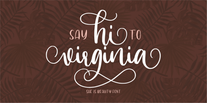 Hi Virginia handlettering font is a beauty & modern handlettering font. It's perfect for logo, invitation, stationery, wedding designs, social media posts, advertisements, product packaging, product designs, label, photography, watermark, crafting, special events or anything. This font include : Hi Virginia OTF, Standar Ligatures, Stylistic Sets, and also Multilingual support. Very simple installation PUA Encoded open Very great for branding, logotype, handletteing, invitations, or fashion branding. Multilingual Support Support for Adobe Illustrator, Corel Draw, Indesign, Adobe Photoshop or Procreate 4.3 (Updated) Support for MAC or WINDOWS
 - Palisade by profonts,
$51.99 Palisade Pro is a new, very elegant script family developed and manufactured in OpenType Pro format by profonts studio. Each of the eight weights contains approximately 1250 characters! The character range includes the complete Latin layout for Western and Eastern Europe, including the Baltic states, Romania and Turkey. Moreover, the character set contains a large selection of handcrafted ligatures (about 450 per font!), character combinations and alternative characters, which make this attractive script perfect for OTF-enabled applications such as InDesign and Quark Xpress version 7and later.
 - Smalkis by Gatype,
$14.00 Smalkis This beautiful script is for those who need elegance and style for their designs and is perfect for wedding invitations, save the date cards and feminine branding. Smalkis includes a full set of Basic Uppercase and Lowercase Characters, Numbers and Punctuation. Also contains ligatures and many stylistic alternatives to perfectly recreate natural calligraphy (check the preview to see all of them) What will you get? Smalkis (OTF) If you have any questions about my products, feel free to write a message on the side.
 - Schuss Sans CG Poster Black by typic schuss,
$33.00 Schuss Sans CG Poster 1 upright OTF Font Latin extended, Cyrillic and Greek. Specially developed for headline poster display sizes. A Sans Black Headline-Font in addition to the Schuss superfamily. The heights are optimized for big sizes, different to the text fonts of the Superfamily Schuss. The character set is slightly different to the non poster styles too. No italic, no additional figures, no tabular figures, no small Caps. But with maximum manual kerning. Ligatures: fi, fl, ff, ffi, ffl. No special OpenType features.
 - Troyer AR by ARTypes,
$30.00The Troyer AR ornaments are based on the first series of ornaments designed for American Type Founders by Johannes Troyer (1902-69). They were cast in 36 and 48 point in 1953 by ATF who said that they ‘mark a distinct and refreshing departure from the motif of earlier ornaments, and add a crisp touch to your finer printing’. Kenneth Day, in The Typography of Press Advertisement (1956), found them 'clean-cut and bright and clearly showing their calligraphic origins . . . useful for single decorative touches'. - Ah, the elusive font EMILKOZAK.COM | fartdeco, a typographical enigma that caters to the refined taste of those who appreciate a good giggle alongside their graphic design. Picture this: the roaring ...
- Mariage by Linotype,
$40.99Morris Fuller Benton, the principal designer of the American Type Founders, designed Mariage in 1901. Mariage, which has been sold under a plethora of different names during the last century, is a blackletter typeface belonging to the Old English category. The term blackletter refers to typefaces that stem out of the historical printing traditions of northern Europe. These letters, called gebrochene Schriften, or "broken type" in German, are normally elaborately bent and distorted. Their forms often print large amounts of ink upon the page, creating text that leaves a heavy, black impression. The Old English style is a subset of blackletter type that dates back to 1498, when Wynken de Worde introduced textura style printing to England. Continental printers had been printing with textura style letters since Gutenberg's invention of the printing press fifty years earlier. Italian printers stopped using them around 1470. For northern Europeans, texturas remained the most popular form of typeface design until the invention of the fraktur style in Nuremberg. Mariage is heavily classicized sort of Old English type. During the Victorian era, designers admired the Middle Ages for its chivalric, community-based values and its pre-industrial lifestyle. Yet they also found the basic medieval textura letterform too difficult to read by present standards. They desired to modernize this old style. Today, this sort of update is often referred to not as "modernization" but as classicism. Benton's design for ATF builds upon earlier Victorian classicist interpretations of Old English/textura letters. For an example of what these Victorian designs looked like, check out the popular 1990 revival of the genre, Old English . Old English style types often appear drastically different from other blackletters. For contrast, compare Mariage to a classical German fraktur design, Fette Fraktur , a schwabacher style face, or the popular early 20th Century calligraphic gothic from Linotype, Wilhelm Klingspor Gotisch . Especially in the United States, classicist Old English typefaces are thought to espouse tradition and journalistic integrity. These features, together with the inherent, complex beauty of Mariage's forms, make this typeface a perfect choice for certificates, awards, and newsletter mastheads. - Catalpa by TypeTogether,
$35.00 The Catalpa font family is José Scaglione and Veronika Burian’s wood type inspired design for an overwhelming headline presence. It has no regular weights, only four slender and four hulking weights. Catalpa wasn’t made to be normal; it was made to overwhelm, to stand out, to bellow. Catalpa is the first font family within a trilogy that will be released through 2020. Each of the three have a distinct purpose and their own look, but they serve a common goal: to act as a complete family covering an editorial’s wide array of needs. As the first of the three, Catalpa is the bookend font family with a headlining purpose. What requirements are there for a great headline typeface? Distinction, weight, and cohesiveness are a good start. Its distinctiveness must catch attention, it must have a range of weights applicable to its purpose, and its internal consistency and external look must create a cohesive family. Catalpa is a distinct and unified family whose weights are attuned to its single-minded purpose — headlines and large text. Catalpa has only eight styles that are divided into two ranges of weights — four very light weights (Hairline, Thin, Extralight, and Light ) and four very bold ones (Extrabold, Heavy, Black, and Extrablack). The thin and heavy ends of the spectrum also have their own variable fonts, each with one axis of weight so designers can fine-tune their work. The geometric influence of the design is more obvious in the light range, with their line thickness increasing in the classical manner. The bold weights increase more in width and substance to serve well in websites, mobile apps, posters, advertisements, and magazines that aim for impact more than spreading information. As a family, Catalpa gels in big headlines, short sentences, and isolated words. The family has many recognizable features, in the bolder weights especially, like the reversed contrast ‘S, s’ or the angular design of ‘Q, M, W, w, a, f, 2, 3’. Catalpa’s headlining mixture of geometry and quirkiness leaves an impression that is so characteristic of wood type, but designed for substrates and screens.
 - Digital Sans Now by Elsner+Flake,
$59.00 Digital Sans Now combines and completes the many diverse requests and requirements by users of the past years. By now, 36 versions for over 70 Latin and Cyrillic languages have become available, including Small Caps. Digital Sans Now is also available as a webfont and reflects, with its simplified and geometric construction and its consciously maintained poster-like forms as well as with its ornamental character, the spirit of the decorative serif-less headline typefaces of the 1970s. The basic severity of other grotesque typefaces is here repressed by means of targeted rounds. Exactly these formal breaks allow the impression that it could be used in a variety of visual applications. Short texts, headlines and logos of all descriptions are its domain. It is because of this versatility that the typeface has become a desirable stylistic element, especially in such design provinces as technology, games and sports, and that, for many years now, it appears to be timeless. Additional weights designed on the basis of the original, from Thin to Ultra, the Italics, Small Caps and alternative characters allow for differentiated “looks and feels”, and, with deliberate usage, give the “Digital Sans Now” expanded possibilities for expression. The basis for the design of Digital Sans Now is a headline typeface created in 1973 by Marty Goldstein and the Digital Sans family which has been available from Elsner+Flake since the mid-1990s under a license agreement. The four weights designed by Marty Goldstein, Thin, Plain, Heavy and Fat, were originally sold by the American company Visual Graphics Corporation (VGC) under the name of “Sol”. Similarly, the company Fotostar International offered film fonts for 2” phototypesetting machines, these however under the name “Sun”. The first digital adaptation had already been ordered in the mid 1970s in Germany by Walter Brendel for the phototypesetting system Unitype used by the TypeShop Group, in three widths and under the name “Digital Part of the Serial Collection.” Based on the versions by VGC, Thin, Plain, Heavy and Fat, new versions were then created with appropriate stroke and width adaptations for data sets for the fonts Light, Medium and Bold as well as for the corresponding italics
 - Baline by Xelo,
$12.00 Baline is a modern and dynamic sans-serif typeface that is perfect for branding, marketing materials, and personal projects. With 20 font styles ranging from heavy to light, and variable weights, Baline is a versatile typeface that can adapt to any design project. Its sleek and clean design makes it easy to read, while its contemporary style gives your text a unique and sophisticated look. Baline is perfect for anyone looking to make a statement with their typography. Whether you're a designer, marketer, or just someone who appreciates beautiful typefaces, Baline is the perfect font for you. Try it out today and see how it can elevate your designs to the next level. Versatility: With 20 font styles ranging from heavy to light and variable weights, Baline is a versatile typeface that can adapt to any design project. This makes it a great investment for designers who need a font that can work across multiple mediums and projects. Modern and dynamic: Baline's sleek and clean design makes it easy to read, while its contemporary style gives your text a unique and sophisticated look. This makes it perfect for branding, marketing materials, and personal projects that need a modern and dynamic touch. Professional quality: Baline is a professionally designed font that has been created to the highest standards of typography. This means that you can be confident that your designs will look polished and professional, whether they are used for print or digital projects. Multilingual support: Baline supports multiple languages, making it a great choice for designers who need a font that can handle multilingual projects. Easy to use: Baline is easy to use and install, so you can start using it right away without any hassle. It also comes with a complete set of characters and symbols, so you can use it for a wide range of design projects. Great value: With its range of font styles and professional quality, Baline offers great value for money. It's a smart investment for any designer who wants to elevate their typography game without breaking the bank. Baline font is a great choice for anyone looking for a versatile, modern, and professional-quality typeface that can handle a wide range of design projects.
 - Bunaero Pro by Buntype,
$33.50 Buntypes Bunaero™ combines classical and contemporary characteristics to a unique and distinctive font family with extravagant but also harmonious appearance. The characters are clear, open and sometimes bellied. Especially the caps have a very high waistline. Based on this, four main states with different moods have been composed: The original Bunaero™, the more conservative “Classic”, the elegant and curvy “Up” and the matching ”Italic”. All states offer weights from a considerably thin „Hair“ to a real fat „Heavy“, so the family consist of 34 Styles, all with rather narrow width and very good legibility. The font was manually hinted and contains extensive handcrafted kerning tables to ensure flawless appearance in all media. It supports at least 99 languages incl. Vietnamese and provides ligatures, alternative glyphs, special localized forms and even more enjoyable OpenType® features. This Pro version of Bunaero also includes a lot of features for sophisticated users: Lining figures for headline setting; Intermediate linings and oldstyle figures for text setting; Tabular versions of all figures; Superiors, inferiors, numerators, denominators and automated fractions; Language specialities like a capital Eszett for the german language and extra characters with a polish kreska instead an acute; And many more. Further information: Bunaero™ Pro Specimen PDF Bunaero™ Pro OpenType® Quickguide Feature Summary*: -4 Moods: Normal, Classic, Up and Italic -9 weights: Hair, Light, Thin, SemiLight, Regular, SemiBold, Bold, ExtraBold and Heavy -Supports at least 99 Languages incl. eastern european and vietnamese languages -Overall width: Narrow or Space-Saving -Advanced f- ligature set including fb -Discretionary s- and c- ligatures -Alternative Characters: a, e, f, g, i, k, l, t, v, w, y, J, K, Q, R, and more -6 sets of figures: -Capital sized figures, oldstyle figures and intermediate figures, each in proportional and carefully adjusted tabular versions -Superiors, inferiors, numerators and denominators -Circled and negative circled figures -Capital German Eszett -Extra characters with Polish Kreska -Catalan Punt Volat -Extra characters with alternate minmalistic Cedille -Arrows -Automated feature for fractions as well as extended fraction character set -More than 1000 characters per font * Some features may only be available in OpenType®-savvy applications
 - Cairoli Now by Italiantype,
$39.00 Cairoli was originally cast by Italian foundry Nebiolo in 1928, as a license of a design by Wagner & Schmidt, known as Neue moderne Grotesk. Its solid grotesque design (later developed as Aurora by Weber and Akzidenz-Grotesk by Haas) was extremely successful: it anticipated the versatility of sans serif superfamilies thanks to its range of weights and widths, while still retaining some eccentricities from end-of the century lead and wood type. In 2020 the Italiantype team directed by Cosimo Lorenzo Pancini and Mario De Libero decided to produce a revival of Cairoli, extending the original weight and width range and developing both a faithful Classic version and a Now variant. The Cairoli Classic family keeps the original low x-height range, very display-oriented, and normalizes the design while emphasizing the original peculiarities like the hook cuts in curved letters, the high-waisted uppercase R and the squared ovals of the letterforms. Cairoli Now is developed with an higher x-height, more suited for text and digital use, and adds to the original design deeper ink-traps and round punctuation, while slightly correcting the curves for a more contemporary look. Born as an exercise in subtlety and love for lost letterforms, Cairoli stands, like its lead ancestor from a century ago, at the crossroads between artsy craftsmanship and industrial needs. Its deviations from the norm are small enough to give it personality without affecting readability, and the expanded weight and width range make it into a workhorse superfamily with open type features (alternates, stylistic sets, positional numbers) and coverage of over two hundred languages using the latin extended alphabet.
 - Cairoli Classic by Italiantype,
$39.00 Cairoli was originally cast by Italian foundry Nebiolo in 1928, as a license of a design by Wagner & Schmidt, known as Neue moderne Grotesk. Its solid grotesque design (later developed as Aurora by Weber and Akzidenz-Grotesk by Haas) was extremely successful: it anticipated the versatility of sans serif superfamilies thanks to its range of weights and widths, while still retaining some eccentricities from end-of the century lead and wood type. In 2020 the Italiantype team directed by Cosimo Lorenzo Pancini and Mario De Libero decided to produce a revival of Cairoli, extending the original weight and width range and developing both a faithful Classic version and a Now variant. The Cairoli Classic family keeps the original low x-height range, very display-oriented, and normalizes the design while emphasizing the original peculiarities like the hook cuts in curved letters, the high-waisted uppercase R and the squared ovals of the letterforms. Cairoli Now is developed with an higher x-height, more suited for text and digital use, and adds to the original design deeper ink-traps and round punctuation, while slightly correcting the curves for a more contemporary look. Born as an exercise in subtlety and love for lost letterforms, Cairoli stands, like its lead ancestor from a century ago, at the crossroads between artsy craftsmanship and industrial needs. Its deviations from the norm are small enough to give it personality without affecting readability, and the expanded weight and width range make it into a workhorse superfamily with open type features (alternates, stylistic sets, positional numbers) and coverage of over two hundred languages using the latin extended alphabet.
 - Flink by Identity Letters,
$25.00 The joy of pure geometry, revisited. Geometric typefaces are a staple in every typographer’s toolbox since the 1920s. It was a time when iconic faces such as Futura, Erbar, and Kabel appeared on the scene and turned the world of type upside-down. Inspired by those early giants as well as later epigones with a legacy of their own (such as 1970’s Avant Garde Gothic), Flink is the Identity Letters take on this genre, characterized by a clean and focused appearance. With neat shapes and the look of pure geometry, Flink adapts to a vast range of applications and topics, from the fine print in contract to website body copy to logo design to billboard-size slogans. Its x-height is considerably larger than in classic geometric sans-serif fonts; its proportions are harmonized as opposed to strictly constructed. This makes for a more contemporary look, setting it apart from the classics. To further reduce the rigidity of a purely geometric composition, you can replace some letters with more humanist alternates, such as a, g, j, etc. This font family comes along in 8 weights from Thin to Black. Each weight consists of an Upright and Italic version. There are more than 750 characters per style, including two stylistic sets that offer variations to the look and feel of Flink, making it even more versatile. Plenty of additional Open Type Features like ligatures, case sensitive forms, old-style figures, and symbols make Flink a valuable tool for the discerning typographer. Flink is the reimagination of a classic genre, designed to suit the needs of our time. ––––– Please note: There is an upgraded Version available: Flink Neue
 - Epic Kantona by Hikhcreative,
$18.00 Epic Kantona Signature is an elegant and a smooth casual monoline signature stylish script. It is perfect for branding projects, logos, wedding designs, social media posts, advertisements, product packaging, product designs, labels, photography, watermarks, invitations, stationery and any projects that need handwriting taste. Epic Kantona works both on Mac & PC. Simple installations, Alternates & Ligature and Multi-lingual Support. Accessible in the Adobe Illustrator, Adobe Photoshop, Adobe InDesign, CorelDraw. This type requires the support of OTF font such as AI, Photoshop, Affinity, Corel and so on. Follow our behance for updates : https://www.behance.net/hikhstudio
