3,874 search results
(0.027 seconds)
- Adelbrook by Vibrant Types,
$36.00 Adelbrook is a dynamic serif typeface that keeps calm. It enriches text with the archaic structure of humanist type, because its characters arrange in a harmonious rhythm with a dynamic stroke, asymmetric serifs and stems that lean in the direction of reading. These characters have gravity and are firmly on the baseline. The tapered stems define a heaviness that end in emphasized foot serifs. Actually all the details are heftier the lower they are. This is particularly evident in a subtle vertical hairline variation, light or unapplied head serifs, and clipped upper dots. The clearness of the semi-serif italics with a brushy nature integrates perfectly in a subtle way. All these details result in a sophisticated text typeface with a sharp contemporary design.
 - Narcissus SG by Spiece Graphics,
$39.00 Narcissus Open is a heavy typeface designed by Walter Tiemann in 1921 for the Klingspor Foundry in Germany. It is a shaded wide roman using a very modest amount of white highlighting. Serifs are extremely delicate, almost ornamental. This elegant old typeface gives a feeling of importance and authority and is highly effective when used in large display sizes. Narcissus Solid lacks all highlighting and becomes more useful in smaller sizes. Narcissus Open and Solid are also available in the OpenType Std format. Some new characters have been added to this OpenType version. Advanced features currently work in Adobe Creative Suite InDesign, Creative Suite Illustrator, and Quark XPress 7. Check for OpenType advanced feature support in other applications as it gradually becomes available with upgrades.
 - Cozy Nap by Yumna Type,
$15.00 Ready to get an awesome font? Cozy nap is a cute display font. The dramatic bold and heavy styles works well in header or title text. While it’s easy to read, there are also a little bit curvy characters to add cute vibes. This font becomes more special with illustrations as the extras. Features: Stylistic Sets Swashes Multilingual Supports Uppercase and lowercase PUA Encoded Numerals and Punctuation This font would looks great on your branding, logos, social media quotes, stickers, posters, wall art, merchandise, social media, and many more. Get more inspiration about how to use it by seeing the font preview. Thank you for purchasing our fonts. If you have any further questions, don't hesitate to contact us. Happy Designing.
 - Stencil Moonlight by Linotype,
$29.00Latvian designer and educator Gustav Grinbergs created Stencil Moonlight as an attempt to slightly lighten up the stencil type scene. Intended as a lively, semi-formal face, its shapes are smooth and compact. It leaves a very heavy feeling on the page, as its letters display a very fat bold design. Stencil Moonlight is available is two separate font styles, Regular and Small Caps. When used together, the Stencil Moonlight family can create the perfect combination for your next display need. Stencil Moonlight works best in larger sizes, where it is clear that its forms stem from an experiment with stencil design. Grinbergs recommends the face for application in package design, advertising, poster design, and perhaps even for the subtitling of foreign films! - Bacony Script by Mans Greback,
$69.00 The Bacony Script family is a bold script family of fonts. This rustic font is expressive, and is constructed of fat brush strokes and heavy letterforms. Use it for a comical logotype or headline to give your work that genuine handpainted look. The Bacony Script family consists of four high-quality fonts: Regular, Italic, Bold and Bold Italic The font is built with advanced OpenType functionality and has a guaranteed top-notch quality, containing stylistic and contextual alternates, ligatures and more features; all to give you full control and customizability. It has extensive language support, covering all Latin-based languages, from Northern Europe to South Africa, from America to South-East Asia. It contains all characters and symbols you’ll ever need, including all punctuation and numbers.
 - Henriette by Typejockeys,
$- The redefinition of a classic In the 1920s the Viennese government decided to standardize the street signs across the city. A typeface was especially constructed for the purpose. It was available in a Heavy and a Bold Condensed version, to support short street names as well as longer ones. As the years went by, the typeface was adopted and redrawn by several enamel factories. These adaptations lead to variations on the design, and to the fact that there isn’t a Viennese street sign font but 16 – in part severely – different versions. Henriette is not a digitization of any of those versions; rather, it is influenced by all of them. The italic versions are completely original and designed to accompany the Roman.
 - Crewekerne Magister by Greater Albion Typefounders,
$13.95 Crewekerne is a typeface family which speaks of the villages that are at the heart of English life. It is inspired by the arts and crafts movement of the early twentieth century, and is complimented by two other families, Crewekerne Magna and Crewekerne Magister. Three widths - condensed, regular and expanded and three weights - regular bold and heavy are offered. Crewekerne is especially good when combined with its two complimentary families and when used in poster and design work that needs a rustic hand crafted flair but still needs to be easily legible. Crewekene is a fun family and a serious set of faces all in one. Crewekerne, Crewekerne Magna and Crewekerne Magister can also be purchased together in the Crewekerne Value Pack.
 - Hard Rain by Scholtz Fonts,
$19.00 Hard Rain is named after the torrential thunderstorms that occur in the subtropical regions on the east coast of southern Africa -- the land of the Zulu. During the two-month long rainy season the steamy downpour usually lasts for a few days, and is then followed by the welcoming sun. The diagonal stripes represent the heavy drops of water that drench everything they touch. The resulting font has something of a grunge look to it. As with other grunge fonts, Hard Rain is best used for posters and display work. However, the crisp edges mean that it can be very readable even if used at a small size. Unlike most grunge fonts, Hard Rain has a full character set and this greatly extends its usability.
 - Hartwell by W Type Foundry,
$25.00 Hartwell is a Neo-humanist sans serif type family. Its strokes and terminal are related to the calligraphic shapes from humanist typefaces in sets with geometric touches. This combination results in a versatile postmodern type family ready to use with many possibilities. Hartwell comes in 18 weights from thin to heavy plus its matching italics. Moreover, this family has OpenType features such as arrows, ligatures, fractions, special numbers, alternate glyphs, extended language support and many more. Hartwell has the ability to blend perfectly in all sort of projects like editorial design, branding, advertising, headlines and short texts. Finally, I would like to thank the entire W team and their collaborators for the months of learning, goodwill and make this project possible.
 - Honesty Sans by Océane Moutot,
$32.90 Honesty was the first font published by the Studio in 2020. It was a typeface with flared stems. 2 years later, we are now publishing Honesty Sans. It is inspired by the original design but is revisited as a sans serif this time. Honesty Sans keeps the inspiration from the incise genre and font such as Albertus or the Trajan but with softness, thanks to its low contrast and smooth curves. Honesty Sans is highly lisible, which offers a variety for use, from titles, edition of texts, branding, magazines and so on. Its large variety of glyphs, including accents, old-style numbers and ligatures will give uniqueness to your designs. Honesty Sans is available in 16 styles, from thin to heavy in roman and italic.
 - Geon by cretype,
$20.00 Geon Family is a modern sans-serif typeface that is clean, simple and highly readable. Letters in this type family are designed with geometric shapes without any decorative distractions. The spaces between individual letter forms are precisely adjusted to create the perfect typesetting. Geon is a versatile type family of 54 fonts. Geon family consists of 9 weights (Thin, ExtraLight, Light, Regular, Medium, Bold, ExtraBold, Heavy & Black) & 3 widths (Condensed, Normal & Expanded)with their corresponding italics. The Open Type fonts contain complete Latin 1252, Cyrillic, Central European 1250, Turkish 1254 character sets. Each font includes proportional figures, tabular figures, numerators, denominators, superscript, scientific inferiors, subscript, fractions and case features. We highly recommend it for use in books, web pages, screen displays, and so on.
 - Sunfice by Mans Greback,
$69.00 Sunfice is a heavy retro typeface. In a style that is not quite sans, not quite serif, this bold lettering gives any project the attention it deserves. Use it for a classic logotype or headline to give your work that genuine vintage look. The Sunfice family consists of four high-quality fonts: Regular, Italic, Bold and Bold Italic The font is built with advanced OpenType functionality and has a guaranteed top-notch quality, containing stylistic and contextual alternates, ligatures and more features; all to give you full control and customizability. It has extensive lingual support, covering all Latin-based languages, from Northern Europe to South Africa, from America to South-East Asia. It contains all characters and symbols you'll ever need, including all punctuation and numbers.
 - Auteur by Up Up Creative,
$29.00 Introducing Auteur, a graceful, full-featured script font with tons of alternate characters and OpenType features. Hand-lettered with a heavy right slant and realistic disconnected letters (connected versions also included), Auteur’s casual elegance is particularly well-suited to invitations, branding, and editorial design. Auteur comes with more than 1200 glyphs! Specific OpenType features include contextual alternates, stylistic alternates, optional initial and final forms, multiple alternate glyphs for many letters (accessed through the glyphs panel), multilingual support (including multiple currency symbols), ligatures, multiple numeral forms (standard, tabular, proportional oldstyle), and ten ampersand styles. Perhaps the most fun thing about Auteur is that it includes multiple versions of all ascending and descending letters, making it lots of fun to play with layouts and compositions.
 - Linotype Sangue by Linotype,
$29.99Linotype Sangue is part of the Take Type Library, selected from the contestants of Linotype’s International Digital Type Design Contests of 1994 and 1997. This prize-winning font was designed by the German artist Gabriele Laubinger. The most distinguishing characteristic of Linotype Sangue is the contrast between the wide, rounded capital letters and the tall, narrow and pointed lower case. Another factor which makes this font so unique is the way Laubinger worked with stroke contrasts, using heavy strokes in the top third of the characters and diminishing to extremely light strokes at the bottom. Linotype Sangue makes a mysterious, secretive impression. It is best used for headlines and displays and shorters texts with point sizes of 12 and larger. - AS Haref by Sallam Type,
$23.00 AS HAREF is a contemporary geometric Arabic font, drawn and constructed carefully Font design is inspired by the ARABIC calligraphic style. AS HAREF Its structure is equal and visually controlled. Character forms are a combination of vertical straight lines that integrate visually with soft angles in some areas. This makes it a line of nature suitable for today's technological and visual development. The variations and weights of this font are suitable to use companies in their names and appearance, and also suitable with the titles and logos and is also used in all the requirements of advertising and long texts, use in headlines, logotypes, branding, books, magazines, motion graphics, web and Tv. AS HAREF consists of 7-weight versions from Thin to Heavy.
 - Jiho by cretype,
$20.00 Jiho Family is a modern sans-serif typeface that is clean, simple and highly readable. Letters in this type family are designed with minimal & modern shapes without any decorative distractions. The spaces between individual letter forms are precisely adjusted to create the perfect typesetting. Jiho is versatile type family of 18 fonts. Jiho family consists of 9 weights (Thin, ExtraLight, Light, Regular, Medium, Bold, ExtraBold, Heavy & Black) with their corresponding italics. The Open Type fonts contain complete Latin 1252, Cyrillic, Central European 1250, Turkish 1254 character sets. Each font includes proportional figures, tabular figures, numerators, denominators, superscript, scientific inferiors, subscript, fractions, old style-figures and case features. We highly recommend it for use in signage, books, web pages, screen displays, and so on.
 - Portheras by Identity Letters,
$39.00 What does “smart casual” look like as a font? Try Portheras: a fairly wide, contemporary humanist sans with a laid-back attitude. Inspired by the fine Cornish beach of Portheras Cove, this typeface pays homage to British design tradition while incorporating an informal idiom. At ease both in flip-flops and silk blouses, in Bermudas and knit ties, Portheras sports a low x-height and comes with italics between “oblique“ and “true italic”. Despite its approachable look, the font family is equipped for heavy duty—you’ll get 16 styles with 780 glyphs each and OT features such as small caps, numerous figure sets (with old-style figures at mid-cap height), a bunch of arrows, three stylistic sets, and more. Portheras is as classy as relaxed gets.
 - Breakers by Kostic,
$40.00 Breakers is a sans serif originally conceived to be a display typeface. Works great in text also, but the diversity in weights is its strong point. It is easy to achieve that high contrast using thin against the ultra weight, but setting tall and lean capitals against the compact and heavy small caps can make really diverse compositions for all kinds of display design. With small caps included, and over 600 glyphs in each weight, it should prove itself useful in finding the right combination for any typographic setting. Breakers has a character set to support Western and Central European languages, and an extended set for monetary symbols. Each weight includes small caps, ligatures, proportional lining and oldstyle numbers, tabular figures, fractions and scientific superior/inferior figures.
 - 1913 Typewriter by GLC,
$38.00 This font was patterned after a few characters on a genuine old 1913 small portable typewriter. It looks like those early typescripts, rough, irregular and eroded, suggestive of mythical famous authors, such as Hemingway, as well as “serie noire” movies or anonymous state employee working in a gloomy Kafkaesque office. It is a complete alphabetic full font. It can be used as web-site titles, poster design, or book editing. It may be preferable, if possible, when printing, to choose a pale color a little rather than condensed - dark grey instead of heavy black, for example - to give the best appearance and to benefit from the full details. The old typewriter character size is 11 to 12 points, but this font easily supports enlargement.
 - Linotype Gotharda by Linotype,
$29.99Linotype Gotharda is part of the Take Type Library, chosen from contestants of Linotype’s International Digital Type Design Contests of 1994 and 1997. This display font started as an experiment of the Croatian-German designer Milo Dominik Ivir. He wanted to design a font with characteristics of both sans serif and Gothic faces. From the Gothic he took the heavy strokes, the narrow letters, the exaggerated overmatter and the high x-height. The modern standard forms of the letters s, a, x and z, the clear capitals and the lack of serifs are the characteristics taken from sans serif faces. The result is a font with a constructed, old German feel. Linotype Gotharda is intended exclusivley for headlines in large point sizes. - Crewekerne Magna by Greater Albion Typefounders,
$13.95 Crewekerne is a typeface family which speaks of the villages that are at the heart of English life. It is inspired by the arts and crafts movement of the early twentieth century, and is complimented by two other families, Crewekerne Magna and Crewekerne Magister. Three widths - condensed, regular and expanded and three weights - regular bold and heavy are offered. Crewekerne is especially good when combined with its two complimentary families and when used in poster and design work that needs a rustic hand crafted flair but still needs to be easily legible. Crewekene is a fun family and a serious set of faces all in one. Crewekerne, Crewekerne Magna and Crewekerne Magister can also be purchased together in the Crewekerne Value Pack.
 - Supra by Wiescher Design,
$29.00 »Supra« – designed by Gert Wiescher in 2012/13 – is a new sans typeface family of eight weights with matching italics. Supra is influenced by current and past sans typefaces, but has a completely new look. The pleasant flow and warm touch combined with great legibility makes Supra unique. The light and normal weights and the dominant x-height with its high ascenders make for easy reading of long copy. The heavy and x-light weights are great for elegant headlines. Supra is an OpenType family for professional typography with an extended character set of over 700 glyphs. It supports more than 40 Central- and Eastern-European as well as many Western languages. Ligatures, different figures, fractions, currency symbols and smallcaps can be found in all cuts.
 - La Taqueria by Sudtipos,
$39.00 Mexico’s storied culture is one of the most recognizable today. Its amazing vibrant art and delicious foods have made the leap to influence many parts of the world in recent years. This proud, intense and diverse identity was the inspiration behind La Taqueria, a set of four fonts that express different characteristics of Mexican pop culture. The heavy and spicy, the light and gentle, the constant dynamism, all come together with one rhythm to produce an explosion of personality. Just like its predecessors Distillery and Scrapbooker, the La Taqueria set contains down-to-earth alphabets perfect for chalkboard art and handmade design. All the fonts include alternates and ligatures, providing plenty of variation for that spontaneous appearance everyone is looking for these days.
 - Bumsy by Flavortype,
$24.00 Bumsy, A new carefully crafted Heavy Sans Serif Typeface. It’s Versatile, Fun, Cute and Beauty feel that you get in Bumsy. Bumsy Created with the happy and fun feeling, so the looks it represent how we feel. Bumsy comes with 3 width : Condensed, Narrow and Regular. if you want more width, you can also use the Variable Width. Bumsy also comes with beautiful swashes, Every glyphs for alternates are curated for the best and possible without eliminate characteristic of this fonts. Our creation on the display to give you a reference what it looks like on your project. such as Branding, Header, Logotype, Poster, Magazine, Packaging, Food Menus, and etc. It shows that Bumsy clearly can accommodate various design style.
 - Prescript - Unknown license

- Nimbus Sans by URW Type Foundry,
$35.00 The first versions of Nimbus Sans have been designed and digitized in the 1980s for the URW SIGNUS sign-making system. Highest precision of all characters (1/100 mm accuracy) as well as spacing and kerning were required because the fonts should be cut in any size in vinyl or other material used for sign-making. During this period three size ranges were created for text (T), the display (D) and poster (P) for small, medium and very large font sizes. In addition, we produced a so-called L-version that was compatible to Adobe’s PostScript version of Helvetica. Nimbus was also the product name of a URW-proprietary renderer for high quality and fast rasterization of outline fonts, a software provided to the developers of PostScript clone RIPs (Hyphen, Harlequin, etc.) back then. Also in the 80s, a new, improved version of the Nimbus Sans, namely Nimbus Sans Novus was designed. Nimbus Sans Novus was conceptually developed entirely with URW’s IKARUS system, i.e. all styles harmonize perfectly with each other in terms of line width, weight, proportions, etc. On top of that, Nimbus Sans Novus contains more styles than Nimbus Sans. Now, Nimbus Sans is also available as Round (like the popular URW fonts Futura Round and Eurostile Round). The Round versions are intended to facilitate the work of designers and typographers. The fonts can be used directly, without further preparatory work in graphic programs as finished, high-quality Rounds.
 - Nimbus Sans Round by URW Type Foundry,
$35.99 The first versions of Nimbus Sans have been designed and digitized in the 1980s for the URW SIGNUS sign-making system. Highest precision of all characters (1/100 mm accuracy) as well as spacing and kerning were required because the fonts should be cut in any size in vinyl or other material used for sign-making. During this period three size ranges were created for text (T), the display (D) and poster (P) for small, medium and very large font sizes. In addition, we produced a so-called L-version that was compatible to Adobe’s PostScript version of Helvetica. Nimbus was also the product name of a URW-proprietary renderer for high quality and fast rasterization of outline fonts, a software provided to the developers of PostScript clone RIPs (Hyphen, Harlequin, etc.) back then. Also in the 80s, a new, improved version of the Nimbus Sans, namely Nimbus Sans Novus was designed. Nimbus Sans Novus was conceptually developed entirely with URW’s IKARUS system, i.e. all styles harmonize perfectly with each other in terms of line width, weight, proportions, etc. On top of that, Nimbus Sans Novus contains more styles than Nimbus Sans. Now, Nimbus Sans is also available as Round (like the popular URW fonts Futura Round and Eurostile Round). The Round versions are intended to facilitate the work of designers and typographers. The fonts can be used directly, without further preparatory work in graphic programs as finished, high-quality Rounds.
 - Thaun by Scholtz Fonts,
$19.00 I can best describe the Thaun family as a general purpose display family, inspired by Scholtz Fonts' " "Delikat". I wanted to produce a display font that was more robust than Delikat, without losing the delicacy of the original. In order to do this I thinned solid, curved strokes toward the baseline, and let them dwindle to gently rounded points. As a graphic designer I became aware that designs that used a number of styles from the same family seemed to work well. This was easily done using a standard sans serif font such as Arial or Helvetica. However, when a different look is needed, display fonts do not always have a the variety of different styles that are necessary to produce a coherent design. Thus with Thaun, the challenge was to create a coherent family based on a display font. The archetype of this family is Thaun Regular with six different widths forming closely related styles. There are also two variants of the archetype i.e. Thaun Black & Thaun Rough to add variety to the primary style. An additional sub-family, Thaun Accord, appears in two widths. Thaun Jazz is a wide three dimensional variation. Thaun has all the features usually included in a fully professional font. Language support includes all European character sets, Greek symbols and all punctuation. Opentype features include automatic replacement of some characters and discretionary replacement of stylistic alternatives.
 - Liturgisch - Personal use only

- Rebellious Brush by Joanne Marie,
$12.00 Rebellious Brush marker font is a hand lettered brush script. What fun I've had from the beginning using pencil on paper to practising creating the glyphs with several types of markers! You'll notice that there are a couple of swashes in the preview pictures - I haven't advertised these because they are only accessible via a glyphs panel using the OTF file supplied.
 - Harry Pro by Red Rooster Collection,
$60.00This revival of Harry is based on the original design by Marty Goldstein (and C.B. Smith). Goldstein, born in Chicago in 1939, was the co-founder of the groundbreaking Creative Black Book. He graduated from the Pratt Institute in 1960. Harry, first published by VGC in 1966, was named for his father. ITF has added four new weights to the original six. - Daretro Mandra by Letterena Studios,
$10.00 Daretro Mandra is elegant serif font. Made for any professional project branding. It is the best for branding, printing, wedding and quotes. Every letter has a unique and beautiful touch. Our fonts are inspired from the country of paris exquisite places according to this font. Includes: Daretro Mandra (OTF) Features: Beautiful Ligatures Beautiful Alternates PUA Encoded Multilingual Support Numerals and Punctuation
 - Standing Room Only NF by Nick's Fonts,
$10.00Here's an Art Deco classic with a bit of an edge. This typeface is based on a somewhat less refined but more energetic version of Broadway, designed by Morris Fuller Benton for ATF in 1928, originally named Broadway Poster. Both versions of this font contain the complete Unicode 1252 (Latin) and Unicode 1250 (Central European) character sets, with localization for Romanian and Moldovan. - Mangatha by Krakenbox Studio,
$17.00 Mangatha is handwritten script font. It has casual, classy, fun, and cute. It’s a great font for fashion, apparel projects, signature, album cover, logo, branding, magazine, social media, & advertisements, but also works great for other projects. Highlight : Fonts are provided in OTF formats. Character Set Numerals and Punctuation (OpenType Standard) Accents (Multilingual characters) Ligature Set PUA Encode Enjoy, Thank you Krakenbox
 - Iraan NF by Nick's Fonts,
$10.00A refreshing stars-and-stripes treatment, suggested by lettering artist Francisco Gonzales, combined with the letterforms of an old ATF typeface named "Rodeo", produced this delightfully novel font, suitable for patriotic occasions. Named for a small Texas town, which pronounces its name "Eerie-Ann." Both versions of the font include 1252 Latin, 1250 CE (with localization for Romanian and Moldovan). - Rustea by Yukita Creative,
$12.00 If you are looking for a typeface that is both different and stylish, Rustea is a perfect choice. With its combination of modern and vintage curves, this typeface is perfect for creating eye-catching designs that will stand out from the crowd. Affordable and versatile Multilingual support and complete character set Get one font for any occasion Support for 31 languages File OTF
 - Amido by Daily Studio,
$17.00 Amido is a gorgeous display typeface designed by Daily Studio. Make your design look exceptional with easy accessibility. Amido will pair beautifully with various fonts and function well with the project you are working on. Perfect for gorgeous logos and headers. This typeface includes full lowercase, uppercase, numbers, punctuation, and standard multilingual letters. With over 200 glyphs and file in OTF format.
 - Strowild by Ditatype,
$29.00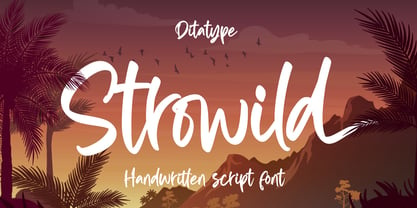 Strowild is a modern handwritten font. Made for any professional project branding that need a modern and attractive typeface. It is the best for logos, branding and quotes. Every letter has a unique and beautiful touch. Includes: Strowild (OTF) Features: Beautiful Ligatures Stylistic Set Multilingual Support PUA Encoded Numerals and Punctuation Thank you for downloading premium fonts from Dita Type
 - Rolling Back by Din Studio,
$29.00 Introducing Rolling Back Font. Made with naturally handwritten. Rolling back font has a casual style. This font is suitable for any design like branding, quotes, t-shirt printing and etc. Included: Rolling Back OTF Features: Accents (Multilingual characters) Beautiful ligatures PUA encoded Numerals and Punctuations (OpenType Standard) Customer support I hope you enjoy it !!Thanks for visiting and purchasing my font!
 - Regular Brush by Din Studio,
$29.00 Regular Brush is a elegant brush font. The handwritten combined with brush font will make your design project more attractive. Made for any professional project branding. It is the best for logos, branding and quotes. Includes: Regular Brush (OTF) Features: Stylistic Set Beautiful Ligatures Multilingual Support PUA Encoded Numerals and Punctuation Thank you for downloading premium fonts from Din Studio

