10,000 search results
(0.145 seconds)
- Monotype Engravers Old English by Monotype,
$29.99 The rather wide, caps-only Monotype Engravers family imitates scripts that evolved from copperplate and steel plate engravers hands of the nineteenth century, which were a quite expressive medium! Monotype Engravers' letters show a strong contrast between thick and thin strokes and have sharply cut serifs. In 1899, Robert Wiebking (who worked for a number of foundries in his time) designed an all-caps typeface named Engravers Roman."" Shortly thereafter, American Type Founders, Inc. (ATF) released another successful ancestor of this design in 1902, ""Engravers Bold,"" designed by Morris Fuller Benton. Engravers Bold was also released by the Barnhart Brothes & Spinder foundry. Also made available by Lanston Monotype at the beginning of the twentieth century, the Engravers faces soon became a popular choice for letter heads, advertising and stationery.
 - Haggis by The Ampersand Forest,
$19.00 Meet Haggis! Inspired by the Insular Half-Uncial and Uncial typefaces that have long been associated with Scotland, Ireland, and their Celtic cousins, Haggis is an unusual creature. Unlike traditional Uncials, he's monoline, rounded, sausagey, and distinctly lighthearted! Use him for posters, signage (especially pub signs!), kids' stuff, and packaging — anyplace a little quasi-Celtic flavor is desired, but with a fun twist. Must we say it? He's a Funcial! Tongue-in-cheek though he may be, Haggis has some great features. He comes in Lean and Overstuffed forms, and has full true small caps, standard(ish) Roman alternates for the more out-there characters, lots of ampersand forms (including a true[ish] "Et" and a Tironian and), fun quasi-Celtic bullets, and lots of ligatures. Try him out today — with some tatties and neeps!
 - Favarotta by Eurotypo,
$24.00 Favarotta was a small settlement on the medieval times. in the Gulf of Castellammare near Palermo, Sicily. Favarotta font is inspired on the style of writing based on Carolingian models, which continued to be used for handwritten liturgical works in Italy. The style show close affinities with the Italian printed books of the period. It combines Roman cursive writing ideas with some of the Celtic innovations in insular writing, including four guide lines, with strokes that flow smoothly from the ascending and descending. Favarotta font family contain five weigh and its corresponding italics. The Italic style are clearly legible and attractively set out, without obvious idiosyncratic tendencies. These fonts can be read and display with pleasure. Each font of the family contain standard ligatures, small caps, old style numerals and support CE languages.
 - Monotype Engravers by Monotype,
$40.99 The rather wide, caps-only Monotype Engravers family imitates scripts that evolved from copperplate and steel plate engravers hands of the nineteenth century, which were a quite expressive medium! Monotype Engravers' letters show a strong contrast between thick and thin strokes and have sharply cut serifs. In 1899, Robert Wiebking (who worked for a number of foundries in his time) designed an all-caps typeface named Engravers Roman."" Shortly thereafter, American Type Founders, Inc. (ATF) released another successful ancestor of this design in 1902, ""Engravers Bold,"" designed by Morris Fuller Benton. Engravers Bold was also released by the Barnhart Brothes & Spinder foundry. Also made available by Lanston Monotype at the beginning of the twentieth century, the Engravers faces soon became a popular choice for letter heads, advertising and stationery.
 - Rare Bird Specimen III by Rare Bird Font Foundry,
$100.00 RARE BIRD SPECIMEN III Rare Bird Specimen III is a graceful hand by Karla Lim of Written Word Calligraphy. This all lowercase font feels both modern and feminine. While uppercase letters are still lowercase in shape, they are larger and read as caps. OBSERVATIONS Specimen III has a dancer-like form; supple and lithe. Willowy letters are nimble and lissome, content alone or paired with a stronger, more masculine specimen. DEFINING CHARACTERISTICS Opentype programming, formal title and preposition word art, 7 alternate lowercase t cross-strokes, Roman numerals, old-style numerals, seamlessly semi-connecting calligraphic letters, realistic double-letter ligatures, in and out-stroked letters at the beginning and end of words where appropriate, basic Latin encoding. POTENTIAL SIGHTINGS Bridal + baby shower stationery, logo design, gourmet food packaging, clothing labels.
 - City Boys Soft by Dharma Type,
$19.99 City Boys Soft is a fashionable contrasted sans-serif that can be used in almost any situation. City Boys has basic, natural and neutral letterforms and skeletons for a wide range of usage. The glyphs are somewhat humanist yet they have vertical stress for modern and sophisticated impression. The ratio of the contrast was carefully designed for modern usage –websites, digital, printings and merchandises–. City Boys consists of 7 weights and their matching Italics for a wide range of usages. Farther, City Boys is supporting international Latin languages and basic Cyrillic languages including Basic Latin, Western Europe, Central and South-Eastern Europe. Also CSS covers Mac Roman, Windows1252, Adobe1 to 3. This wide range of international characters expands the capability of your works. City Boys is a normal corner version of this City Boys Soft.
 - Fortezza by Eurotypo,
$22.00 Fortezza is a family of fonts inspired by the great masters who have created the Modern Roman style: Firmin Didot (1764 -1836) and Giambattista Bodoni (1740 -1813) Both typefaces can be similar, but a trained and close vision, show clear differences in the final result, like its weight and the degree of transition of the strokes. The type of Didot suggests greater warmth and elegance, they are characterized by extreme contrast in thick strokes and thin strokes, by the use of serifs very thin and by the vertical stress of the letters. while the Bodoni type conveys a greater robustness and hardness. Fortezza brings together the elegance and spirit of both types, but proposes a contemporary vision, establishing a distance with certain features typical of the baroque that was manifested at that time.
 - Tractatus by Kaer,
$24.00 These initials set I collected from “Tractatus sacerdotalis de sacramentis”, published in the city of Lugrun, printed by Arnaldum Guillermum de Brocario in 1503. Tractatus font family has Regular and Colored styles. It's all you need to precisely imitate medieval style text. Use this font as a decorative element at the beginning of a paragraph or section, other part of the paragraph should be in regular black letter font. You’ll get Drop Caps & Numbers set. --- *You can use color fonts in PS CC 2017+, AI CC 2018+, ID CC 2019+, macOS 10.14 Mojave+ * *Please note that the Canva & Corel & Affinity doesn't support color fonts!* *Please download this test file with only A letter ( https://www.dropbox.com/s/1lr7fify0n520ms/Tractatus-Test.otf?dl=0 ) to check your app & system.* --- Best, Roman. Thank you!
 - Storica by Arkitype,
$15.00 Storica is a display typeface with roman style serifs that create a sense of history and culture. The Storica family has 7 weights as well as a Heavy Rough and Heavy Hand version that give you an option for a more rustic or hand style approach to you projects. The character set is expansive and has a wide range of language support. Storica has a great selection of Stylistic alternates, ligatures, small-caps, old-style numbers and more packed into the opentype features. This typeface is an excellent choice for branding, particularly in the beverage industry, it is also perfect for typographic layouts for magazines, poster, books etc. Storica has been designed to make it easy for a designer to create beautiful typography with creative flair quickly and easily.
 - Parochus by Kaer,
$24.00 Hello! Inspiration for this beautiful script font I found in “A Source of Solace in Illness” (Trost Bronn der Kranchhen) book, published in the middle of 17th century. There was an entire on the back of the top cover: Joannes Auanger Parochus Sinchingae 1808”. That's why I named my font family Parochus. In the Catholic Church, a parish is a community of the faithful within a particular church, whose pastoral care has been entrusted to a parish priest (Latin: parochus). There are original and regular style fonts. Also, I’ve added some modern symbols. With this set, you can precisely imitate medieval style text. I designed a full uppercase and lowercase set with Multilingual support and ligatures. You'll found ß, &, Š, ę and many other beautiful glyphs. Best, Roman.
 - HandVetica - 100% free

- Arsenale Blue - 100% free

- Andron 2 by SIAS,
$44.90 The sister fonts Andron 2 English and Andron 2 Deutsch provide a groundbreaking new possibility to render literature text bodies in a sophisticated traditional and yet modern way of type. In German typographic history there has once been a long-lasting struggle called the Frakturstreit (the blackletter quarrel). It was about wether German text ought to be composed in blackletter or rather in Roman type, a question upon which even Goethe, Schiller and other period celebrities got grey over time. However, blackletter type remained alive and has just recently seen an astonishing renaissance. This is not about a blackletter revisionism or some ‘mixture’ concept arguably bridging the gap between either worlds. Andron 2 English and Andron 2 Deutsch offer a new approach to circumvent that old antagonism. As for the lowercase letters I applied certain features of blackletter type onto the glyphs – but entirely abandoned the principle of the broken stroke as such. The result is a lowercase alphabet in the classical Andron style which may be considered an attractive alternative for text in English, German or even other languages. So it’s no longer entirely about choosing between ‘modern’ Roman or ‘ancient’ blackletter only. Andron 2 English Regular and Andron 2 Deutsch Regular feature the same lowercase glyphs but differ in the majuscules (Andron 2 English has normal Latin capitals). ++++ 2012 + NEW! +++ In response to its growing popularity we now present five new fonts as part of the Andron 2 series. Andron 2 English is completed by an Italic and a Bold font. Andron 2 Deutsch now contains three interesting alternative fonts: Italic, Scriptive and Laendlich. Last but not least – A new set of wonderful classical typographic ornaments is part of the Italic and Scriptive fonts. – You can also purchase these ornaments separately as “Andron Ornamente”.
 - Getty Dubay by Handwriting Success,
$9.00 The Getty-Dubay® family of fonts has been 500 years in the making — so that you can make your handwriting worksheets in seconds. These fonts are modern descendants of the chancery handwriting style (now called “Italic”) from the Italian Renaissance, when master scribes designed a fluid and graceful hand, inspired by the proportions of the golden rectangle and Roman capitals. The Italic style has been in constant use since then. In modern times, it has been celebrated by Alfred Fairbank, Lloyd Reynolds and many others including authors Barbara Getty and Inga Dubay in their Getty-Dubay® Italic method. The Getty-Dubay® monoline handwriting fonts provide a replete resource to effectively model the highly-legible and beautiful Italic handwriting style. These are the official fonts of Getty-Dubay® Italic. Download the Getty-Dubay® Font Guide for everything you need to know about the Getty-Dubay® fonts. The Getty-Dubay® Joined fonts produce a clean cursive handwriting with join-as-you-type ease. Four join options are included: Standard, Pointed (altered joins into m, n and r), e k (utilizing the two-stroke e and one-stroke k), and Beginning (easiest joins only). The Getty-Dubay® Basic fonts provide sans-sarif clarity suitable for young writers. The Getty-Dubay® Precursive fonts add serifs to the lowercase letters, while retaining the pure Roman capitals of Basic Italic. The Getty-Dubay® Smallcaps fonts make mixed capitals easy to use. All Getty-Dubay® fonts come with scaffolds such as dashed contours, ruled lines, directional arrow and starting dots (for Basic and Smallcaps). They support multiple Latin-based languages from around the world. Getty-Dubay® is a registered trademark in the United States.
 - Anachrony by Cerulean Stimuli,
$24.00 Reminiscent of circuitry and wrought iron, Anachrony constructs the forms of an Old English Blackletter with the strokes of a Modern Geometric Sans, and lands in the vicinity of Art Deco. For such an unusual chimera, the Anachrony family is legible and versatile. Its glyphs cover pan-European Latin, Greek, and a wealth of symbols including arrows, zodiac, planets, chess, suits, and circled numbers. It is also packed with Opentype features: Small Capitals: Of similar proportions to the default numerals, tall enough to be a suitable choice in place of regular capitals. All Caps Forms: In addition to the four usual types of numerals, there are numerals and currency symbols that match the capitals. Swash: A leading curly swash on capitals, and fancy looped ascenders in the lowercase that are handled by over a hundred standard ligatures where they would collide. Style Set 01: Romanized forms. Especially recommended for all caps. Plainer A/M/T/V/W/Y, J/Q reined in to the baseline, and alternate g. Style Set 02: Masthead forms. Old-fashioned capitals with descenders and that lower left dealy. Also f/x/z/ß in a more traditional fraktur mode. Style Set 03: Mild embellishments. Tall bifurcated ascenders and descenders. Style Set 04: Extravagant swash descenders. Style Set 05: Final swashes for the end of a word. Style Set 06: Converts capital letters into the corresponding connected Roman numerals. Seemed like it could be useful sometime. Easy swooshes: Standard ligatures allow you to type two to seven commas in a row to append an assortment of sweeping or ending swashes. Catchwords: In Anachrony Royale, turn on Discretionary Ligatures for a variety of decorative articles and prepositions.
 - Mr Eaves Modern by Emigre,
$59.00 Mr Eaves is the often requested and finally finished sans-serif companion to Mrs Eaves, one of Emigre’s classic typeface designs. Created by Zuzana Licko, this 2009 addition to the Emigre Type Library expands the versatility of the original Mrs Eaves with two complimentary families: Mr Eaves Sans and Mr Eaves Modern. Mr Eaves was based on the proportions of Mrs Eaves, but Licko took some liberty with its design. One of the main concerns was to avoid creating a typeface that looked like it simply had its serifs cut off. And while it matches Mrs Eaves in weight, color, and armature, Mr Eaves stands as its own typeface with many unique characteristics. The Sans version relates most directly to the original serif version, noticeably in the roman lower case letters a, e, and g, as well as in subtle details such as the angled lead in strokes, the counter forms of the b, d, p, and q, and the flared leg of the capital R, the tail of the Q. The distinctly loose-fitting letter spacing of Mrs Eaves was applied also to the Sans version. This, together with generous built-in line spacing due to a small x-height and extended ascenders and descenders, renders the same kind of lightness and airiness when setting text that is so characteristic of Mrs Eaves. Deviations from the original Mrs Eaves are evident in the overall decrease of contrast, as well as in details such as the flag and tail of the f and j, and the finial of the t, which were shortened to maintain a cleaner, sans serif look. And the lower case c had to be balanced out differently after it lost its top ball terminal. And with the loss of serifs, Mr Eaves set width is slightly narrower. Mr Eaves Italic also carries over many forms from its Mrs Eaves model, most notably the v, w, and z, which are unusually flamboyant for a sans italic design. It also utilizes lead in and terminal tails that are reminiscent of the serif italic. The biggest departure here is the width of the characters. The extra narrow gauge and delicate features seemed more appropriate for the Serif than the Sans. To allow for a comfortable fit, Mr Eaves Italic has a more robust design and wider character width. Meanwhile, the Modern family provides an overall less humanistic look, with simpler and more geometric-looking shapes, most noticeably in the squared-off terminals and symmetric lower case counters. This family has moved furthest from its roots, yet still contains some of Mrs Eaves’ DNA. The Modern Italic is free of tails, and overall the Modern exhibits more repetition of forms, projecting a cleaner look. This provides stronger differentiation from the serif version whenever a more contrasting look is desired. Each version (Sans and Modern) contains its own set of alternates providing unique options for applications such as headlines, word logos, letterheads, pull quotes, and other short text settings. Both the Sans and Modern come in six weights. The simpler forms of a sans-serif provide the opportunity of more weights than do serif letter forms, which are more complex in structure, making it difficult to accommodate additional weight without distortions. Regular and Bold match the original Mrs Eaves weights, while the Heavy provides an additional weight for extra emphasis.
 - Mr Eaves Sans by Emigre,
$59.00 Mr Eaves is the sans-serif companion to Mrs Eaves, one of Emigre’s classic typeface designs. Created by Zuzana Licko, this 2009 addition to the Emigre Type Library expands the versatility of the original Mrs Eaves with two complementary families: Mr Eaves Sans and Mr Eaves Modern. Mr Eaves was based on the proportions of Mrs Eaves, but Licko took some liberty with its design. One of the main concerns was to avoid creating a typeface that looked like it simply had its serifs cut off. And while it matches Mrs Eaves in weight, color, and armature, Mr Eaves stands as its own typeface with many unique characteristics. The Sans version relates most directly to the original serif version, noticeably in the roman lower case letters a, e, and g, as well as in subtle details such as the angled lead in strokes, the counter forms of the b, d, p, and q, and the flared leg of the capital R, the tail of the Q. The distinctly loose-fitting letter spacing of Mrs Eaves was applied also to the Sans version. This, together with generous built-in line spacing due to a small x-height and extended ascenders and descenders, renders the same kind of lightness and airiness when setting text that is so characteristic of Mrs Eaves. Deviations from the original Mrs Eaves are evident in the overall decrease of contrast, as well as in details such as the flag and tail of the f and j, and the finial of the t, which were shortened to maintain a cleaner, sans serif look. And the lower case c had to be balanced out differently after it lost its top ball terminal. And with the loss of serifs, Mr Eaves set width is slightly narrower. Mr Eaves Italic also carries over many forms from its Mrs Eaves model, most notably the v, w, and z, which are unusually flamboyant for a sans italic design. It also utilizes lead in and terminal tails that are reminiscent of the serif italic. The biggest departure here is the width of the characters. The extra narrow gauge and delicate features seemed more appropriate for the Serif than the Sans. To allow for a comfortable fit, Mr Eaves Italic has a more robust design and wider character width. Meanwhile, the Modern family provides an overall less humanistic look, with simpler and more geometric-looking shapes, most noticeably in the squared-off terminals and symmetric lower case counters. This family has moved furthest from its roots, yet still contains some of Mrs Eaves' DNA. The Modern Italic is free of tails, and overall the Modern exhibits more repetition of forms, projecting a cleaner look. This provides stronger differentiation from the serif version whenever a more contrasting look is desired. Each version (Sans and Modern) contains its own set of alternates providing unique options for applications such as headlines, word logos, letterheads, pull quotes, and other short text settings. Both the Sans and Modern come in three weights. The simpler forms of a sans-serif provide the opportunity of more weights than do serif letter forms, which are more complex in structure, making it difficult to accommodate additional weight without distortions. Regular and Bold match the original Mrs Eaves weights, while the Heavy provides an additional weight for extra emphasis.
 - PG Gothique by Paulo Goode,
$30.00 This is my addition to a long line of traditional gothic typefaces. As you can probably tell, PG Gothique is inspired by classics such as Trade Gothic, News Gothic, Franklin Gothic, Alternate Gothic, and Gothic Gothic. Well, maybe not the last one... But Paulo, we have all those already, why would we want to add PG Gothique to our collection? This typeface has many subtle design nuances that differentiates itself from its historical influences. Also, this is possibly the most comprehensive Latin gothic font family released to date. It has 99 fonts that cover pretty much every style you could ever need, and if you do require more, this family is available as a single variable font that covers all the weights and widths in between. PG Gothique is designed to handle a multitude of applications, from branding projects, to titles, body text, user interfaces, and film poster credits. This type family has a style that will suit the purpose. There are 99 fonts in this family, ranging from Thin to Ultra weights across six widths in both roman and italic*. Activate Stylistic Set 1 and you will get the alternate slab serif-style capital “I” that offers improved legibility when placed adjacent to a lowercase “l”. PG Gothique has an extensive character set that covers every Latin European language. If you would prefer PG Gothique as a single variable font, please choose PG Gothique Variable. Test drive PG Gothique today – both the Regular and Italic fonts are offered as a free download. See full details and hi-res examples at https://paulogoode.com/pg-gothique Key features: 9 Weights 6 Widths 99 Fonts Small Caps Old Style Figures European Language Support (Latin) 600+ Glyphs per font *Compressed weights do not include italics.
 - NudE - Unknown license

- Badger Fatboy CTBT - Unknown license

- Donthank by Letterhend,
$19.00 Introducing, Donthank Script Typeface. Donthank is a script typeface with swash.This font is perfect for quotes, branding, packaging, etc. What will you get: Including number and symbol. Support Multi Language Ligatures Alternates This font also support PUA Encoded! So, grab your own. Thank You!
 - Merchandising JNL by Jeff Levine,
$29.00 With some slight variation, Merchandising JNL was modeled from the lettering on a display box for Meyercord Decal letters and numbers. The phrase "make your own signs with decals" was lettered in a casual brush-like style, and is reproduced for the first time digitally.
 - Caffe Lungo by Hanoded,
$15.00 Caffe Lungo is a beautiful set of handmade fonts. Lungo is very legible, very clear, but has that authentic ‘handmade’ look. Caffe Lungo comes in three weights, each with its own Italic style. I also added ligatures for the g_j and j_j letter combinations.
 - Celliqath by Letterena Studios,
$10.00 Proudly present Celliqath Typeface , created by Storytype, A serif modern and classic typeface that has own unique style & modern look. This typeface is perfect for an elegant & luxury logo, book or movie title design, fashion brand, magazine, clothes, lettering, quotes, and so much more.
 - Cellosia by Bluestudio,
$20.00 Cellosia is made to resemble hand scratches, so it looks like a natural style like your own hand scratches. Cellosia offer beautiful typographic harmony for a variety of design projects, including watermark, logos, branding, wedding designs, social media posts, advertisements, product designs, magazines and others.
 - Versatylo Rounded by Variatype,
$14.00 Versatylo is a very strong and outstanding branding font that is usable in any company that wants to make its image look modern and high technology. So, let's make your own logotype with this font. FONT FEATURES Additional Accents 66 Languages Kerning Alternates Ligatures
 - Zalcony by HandletterYean,
$16.00 Introducing Zalcony, a captivating handmade font exuding a simple yet alluringly distorted brush aesthetic. Every letter and character carries its own unique size, beautifully showcasing the authentic, natural flow of handwritten script. With Zalcony, add a touch of genuine, personalized charm to your designs.
 - Salamanca TF by TypeFaith Fonts,
$24.00 Salamaca TF is a fun to use typeface. First released in 1994 but completely redesigned in 2013. With the OpenType options or the glyphs palette you make your own special typo's. The font is based on the wall typography of the city of Salamanca.
 - Ayulinda by Patria Ari,
$17.00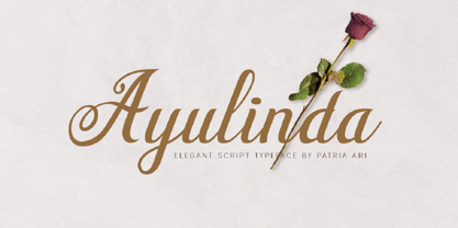 Ayulinda is a luxurious wedding script typeface with its own beautiful alternate glyphs that you can experiment with. Ayulinda is perfect for branding projects, wedding invitation, branding, logo, social media posts, advertisements, product packaging, product designs, label,poster, and any projects that you work on.
 - Maroko by Goodigital13,
$20.00 Perfectly suited to stationery, logos and much more. It looks stunning on wedding invitations, thank you cards, quotes, greeting cards, logos, business cards and every other design which needs a handwritten touch. Made your own design cards, poster, or anything else you might think of!
 - Mallory by Letterena Studios,
$10.00 Proudly present Mallory Typeface , created by Storytype, A serif modern and classic typeface that has own unique style & modern look. This typeface is perfect for an elegant & luxury logo, book or movie title design, fashion brand, magazine, clothes, lettering, quotes, and so much more.
 - Mehriban by Michael Browers,
$25.00Mehriban is a deconstructivist revival inbred from Michael Browers' previous work: Formasi and Disjecta. Formasi characters were morphed with their Disjecta counterparts, and in some cases with previously unpublished letterforms from Disjecta's concepting stages, resulting in a grunge font with its own unique swagger. - Saritha by Bluestudio,
$20.00 Saritha is made to resemble hand scratches, so it looks like a natural style like your own hand scratches. Saritha offer beautiful typographic harmony for a variety of design projects, including watermark, logos,branding, wedding designs, social media posts, advertisements, product designs, magazines and others.
 - Dreamy Notes Script by Subectype,
$15.00 The Dreamy Notes Duo is a stunning and comprehensive duo font (script and sans serif), ideal for giving your projects a branded but friendly feel. The two included styles can be combined together perfectly but are also beautiful on their own. Thank You, Subectype
 - Olimpico by MAC Rhino Fonts,
$59.00 The name of this typeface is a hymn to the Stadio Olimpico in Rome. The home arena to the World's most beautiful football club – AS ROMA. A club with many great players through the years. The biggest of them all, is already a living legend… Francesco Totti. The design is a 2-weight family perfect for elegant display work. The regular weight is more even in blackness while the bold weight carry more contrast.
 - Upton by Halbfett,
$30.00Upton is a modern and condensed sans serif. The initial inspiration for its design came from lettering Wim Crouwel created for a poster design. It also takes some cues from neutral grotesks like Helvetica and Akzidenz. Because of its narrow letterforms, Upton is best applied to headlines and poster-sized typography. Upton’s italics were designed with high-quality compensation for all circles and strokes. Upton ships in two different formats. Depending on your preference, you can install the typeface as two Variable Fonts or use the family’s 14 static OpenType font files instead. Those weights run from Extralight to Extrabold. While the static-format fonts offer a good intermediary-step selection, users who install the Variable Font have vastly greater control over their text’s stroke width. The weight axes in Upton’s Variable Fonts allow users to differentiate between almost 1,000 possible font weights. That enables you to fine-tune your text’s exact appearance on-screen or in print. In its fonts, Upton has several ligatures. That includes optional “discretionary ligatures,” which bring a unique tone to display usage. For instance, the fonts include optional ligatures for the letter combinations “E-T”, “F-l”, “L-E-T-T-E”, “L-E-T-T”, “L-E-T”, “L-E-L-O”, “L-U”, “i-j”. and “m-m”. There are also many alternate glyphs. Stylistic Set 1 substitutes in new forms for “G”, “R”, “a”, “f”, “g”, “i”, “r”, “t”, and “y”. Six more Stylistic Sets have alternates for the “æ”, “g”, “k”, “o”, “K”, “O”, and “Q”. Additional OpenType features activate other useful features, such as fractions, numbers in circles, or symbols. - Albert Einstein by Harald Geisler,
$29.00 Harald Geisler wants to make you as brilliant as Albert Einstein. Or at least let you write like him. Or at least write in his handwriting. — The Wall Street Journal Imagine you could write like Albert Einstein. The Albert Einstein font enables you to do exactly that. In an joined effort, creators Harald Geisler and Elizabeth Waterhouse, spend over 7 years on finalising the project. It was made possible with the help of the Albert Einstein Archive, the Albert Einstein Estate, and funding by a successful Kickstarter Campaign of 2, 334 backers. The outcome was worth the effort: a font unprecedented in aesthetic technique and a benchmark for handwriting fonts. To create a result that is true to the original, Harald Geisler developed a method to analyse the movement of the famous writer. Letter by letter, every glyph was digitally re-written to create a seamlessly working font. It is the only font that holds 5 variations for each lowercase and uppercase-letter, number, and punctuation sign. Each based on meticulous detail to the original samples of Albert Einstein’s handwriting. The OpenType contextual alternates feature dynamically arranges the letters automatically as you type to ensure that no repeated letter forms are placed next to each other. Stylistic variants can also be accessed through stylistic sets. The font has 10 fine-tuned weights ranging from extra-light to fine and extra bold to heavy. The result is a vivid handwritten text true to the original. A PDF documentation, showing step by step how the font was made and comparing numerous original samples, is included with the font and can be downloaded here. The work has been recognised internationally, by press, Einstein fans, and designers. Some quotes used in images: “The font is beautiful“ — Washington Post “If you could write like Einstein, would it help you to think like Einstein?” — The Times (London) “Finally, if your colleagues aren’t taking you seriously, then perhaps you could start sending e-mails in a new font that mimics the handwriting of Albert Einstein.” — Physics World “Geisler and Waterhouse are really asking deeper questions about the diminishing (or evolving) role of our flawed, variable penmanship as a conduit of thought in today’s pixel-perfect landscape.” — QUARTZ “Your writing will look imaginative — which is exactly what Einstein would've wanted." — Huffington Post Arts & Culture "Forget Myriad Pro, Helvetica or Futura. The only font you’ll ever need" — Gizmodo “Capture a piece of Einstein's genius in your own writing." — Mashable
 - Barbaric - Personal use only

- Red October - Personal use only

- Janda Curlygirl Pop - Personal use only


