4,356 search results
(0.025 seconds)
- Hugenick - Unknown license
- OMEGA Old Face - Unknown license
- Asian Dings - Unknown license
- HeavyWood - Unknown license
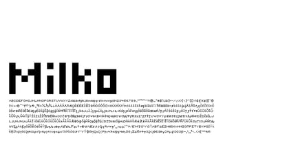
- Milko by Jesse Tilley,
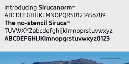
$12.00 - Sirucanorm by FSD,
$60.27 - Illinoise by Just in Type,
$18.00Illinoise is a mutation of one of the most beautiful screen fonts ever. But, there are no straight lines. Everything is shaking. Let's party! - Stereo Gothic by Dharma Type,
$14.99 - Lux by URW Type Foundry,
$35.99Many times, when a new creative process is starting, it is triggered by an everyday action or item. In this case, the looks of a lady’s watch inspired Michael Herold to create his new typeface LUX. The sight of the chronograph sparked associations of the 1950s in Mr. Herold: While this decade was predominantly dominated by brush and feather scripts, there was also a bloom of strict and modern architecture. This special mix of strength and retro style is exactly what Michael Herold is trying to capture in his LUX. The result is a typeface which is perfectly suitable for use on book covers, posters and claims – thanks to its striking impression. The name LUX, Latin for light, is inspired by the high bright-dark contrast within the individual characters. Oft sind es alltägliche Gegenstände, die das Bestreben eines neuen kreativen Prozesses auslösen. So entspringt auch die Inspiration zur Erschaffung der LUX von Michael Herold dem Anblick einer Damenuhr. Der Chronograph löste bei Herrn Herold Assoziationen zu den 1950er Jahren aus: Während diese Zeit hauptsächlich von Schreibschriften aus Federn und Pinseln beherrscht wurde, nahm auch die streng und modern anmutende Architektur starken Einfluss auf die Epoche. Diese Mischung aus Strenge und 50er Jahre Retro-Stil soll in der LUX zum Ausdruck kommen. Das Ergebnis ist eine Schrift, die sich mit ihrer plakativen Wirkung perfekt für Buchumschläge, Poster und Claims eignet. Namensgebend war der starke hell-dunkel Kontrast innerhalb der Schrift – festgehalten in dem lateinischen Wort für Licht. - **The Enigmatic Elegance of Xiparos Lombard: A Font Review by Yours Truly, the Artistic Oracle** In the grand parade of typographies where fonts like Arial and Helvetica march with their heads held...
- Pomfrit Dandy NF by Nick's Fonts,
$10.00This elegant monocase design is based on a nineteenth-century offering from Britain’s Stephenson Blake Foundry named "Fry’s Ornamented No. 2". Stylish, witty and debonair, it will add grace and charm to any project. The font features bracketed fleurons in the greater than and less than positions, and no math operators. Both versions of this font contain the Unicode 1252 (Latin) and Unicode 1250 (Central European) character sets, with localization for Romanian and Moldovan. - Collected Catchwords JNL by Jeff Levine,
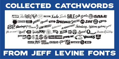
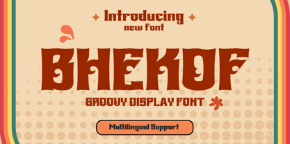
$29.00For those designers looking for nothing more than a library of familiar catchwords and phrases re-drawn from vintage source material, look no further. Collected Catchwords JNL gathers up ninety-three of them, picked from the dingbat typeface library of Jeff Levine Fonts and placed into one convenient font file. "Free", "Sale", "As Advertised", "Dollar Days", "Look", "New" and dozens of other icons of print advertising are no more than a keystroke away. - Bekof by Twinletter,
$15.00Bhekof is typography with strong characteristics. Explore several other eras of art and combine them into a strong Bhekof characteristic. A great typeface for your next design project. Looking for a typestyle that has strong characteristics? Look no further than Bhekof! This awesome typeface has a vintage look that will make your designs stand out from the rest. With strong characteristics like this, it’s no wonder it makes your design very popular. - Gravtrac by Typodermic,
$11.95Gravtrac is a slab serif headliner designed to deliver solid punches while taking up as little horizontal space as possible. Inspiration comes from mid twentieth century classics: Univers 59 Ultra-Condensed, Helvetica Inserat and Compacta. It’s all about flat sides, a steady rhythm and tight, precision curves. The widest style of Gravtac is Condensed—compact, yet a comfortable read, available in 7 weights from Ultra-Light to Heavy. Gravtrac Compressed is probably the width where most typefaces would quit. It's narrow enough for most...but not for you. That’s why we have Gravtrac Crammed. It’s audaciously narrow—perfect for times where you want the reader to slow down and truly pay attention to the message. Gravtrac Crushed is devilishly slender. Try it with wide tracking for a stark, opulent look. All styles are also available in obliques varying from 7 to 10 degrees—58 styles in total. Gravtrac includes Opentype fractions, numeric ordinals, a breadth of currency symbols and old-style (lowercase) numerals. Every skilled designer already has slab serif typefaces in their stockpile but some of us have the need to squeeze. Most Latin-based European, Vietnamese, Greek, and most Cyrillic-based writing systems are supported, including the following languages. Afaan Oromo, Afar, Afrikaans, Albanian, Alsatian, Aromanian, Aymara, Azerbaijani, Bashkir, Bashkir (Latin), Basque, Belarusian, Belarusian (Latin), Bemba, Bikol, Bosnian, Breton, Bulgarian, Buryat, Cape Verdean, Creole, Catalan, Cebuano, Chamorro, Chavacano, Chichewa, Crimean Tatar (Latin), Croatian, Czech, Danish, Dawan, Dholuo, Dungan, Dutch, English, Estonian, Faroese, Fijian, Filipino, Finnish, French, Frisian, Friulian, Gagauz (Latin), Galician, Ganda, Genoese, German, Gikuyu, Greenlandic, Guadeloupean Creole, Haitian Creole, Hawaiian, Hiligaynon, Hungarian, Icelandic, Igbo, Ilocano, Indonesian, Irish, Italian, Jamaican, Kaingang, Khalkha, Kalmyk, Kanuri, Kaqchikel, Karakalpak (Latin), Kashubian, Kazakh, Kikongo, Kinyarwanda, Kirundi, Komi-Permyak, Kurdish, Kurdish (Latin), Kyrgyz, Latvian, Lithuanian, Lombard, Low Saxon, Luxembourgish, Maasai, Macedonian, Makhuwa, Malay, Maltese, Māori, Moldovan, Montenegrin, Nahuatl, Ndebele, Neapolitan, Norwegian, Novial, Occitan, Ossetian, Ossetian (Latin), Papiamento, Piedmontese, Polish, Portuguese, Quechua, Rarotongan, Romanian, Romansh, Russian, Rusyn, Sami, Sango, Saramaccan, Sardinian, Scottish Gaelic, Serbian, Serbian (Latin), Shona, Sicilian, Silesian, Slovak, Slovenian, Somali, Sorbian, Sotho, Spanish, Swahili, Swazi, Swedish, Tagalog, Tahitian, Tajik, Tatar, Tetum, Tongan, Tshiluba, Tsonga, Tswana, Tumbuka, Turkish, Turkmen (Latin), Tuvaluan, Ukrainian, Uzbek, Uzbek (Latin), Venda, Venetian, Vepsian, Vietnamese, Võro, Walloon, Waray-Waray, Wayuu, Welsh, Wolof, Xavante, Xhosa, Yapese, Zapotec, Zarma, Zazaki, Zulu and Zuni. - Anultra Slab by Eclectotype,
$40.00Anultra Slab is, you guessed it... An ultra bold slab serif! Anultra Slab is a hard hitting headliner, designed to be set LARGE. Because it's a single weight typeface, no compromises were necessary to get it interpolatable with other weights, so it is as bold and tight as I intended. Features include automatic fractions, case-sensitive forms, ligatures, stylistic alternates for non-descending J and Q, and a 3D 'xtrude' style, which can be layered behind the regular to create two colour, photo-lettering style text. Very seventies. Very cool. A companion typeface, Alight Slab , is available at the other end of the weight scale, but there are no weights in between. You're no middle-weight designer, so why use middle-weight fonts?! - Soho Gothic by Monotype,
$29.99“There is just something magical about type design,” says Sebastian Lester. “If you draw a successful typeface it can travel the world, taking a part of you with it.” If this is true, his Soho® Gothic family has taken him far and wide. Understated, modern and exceptionally versatile, the family has been put to good use in just about every application imaginable. A good choice for virtually any type of project, The Soho Gothic family performs equally well as the backbone of a global brand as it would in an edgy fashion magazine. Versatile, extensive, customizable, and multilingual – the Soho Gothic typeface family has it all.With the same proportions as Soho, its slab serif cousin, Soho Gothic ranges across seven weights, from a willowy hairline to a brawny ultra – each with a complementary italic.Lester took care to ensure that the Soho and Soho Gothic designs work in perfect harmony. According to him, “The typefaces were developed alongside each other so that I could consider every aspect of each design and be certain that they would be absolutely compatible.”Soho Gothic is a more understated and more subtle design than Soho. Features that give the design its distinctive tone are the flat, crisp apexes of the diagonal characters like the A and V, and the marked horizontal stress in the a, g and s. “I wanted the family as a whole to radiate effortless modernity,” recalls Lester, “to be a master communicator that works in all conditions and at all sizes.” A collection of alternate and “semi-slab” characters were also part of Lester’s plan. “I like to develop alternate characters for all my type designs,” he says. “I believe they give graphic designers greater flexibility and make a typeface more valuable.” Soho Gothic is available as OpenType® Pro fonts that have an extended character set which supports most Central European and many Eastern European languages. If you’re looking to complete your designs, consider pairing it with Bembo® Book,Joanna® Nova,Neue Frutiger®,PMN Caecilia®,or ITC Stone® Serif. - Chunkmuffin - Unknown license
- Jaunty - Unknown license
- KillerStumps - Unknown license
- Chunkmuffin - Unknown license
- CrappyGothic - Unknown license
- Chewed Straw - Unknown license
- HollowWeenie Bats - Unknown license
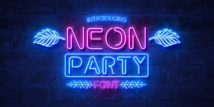
- Neon Party by Beast Designer,
$15.99 - Stamps by Solotype,
$19.95We have a penchant for types that connect to form a ribbon or band. Here's another one, and no amount of words will excuse it. - Stampede by FontMesa,
$25.00Stampede was created from a small sample of letters found on an old document dating back to 1902 from the Chicago, Indiana & Eastern Railway Co. - Datura - Unknown license
- Vallentino by Bal Studio,
$12.00Vallentino is a stylish and elegant handwritten font, which looks like a signature, this font is deliberately made with unique ligatures and alternatives. Vallentino is perfect for signatures, branding, logos, business cards, posters, invitations, greeting cards, news, product packaging, blog posters, all including personal charms etc. This font is also equipped with unique and interesting ligatures, by using these ligatures you can give a real handlettered style: ab ah ak al am an ar at ch ck cr eb el em en er es et ff ht il im in it ll mm ng nn nt of oh oi ol on or oo od ou ow oy sh ss st th tt ut wh Th ft Multiple Language Support: ŠÀÁÂÃÄÅÆÇÈÉÊËÌÍÎÏŸŽÐÑÒÓÔÕÖØÙÚÛÜÝßàáâãäåæçèéêëìíîïñòóôõöøùúûüýÿŒœš Thank you for your purchase! - Byblos by Wiescher Design,
$39.50“Byblos” is the name of a town in Lebanon and the name of a famous hotel in St. Tropez. Some time ago I discovered their original logo in an old french magazine, just 5 by 3 centimeters small without any text, address, telephone number not even a picture. They did not need that, that’s how famous the hotel and its old logo was. Well they abandoned their identity when the place was sold to a big chain – I think. But the logotype, just those five letters inspired me to this new font. It evokes times past and has a little Bauhaus in it – as well as a really modern touch, all depends on the way you use it. Your strange typedesigner Gert Wiescher - Luke by The Northern Block,
$49.50Luke is a contemporary adaptation of historic English Blackletter, inspired by the creativity of leading English type-creator: Caslon Foundry. Their highly unique 19th century Blackletter typeface provided the core elements of Luke, with the name paying tribute to the Caslon family tomb in the churchyard of St Luke Old Street in London. This modern and versatile type family offers a wide range of styles — from thin to thick contours, and with half-filling to complete — allowing it to work best for headlines, short text and branding. Details include twelve styles and 641 glyphs. Opentype features include superscript, denominators, numerators, scientific inferiors, ordinals, stylistic alternatives, case-sensitive forms, fractions, contextual alternates and discretionary ligatures. Luke supports 37 languages, covering South, East and Western Europe. - Elizabeth by ParaType,
$30.00The hand composition typeface was developed at the Ossip Lehmann type foundry (St. Petersburg) in 1904-07 (after designs by Alexander Leo?). It was redeveloped at Polygraphmash in 1960s for slugcasting composition. Named after Russian Empress Elizabeth I (1709-61). Based on typefaces of George Revillon type foundry of 1840s, though some characters’ shapes were redrawn similar to Russian Academy of Sciences typefaces (mid-18th century). Sharp contrast, strong weight Modern Serif with archaic flavor. The typeface is useful in text and display composition, in fiction, historical, and art books, especially connected to the 18th or 19th centuries. It looks great in Russian classical literature such as Pushkin and Gogol works. The revised, improved and completed digital version was designed at ParaType in 2001 by Lyubov Kuznetsova. - Speech Bubbles by Harald Geisler,
$68.00The font Speech Bubbles offers a convenient way to integrate text and image. While the font can be used to design comics, it also gives the typographer a tool to make text speak – to give words conversational dynamics and to emphasize visually the sound of the message. The font includes a total of seventy outlines and seventy bubble backgrounds selected from a survey of historic forms. What follows is a discussion of my process researching and developing the font, as well as a few user suggestions. My work on the Speech Bubbles font began with historic research. My first resource was a close friend who is a successful German comic artist. I had previously worked with him to transform his lettering art into an OpenType font. This allowed his publishing house to easily translate cartoons from German to other languages without the need to use another font, like Helvetica rounded. My friend showed me the most exciting, outstanding and graphically appealing speech bubbles from his library. I looked at early strips from Schulz (Peanuts), Bill Waterson (Calvin & Hobes), Hergé (TinTin), Franquin, as well as Walt Disney. The most inspiring was the early Krazy Kat and Ignatz (around 1915) from George Herriman. I also studied 1980’s classics Dave Gibbon’s Watchmen, Frank Miller’s Ronin and Alan Moore and David Lloyd’s V for Vandetta. Contemporary work was also a part of my research—like Liniers from Macanudo and work of Ralf König. With this overview in mind I began to work from scratch. I tried to distill the typical essence of each author’s or era’s speech bubbles style into my font. In the end I limited my work down to the seventy strongest images. An important aspect of the design process was examining each artist’s speech bubble outlines. In some cases they are carefully inked, as in most of the 80’s work. In others, such as with Herriman, they are fast drawn with a rough impetus. The form can be dynamic and round (Schultz) with a variable stroke width, or straight inked with no form contrast (Hergé). Since most outlines also carry the character of the tool that they are made with, I chose to separate the outline from the speech bubble fill-in or background. This technical decision offers interesting creative possibilities. For example, the font user can apply a slight offset from fill-in to outline, as it is typical to early comic strips, in which there are often print misalignments. Also, rather than work in the classic white background with black outline, one can work with colors. Many tonal outcomes are possible by contrasting the fill-in and outline color. The Speech Bubbles font offers a dynamic and quick way to flavor information while conveying a message. How is something said? Loudly? With a tint of shyness? Does a rather small message take up a lot of space? The font’s extensive survey of historic comic designs in an assembly that is useful for both pure comic purposes or more complex typographic projects. Use Speech Bubbles to give your message the right impact in your poster, ad or composition. - Heat Sinks 586 - Unknown license
- Chingolo Pro - Unknown license
- Heat Sinks 386 - Unknown license
- Heat Sinks 486 - Unknown license
- FuzzySock - Unknown license
- Evil Of Frankenstein - Unknown license
- Cthulhu Runes - Unknown license
- Kaptain Kurk - Unknown license


